7 Main Hand Lettering Styles with Ideas & Examples
Hand lettering is used everywhere. You can see quotes written in different lettering styles on packaging, invitations, and social media. Often, they look so good, it’s hard to believe anyone can master this art.
However, it’s true. With practice and determination, you can master hand lettering and create beautiful visuals yourself. This hand lettering guide will help you figure out how to do so.
What is hand lettering?
Hand lettering is the art of drawing words and letters. It is all about creating custom letterforms, experimenting with styles, techniques, and embellishments.
It is sometimes confused with typography, which is the process of creating fonts and typefaces. However, hand lettering fonts are done by hand, and just like any other handcraft, this one is unique. Even the same letter in a sentence can be written differently.
Typography, on the other hand, is created using digital tools and has to be very precise. For instance, all the spaces between letters in a font are calculated thoroughly to achieve a harmonious overall look.
7 main hand lettering styles
There are so many different lettering styles out there. Some are more beginner-friendly, while some can be difficult to master without previous experience. This article focuses on the seven most common types of lettering. You can pick the one that seems the most appealing and start practicing it.
- Cursive/Script
- Brush lettering
- Gothic
- Monoline
- Block lettering
- Serif
- Creative lettering
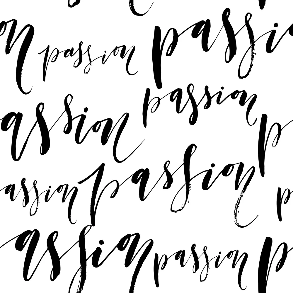
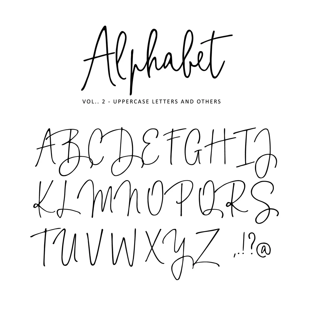
1. Cursive/Script
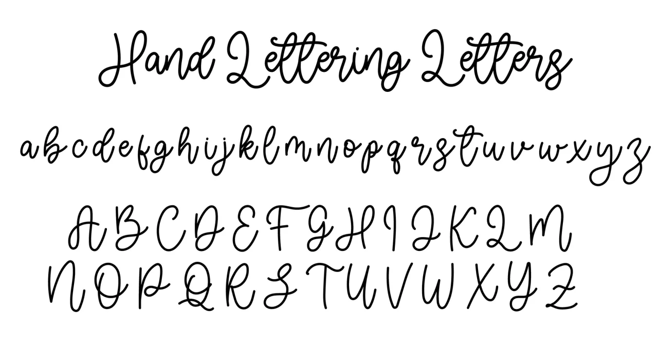


This type of lettering mimics cursive handwriting: the characters are written in a flowing manner, and the hand drawn letters are connected. Its history dates back to ancient Rome, when Roman cursive (also known as Latin cursive) was invented. It evolved over the ages and became widely popular in the 17th century. Back then, people used quill pens to write, which helped make strokes smoother and connected.
Script lettering is versatile. It can be used for both formal and casual invitations, personal projects, and overall lettering designs that have to look graceful and fluid.
This hand drawn lettering is moderately difficult to master. It is generally more forgiving than other styles. However, to achieve a consistent letter flow and elegant look, you need to practice a lot. The key aspects of mastering script lettering are maintaining proper spacing and keeping a steady hand.
2. Brush lettering
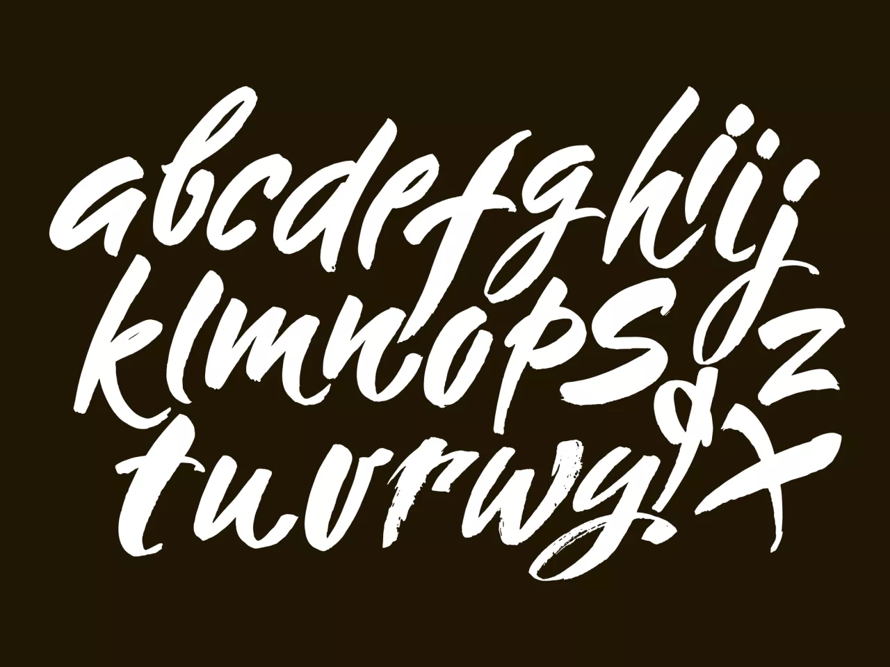
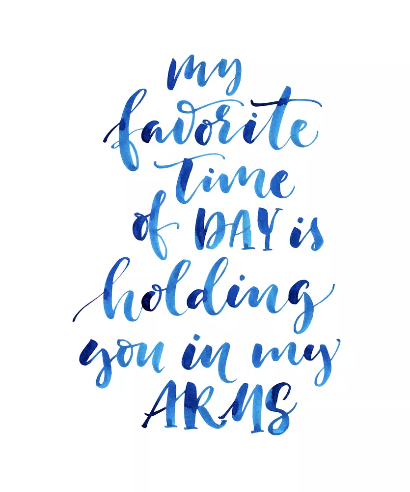
This style is created with a brush or a brush pen. Thick and more prominent strokes are combined with thinner ones. Brush lettering originated in East Asian calligraphy and became popular in the US and Europe during the 20th century. Brush lettering is often used for artistic posters, inspirational quotes, and projects that need to have a dynamic and organic look.
This pretty hand lettering style is moderately or highly difficult to master, depending on your individual skills. You need to understand brush control to create varying strokes. It can be challenging to achieve a harmonious balance between thick and thin lines, so you have to be patient and practice a lot.
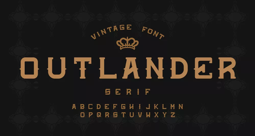
3. Gothic
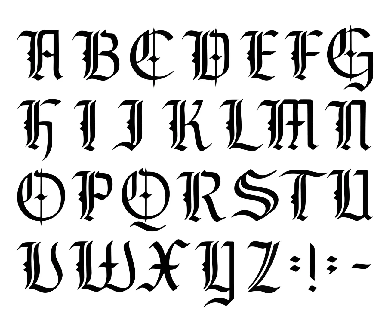
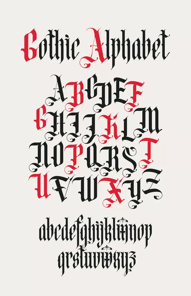
Also known as Blackletter, Gothic lettering is inspired by medieval calligraphy. This type of lettering was often used in manuscripts and religious texts. Later, it experienced a revival in the 19th and 20th centuries, especially in the graphic design field.
Gothic lettering has bold, angular strokes with a distinctive and often vintage appearance. This style is commonly used for band logos, vintage-inspired designs, and projects with a bold and historical vibe.
Gothic lettering is one of the most complex hand lettering examples. You need to be precise in strokes and have a keen eye for details. Beginner-level creators can struggle with accurately replicating the angular shapes and ornate elements of this style.
4. Monoline
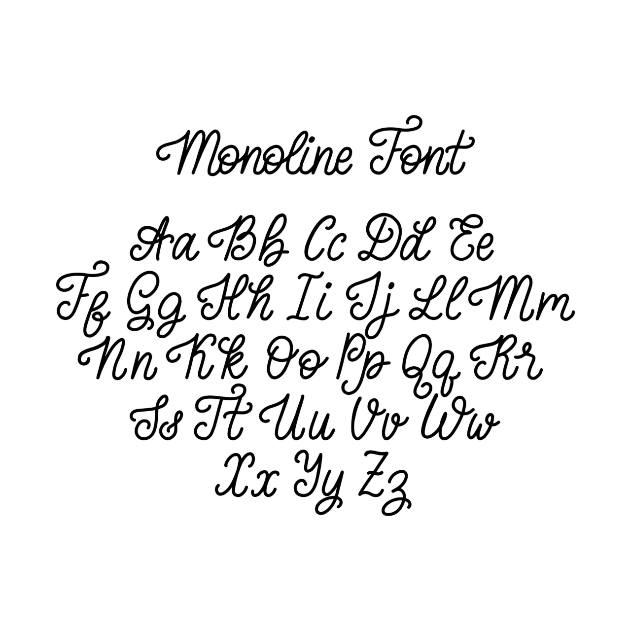

Monoline hand lettering has consistent line thickness for each letter, therefore looking clean and uniform. Letters are often drawn with a single stroke weight. This style is fairly new: it appeared in the mid-20th century with the development of modern design.
Due to its simplicity, monoline lettering is often used in logo design, branding and packaging, website design, and social media graphics.
This is an easy lettering style. Due to its simplicity and uniformity, it is more accessible for beginners. Although it can take some time to make lines clean and consistent, it is still easier compared to other styles.
5. Block lettering

In block lettering style, each letter has a clean geometric shape. This style originated from ancient inscriptions and architectural lettering, and became popular in graphic design during the Bauhaus movement. Block lettering is often used in posters and projects that require sentences to be easily readable.
This is a rather simple style; it is a popular choice for beginners due to its straightforward geometric shapes.
6. Serif
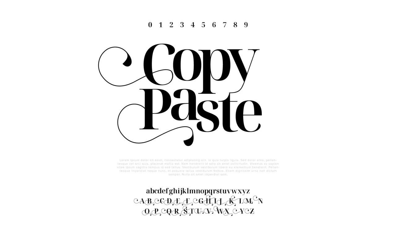

This hand lettering style is known for its usage of serifs — small decorative strokes at the ends of letters. It was commonly used during the Renaissance era and became associated with classicism. Serif fonts are classified into different categories, such as Old Style, Transitional, and Modern.
This style looks classic and sophisticated, and is commonly used for formal invitations, editorial design, and branding projects with a traditional or timeless aesthetic.
Serif is not an easy lettering font. You need to be attentive to detail and precise to add serifs to letters, understand the subtle nuances of serif fonts, and be consistent in stroke thickness.
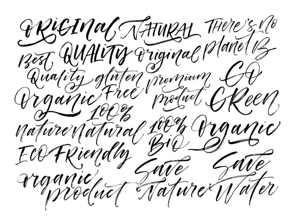
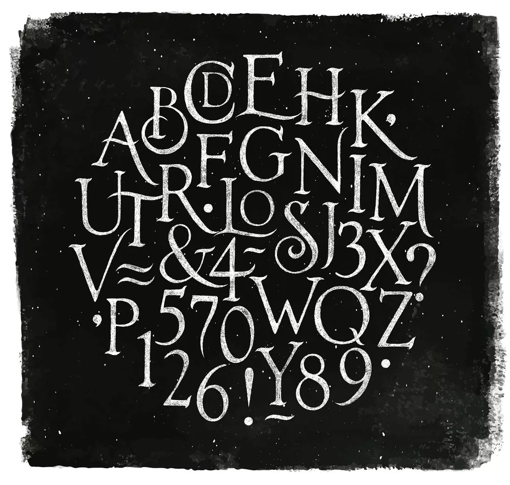
7. Creative lettering
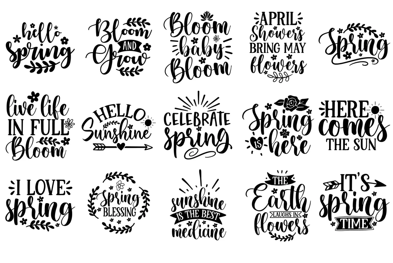


If you’ve ever seen handwriting designs and signatures framed by hearts, flowers, textures, color dots, or other drawings, that’s called creative lettering. This cool hand lettering style is the most flexible of all, as the artist is limited only by their imagination. These days, it is widely used on social media, as various artists showcase their unique styles with the help of it.
It’s often combined with illustrations used in social media design, packaging, and invitations.
The difficulty level of creative lettering depends on the complexity of the artistic elements used. Things like drawings, textures, and colors require creativity and a willingness to experiment. In general, this style is a great fit for those who explore their artistic skills.
How do you start hand lettering?
If any of these styles (or all of them) seem appealing to you, it’s time to start mastering the art. Here is how you can approach hand lettering practice.
1. Gather basic equipment
The first step of your hand lettering journey is assembling essential tools such as paper, pencils, erasers, and a ruler. While this might not seem like enough, it is actually a pretty decent starter kit that you can gather without spending lots.
If you want to practice calligraphy lettering, consider purchasing proper tools (for instance, brush pens or nibs). And if you want to create digital hand lettering, you can also buy a tablet or an iPad with an Apple Pencil, or scan your work and edit it in Adobe Photoshop or Illustrator. However, this isn’t necessary at the beginning. You can always start with the basics and purchase additional equipment for your lettering designs later.
2. Learn the anatomy of letters
This might take a lot of your time, as the anatomy of letters is quite complex and diverse. However, there are several main things you can start with: the baseline, x-height, ascenders, and descenders.
The baseline is the line at which the bottom of your letters rests. The x-height is the height of a lowercase letter. The ascender line indicates the height of an uppercase letter, while the descender line does the same for lowercase letters.
Learning these things and keeping them in mind can help you make letters proportioned and visually pleasing. However, it’s okay to ignore these rules in some cases and make some optical adjustments.

3. Choose the lettering style you like
As you already know, there are plenty of lettering styles out there. Practicing all of them at once can be quite challenging and leave you tired and confused. That’s why it’s better to start with one font to draw by hand — the one that you like most.
Once you’ve selected a style, collect image references from various sources. This could be hand lettering tutorials, examples, and artists that work in that style. These references will serve as valuable guides that you can learn from.
4. Start practicing
A structured approach can help you make the most of your hand lettering practice and build desired skills without straining yourself too much. You can start with mastering basic strokes to develop control and consistency and learning different ways to draw letters. Once you feel confident with them, move on to the next step — practicing simple words or phrases, and gradually trying more complex letterforms.
Be sure to practice regularly. Regular and consistent practice is essential if you want to hone your skills and build the muscle memory necessary for fluid hand lettering.
5. Experiment
You can experiment with hand lettering right from the beginning, or do so later when you feel more confident with the basics. In any case, creative elements such as decorations, dimensions, and intricate details can make your compositions more unique and help you develop a personal style.

Tips to improve your hand lettering
Practice makes perfect, they say, and that’s especially true when we’re talking about hand lettering. Consistency grants you more confidence with the thickness of strokes or the spacing between letters, and helps you grow your skill. However, it isn’t the only thing that can improve your hand lettering. Here are other important tips to consider.
1. Create pencil drafts
This can be especially helpful if you’re working on important and creative lettering art (for instance, for a greeting card) that you are afraid to mess up. Pencil drafts and guidelines can help you see how the overall composition looks and how even the letter spacing is.
There are two rules of thumb here. Firstly, make your pencil lines thin and light so you can easily erase them later after you’re done. Secondly, use a pen that won’t smudge if you accidentally touch the lettering with your eraser. Various liners, such as Micron, are usually great for that purpose.
2. Use your lettering in real life
Consider practicing lettering not only in your workbook, but also in various real-life projects. For instance, you can create and practice a fancy signature, write in beautiful cursive on greeting cards, or start a bullet journal.
First, this will be great additional practice as you start doing hand lettering more often. Second, it can be very inspiring and rewarding to see your creative efforts in real projects.
3. Learn typography principles
Even if you have no intentions of becoming a typography designer, consider exploring and remembering the basic typography principles. Knowing them can help you quickly enhance your compositions.
You can start by mastering concepts like kerning and tracking, which involve adjusting the spacing between individual letters and words to achieve a visually balanced layout. Understand the significance of hierarchy: how to organize your text to guide the viewer’s attention effectively. Experiment with different typefaces and letterforms, taking their readability and visual appeal into account. This will help you create a professional and polished finish.

4. Create a hand lettering challenge
A challenge like this can help you kill two birds with one stone. First, you’ll practice more often. Second, it will give you an opportunity to network. For instance, you can share the challenge with a hand lettering community and meet new people, or publish the results on social media and gain more visibility.
This challenge has to suit your goals and aspirations if you want to enjoy it and complete it successfully. You can come up with specific hand lettering ideas for each day or week, and challenge yourself with diverse subjects or styles. If you want to grow as a hand lettering artist and push your boundaries, you can also create certain constraints. For instance, you can limit yourself to a specific color palette or experiment with unconventional lettering layouts.
If you’re struggling with creating your own challenge, joining those created by others can also be a great option. This doesn’t have to be a challenge developed for the hand lettering community specifically — you can pick one you like and adapt it to your needs. For instance, you can join 36 days of type and try drawing different styles. Or, you can join Inktober and create beautiful compositions on given topics using ink.
5. Communicate with other artists
Hand lettering challenges aren’t the only way to network with other enthusiasts. You can also join creative communities — for instance, by looking for fellow hand letterers on Reddit and Discord.
Doing so can help you learn new tips and tricks to find inspiration and fresh approaches to the art of hand lettering. You can also participate in collaborative projects or art swaps to receive new experiences and feedback.
6. Digitize your hand lettering
If you feel confident in your hand lettering, you can take it to the whole next level by turning it digital. It might take some time and effort because you’ll need to master graphic design software like Adobe Illustrator or digital apps such as Procreate for iPad.
However, doing so will allow you to experiment with various brushes, textures, and layering techniques, and generally refine your lettering compositions. Furthermore, you can start printing styles drawn by hand and turn such compositions into T-shirt prints, typography posters, and other things.
To wrap up
Hand lettering is the art of drawing letters and words by hand. It has many different styles, such as Gothic, monoline, serif, and brush lettering. While hand lettering may seem complex to many, it is possible to master it as long as you are consistent, eager to work with various lettering ideas, view hand lettering tutorials, and practice regularly. So, don’t hesitate to try this hobby — it’s fun, it’s creative, and the results are worth it.
FAQ
When should you use hand lettering vs typography?
Use hand lettering for personalized and artistic projects: invitations, custom signatures, illustrations, etc., that require a unique and handmade touch. Typography, on the other hand, should be used in professional designs, like websites, magazines, or corporate branding.
What materials do you use for hand lettering?
You can start with basic materials: paper, pencils, erasers, and rulers. Later, you can purchase brush pens, markers, and high-quality paper to achieve different textures and effects.
How do you practice hand lettering?
Start with basic strokes to build muscle memory. Practice individual letters, then move on to short phrases and experiment with composition and layout. If you practice consistently, try various styles, letter design ideas, and ask others for feedback — you can progress quicker than you expected.
How long does it take to get good at hand lettering?
It depends on your individual dedication and practice. If you are a beginner who practices regularly, you can see improvement within a few weeks to a couple of months. However, mastering advanced techniques and developing a distinct style can take years of consistent practice and experiments.
Other articles that may interest you
Basic Typography Rules: What Every Designer Should Know
From A to Z: A Guide to Font Selection and Pairing
How to Make a Moodboard. Tips and Tricks for Designers