Winter Color Trends 2024-2025: Intense vs Subtle, Featuring Inspiring Collections and Palettes
Winter’s here—and so is the perfect excuse to refresh your creatives! As much as we’d love to romanticize winter with its traditional Christmasy colors, some years just call for something else. This is one of them.
How about getting comfy for the trendiest winter colors of 2024-2025? We’ve gathered insights on the latest color tendencies in digital design, fashion, and architecture to share with you in our seasonal report.
Maybe you’re crafting a standout holiday campaign or just want your brand to stay trendy. Explore our curated collection of licensed content and incorporate winter hues into your designs.
Discover Winter Color Trends CollectionTop 4 winter colors to appreciate and apply in your seasonal creative projects
On the verge of 2025, we are as true to ourselves as it gets. Winter is about appreciating the effort and time it takes to recover from all that blooming and busy bee-ing for three seasons in a row.
The anxious, uncertain moods and high demands of the current generation of consumers are what shape upcoming trends today. Find out more about the leading creative trends of 2025 in our primary forecast based on in-depth research, data, and expert opinions.
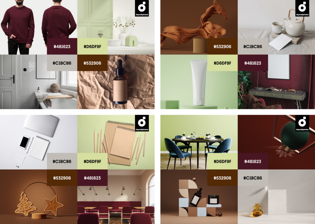
Now, it’s time to conquer your winter arc and get sentimental because the key colors of this season are natural, intense, and a nod to the past while keeping things contemporary. Aged Wine, Matcha Latte, Stardust, and Dark Copper—four shades setting the tone across graphic design, digital and print media, fashion, and interiors. Let’s see what makes each one a showstopper.
Download Ready-to-use Images
Aged Wine
#481623
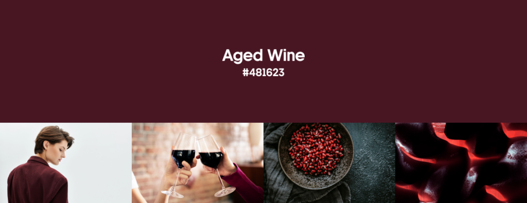
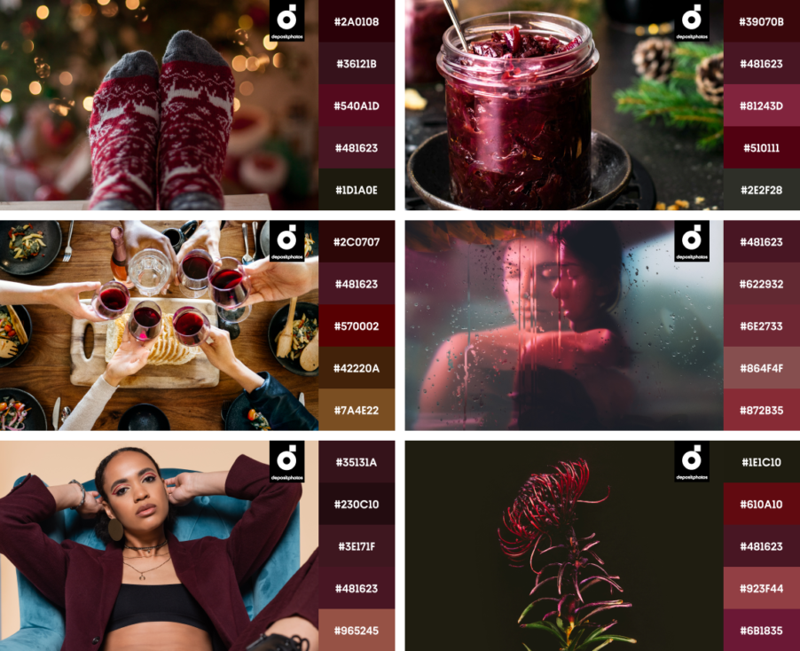
One of the most prominent colors of winter—Aged Wine—is our new black, at least this season. It’s a dark, deep shade of red, blending burgundy and maroon. Rich and versatile, this color is reminiscent of a fine bottle of Bordeaux, sweet cherry, or velour.
Aged Wine is the evolution of a widely popular Midnight color we saw earlier this fall. It is a powerful and sophisticated shade, making it the go-to color for brands built around the values of luxury and tradition.
For an inspiring application in digital design, take a look at the Ray-Ban | Meta campaign by EssilorLuxottica Creative Hub. Aged Wine brings allure, making it perfect for whatever you want: backgrounds, product props, headlines, accents, and branding elements.
In fashion, burgundy dominates winter collections with shiny evening gowns, tailored pantsuits, and cozy knitwear. Fashion Week runways and celebrities brought Aged Wine to its peak—and eventually to our wardrobes as an iconic winter shade. We couldn’t help but mention Beyonce’s outfit as a great example of a thoughtful monochrome.
In interiors, it’s noticed in upholstered furniture, accent walls, rugs, and decor. For example, this moody wood-panelled BAO City restaurant. The color is so dynamic, it creates depth when applied with lighter shades of red and warm lighting.
Age Wine pairs equally well with silver, gold, and bronze; lighter pink or blue shades; and green.
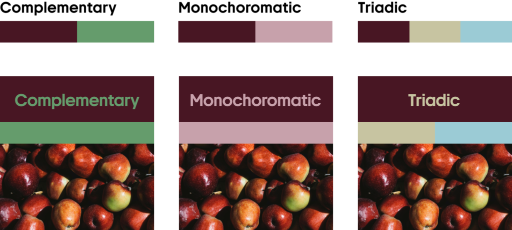
Use Aged Wine as the base for your monochrome designs, or make it an accent color, balancing it with pinks, dark gray or black, and various shades of brown or blue.
Keeping up with the latest trends is easy with our design, marketing, and business reviews.
Matcha Latte
#D6DF9F
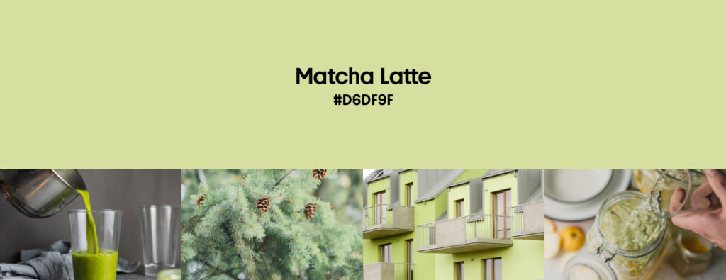
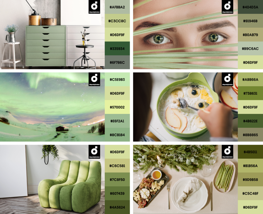
If you’ve been tired of pumpkin latte since autumn, consider switching to Matcha Latte, as this is an outstanding winter color trend. Soft, pastel green—that’s as fresh as it is calm—reminds us of young pine tree branches, the zesty insides of a lime, and matcha mixed with milk.
According to WGSN and Coloro, this light-green shade connects both nature and technology, and highlights the importance of developments in nature-powered bio and plant-based materials, dyes, pigments and energy sources.
Matcha Latte’s pastel quality makes it perfect for natural interiors, website backgrounds, product packaging, or even as a primary brand color for companies saluting wellness, sustainability, and eco-friendly approaches.
Among pastels, Matcha Latte is definitely a color with a lot of character as it relies heavily on bold choices and a well-thought-out supporting palette. This shade frequently appeared in AW’24 fashion collections in both base pieces and accents—as a soothing counterpart of darker trendy shades such as Aged Wine and Dark Copper. For instance, Loewe’s Small Puzzle Bag.
Explore Matcha Latte Collection
Pair Matcha Latte with darker greens, contrasting blues, and reds, or other pastels such as baby blue and pink.
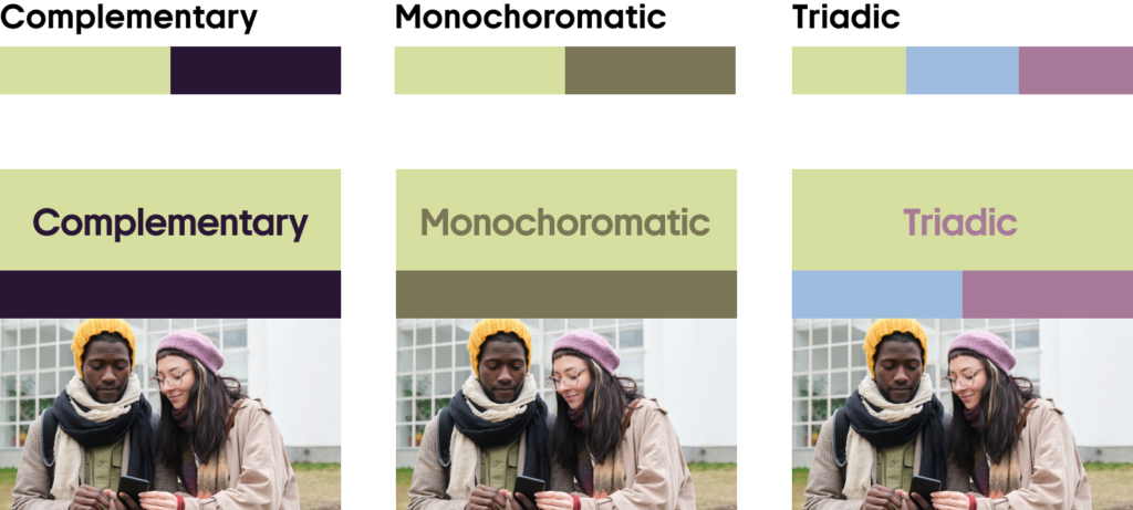
Matcha Latte works wonderfully with warm tones, neutrals, and charcoal gray, looking modern and calming in any scenario.
Find out the colors of the year 2025 by Dulux and WGSN + Coloro
Stardust
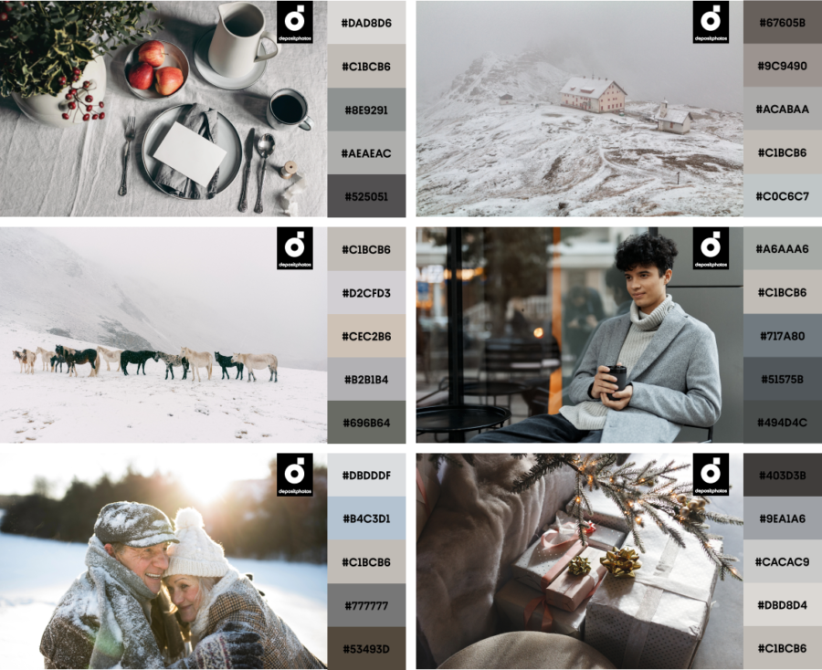
#C1BCB6
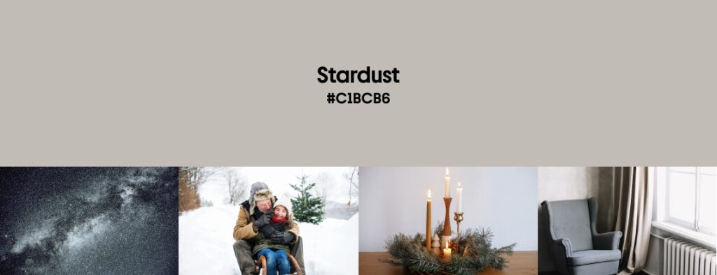
Take out your silver jewelry, celebrate the gray walls in your apartment, and don’t forget to look at the sky at night. Stardust is back in town. This luminous silver-gray embodies industrial elegance, reminding us of polished chrome and futuristic narratives.
Looking into graphic design, Stardust and its shades work perfectly as a main color because it’s the essence of clean and professional design. You can notice an abundance of Stardust in tech, branding, and user interfaces. Check out PUR+ Architects project by Nick Schmidt from STUDIO 3000.
It is also widely applied in modern interiors such as those of the Swedish architecture office Tengbom, creating subtle, minimal accents and an industrial feel.
Recent creative trends push us to be individuals, as well as embrace reality and our true nature, even if it’s not that colorful. Feel free to use Stardust in your fashion choices as well, be it a metallic or matte finish. For example, a coat, suit, or a merino wool sweater you’ve been wearing since school years.
Stardust works great with deep jewel tones such as sapphire or emerald, and when paired with lavender or copper, it creates a calming effect.
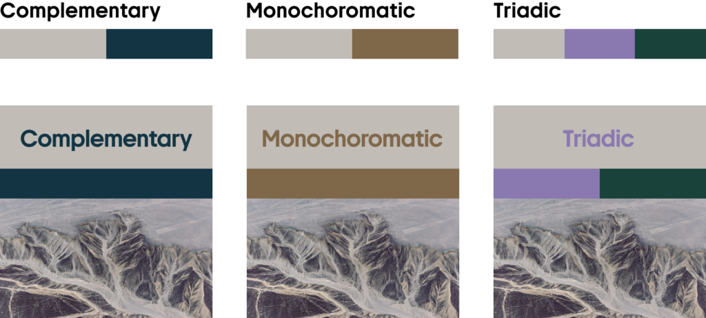
Combine Stardust with whites, blues, natural earthy tones, and darker grays. Matte or shiny, this color is so versatile it will support any look you’re aiming to achieve.
Dark Copper
#532906
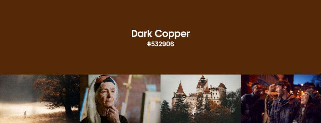
Last but not least—Dark Copper. It’s rusty, warm, and familiar. We saw a lot of browns this year as the trend holds leading positions, and continues to be widely used in winter. This time, in a deeper version.
Dark Copper is a dark orange-brown that feels earthy and grounding. The color of dry leaves, brick, and soil—this shade will bring a cozy yet contemporary feel to your visuals. It’s an excellent choice for brands that value authenticity and heritage. Such as the Shearling Ranch Coat from the Ralph Lauren Collection.
Dark Copper is versatile, but when it comes to web design, its best application is in highlighting elements such as headlines, CTAs, or other particular visual anchors. This hue can feel overpowering, and it’s the main reason why it’s rarely used for backgrounds. However, it dominates in scenic and portrait photography, and is often noticed in natural environments.
In fashion, Dark Copper is noticed everywhere, from loungewear to outerwear, accessories, and leather goods. In interiors, it’s mostly seen in accents such as pieces of furniture, decor, textiles, and artisanal ceramics. Sometimes, it takes center stage if you go for walnut or ebony as your main type of wood.
Explore Dark Copper Collection
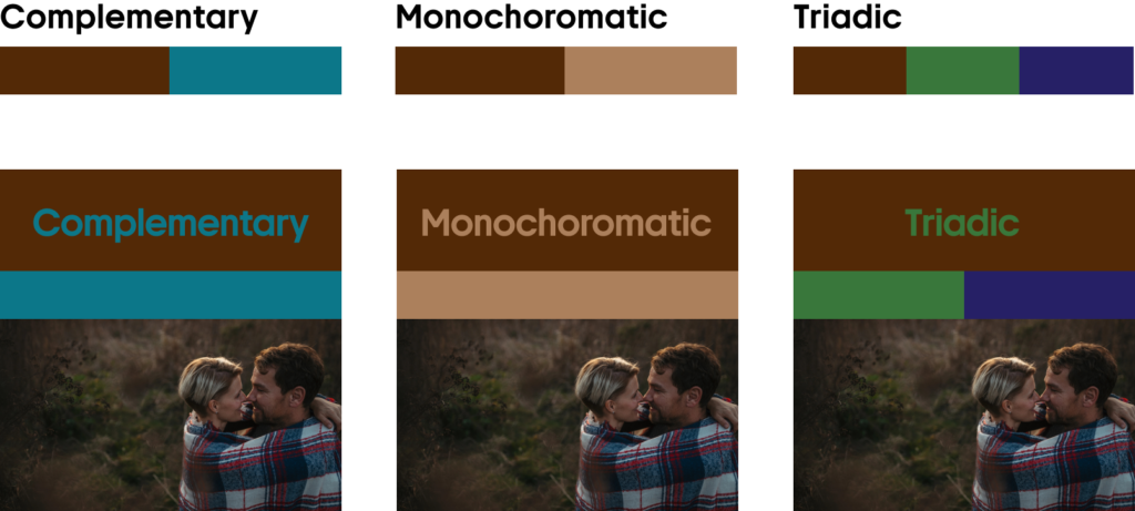
Combine Dark Copper with dark greens and blues, especially deep teal shades, and neutrals or lighter hues of brown.
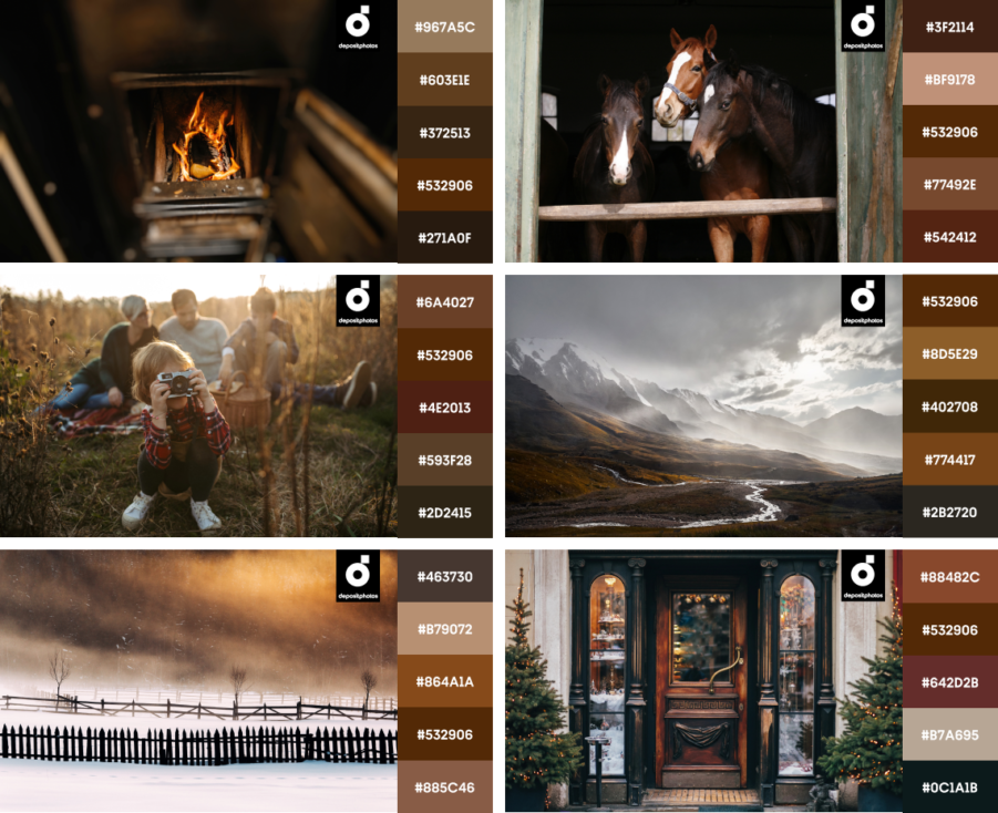
Dark Copper creates a warm and familiar mood, especially in a palette of similar browns and grays, and perfected with gold or bronze details.
Here’s your go-to collection of vectors and ready-to-use mockups in key winter colors
Nail this winter’s trending colors with our handpicked collection of high-quality, licensed vectors and mockups. Download and use them for your digital or print projects, product design, and marketing, or just scroll through our collection for inspiration and ideas.
Final thoughts on winter tendencies
Cool air, holidays, and a transition into the coming year—winter is a great time to reassess and focus on your well-being. It’s the season of your favorite sweater, and since today’s shoppers challenge the culture of consumerism, it’s better we dig out our vintage pieces in Aged Vine, Matcha Latte, Stardust, and Dark Copper, and appreciate them once again.
As for the digital space, the holiday season is a perfect time for creating mindful customer experiences with high-quality concepts. Use the trendiest colors for your website banners, social media campaigns, and merchandise. Our curated collection of files is a savior if you want to upgrade brand visuals, especially when it’s a last-minute project!
Explore Winter Color TrendsRead more about creative trends
Creative Design Trends 2025: From Wabi Sabi to AI-fueled Art
25 Top Web Design Trends 2025: From Neubrutalism to Dynamic UI
True Joy & Future Dusk: 2025 Colors of the Year by Dulux and WGSN + Coloro
