Spring Color Trends 2021: Inspiring Palettes, Photo Collections, and Marketing Ideas
As we enter a new season, designers and content creators alike are starting the search for new color choices to make their projects stand out. They browse through social media, explore dozens of websites, and spend hours experimenting with color palettes just to find the perfect combination of hues.
We know how time-consuming the search can be, which is why we’re happy to share our spring color trends for 2021. We also put together thematic photo collections, created inspiring palettes, and prepared a variety of mockups that illustrate how you can use the trendiest colors in your designs.
Trendy colors for spring 2021
If you’ve been reading the Depositphotos blog for a while, you probably know our approach to choosing the trendiest colors of the season. But let’s go over it again.
First, we’re looking at the latest reports by Pantone Color Institute. We examine the color of the year, as well as summarize key observations from New York, Paris, London, and Milan Fashion Weeks. Then, we turn to our yearly Visual Trends Guide (that is put together by the Depositphotos team and leading industry experts from all over the world) to make final decisions on color palettes that will dominate in design this season.
This spring, trendy colors are awakening and refreshing. They give you hope for a brighter future, but also make you feel serene and inspired as we approach warmer seasons.
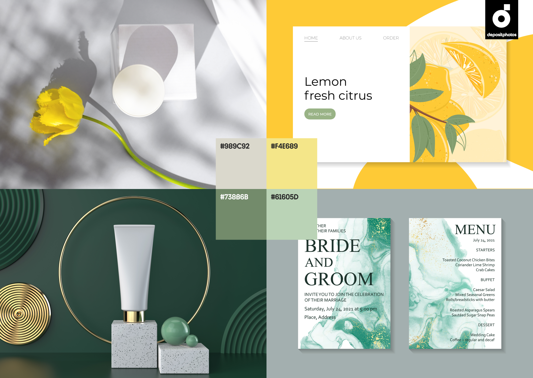
In this vein, we singled out four main colors that will help you stand out with your designs:
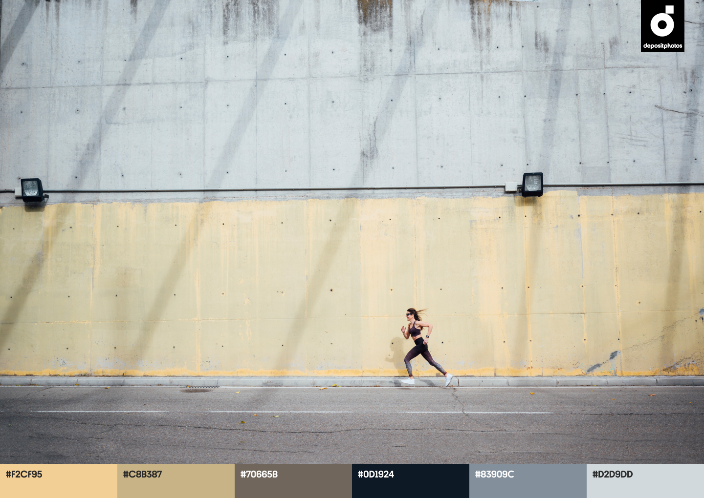
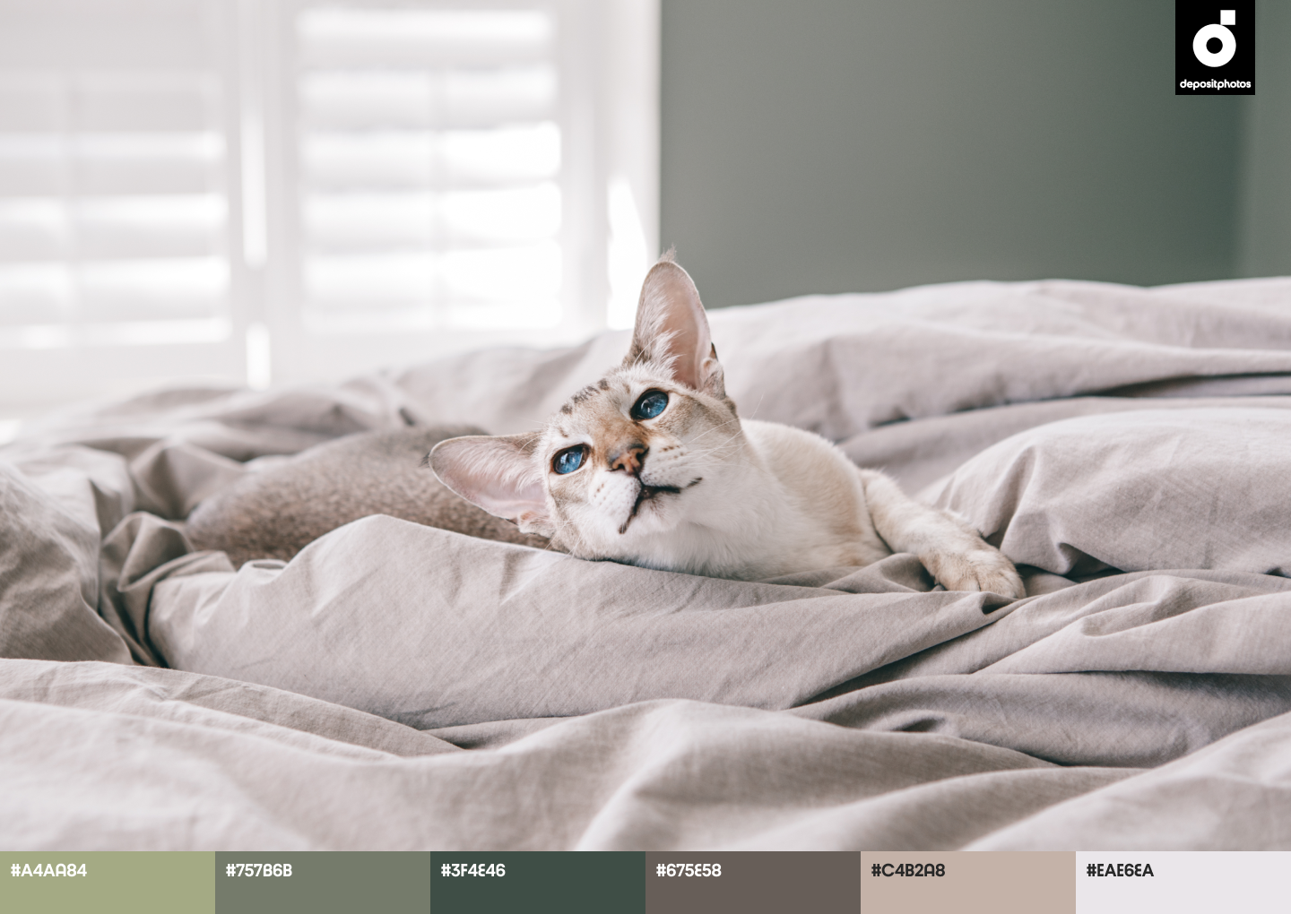
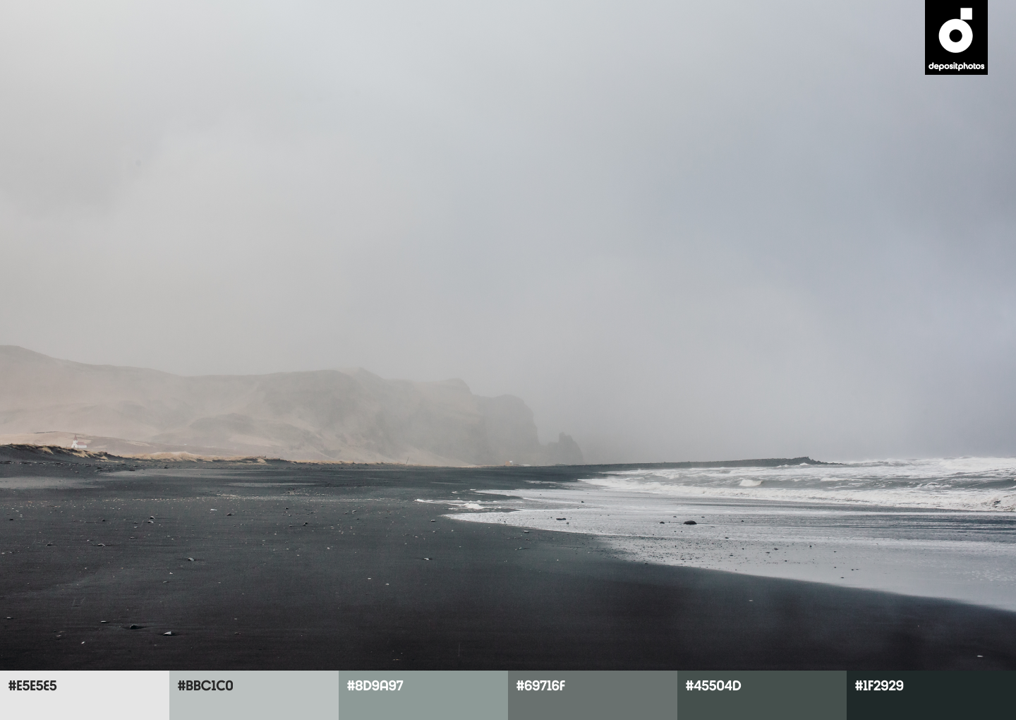
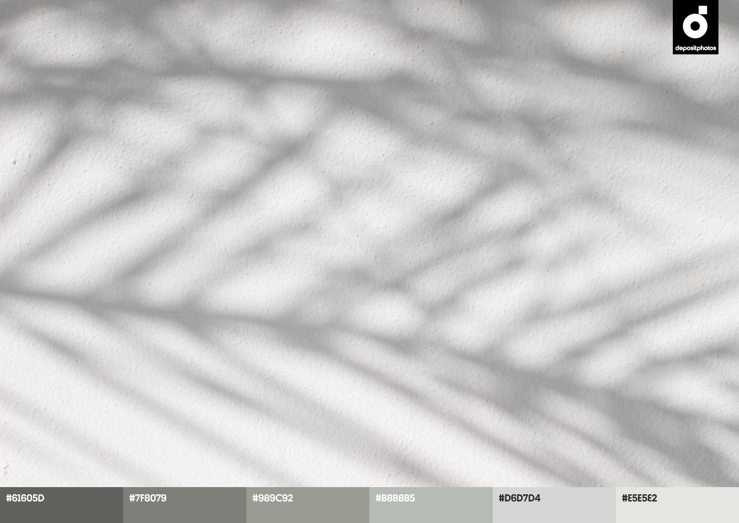
- Pastel Grey
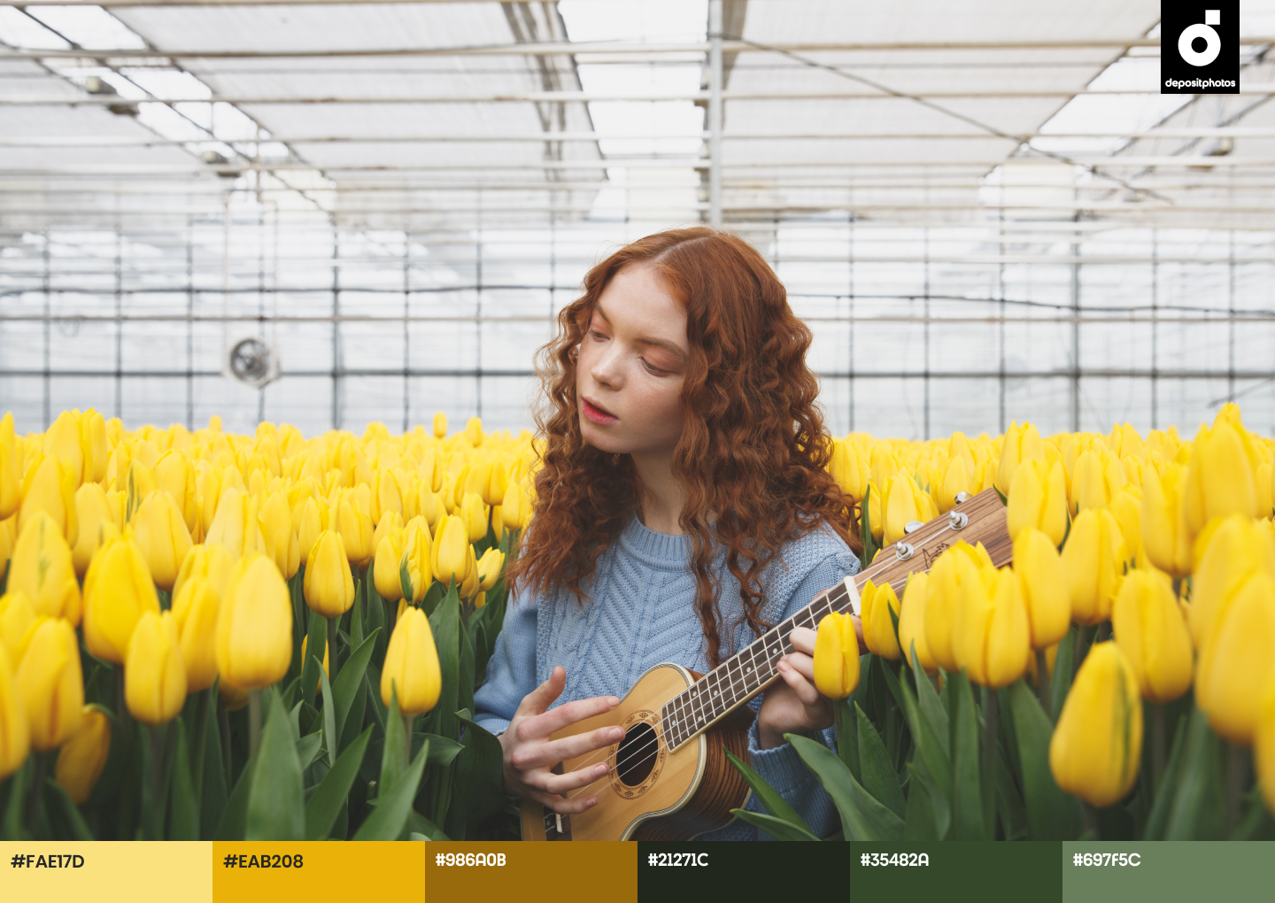
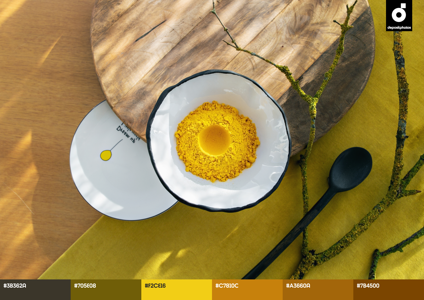
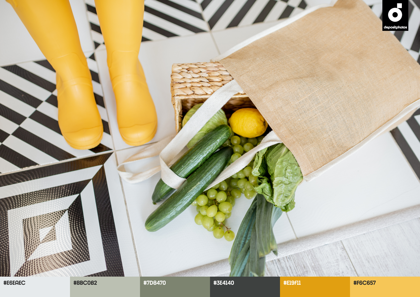
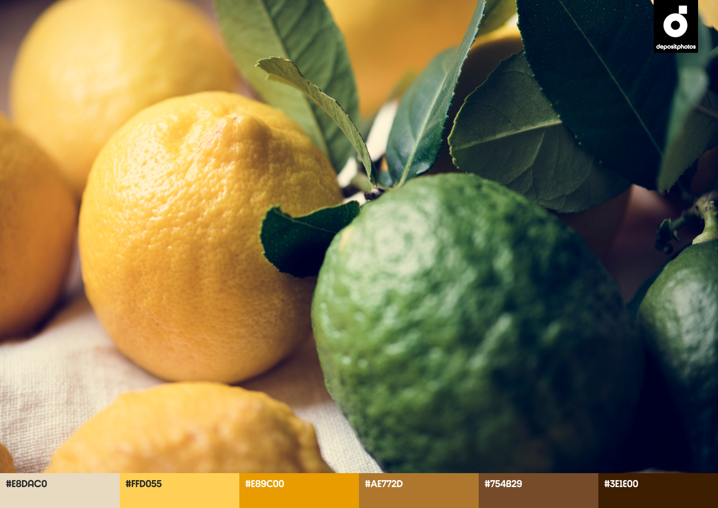
- Awakening Yellow
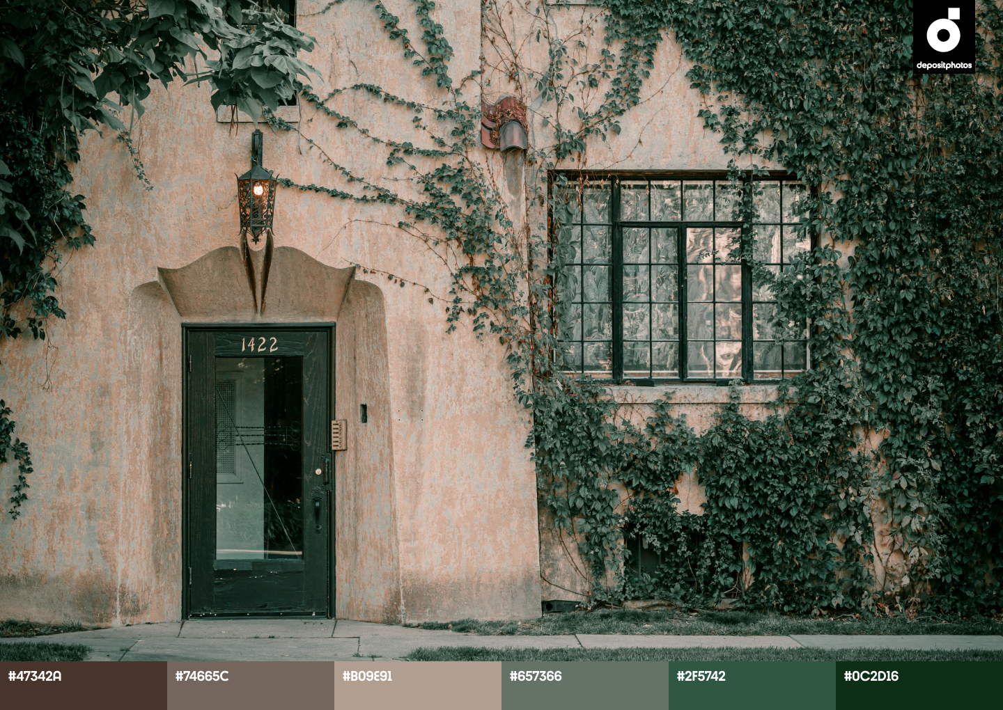
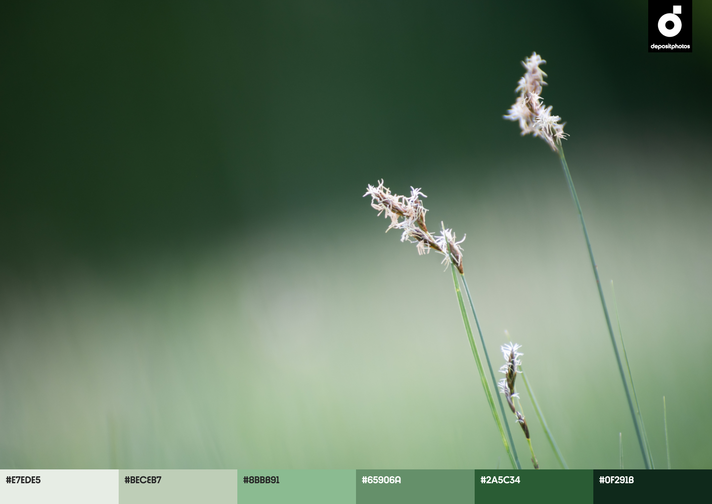
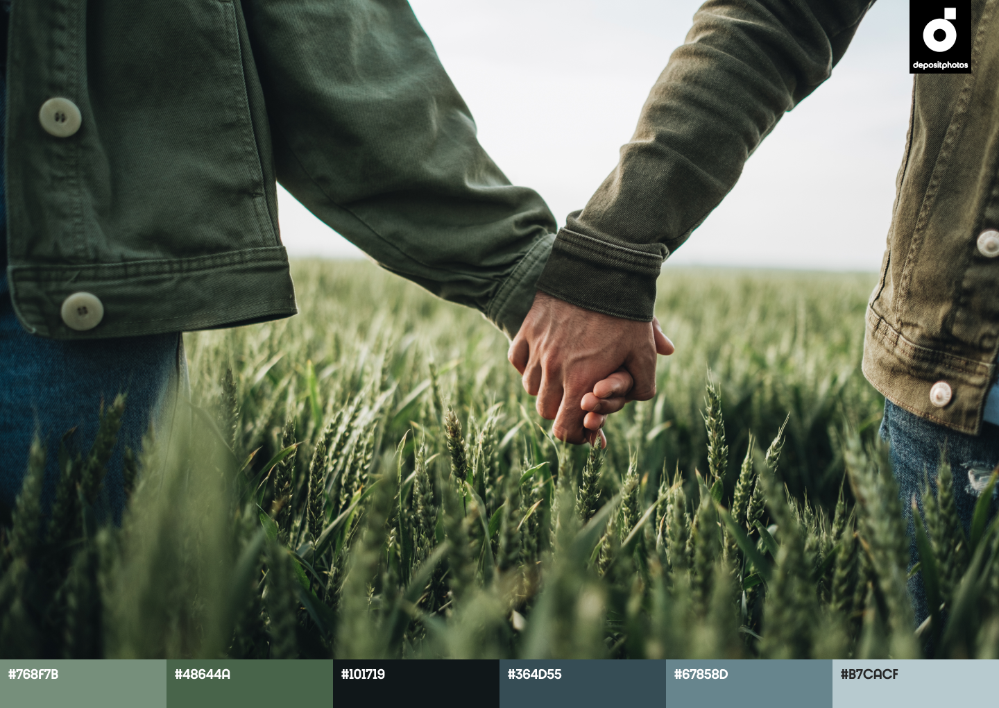
- Refreshing Green
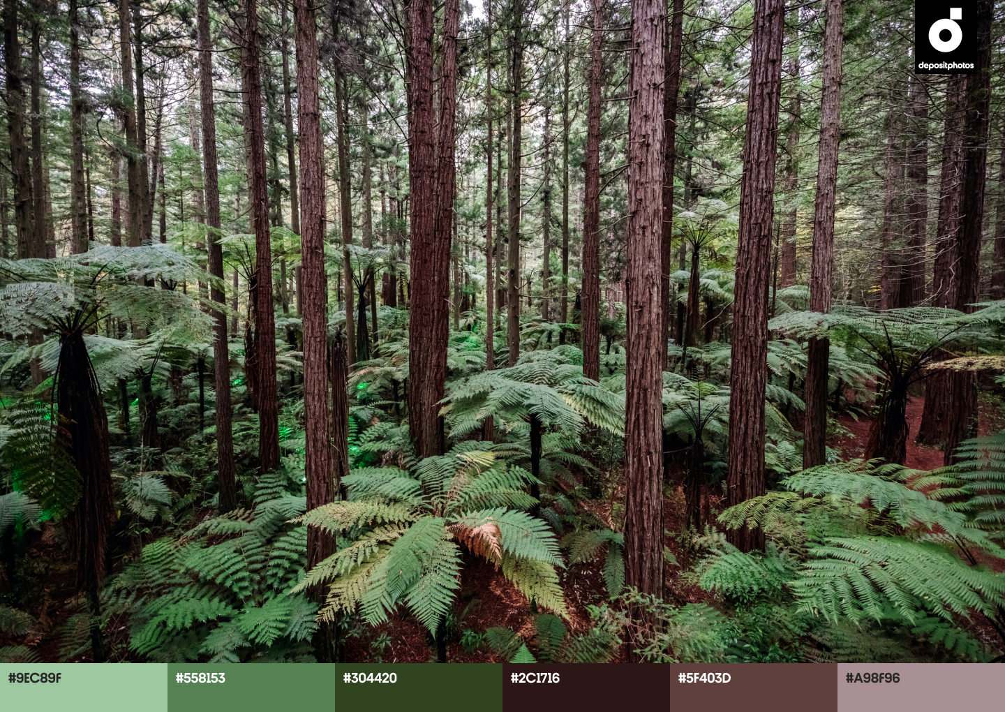
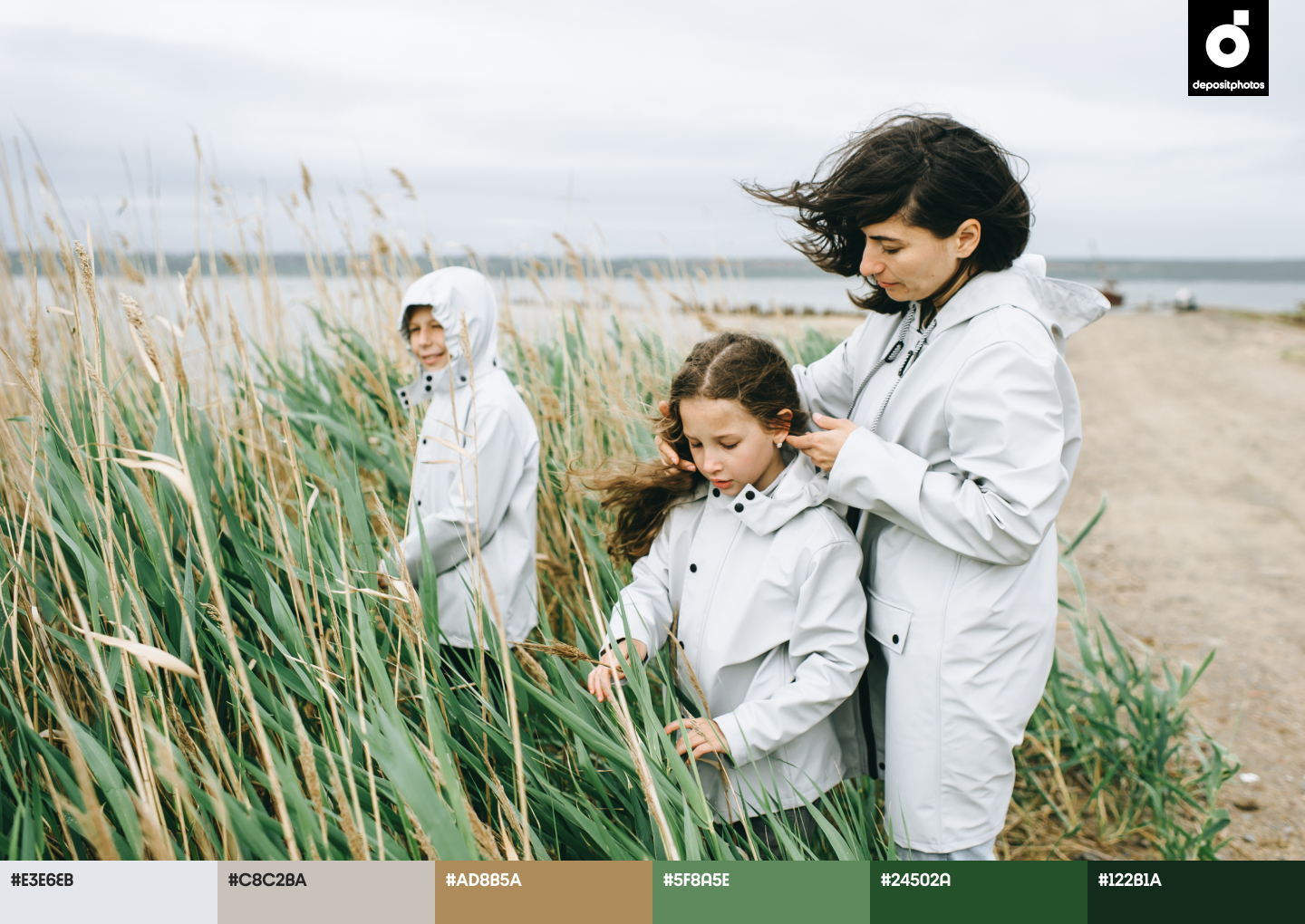
- Spring Forest
Here’s a closer look at the colors from our list and the meaning behind them.
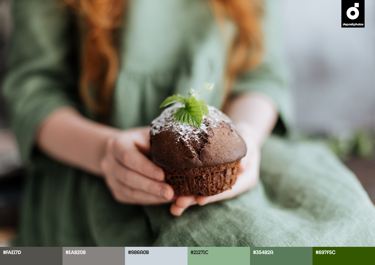
Pastel Grey
Based on the outcomes of 2020, Pastel Grey is the perfect color to recover from chaos. It symbolizes resilience, balance, and serves as a basis for creating something more sophisticated and meaningful.
The Pantone Color Institute suggests pairing it with yellow. These two colors used together can make your projects look more thoughtful, welcoming, and trendy as well.
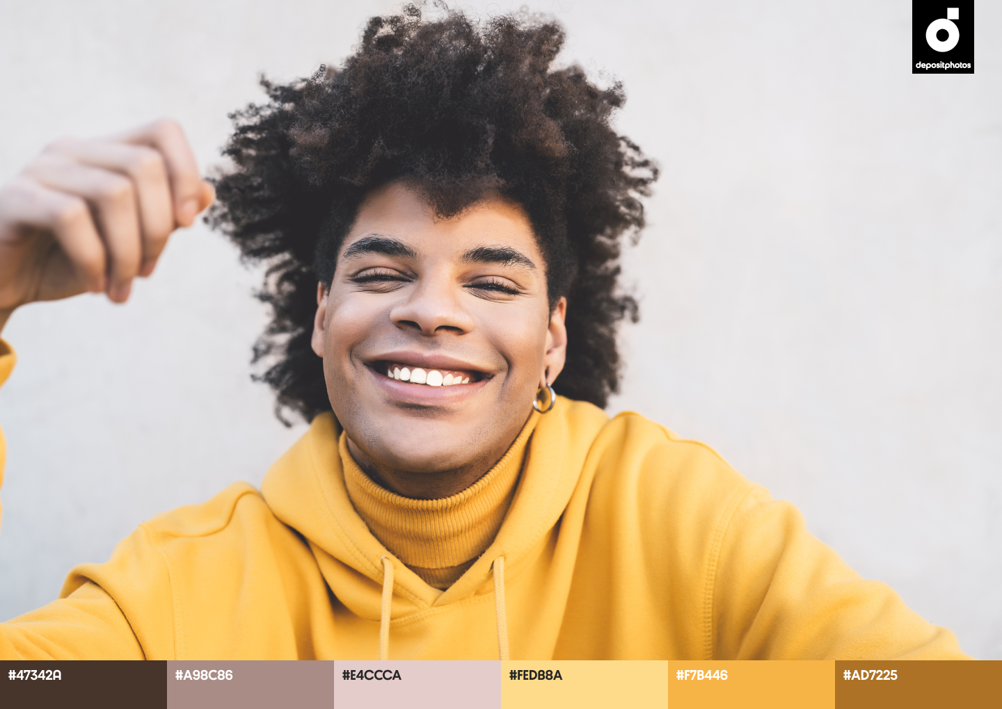
Awakening Yellow
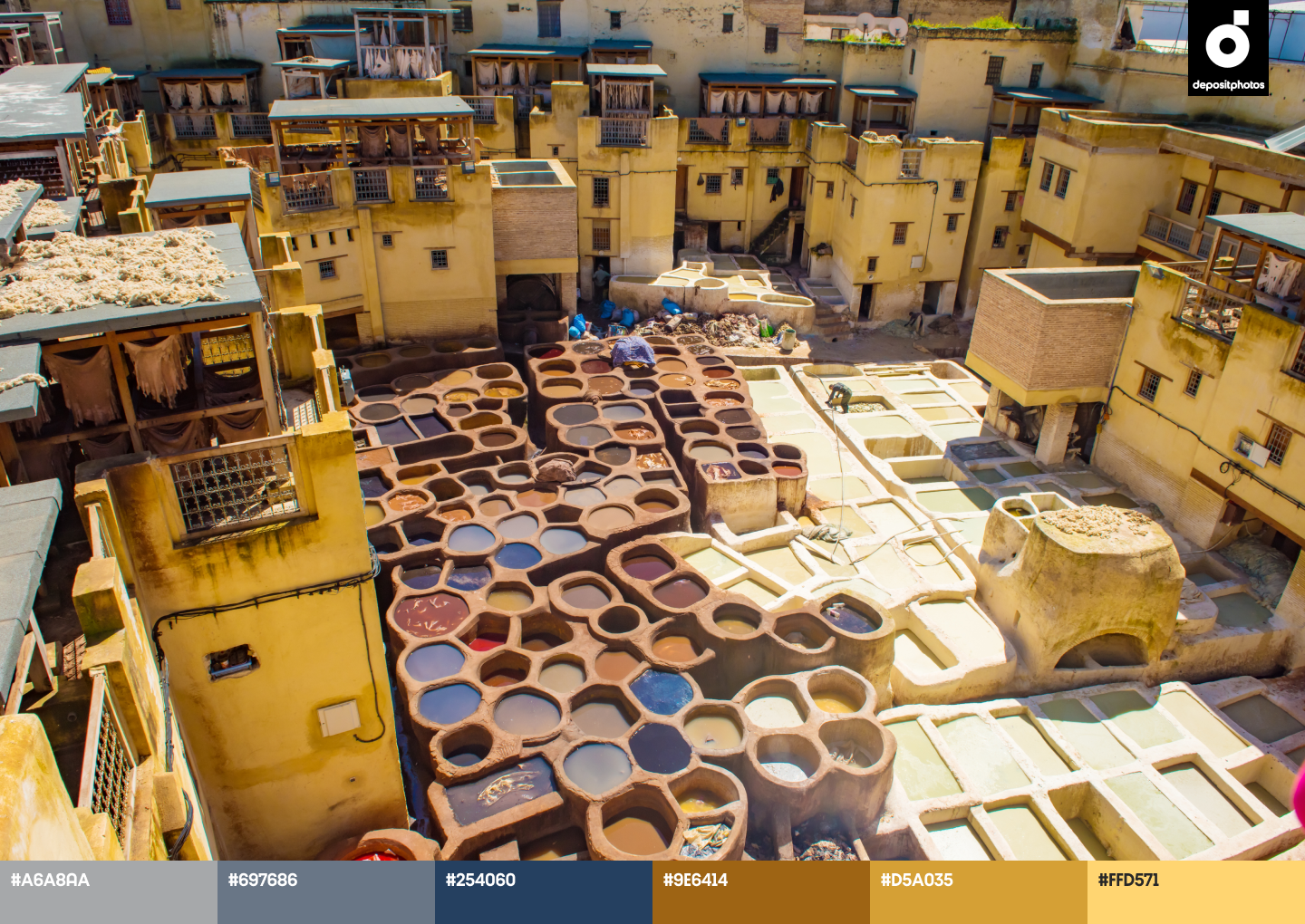
Awakening and luminous yellow is another color to consider when working on designs this spring. Whether you mix and match it with different shades of grey, or use it as a central color for your projects, yellow will endow your designs with an optimistic mood.
If you use Awakening Yellow in combination with green, orange, or other bold colors, your designs will translate cheerfulness, creativity, and fun.
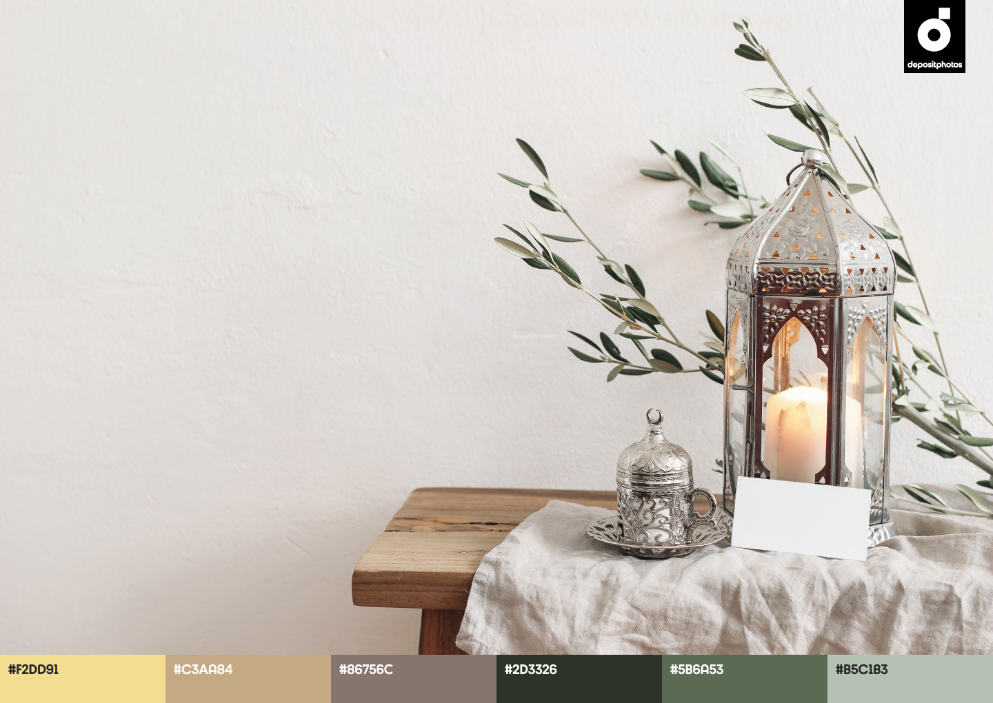
Refreshing Green
Speaking of Refreshing Green, this color stands for creativity, vitality, and productivity. It energizes, as well as inspires you to get out of a boring rut and seek adventure. At the same time, green is a tranquil color that allows for better concentration and helps convey messages more quickly and efficiently.
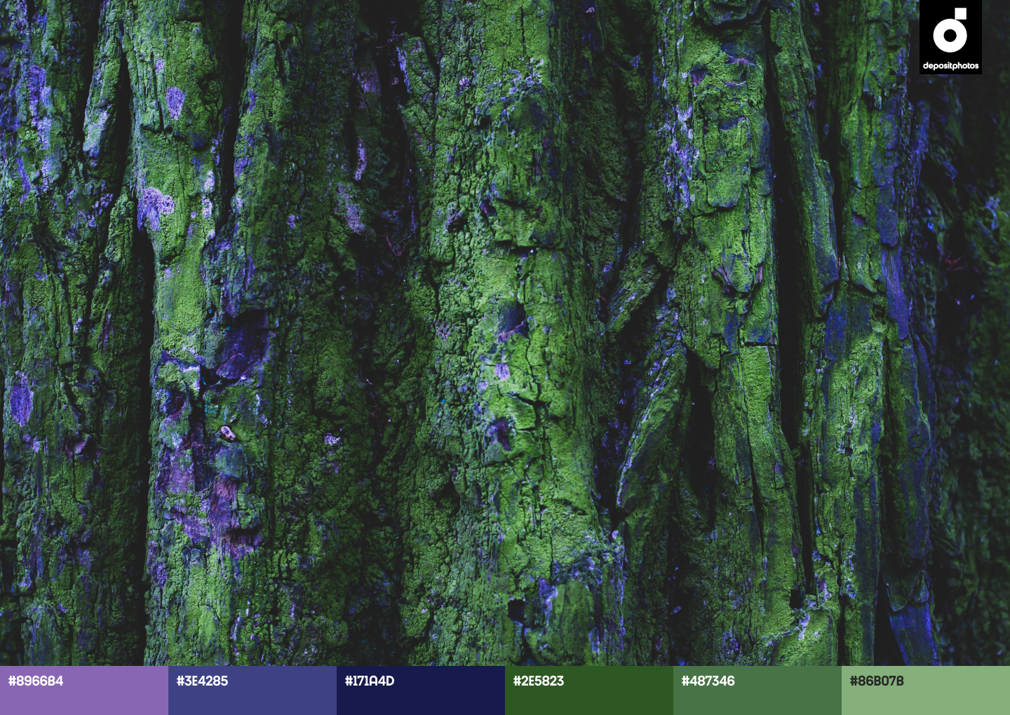
Spring Forest
It’s been a year since the first lockdown, and we can clearly see how different our lifestyles have become. We have new habits, priorities, and values, all of which pave the way for a dark green shade that symbolizes new beginnings.
The world is ready to move on, and Spring Forest is a color to reassure you and your audience of luck, growth, and prosperity.
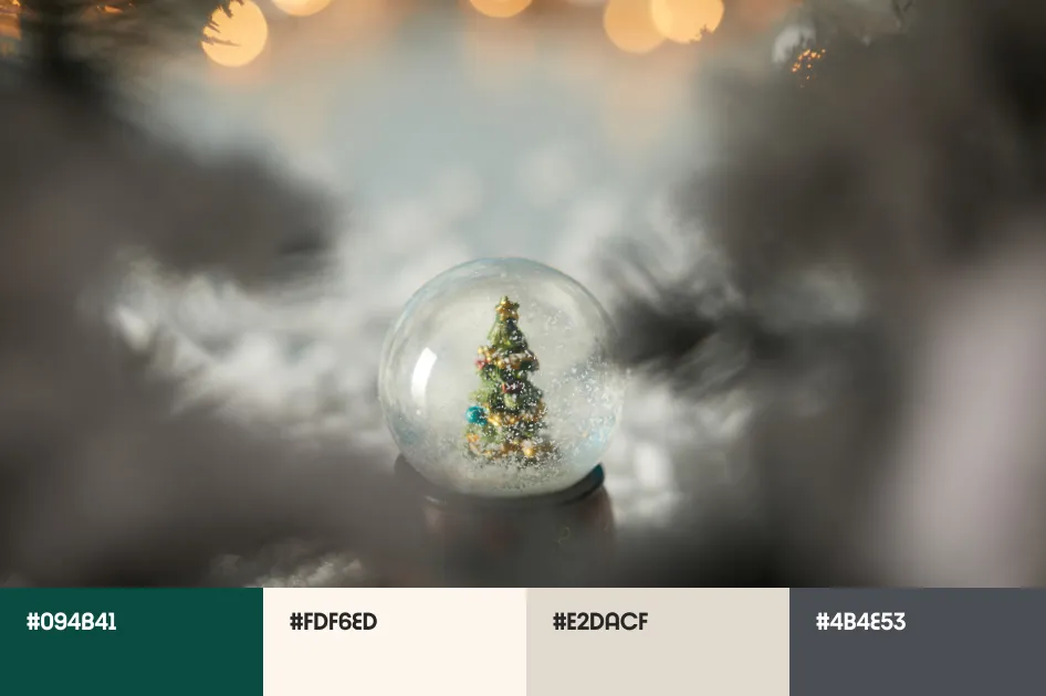
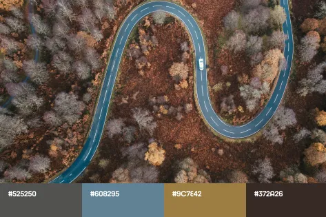
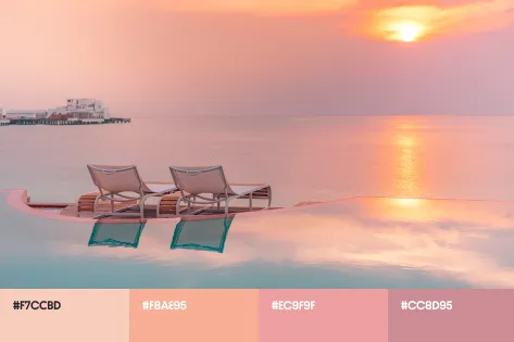
Wondering how to create perfect color combinations? We share inspiring palettes that you can keep at hand when working on your design projects this spring.
Spring color palettes for eye-catching designs
Design inspiration for your spring projects
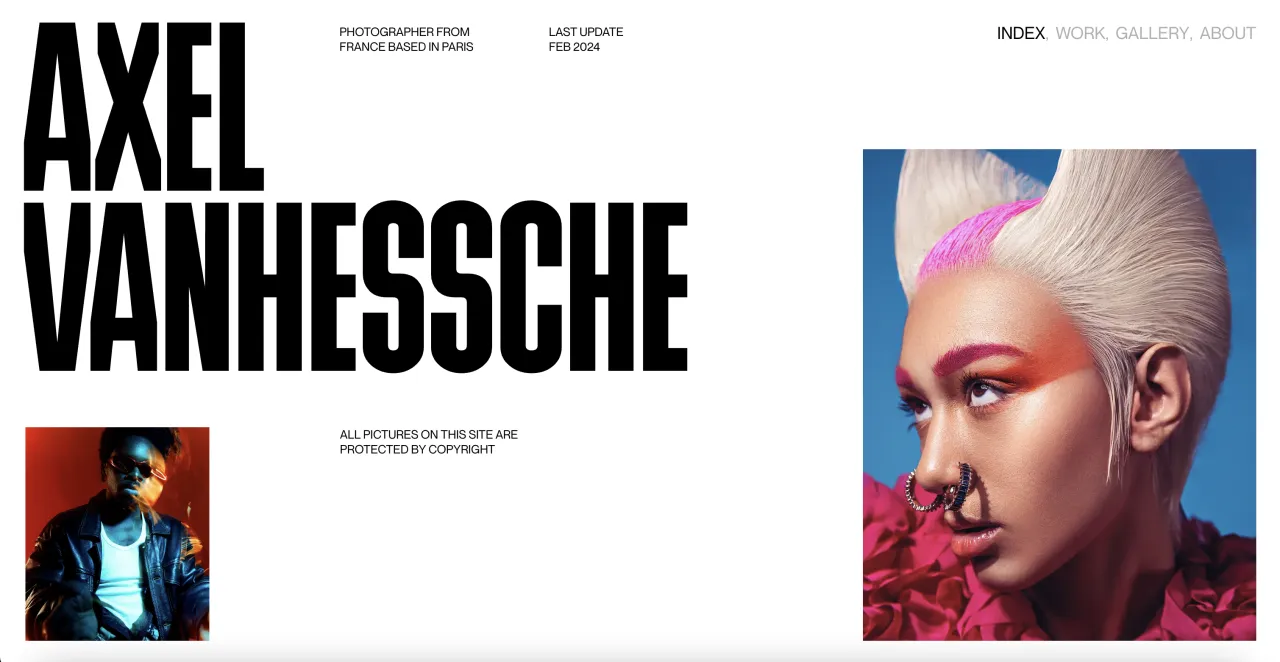
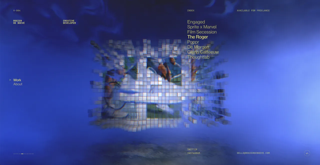
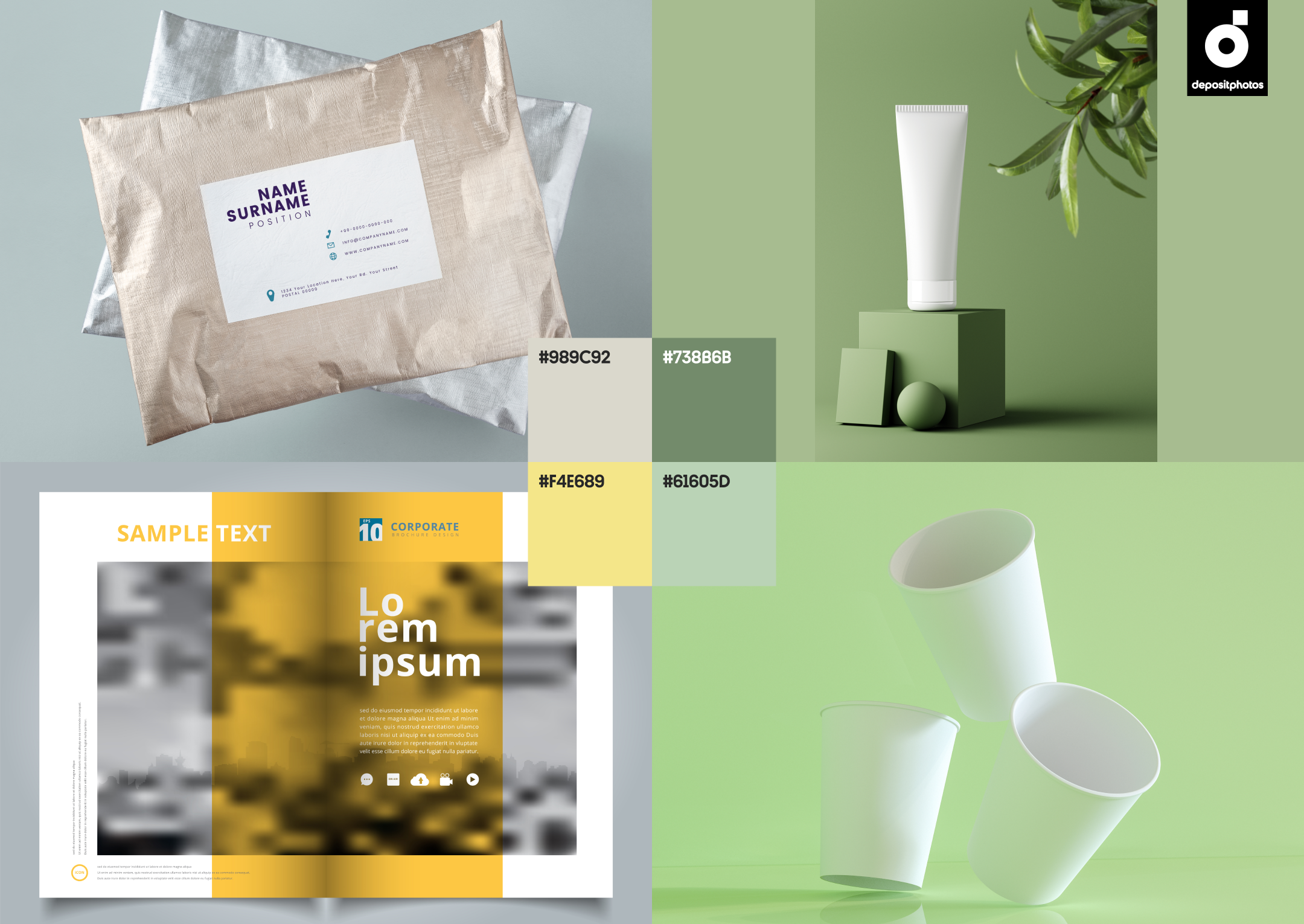
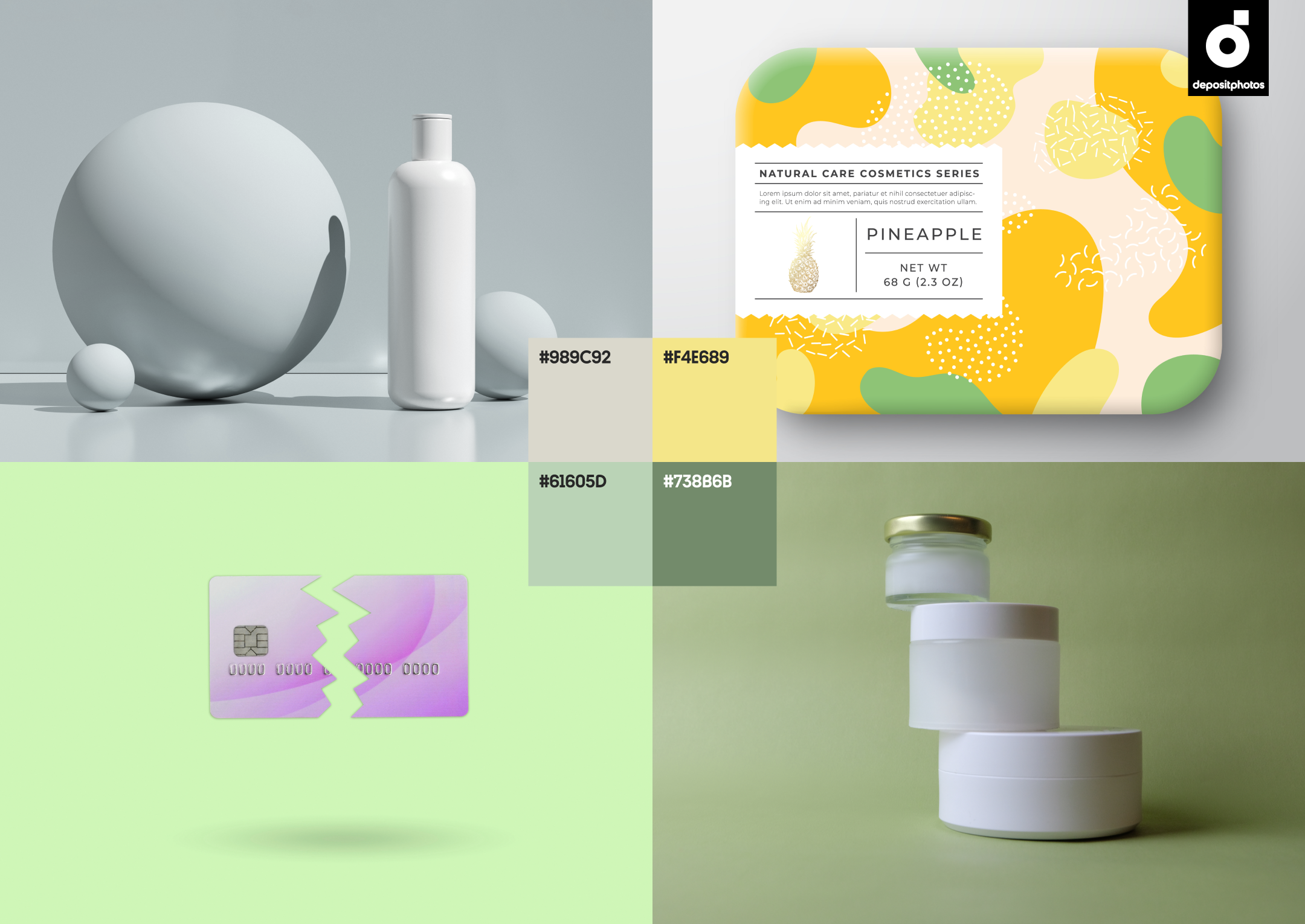
In addition to thematic images, the Depositphotos library has a rich variety of mockups that you can use for different types of designs. We browsed through our website to bring you a selection of mockups in this season’s trendiest colors.
To sum it all up
Staying up-to-date with the latest trends is a great way for brands and content creators to effectively engage with existing audiences and reach new ones as well. For instance, with colors like Awakening Yellow and Refreshing Green, you can cheer up your loyal customers and earn credibility with new ones, while providing them with hope for a better future at the same time.
It should come as no surprise that customers eagerly engage with and trust brands that make them feel good. This means that making the right color choice is important for any project’s success, whether you plan to conquer new heights or simply run a seasonal campaign.
