Depositphotos Has A New Logo! See How We Updated Our Brand Identity
A brand new decade and our recent 10-year anniversary at Depositphotos got us thinking about how far we’ve come. From the humble beginnings of Depositphotos in 2009 to a library of over 190 million files today, from a few employees to hundreds with international offices around the world. In just 10 years our creative community grew to over 100,000 contributors, and we work with over 19 million clients.
In light of the big milestones for our company at the beginning of the year, we thought that now was the time for a complete redesign to mark the evolution of our values, goals, and to highlight our bigger mission as an international company. We partnered with the creative agency CREVV to help us redesign our brand identity.
Our brief for the team included a general sense of direction to find a design solution that would better reflect who we are today and what we’d like to communicate to our clients, contributors, and new members that we welcome on board to Depositphotos every day.
On developing a new brand identity for Depositphotos
Choosing the right team
Once you know for sure you’re setting out on a long journey with an ambitious project that involves rebranding, the toughest step is to find and then select a team to execute it. But it’s not just choosing any team that makes it difficult, it’s choosing the right team. For us, the CREVV team was at the top of our list because we’ve worked together on a successful project in the past.
It’s a big plus if you know a great team that’s already had a first point of contact with your brand. They can evaluate right away if the scope of work is realistic for both the brand and the design team based on past experience. Our initial meetings were necessary to establish a timeframe, discuss our expectations, and find a comfortable workflow for the months ahead.
We appreciated their approach from the start and after setting on the scope of the project and our unique roadmap, we put together a working team from Depositphotos and CREVV to get the project started. CREVV also brought together other specialists that helped us along the way. Aside from a designer, there was a strategist and a communication specialist that were involved at different stages of the project.
Brand identity allows a business to be consistent with communication across various channels – from social media to blogs and email marketing. A brand that is recognizable on the market and looks familiar to an audience among dozens of others, allows to better connect with audiences, attract potential customers, and convert existing clients into loyal ones.
A redesign doesn’t start with design at all
Regardless of how familiar one might be with a brand, there are always more insights to be drawn, and the only place to seek them is to speak directly to those that interact with the brand. The first stage of the redesign process was about market research and competitor analysis for a more holistic picture of the business. The next point of contact was insights from Depositphotos clients and contributors which started with quantitative surveys and dozens of interviews.
The outcome was a better understanding as to what our company has to offer to our community and what they see as our key benefits and advantages. This brought together different perspectives from individuals to help the design team filter some of their initial ideas about redesign concepts. But they needed one last step to bring this research together:
After our work with primary research, we also created a map of the main colors used by competitors on the market. When you’re looking at the market from a bird’s eye view perspective, it becomes obvious which colors you should use or which ones to avoid. Considering this information, we came up with a concept for the Depositphotos brand identity.
How we finally settled on a concept for our brand identity
It always starts with colors. From our experience, we can say that there is no ‘one-size-fits-all’ when it comes to selecting a concept. It’s a conversation to be had between the client and the designers, and in our case, the decision was settled on based on a conceptual idea that aligned with the unique nature of our business.
For our company, it made sense to approach this task, not as one universal solution, but a more creative one to appeal to both our clients and contributors. Our clients turn to us for business solutions, and our contributors provide the creative materials to do so. The choice of a concept was guided by the need to appeal to both sides of our community.
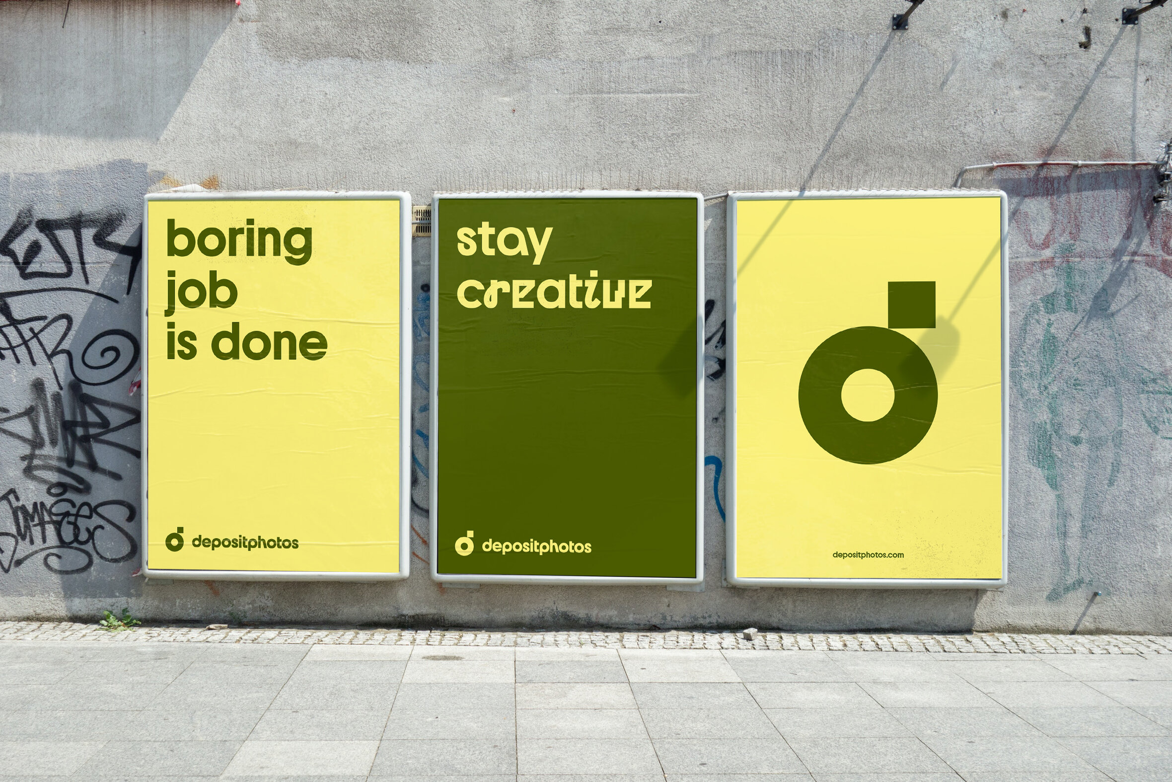
Black and white was the choice of a base color for the brand’s main visual elements while a contrasting, bright color palette was chosen with contributors in mind. This was done to appeal to different kinds of clients and highlight the authentic and creative work submitted by all the talented contributors.
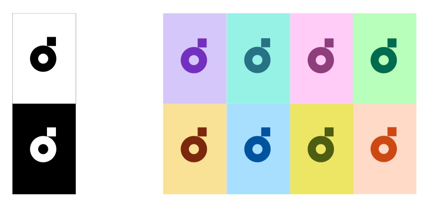
CREVV ended up proposing a branded color palette that covers all the colors of the spectrum, which was to be used for communication with contributors. The best part about this? Our designers now have the liberty of mix and matching color palettes based on the featured images in our designs.
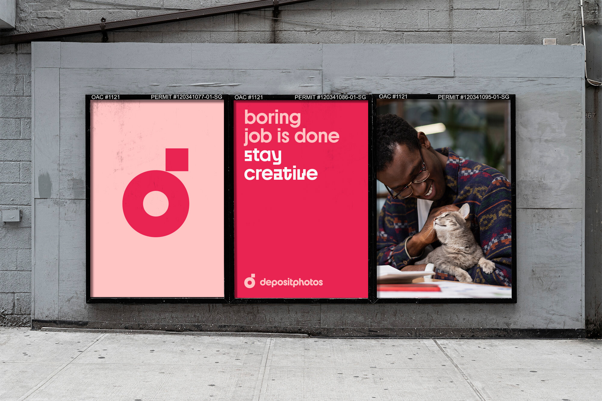
To make it a bit easier, we created sets of three shades that must be used together. The first color is always very light, the second is a bit more saturated and the third is darker (to be used for buttons and additional elements less often). If the background is light, the text on it will be saturated and vice versa. If a designer does not have enough combinations from the palette when creating layouts, they can always choose new color combinations with the same scheme based on the images they use.
Moving on to a new typeface
The CREVV team felt it was important to develop a new typeface that would complement a more sophisticated design solution of the black and white base colors as well as the more playful concept behind a colorful palette for contributors. The task was to create a recognizable corporate typeface. Members of CREVV reached out to a Ukrainian typeface designer, Dmitry Rastvortsev, to create it.
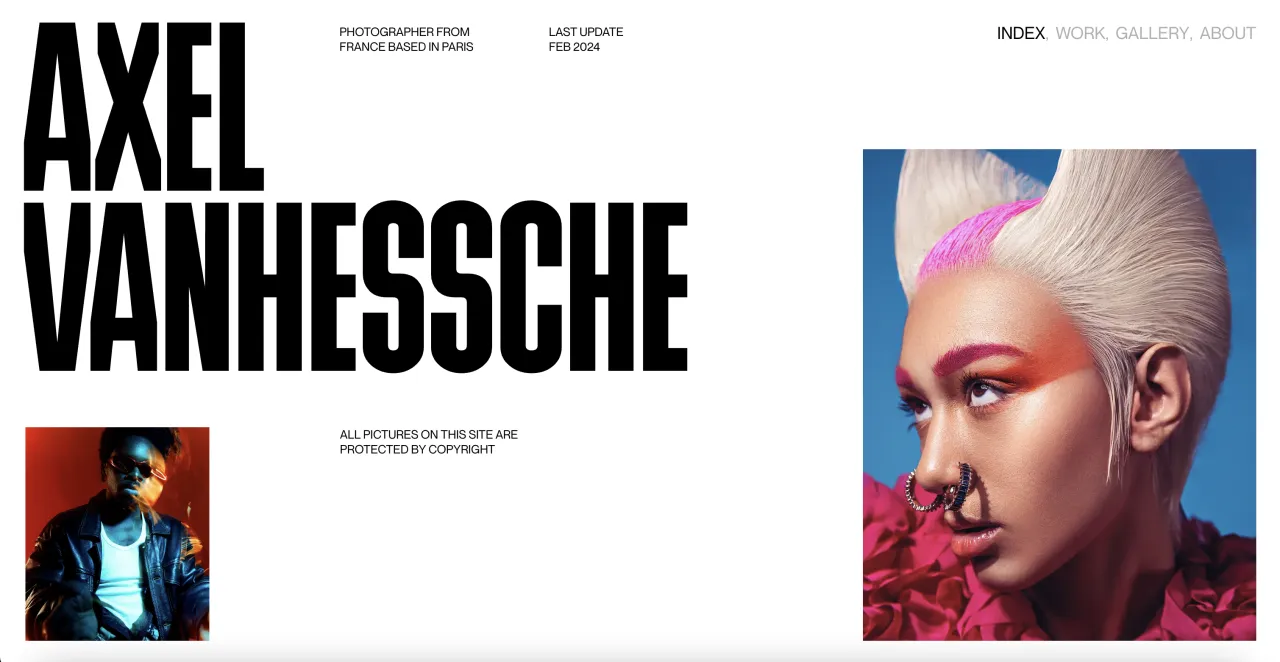
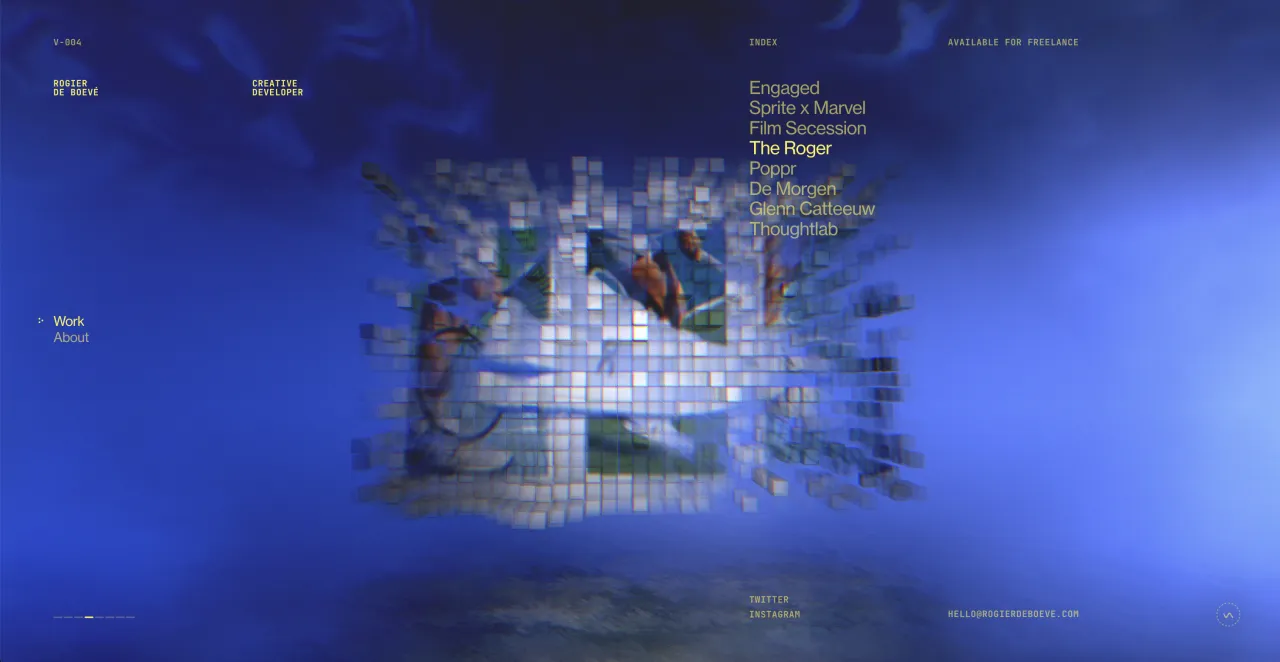
The new corporate typeface has several fonts, one of them is an ordinary grotesque font and four additional ones are more unusual and creative fonts. The fonts are based on art and design movements from different parts of the world. The savvy and curious might recognize the playful calligraphy, references to graffiti culture, and some Bauhaus-style features.
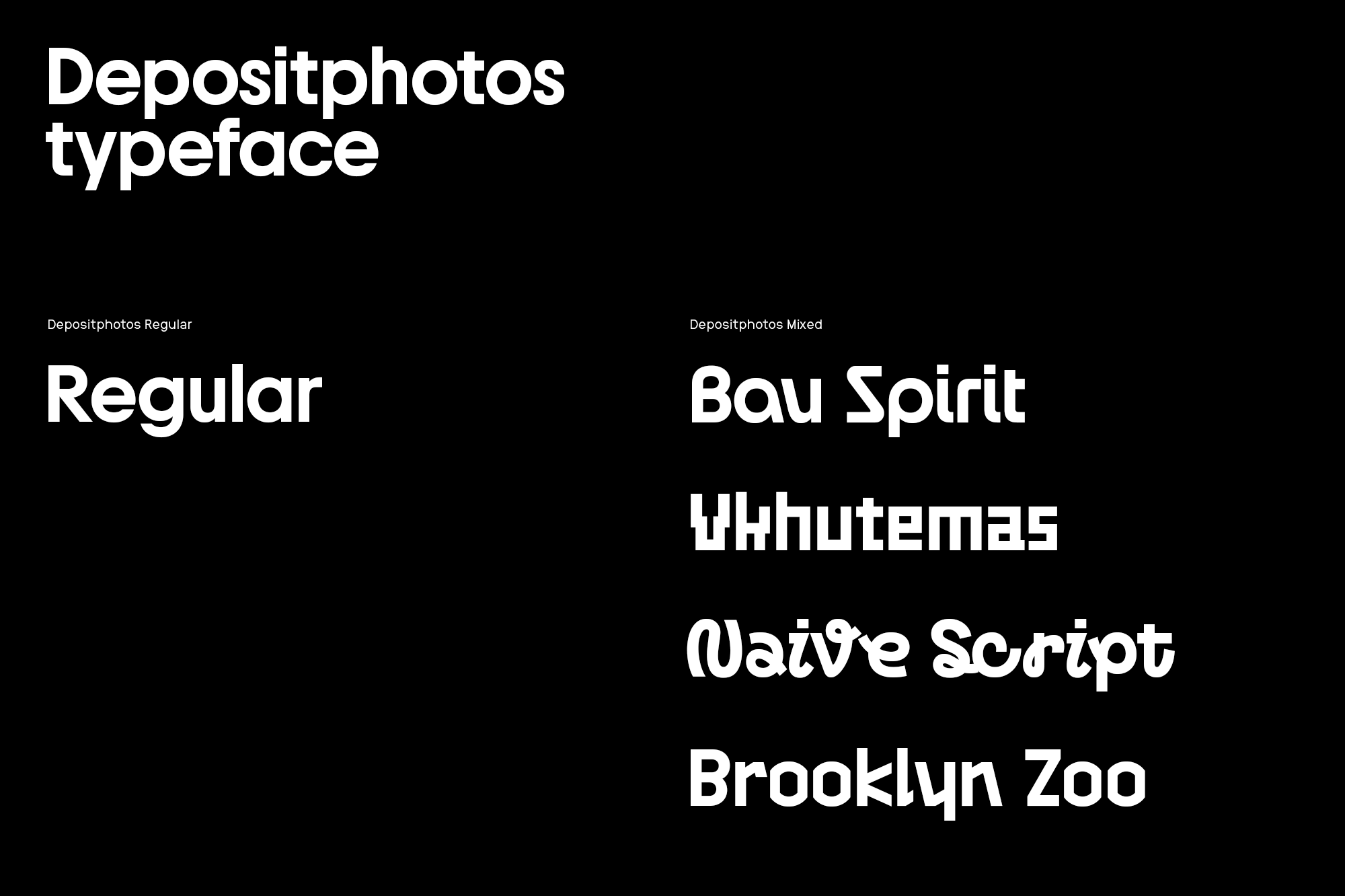
The standard font is the embodiment of the Depositphotos library being a useful and simple-to-use tool for creatives, while the four additional ones reflect the creative part of the brand – the Depositphotos contributors, clients and the content itself.
CREVV on Depositphotos’ new logo
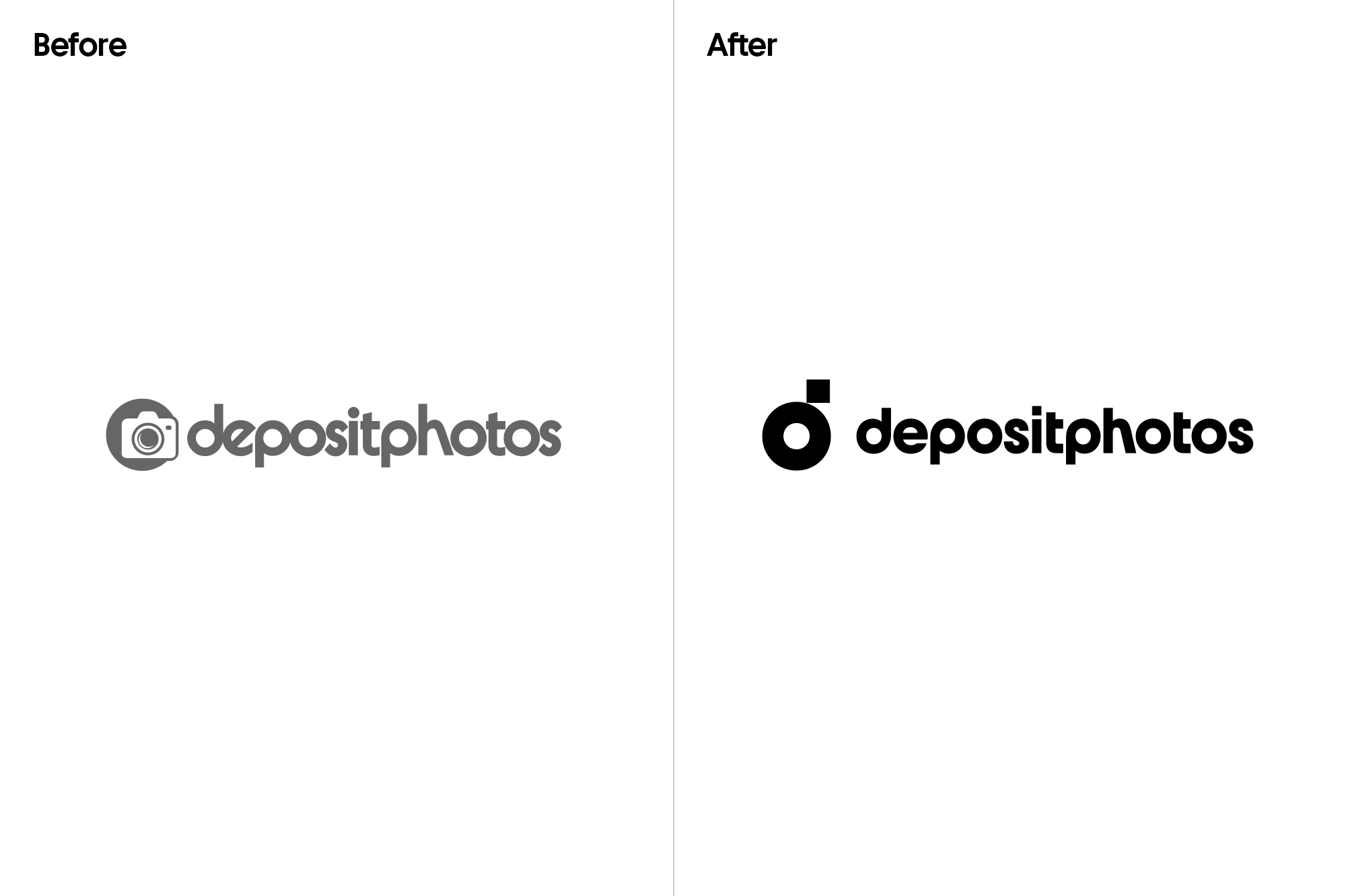
The first question from a design team will always be about what you don’t like about your old logo. For us, it was a bit different because everyone is attached to the old logo! It hasn’t changed as much in the past 10 years and is somewhat defining for our legacy. What we wanted to see was a transformation of that legacy into something more minimalistic and modern that was fit for more design formats that we’ve introduced.
Designing a logo is an extremely intricate business. From sketches to concepts, to an embodiment of whole ideas – the bottom line is that the logo has to stick to the brand from first glance. What a design team aims for is for a room full of team members to all say “That’s the one” in unison, but it’s not always the case. From our mutual experience, providing several options in a row with a brief explanation for the design choices is the best way to go until a mutual decision is made.
The logo development has begun with a search for shapes and many sketches. Different options appeared in the progress of developing the new design. One of them was the “dp” abbreviation, but it did not pass the uniqueness check.
While working on the text part of the logo, we analyzed the original version and realized that it has a very characteristic rhythmic pattern. This is achieved by alternating the wide, round letters -d-e-p-o and rather narrow -s-i-t-. Separately, it is worth noting that the letter -h- stands out from the general rhythm. It is very particular due to the letter’s unusual elongated right stem. We transferred the rhythmic features and the letter -h- to the new textual part of the logo, where all the characters were redrawn again. We also increased the spacing between the letters to make the lettering easier to read.
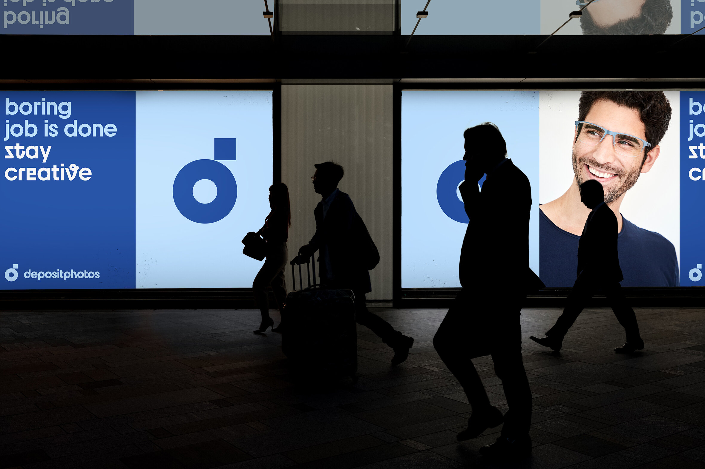
The final logo is based on a camera lens. We have kept the consistency with the previous version of the sign but gave it a modern touch. The new logo has become more recognizable and in its form is now more coherent with the textual part of the Depositphotos logo. In essence, the new logo embraces the idea of a camera lens and the shape of the lowercase letter “d” which gives the design more character.
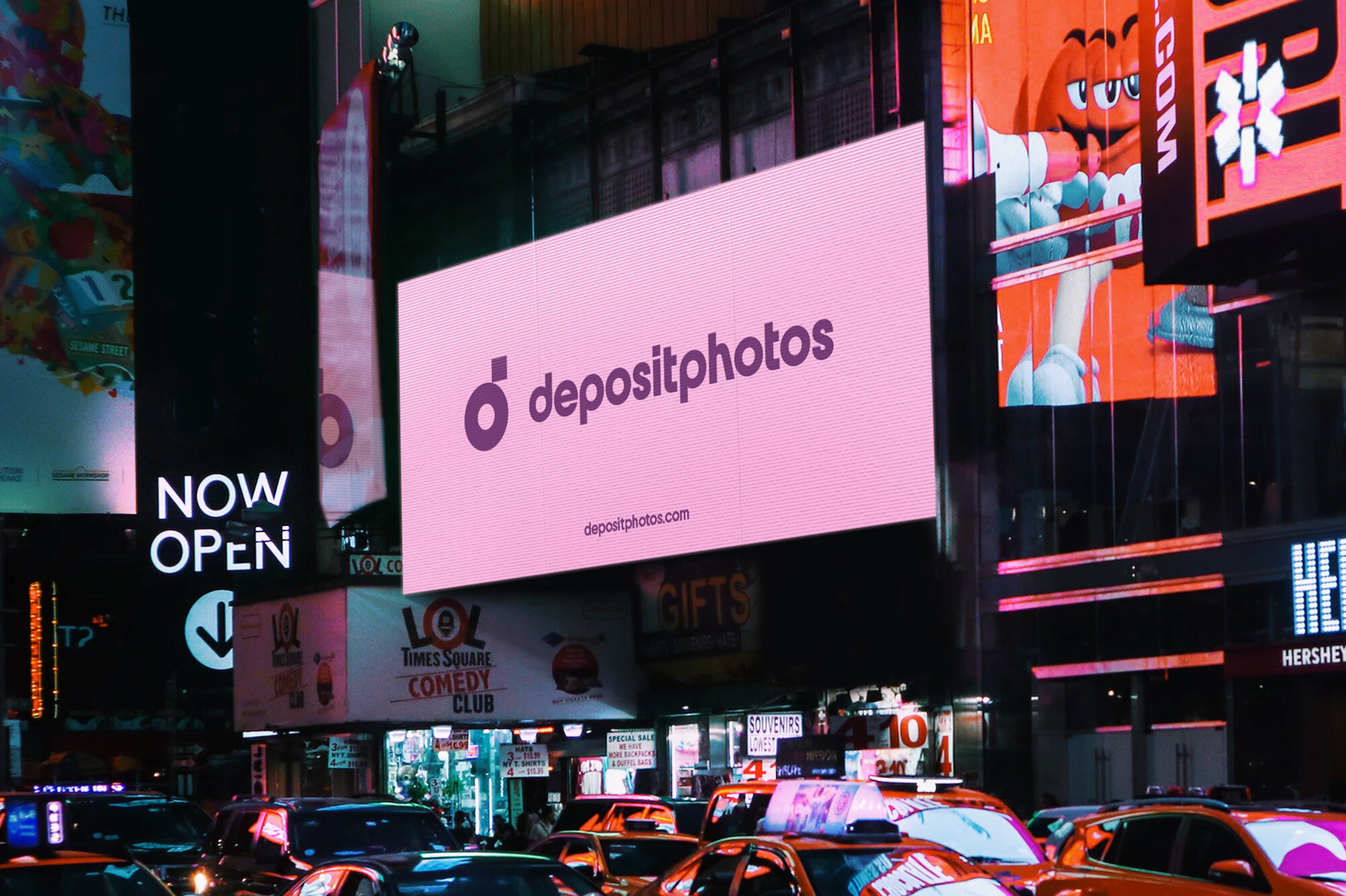
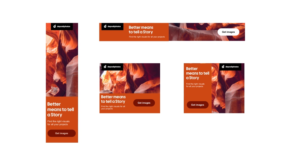
The one thing we’ll add is that a logo for us had to also be adaptable to different formats. This had to be taken into consideration by the design team when developing the final logo that we all chose. For example, we have different format needs for banners and email newsletters. For this purpose, CREVV developed a variation of the logos and it’s placement to look more coherent with different design formats. A series of animations with the logo was also part of the package so we had more flexibility with social networks and our own design choices.
Depositphotos redesign – a change for the better
We didn’t go into this project with CREVV knowing we’d have to reschedule meetings to 100% online, do most of our strategic sessions remotely, and carry out whole workshops to test everyone’s comfort levels. The world went digital right after the start of our project, and all businesses, including ours, had to adapt to this futuristic reality.
This is also part of our redesign story. Adapting to change while inciting change in tough circumstances, taking into consideration a changing world as we made decisions to move forward and adapt instead of backing up on our choices. The journey took longer than expected, but thanks to CREVV, we’ve also managed to do a wonderful project in the midst of all this.
In the middle of our redesign project, we launched a #Lockdownart campaign to encourage our contributors to document the changes taking place in the world in 2020. We continued to support the arts and artists around the world in all the small and big ways that we could. And this was something completely unexpected that took us to make spontaneous decisions to highlight the positive changes yet to come.
Let us know what you think!
The refined brand identity marks the beginning of a new era in the history of Depositphotos. It will be exciting for both our clients and contributors in the near future, and we hope that this change in our brand identity with a modern outlook will be appreciated by our loyal customers and our creative community. We’d love to hear from you! Let us know what you think in the comments section below.
