The Key Do’s and Don’ts of Good Logo Design
The most important part of starting any new business is your brand. Having a good and consistent brand will elevate you from a hobbyist to a professional. Your brand will follow you everywhere, from business cards and your website, to your social media presence, and even your product. The anchor of a good brand? A good logo.
Hiring a professional to design your logo can be costly, especially if you’re just starting out. Luckily there are online logo maker tools and resources available to help you create a great brand at a fraction of the cost. I’ve pulled together some of my top ‘Do’s and Don’ts’ of good logo design to keep in mind when creating your logo:
DO
1. Do make your logo clear and legible
Your logo should be easy to read. Seems simple, but how many times have you struggled to read a logo with a cursive font? There’s a coffee shop near where I live with a cursive handwritten sign outside, and I honestly do not know what they are called despite walking past them every day.
If everybody can read your logo, you aren’t alienating those with poor eyesight, or those who don’t share a native language with you. And the more people who can read your logo = the bigger your potential audience.
A good way to test this is to print out your logo on regular sized paper, and see if you can read it, or at least recognize it, from the other side of the room. You can use icons and splashes of color to help increase your legibility from a distance. Everybody can recognize the McDonalds icon from all the way down the highway – you should aim for similar. 
2. Do use visual metaphors in your logo design
In design, a visual metaphor is a representation of an idea. When branding yourself, a visual metaphor can be used to show your potential customers who you are and what you do. For example, if you sell flowers, you could include a bouquet of flowers in your design.
Visual metaphors can also be conceptual. The Amazon logo features an arrow underneath their brand name. Arrows convey a sense of urgency, and are often used to represent travel, or moving things forward. This arrow tells us that Amazon will deliver things to us quickly. But it’s not just an arrow! Look again and we can we see that the arrow is also reminiscent of a smile, showing us that Amazon will make us happy with their service.
What do you want your business to represent? How do you want your service to make people feel? How can you visualize those things?
3. Do think about brand colors
If you want to use color in your logo, it’s worth creating a brand color palette. It’s not as scary as it sounds – a brand color palette is just four or five color swatches that you use throughout your work. By picking your colors you help build a brand identity. Look at the Google’s brand color palette below:

Even without seeing the logo, we could probably guess that this color palette was from Google. By using these four colors consistently across their products, Google has built instant brand recognition.
Whilst you’re unlikely to be as recognizable as Google any time soon, it’s worth taking their lesson in brand colors on board. And don’t forget that every color has meanings and connotations. Blue is a calming and peaceful color, whilst yellow is a bright and sunny one. Read up on Color Psychology and what it means for your brand, to help you pick a color palette that works for your business.
4. Do think about logo applications
Ok, a bit of designer talk here, but bear with me: think about your logo applications, in particular your Black & White (B&W) and your Whiteout options.
Let me explain. You have a logo, it looks great in color. This is great news for things like the internet, but what if you need to print it on a document in black and white? Does it still look so good? What about if you want to overlay the logo on top of an image? Still looking good?
B&W basically means ‘your logo but just in black’ and Whiteout means ‘your logo but in just white’. Have a look at the examples below of the Instagram logo to see what I mean:
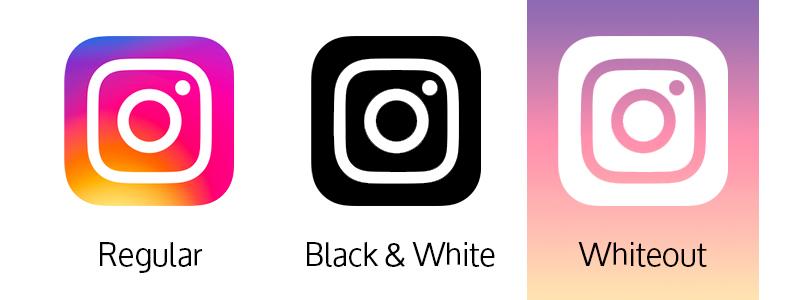
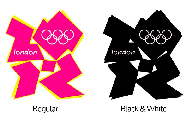
This is why logos with a strong color contrast or defined outlines tend to be more popular – because they translate better to B&W and White Out applications. The London 2012 Olympics logo looks great in color, but when translated into a Black & White application just becomes a blob.
And whilst you might be thinking ‘this doesn’t apply to me, my logo is just for my website’ it never hurts to think about the future. Who knows how big your business might grow? It’s good to keep your options open.
5. Do be consistent
Your logo sets up who you are as a brand, and should be used to guide your brand design forward. Your logo is a brand anchor, not an isolated graphic. The easiest way to do this is with fonts. If your logo uses the font ‘Gotham’, for example, your business cards should also use the font ‘Gotham’.
If you logo has lots of white space in it, your brand should also use white space. Let’s look at Google again. The Google logo is very clean, with lots of white space in between letters. The font is also bold.
Now when you look at the Google homepage, you also see white space and bold fonts:
This consistency is a really easy way to establish yourself as a professional brand. Once your brand look is established, you can roll it out across all of your promotional and marketing materials, as well as on your own social media channels.
DON’T
1. Don’t overthink your logo
When designing a logo, it’s so easy to get wrapped up in the minute details. What if I moved the icon 2 pixels to the left? What if the text was 5% smaller? What if I was cleverer with this design? The list goes on.
Most people are only going to glance at your logo, not deconstruct it. So whilst it’s worth putting in the effort to make sure it’s good, you don’t need to lose sleep over it. You don’t need to reinvent the wheel to create a good logo. If you find yourself overthinking it, take a step back and get a second opinion. Sometimes all you need is a new set of eyes.
2. Don’t copy an existing logo
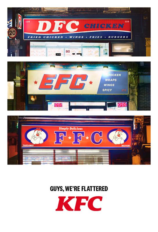
Your logo should be unique to you. This means it should be based on creativity, not a competitors website. It’s ok to take inspiration from others in your field, and you should absolutely do some competitor research as part of your brand development process, but your customers want you to be you – not a bad imitation of somebody else.
3. Don’t do too much with your design
A busy logo is a bad logo. Try and keep your design as simple as possible – that means don’t use 4 icons, 3 fonts, and 7 colors!
The Starbucks logo is a great example of scaling down a design to the essentials:
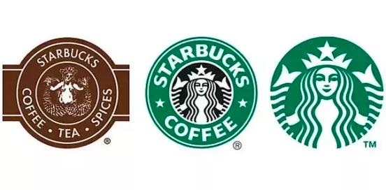
The original logo was very busy, with lots of words and a detailed illustration. Today’s logo is much more simple, but still instantly recognizable. Less is very much more.
Think you can master the Do’s and the Don’ts of good logo design? By starting out with a strong logo and a defined brand, you’re making it easier for yourself to establish your business, especially if you decide to do your own PR or marketing. A strong logo will also help good old fashioned word of mouth. The more people can identify and recognize your brand, the easier it is to engage with them as audiences or consumers – meaning the more successful your business is.
Logo design checklist:
- My logo is clear, legible, and easy to read
- My logo tells people who I am and what I do
- My logo sits within my brand colors
- My logo has Black & White and White Out options
- My logo is simple
- I’ve asked for a second opinion on my logo from somebody I trust
- My logo is unique to me
- My logo makes me happy
Go forth and create amazing logos for your brand!
