Graphic Design Tips For Non-designers
We know, designing from scratch is hard work. Do these colors go together? Does this font work with this one? Am I getting the composition right? For starters, let’s deal with the fact that not everyone went to art college, but that in no way means you can’t be a designer! This article will be a collection of simple graphic design tips that are easy to grasp and will help you elevate your designs.
Think of it a crash course, the knowledge of which is applicable after you think over some basics. If you’re designing images for social media, blog posts or ads, you know that you don’t need a graphic design degree, you just need the right tools and a little bit of background knowledge. The good news is that both of these things are in this article. Let’s take it apart in 10 easy to follow steps.
Tip #1:

Like any other project, your visuals are targeted at a specific audience. Always remember to keep them in mind. It really helps to have an idea of one person, similar to the concept of your ‘ideal reader’ with writing. This really helps you create designs with a purpose, suitable for your intended audience.
If you’ve done some research, you know the demographics of your audience. The context of your design really matters. You wouldn’t want to produce a very sophisticated and sleek design for a teenage audience, or something so quickly that an older audience won’t appreciate.
While keeping your audience in mind, you are tailoring your designs to appeal to them. This also helps you get a sense of direction, a more coherent overall style and even the right color scheme which brings us to the next point.
Tip #2:
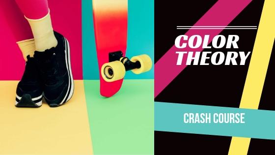
You might feel overwhelmed with so many color choices, hues, shades and the endless possibilities of using color. There are some really simple tools that can help you pick color schemes. For example, if you really can’t settle on a color scheme you can use Coolors and keep clicking the space bar until you find a color scheme you like.
If you’re feeling slightly more confident, there is a tool Cohesive Colors, which allows you to upload an image and find colors that go with it. So there. Didn’t have to go to design school to learn the basics of color theory! And if you’re a bit lost, you can always get inspired by our website color palettes.
Tip #3:

If you’re brand new to design, give Crello a try. The simplified design tool is not just for easily creating designs from scratch, but is also a source of inspiration with designs that are made by professional designers.
Use free templates to get a feel for how compositions work, what fonts work best together and the types of visuals that you should be using in your designs. Creating a design in Crello is really simple and you can have ready designs in a few clicks.
Tip #4:

Many of your designs are going to need beautiful, complimentary visuals. A great source of inspiration of already hand-selected visuals for different themes are our featured collections. If you frequent Depositphotos, collect your favourite images in your Favourites folder and have them ready for your designs. Crello has free photos under ‘Photos’ – ‘Free photos’ as well. Whatever method you choose, it’s a good idea to save your favourite images so you have something to choose from when you’re designing.
Tip #5:
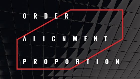
To help you keep things neat, Crello has a feature that allows you to easily align objects. Grid lines will appear automatically as you’re aligning your text or objects manually. For a design to look presentable, things have to be quite neat and orderly.
You can use additional design elements to correspond to your text. To keep with proportions, make sure your elements’ thickness matches that of the weight of the fonts. Don’t busy your designs with too many design elements, try to keep it clean.
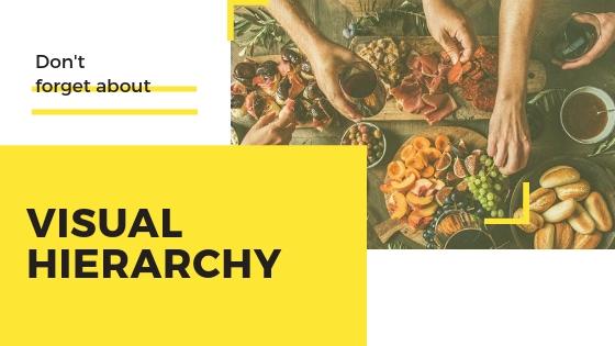
There should be a visual hierarchy in your designs. The biggest element or the biggest font will be seen or read first. Use smaller text for sub headings and an even smaller text size for your body. Don’t be afraid of scale. Some typefaces look great in a larger size and will help drive attention to the important text elements in your designs.
Tip #6:
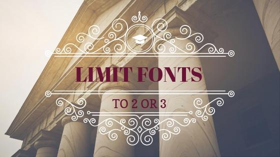
One of the most common rookie mistakes is using too many fonts in your designs. Thankfully there is a golden rule, which tells you to limit your fonts to 2 or 3 but no more than that. What could possibly go wrong right? Sometimes even choosing 2 is hard work! Here’s a quick article on font pairings that should help you here.
The reason why you should restrain from using too many fonts is because it’s really difficult on the eye. Ideally, you should use fonts from the same family for your headings, subheadings and body text. Don’t switch back and forth between the different fonts because it tends to look a little amateur.
Tip #7:
Although this is an extensive topic, you can easily grasp it by thinking of your overall composition as a form of a hierarchy. The most visually dominant feature (the object in an image, text or design element) should be the most important part of your message. It is where the eye will be drawn first.
To check if you’re doing it right, ask for a second opinion! Grab the nearest coworker and ask them what they look at first, second, and last depending on how much text you have and how busy your design is. Playing around with scale, color overlays and fonts is important in this stage.
Tip #8:
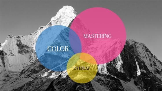
The easiest way to make your font stand out is to use color overlays. This can either be a partial overlay, or one over your whole image. Avoid super bold colors, and try to change the opacity of your color layer so it is more integrated into your design.
If you’re stuck on what colors to use in your images for the color overlays, refer to the color palette tools we talked about earlier. Adding color overlays makes your text more legible and can be a great way to add visual interest to your compositions.
Tip #9:
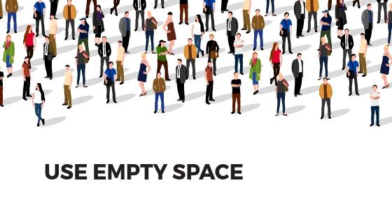
Many non-designers are a little hesitant about leaving white space in a design. Wait, but shouldn’t I add something to cover that space? No. Don’t be afraid to intentionally leave blank space in your designs. You know it, and we know it, less can sometimes be more.
In making an informed decision about leaving some space, you’re really telling your viewers that you want them to focus on other more important aspects of your design. If you start filling up all the white space, you’re going to end up with a cluttered design which will be hard on the eyes. No one wants clutter in their designs.
Tip #10:

When you get familiar with all the tools available to you, all the effects and cool features, you might want to use all of them. Do restrain yourself from the temptation. If you start adding too many unnecessary elements, your designs will lose any sense of balance. Remember, every single element that you add to your composition should have a logical purpose.
That’s right, everything you add to your designs matters regardless of what format you’re designing for. That’s why it’s best to always keep it simple, and let the eye appreciate the little details and the bigger picture. This is not to say you can’t use a variety of elements, but you should use them sparingly to give viewers a visual break instead of overwhelming them.
At the end, consistency is key
Lastly, and a key to all these tips is that you really have to understand and be able to justify your choices of fonts, design elements, images and other details. That’s designing with a purpose. This thought, when kept in mind at all times, will help you with consistency when creating multiple designs for a series of blog posts, social media posts or ads.
As you can probably tell, these aren’t tough tips to master. Once you grasp the importance of the separate parts of a design, their function and necessity, you come a little closer to an aesthetically pleasing composition created by none other than yourself, a non-designer with some mad skills. Good luck!


![Graphic Design Trends 2021 [Infographic]](https://depositphotos-blog.s3.eu-west-1.amazonaws.com/uploads/2021/02/Graphic-Design-Trends-2021-Infographic-1.webp)