Bright vs. Soft: Choosing the Best Easter Colors for Your Campaigns
Each season brings its own colors and associations, with seasonal holidays enriching palettes even further with distinctive hues—from the green of St. Patrick’s Day to the red of Valentine’s Day. But what about Easter colors? What shades do you associate with one of the key spring celebrations? Probably, white and pastels will come to mind first. However, the holiday’s color range is much more diverse.
To inspire your festive visual communication, we’ve explored various hues of the Easter color palette and the meanings behind each shade, from glorious gold to tender light pink. Stay tuned to find the best hues for upcoming holiday campaigns. Use them to set the right vibe and appeal to your audience.
Easter colors: a celebration of tradition and meaning
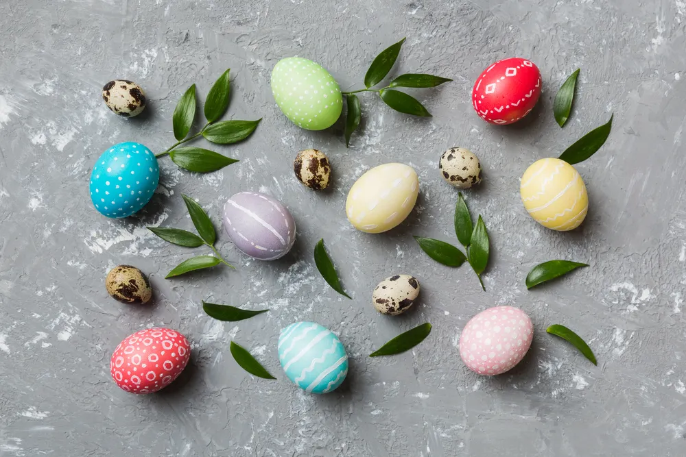
The key message of Easter is joy and revival, which give the festive communication a bright and uplifting character. An Easter color palette is also vital to bringing this to life, with each shade adding its specific touch. For instance, traditional hues like white and yellow capture the holiday’s essence by conveying renewal, while pastels introduce a fresh element.
Whether you’re working on an Easter post or a big seasonal project, understanding the nuances of specific holiday shades will help you achieve maximum impact. And so will the handy design tips you’ll find next!
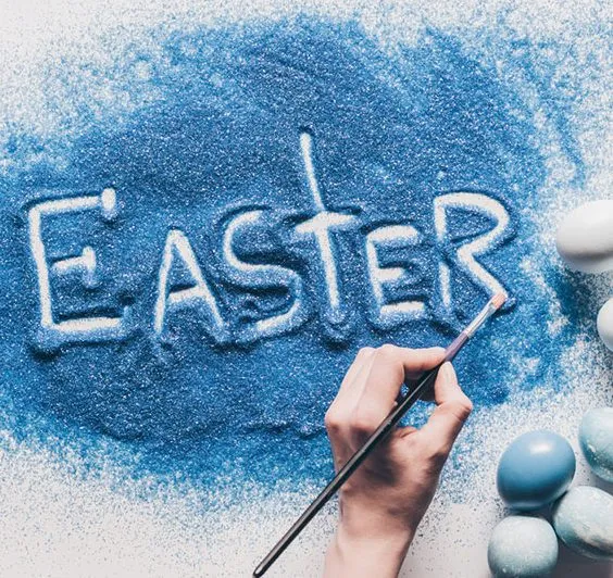
🤍 White: purity and new beginnings
In a “What colors represent Easter” survey, white would definitely be the winner. As the primary color in Christian tradition, it symbolizes light, holiness, and the resurrection of Jesus Christ. White marks the triumph over darkness and death, as well as the promise of eternal life. Embodying the core idea of the holiday, this shade represents a spiritual rebirth that Easter brings to believers. At the same time, as a color that evokes strong associations with new beginnings, white resonates deeply even with non-religious audiences.
Integrate white into your holiday design to reinforce the themes of hope, renewal, and celebration. Use it as a clean background shade in minimalistic layouts or pair it with bright Easter colors for an uplifting aesthetic. As a basic neutral hue, you can use white in literally any design, but to make it relevant to the moment, add pastel tones or gold accents to your composition.
Curious why white lilies are a symbol of Easter? Find out in our thematic article.

💛 Yellow or Gold: joy and celebration
Yellow and gold symbolize victory, divine glory, and the joy of resurrection. These hues closely correspond to white, but due to their warm nature, they convey happiness and the festive nature of the holiday as a time of rejoicing. Gold and yellow appear in the Easter color palette for a reason: you can see them in Christian icons, including the divine glow around Christ, church decorations, Easter eggs, and spring flowers.
Although these colors are different in character—yellow is friendly and joyful, while gold is refined and majestic—they both fit perfectly in holiday designs. Whether utilizing yellow for call-to-action buttons or framing products with gold highlights, these shades significantly enhance campaigns. For example, combine yellow with white or pastel Easter colors to evoke happiness, energy, and positivity. Or, add radiant gold accents to your compositions to convey a sense of celebration and spiritual significance.
Looking for exciting content to fulfill your Easter advertising ideas? We have not just one, but five thematic collections, so you’re sure to find something special.
💜 Purple: lenten sacrifice and royalty
Purple, deeply rooted in spirituality and penance, adds profound depth to the Easter color palette. It plays a key role in both the solemnity of Lent and jubilant festivities. On the one hand, purple symbolizes sorrow for sins, humility, and preparation for Christ’s resurrection. On the other hand, it’s associated with majesty, as purple dye was rare and expensive in ancient times, so only royalty could afford it. In the Easter tradition, this color praises Jesus Christ as the King of kings.
Celebrated for its dignified allure, purple is perfect for giving holiday-themed graphics a stately look, especially when combined with gold. You can utilize rich violet tones in your Easter color sсheme to frame content or headline print and digital layouts, lending them a majestic quality. Furthermore, employing muted purple as subtle background gradients can craft a contemplative vibe, enhancing thematic depth. With its ability to transition between formal and symbolic realms, purple is ideal for campaigns that balance solemnity with grandeur.
Learn what virtual Easter eggs are and how they can help you promote your business.
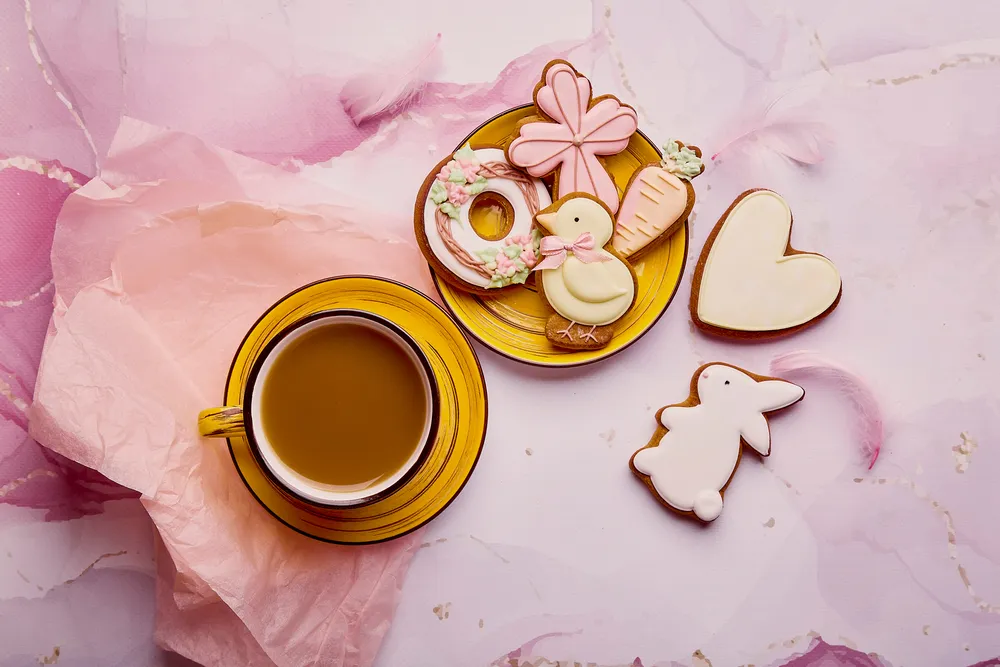
🩷 Pink: delight and gratitude
Pink holds a special place in the family of pastel Easter colors. It serves as a bridge between the solemnity of Lent and the celebration, representing the transition from sorrow to happiness. A softer version of red, pink also symbolizes Christ’s love and compassion, as well as the grace received through faith. It signifies the arrival of spring, fresh starts, and the promise of new life through Christ’s resurrection. Outside of religious context, pink fits perfectly into the seasonal context, as it reinforces themes of renewal and beauty.
A vibrant symbol of love and joy, pink offers a delightful touch to Easter campaigns. This color’s association with affection and celebration makes it ideal for designs expressing warmth and kindness. When used in marketing, pink infuses promotional materials with a cheerful and approachable aesthetic. Its playful nature and visual appeal attract audiences seeking positivity and comfort. Additionally, pink complements other Easter colors, providing a harmonious balance that is both welcoming and visually striking. Pair it with pastels like yellow, lavender, and mint green to create a soft, spring-inspired aesthetic.
Pink can be much more versatile than it may seem at first glance. Learn more about the nature of this cheerful color in our article.
❤️ Red: love and sacrifice
Although red is not a traditional Easter color palette hue, it is often used for the role it plays in the holiday’s context. Red represents the blood of Christ and is associated with Good Friday, the day of Jesus’ crucifixion. It symbolizes sacrifice, redemption, and resurrection. Some churches use red on Palm Sunday or Good Friday but shift to white or gold for Easter Sunday to represent joy and victory over death.
By incorporating red, designers can harness its power to resonate with audiences seeking a connection to this reflective holiday. Consider using red to accentuate focal points like call-to-action buttons, where capturing immediate attention is crucial. Additionally, red can highlight elements in otherwise subdued color schemes, creating a unique contrast that enhances overall design. You might balance it with traditional Easter colors like pastels or neutrals to keep the look fresh and springlike. While bright reds aren’t as typical in Easter decor or marketing, soft coral, peachy reds, or warm pinkish-reds can work in spring designs.
Consider using coral in your Easter-themed design, as it is one of spring’s most trendy colors.

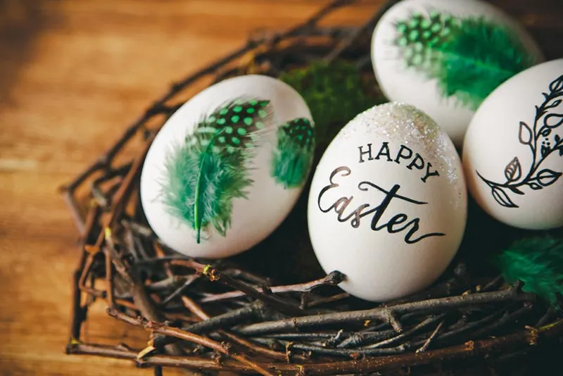
💚 Green: renewal and hope
Our Easter color scheme would not be complete without green, symbolizing renewal and eternal life. It reflects both the natural rebirth of spring and the spiritual revival that Easter represents. Just as plants grow after winter, green embodies the promise of new life through Jesus’ resurrection. Green also marks the arrival of spring, when trees regain their leaves and flowers begin to bloom. This makes it an ideal choice for seasonal campaigns, both Easter-related or not.
When incorporated into designs, green’s natural freshness provides a serene yet energizing atmosphere. Employ gradients of green to create a calming and visually appealing backdrop that harmonizes with softer tones, enhancing your design’s growth narrative. Incorporate green into your Easter-themed branding, packaging, and promotional materials, combining it with pastel Easter colors to create a lively, springtime feel.

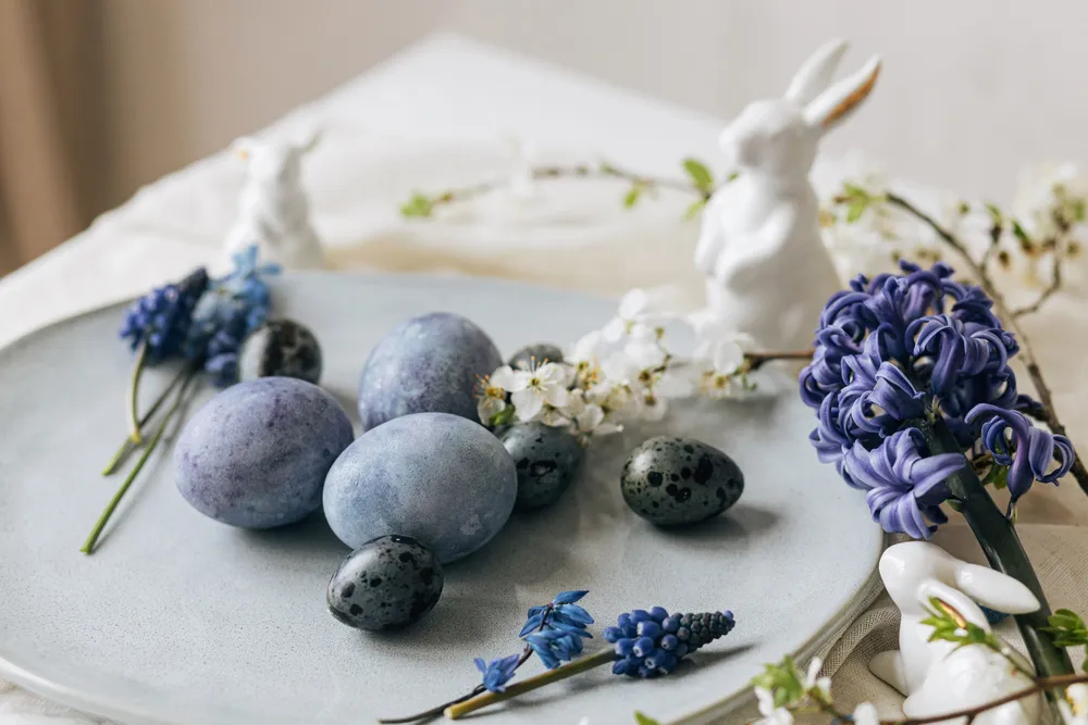
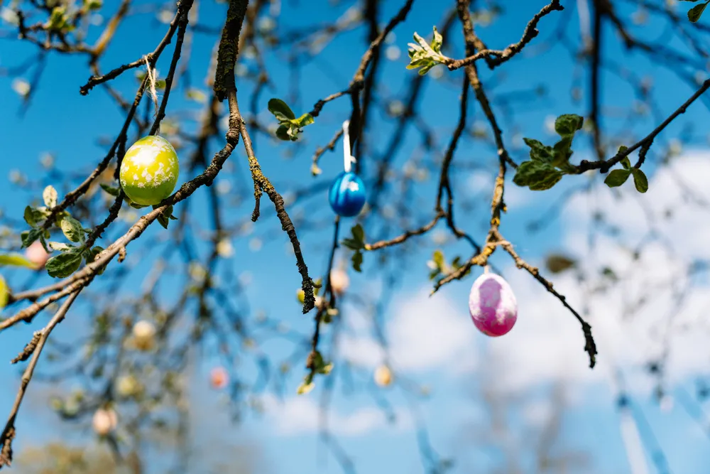
💙 Blue: the Heavens and faith
Blue is often associated with Easter as a color that represents the Virgin Mary. More generally it symbolizes faith, hope, and the heavens. Additionally, blue can represent spiritual ascension. It serves as a reminder of a higher power and connection to the divine. Light blue is commonly used in Easter decorations and designs because it embodies peace, serenity, and renewal—perfect for the spring season and the holiday’s themes of rebirth.
Blue is incredibly versatile, making it one of the favorite Easter colors in marketing design. It can also be a fresh alternative to traditional pastel shades. Combine blue with yellow, pink, white, or mint green to create cohesive festive compositions. Such combinations can brighten up any design, from promotional campaigns to packaging.
Colors for Easter holidays
Easter holidays feature vibrant color palettes that symbolize profound meanings and enhance thematic designs. Palm Sunday, reflecting Jesus’ entry into Jerusalem, uses green to evoke renewal and life, crafting a hopeful narrative. Maundy Thursday, linked to humility, often employs muted earth tones to convey simplicity and contemplation.
Good Friday, known for reflection, traditionally uses black, symbolizing mourning and sacrifice, adding depth to visual materials. Holy Saturday, the pause before celebration, integrates subdued purples and pastels, inviting quiet anticipation. These tones imbue designs with a reflective yet hopeful essence, preparing for Easter Sunday’s vibrant celebration. Together, these Easter colors transform marketing materials into powerful narratives, enhancing visual appeal and emotional depth in campaigns.
Modern interpretations of Easter colors
The transformation of the Easter color palette reflects an evolution toward vibrant, contemporary aesthetics. Pastel tones, appreciated for their understated, yet captivating quality, introduce warmth and elegance to modern visuals. These colors are prevalent in digital design and product packaging, fostering a gentle sense of renewal that resonates with today’s tech-savvy audiences.
A further trend is the rising use of metallic elements like silver and gold, which add depth and dimension to designs, turning ordinary pieces into striking visual compositions. By merging these reflective accents with traditional Easter colors, designers create a trend-forward palette that honors and reinterprets timeless styles. This innovative blend of pastels and metallics effectively enriches campaigns, leveraging modern design sensibilities to craft an aesthetic that not only attracts attention but also delivers an enduring impact, engaging audiences in meaningful ways.
Final thoughts
What makes colors so vital in holiday marketing? Their significance goes far beyond aesthetics alone, as shades affect mood and evoke different emotions. In the case of religious holidays, colors also gain a deep spiritual meaning, as we can see from the example of Easter colors.
Understanding traditional symbolism will help in choosing the shades that work best for you. So, think about the message you want to share with your audience: is it joy, hope, or renewal? Make your holiday designs not only appealing, but also meaningful to truly connect with your audience.
More articles on Easter theme:
5 Last-Minute Easter Visual Collections to Boost Spring Sales
Easter Bunny, Eggs, and Lilies: What Easter Symbols to Use in Your Seasonal Campaigns
Virtual Easter Eggs: What They Are and How to Use Them to Promote Your Business