Creative Ads: 8 Ideas to Inspire Photographers
Creative advertising is one form of advertising where creativity most literally seeps off the page – it makes us think. Throughout the day, we’re constantly exposed to all kinds of ads. They’re on our screens, our TVs, on the road and trail us throughout our commutes. Research shows that as little as 3% of all the ads leave a long-lasting impression. This is the gold spot that creative ads fall into. We searched the web to collect some of the most creative print ads so that you can get inspired and perhaps inject some of the creativity into your portfolio or commercial projects.
What you will likely find striking is the fact that some of these advertisement ideas are so clever and well thought out that you (and the audience) can immediately relate and appreciate the bigger picture. With creative ads, marketers appeal to our intellect and our sense of humor as opposed to provoking ads that are there to simply grab attention.
The reason why this is an interesting topic for stock photographers is because our database is available to graphic designers, advertisers, and other professionals that are on the lookout for visuals. Add a new spin to your portfolio, and you’ve got clients. Here are some lessons we’ve learned from creative ads over the years.
1. Tell a story
Although this is more of a beautiful illustration, this ad was created by Saatchi & Saatchi and done to promote the Schusev State Museum of Architecture. The whole ad campaign shows photographs of famous landmarks only to unravel whole worlds below them. The tagline for the campaign is ‘Discover the full story’.
As a stock photographer, the first lesson to be extracted here is showing fragments of a story with a bigger picture in mind. In this way, you have to adapt to showing instead of telling. This campaign is powerful and it exists because there is a photography idea, a concept, and flawless retouching.
Some cool ads make us wonder, others cause us to marvel. With a little bit of digital manipulation, you can tell a story in one shot. One stock photographer, John Wilhelm, uses this tactic. He utilizes his post-production skills to tell whole stories in one shot.

A lesson to learn for stock photographers. Truly creative photography that is able to communicate a story with a single image starts with heroes and conflicts. Choose what kind of brands you’d like to attract and think of possible ‘conflicts’ that their products might be involved into. In the case above, the Schusev State Museum of Architecture is struggling against a lack of curiosity, which prevents people from seeing things as they really are. Find your target audience first and then search for ‘conflicts’ and product insights with niche magazines.
2. Generate visual riddles
This is a touching ad featuring a family of 3 in an animal adoption ad. This is the best example of layered meanings and clever composition. For one, you can always count on the furry friends to appeal to the masses and a composition like this one is sure to captivate audiences.
There is no element in this image that is extra – it’s simple and effective. It’s a great example of how you can most literally create something from nothing. All that is used in this image are models, great lighting and slight post production touches. However, the key advertisement idea was communicated without using capital letters which made it more memorable as most people are visual thinkers. Use our generation explainer to learn why visuals are that important for different types of audiences.

A lesson to learn for stock photographers. Minimalistic and clear compositions with a small puzzle for the human mind are perfect to use as photography ads. You might not sell that many copies if you were to create typical content for your target audience knowing their needs and tastes, but you definitely could draw a client’s attention with artwork like this one. If you achieve this ‘thumb-stopping’ aspect with some of your works, clients may want to check out your portfolio or share your image with others. That’s how viral marketing works. And remember: puzzling images make people pause and study them longer which means they will remember you. Another similar advertising example is Fiat’s social campaign ‘You either see one or the other’.
3. A touch of humor is okay
Without being ironic, you can bring some humor to your photo shoots. This cool ad might not be the most artistic or stunning campaign but it does grab attention. It’s captivating for all the right reasons, and it makes us laugh.
This kind of quirkiness will make your clients stop. This is precisely the reaction the advertising agency Duval Guillaume was going for. The message of this iconic ad is ‘Reality sucks’, and surely you see all the elements add up in the ad – the imperfect weather, mediocre boat, and a very unfortunate accident. By far, not the romanticized scene we’re used to seeing on screen.

A lesson to learn for stock photographers. For stock photographers, humor can be your best weapon. Learn to use it right and you will boost your portfolio. It’s a call to get more creative and harvest something ‘more’ from your photoshoots. Have some spare time? Try a humorous take on your scene. For other ironic advertisement examples search for ‘You Eat What You Touch’ campaign by Lifebuoy Hand Wash or Pepsi Light trucks’ design.
4. Show attitude and use emotions
If we talk about execution, this Rolling Stone ad is a brilliant example. With a tagline, ‘We are made of rock’, the ethos, product and attitude is really translated using one image. Note the simplicity in the actual shot – it’s all that’s needed to make a resemblance to an instrument. At the same time, there is a deep understanding of the target audience behind creative ads like this one.

A lesson to learn for stock photographers. In stock photography, we often come upon still life photography. They’re simple photographs of objects we’re used to seeing. What if those objects were used to tell a different story like this one? There’s some food for thought – all you have to do is explore.
Brands are constantly looking for visuals to reflect their brand values so it’s worth investing in image production for those who have active brand accounts on social networks. Why? First, they accept photography ideas with diverse emotional backgrounds and statements. Second, they are more likely to purchase another image after. To hit the jackpot, create images that reflect your customer’s audience values. More examples – Amnesty International social advertisement on abuse issues (‘He has his mother’s eyes’) and Greenpeace ads on global warming and icebergs (‘Now it’s completely visible’).
5. Break a pattern to make a statement
Our eyes are quickly drawn to patterns. The way our brain functions simply makes us attracted to them. The reason why breaking a pattern is so effective is because our eyes become accustomed to a pattern quickly so when you break it, the element stands out like an eyesore (but a good one in this case).
This is a simple, yet very effective concept that was used by the Volkswagen ad campaign. The photography ad tagline is ‘A bad part affects the entire system.’ It’s as simple as a line up of people and one rebel in this shot but it makes a point.

A lesson to learn for stock photographers. These images are winners in stock photography. Patterns in nature and everyday life will always be in demand. Breaking these patterns in a clever way will be quite attention-grabbing. It’s another trick up your sleeve. In addition, making patterns is a win-win strategy for photographers on stocks: you can sell both versions of your pattern (holistic and broken ones). Designers will prefer a classic option as they need textures and others will look for an image that reflects their ideas and needs minimal editing before including into their creative ads. Other advertisement examples are another Volkswagen campaign (‘Precision Parking’), Special Olympics campaign of 2017.
6. Nature as inspiration for creative ads
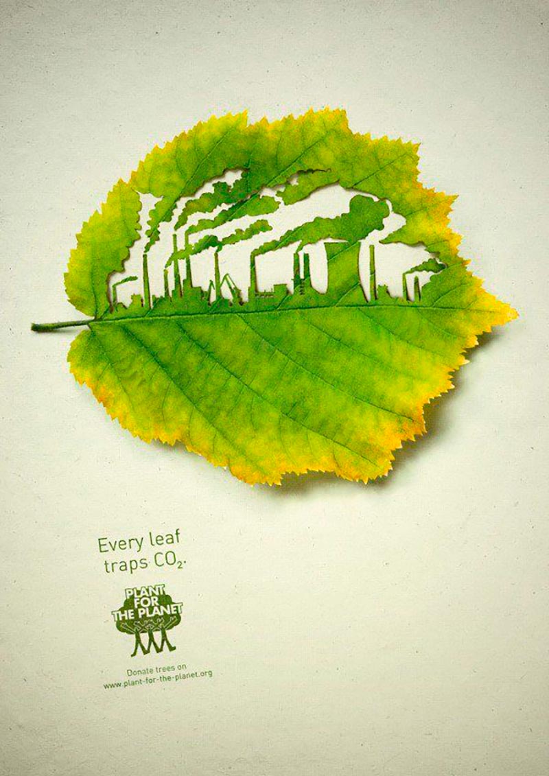
A very minimalistic, yet complex piece. Plant for the Planet took something as delicate as a leaf and created a skyline within it. With a powerful message and a little bit of an artistic touch, this ad speaks volumes.
Many of you play around with compositions of leaves and other materials. Those very materials can be made into statement pieces. You have to have a spark of creativity to invest your time into customizing artworks. In this case, your image could become a starting point for somebody to develop their advertisement ideas.

A lesson to learn for stock photographers. Users are attracted to natural objects, even if they see them on the screen of their computers. Nature allows them to overcome stress and relax. Therefore, creators of advertising often use nature as a component that increases the reach of their advertising messages. If you are just discovering your Depositphotos contributor’s opportunities, fill your portfolio with images of nature. Unusual statements, storytelling, and unexpected composition will be your advantage. Find more inspiration here – ‘Big Cat, Small Cat’ campaign by Whiskas and Pedigree ‘A dog makes your life happier’ posters.
7. Spotlight on social awareness
Amnesty International has some of the most powerful creative ads. They don’t use tricks or bold colors, they show us frozen moments in time like this one. The correlation between a quiet family gathering around a TV and this illustration makes you wonder. We can all relate to the family aspect, but some families are devastated to live in a different reality.
One of your duties as a photographer is to depict life as it is but also where you choose to focus and shine your spotlight is important. In an earlier article, we looked at different photography ideas and a social awareness project was on the list. Photographs that depict reality, although sometimes brutal, can be so powerful.

A lesson to learn for stock photographers. Thoughtful shots that highlight social issues such as domestic violence, inequality, water or air pollution are not only a powerful way to raise awareness but also is an idea of how to advertise your business being a photographer. You can opt for reportage shooting, contrasting compositions, or retouching. More powerful social ad examples: SAMU Social campaign for supporting homeless people and ‘What Goes Around Comes Around. Keep The Sea Clean’ campaign by Emirates Environmental Group.
8. A new creative take on old concepts
Clean Up Australia Day must have been a success because this spin on a widespread concept was done with a lot of thought. We all know the concept of a growing sprout as a stock photo cliche. Here’s a very simple advertisement idea that really took off. A bottle’s imprint was such a small addition but a really powerful message – where there is trash, little grows and prospers.

A lesson to learn for stock photographers. As a photographer, you need to update and revive some new concepts. In one of our special projects, Reinventing Stock Photography, we asked 5 photographers to show us their take on a growing sprout. When you are forced to rethink old concepts, you come up with some really refreshing ideas and creative solutions. It’s another idea to add to your body of work. Check some iconic ads of that kind: ‘When You See A Tuna, Think Panda’ by Sea Shepherd Conservation Society and ‘Buckle up. Stay alive’ by Quebec Auto Insurance Corp.
What can we take away from these creative ads? As a photographer, the most important lesson is that you can tackle many topics with your portfolio. The more you span out and the more versatile the portfolio will be, the more sales you can expect to make. How you approach your photoshoots makes all the difference. Flood your portfolio with pieces that make a statement; pieces that are engaging and memorable. If you choose this route, you’re tapping into the larger market where demand for creativity and a unique perspective is appreciated above all else.
For more ideas, see our cover on creative collages made with stock images and marketing tips for photographers, or visit our Knowledge Hub to explore practical tips and tricks concerning photography, design, and marketing.


