7 Types of Logos & How to Use Different Logo Styles with Examples
To understand how important the role of logo design is in representing and promoting a business, it is enough to mention that 75% of people recognize a brand by its logo. This key element of visual identity helps attract an audience, shape the company’s image, differentiate it from competitors, improve customer loyalty, and more.
Today, it is impossible to imagine a successful brand without an effective logo. But what is the secret? At first glance, most logo pictures appear to be a simple combination of lettering and images. But in fact, there are many approaches to creating a logo. In this article, we’ll look at the most popular types of logos and share tips on how to choose the best option for your business. We have also created a special collection of logos where you can find interesting ideas and ready-made design solutions.
Browse Collection
The most common logo types
- Text logos or wordmarks
- Letterforms or Monogram logos
- Symbol logos
- Abstract logos
- Mascot logos
- Emblems or badge logos
- Combination logos
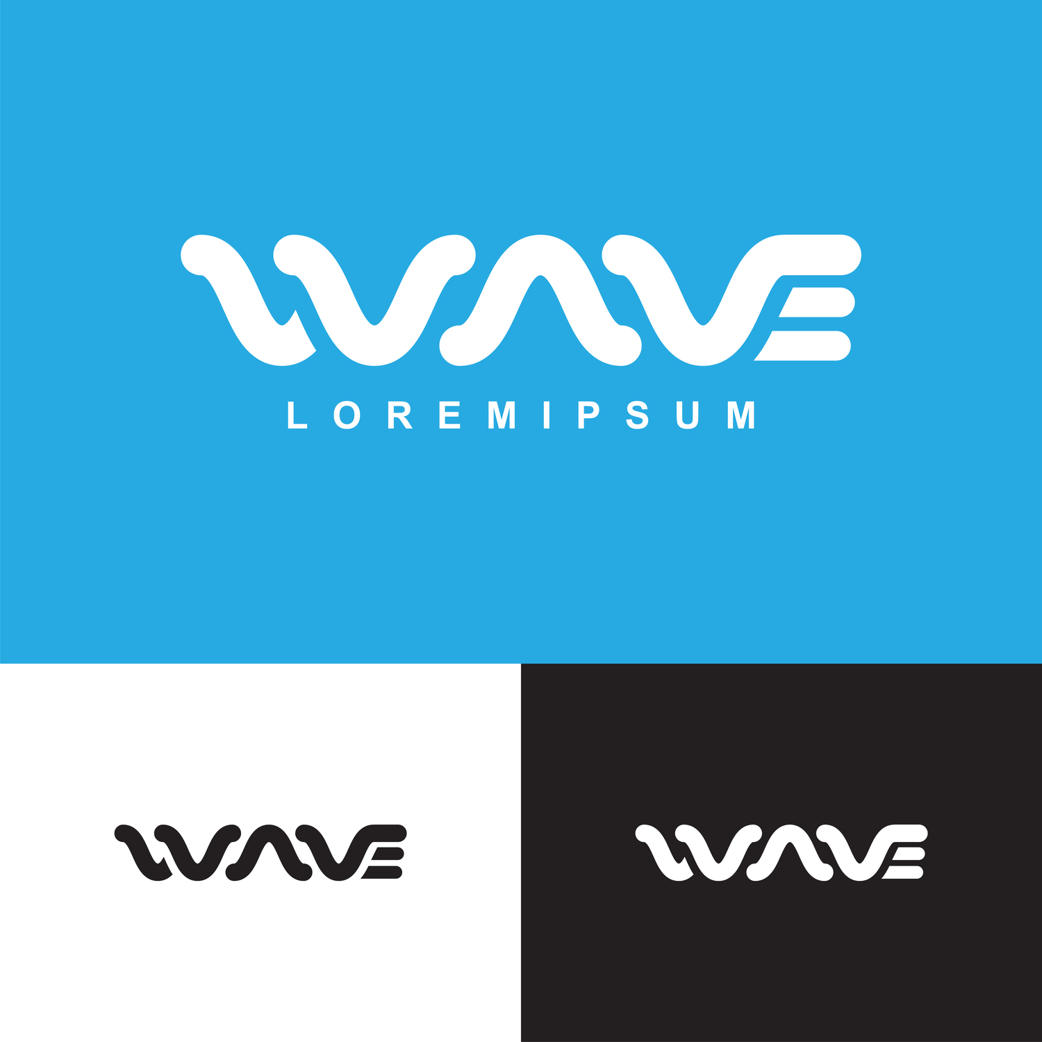
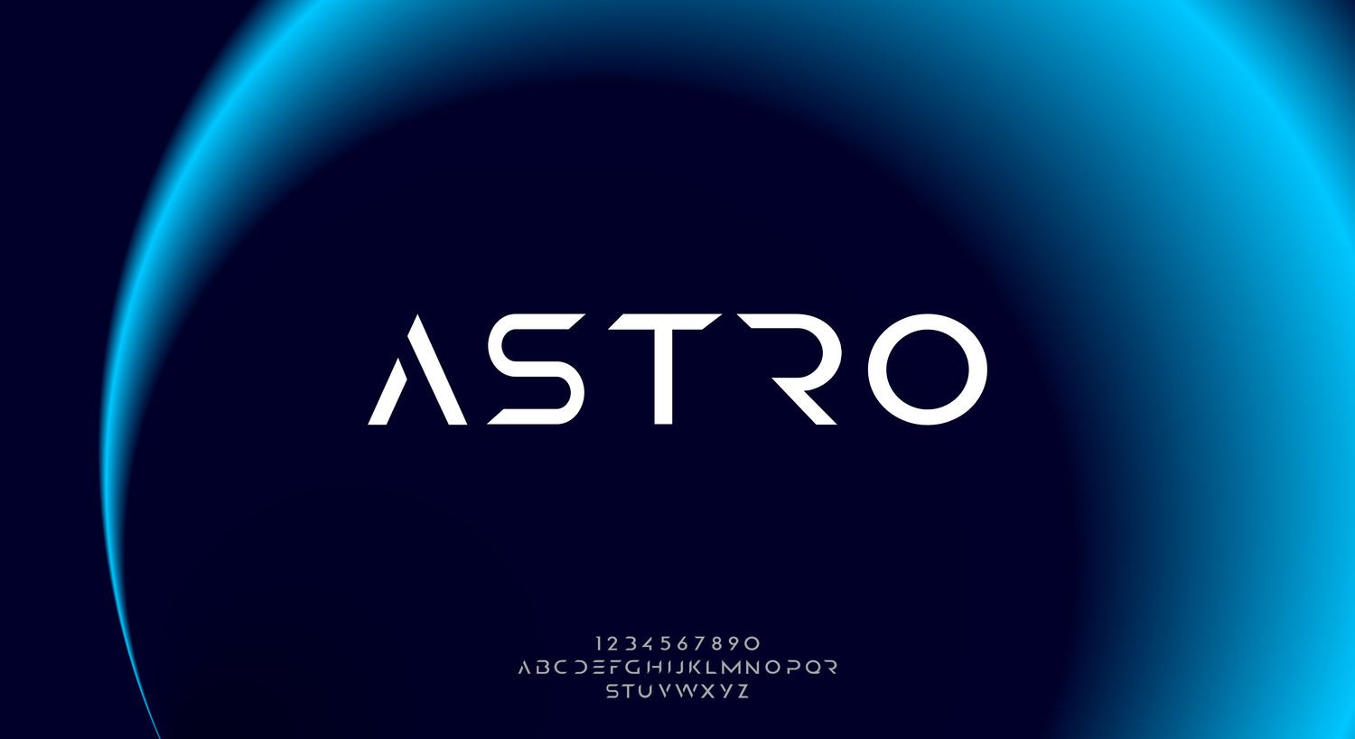
1. Text logos or wordmarks
Wordmarks contain lettering (most often brand names) designed using corporate fonts and colors. The undoubted advantage of this type of logo design is its clarity and recognizability. Other key features of wordmark logos are their minimalism and versatility, as they can be seamlessly integrated into any brand communication format.
Meanwhile, the idea that creating a text logo is easier because you don’t need other visual elements is a misconception. Moreover, in this case, you can only rely on the font, which must be both appealing and legible so that the viewer can easily read it. Choosing the right font can be a real challenge. It is not surprising that leading brands such as Coca-Cola rely on custom fonts that accurately reflect the company’s personality.
In today’s digital age, you can also use an AI logo generator to instantly create a professional-looking wordmark logo in just a few seconds, making the design process faster and more accessible than ever.
Brands with wordmarks: Google, Coca-Cola, eBay, FedEx, LEGO
Choose a WordmarkWordmark logos examples

Wordmarks are best suited for:
- brands with short names. Wordmarks are a win-win choice for companies with short (usually one-word) names regardless of the industry. The logo design of both the luxury brand Dior and the shipping company FedEx are striking and instantly recognizable.
- new brands. For companies just starting out in business, it is important to make an impression and gain the trust of their audience. Of all the logo types, wordmarks maximize recognition, making it a great option for new brands.
- brands that value versatility. The minimalism and lack of additional elements in a wordmark make it easy to adapt it to different platforms and formats, which greatly simplifies the design process.
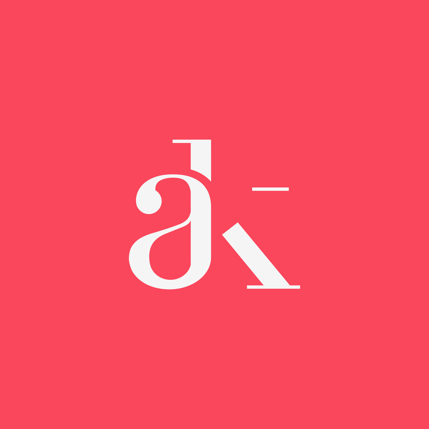
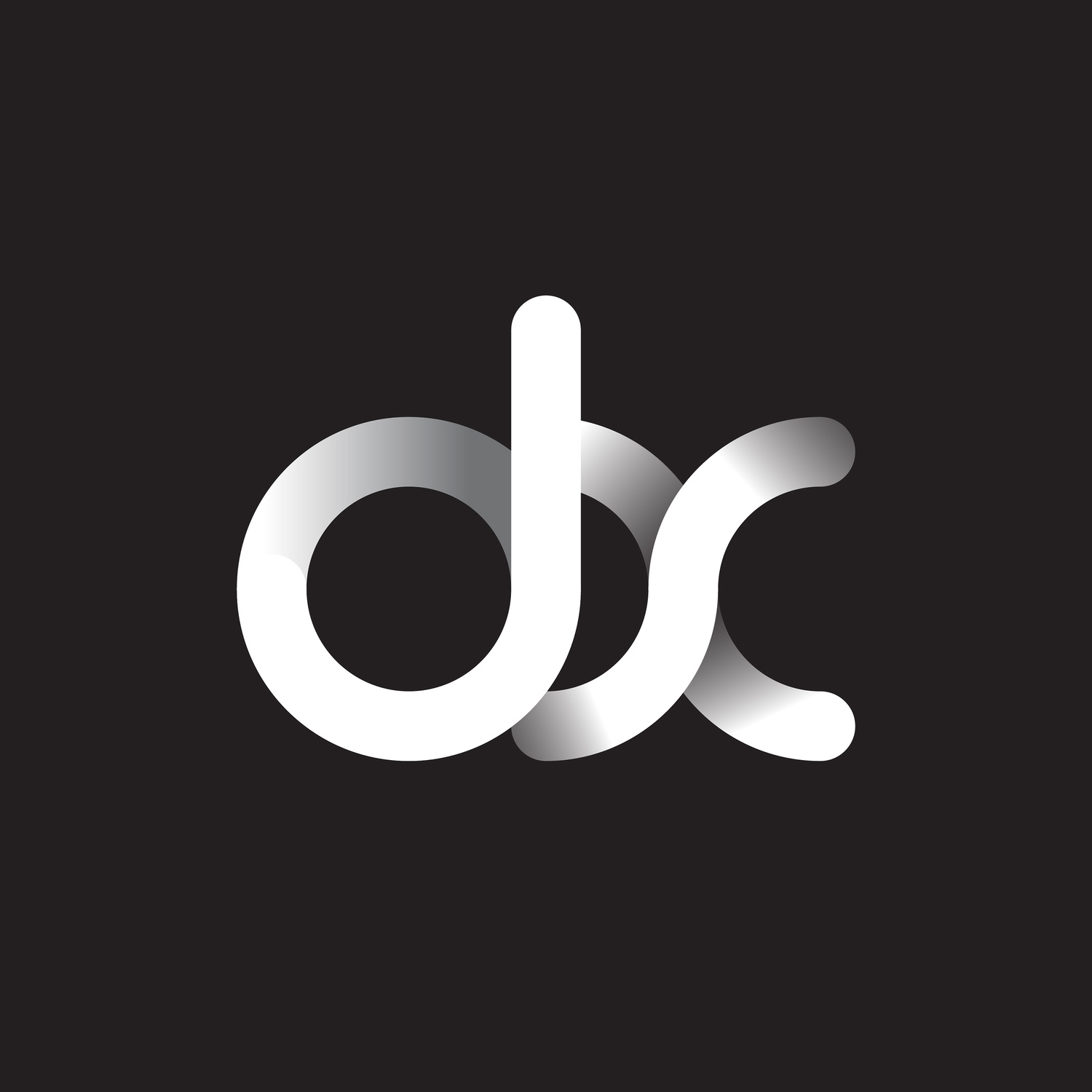
2. Letterforms or Monogram logos
This type of logo is also based on typography, but it’s a shortened version — an abbreviation or a monogram. Simply put, it is a graphic representation of several capital letters representing a company’s name (for example, HBO or IBM) or its abbreviated version (for example, YSL for Yves Saint Laurent). The main advantage of monogram logos is their elegant and clean look. And, as with text logos, their excellent adaptability makes them perfect for any marketing materials.
Monograms are usually associated with luxury and status. Not surprisingly, luxury brands often choose this format. Take, for instance, the iconic logo design of the French fashion house Louis Vuitton in the form of the overlapping letters L and V. This is a vivid example of how an interesting combination and non-standard outline can create an effective and recognizable symbol. For monograms, the shape becomes even more important, as it is the shape and color choice that determines how well your logo conveys your brand’s personality and resonates with your audience.
Brands with monogram logos: MAC, DKNY, YSL, HBO, BBC
Choose a Monogram LogoMonogram logos examples

Monograms are best suited for:
- brands with long names. If your company name consists of several words, you’ll hardly be able to fit it into a logo. In this case, it is better to limit yourself to the main letters of the name and work out the authentic shape or outline to give the design a unique character and look.
- luxury brands. Companies that want to emphasize their high status can also benefit from relying on a letter logo. An exquisite monogram will attract the attention of a discerning audience and create an image of exclusivity.
- internationally-oriented brands. Not all companies have names that are equally easy to understand everywhere around the world. If you work for different markets, consider creating a universal monogram logo that will help increase brand awareness and memorability.
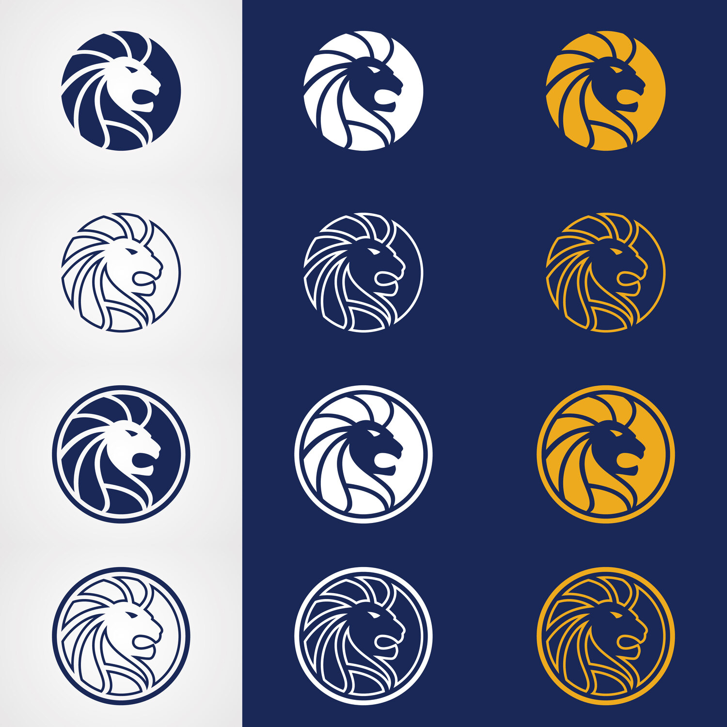
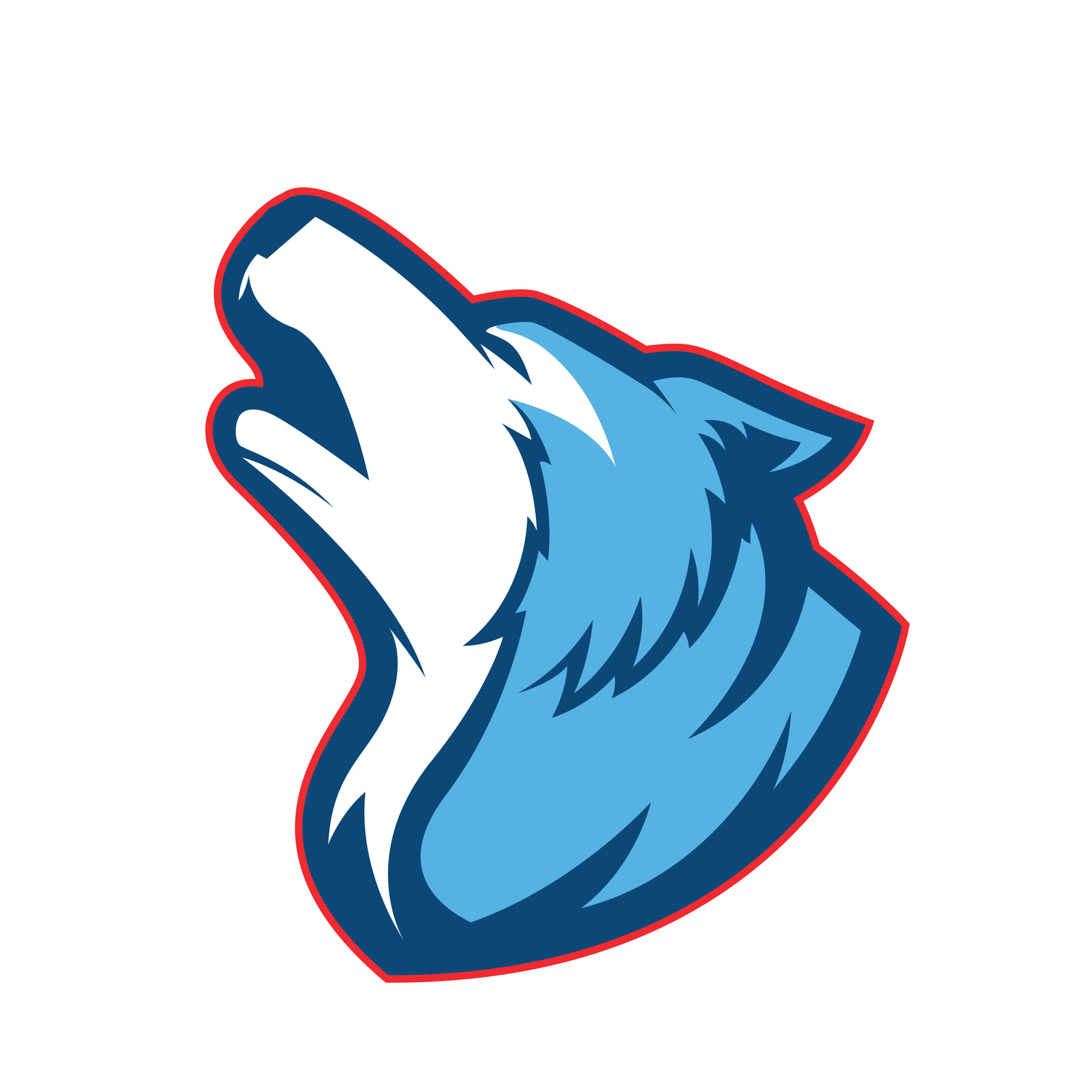
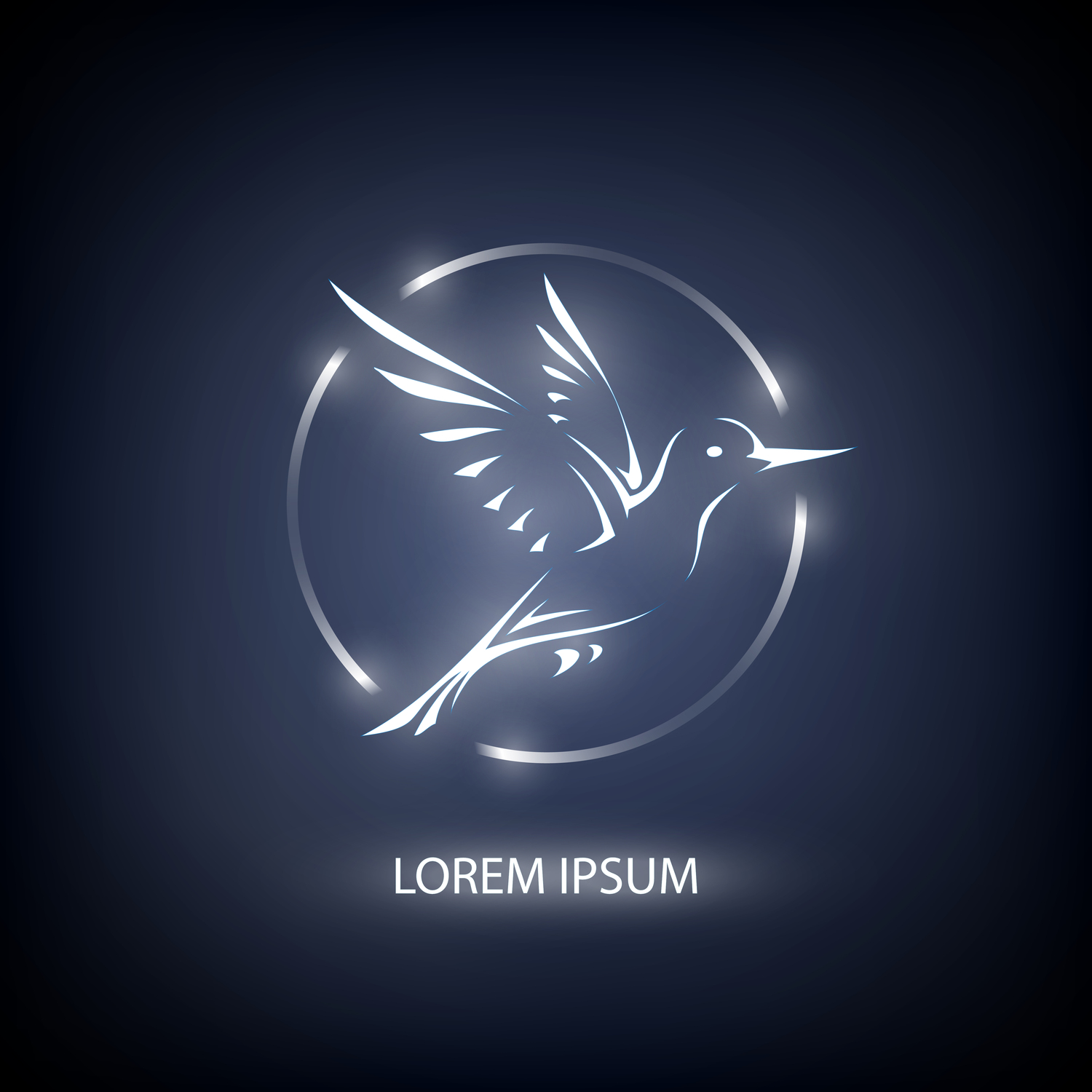
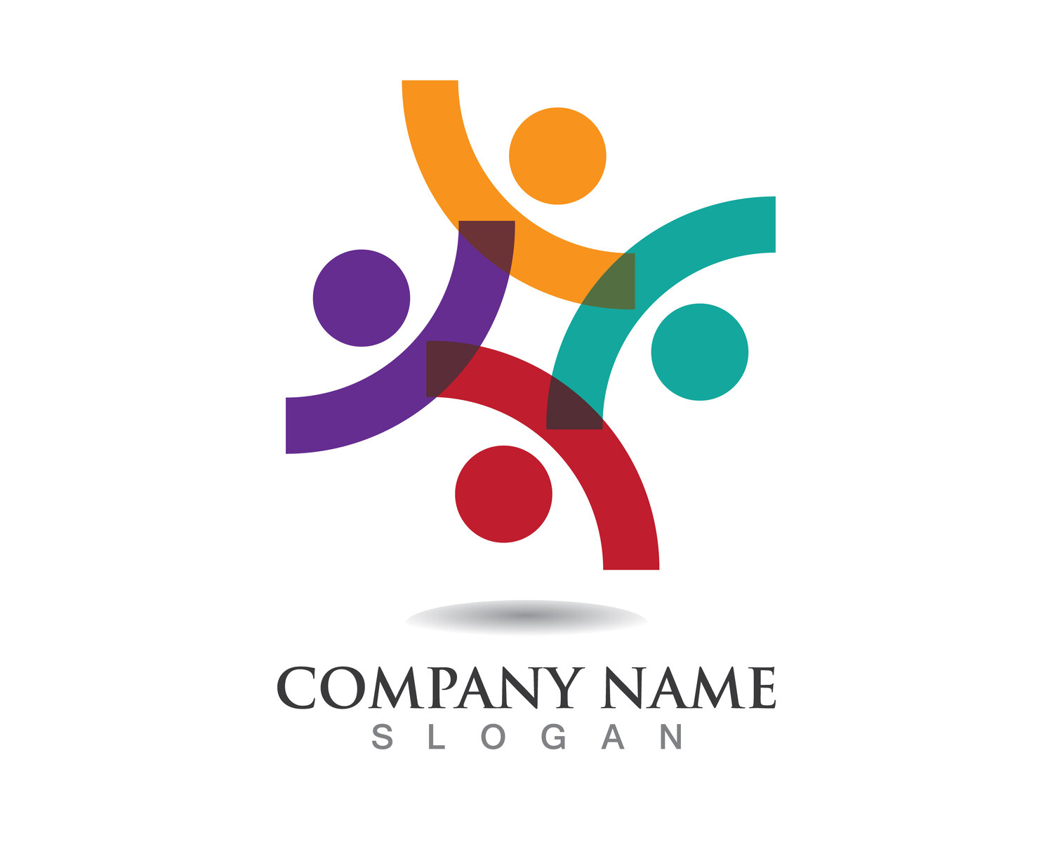
3. Symbol logos
In this case, the basis of the logo design is a symbol or image that embodies a brand’s identity or the essence of its activities. As a rule, it represents real-world objects. When choosing a symbol, brands usually use two main approaches. Some rely on literal images. Vivid examples include the apple-shaped logo of Apple and the shell-shaped logo of Shell. Other companies opt for creating associative links. For example, Playboy chose the image of a rabbit for its logo as a symbol of playfulness. Until recently, Twitter (now X) had a bird logo that symbolized freedom and unlimited possibilities.
Symbols are a powerful visual identity tool. However, it takes creativity, experience, and time to craft both a creative and memorable corporate image that conveys the essence of a brand. It is also important that your logo design does not lose its relevance over time. Otherwise, it might need to be redesigned, as there’s a risk that it will become less recognizable.
Brands with logo symbols: Target, Apple, Dropbox, Instagram, Starbucks
Choose a Symbol LogoSymbol logo examples
Symbol logos are best suited for:
- well-known brands. Symbols are not the best choice for companies that are just entering the market, as it takes time for an audience to remember them and associate the logo with the brand. At the same time, it is a perfect option for companies that are already well-known to consumers. The logo symbol will strengthen the connection with them even more.
- brands that can convey the essence of their business in one image. Think of the YouTube logo as a Play button or the Instagram logo as a camera. These simple, recognizable images perfectly convey the specifics of each company. If your business has a distinctive identity, think about how you can embody it with a symbolic icon.
- international brands. The same logic applies here as with monogram logos. If your company name is difficult to adapt to different markets, you can consider a universal symbol that will be perceived the same way everywhere.
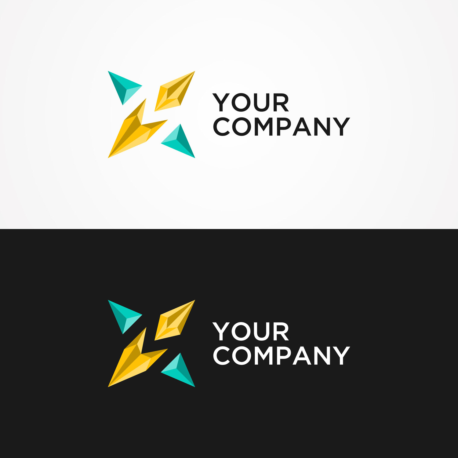
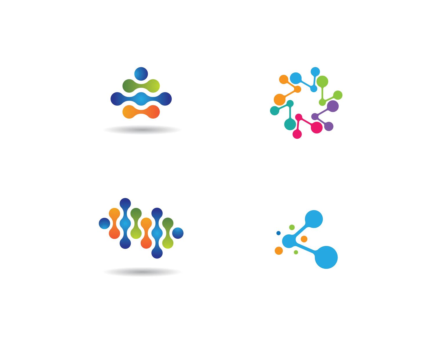
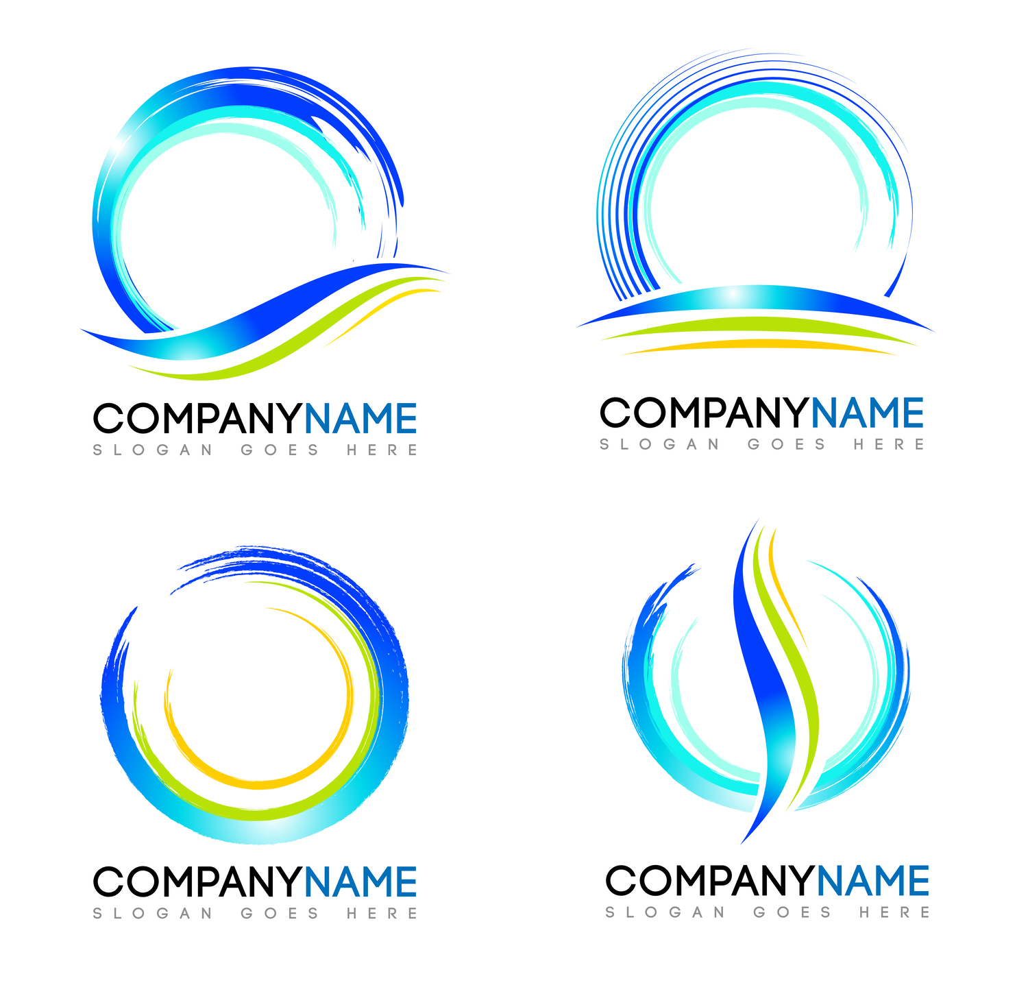
4. Abstract logos
Abstract logos are based on images, just like symbols. However, they are not images of real objects, but rather abstract symbols (usually geometric shaped logos). Since there are no restrictions on the choice of visual elements, you have the opportunity to create a unique logo design that conceptually represents your brand.
Abstract logos allow you to convey your company’s values and philosophy, as well as create an emotional connection with your audience. For example, one of the most recognizable and expensive logos in the world, the Nike swoosh, depicts the wings of Nike — the Greek goddess of victory — and symbolizes the sound of speed, movement, and motivation. Abstract logos can also be metaphorical representations of a company and its products. For example, the Windows logo, which consists of four squares of different colors, represents the brand’s services designed for different purposes: blue for the main color of the Windows interface (symbolizing stability), red for Office (work), green for Xbox (entertainment), and yellow for Bing (optimism).
Brands with abstract logos: Pepsi, Nike, Toyota, Mastercard, Audi
Choose an Abstract LogoAbstract logos examples
Abstract logos are best suited for:
- brands with a history. An abstract logo is not just a pretty picture. It has to convey a certain message or story. For example, the four-ring Audi logo symbolizes four automakers that have formed a single corporation. Think about what you can say with a design.
- brands with complex products. Sometimes, it can be difficult to visualize what your company does. The advantage of abstract logos is that they allow you to do this in a metaphorical way. The most important thing is to decide what message you want to convey to your audience.
- creative brands. Since abstraction has no limitations, such logo designs are an ideal choice for companies that want to emphasize their creativity.
5. Mascot logos
A mascot is any character (anthropomorphic or not) that serves as a symbol for a brand or an organization. Characters can represent the company’s products or services to customers (Ronald McDonald is an example) or they can be the basis of the company’s logo.
The main advantage of mascot logos is that they appeal directly to people’s emotions and evoke positive associations because they resemble cartoon characters. Creating a mascot allows you to personalize your brand and build stronger relationships with your customers. It’s also a great way to create a legend around a brand, which helps communicate its mission and values and improve audience loyalty. But to resonate with consumers, a character needs to have a personality and story.
Brands with mascot logos: Michelin, Mailchimp, KFC, Android, Pringles
Choose a Mascot LogoMascot logos examples
Mascot logos are best suited for:
- brands with a legend. An example is KFC and Colonel Sanders; he was the founder of the chain, and since the late 50s, his image has been an integral part of the company’s logo. If the history of your business is also associated with a unique personality, consider reflecting this in the logo design.
- brands that prioritize personalization. Character logos allow you to put a human face to your brand, making it more relatable and understandable to your audience. They also allow you to connect with customers on a more personal level.
- brands seeking to establish friendly communication. Character logos are usually associated with fun and evoke positive emotions. They easily attract attention because they appeal to the child that lives in each of us. Not surprisingly, this option is often chosen by companies with a focus on children and families.
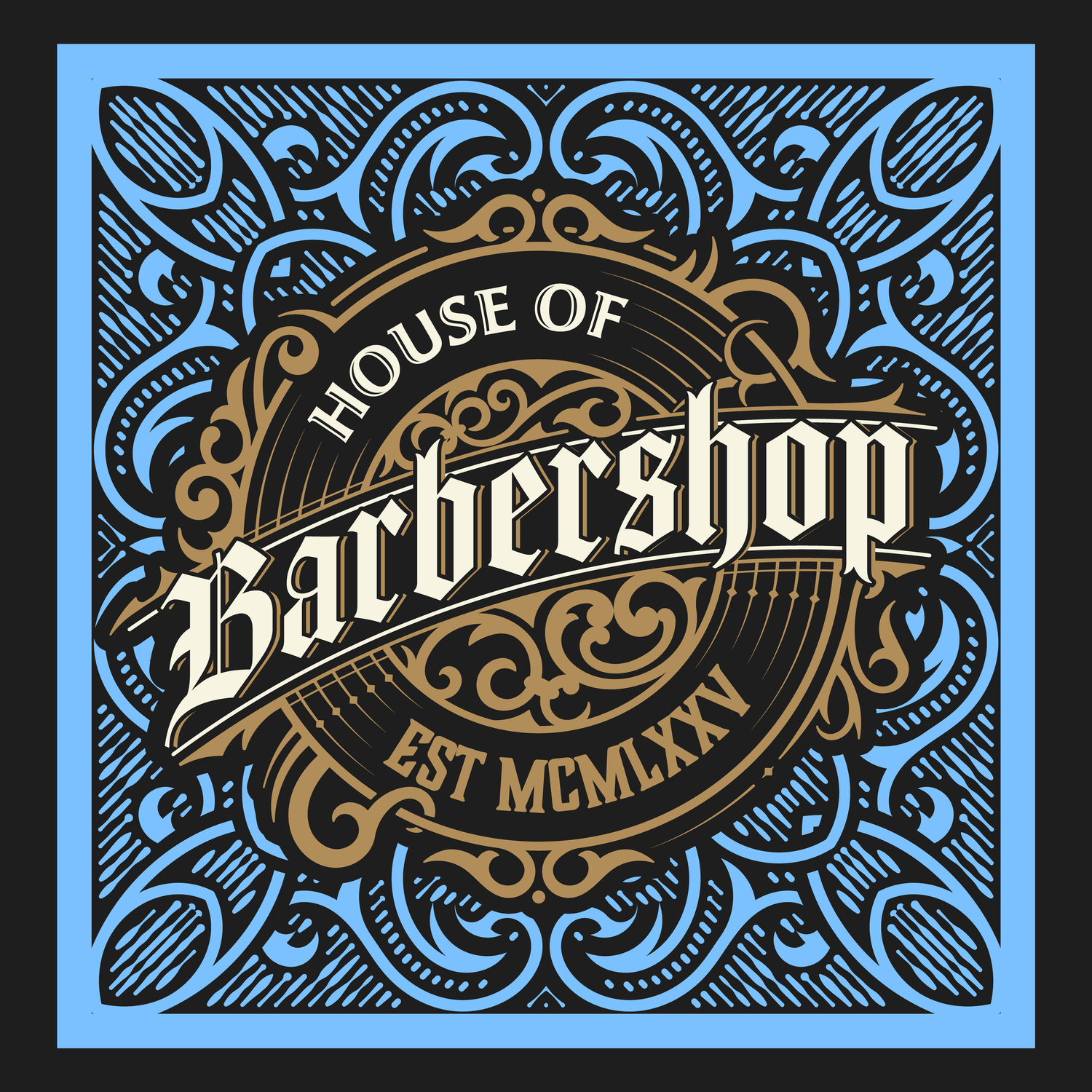
6. Emblems or badge logos
Emblem logos most often look like framed text (sometimes with visual elements.) Emblems can be minimalistic, such as a simple inscription on a colored background. They can also be more complex, with many decorative details. Such logo designs are usually associated with prestige and power and resemble family crests.
In addition, the classic look of emblem logos conveys a sense of professionalism and commitment to tradition. Not surprisingly, they are often chosen by government agencies, universities, and automotive manufacturers. The advantage of emblems is that they are very memorable and help create an image of a reliable company that has been and will be on the market for a long time. At the same time, these logos have drawbacks, as they are less versatile than other options and are not suitable for all types of branding.
Brands with emblem logos: Nissan, Stella Artois, Warner Bros., Harley-Davidson
Choose an Emblem LogoBadge logos examples
Emblem logos are best suited for:
- brands that want to be associated with reliability and trustworthiness. Emblems often include the image of a circle or shield. These shapes create a sense of protection and safety. That’s why emblem logos are a great choice for law firms, banks, and car manufacturers.
- brands with traditions. Emblems are ideal for companies with history that want to emphasize their long presence, commitment to tradition, and high standards. It is also a great way to build audience loyalty.
- brands seeking to create a community. Because emblems have much in common with family crests, they also evoke a sense of kinship. Consider this logo option if you want your customers to feel like they are part of a community.
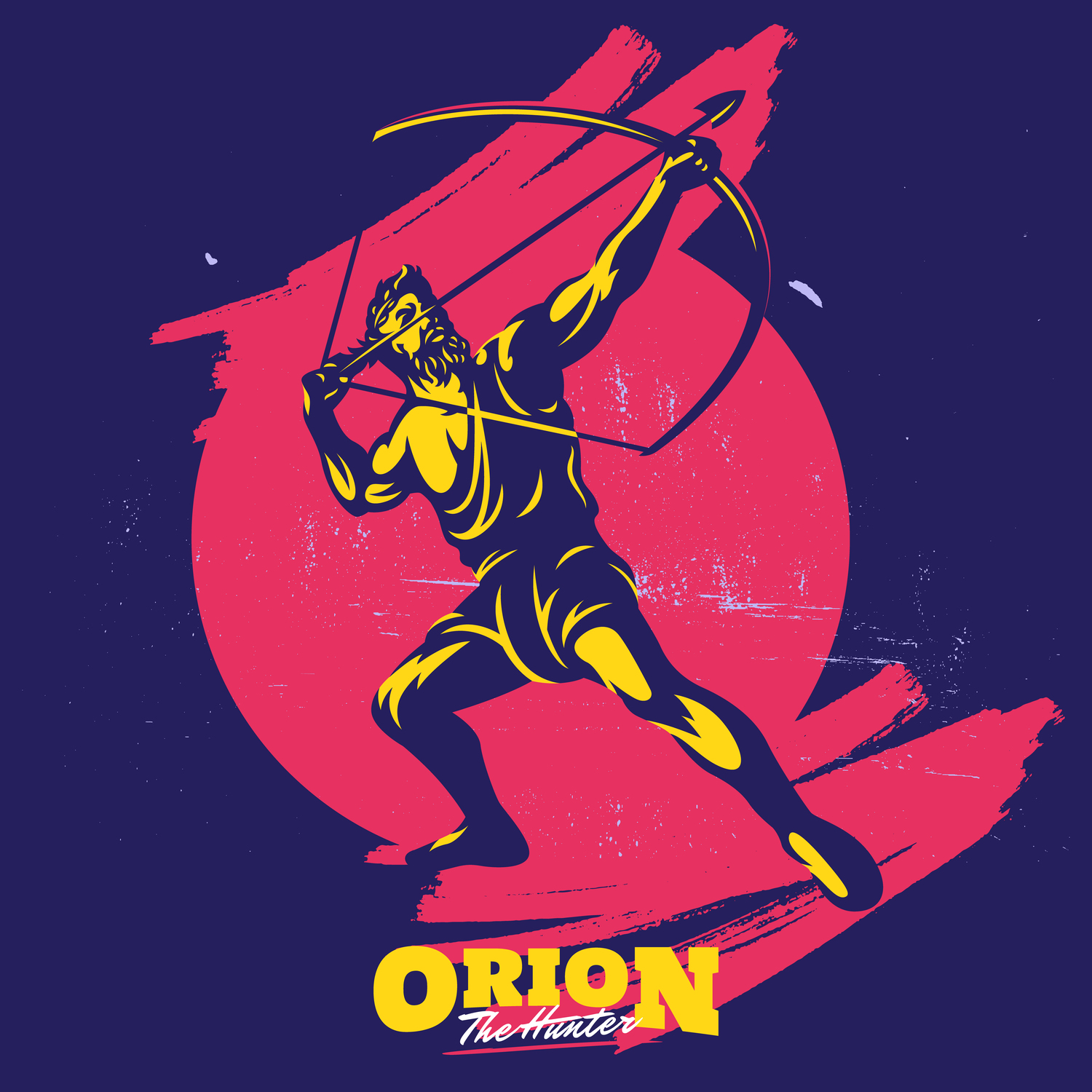
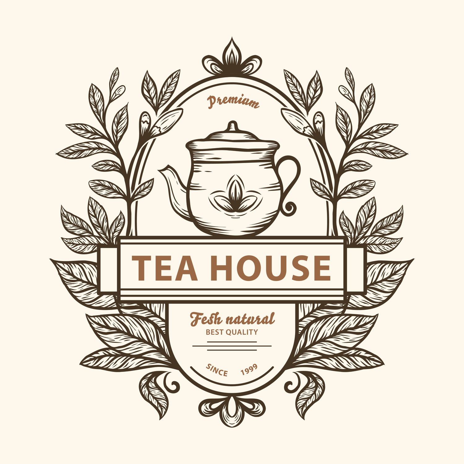
7. Combination logos
The most popular type of logo (chosen by 61% of Fortune 500 companies) are combination logos. They feature both imagery and typography. You can combine any text-based logo with a symbol, abstract, character, or emblem logo. In this case, your typography can be next to your image or an element of it. Here, they work as a whole, complementing each other.
A combination logo is a versatile choice for increasing recognition because it allows viewers to easily remember a brand and associate its name with the brandmark. If the design solution is successful, it is likely that you will be able to use the visual part of your logo separately in the future. Many well-known brands take this approach, using the name or image separately for each communication format or platform.
Brands with combination logos: Burger King, Depositphotos, Adidas, Slack, Red Bull
Choose a Combination LogoCombination logos examples
Combination logos are best suited for:
- new brands. Companies that are just starting out should opt for a combination logo because they have a better chance of being remembered by using two visual cues at once.
- brands looking for a universal solution. Combination logos give you more opportunities to experiment with design. In addition to the aforementioned separate use of text and images, you can easily customize such a logo for different marketing needs.
- brands that strive to maintain consistency. Combination logos help companies make a strong statement. The combination of a name and an image in a logo can help create a consistent brand image.
What are the key characteristics of an effective logo?
As a branding tool, a logo must fulfill certain tasks, which includes attracting audience attention, making a strong impression, strengthening company image, and improving brand loyalty. This can be achieved if all aspects of the logo are carefully considered and it meets the requirements listed below.
1. Simplicity
Since consumers can make decisions in fractions of a second, brands should do their best to keep interactions with their audience simple. This is especially true for logo design. Therefore, the primary task is to ensure that the brand is presented in a clear and accessible manner.
2. Relevance
According to statistics, 42% of consumers believe that a logo helps with understanding the personality of a brand. A relevant logo design that reflects the essence of a business helps create a clear image and gain the trust of an audience.
3. Attractiveness
Of course, a logo should attract attention and enhance brand memorability. That’s why it’s important to take its creation very seriously. The main elements you should consider, besides the logo itself, are color choice and font (if you plan to use text).
4. Versatility
Since a logo is intended for a variety of online and offline formats, it should be easily scalable, meaning it can be scaled up and down without losing quality.
5. Longevity
Since a logo is a visual representation of your business, it is important to choose a solution that will not lose its relevance over time. Of course, future updates are possible and probably inevitable, but if you have a strong design from the start, it can last for decades with only minor changes (the Coca-Cola logo is a good example).
Try our AI Image Upscaler, which lets you double the size of your images and improve quality.

Where can you use a logo?
Consistent use of a logo contributes to successful branding and the creation of a cohesive corporate image. To get the most out of your logo design efforts, make sure it’s present in key channels of interaction with your audience. They include:
- website or blog. A logo on your website and blog helps increase your brand awareness and builds trust. Make sure your design is visible by placing it at the top of your page. Also, don’t forget to customize the site icon so that the logo is visible when multiple tabs are open in the browser.
- business cards. Don’t underestimate the power of business cards. They allow you to connect on a more personal level and make a great first impression. A logo plays an important role here, as the design of your business card reflects your professionalism, as well as the quality of your products or services.
- products and packaging. If you have any doubts about the importance of packaging, just think about how popular unboxing videos are on YouTube. This is a great way to improve customer experience. And placing your logo on packaging is the key to brand recognition, which helps increase loyalty.
- communication with your audience. As a powerful branding tool, your logo should be present in all customer communication formats, including emails, marketing campaigns, advertisements, etc. This will help your audience understand who they are interacting with and increase their trust in you.
- social media. Using your logo on social media allows you to create a cohesive, consistent image of your brand across multiple platforms. That’s why it’s important that your followers see the logo in their feeds every time you post content.
- banners and signs. Outdoor advertising and signage typically attract a lot of attention. If these formats are relevant to your business, be sure to complement them with a logo large enough to be clearly visible.
- merchandise. Branded goods actually provide free advertising. Imagine someone walking around every day with a bag with your logo on it. It’s the perfect way to increase your visibility and build trust with your customers.
Discover our collection with different types of logos. Perhaps this is where you will find the perfect logo for your business.
Browse Collection
To wrap up
It’s no easy task to create a logo that accurately reflects your brand’s character, grabs your audience’s attention, and is easy to remember. It requires a thorough approach with market and audience research and lots of experimentation. Start this journey by choosing a logo that best suits your business. Focus on simplicity, appeal, and versatility, and think about where and how you will use your logo.
FAQ
How many types of logos are there?
There are different classifications of logos. Traditionally, they are divided into three main types: logotypes (text logos), logomarks (graphic logos), and a combination of the two (combination logos). But the most popular is the division into seven types: wordmarks, monograms, symbol logos, abstract logos, character logos, emblem logos, and combination logos.
What are the 5 basic types of logos?
There is also an abbreviated version of the previous classification that divides logos into 5 types: wordmarks, lettermarks, brandmarks, emblems, and combination logos. Not all logos fit into one of these categories. But, they can be seen as a general approach to logo design, rather than as a strict set of restrictions.
How many types of logos should a company have?
It all depends on the specifics of your brand’s business activities and where you plan to use the logo. In general, a strong logo with several variations is sufficient for most companies:
- primary logo. This is the main variation of the logo that represents your brand. All other variations are derived from it.
- secondary logo. This is a simplified version of your primary logo. An example is using text from a combined logo.
- submark. This is a simple and small brand mark. It can contain company name and/or a graphic element.
- favicon. This is the smallest logo in the form of a brand monogram or a small image. It serves as a branded icon on your website.
What types of fonts to use for logos?
Logos use all kinds of fonts. The most common choices are serif or antique fonts (Zara, Tiffany & Co.), sans serif fonts or grotesques (Google, Netflix), and handwritten fonts (Coca-Cola, Barbie). The most popular fonts for logos include Bodoni, Helvetica, and Open Sans.
Why do we choose certain types of colors for logos?
The choice of color in logo design is extremely important because colors appeal to viewer emotions and help set the right mood. According to statistics, 95% of leading brands use one or two colors in their logos. The most popular colors are blue, red, black, and yellow (or gold). Designing a logo in a corporate color can increase brand recognition by 80%.
Other articles that may interest you:
The Key Do’s and Don’ts of Good Logo Design
What Is a Brand Book and Why Do You Need One?
Types of Visuals Every eCommerce Brand Needs
5 Things All Great Podcast Logos Have in Common