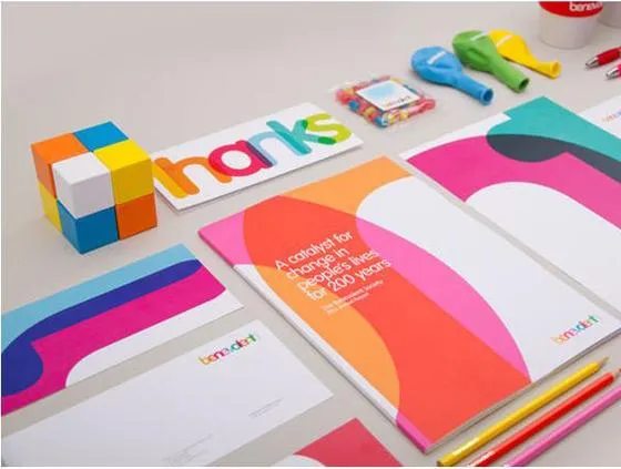
Visual Identity: What You Need to Know to Create One That Will Strengthen Your Brand
Visual identity equals strong brands and vice versa. What does that statement even mean?
Your brand is what your consumers “see” when they interact with you, content, products, social media posts, and email marketing campaigns included. Your visual identity is one of the first things that paint a picture of your brand in a consumer’s mind.
(Source)
As the statement above shows, you need great design, excellent User Experience (UX), and a great product. So, let’s talk about that.
What’s in a brand?
Your brand, as I mentioned in the beginning, is what consumers experience. This experience portrayed to the outside world consists of some elements:
- The core values of your brand. In other words, the beliefs rooted in your brand. These will dictate your actions and the way you present those to the public.
- The tone of voice of your brand. In other words, the way your brand expresses itself. The personality of your brand and the words it uses to convey your core values.
- The visuals of your brand. The look and feel. What a consumer sees, from your typography to the decoration of your brick-and-mortar store.
The above elements are crucial for your brand. They will be discussed and pinpointed while introducing yourself at the beginning of the summary of your marketing plan and before deciding your KPIs or goals.
A brand’s visual identity
Your visual identity can be found in your brand’s visual aspects: the images you use, the typography, colors, and design.
A brand’s visual identity needs to express the brand’s tone and core values. While the elements are relatively easy to pinpoint, the difficulty lies in making them work with your brand tone as a whole, your mission statement, and core brand values.
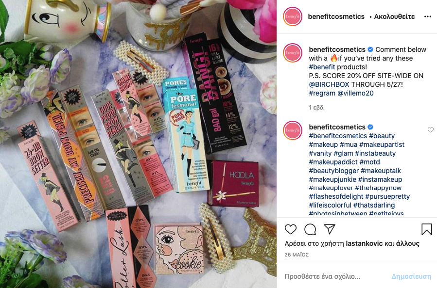
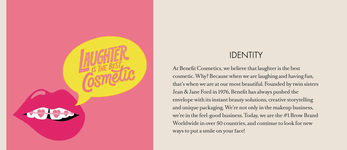
Attracting the right demographics is not a walk in the park, either. Your brand’s visual identity shows the type of personality your brand is going to adopt. An easy-going brand has fun visuals, an edgy brand has edgy visuals, and a serious brand’s visuals show that they mean business. A great visual identity example is that of Benefit cosmetics:
(Source)
This brand has a youthful target audience that uses cosmetic products to express themselves and have fun while doing it.
Here’s the brand’s mission statement:
(Source)
The visuals inform the consumer that this brand’s core values aim to give the consumer a happy, pleasurable experience.
A brand needs a clear, concise, and memorable visual identity for the following reasons:
- It can help consumers remember your brand and recognize it.
- Your visuals can portray how your products are meant to be used and how people feel while using them.
- They need to attract the attention of the right prospects, aka those who coincide with your buyer personas.
How is a visual identity different from branding?
It might be difficult to distinguish between branding and visual identity, as most use those terms interchangeably. While one won’t work without the other, as branding can encompass the visual identity of a brand, it’s good to define those terms and understand the differences.
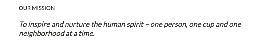
Branding encompasses the actions that evoke a specific feeling amongst consumers. Branding is the experience a consumer has with a product or service. When one visits Starbucks, they expect a calm and relaxing environment, excellent service, and quality products. The way Starbucks has portrayed its personality to its target audience since day one hasn’t changed:
(Source)
A brand’s visual identity creates this atmosphere from the colors and fonts to the logos and everything a brand creates for its website, and preferred social media platforms.
Branding is an abstract concept that has to do with the audience of said brand. A visual identity is a solid idea of the way the brand itself is supposed to look.
The person analogy in visual identity
Visual identity is like a person’s appearance. It is meant to express a specific set of visual characteristics that will attract the right crowd-all the more reason to build your visual identity in a way that will be on par with your buyer persona’s appearance.
What is your ideal customer’s appearance? What are their favorite fabrics, what colors do they love? Do they wear their hair in a strict updo? Are they more “urban” and colorful? A person’s look creates first impressions. The same principle applies to your brand.
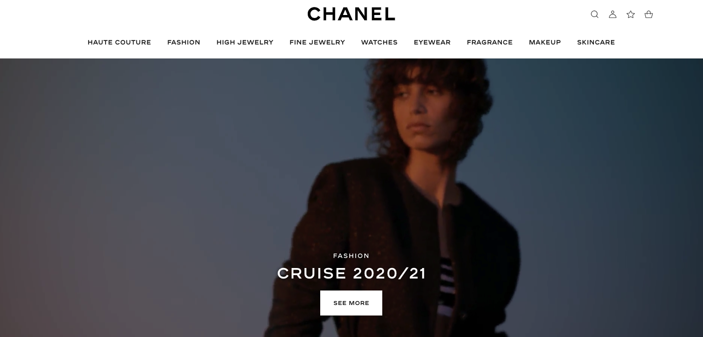
A great example would come from an exclusive fashion brand like Chanel. Their audience is elegant, and their appearance is classic, classy, and frequently minimalistic. If you take a look at Chanel’s website, this is reflected on the visuals:
(Source)
There is no flash of colors, nothing too extravagant, bold typography, and a simple website design that makes a statement, much like their buyers’ aesthetic.
Take a look at Chanel’s muses through the years if you want to take it a step further. The colors and clothes are always simple, and bold jewelry makes all the difference if need be. If your “muse” wouldn’t wear hot pink, your website doesn’t need it in its visuals. If they’re a graffiti artist inspired by the 80s aesthetic, you need all the color and funk you can get.
What components should you take into account?
Following the above example, let’s see what will make your visual identity look like your ideal customer’s appearance.
Your audience and core Values
Since your brand’s visual identity is a tangible concept, you’ll need to base it on solid ground. You can do that if you find the connection between your audience and your own brand culture. Your mission statement will help you create your business’ “appearance,” one that will express your values.
Research your audience by investing in some AI technology. It will allow you to create micro-segments and buyer personas that will correspond to your core values on a one-on-one basis. Your data will reveal the patterns that show how your prospects interact with your brand. The pieces of information you’ll find in there will show you how to present your brand across your audience visually, especially if it’s diverse in terms of age, gender, education, or income.
Your data will allow you to decide the way your visuals will speak to your audience and how your efforts reflect your values. Thus, you’ll minimize the chance of prospects forgetting your content. And this is a high chance, as 80% of your audience most likely will.
Your competitors and good research
If you’re in a phase where you’re just creating your visual identity, it’s safe to assume that you know what you offer, but your audience doesn’t – yet.
Your competitive analysis and research come into play at this point. Take a look at your competitors’ “appearance.” That will give you excellent visual inspiration in terms of design and your own Unique Selling Proposition (USP).
The more you study your competition, the easier it will be for you to find the gap you can cover with your product. Apply the same logic you’d apply for a complete competitive analysis. Only this time, instead of comparing metrics, compare your visual identity with your competitors’.
Do they use current trends? Does the audience like to engage and interact with current trends? What is the content on their Instagram marketing page? Are all their social media pages on par with that? Is their content unanimous in their emails as well? Check the way competitors’ audiences engage with their brands on social media. Are they asking for something more interactive? Here’s your chance to shine. Are they pro-dark colors and aesthetics? Create that to attract attention.
The storytelling component
The visual elements in a visual identity tell the audience some kind of story that your audience can trace back to your values.
Would you trust a law firm with a comic sans purple logo or a Times New Roman, dark blue (for mental agility), or black (for structure) logo? The challenging thing about storytelling in visual identity is the visual aspect itself. How do you present your USP without words? With emotion.
Create visuals that will reflect your own story. Be climactic wherever needed and subtle wherever possible. Your visuals will aid wherever words fail.
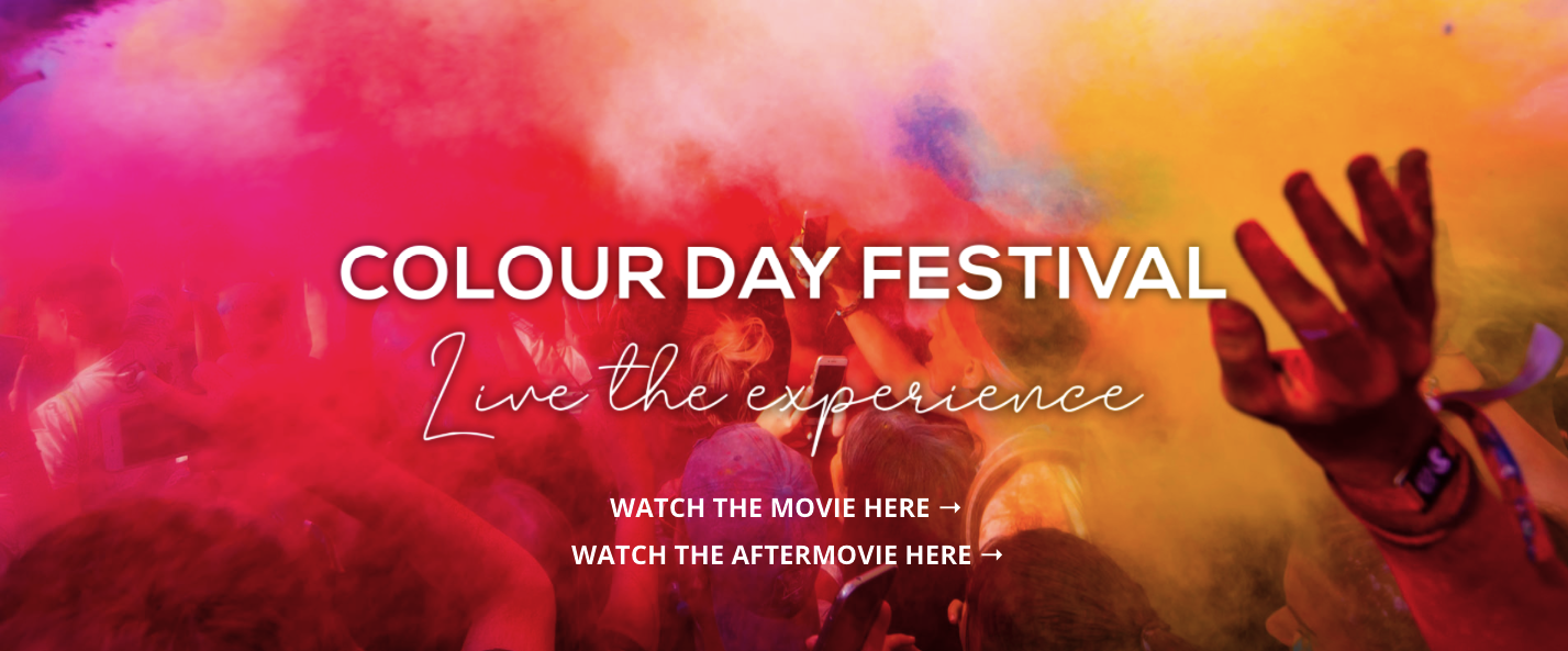
(Source)
A writer wouldn’t be able to put the above picture into words. The pure excitement the bright colors create is essential to a brand like the Colour Day Festival, a type of emotion that pure words cannot portray.
Images associate feelings and words with your brand. Designing with your brand’s story in mind and creating different images that portray your core values leads to an emotional climax that makes a brand’s visual identity memorable.
Your tone of voice
Your tone of voice needs to be evident across your visuals and express your brand values. You can make assumptions about the way a person talks by their appearance. And a person’s voice is theirs and theirs alone.
The same goes for brands. The tone of voice needs to be evident across everything from visuals to the website, trace back to the product itself, and feel like it’s the same for everything. Uniformity makes brands trustworthy and memorable.
(Source)
A consistent tone of voice doesn’t equal a non-changing one. Everyone’s tone changes according to the situation. A brand’s tone should as well, according to the function the message is supposed to complete, the audience it refers to, and the platform-social media or otherwise-used at that specific moment.
Visual identity and user experience
A strong visual identity is detrimental to another essential component: User Experience (UX). A brand’s interface needs to reflect the brand message and values.
Every interaction and element needs to be tied in with the visual identity perfectly. However, you’ll need some smart UX design to hit the right spot. Prospects presented with bad UX won’t appreciate the brand. And since the brand identity is what prospects perceive, those two are tied.
Use UX to Your Advantage
Colors and color psychology can influence a user’s experience even before they get to experience a brand. You need colors, images, and gradients that will be able to convey your message.
Color psychology is a crucial component of the user’s experience. Use a two-color scheme and make sure that it’s the correct one for your business. Here are some basics to remember: Use blue for trust and balance, green for calmness and prosperity, red for power and attention, or black for authority and structure.
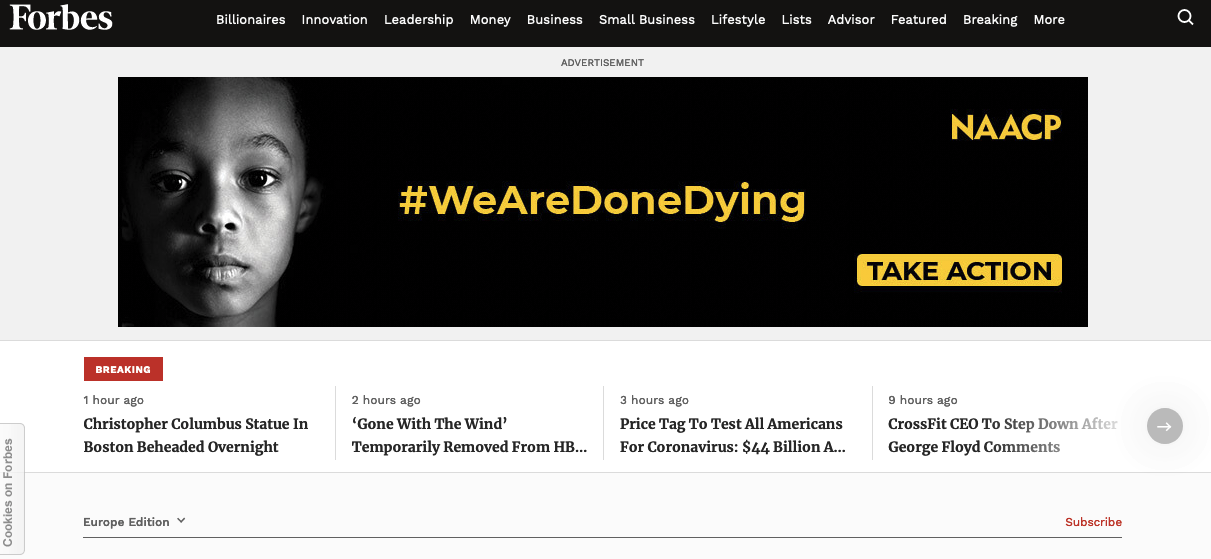
(Source)
Forbes, for example, is a publication that talks business. Its color scheme is black-and-white: authority, structure, and contrast.
Another part of your UX is your logo. You need something memorable that you can change when the time is right. Combine your values, core colors, and design elements to create it.
As far as the overall experience is concerned, your font is just as important. A SaaS company can’t use the same font as a tourist organization, as one is related to technology, and the other is tied to experiences.
While technology can be exciting, it can’t offer the same type of experience. This type of difference needs to be reflected in the UX design as well.
Consult your customers
Knowing what to say and creating the perfect UX can be achieved if you listen to your customers. Create NPS surveys and consult your live chat. Get your audience’s feedback and use it to your advantage. Feedback will give the prospects a sense of belonging and will create an image of a brand they can trust, both as customers and as potential ambassadors.
Another thing you should keep in mind when it comes to UX design would be loading times. Ask your audience how they feel about your website. Maybe it makes their computer crash while loading. Is it slow or unresponsive? Here are the effects of falling into the trap of not adapting your visual identity to your UX:
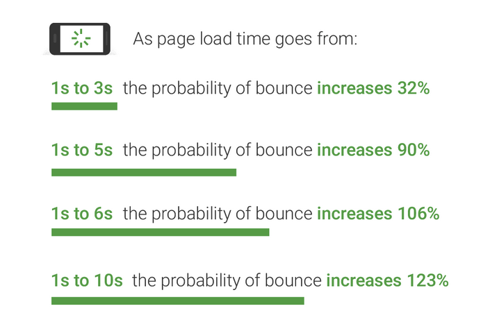
(Source)
Prospects bouncing off your page doesn’t equal a memorable experience or a strong brand.
UX writing can boost visuals
As a writer, I couldn’t leave this essential component out of the equation. UX writing is a small copy that will guide the users through a product. So, CTA buttons, information that appears as you hover over a link or a word, error messages, and T&C’s.
A strong brand with a memorable visual identity needs UX writing for the following reasons:
- It makes the brand memorable by shifting the attention to words and keeping users engaged.
- Actionable writing gives direction to those interacting with your brand.
- It can bring the visuals to life, making people pay more attention to what they see by providing them with a little information.
Of course, a “talking” UI that creates a fantastic UX needs to fall under the general umbrella of an excellent brand tone.
Brands that need no introduction
Consumers purchase off brands they recognize. We’ll take a look at brands that need no introduction and how they managed to claim that spot in their niche.
1. Casper
Casper is the brand that turned a strange concept into an undeniable reality. An eCommerce store that sells mattresses isn’t something one sees every day.
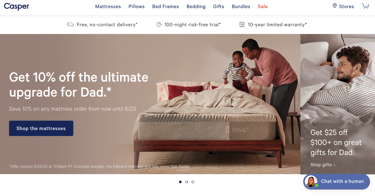
(Source)
Its visual identity is one of the strongest ones, as it’s calm, bright, and soothing at the same time, bringing a sense of comfort and relaxation. Bold typography with smooth blues and soothing family pictures, paired with great micro-copy, do the brand tone justice in just the right way.
And one last thing: See how the only thing that differs is the “Sale” button in bright red?
2. Apple
It’s hard to find a brand with a stronger visual identity than Apple. Its elegant visuals, neutral colors, and bold images are prominent everywhere, from Apple stores to its social media and website.
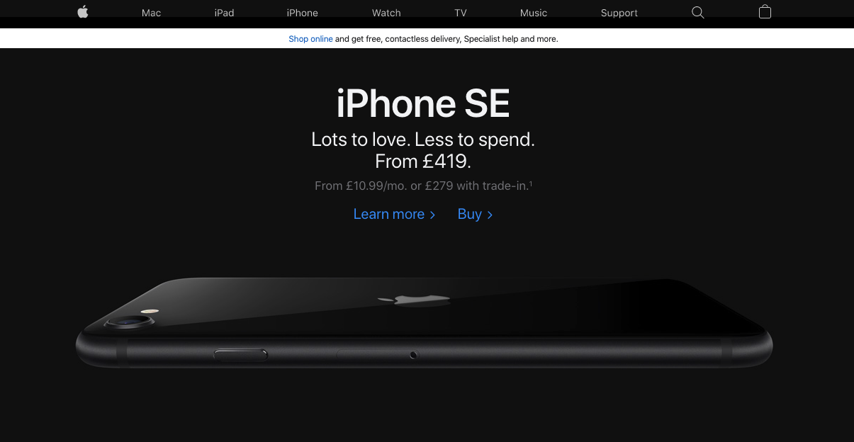
(Source)
The tone is simple, no-fuss, and speaks to those that are sure of what they need from a brand: to do more in a non-complicated manner.
3. Coca-Cola
Another brand with a powerful visual identity, Coca-Cola is one of the most recognizable trademarks from the late-19th century, onwards. Its identity is so strong that the “Share a Coke” campaign was the predecessor of the hyper-personalization trend we see today in every marketing aspect.
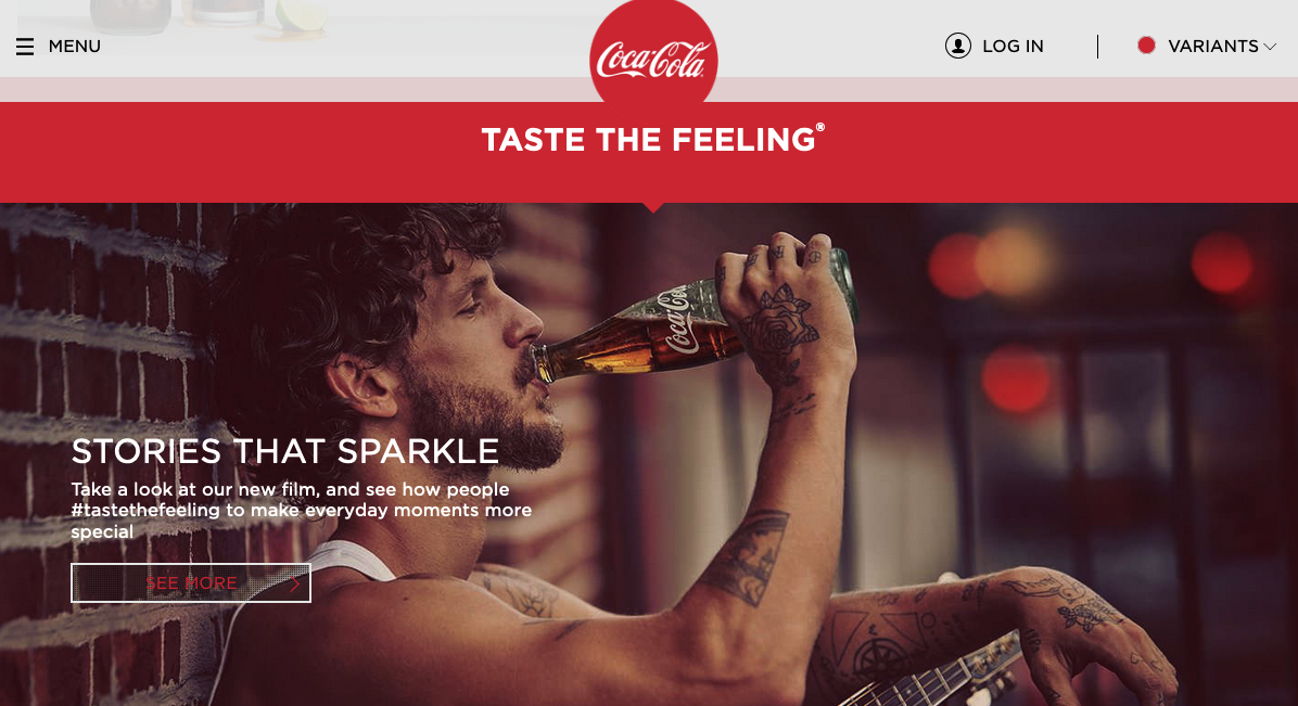
(Source)
Coca-Cola uses red everywhere, to exude confidence and hasn’t changed the logo or the typeface ever. It’s all about enjoyment and refreshment-exactly what a soft drink needs to provide to the consumer.
4. Little Wolf
The name could bring a cartoon to the consumer’s mind, which is what the coffee roaster has created and used.
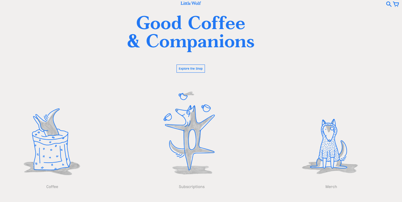
(Source)
Its visual identity revolves around the little cartoon-like wolf illustrated on the website, printed on the cups and merch of the brand, and found across its social media. The blue-and-white color palette evokes feelings of calmness, happiness, and mental activity, making the consumer feel both awake and at home.
Now What?
Understanding how to create a strong brand identity is vital when it comes to creating its own visual identity. The elements you’ll use need to be well-thought-out, well-researched, and matching through all platforms of your digital presence, from a welcome message to your own Instagram account. Research the colors that will work in your favor and pass your message on to your consumers. Create clear and actionable microcopy that will complement your visual. Lastly, your typography and logo need to express your own story.
After all, what brand doesn’t want their logo to be as well-known as Coca-Cola’s?
Your visual identity will be strong and will strengthen your brand by telling your own brand’s story.