How To Create A Beautiful and Captivating Email Newsletter
Article by Artem Chekhovskoi from UniSender.
We have compiled, carefully analyzed the latest trends and selected the most relevant features in email newsletter design in 2019. For each section of this article, we have picked up examples of real letters from our mailboxes and added ideas on how best to implement these trends.
1. Personalization
Personalization is very useful, but only if it goes beyond the name of the subscriber. It is not enough to only contact the user by their first or full name. To make this more effective, you need to dig deeper. Find out the needs, hobbies or position of the subscriber to appeal to them.
To get this information, look at the clicks from the email, create a newsletter with the appropriate survey or collect preference data from the subscription form. After that, segment the database and send relevant information with offers that are really useful for individuals and not the masses.
Cosmetics store example
In this case, we notice that a client often looks through a catalog of skincare products. The client comes to this group of products from the initial email. The solution here is to send the subscriber the latest and most appealing offers related to these products. You should not offer decorative cosmetics, which would likely interest him or her less.
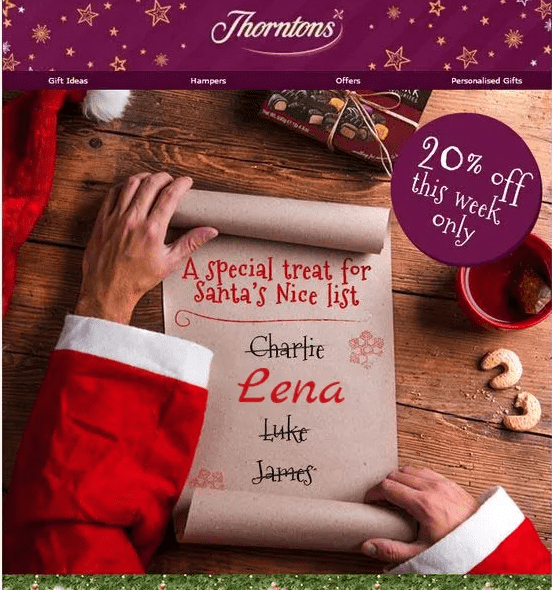
Another personalization idea is images with the name of the subscriber. You can easily create this with NiftyImage.
2. Responsive design
According to Litmus, 42% of emails in 2019 were viewed from mobile phones. Therefore, the responsive design of the newsletter is very, very important. Before sending emails to subscribers, check how adequately and conveniently they are displayed on all types of devices. Keep the following in mind:
- the text is clearly visible and does not go beyond the screen
- images load quickly and adjust to the width of the smartphone
- all buttons are easy to click.
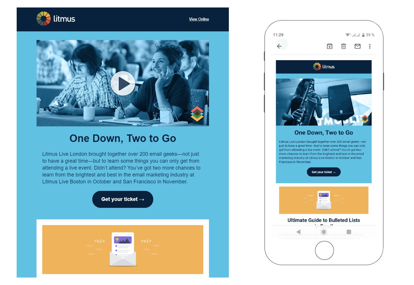
For example, Litmus fully adapts emails to all devices. They are convenient to view from both phone and desktop.
It’s better if you carry out this action in reverse. Firstly, develop and improve the mobile version of the newsletter, and then the desktop version. In block editors, on the contrary, it is better to start with the desktop version (mobile will be adaptive by default).
Do not forget about the capabilities of smartphones. Add calls to action to your newsletters like “Order a call” or “Call me back”.
We’ve covered how to make a responsive email, even if you are not a template designer.
3. Interactivity
Interactive emails contain dynamic elements such as hamburger menus, accordions and sometimes whole mini-games. This approach helps draw attention to the email and make it unique.
Here are some examples of interactive newsletters:
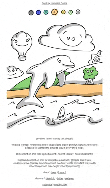
Colouring book in email format from Tabletrtd.
Be sure to check that the interactive layouts work with different email providers — a lot depends on what technologies they use. You can carry out this check through Litmus or Email On Acid.
4. GIF animation
GIF animation gives marketer more options:
- show the product in action
- rotate the product so that the subscriber sees it from different angles
- help create a stylish and unusual design
Below are some examples of emails with animations:
Be careful to not overdo it. The GIF-animation should not completely distract the reader. What you offer and why the client needs it should be evident first and foremost.
5. Vector animation
To avoid the loss of quality that inevitably occurs when animating raster graphics, use simple and light vector images. You will definitely not have problems with these since they load quickly.
You can create vector images by yourself in Adobe Illustrator or search for them on sites with stock illustrations.
6. Microsite emails
Microsite emails are convenient for the user because they can buy goods directly from email without going to the site.
Instead of reading the text, the reader immediately looks at the catalog of goods or services. These microsites are relevant to use in situations where users add products to the shopping cart but hadn’t bought them yet.
An animated example of how it happens in action:
The ability to create microsite emails was a possibility only in 2019, thanks to the introduction of AMP technology. With microsite emails, you can create polls, games, catalogs and other interactive elements in letters.
Read more about AMP in the following articles:
- Google documentation
- AMP Playground
- Send yourself an AMP letter to look at various interactive elements
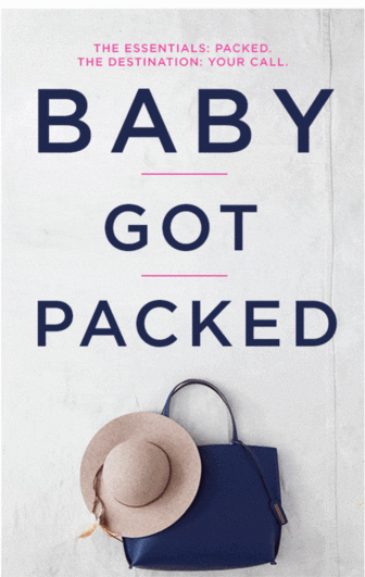
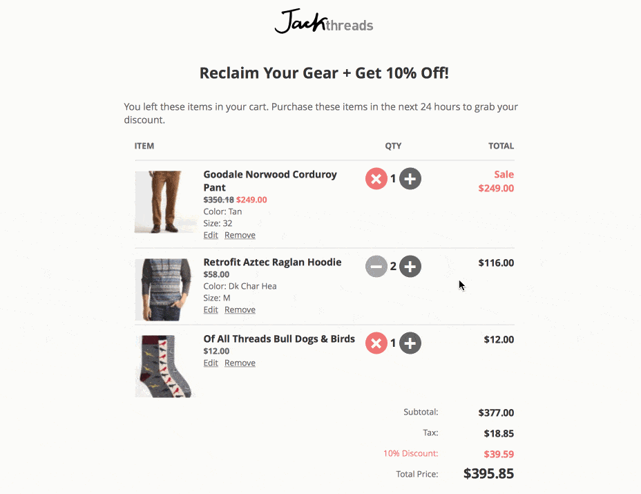
7. Short and informative text, on-point images
An average office worker receives about 121 emails per day. To stand out among other newsletters, you need to compose clear texts with a convincing call to action and simple, nice-looking pictures that complement the text.
The quicker and more frequent responses are given to emails with a small amount of words. Sometimes, a single sentence is enough.
The essence of the email is clear thanks to just 3 lines of text.
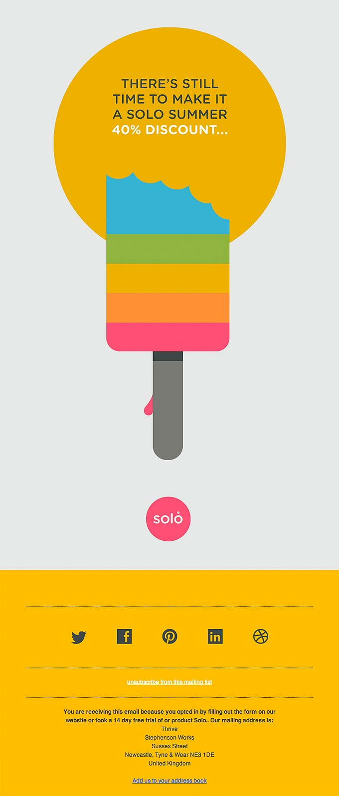
Solo’s authors say it’s not too late to get a discount.
8. Embedded videos
You’d be surprised, but today many clients do not support video streaming. However, marketers have found a way out of this situation. They show just one frame from the video and put a “Play” icon on it.
According to Syndacast, mentioning “Video” in an email subject line boosts open rates by 19%, and click-through rates by 65%.
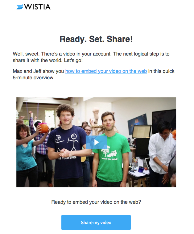
Wistia knows a lot about video and often add it to emails.
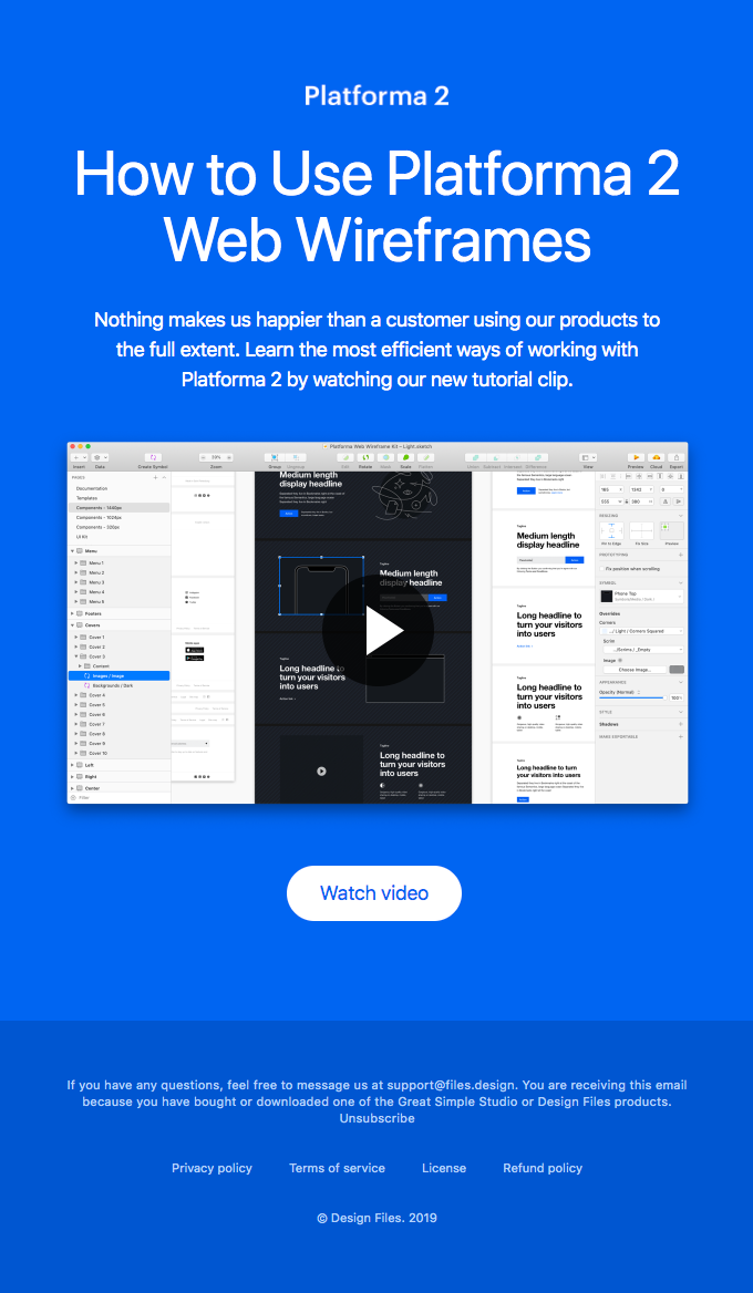
DesignFiles has an entire email dedicated to just one video.
9. Minigames
For even more user engagement, small games can be integrated into the email. Previously, they were made only using HTML and CSS (below are a few examples). With the advent of AMP, making interactive games became even easier.
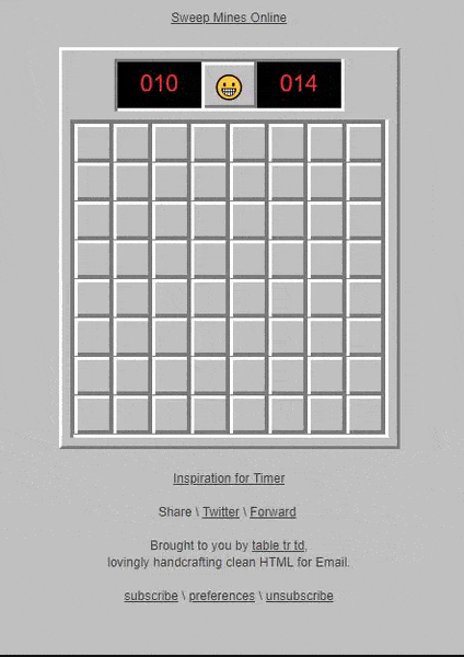
For example, in an email from Tabletrtd you can play Sapper.
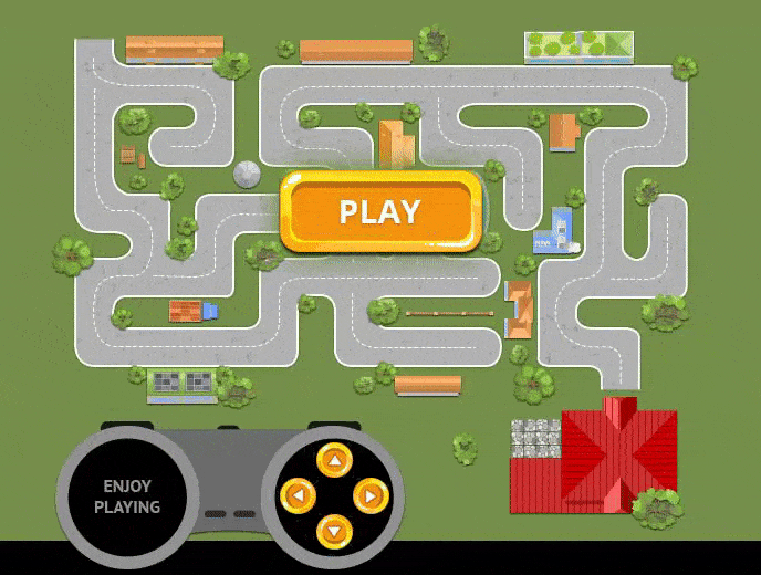
EmailMonks added a game in which you help Alex get home. Try it in your browser.
10. Bright saturated colors
Vivid colors help to capture user attention and focus on important elements. The use of saturated colors helps structure the content and of course make the email more original.
According to Canva designers, the most popular colors this year are coral, electric yellows, pink and lime green. They can often be found in outdoor advertising and on the Internet.
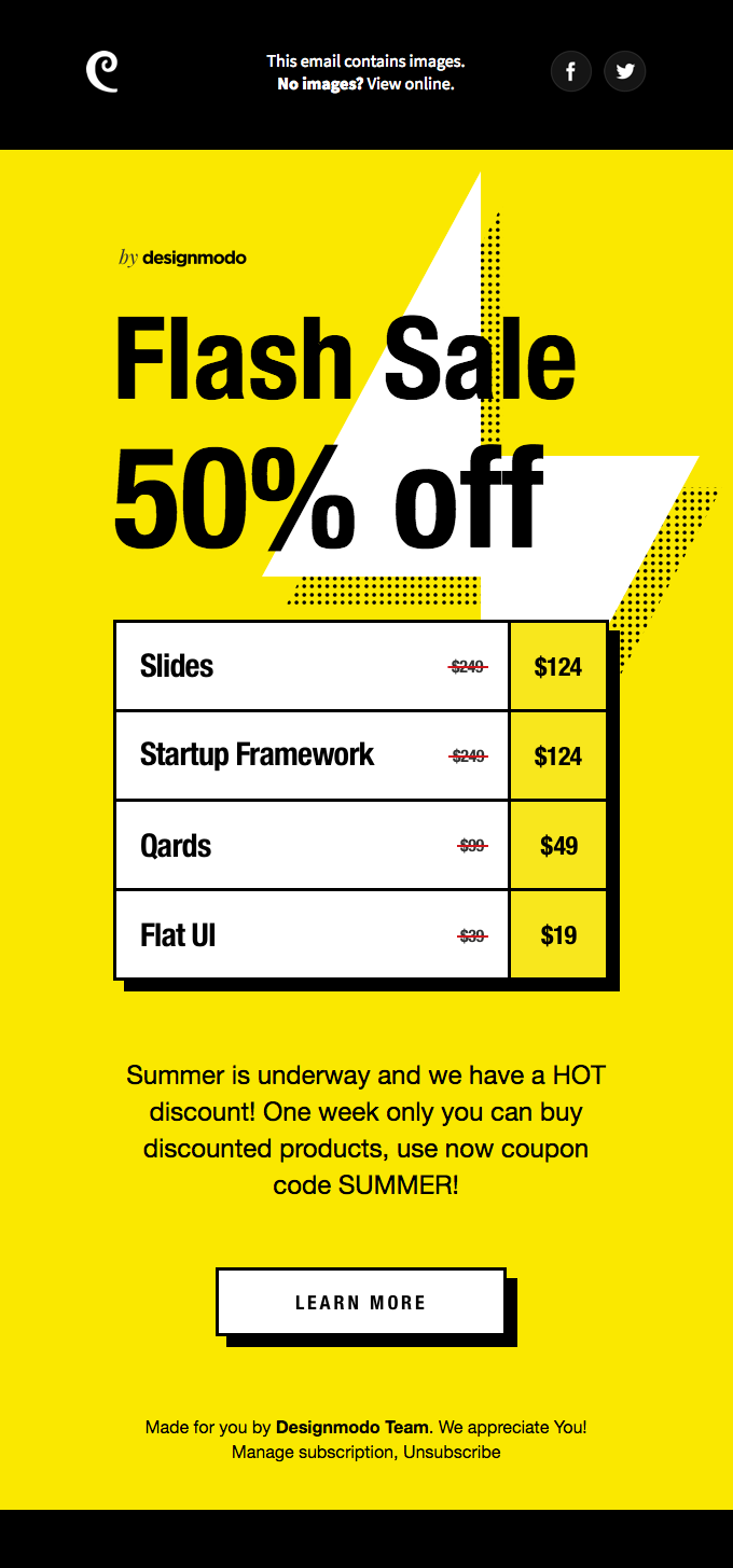
Email from DesignModo about their discounts.
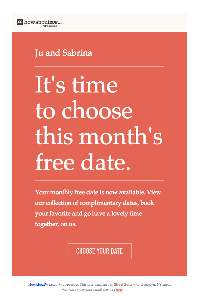
How About We use a coral background in emails.
11. Minimalism
Minimalism helps create stylish and effective emails. Thanks to minimalist pictures, fonts and decorative elements, a user’s attention is not scattered. They immediately plunge into the essence of the message.
A small header, short text, and call-to-action. Nothing extra.
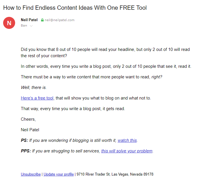
Recently companies have deliberately moved away from HTML templates to sending regular text messages. Most often, this approach is found in B2B but there are some exceptions.
Here is an example of a marketer, Neil Patel, who sends only text emails:
Conclusion
Finally, we can attest to the fact that improving the design of email newsletters and following current trends is effective.
However, do not focus only on design. This is because the success of the content strategy depends on several factors such as automation, the technical part, segmentation, and analytics.
Give readers what they want – interesting and useful emails that are pleasant and comfortable to read.