Email Visuals that Convert: What to Choose and Where to Find Them
Email design is more than just appealing colors and a well-designed layout—it’s also about the visuals you choose. A good image can grab attention, spark emotion, and motivate your recipients to click, while a poor one can disconnect or confuse them. But what makes email visuals effective? And where do you find high-quality images that match your goals?
In this article, we’ll expand on the types of email visuals that drive engagement, compare good and poor image choices (examples included), and share some tips on where to find compelling visuals for newsletters without slowing down your workflow.
Visual types that drive engagement
Sometimes, when you look at an email and it just feels right, it’s often because of the well-thought-out image choices. Let’s explore what works best and which visual types drive consistent engagement:
1. Hero banners
A hero banner is a large, eye-catching image (static or dynamic) at the top of an email. These images are often the first thing subscribers see in your email, making them great for setting the tone, storytelling, or highlighting a campaign. Whether you want to announce a seasonal sale or showcase a new feature, hero banners with top-quality images and eye-catching text will spark curiosity and evoke emotions.
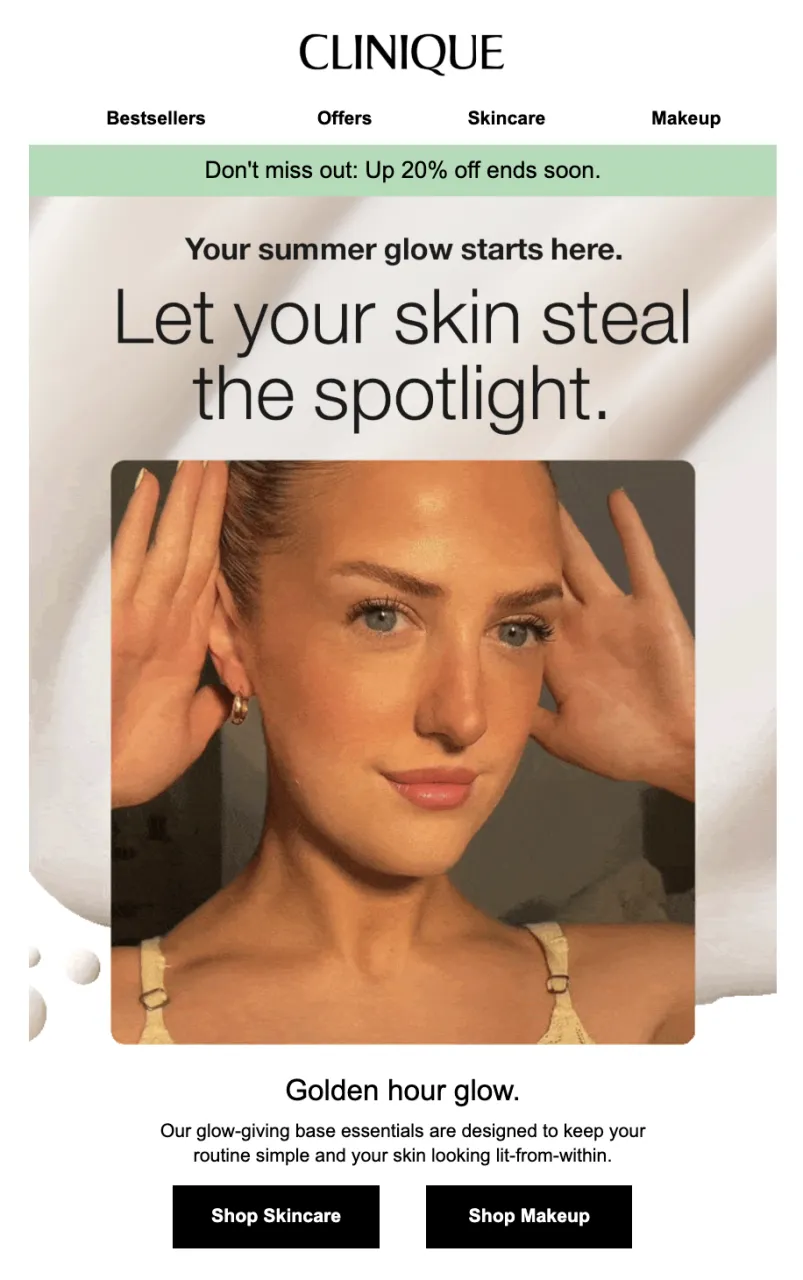
Source: Email from Clinique UK
2. Product shots
Your products drive your business and make your emails stand out in crowded inboxes. High-quality, clear images with clean or branded backgrounds that focus on the item you’re promoting will help you convert better and showcase your offers. This type of visual works best for e-commerce emails, product launches, and back-in-stock updates.
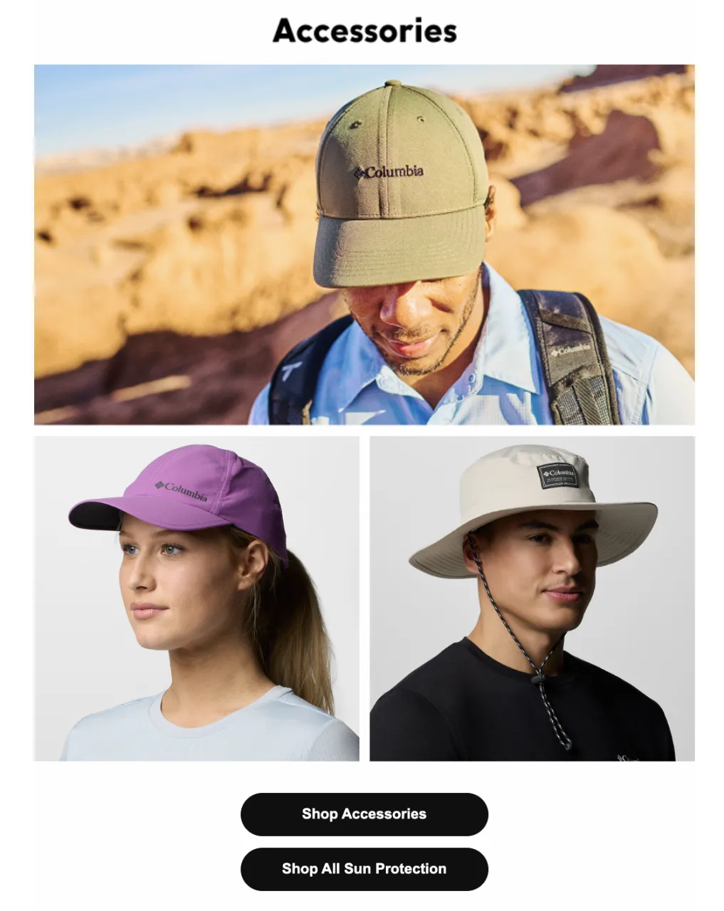
Source: Email from Columbia
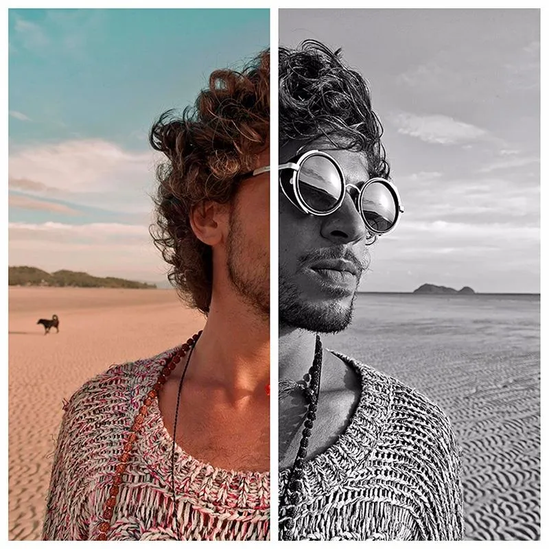
3. Lifestyle photos
If you have photos of people using your products in real life, they’re a great way to strengthen relationships with your subscribers and build relevance. Such visuals will help recipients picture themselves using your products in everyday activities and humanize your newsletters, making them more relatable.
Source: Email Love
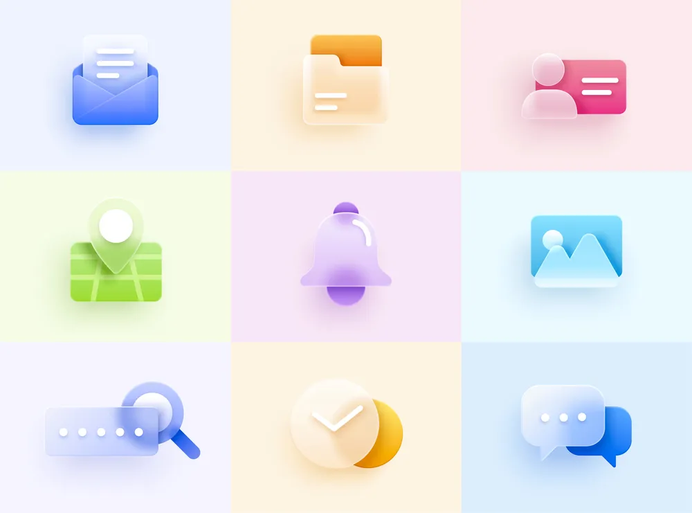
4. Icons and illustrations
If your emails require visualizing data, making complex concepts easier, or showing subscribers how to use your products or services for maximum results, custom icons and illustrations can be game changers for you. They are particularly useful for quick visual explanations, how-to guides, regular reports, or onboarding sequences. Such visuals don’t need a lot of email space and make your newsletter feel structured and polished.
![]()
Source: Email Love
Good vs. poor image choices (with examples)
Even a well-designed email can feel off due to low-quality or overused stock images, a lack of mobile optimization, and inconsistent styles. Let’s find out which email images drive conversions and which ones get ignored.
Email image essentials: What works best
1. High-res images: Top-notch images highlight your professionalism and show that you invest time and effort into your emails, while blurry visuals can ruin even the most tempting offer. Remember to always test your newsletters across multiple email clients and devices before sending.
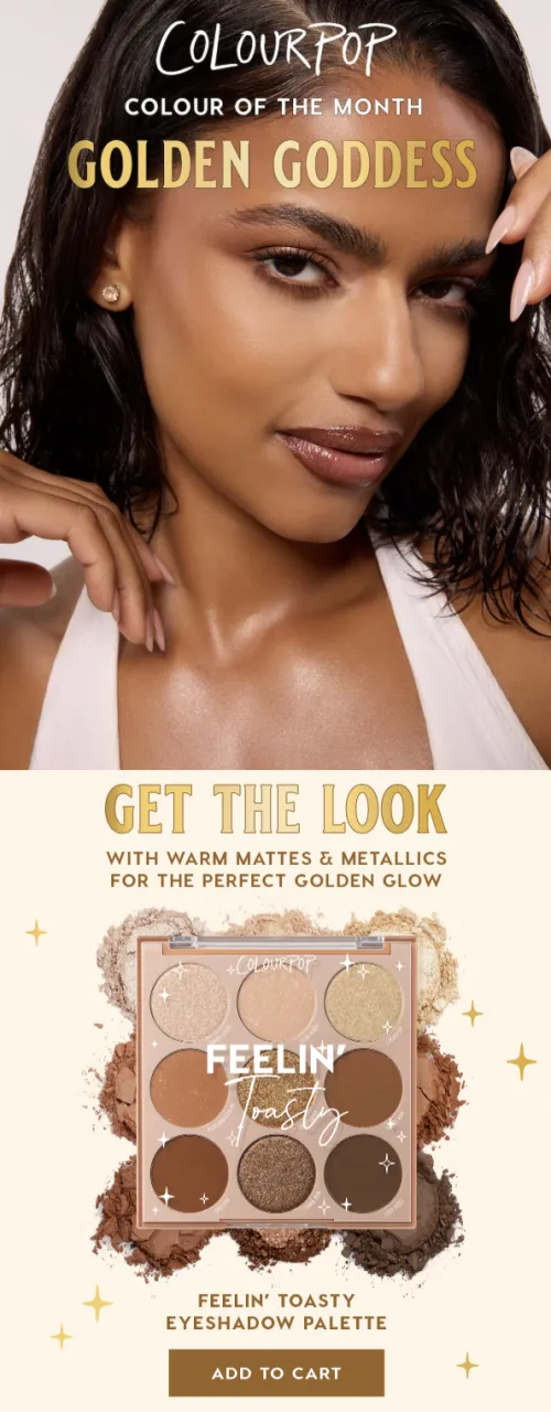
Source: Email from ColourPop Cosmetics
2. Emotional appeal: Emails are not all about promo and discounts—your content should evoke emotions that align with your brand and message. Such an approach can strengthen relationships with your target audience and boost engagement. For example, a cozy family image will inspire action in a Mother’s Day campaign, while bold and vivid visuals can be a perfect match for your flash sale.

Source: Email from Outdoorsy
3. Mobile optimization: Did you know that email opens from mobile devices vary from 26% to 78%, depending on your recipients and the services you provide, making responsive design a must-have? Even the most well-thought-out email layout can break if an image contains illegible text on smaller screens or gets cut off. You can opt for tools that let you preview emails for various devices or design your newsletters in builders that provide responsive email templates.
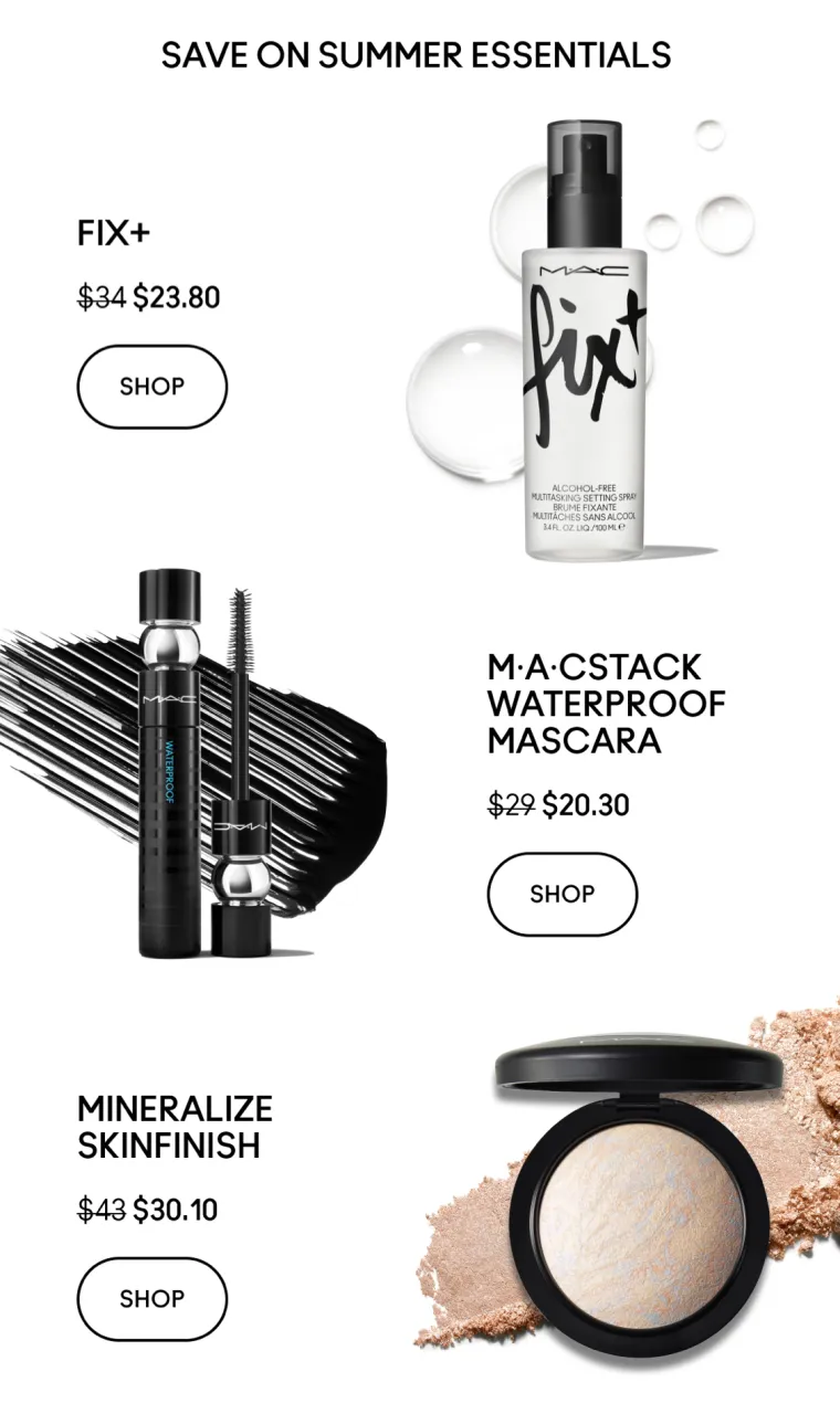
Source: Email from MAC Cosmetics
4. Brand consistency: Subscribers should recognize emails from your brand in their cluttered inboxes even before reading any copy. It’s vital to establish visual elements that make you stand out and stick to them across your email campaigns—a brand color scheme, a distinctive illustration style, unique characters for storytelling, or custom icons will help you build trust over time.
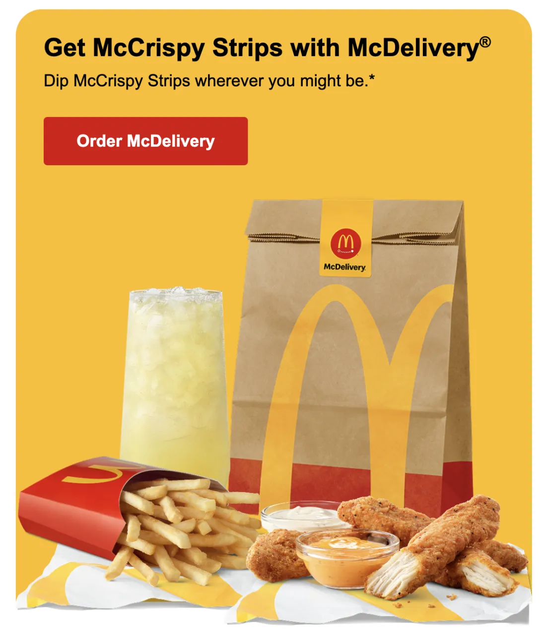
Source: Email from McDonald’s
Mistakes to avoid while choosing email visuals
- Overused stock images: Imagine a subscriber opening an email from a brand they trust and seeing an image from dozens of other websites or newsletters, like an office worker wearing a headset or hands on a laptop. Such visuals are often irrelevant, look like cliches, and can reduce credibility. Opt for stock images that feel authentic or choose curated collections.
- Poor-quality images: A pixelated image shows subscribers that you didn’t polish your email before sending, were inattentive to details, and launched your campaign in a rush, leading to lower conversions and engagement. It’s always a good idea to double-check your image size and resolution, and test a newsletter across different devices and email clients.
- Inconsistent styles: Even though surprising your subscribers may be beneficial, combining completely different styles (e.g., 3D illustrations and minimalist icons) will make your newsletter look chaotic and cluttered. It’s better to perceive email images like brand extensions and make sure they look consistent and align with your overall message.
- Irrelevant visuals: Images that don’t match the main message of your email can confuse subscribers and divert their attention from an action you want them to take. For example, if you wanted to make your email with tech updates more relaxing and chose a beach photo for this, it would look disconnected and confusing. Always double-check whether your visuals support the recipients’ expectations from other email elements, such as a subject line, calls to action, and copy.
Where to find high-quality, authentic visuals
Now that you know which visual types drive conversions and which images to choose for your next email campaign, it’s time to find these visuals without spending a lot of time digging through irrelevant or low-quality options. So, where should you start?
Common methods
- Google Images: This method might seem tempting, as it doesn’t require a lot of time and effort to enter a few keywords before finding a relevant image. But even if they are high-quality and align with your email message, most of these images are copyrighted, and if you use them without the owner’s permission, you will cause your brand legal issues.
- Free stock sites: With this method, you don’t have to worry about legal risks, but free stock sites come with limitations like overused images, which we mentioned above, and a lack of style consistency. It may be a good idea for startups with tight budgets or as references for a designer, but when you build a long-term brand image, your visuals should be unique and recognizable.
- Designers and photographers: Custom imagery from designers can be a perfect option—unique and on-brand content aligned with your goals and message. But still, this approach can be time-consuming and expensive if you often send emails like time-sensitive discounts or daily newsletters.
Smarter alternatives
- Depositphotos with curated collections: With access to 315 million files, including royalty-free photos, illustrations, and collections, you can always find appealing and top-quality images for any industry. Collections include the latest web design and color trends, making this approach great for fresh and relevant imagery.
- Depositphotos x Stripo: If you are looking for an email template builder to speed up your design process, Stripo might be a good option for you, as new users get access to the Depositphotos collection through 50 premium image downloads. You can search for visuals and add them to your email templates without leaving the editor, making the email design process much faster.
Wrapping up
Your subscribers receive dozens of promo emails per day, so it’s important to strengthen your email content with relevant and high-quality visuals. After all, you want to enhance conversions and grab your recipients’ attention. Images like hero banners, lifestyle photos, product shots, illustrations, and icons tailored to your brand guidelines will make your emails recognizable and improve audience trust.
Make sure to use high-res, emotionally appealing images that are optimized for mobile devices and align with your brand image. Be careful with Google Images and free stock sites to avoid legal issues and overused visuals. Instead, choose authentic imagery or curated collections to create a stronger visual impact.