Corporate Identity: How to Create a Brand Style Guide
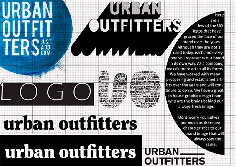
Every brand, from big corporations to startups, have branding guidelines that they put together in a visual style guide. For each of these brands, the objective is to be memorable. Being memorable implies consistency which is why every brand eventually has to develop a guide.
Some of our favourite brands are recognizable from a mile away. A visual style guide is like a company’s personality on paper. With recognition comes trust and that’s something you need to establish early on.
What is a visual style guide?
A visual style guide is a detailed document that a brand or organization uses to keep record of the way they present themselves to the public. It is a tool of reference for the brand and sometimes third parties that shows what the brand will look like, sound like and ultimately feel like.
Think of it as documentation of your brand’s style that helps people working in your teams provide a consistent experience throughout marketing campaigns and a tool that will be of great help to the customer service, sales and most importantly the design teams.
A visual style guide communicates your company’s identity to the public (as well as within your teams) and here are the basic steps to achieve an impeccable style guide.
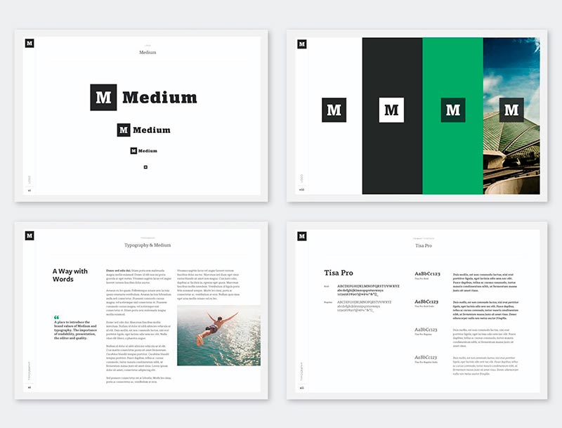
Image credit: Medium
Visual style guide essentials
There are 4 basic essentials to every visual style guide: logo, color palette, fonts and visuals. Before you jump into it, you need to know exactly what your brand is all about and the impression you’d like to leave. Things like vision for the brand, target audience, brand personality, company values and objectives are important components of your guide.
All these things put together will give a clearer picture about your brand and a holistic image in mind on your brand’s presentation and first impressions.
How to create a visual style guide
1. Research and inspiration
In many of our business tutorials, we’ve discussed how important research is to any creative endeavour. This is especially true for a visual style guide. Go through images and save pictures for references that represent your brand, your values and your personality. This can be done by one person or the whole team.
2. Settle on the essentials
The most difficult part about creating a visual style guide is knowing what to include and what to exclude. Here are some things that you can choose from for your guide:
Brand story: This is your introduction to the world. Imagine explaining to a stranger the essence of your company. This helps potential clients make up their mind about your goods or services and leaves an important first impression.
Logo: Style guides often begin with logos and logo placements. It is important to establish exactly how your logo will be used for projects. This part of the guide will show others where the logo should be placed and how it shouldn’t be used. It also helps avoid common mistakes such as resizing logos, altering their appearance and re-aligning with text.
Show examples of how your logo is to be used,what is the minimum size and the optimal proportion to text. Give instructions on the use of white space, the variation of colors and how your logo shouldn’t be modified. Here is Skype’s guide to logo usage:
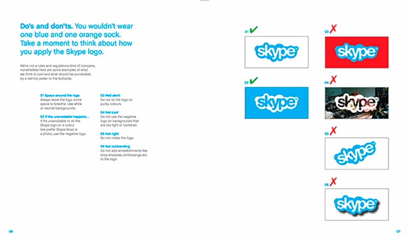
Image credit: Skype
Color palette: Your brand’s consistency rests almost entirely on your color palette. Something to keep in mind is that different designers have their own styles and use different programs to work on designs. They need a reference point with the exact specifications of your brand’s color palette.
Choose 4 colors at most and their variations. Your style guide should include swatches of your brand colors and include basic information such as the Pantone name of the color, print color and digital color. Prints take up time and money so including the exact specifications will save you both.
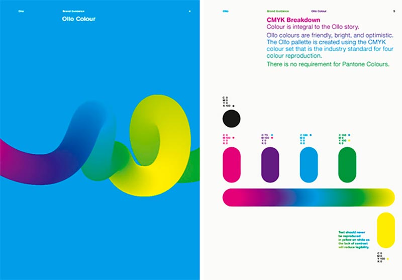
Image credit: Bibliothèque Design
Typography: Aside from your logo and color palette, typography is another major component of a visual styleguide. Good, consistent typography determines your professionalism. You need to choose one or more typefaces that go well with your brand and industry.
You can find out more about insider tips on fonts and their use in different industries in this article. Generally, you should use a different font from your logo so there is some contrast. Make sure the font is also relevant to your brand and is not a distracting element. Other things to include are the text alignment and spacing.
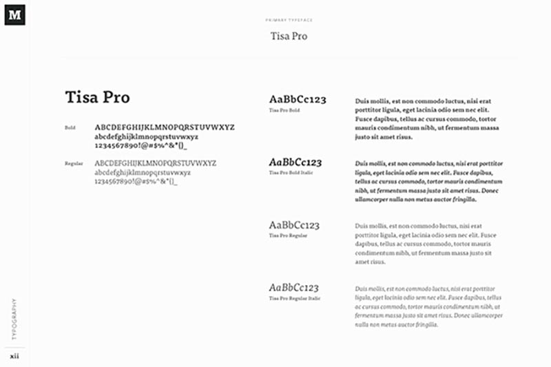
Image credit: Medium
Images: There are as many photography styles as there are photographers. The photographs you choose will be the more memorable part of your campaigns and projects which is why this section is more time consuming. You need to select imagery in your guide that will show others the general style you’re going for. This is perhaps the hardest part of putting together a visual style guide because there are only so many images you can include.
What will help you with this sector is showcasing images that have worked for different causes within your brand. These images should give others a good idea of what to post on social media accounts, what images to use for advertising materials and print.
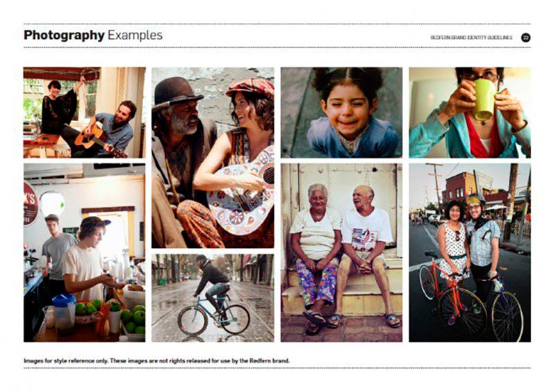
Image source: Redfern
Voice: Writing style is just as important as images. You brand not only needs to look a certain way, it must also sound like it. Your company’s voice actually says a lot about your brand from the first glance (typography), to your writing style (voice). A good way to approach this section is to show words that you like and words that don’t communicate as well. Focus on your target audience and you will find your voice.

3. Consider digital and print use
We covered the very basics and the essential elements that will make up your brand’s visual style guide. There are other things to keep in mind as you are creating one. If your brand is mainly digital, you might want to include a section on image layout in your guide. If you have physical products that also require branding, packaging guidelines are a good idea. If your brand is more focused on social media, then the imagery section will take up more space to showcase your visual style.
Add other necessary elements that you need to cover. For digital use, your website, social media accounts and banners need to be integrated into the visual style guide. For print, consider brochures, packaging, signage and stationery items. These fine details also deserve attention.
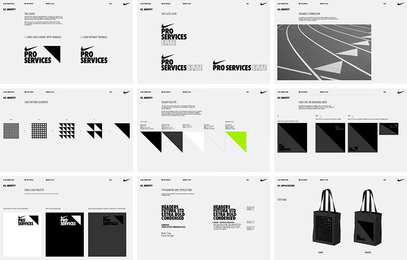
Image source: Nike
4. Outline and rough draft
Designers on your team need to help you put all the information together. Consider the general information you’d like to put in your visual style guide and work from there. Next, you need to consider how you’d like to present your guide: print, online or PDF. This is going to be an important document passed on to many segments of your company so the actual designing stage should be carefully weighed out.
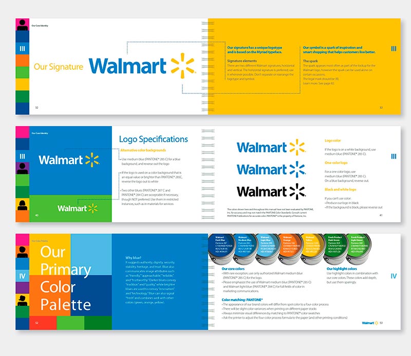
Image credit: Walmart
5. Leave room for development
Although you will put together this guide, remember that it is a work in progress. Things within brands and companies are constantly changing so you might be adding more things to your guide with time. Leave some room to adjust the information but concentrate your efforts on building a strong foundation first. You and other members in your team might want to revisit the information and review your goals and priorities.
You’re good to go
We see before we hear, so ask yourself what your teams and clients will have to look at before they get to work or get introduced to your company. You’re the face behind a great product and your style guide will help let everyone in your team understand how to stay true to your brand style and aesthetics.
As long as you cover all the basics and get professional help with the design of your visual style guide, you’re ready to share it with others. Decide early on whether this document will be internal or available to the public.
Some style guides are extensive while others are just a single page document. It doesn’t matter how long it is, just keep in mind the basic brand elements that distinguish you from others and create a point of reference for future projects. You’re making the design process easy and accessible for all; keep it professional and concise.




![Your Guide Integrating Audio Into Brand Communication [Infographic]](https://depositphotos-blog.s3.eu-west-1.amazonaws.com/uploads/2020/11/A-Guide-Integrating-Audio-Into-Brand-Communication-Infographic.webp)


