Guide to 10 Font Characteristics and Their Use in Design
Fonts play an essential role in design – they set the mood, evoke emotions, and help form an opinion before you get to read the text. They are secret agents of visual communication working with the subconscious of the viewer. This article explains which fonts you should use for different industries and how even the smallest change in font details will alter the reader’s attitude towards the content.
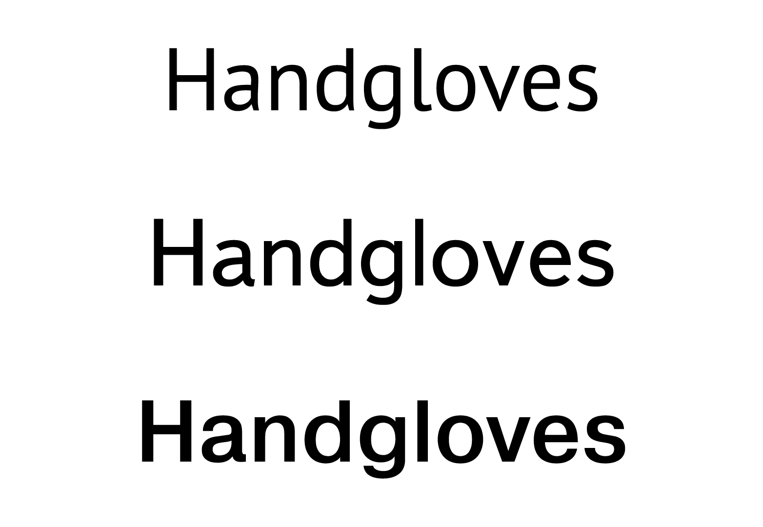
1. Font weight
The font weight is often the first thing we notice. The main types of font weight are light, regular, and bold. Regular font styles are neutral; they are least affected by optical distortion or poor sharpness. They have the most readable grapheme, which is why regular weight is perfect for reading. Light and bold font styles are more expressive as they convey a whole range of emotions, from delicacy to perhaps even rudeness.
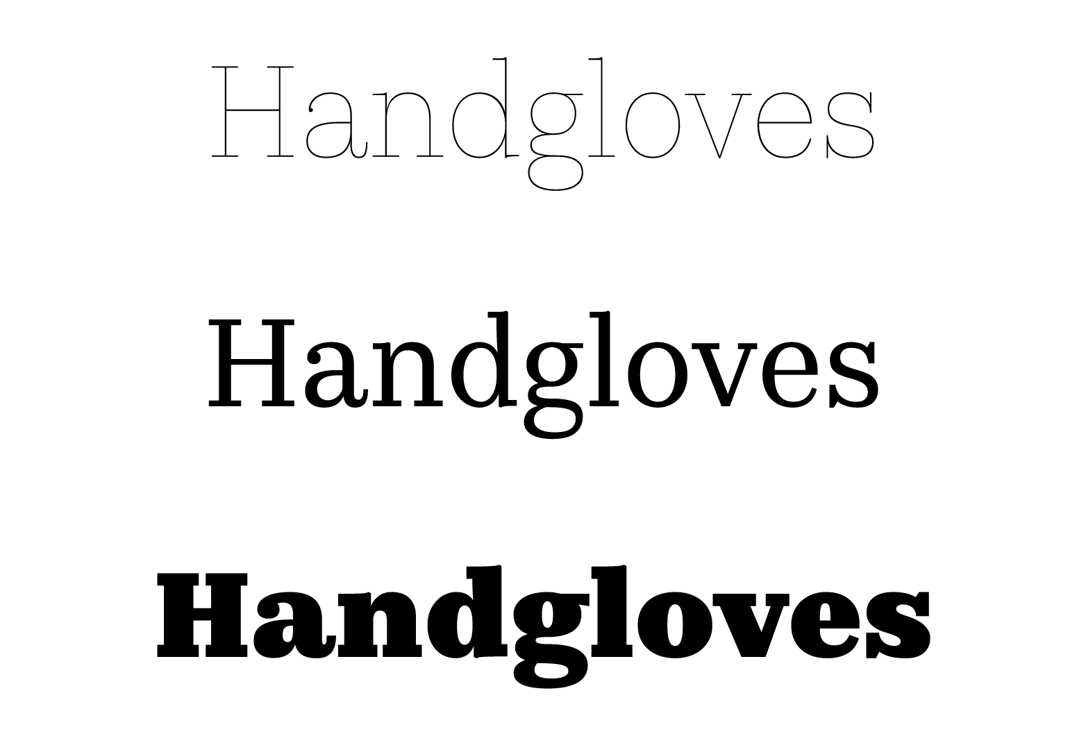
Thin or light font styles are pleasant to look at as a linear drawing. A phrase in such font wouldn’t catch your attention (unless you want it to); it can be “switched off” just by shifting your glance. Hence it carries the connotation of sensitivity and care. It comes as no surprise that such font styles are widespread in cosmetic field and in everything that is close to the body; from undergarments to wearable gadgets.
Semibold font styles contain maximum uniqueness of shape, retain readability and add value to the text. Due to this they are used for emphasis in the text, as well as in logos.
Bold font styles are designed to draw attention to short phrases. They are not very easy to read, but you have no choice. Once you spend enough time looking at such font, your brain becomes familiar with it and adapts.
Black fonts create a feeling of heaviness, power and enhance the existing properties of the font, which are impossible to convey with more neutral styles that lack the weight. Such font styles provoke a quick emotional response, that’s why they are often used in games, advertising, and show business.
2. Font width
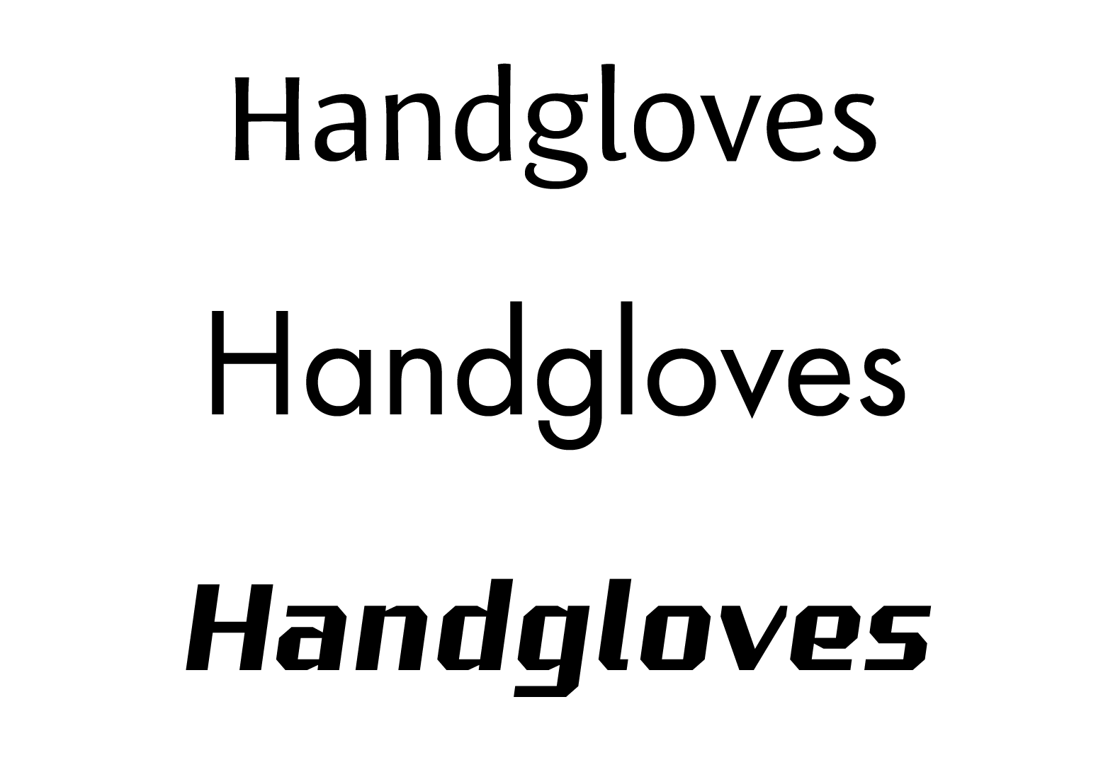
Width of the font characters, just as their weight, is quickly recognized and strongly affects readability and visibility of a piece of writing. Regular width font styles are preferable for reading, while other variants – condensed and extended – are very specific and have distinct emotional associations.
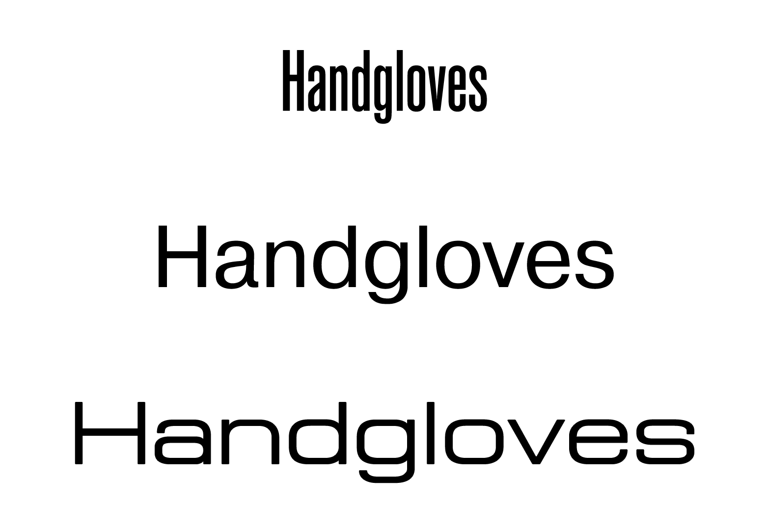
Slightly condensed font styles can also be readable. Compressed versions of text fonts are used when you need to fit lots of text into a small space. But this technique creates a slight feeling of tightness and seems like you’re trying to save up space.
Extra condensed font styles have more interesting characteristics. They are easy to notice due to vertical lines that begin to prevail in the text. It looks like someone tall has climbed onto a stand and is firing up the crowd. Due to low readability of narrow letters, this font can convey only short words that are really important. Therefore, extra condensed fonts naturally look better where a “stop effect” is needed: in advertisements and headlines.
Extended and extra extended font styles greatly change the perception of a text. In extended fonts, character shape changes, more horizontals appear. Even a short word is now read slower; it becomes significant and memorable. Everything around the text looks abundant and impressive. Extended font styles are well readable at an angle – the perspective compensates proportions. That’s why such fonts are often used by manufacturers of cars, airplanes, and sporting goods.
3. Font contrast
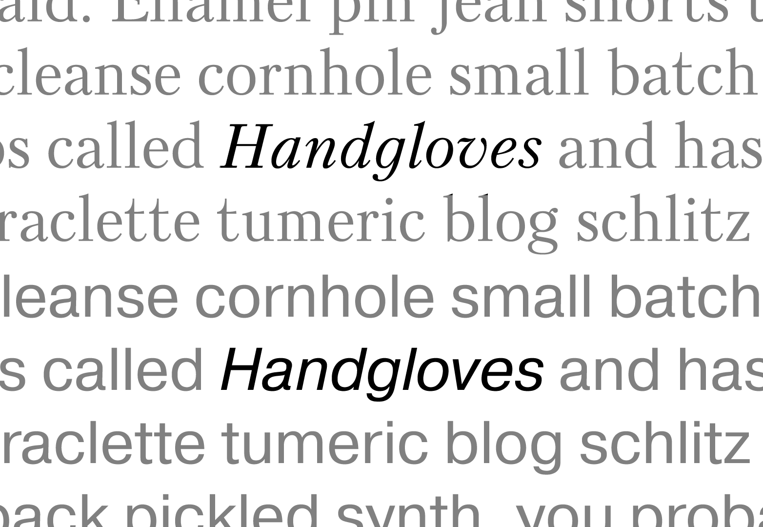
The difference between the main and additional strokes is called font contrast. Contrast defines a font’s position on a legibility/appearance scale. Low and medium contrast is helpful during long reads and doesn’t always evoke a special mood; in return, extreme values – monoweight and high contrast – create distinct imagery.
Without any contrast, the text looks simple and neat, sometimes even primitive. Monoweight fonts break a bond between typesetting and handwriting, resting upon industrial and postindustrial urban aesthetics in all of its aspects, from stick fonts to neon signs. These qualities make monoweight fonts a perfect solution for those who want to look modern and forward-thinking.
Extra high contrast is an artistic characteristic of Romanticism and Classicism fonts. Contrast fonts sacrifice readability to the beauty of a title sheet, cover art or poster. Interchanging thick and thin lines are reminiscent of dramatic confrontation between strength and weakness, ice and fire; and connection of contrast strokes creates an elegant silhouette and a rhythm, which reminds one of music or dancing. It’s logical that contrast fonts are perfect for theater, fashion and glamour.
4. X-height
The height of the lowercase letters against capital letters and their own ascenders or descenders is one of the main font properties that define its usage. Mood and character of the message depend on X-height.
In case of medium X-height (from 2/3 to 3/4), upper-case and lower-case letters keep balance of similarity and difference, which allows to easily find the beginning of a sentence, but doesn’t distract you from reading. This moderation, along with the other characteristics, makes the font easy to work with in text.
Small X-heights (1/2 and less) create a significant difference between letters within one font. They make the font twice as diverse and interesting as the equivalent font with medium X-height. The more the difference, the better you can communicate extroversion, musicality, and artistry. These qualities make it perfectly suitable for short personal or lyrical texts: poems, greetings, invitations, and playbills.
Large lowercase letters (more than 3/4) make the font more homogeneous (upper-case and lower-case letters look alike); using such font allows you to fit more text in the lines. Due to smaller capital letters and short ascenders and descenders, there’s little interaction between text lines and space. These are introvert fonts that communicate a feeling of stability and safety, but sometimes lack a friendly vibe.
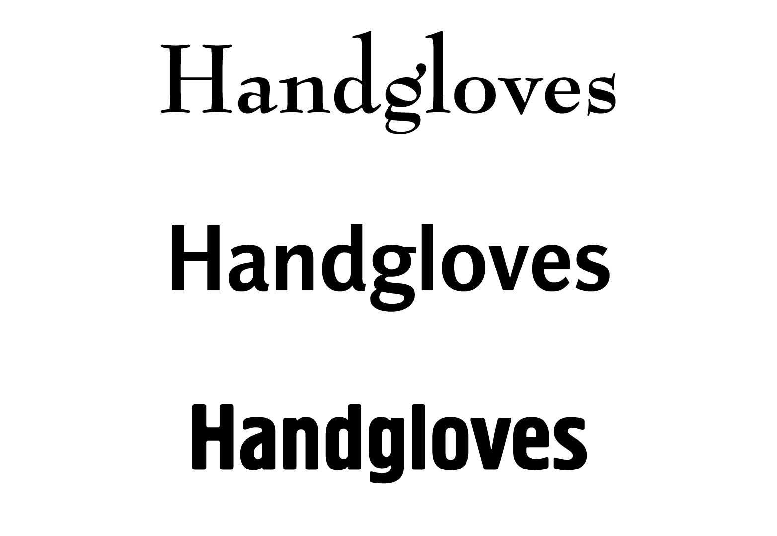
5. Corner rounding
Intersections and connections of strokes inevitably form corners. Square corners like in T, H, E, or sharp ones like in A, V, Z, N. The end of any stroke also has its own outline: sharp, square or rounded. Corners, intersections, and edges are natural visual irritants. Usually, people notice each corner and focus; without this skill, our ancestors would run into sharp stones and branches. So, the sharper the corners in an inscription, the easier it catches the attention of the viewer.
Substitution of common, expected corners with round ones decreases eye strain and is associated with smooth, nice to the touch surfaces. This evokes pleasant emotions and feeling of comfort. Rounded letters also work with our primary instincts, as a round shape is the basis of baby shape. That’s why bold and rounded fonts are so good for baby food, shampoos, and diapers. Also, when paired with something hand made, it makes the font look like food – buns, ice-cream, fruits.
Sharp corners and stroke edges draw greater attention, create tension, and even discomfort. But they can be really useful if you sell “thrills”, and want to surprise or shock your audience. That’s why “prickly” fonts are common in goods for teenagers, attributes of heavy metal and other subcultures.
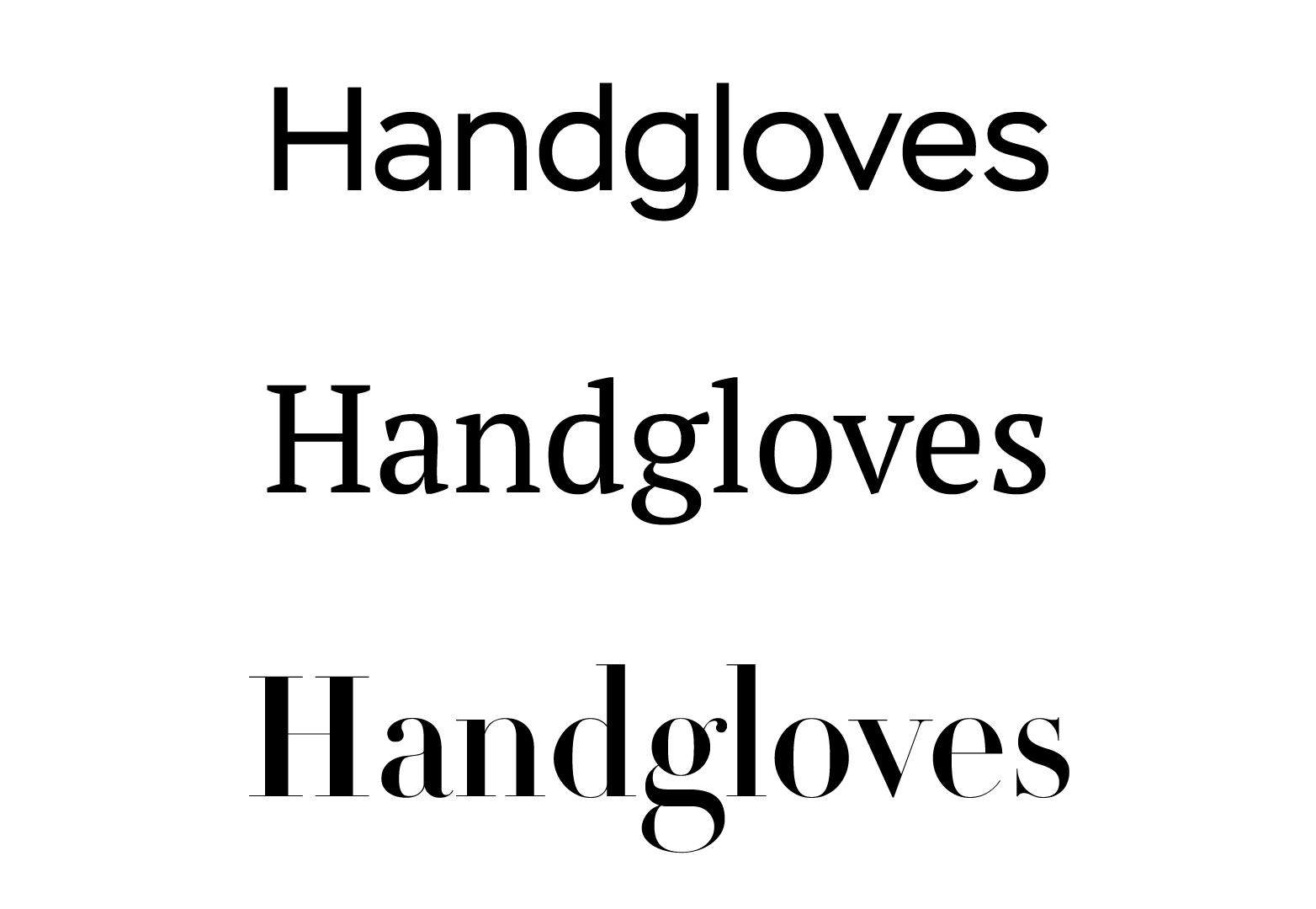
6. Serifs and slab serifs
Font serifs is the most important characteristic in any font classification. Serif shape depends on the overall logic of font building, and this logic has been developing from the Ancient Rome to present day. Due to ancient origins, fonts with serifs are called Antiquas. You appreciate serif fonts like you appreciate good wine and there are heaps of books on this subject, but here we will speak about what their overall meaning and their proper uses are.
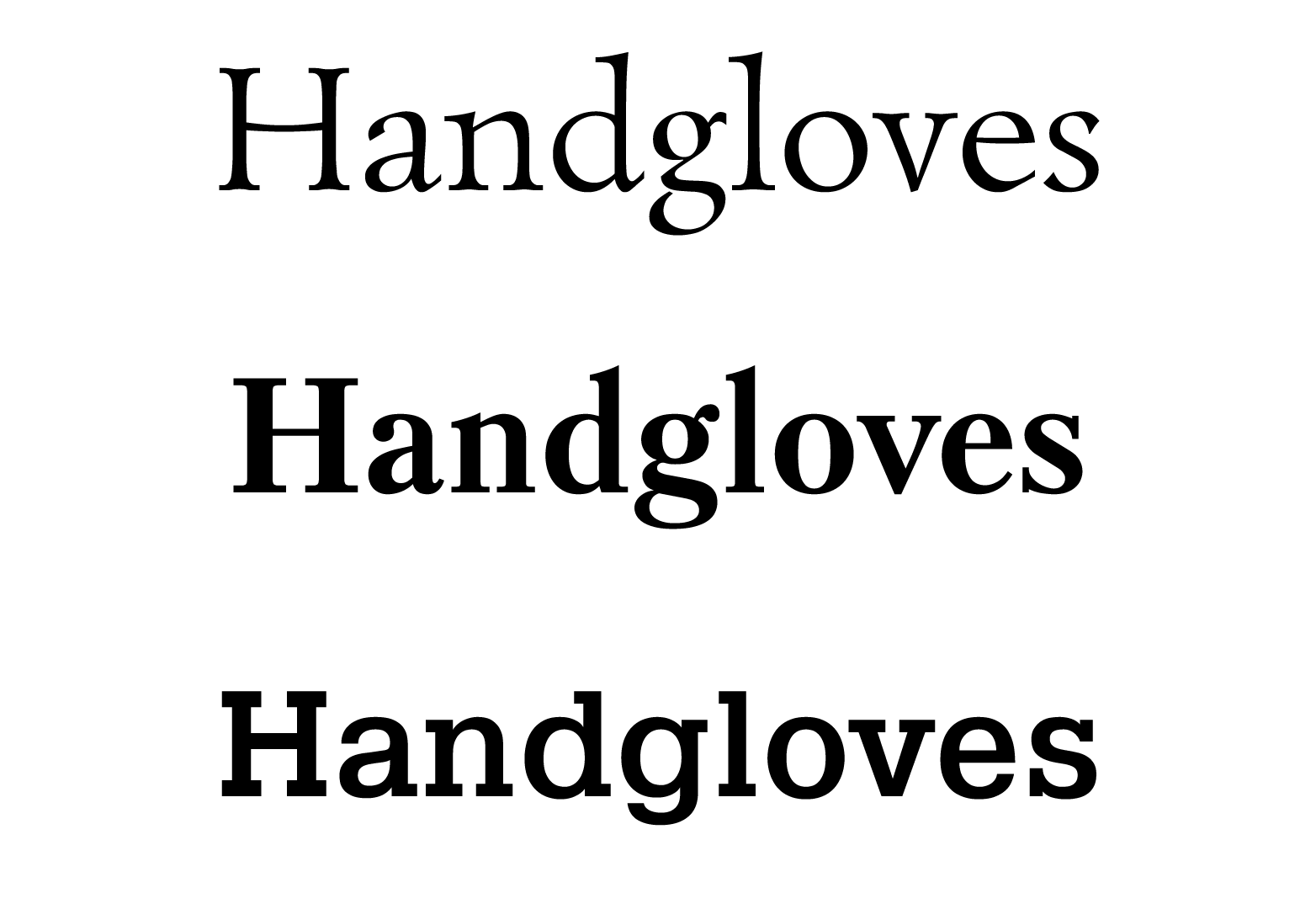
In text fonts like Times New Roman or its equivalents, serifs at the ends of strokes help the eye to move faster along the line of text. Even in case of low sharpness, serif doesn’t allow optical distortion to shorten the vertical stroke, so the baseline and letter height are preserved. For this reason serif fonts are typically used in large literary, scientific, or educational texts.
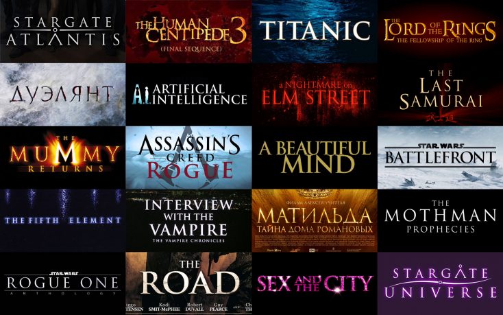
On a large scale, Serif fonts become a historical costume on a character taking the viewer to the right place and time. Venetian Serif, Garaldes, English serif, Classical serif – all of them are portals to their country and historical era. The higher the level of cultural sophistication of a viewer, the more precisely he or she will travel. Even a mass consumer that is not familiar with these things or history would decide that it is a classical, historical font that he or she sees, and these associations evoke trust. All serif fonts, except slab serifs, to a greater or lesser extent communicate pathos of their Great ancestor – Roman square capitals from Trajan’s Column. This is an understanding that is a known fact with Hollywood producers, which is why Trajan is the most common typeface in cinema.
Slab serifs greatly differ from other serif shapes, so slab serif fonts have their own place amongst the classifications. A serif is considered to be a slab when it’s straight enough, rectangular and comparable in thickness to the main font stroke. It’s very inconvenient to write such letters with calligraphic tools; it’s better to draw, stamp, or cut them out. Such form doesn’t contribute to comfortable reading, but instead it can carry the viewer to different places, from the Wild West to 1930s Germany. The main feature of slab serif fonts is their patriarchal severity, that’s why they look so natural at factory floors, hand tool shops or steak houses.
7. Italics and oblique
Italic and oblique font styles are common in modern font families in addition to straight ones. However, they have different functions and meaning.
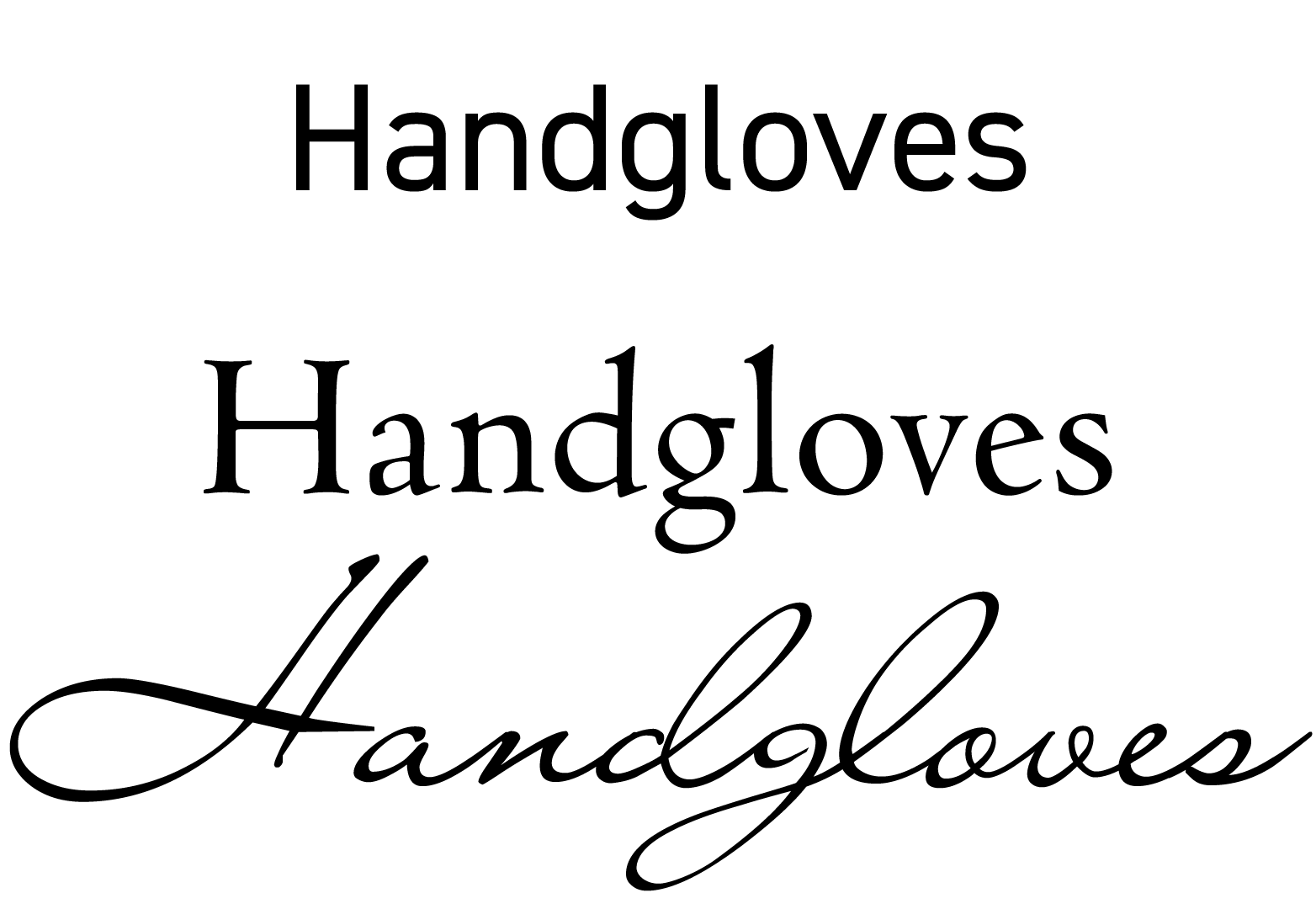
Italic font styles differs from regular by a more handwritten form, because they originated from common Italian handwriting of the Renaissance era. From the 16th century till present day, italic is used to highlight text. The slant implies a change of intonation when reading. In addition to this, handwritten letter shapes have less vertical lines and more elegant curves, which add a pleasant polite tone to a phrase. Everything that is reminiscent of handwriting seems to be more personal and confiding, than direct “printed” letters; for this reason most greetings and invitations feature handwritten fonts or italic serif styles close to cursive.
Oblique font styles are built by means of slanting upright letters and mainly serve to communicate the feeling of speed to a text, and sometimes, to highlight parts of it. After slanting, all vertical lines become oblique, and even rounded shapes lose part of their uniqueness. More monotonous text, as if leaning due to wind, is perceived as something speedy and prompt. That’s why slanted fonts are an excellent choice for sport or an automobile theme.
8. Geometry
In digital fonts, every letter is built according to a geometric formula. But this formula has different meanings for function and character of a font. In decorative typefaces that imitate handwriting (blots, and paint brush strokes), geometry is rejected, and their form is sort of spontaneous. But the most part of general-purpose fonts created since the invention of book-printing till nowadays are well calibrated and have either humanistic or geometric proportions.
Humanist design means that it is based on a form of handwriting of Renaissance Age humanists, thus the name. These are beautiful and legible fonts, designed to perfection. They have open varying-width letters with distinct difference between upper-case and lower-case letters with slanted stress axis. In humanist typefaces, geometry serves for shape perfection and doesn’t create specific images. They are convenient for most people and are practically universal. For this reason Sans Serif typefaces with humanist proportions are common in public communications; for example in urban navigation.
Geometrical design from scratch, despite experience and tradition, is characteristic of the 20th century. The first geometric fonts appeared in 1920-1930s under the influence of Constructivism. All characters were built of simple geometric shapes: circle, square, triangle. Typically, they were sans fonts or the serifs were replaced by slabs. Nowadays, they are called Geometric Sans Serifs and Geometric Slab Serifs.
Ideas of scientific progress, standardization, simplification led to the creation of a new type form. A simple drawing is able to totally replace handwritten and typefoundry heritage, and even common letter outlines (graphemes) can change. For instance, the round letters О, С, D can become square, and the whole font can be built of the unified modules. At that, the letter shape would lose its influence on readability and image. Everything will depend on the module shape: a bow, a polygon, a square. For example, modular fonts of Star Wars, Terminator, and Robocop era use their not-made-by-hands form to illustrate fantastic future with all its space flights, smart machines, and other technologies that have excited people since mid-20th century.
The choice of a geometric font works like a time machine. You can take a viewer to revolutionary Russia (rectangles, sticks, triangles), pre-war Germany (rectangles, circles, bows), the jazz age America (triangles, circles, thin lines), or to the beginning of the computer age (squared letters, pixels, matrices).

Geometric Sans Serifs are relevant today too – look at the 2015 Google logo for example. Font culture of 2010s re-appeals to a modernist style and reinterprets it. We’re seeing a return of the trendy geometric fonts, which due to high display resolution and smoothness of paper look perfectly precise, neat, and still readable. Such fonts perfectly solve tasks of global corporations, mass media, and even major politics.
9. Statics and dynamics
The letter shape of the font can be static or dynamic. The more there are horizontal and vertical lines in a text line, the more static the font looks. While lines and bows that are not parallel to the text line add dynamics to a font. Dynamics are affected by the following: stress axis slant in letters o, e, c, p, b, d, slope of bar of е, stroke endings of letters s, c, a, and serifs shape. All these elements can be vertical, diagonal, or curved. Italic or oblique font styles make the drawing even more dynamic.
Static in a font comes off as a hallmark of calm and orderliness. It’s no coincidence that Helvetica (designed to be all-purpose neutral font) is static. But if the font has more verticals than usual, for example, due to squaring ovals, it will be associated with strict order driven to automation. This is perfect for restricted access facilities: precise manufacturing, railroad, power plants.
Dynamic pattern in a straight typeface (not so obvious as in italics) is a pleasant to notice nuance. This non-mandatory characteristic creates interest in a line of text. Its hidden complexity is the sign of true art. That’s the reason why dynamic fonts are good for everything aesthetic and creative.
10. Openness of letters
Open letters, like c, can be wide open, moderately open or almost closed. Openness of letters (aperture) affects the shape of characters: c, a, e, s. Wide open letters are more compact than closed ones; their width affects font capacity to a great extent. Frequency analysis of languages shows that letters e, a, s, c amount to over 30% of English. So, due to larger aperture and slight squaring of oval elements o, p, d, b, q you can get very compact font, which won’t look tight and will keep good readability (like PT Sans, for example).
Moderate aperture doesn’t create mood by itself. Instead, half-closed letters are the most legible for fast reading, for example on road signs or license plates.
Wide open fonts show personality when working with short texts. They really have an open-to-the-world, extroverted nature. Their openness evokes a feeling of comfort, ease and honest communication. Such fonts are widely met in election campaigns of those politicians who promote ideas of freedom and democracy, as well as in advertising of something handy, comfortable, and elegant (like a smart home or a slim laptop).
The characteristics of closed fonts also conforms to aperture. These self-sufficing introverts induce a feeling of stability, reliability, and security. For this reason they are used in politics by conservatives and protectionists, and in advertising they are irreplaceable for everything based on security and protection.
Summary
Each font characteristic affects a person on the level of optics, ancient instincts, and cultural experiences. These hidden messages help your design work, but they can also hinder, so your font choice should be related to a message communicated, brand values, or preferences of your target audience. It’s better to use minimum of properties, adjusting them as precisely as possible rather than missing the target completely with too many adjustments. Then your design will be understandable to target audience, useful for the clients, and interesting for other designers.
If we gather all font properties in one list, we’ll get something like a menu in a Dutch pub:
- Weight affects the level of interpretation: from tender delicacy (Thin) to persistent rudeness (Black).
- Width affects message urgency: from a screaming headline (Extra Condensed) to long-awaited appearance above the horizon (Extra Expanded).
- Contrast levels the artistry of a message: from a speech synthesizer (Monoweight) to Grand Opera actress (Extra high contrast).
- X-height is associated with a wish to impress the viewer: from a love letter (small x-heights) to indifferent “Break” sign (large x-heights).
- Corner rounding influences over tenderness level: from sleeping babies (Rounding) to noisy teenagers (Sharpening).
- Serifs and Slabs create cultural context: from idealism of timeless classics (Serifs) to pragmatism of factory stamping (Slab serifs.)
- Italic and Oblique ask for a moment of attention: to make a polite comment (Italic) or to communicate an urgent message (Oblique).
- Geometry reflects life values: from respect to a person’s peculiarities (Humanist fonts) to admiration of futuristic machines (Geometric and Modular fonts.)
- Statics and dynamics show individuality and richness of inner world: from neutral Helvetica (Static pattern) to Old Style Serifs, embodying pathos of their time and country (Dynamic pattern).
- Aperture affects sociability and progressiveness: from liberal extrovert (Open fonts) to conservative defender of borders (Closed fonts).
In addition to all aforementioned internal qualities, fonts also have external ones. Interaction of letters, words, lines, and paragraphs against each other and against space is called typographic composition. We will talk about influence of topography on the viewer in our next articles.