Cannes Film Festival: 10 Most Beautiful Posters to Draw Inspiration From
One of the most significant events in the field of cinematography, the Cannes Film Festival, ended this weekend on the French Riviera. Every year, it attracts viewers from all over the world: both film lovers and creators who find inspiration in competing films’ themes, plots, and aesthetics. However, movies are not the sole source of inspiration. The posters from the Cannes Film Festival deserve special attention as one of the brightest examples of modern poster art.
The posters convey the general mood of the event and immerse viewers in the magical atmosphere of the world of cinema. Today, we will share the most spectacular posters from the Cannes Film Festival in the last 20 years, as well as explore their significance. To make this review more interesting, we reached out to professional graphic designers – Maryna Diachenko, Anastasia Dovgal, and Ivan Bohomaz. They shared their vision and expert opinions on posters. Continue reading to learn about symbolism and artistic approaches in iconic Cannes posters.
1. 2022
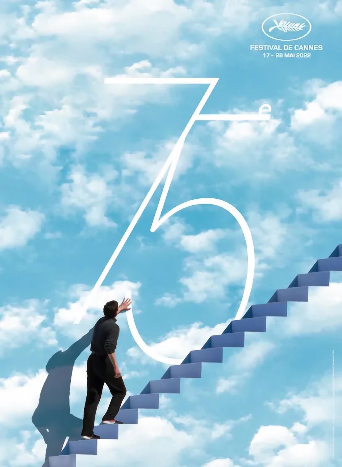
Source: Cannes Film Festival website
The 75th anniversary Cannes Film Festival poster impresses with its spectacle and allegory. It is based on a shot from the 1998 film “Truman Show”. This is one of the last scenes in which Jim Carrey’s character realizes that he lived in an unreal world under the dome, and decides to escape from it. According to the festival’s organizers, the official poster symbolizes the irresistible desire for self-expression and freedom. Climbing never-ending stairs represents rethinking the past and striving for rebirth. This poster can be called one of the most beautiful in the history of the Cannes Film Festival. The spectacular composition and harmonious combination of colors, dominated by the dreamy blue, create an unforgettable impression.
“It is worth mentioning that the posters for the Cannes Film Festival are not intended to cover the event itself, but to tell more about the time and mood in society at the moment. To understand the meaning of these posters, you need to know the context and stories of people from the environment, to live the life of cinema. For example, a poster for the 75th Film Festival depicts a scene from the Truman Show, which shows a person’s willingness to realize and accept that his view of life has been deceptive and illusory, and that he is ready for a new real life. It may be an illustration of the latest military events in the world, which few people were prepared for, but now it is our common new reality”, – Anastasia Dovgal.
2. 2021
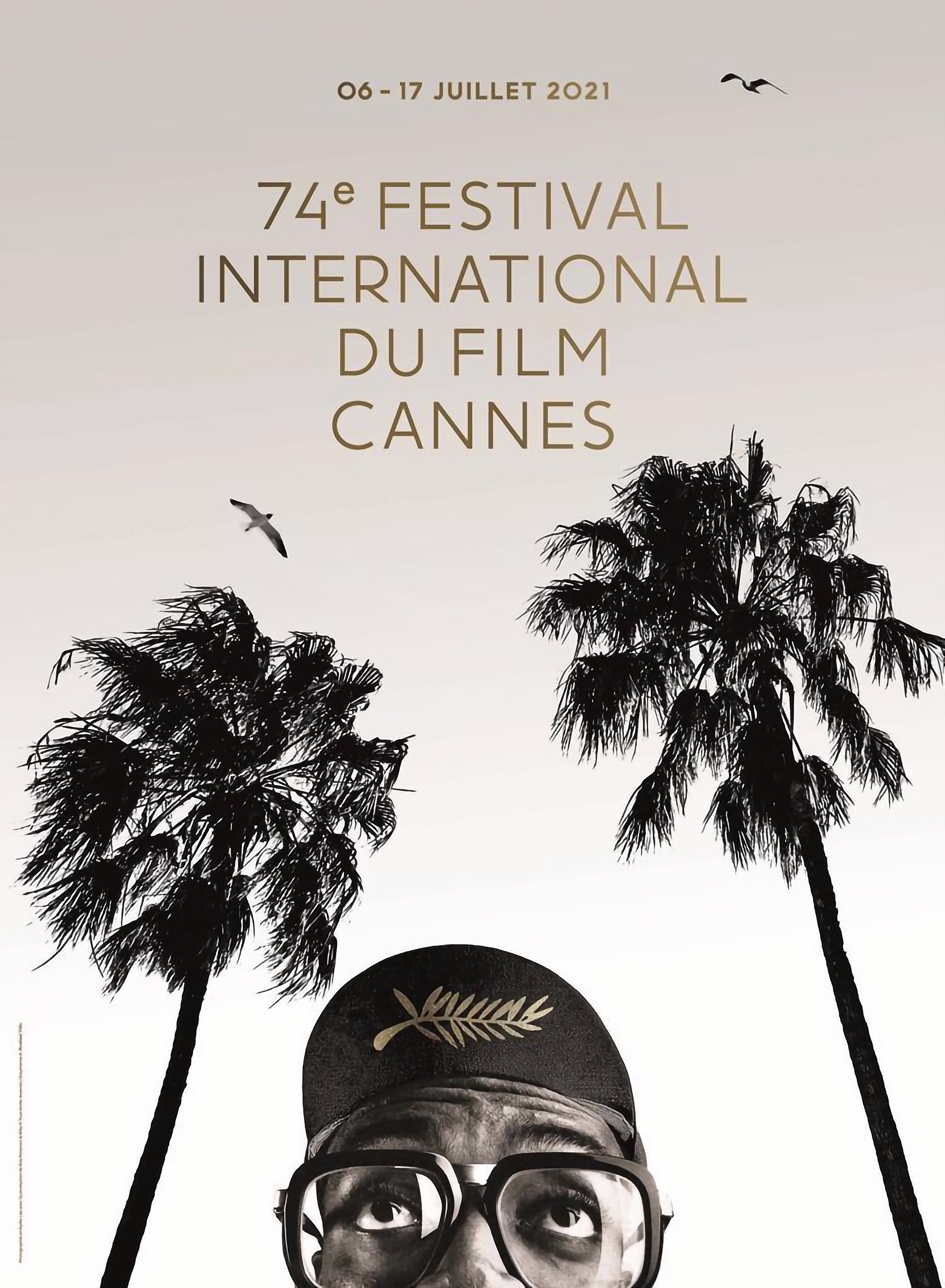
Source: Cannes Film Festival website
The main character of the 74th festival poster was the head of the jury – American director Spike Lee. He got this role for the second time, because in 2020, the event could not be held in the traditional format due to coronavirus restrictions. In the poster, Spike Lee embodies the character of Mars Blackmon from his film “She’s Gotta Have It”. Designer Hartland Villa, who worked on the poster, chose a black and white palette, except for the festival’s golden name, date, and logo. According to the organizers, the white background with palm leaves and birds symbolizes a blank screen in anticipation of film screenings, and the interested look of Spike Lee – future viewers.
3. 2019
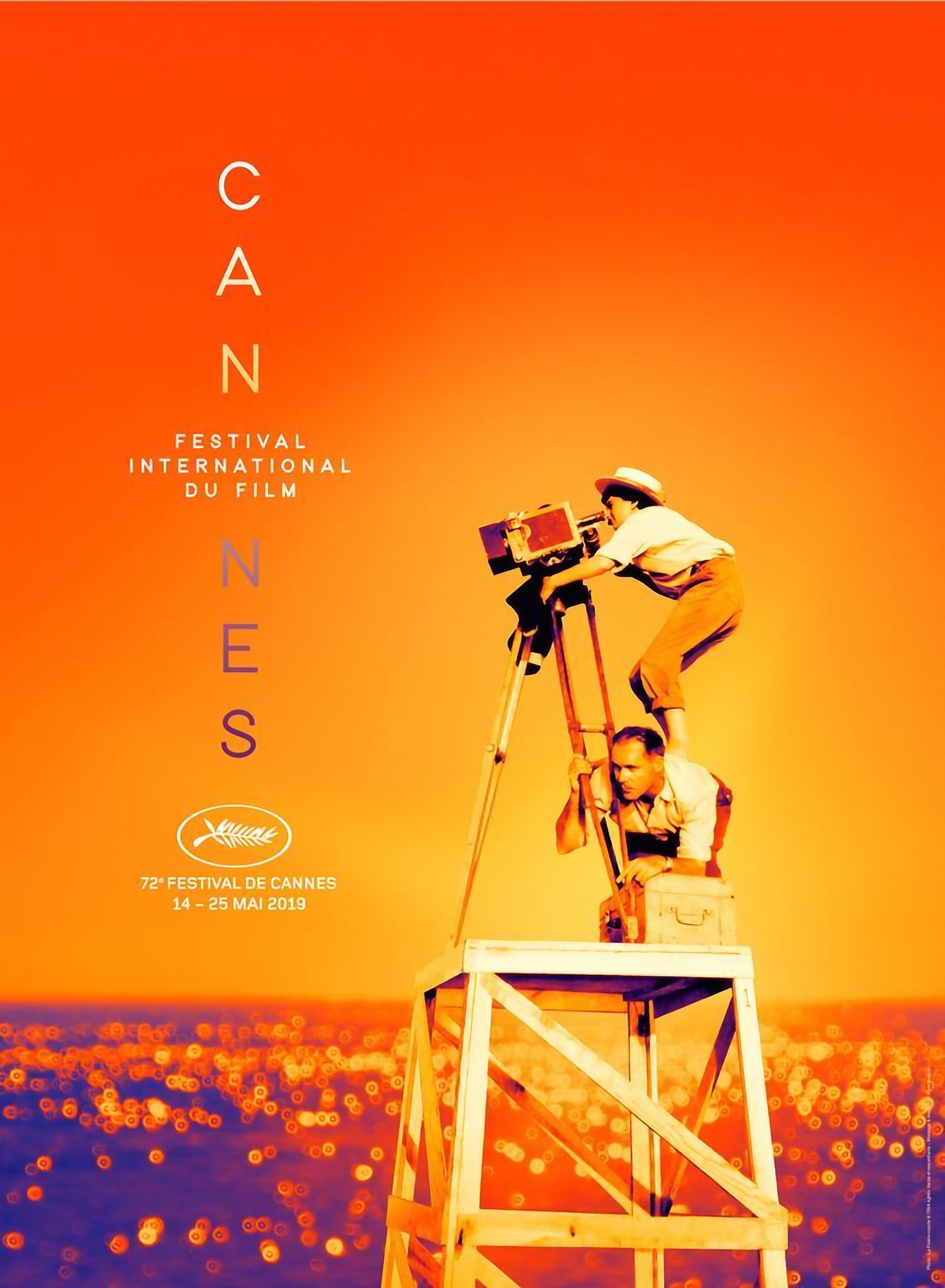
Source Cannes Film Festival website
Images of actresses were often chosen for Cannes Film Festival posters, but the 2019 poster was special because it featured a director for the first time. We are talking about Agnes Varda, a Frenchwoman who became the first woman to receive the honorary “Golden Palm Branch”. The photo, chosen as the basis for the poster of the 72nd festival, was taken during the shooting of the director’s debut film. The organizers described their choice as follows: “Agnes in bright light. Above. Climbed on a motionless technician. She clung to the camera, which seemed to be absorbing her. A young 26-year-old woman is making her first film. This picture embodies all of Agnes Varda: her passion, audacity, and mischief.” The main color of the poster, orange, also supports the cheerful mood.
“Unlike a poster for any film released, the poster aims to show what will happen in the picture and serves as a kind of “static trailer of the film”. Ideologically, the Cannes Film Festival posters are based on the concept of “movie buffs for movie buffs”. In this case, the viewer must understand the context of the frame selected for the promotional poster of the festival in a particular year. In general, posters are built on the most effective principle: photographic or illustrative central image (film shot) and usually expressive typography (fonts), which in some cases is used as an element of decor and contains some festival information. For the most part, it is a graceful geometric grotesque. They are informative and easy for the viewer to perceive. Each poster has an idea that makes them unique from year to year”, – Ivan Bohomaz.
4. 2018
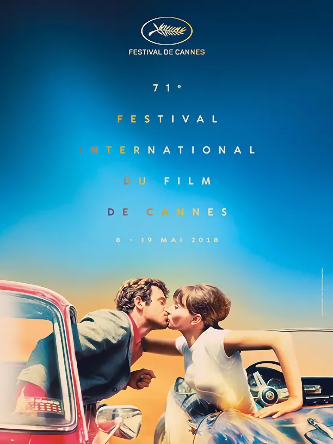
Source: Cannes Film Festival website
The author of the poster for the 71st Cannes Film Festival, designer Flore Maquin, was inspired by Jean-Luc Godard’s iconic new wave film “Pierrot le fou”. She used a fascinating shot for the poster in which the main characters froze in a kiss. This choice was not accidental, as love was one of the festival’s themes in 2018. The author filled the space around the lovers with bright blue and yellow, which enhanced the romantic, dreamy mood of the image.
5. 2017
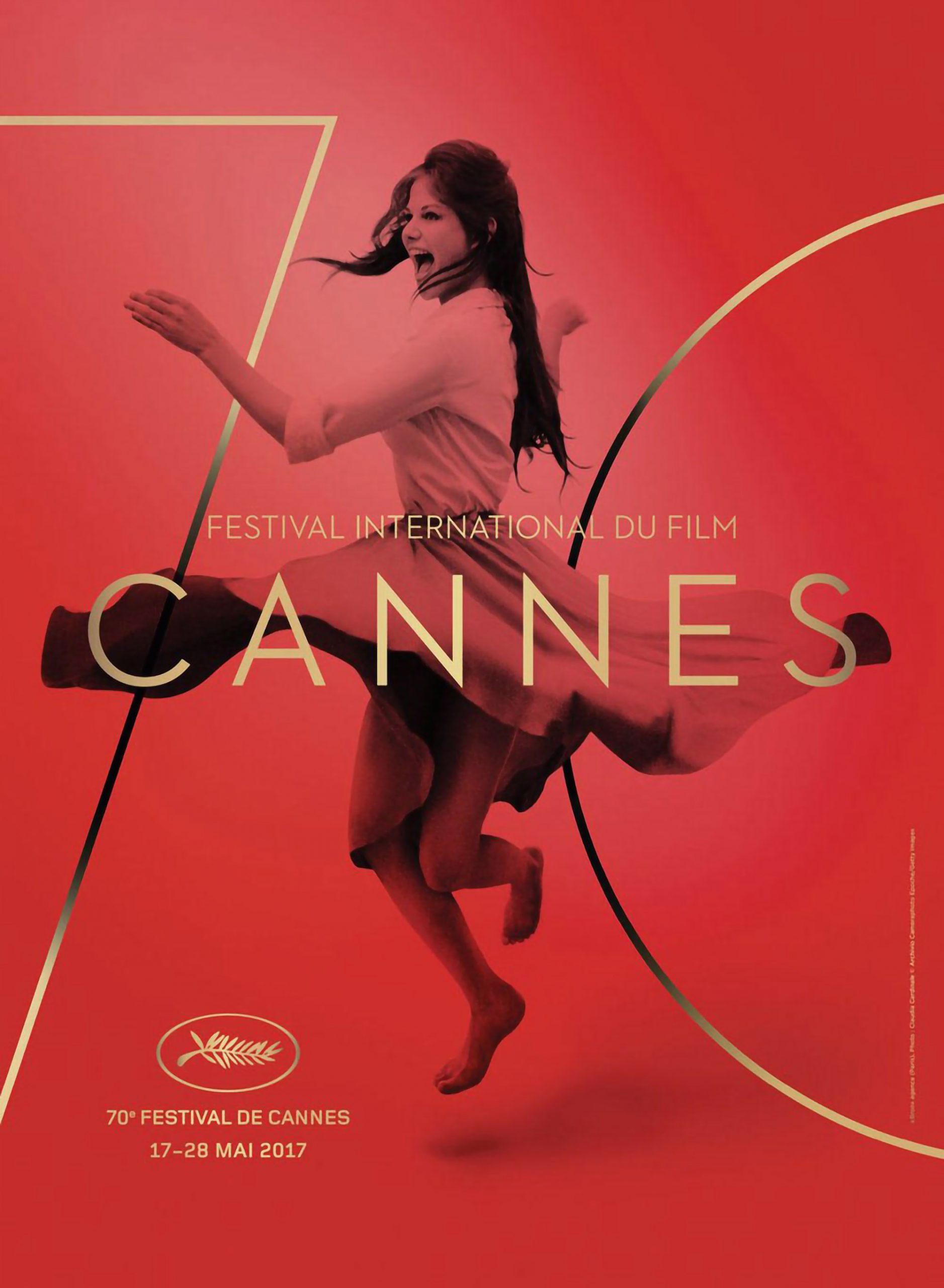
Source: Cannes Film Festival website
The poster of the 70th-anniversary festival, which depicts Claudia Cardinale, caused a lot of controversy and debate at the time. The poster’s creators decided to make the actress a little slimmer and used the magic of Photoshop. This caused a wave of criticism. The Cardinal put an end to this story by taking the side of designers. According to her, the photo was retouched to show the lightness that makes the model a game of imagination. From an aesthetic point of view, the poster is incredibly spectacular and exciting. It is full of life and energy, which is achieved through a dynamic image and the use of red as a base color. Although according to color theory, it is ambiguous, in this case, the shade perfectly complements the main theme.
“As for the design, all posters have the most concise style. There is one shot in which the text is inscribed. The font part is nearly always part of the broader composition that complements the picture. The feeling of lightness and premiumness is achieved because the core of the composition is the image, and the text is in the second or even third plan. Like the Cannes Film Festival films, the posters are devoid of extra tinsel, very elegant, and have layers of meaning. All that remains is to unravel them”, – Anastasia Dovgal.
6. 2015
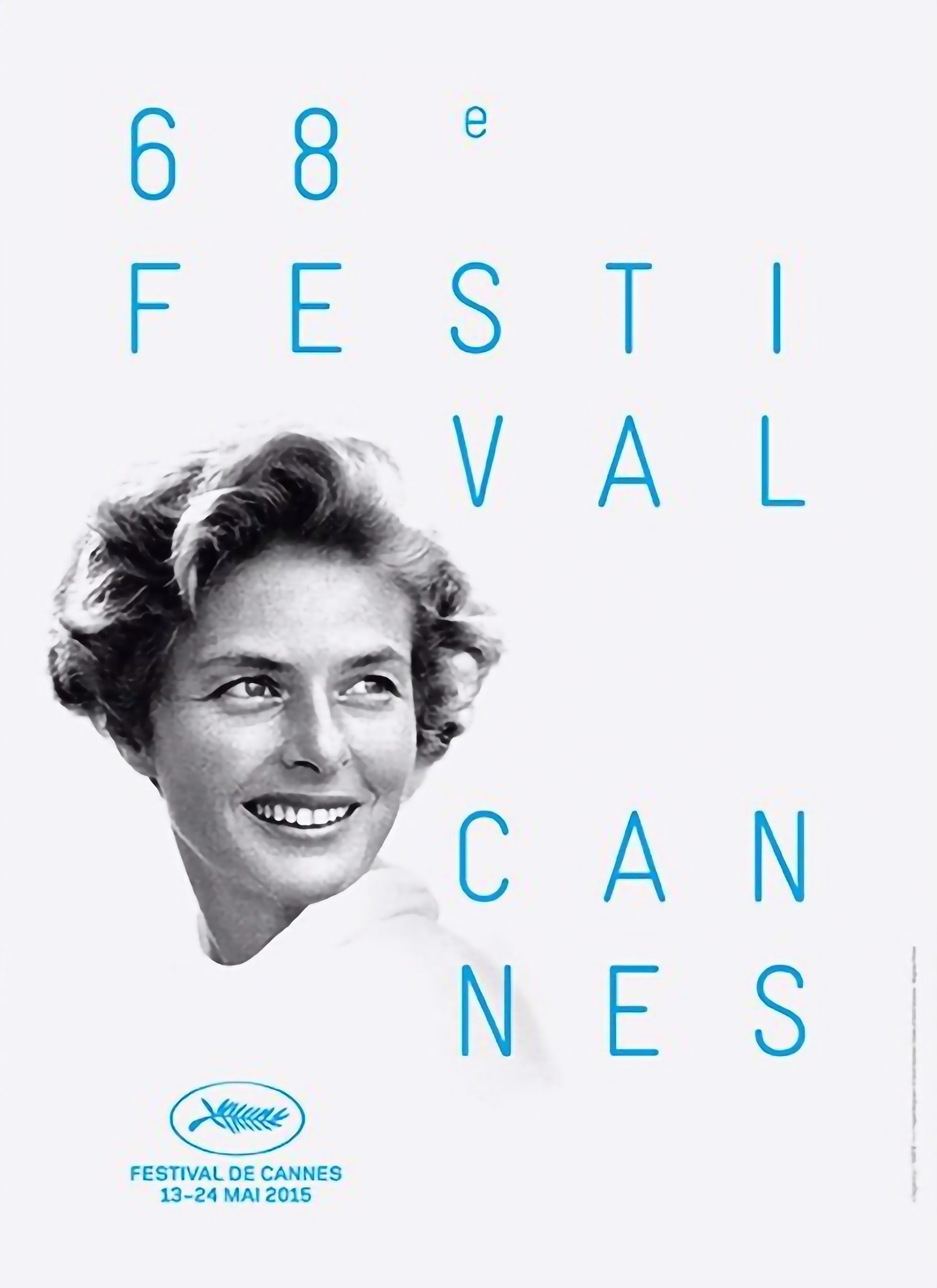
Source: Cannes Film Festival website
The 68th festival poster was dedicated to Ingrid Bergman in celebration of her 100th birthday. The poster was based on a photo of the actress, taken by famous photographer David Seymour, one of the founders of Magnum Photos. The organizers noted that Bergman “is a modern legend, a free woman, and a brave actress. Obeying her desires, she changed roles and countries, always maintaining elegance and simplicity”. That is also how the poster for the 2015 festival can be described. It is simple and stylish at the same time. A monochrome picture dominated by white, a photo with visible graininess and a bright accent in the form of blue writing attracts attention and creates a nostalgic atmosphere.
7. 2014
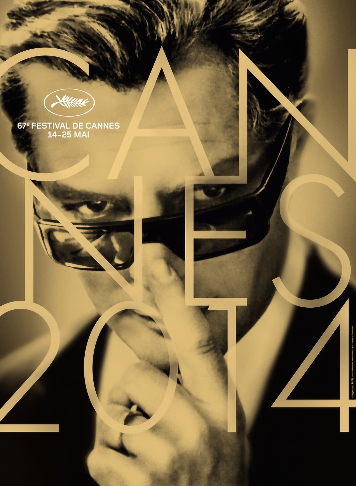
Source: Cannes Film Festival website
The 2014 poster continued the tradition of using footage from cult films. This time, the focus was on an image from the movie “8 1/2” by Federico Fellini. In this scene, Marcello Mastroianni’s hero lowers his sunglasses and glances wearily at the charming heroine Claudia Cardinale, who is his dream. According to poster makers, this view over dark sunglasses embodies the joy of life and meeting at the Cannes Film Festival. The designers left the eloquent shot in its original form, adding only text and a sepia effect, which mimics the shade of old photos and adds a light taste of nostalgia.
“Color takes us to the movies of the 60’s. Marcello Mastroianni immediately catches the eye, and we are on the hook of curiosity. A large font with a second layer on the photo is a more decorative trick because the emphasis in white is already made on the info block (logo + date). However, the viewer reads the text to the end, and we find ourselves in 2014; thus, the presence of this typographic block is justified”, – Maryna Diachenko.
8. 2013
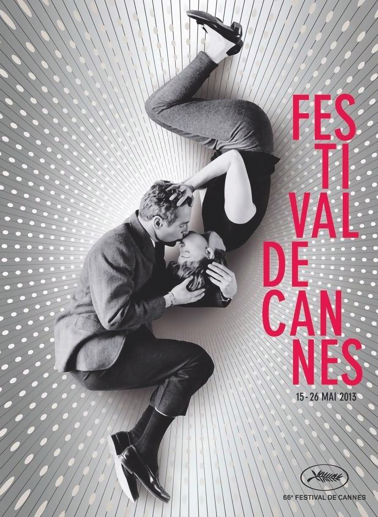
Source: Cannes Film Festival website
Interesting fact: kissing scenes have appeared three times on the posters of the Cannes Film Festival. In addition to the already mentioned couple from the poster of the 71st festival, there was also a kiss between characters Ingrid Bergman and Carrie Grant from Alfred Hitchcock’s movie “Notorious” on the 1993 poster. And 20 years later – the kiss of Paul Newman and Joan Woodward. This romantic and touching shot was taken during the filming of “A New Kind of Love”. It was processed for the poster, as well as supplemented with a dynamic background and bright text.
“Good method of repeating lines in a photo with a text block. Typographic composition emphasizes the dynamics of the figures. The photo’s background actively directs our gaze to the center, to the kiss, and the blurred bokeh creates an atmosphere of dizziness from love. The figures are in an intricate pose, but at the same time, kept in balance. The bright pink color of the text is rather frivolous because it is a shot from a playful movie “, – Maryna Diachenko.
9. 2011
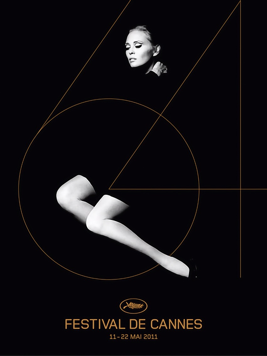
Source: Cannes Film Festival website
Actress Faye Dunaway became the heroine of the poster for the 64th Cannes Film Festival. Her photograph, taken by director Jerry Schatzberg in 1970, was used to create the poster. The organizers noted that this photo is an example of sophistication and timeless elegance, the embodiment of the cinematic dream that the festival strives to support. This poster is also a great example of how spectacular a minimalist composition can be. The black-and-white image is complemented by elegant gold typography, and a special dramatic effect is achieved through the skillful use of negative space.
“Minimalism is generally inherent to posters because the time of contact with the viewer is short. The conciseness of this poster is also supported by meaning. The perfect poster for an event about prestige and elegance. Exquisite model from the 70’s and a thin, graceful font and delicate lines. Moderate colors – monochrome and gold. Two light accents on the model’s body, everything else is in mysterious darkness. The human brain first responds positively to the model’s face and, completing the invisible, gradually (according to the dynamics dictated by the slope of the number 64, and then the line of the model’s legs) descends to the center of the circle and below to the centered logo, name, date”, – Maryna Diachenko.
10. 2008
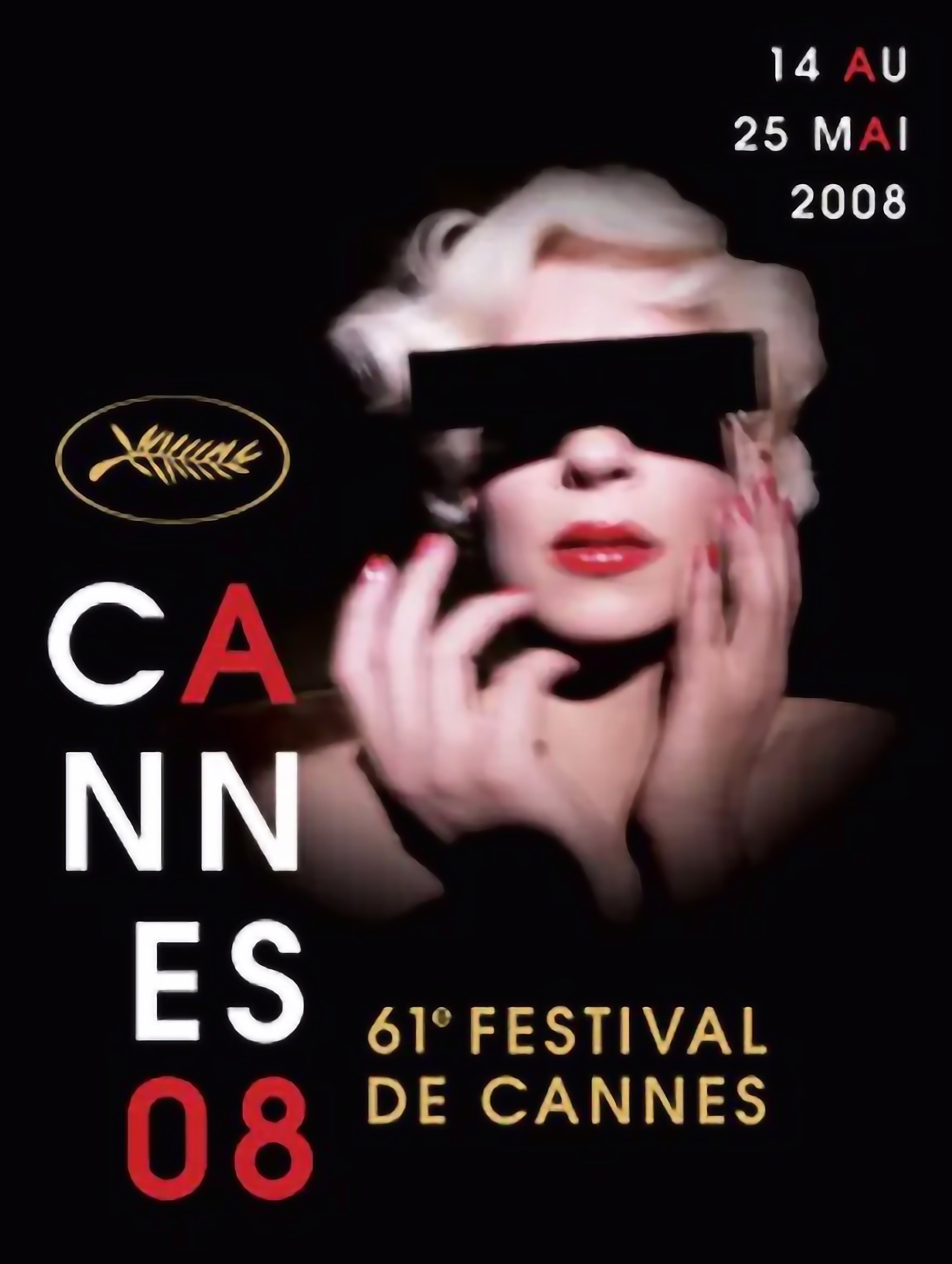
Source: Cannes Film Festival website
The authors find inspiration for creating posters for the Cannes Film Festival in both films and photographs. For example, the basis for the poster in 2008 was a picture of David Lynch. It depicts cabaret dancer Crazy Horse, whose image resembles Marilyn Monroe. The poster immerses the audience in the illusory world of cinema. This feeling is enhanced by a blurred photo of the model, which creates a special, mysterious atmosphere. The color pallet contributes to this vibe. Black and white shades complement the accent of red and gold as an element of solemnity and triumph.
Wrap up
Every year, the Cannes Film Festival poster release is an event that is expected to be no less exciting than the competition itself. These works exemplify the spirit of the time and have a distinct style that inspires many creators. It is also an excellent opportunity to train artistic vision, because the festival posters are designed by renowned artists, from whom you can learn something. We hope you discovered some interesting ideas or at least found this compilation aesthetically pleasing. We also invite you to share in the comments which of the posters you liked the most.
Find even more inspiration from the world of cinema in these materials:
Movie-Inspired Color Palettes for Ambient Design Projects
10 Documentaries for Photography Enthusiasts
Must-Watch List: 14 of the Most Inspiring Movies for Designers
Design Lessons from 5 Great Movie Posters
10 Aesthetically Pleasing Movies for Design and Photography Enthusiasts