The Top 15 Business Card Design Ideas to Make a Strong Impression
Wondering if anyone still uses business cards today? You’ll be surprised, as in the United States alone, about 27 million business cards are printed daily. They are not just an ordinary attribute of an entrepreneur, but a practical tool. It turns out that cards have a conversion rate five times higher than an average website (12% vs. 2.35%). Sounds like a convincing argument to give them a try.
The good news is that you don’t have to think about how to make a business card by yourself. Save time and effort with our collection. Discover a special selection of the best business card templates to help you or your brand become more memorable!

Why you need a business card in 2024
In today’s world, where online communication dominates, business cards may seem outdated. It would appear that with social media such as LinkedIn, online ads, and finally, digital business cards, no one needs printed ones anymore. However, statistics disprove this, as plenty of brands still turn to this method of promotion.
A well-designed card can help you make a lasting impression, strengthen your brand identity, and provide other vital benefits. So, here’s why you should consider one:
1. To make a solid first impression
One of the advantages of business cards is that they convey a strong sense of professionalism. This is an excellent way to build credibility and stand out from the crowd. But keep in mind that the design and quality must be top-notch, as 39% of people won’t deal with you if your card looks cheap.
2. To save money on promotion
Business cards can be a good option if you have a small brand and are looking for budget-friendly ways to promote it. They are much cheaper to produce than other types of advertising. In addition, cards are user-friendly due to their small size, and they don’t expire.
3. To network effectively
It only takes a second to share a business card. This is especially crucial at industry or networking events with dense programs and numerous contacts. Having a business card stack ensures more people will get your contact information.
4. To enhance branding
Since a business card is often the first touchpoint with your brand, keeping it consistent with your identity helps to enhance its impact and make it memorable. This can be facilitated by using a company logo and corporate colors in the design.
5. To not miss opportunities
You never know where you’ll meet a potential partner or client. That’s why it’s a good idea to always have a few business cards on hand. They are also easy to distribute. You can give cards in person or leave them in a coffee shop or other public place, as your target audience can be found anywhere.
Business Card Design Ideas to Stand Out
Now, let’s move on to the best business card ideas from our custom collection. Here, you’ll find a range of spectacular designs that will help you get noticed and build your desired image.
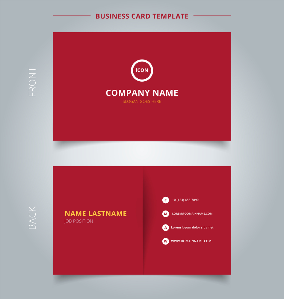
We’ll start with a minimalistic design that doesn’t look boring, thanks to the use of red in combination with elements of white and yellow. It’s worth noting that red can be too overwhelming, but choosing a muted shade allows you to avoid this effect and, at the same time, quickly draw attention to the information.
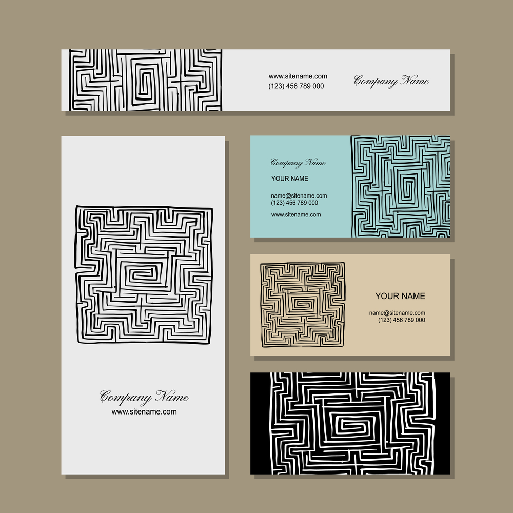
Another surefire way to grab the eye is to create visual intrigue in designs. This business card achieves such a result thanks to a custom labyrinth image. The design is built around this dominant element and uses combinations of only two colors, one of which is neutral black (or neutral black and white).
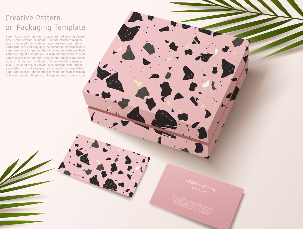
In this case, we see how the design of the card is consistent with the packaging design, which reinforces the overall branding. The front side of the business card reflects the catchy print of the box, while the back side with important information is kept laconic.
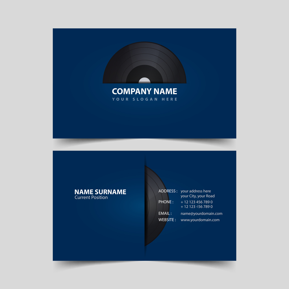
A great approach is to integrate images that immediately make it clear what the business is about. This card’s creativity also lies in the fact that the work imitates a vinyl record sleeve. The thoughtful composition and color choice enhances the overall effect and conveys the right mood.
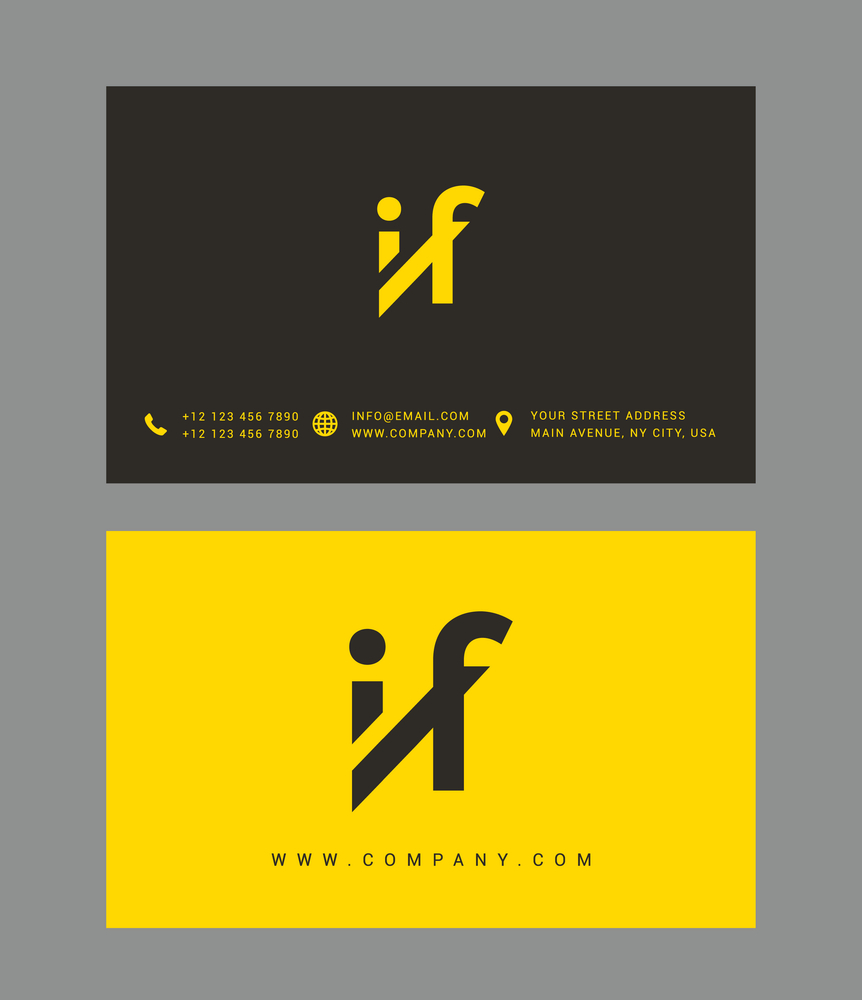
If you have a distinctive logo, it can be a key element of a business card, as in this case. There are no unnecessary elements here. This card serves the main purpose of conveying information.
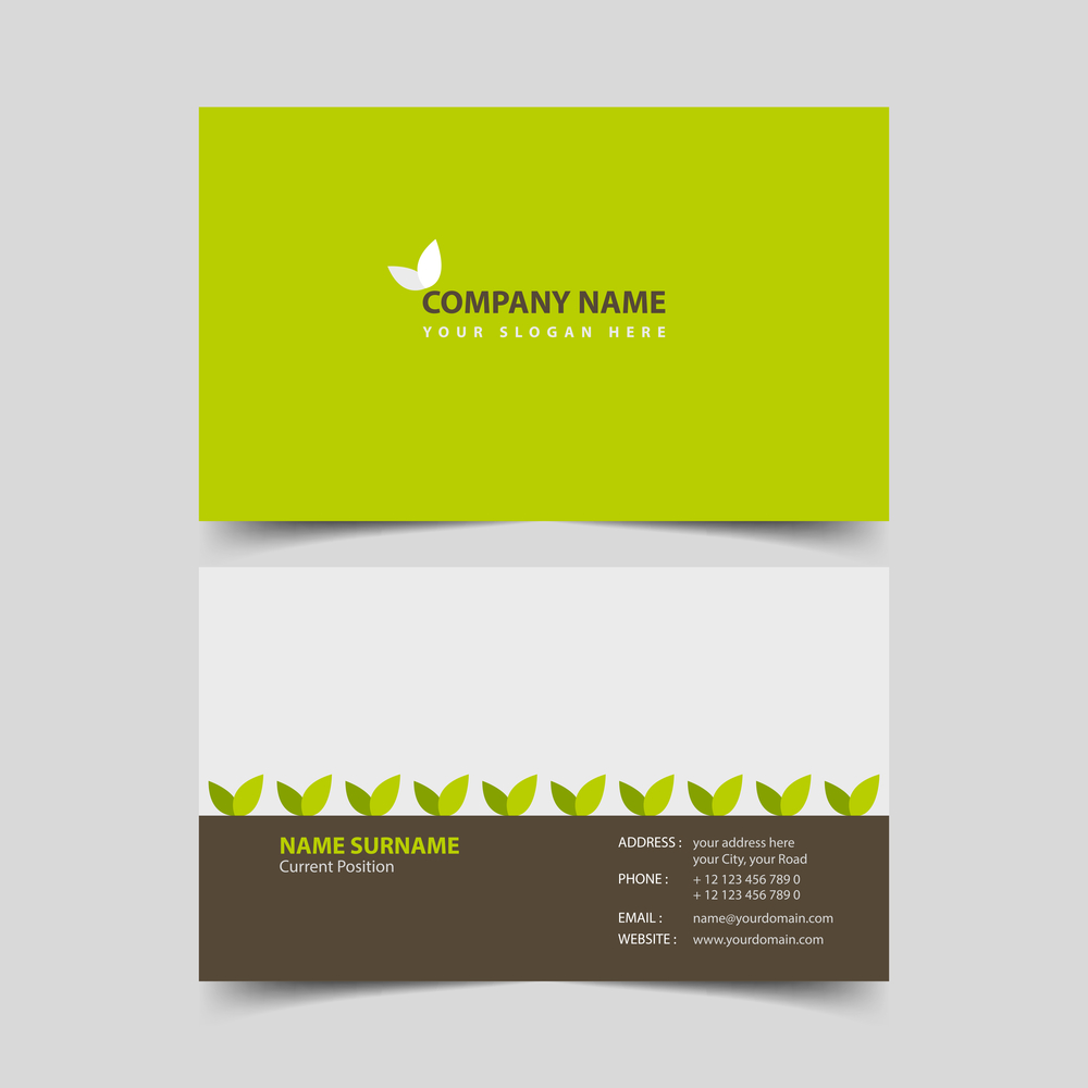
Do you have an eco-brand or work in the agriculture sector? Then, rely on a green and brown design that conveys a connection with nature. These graphics emphasize the natural theme with specific elements, making the business area clear.
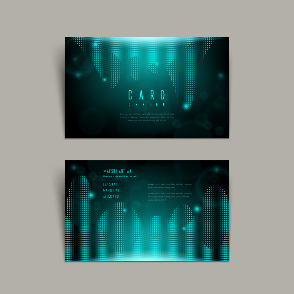
It’s challenging to convey abstract concepts such as the Internet and other technologies, especially in small designs like business cards. Here, we see a great example of a design for a tech company. Matrix-style graphics instantly catch the eye and keep you engaged.
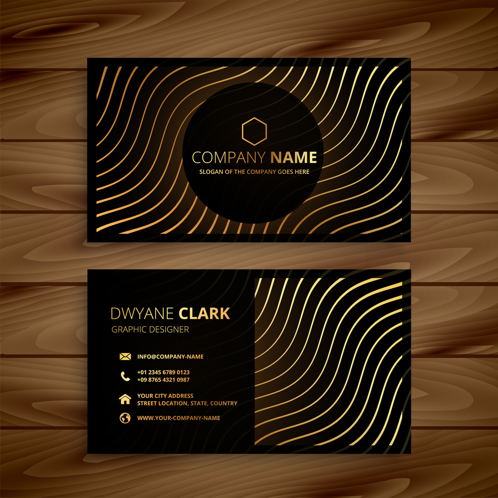
If you represent a luxury brand, the color gold will help you to create a sense of sophistication and exclusivity. However, consider that too much gold can look a bit tacky. An alternative is to add gold elements to the design, which look especially refined on a black background.
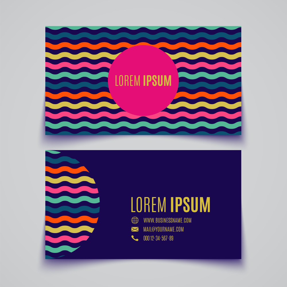
Want to add more colors to your design? Check out this business card. The golden rule of three colors is intentionally ignored here, however, it don’t look cluttered. The secret is that the basic dark purple is combined with complementary vivid shades.
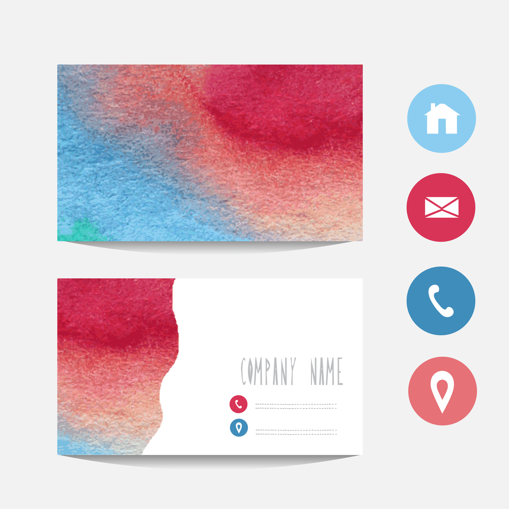
You can also use colors as a gradient, similar to this example. The image on the front of this card resembles an abstract painting that instantly grabs the eye. A great design option for an art gallery or art school.
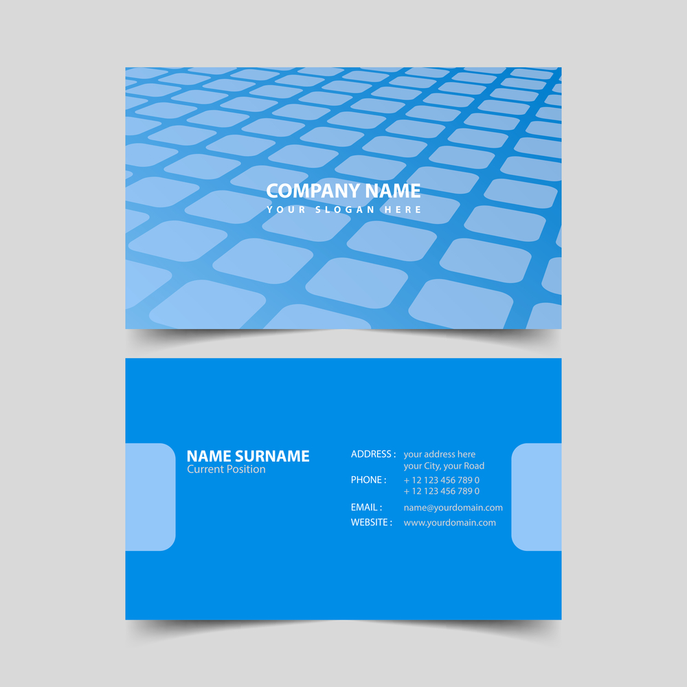
A monochromatic design can be made more interesting with an unusual background. In this example, a background image with cells creates a sense of perspective and depth, which is always appealing.
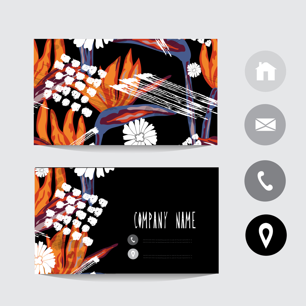
If you want to convey your creativity and bold style with your business card, rely on striking illustrations. Custom patterns and bright colors will definitely help you stand out and be remembered. And custom fonts are one of this year’s design trends.
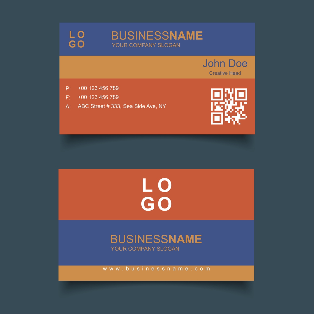
Here, we see a clever use of colors, where each shade highlights a separate block of information, creating a structured design. The QR code deserves special attention: it is a sure way to show that you embrace technology and provide another convenient option for contacting you.
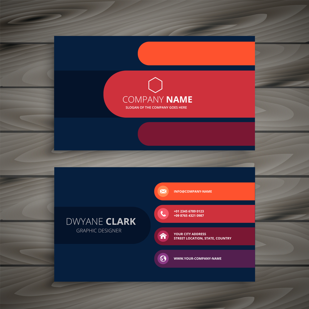
This is another excellent example of visual hierarchy achieved through color. The shades not only perform a decorative function, but also highlight information according to its importance. Red and orange are used for key data as colors with higher visual impact.
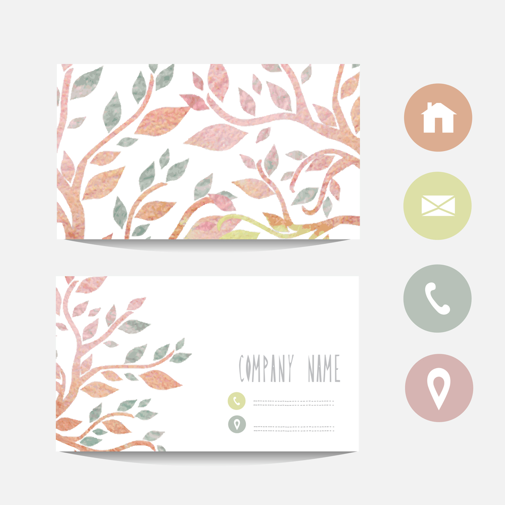
Searching for something more delicate and elegant? Check out this business card design. Its soft, faded colors and botanical pattern create a romantic and subtle look that will perfectly suit a beauty company or a women’s brand.
To sum up
Business cards offer many perks, from giving your brand a professional look to helping potential customers remember it. They’re also very affordable, long-lasting, and easy to distribute compared to other advertising channels. What’s more, cards deliver a high conversion rate. So it’s definitely a strategy worth trying. Besides, you don’t need to design a business card yourself, as we have a comprehensive collection with thematic templates suitable for various brands or individuals. Explore it to choose the best design that will emphasize your professional uniqueness and help you make an impression.
Other articles you might find interesting
Building Your Professional Image: A Comprehensive Guide to Personal Branding
Mastering the “What Makes You Unique?” Interview Question + Sample Answers
Transforming Your Network: Key Techniques for Building Valuable Connections
