Winter Color Trends 2025-2026: Collections and Palettes for Elevated Seasonal Projects
Winter 2025–2026 arrives with a fresh creative pulse. Designers are leaning into richer contrasts, natural textures, and vintage-inspired hues, and we’ve curated the season’s most compelling colors to help you stay ahead of the curve. We explored the latest winning design projects and the strongest branding and product design examples to curate an ultimate color selection for you.
Meet four defining shades—each paired with collections and practical design tips to keep your seasonal visuals bold, atmospheric, and unmistakably current.
Discover Winter Color Trends Collection
Winter 2025-2026’s Most Wanted Colors
Welcoming winter means embracing its contrasts. This time of year carries many moods. We move between the buzz of pre-holiday preparations and wrapping up work projects, and quieter moments of calm and reflection—shaped by the year’s end and winter’s natural stillness. Our set of on-trend seasonal colors captures these shifts: rich yet balanced, dramatic yet grounded.
Say hello to crisp Deep Azure, opulent Wild Cherry, earthy Olive Green, and soothing Greige. Each shade brings its own signature vibe, yet together they form a winter palette of soft sophistication, uniting freshness and coziness, trend and timelessness. Think winter cabin meets modern city: cool air outside, warm firelight inside.
This confident, nature-rooted selection brings an interplay of opposites—cool versus warm, botanical versus mineral—yet stays within a muted, slightly retro range. And if you caught the vintage note, you’re absolutely right. The palette reimagines classic 70s staple hues through a modern lens, reviving retro minimalism and heritage luxe while staying both premium and approachable.
Now, let’s see what each color brings to the narrative.
Deep Azure
#045A83
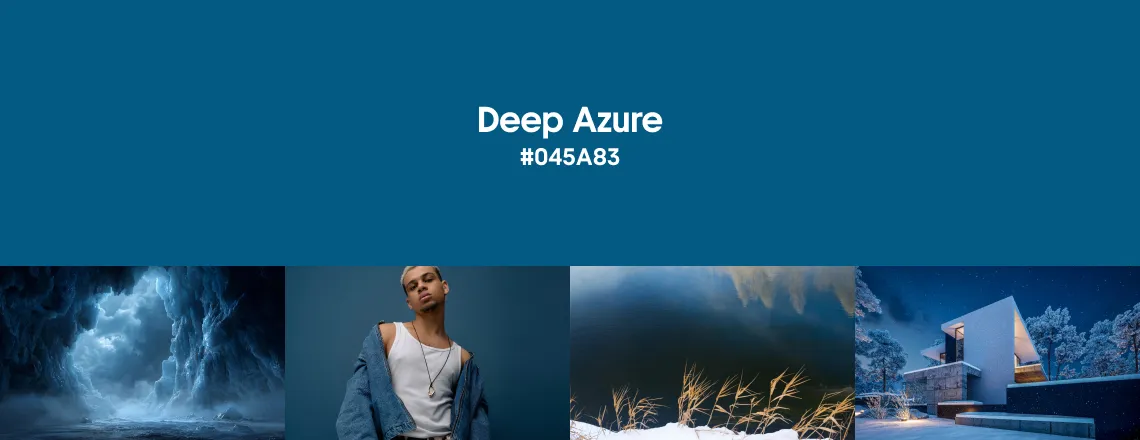
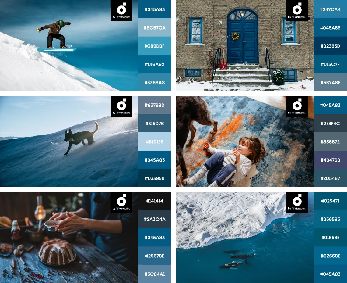
Our winter color edit opens with Deep Azure. This cool, muted ocean blue with a hint of teal may seem like a surprising choice, but it taps into a blue wave that promises to sweep us all away in 2026. Our pick of this shade is backed by a range of industry trend forecasts—from the Blue Hour in the Creative Trends report to Dulux’s indigo family (a trio of blue shades) and WGSN’s Transformative Teal, all tipped as colors of the coming year.
Deep Azure strikes a perfect balance of intensity and freshness. It’s medium dark yet richly saturated, bringing energy without overpowering a design. This coastal shade isn’t showy, but quietly confident. Like all blues, it conveys calmness and reliability, offering moments of serenity amid visual noise. Yet Deep Azure is far from a stark corporate navy: a subtle teal undertone gives it a natural, lively edge—like a cold lake under winter light.
Blue has long been an all-time favorite among designers and brands, but today many are seeking fresher alternatives to familiar classics, and Deep Azure is just such a find. We see it setting a bold, high-energy mood in hero images, popping alongside orangy-yellow accents in brand design, and grabbing attention in print ads. This teal blue works beautifully both on its own and in tandem with other shades: paired with neutrals, it truly shines, while next to brights it holds its own as an equal partner in drawing the eye.
Combine Deep Azure with rich orange, muted yellow, or saturated red to create bold contrast.
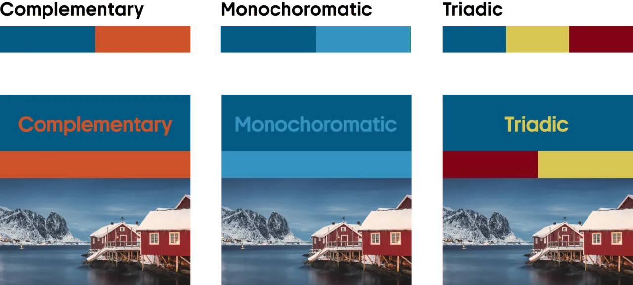
Pair Deep Azure with lighter or darker blues, plus greys and purples, to build calm, harmonious palettes.
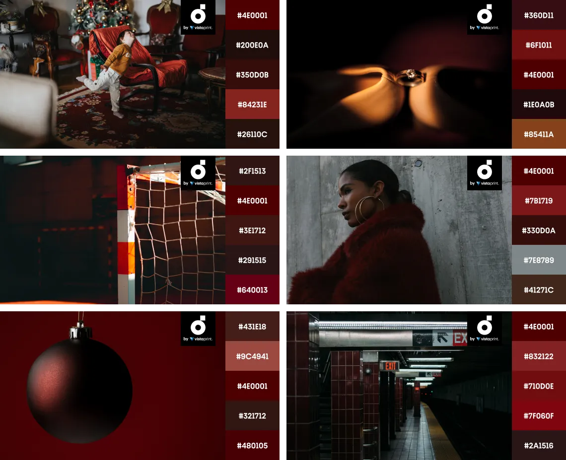
Wild Cherry
#4E0001
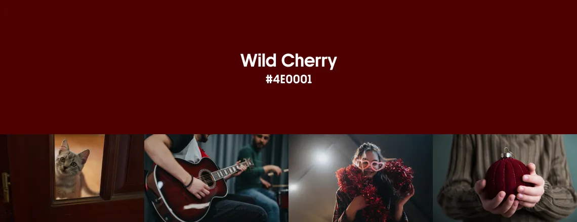
We simply couldn’t ignore this shade (and who would?)—it’s everywhere right now, from street style to chic restaurants and design-forward venues. Wild Cherry is a sister shade to Aged Wine, one of last year’s winter color trends. At first glance, they’re nearly indistinguishable, but Wild Cherry is warmer, with no purple undertone. It sits closer to pure red with a subtle brown cast—a saturated dark crimson that feels bolder and more dramatic.
This rich tone embodies sophistication, elegance, and sensuality—think of old theaters with velvet curtains or a glass of mulled wine by candlelight. Confident and powerful, it carries none of the aggressiveness of a bright red. A warm undertone keeps Wild Cherry grounded and cozy, so it naturally slips into winter palettes.
In graphic and product design, this trendy shade conveys refinement and a high-end feel. With neutrals and golden accents, it becomes an emblem of quiet luxury; used on its own, it makes a bold statement that won’t go unnoticed. At the same time, it would be a mistake to see Wild Cherry as too serious or one-note. Just look at how its mood shifts alongside brights such as orange and lilac or pink and green-yellow: burgundy delivers crisp contrast without taking over the palette.
Explore Wild Cherry Collection
Wild Cherry looks especially striking alongside bright purple, pale yellow, and cornflower blue. Paired with berry reds, it creates a more dramatic effect.
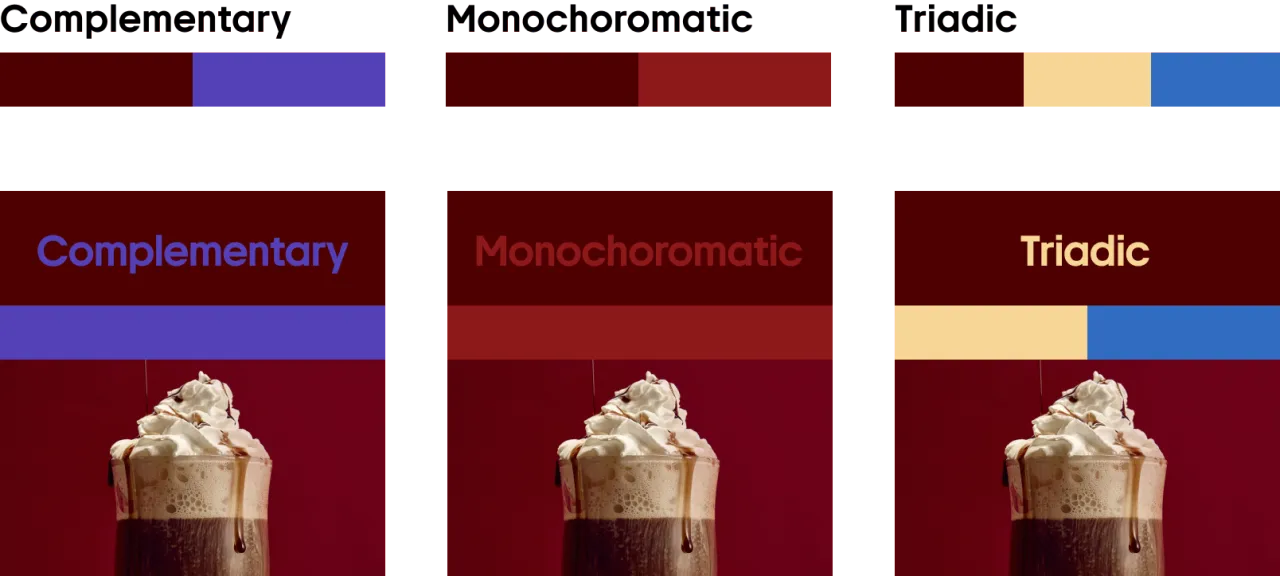
Combine Wild Cherry with warm browns to enhance its natural richness, or soften it with grey for a balanced, modern look.
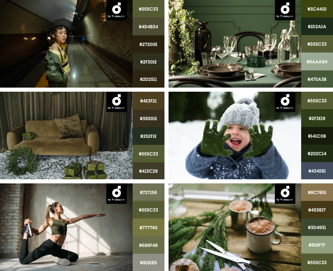
Olive Green
#555C33
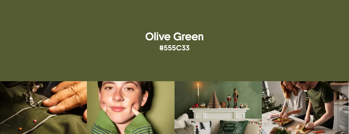
Where Deep Azure feels crisp and cool, Olive Green brings a warm, botanical freshness to our winter palette. This dark forest green carries subtle yellow undertones, reading earthy and smoky with an outdoor vibe. It instantly evokes nature—old moss, cabin woods, and quiet olive groves. This hue also comes across as practical, steady, and protective, a connection rooted in its history as a widely recognized military shade.
Olive Green reflects a natural confidence: it isn’t flashy, just quietly sure of itself. Calming without turning cold, it stays inviting rather than stern. Its mature character suggests heritage and longevity—another facet of this versatile tone. Think Olive Green is too earthy to feel high-end? This Aston Martin (pure luxury on wheels) proves otherwise.
Olive shades are a go-to among graphic designers for packaging and brand identities that lean into organic, nature-first philosophy. Just look at this perfume-bottle concept with moss detailing—it’s a real treat for aesthetes and nature lovers. At the same time, our olive is anything but one-note. It builds dynamic compositions with other rich colors—whether paired with brown and pink or set against vibrant pear green—while giving any palette a strong, grounding anchor.
Explore Olive Green Collection
Complement the natural warmth of Olive Green with muted ochre or deeper mossy tones. For extra visual intrigue, pair it with lavender purple or blue-violet.
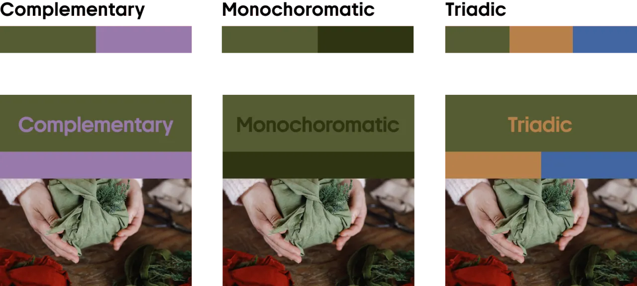
Brown, beige, and grey shades work beautifully with Olive Green for palettes that feel grounded and cohesive.
Greige
#AEA9A0
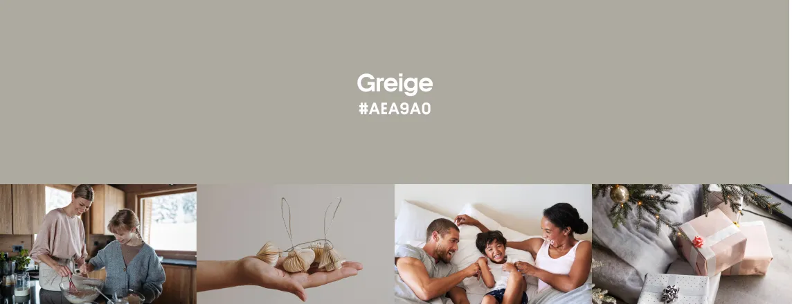
Greige is the final hero in our selection of winter-trendy colors—understated, yet completely self-sufficient. A refined blend of gray and beige, it captures balance in its purest form. Soft, muted, and lightly earthy, it tempers the season’s bolder shades with effortless calm.
This delicate neutral shade conveys a soft, gentle warmth, bringing to mind cozy textiles—like a wool blanket that keeps you comfortable on cold days. Its natural, tactile character is reinforced by echoes of clay, warm stone, and handmade ceramics.
Greige is a real find for graphic designers: it sidesteps stark white and keeps palettes cohesive and uncluttered. Moreover, thanks to its neutral nature, this tone pairs effortlessly with virtually any color. Greige also makes an ideal background—it adds depth and quietly supports a design without disappearing. Yet alongside neutrals like black and whitewashed grey, it steps forward and plays a more active role in the palette. Beyond color pairings, the shade works beautifully with visual effects as well, from subtle graininess to sun-cast shadows.
Create festive designs by combining Greige with yellow-gold. For a more playful feel, pair it with mint or lilac.
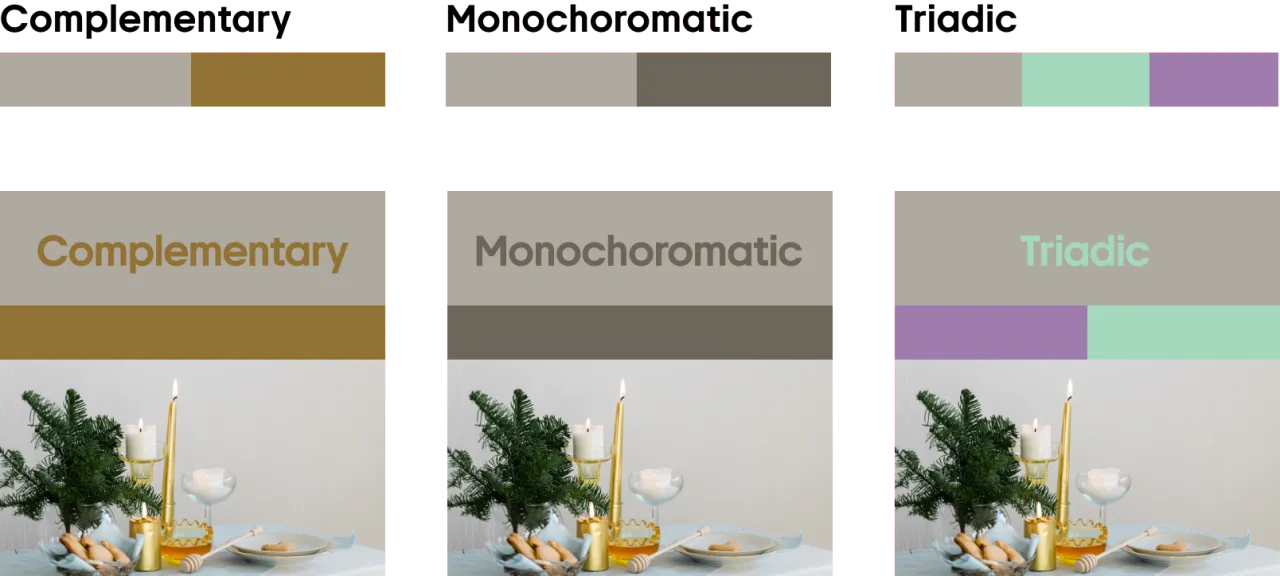
For a modern, well-balanced palette, team Greige with beige and earthy browns.
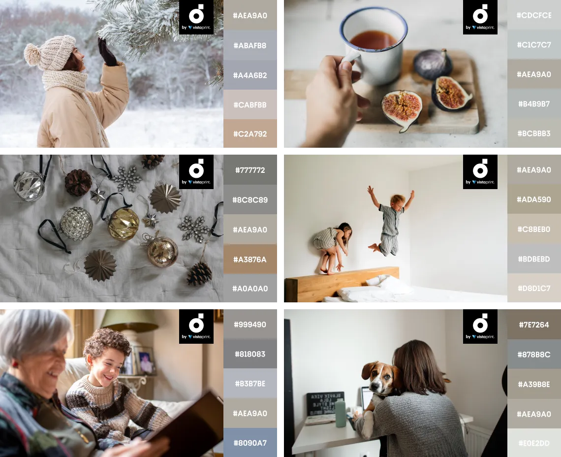
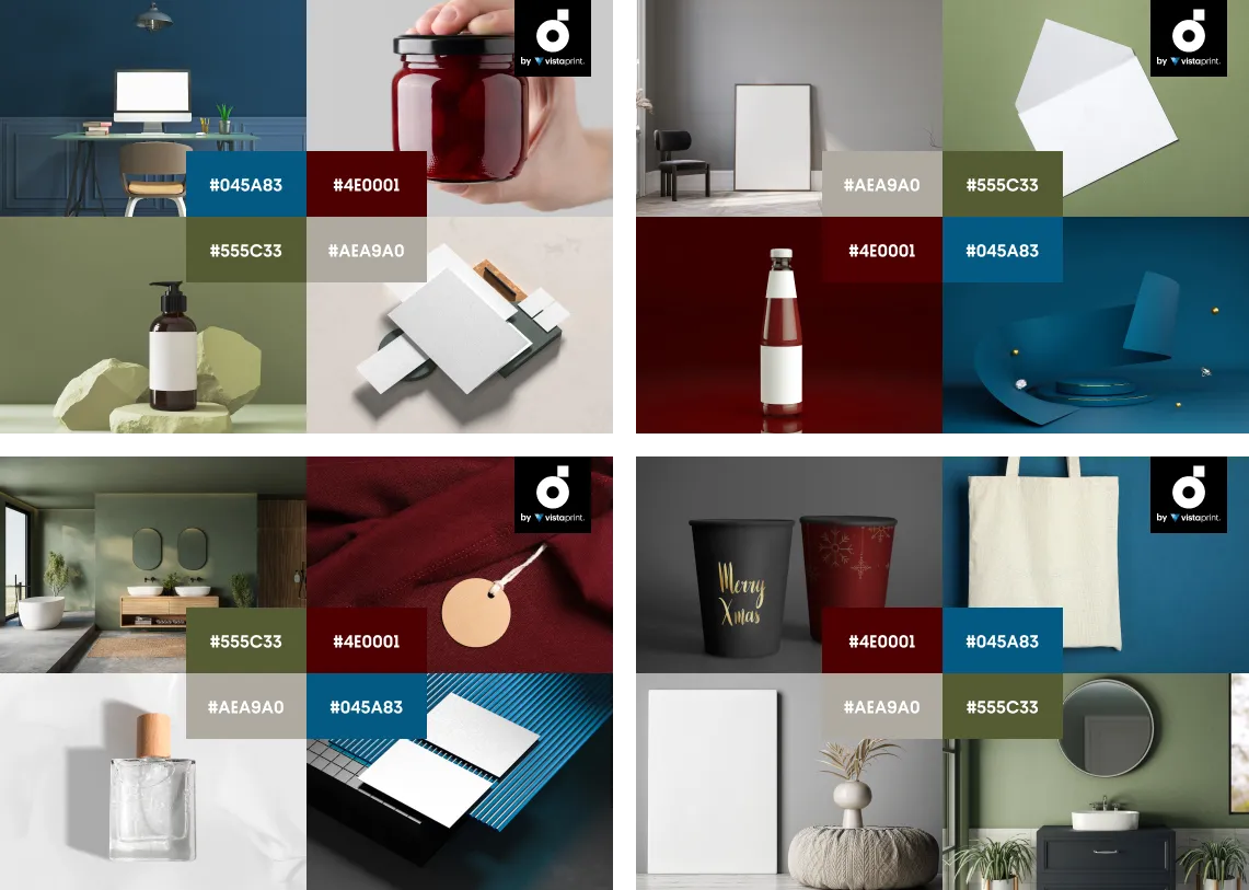
Ready-to-use mockups to inspire your winter designs
To spare you the trouble of figuring out how to bring trendy winter colors into this season’s projects, we’ve put together a curated collection of mockups and ready-to-use design files in Deep Azure, Wild Cherry, Olive Green, and Greige. Turn to it whenever you’re building winter campaigns—whether you’re creating email newsletters, setting up social media ads, or planning a website makeover.
More creative insights for your inspiration
Creative Design Trends 2026: Reality Strikes, The Tender Shift, and More
Full Expert Insights Behind the Design Trends Forecast
Fall Color Trends 2025: Cozy Up with Four Enchanting Colors, Mockups, and Collections