6 Design Trends to Unfollow in 2021, and Why They Became Irrelevant
Design is not purely about beauty, it is also about functions and technologies. Our interests and needs are constantly changing and those changes are followed by changes in functions of the objects to which we are accustomed. For this reason, there is nothing tragic or strange in the fact that some approaches to visual design fade away, while others come to replace them.
Here, we’ve compiled a list of the currently dying design trends and explained why they lost their relevance in 2021 and how they have transformed since their inception. The cause of their death may vary: some design trends are not matching the dominant ideology anymore, while in other cases it is about technical progress that opened new horizons for designers.
To learn details, let’s dive into the world of graphic design trends (and anti-trends!) for 2021.
Dying Graphic Design Trends for 2021
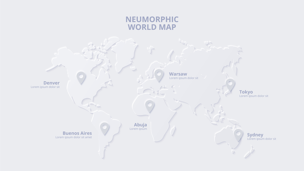
❌ Neumorphism as a skeuomorphism version
Why it is a dying trend:
— low functionality
— inconvenience associated with outdoor mobile device usage
— non-inclusiveness towards people with sensory systems diseases
On this list, neumorphism is perhaps the youngest trend. Experts predicted a bright future for it in 2020, appreciating its visual sophistication, noble restraint (for example, it includes small number of colors), and potential to simulate real-world visual experiences.
What went wrong? It turned out that minimalistic neumorphism is difficult to use at the level of product design or brand identity, as it is based on faded shadows, low contrasts, and a very limited color palette. Thus, people with visual impairments have difficulty dealing with such designs. Plus, these types of design templates take longer to get comfortable with their navigation, as their clickable elements are not very different from everything else.
At the same time, skeuomorphism, that is, the trend according to which graphic design makes objects on the screen look like they are real and 3D, is still at its peak. The reason is it has infinite artistic potential and expressiveness.


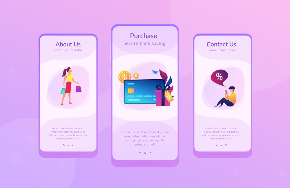
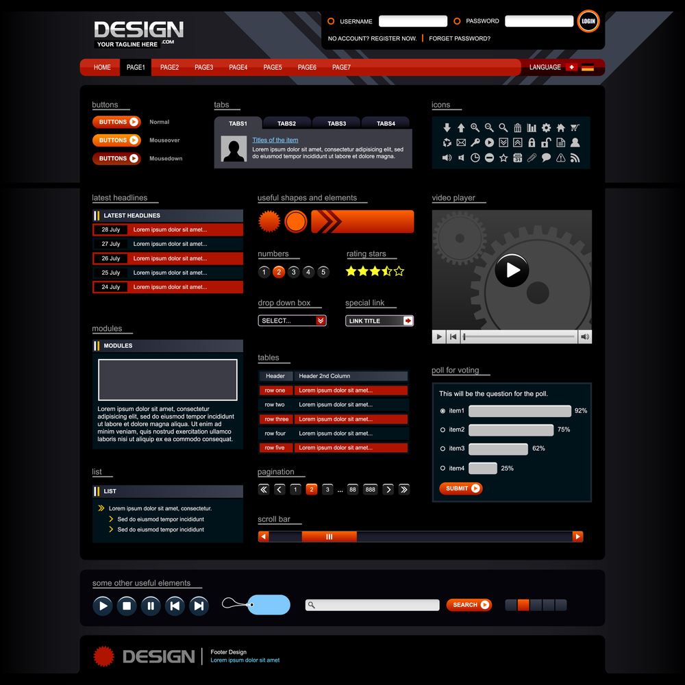
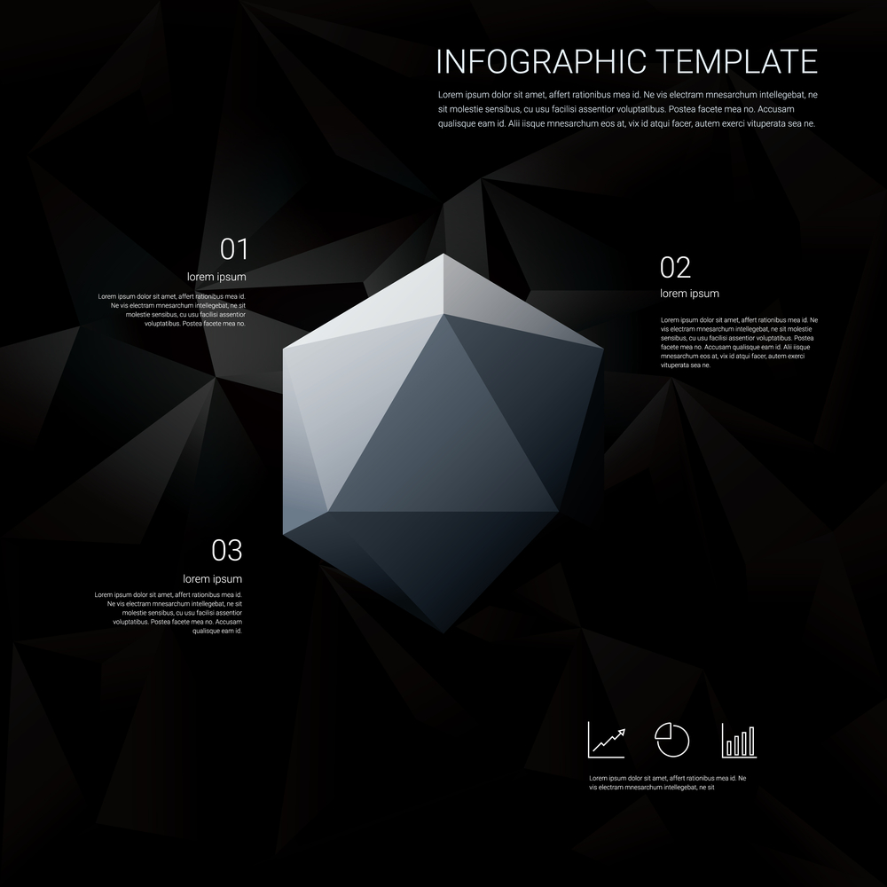
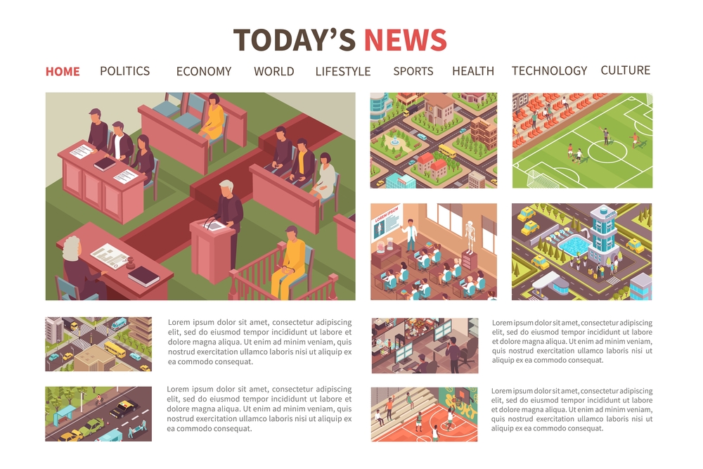
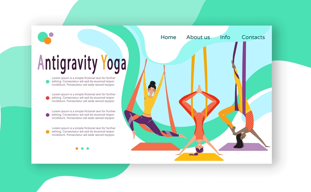
❌ Typical flat and isometric illustrations
Why it is a dying trend:
— lack of personality
At first, cute 2D illustrations was the trend. As a rule, they were created in vector formats, which made it possible to recolor them based on corporate colors or the design of your website pages. Such pictures became an alternative to photos: they worked well in terms of responsive design due to less detail and ease of scaling. Moreover, they saved the resources of user devices and accelerated site loading.
With the development of graphic tools, the trend for generalized metaphorical illustrations has spread to 3D design and motion design. And both 3D and animated graphics make websites more user-friendly and eye-catching.
So why do we advise you to rethink your attitude towards such illustrations in 2021? The problem is that this approach has become so popular that you can hardly find a website of an IT company, an Internet bank, or a creative studio without schematic typical flat or 3D images of people who somehow use a mobile device or interact with each other. To stand out, we recommend that you go for more custom-made illustrations and ditch the visual metaphors that have become clichés.
❌ Rounded corners and organic shapes everywhere
Why it is a dying trend:
— makes it difficult to understand the hierarchy of page elements
— overuse leads to confusing users and higher bounce rates
From a psychological point of view, most people subconsciously respond positively to rounded organic shapes, both in the real world and in digital interfaces. The reason is that rounded corners feel safe to us compared to sharp corners and lines.
Unfortunately, this feature of human perception is often abused these days, depriving the designs of web pages and apps of all possible clear lines and corners. This approach creates a visual mess and prevents users from figuring out how to move around the page.
We are not urging you to get rid of rounded shapes at all, but we advise you to use them deliberately. Sharp corners and a clear content grid also have their advantages: in particular, they help users easily navigate your site. Use rounded elements to draw attention to your call to action and strategic buttons, as well as make your product images more appealing to users.
❌ Unnaturally bright colors and filters that increase contrast
Why it is a dying trend:
— create a visual mess if overused
— decreases user loyalty as makes things look unrealistic
— user eyes get easily tired which leads to higher bounce rates
The brighter objects on the screen easily grab attention, and photos or illustrations in warm and contrasting colors look more appealing than images with cold and muted shades. This rule is often used by those who create content for social media. And in this industry, it is absolutely justified, since the attention span of social media users is very short, and your message formats are highly standardized there. Check out some trending Crello templates if social media content production is your case.
The trend towards bright colors and contrast image post-processing by inertia has come into areas such as website and app design. The negative consequences of blindly following this trend in web design are eye-tiring sites that you want to close as quickly as possible. In addition, aggressive colors often increase anxiety.
Alternatives to flashy images could be found in the 2021 Visual Trends Report by Depositphotos (see the trend called Solace in Nature). This year, users are responding better to grounded nature-inspired colors that help them to calm down while surfing online. Check out the color pair suggested by Pantone as Colors of the Year 2021 and Brave Ground, which Dulux recommends for physical designs this year.
❌ Black theme and custom backgrounds
Why it is a dying trend:
— it requires more time to read bright letters on dark backgrounds than vice versa
— not needed outside of mobile design
— problems with using black-themed interfaces when it is sunny
There are two approaches to using dark themes in website and app design. Some designers create dark mode to make their product more flexible and user-friendly. Users can switch or set the app to automatically switch to a dark mode so as not to disturb other people at night with the light from their screens. The dark mode is also used to increase the energy efficiency of mobile devices.
Originated in mobile messengers, social networks, and news platforms, the dark theme trend soon got into desktop design. Product pages, company landing pages, and corporate sites all of a sudden got a dark background that made them look trendy but inconvenient. Some designers have gone further and provided users with tools to customize the site theme. However, it rarely adds product value.
As a result, many websites are now returning to white backgrounds. Dark mode has remained in products where it is really useful.
❌ Static visual content
Why it is a dying trend:
— increased mobile performance and internet speed
— Millennials and Gen Z’s are hard on static and non-interactive content
If you want your potential audience not to pass by your brand messages but to remember them and take targeted action, you need something more than just text and a static image.
Millennials, who shop more online today than all other generations, are used to receiving information in multimedia formats. As for Gen Z, these young people were born with smartphones in their hands and find static content simply boring.
For more arguments, consider the fact that the past year, the year marked by global lockdowns, has increased the demand for content that creates experiences similar to real-life ones. This phenomenon was covered within our Content Marketing Guide for 2020 and Beyond.
In the 2021 Visual Trends Report, you’ll also find trends titled Audiovisual Sync and Gamifyed by Design, accompanied by visual references and insights from creative agencies.
If you are not ready to heavily invest in multimedia content production, use social media-ready animated templates by Crello or opt for creating audio UX. Use the 2021 Guide on Choosing Music for Ads, Videos, and Podcasts to get things right quickly.
Wrapping up
In this article, we’ve collected design trends that have become irrelevant these days for various reasons. Our task was not only to describe them, but also to explain why we believe that some design approaches are outdated, and what is coming to replace them. At the same time, we do not want to limit your creative search with our forecast.
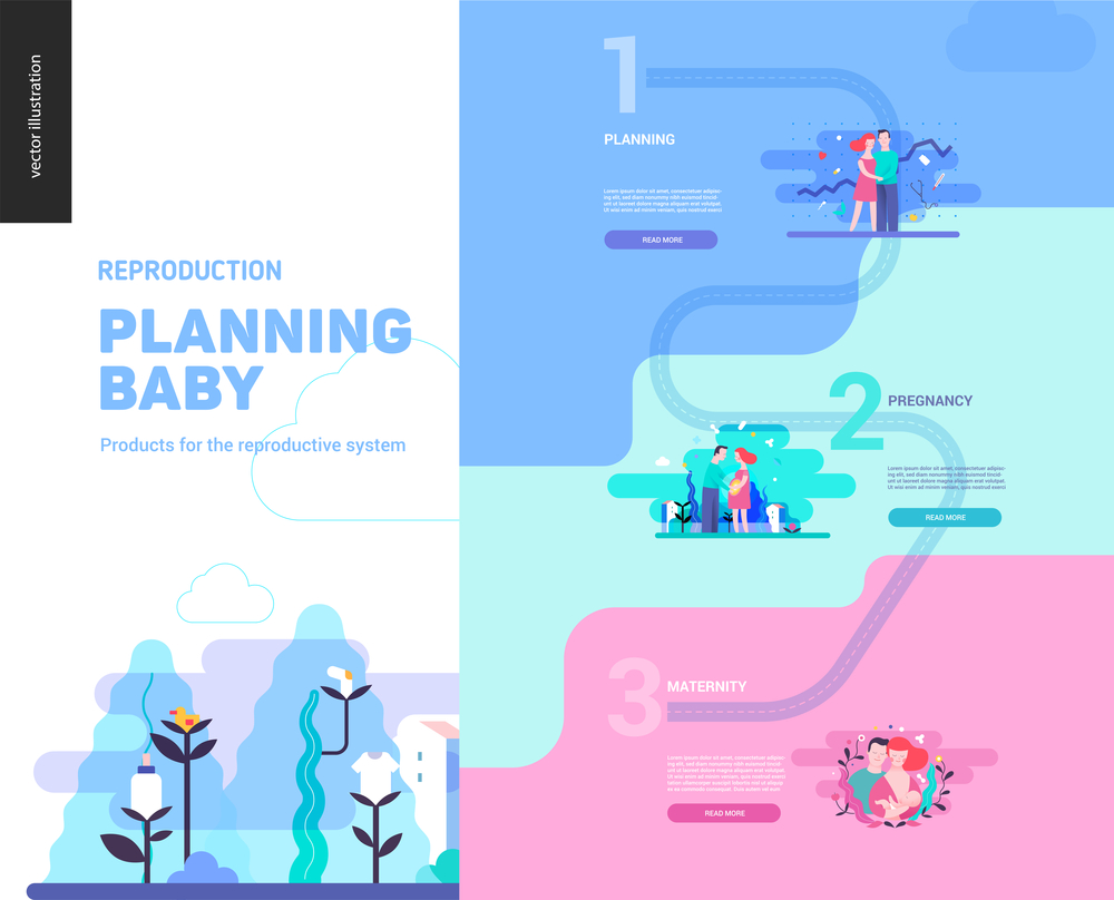
Any design has its own challenges, and sometimes artistic tools that experts have long considered outdated are the best choice. Stay up to date with the latest design trends and anti-trends, but remember to be critical of them. For more on this year’s trends and beautiful references, check out our recent article — Graphic Design Trends 2021 [Infographic].


![Graphic Design Trends 2021 [Infographic]](https://depositphotos-blog.s3.eu-west-1.amazonaws.com/uploads/2021/02/Graphic-Design-Trends-2021-Infographic-1.webp)