Сolor in Photography and Design: Trendy Palettes Review
When you take your shot, you’re conscious of about a million things that will make up your photograph – lighting, camera settings, props. Of course, there is the weather that always manages to take you by surprise. Another aspect that could make for an interesting photograph is the primary colors ratio or trendy palette present in the frame.
Let’s face it, the colors in your frame are probably the last thing on your mind. Take a minute to consider how every element in a photograph contributes to the color spectrum. Your color scheme, in turn, influences your audience. You might not be fully aware of the meaning of green or yellow but the color is the high road to positive emotional responses.
We won’t be getting into what color theory is but we will be exploring some emotions associated wth color and the many ways colors affect us. We’re here to appreciate the conscious and subconscious decisions that photographers make and the meanings of some of those colors. Color schemes and palettes drawn from photographs reveal a different side to photography but we’ll let you decide for yourself.
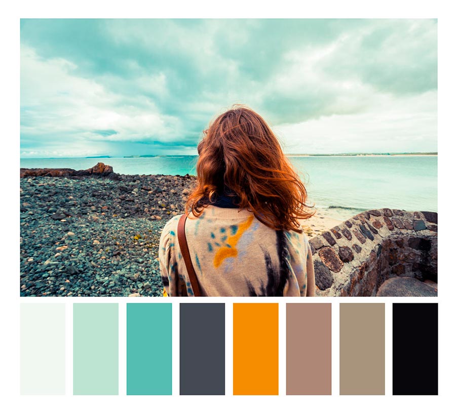
Orange
Orange is by far not the focal point in this photograph. However, the tiny detail on the subject makes it prominent against the lighter hues. A beautiful mixture of yellow and red, orange contains characteristics of both. Orange color in photography is the color of love, desire, passion, and heat. Orange has a youthful energy about it and represents things like vibrancy and enthusiasm. Closely associated with fall, it’s a reminder of the beautiful changes in nature.
Color wheel best match: blue, pink, green; purple and blue
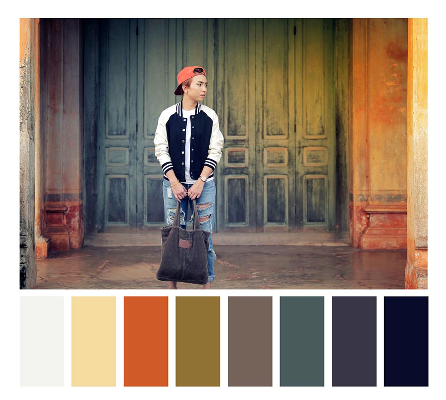
Where to spot perfect orange if you’re a photographer. A rich orange-based color scheme can be caught during sunset, especially if you’ve managed to find a really flat area. Incredible photos in orange tones are usually taken in the deserts at sunrise or sunset.
You can also practice with the orange palette at home. To do this, stock up on carrots, tangerines, juicy mangoes (it will need to be cut).
Experiment with portrait photography by inviting red-headed people with freckles for your photo session. Look for orange at metallurgical plants (red-hot metal) or abandoned factories (rust). And, of course, you can become a National Geographic star demonstrating the power of nature in photos of the volcano’s overhead.
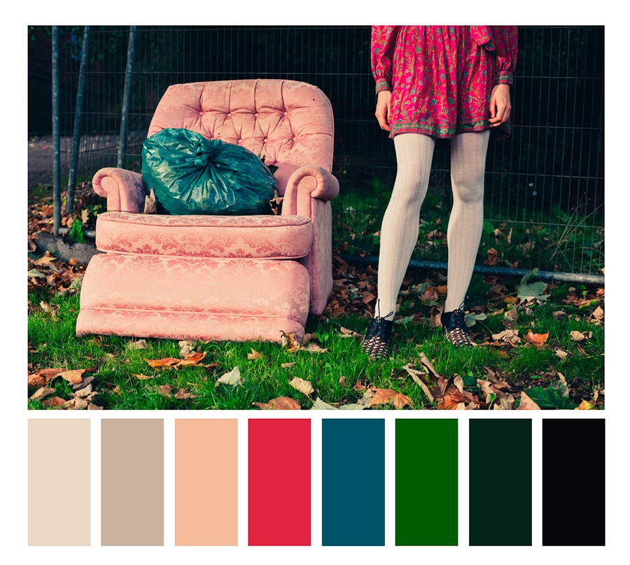
Pink
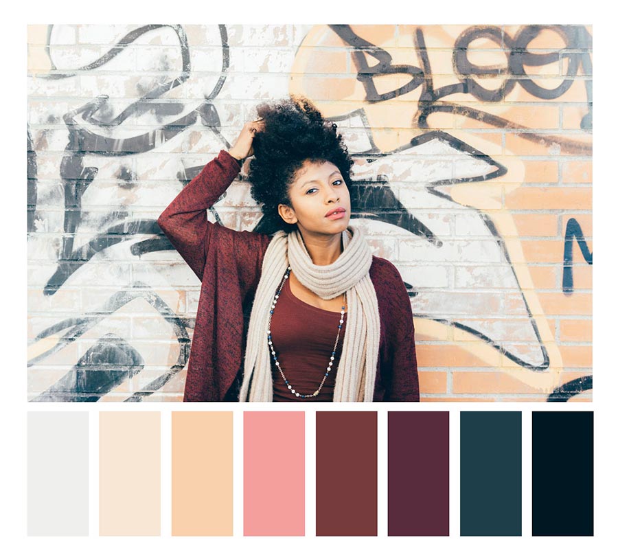
Delicate by nature, pink has a definite feminine vibe and charm to it. It’s not a bold color that excites the senses, it is rather a soothing tone with a calming effect. According to color theory, pink color represents love, romance, and tenderness. The different shades of pink have different associations and the one in this photograph is a great example of the diverse spectrum of the color.
Color wheel best match: blue, orange, green; yellow and purple
Where to spot perfect pink if you’re a photographer. Pink is a frequently-used color in design. This color has more feminine vibes, as some decorative cosmetics, including powders, are pink-colored. It is also the classic color of chewing gum, which can be used as a strong accent color throughout your project.
Once a year, a major event in the life of photographers who work with pink palettes also takes place, this event is called sakura blossom (best place to be: Japan). Check out Pink Lagoon in Western Australia if you are a travel photographer. Or visit pink flamingo habitats (such as a huge salt lake in Cyprus).
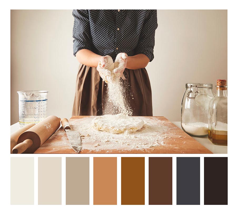
Brown
One of the dominant colors in nature, brown as a color in photography is humble and lovely in any shade. It is the color of the earth and all things connected to nature. Some may say it is a dull color, but in reality, it comes in all shades and hues and reminds us of stability, wholesomeness, and humility. In the photograph above, brown can be seen as the main color in almost every household.
Color wheel best match: deep blue and dark yellow
Where to spot perfect brown if you’re a photographer. Brown is among the trending colors of 2020 as it refers to nature, recycled materials, and air pollution at the same time.
A brown color palette is not suitable for accents in the frame, but it could form a great background for portraiture if you do not have access to a studio. Try working with tree trunks and plowed or dry ground (depending on what effect you need). Late autumn landscapes and old oak leaves are also perfect.
Travel photographers will like houses with clay walls in ancient Moroccan cities, as well as in southern Spain. A brown accent to your final image can add an insect, a leather bag, fresh bakery, a cup of tea, or a slice of cinnamon in the frame.
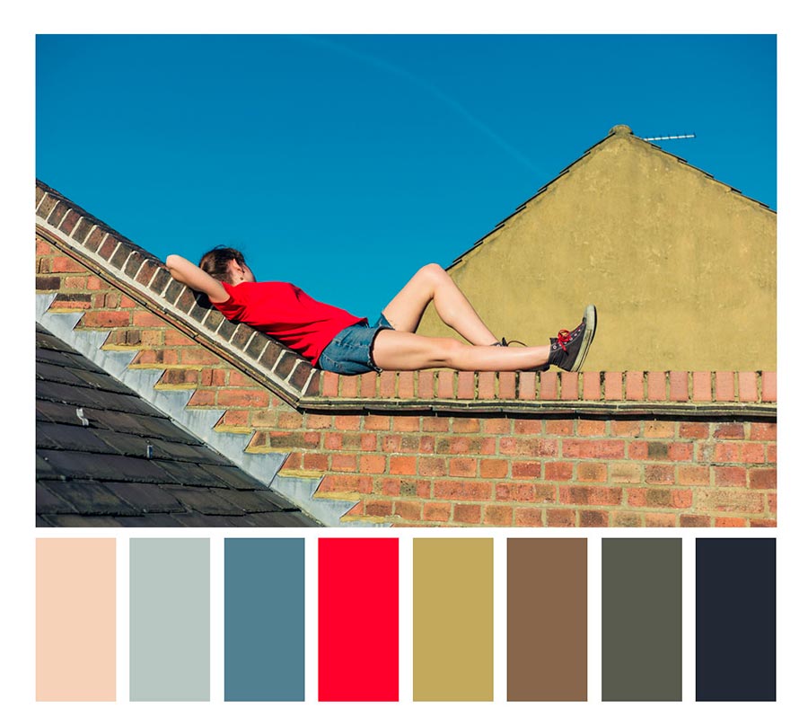
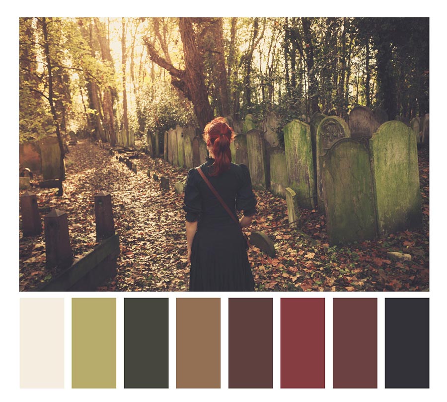
Red
Red has about a million qualities and just as many influences. It is one of the primary colors as well. The meaning of red in photography is usually about indicating dangerous things, provoking action, and call to adventures. We associate red with bravery, courage, and dares. It is the most stimulating color which evokes very strong emotional responses. Being so powerful on its own, it should be used sparingly. The little detail in this photograph couldn’t be more perfect. It’s a touch of the unexpected, an attention grabber, and a mood setter.
Color wheel best match: orange, green, blue or just green and blue
Where to spot perfect red if you’re a photographer. Red lipstick, red frill on a tango dancer’s dress, a juicy red apple from a fairy tale about Snow White, the moon in windy weather, British telephone boxes, and the ‘Stop’ road sign. Red color (by the way, you might see it among the top colors of 2019) is a perfect solution for accents in the frame.
Note that footages where red dominates usually look intimidating. We recommend that you determine the optimal dosage of red in the frame. And one more hint: add a red accent to the frame if a composition looks too boring.
Green
Another popular color that rules over nature is closely associated with all earthy symbols and is the color of growth, harmony, and hope. Green has very strong symbolism that can be traced to early associations with rebirth and peace. What’s the meaning of the color green color? Some say that it is a color with healing powers and is the most peaceful in the color spectrum. It is also the color that has the most hues, as seen in the photograph. A variant of the shade, Greenery, has been named the color of the year by Pantone a while ago.
Color wheel best match: red, orange, blue or just red and blue
Where to spot perfect green if you’re a photographer. Spring and summer are the best seasons to spot this color. The emotions that the color awakes are always positive.
If you want to find out if you should work with a green color palette, try macro photography of insects (grasshoppers and caterpillars) or invite your friend to take some forest pictures.
Green color can help you focus one’s attention on a certain part of the frame, or it can, on the contrary, become a subtle background. If you are a beginner in photography, experiment with harmonious natural patterns such as green foliage and moss on the mountainsides. They will inspire you a lot and show you how to work with composition.
Green is also the color of exotic voyages. A still-life on an exotic theme can be created using kiwi and matcha tea in an authentic interior. And if you prefer to travel with cameras in your hands, go hunting for Norwegian northern lights or Australian parrots.
Violet/purple
Purple or violet is not a color we see often in nature. If you’re lucky, the sky might show a glimmer of it. It’s more often associated with royalty, power, and wealth because of the rich saturation of the hue. Sometimes the color used in a photograph can be calming and humble like in this one. The ever so slight hint at violet makes it a soothing photograph.
Color wheel best match: green, blue, red; blue and yellow
Where to spot perfect purple if you’re a photographer. The violet color scheme is hard to work with. For best experiments, stock up with ripe plums, blueberries, and blackberries. And if spring has just begun, set off in search of a flowering bush of lilacs. In July, head to Oregon lavender paradise.
Shades of purple can also be seen in the sky in the early evening. And when the sun disappears beyond the horizon, hit the road to downtown. Purple neon signs are what you need.
White and grey
We have a positive association with white. It’s elegant, light and associated with spirituality. With a bit of it’s opposite, white turns into gray; a neutral, moody color. It’s interesting how the lighter colors are closely associated with femininity and when mixed with black, masculinity. It is a color that shares the attributes of the strength of black and the purity of white.
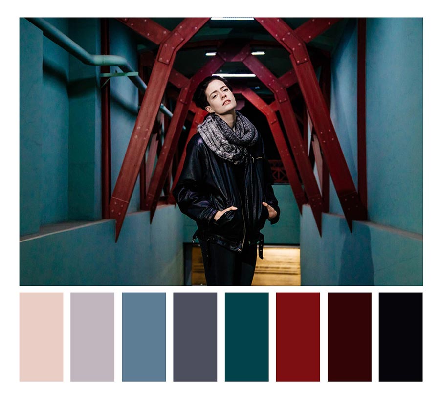
Blue
Note! Trending color of 2020
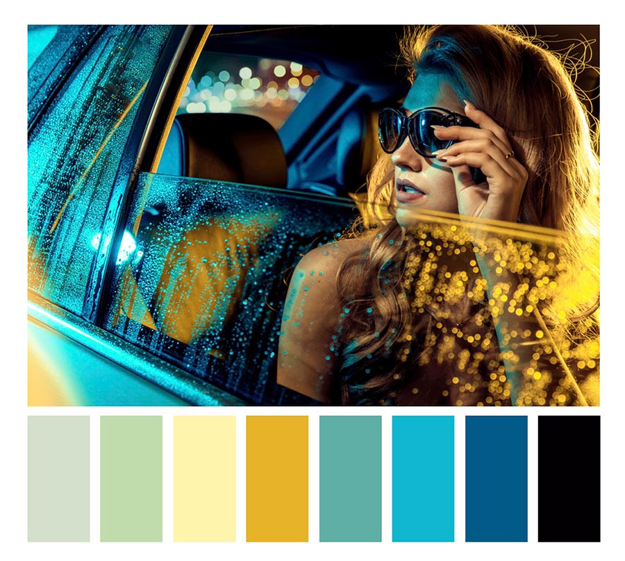
This premier color, known as the color of the sky and water, is also a popular one with interiors. It is calming, soothing and is associated with strength and trust. Light blue evokes feelings of peace and serenity while the darker hues are about strength and dependability. It is a spiritual color with roots that go back to ancient art when it was the symbol of heavens. Blue color meaning also relates to water. In this photograph, the blue walls set the mood and it is the color that creates the atmospheric undertones.
Color wheel best match: yellow, green, purple; green and red
Where to spot perfect blue if you’re a photographer. In 2020, classic blue color in design is extremely in demand. The most popular photographs in blue are seascapes, landscapes with an ‘understated horizon’ (the sky occupies most of the photographs), as well as macro images of Blue Butterflies (Morpho in Latin), royal blue tang fish, hyacinths, blue hydrangeas, cornflowers, and periwinkles, as well as ideal crystals of copper sulfate.
To get outstanding footage that blue can dominate, you can also visit exotic places on the planet: the blue alpine city of Chaouen in Morocco, the Greek coastal cities, the Maldives, and the Galapagos.
Black
Black is the color with many dual meanings. It’s one associated with death but also power and elegance. It’s not one to be taken lightly and used very sparingly in photography. It is also the absence of color and when paired with other hues, like orange in this image, provides a visually appealing and dramatic contrast. Another meaning for the color black is solemnity as well as retreat.
Burgundy
Note! Trending color of 2020
Burgundy is such a rich color in photography that it deserves its own spotlight. It’s another color associated with royalty and wealth. In this photograph, it stands as an emphasis and an accent color against the lighter hues of orange and the overpowering black and white.
Color wheel best match: classic blue and dark green
Where to spot perfect burgundy if you’re a photographer. One of the trending colors of 2020, burgundy remains rare. Of course, in order to reveal its potential, you can start your experiments with a still life with roses, glasses of wine, a flowering cactus in a pot, or even a reportage shooting in the theater (there, curtains are usually colored in royal burgundy). But why not look at things differently? Burgundy is also a color of masonry, autumn maple leaves, men’s suits, and women’s hair. Let’s play with those archetypes! Here are some inspiring examples from our contributors!
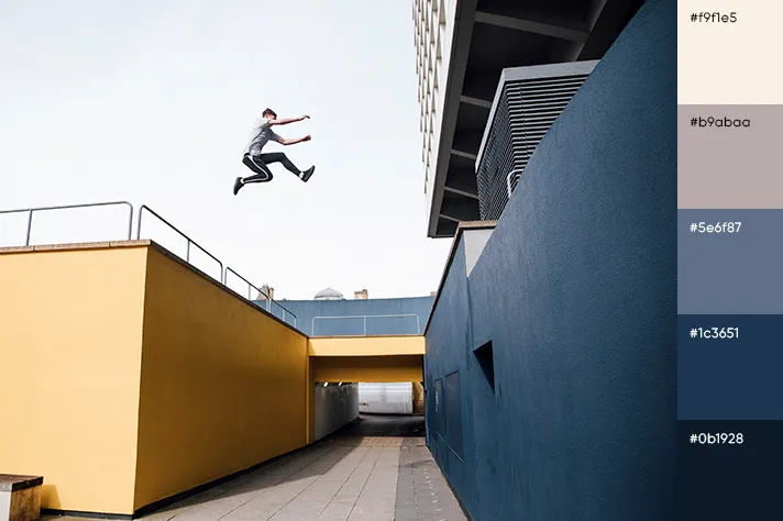
Yellow
Yellow is the most visible color in the spectrum and also the last one among the three primary colors. It grabs attention like no other color and we tend to see it before anything else in this shot. It’s a happy color associated with optimism, imagination, and energy. The color yellow means sunshine, warmth and is even sometimes associated with the divine. Different shades of yellow have different influences. Darker shades can intensify an atmosphere and create a dramatic effect while the lighter pastel ones do the opposite.
Color wheel best match: blue, green, purple or just blue and purple; if using yellow background, opt for gray objects
Where to spot perfect yellow if you’re a photographer. Emotions associated with yellow are positive. However, we recommend you to start exploring yellow, using it as a bright accent in still lifes (lemon, yolk, bananas, corn, sunflowers, and turmeric), landscapes (yellow road markings) and portraits (yellow fog glasses and overalls). Keep in mind that yellow is very difficult ‘to tame’. For being noticeable on a yellow background, an object must contrast to the background a lot, and the background should be as homogeneous as possible (try taking pictures in front of a yellow wall or wheat field).
These images raise the question – what makes an emotionally compelling color photograph? Things like composition and lighting (check out this article: Contrast in Photography: Tips and Ideas) are important and it goes without saying that the subject plays a big role. We hope you’re encouraged to also consider intelligent and purposeful use of color in photography. The color palettes bring out a deeper meaning in your images and result in a more powerful, emotional impact on your audience.


![Gradient Color Palettes for Your Next Design Project [Infographic]](https://depositphotos-blog.s3.eu-west-1.amazonaws.com/uploads/2019/08/Gradient-Color-Palettes-for-Your-Next-Design-Project-Infographic.webp)

