The Power of Imagery in Web Design – Tricky Tips
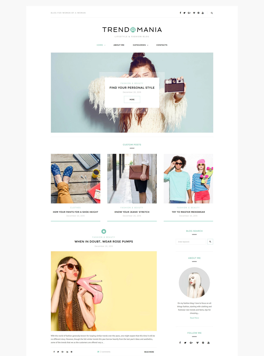
A picture on a webpage can make or break it. By means of properly selected visuals, you can make your digital project far more appealing and captivating to the target audience. You can also deliver any message imaginative to the web users. An image can encourage them to make a purchase, evoke emotions, upset them, and have a whole lot of other effects. With a right collection of images, your creative project will come to life and tell the story for you.
In web design, the role of images is unparalleled. In fact, visuals are considered as one of the strongest aspects of web design. Most often than not, images are used to sell specific kind of goods/services. In online marketing, images should not only look “nice” but also bear an explanatory meaning as per the things a user is going to read.
Today, images deliver a deeper message than ever before. Typography and other elements go on the back burner, and here are the key reasons why:
- Images are better attention grabbers. In fact, this is the first thing that a person sees when reaching a site.
- An image can deliver several emotions at a time. They can set the mood, define the audience, specify the tone of the page before a person starts readings words.
- It’s easier to navigate pages that feature images, provided that a site includes images that are linked to other content on the same web resource.
- Images receive more “likes” than texts. According to a study run by HubSpot in 2010, images get 53% more “likes” than text posts. Users are also more likely to share content with visuals as opposed to content that is all writing.
Role of Images in Website Usability
Integrating images to web design is easier than it sounds. Customising images to fit your page or taking photo shots is also doable. While many websites are just flooded with images, the most difficult and important part that we need to consider is how to use the power of visuals to the fullest. What are some of the rules that web designers should follow when enhancing their sites with images?
Understanding visual content and how it works is something all web designers should know best. It’s more about details rather than principles. One of the well-known experts in web design usability – Jakob Nielsen – has once conducted a study together with his company NN/g and compiled his results in an article “Photos as Web Content“. The conclusions that were drawn really surprised the web design industry because they brought answers to a number of questions that everyone was wondering about.
Thus, according to Jakob Nielsen, “Users pay close attention to photos and other images that contain relevant information, but ignore fluffy pictures used to ‘jazz up’ web pages.”
Indeed, when browsing a website, people want to see visual content that enhances what they are reading about. It is also a fact that users would rather visit pages with no visuals rather than a page that has irrelevant images that don’t contribute anything to the content. As per the same study, the key fundamental principles of using images in web design include:
- Successful images should be sized properly, be high quality, and have proper composition and exposure. The quality of images makes a big difference to the overall look of the page.
- An image should evoke certain feelings. What is meant by this is that the image has a certain brand appeal and fits in with the style of the brand. It must also have some emotional appeal to inspire people to want a product. Finally, rational appeal is just as important so that the benefits of the product are revealed.
- Visual content should also aid the user and their decision making, thus creating a desire to grab a certain product.
- An image must also transmit the right message to the audience.
If you have an image that is just there for decoration, it is more likely to be dismissed by your users. The same study revealed that if the images are of people or the product, they are perceived as important and have higher chances of being studied in more details by the brain. For example, when browsing someone’s personal blog, people are more interested in seeing the blog owner’s face as opposed to a stock image of a random person or an abstract image.
So, are there basic tricks that web designers should take into account when enhancing their sites with visuals? Let’s consider the 5 most effective ones.
Images and Related Texts Should Stand Close to Each Other
This provides for better comprehension of the content that you share on a web page. If the selected visuals complement the written data, the message will be understood right away.
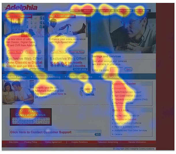
Relevance is also important as highlighted by the eye-tracking study. Although the quality and size of images embedded into web designs are also important, it’s crucial to upload a site with relevant visual content rather than fillers, which will only be a waste of space on your website pages. Take a look at the image below. The areas that are painted red receive the biggest part of the user’s’ attention, whereas blue areas are simply dismissed. The site makes use of stock photography to fill the site area with visual content. However, such an approach is totally useless, which makes images easily dismissable.
Full-width Images
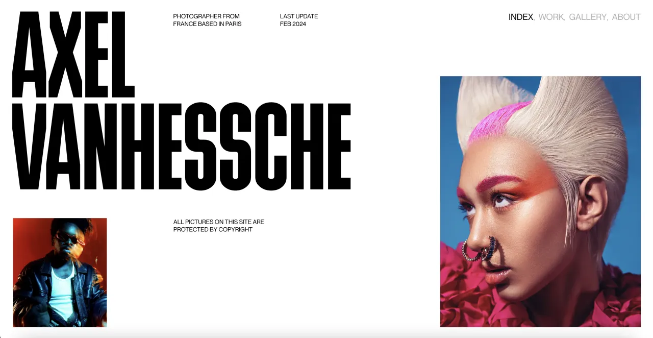
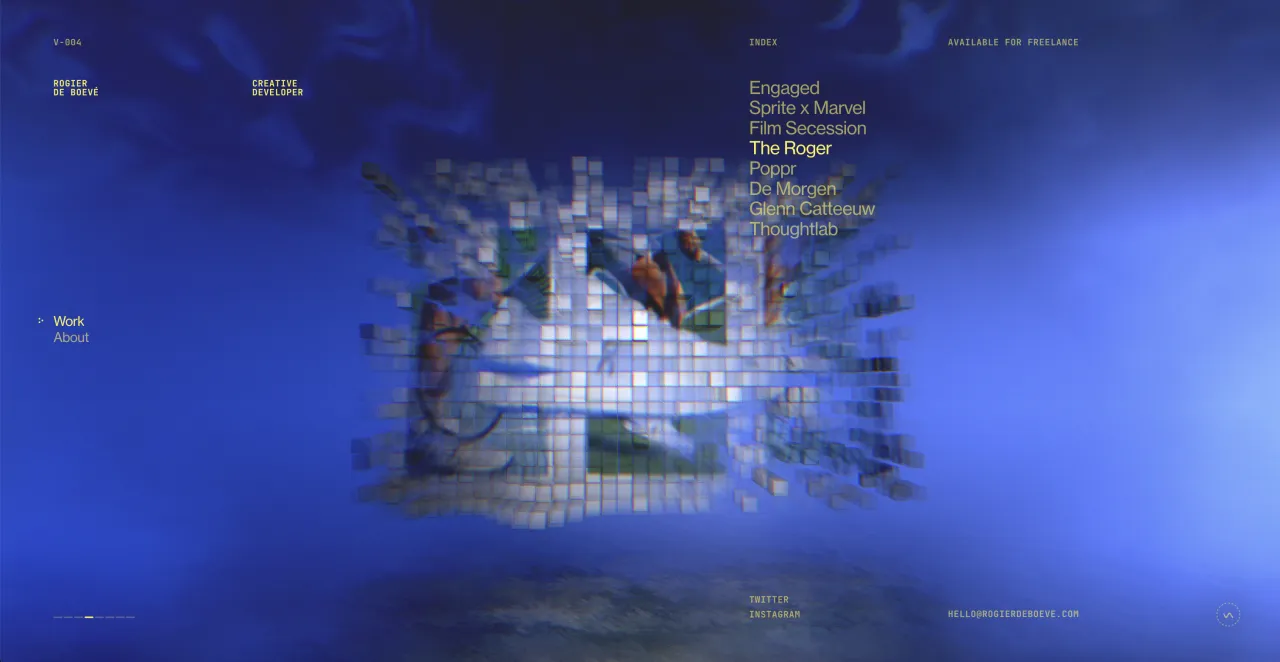
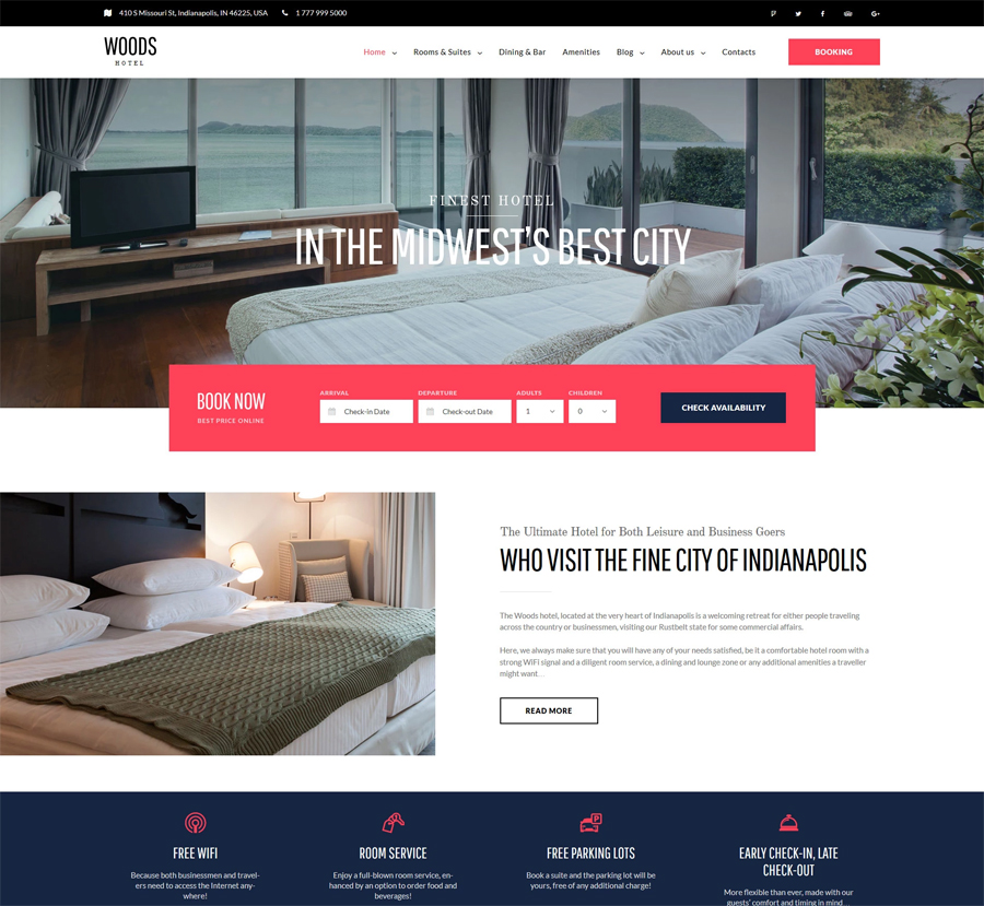
This is one of the most popular trends that seems will still be in demand in a year or two. High-resolution images will enhance a site’s visual appeal, making it look stunning on high-resolution monitors. For more captivating storytelling, the images can be enhanced with impressive animation effects like parallax scrolling, which will get the audience more immersed into the site’s navigation.
Full-width images are impossible to miss. Having such a picture shared on your site’s pages makes it a better attention-grabber than a blog post. A full-width image makes it possible to define a company directly. With its help, you can clearly visualize what particular kind of products or services your company deals with.
Use Images to Guide Users Towards the Content
This is of special importance to eCommerce sites. A common mistake that online selling businesses make is putting emphasis on the model rather that the product that is key. This will hardly result in a sales boom.
Having a degree in psychology isn’t necessary to understand how the brain works in regards to this topic. Several eye-tracking studies reveal that an image can change the focus of our attention while browsing web content. James Breeze once made an eye-tracking study on 106 people. He used a baby diaper manufacturer’s website and tracked the reaction that the audience had on a photo of a baby sitting face front and the same baby looking at the text placed right next to it. As a result of the experiment, the second image increased the attention of the audience towards the selling data, whereas the first drew the users’ attention to the baby’s face.

Images Should Be Purposeful
A successful image isn’t just the image that grabs the user’s attention but also explains some basic facts about a product in a split second. One great example appeared on Square. The latter is known as a smartphone app that makes it possible to accept credit card payments through a small device attached to a handheld gadget. That’s exactly what a large hero image from their website reveals.

Images Should Look Credible
This tip is particularly useful to the owners of eCommerce sites. If the goal of your website is to bring you more earnings, the images that it stores should look credible and trustworthy. How is that possible to achieve? Let’s consider a landing page conversion study conducted by Paras Chopra. They run an experiment on a website selling Brazilian and Caribbean paintings. What they did was a complete replacement of thumbnails of paintings with the ones containing images of artists who created them. As a result, they obtained a 95% boost of conversion rates. By revealing the images of artists the site made online shoppers feel like they are purchasing from believable people as opposed to a machine.

Wrapping Up
Making clever use of images in web design is a must if you are shooting for online success. This becomes even more important in reaching higher conversion rates. Images can either captivate your visitors or make them feel indifferent. In order for the latter not to happen, take the right pictures, use them in your designs cleverly, and you will be impressed by the wonders they will do for you.
