9 Epic Design Fails And Their Takeaway Lessons
Professional designers say that practice makes perfect but getting acquainted with the theory is no less important. Only after you understand the basic design principles you can proceed to master practical skills.
Although learning theory may take some time and the process itself is quite boring, everything depends on you. For instance, you can explore epic design fails, analyze the mistakes, and figure out why you should never repeat them. Sounds like fun!
Wrong fonts and signs
Ideally, a design has to speak for itself but there are also cases when text helps strengthen a message. A catchy phrase, a loud word or any other piece of the text should be memorable and easily understandable. Unfortunately, some beginners or non designers believe that practice is much more important than theory, and create designs that make you want to cry.
№1
The team that works on a brand’s campaign launch should consist of at least of a marketer, a designer, and a copywriter. Thus, every person will do the job and help the brand avoid being a laughing stock.
Perhaps, Maria Tash’s designers were too busy designing the banner and have forgotten to check if the phrase “Something for every hole” is ambiguous.
It may sound obvious, but before publishing your design, don’t forget to do two things:
1) to proofread a copy as many times as possible
2) to ask for a second opinion, as you may be tired of the design and may simply not pay attention to details that matter.

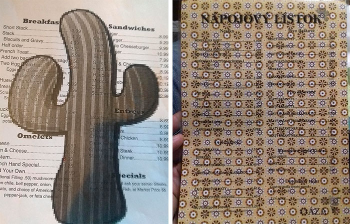
№2
The ultimate winners of the ‘wrong fonts and signs’ rubric are these two menus below that make it impossible to read the name of the dishes.
Designing for design’s sake
Unless you’re creating speculative design projects, you should stick to the primary design goal – solve problems. Don’t use colors because you like them. Don’t design objects and visuals to simply channel your creativity, as you may appear in a trap that you’ve created by and for yourself.
№3
Every design solution has to be justified, and this uneven bench is an example of what happens when the rule is ignored.
Minimalism has been popular for decades and in 2019, it is still a trend. Carrying out the principles of minimalism can be a solution for those who fall into the trap of overdesigning. Thus, before presenting you creation, reduce the details until only the essential ones remain.

№4
At first sight, the t-shirt design for a Spanish football team may seem nice but from afar it looks like a mess. Not surprisingly, it’s been a topic for discussion on social media.
To avoid such epic fails in your design, try to learn about the design-thinking process. It implies five stages, the last two of which are prototyping and testing. This means that design mockup is tested in real life conditions and only after receiving and analyzing feedback from the audience, the design is carried out.

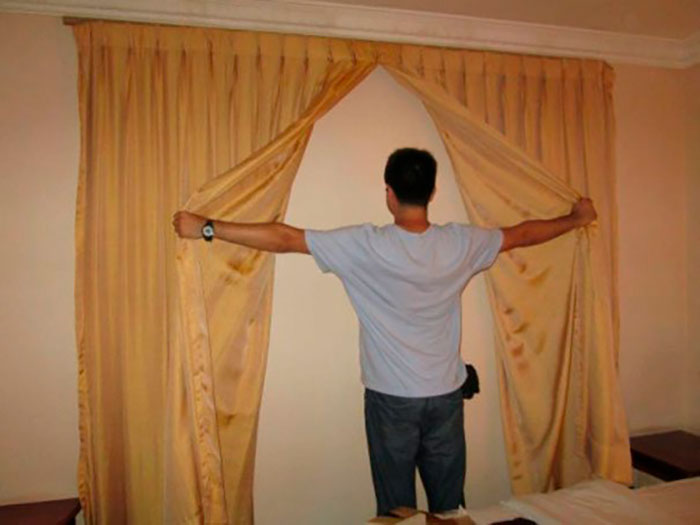
№5
Remember us saying that one of the primary design purposes is to find solutions to problems? So, why on the earth did they decide to put curtains on the wall? It’s puzzling, confusing, and everything in between. This is one of many examples of design without a purpose or deep thought.
№6
Although we can refer to this case as a font error, it is also an example of designing for design’s sake.
Braille is a writing system for visually impaired people. It is presented in a form of dots that are punctured and, thus, read. In this epic design fail, the braille typeface is flat…
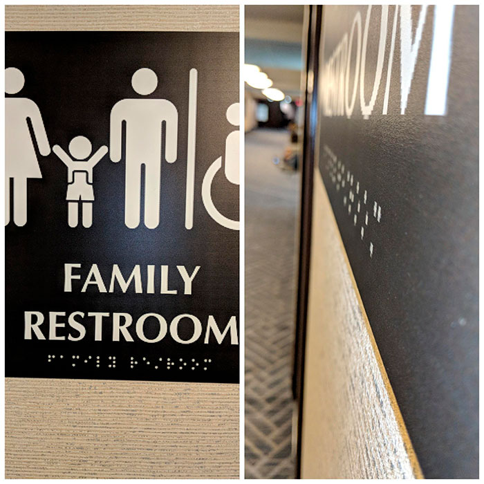
№7
A logo is the anchor of a brand. It sticks with your brand from product packaging to business cards, and everything that requires your brand’s touch. You have to make it legible and simple, at least to ensure that it works as a strong concept and is versatile for digital and print use on any scale.
Logo design checklist:
- My logo is clear, legible, and easy to read
- My logo tells people who I am and what I do
- My logo is simple
- My logo follows clear style guidelines particular to my brand
- My logo works in color and black and white
- My logo is scalable
- I’ve asked for a second opinion on my logo from somebody I trust
The company responsible for the mess below (can’t read its name), perhaps, did not see our ‘The Key Do’s and Dont’s of Good Logo Design’ piece, as well as the checklist of how to make sure your logo will work.

Absence of visual hierarchy
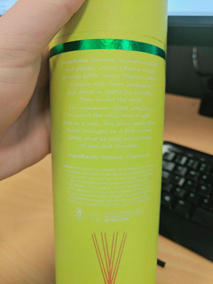
№8
Every designer should definitely be familiar with the concept of visual hierarchy, the aim of which is to help a user distinguish the order of visual importance. The notion concerns not only the size of the text but also the color, alignment and placement. If these principles are observed, the message will be successfully delivered to a client.
The case below shows what happens when the proper contrast is absent. White letters on a yellow background does not make the text readable at all and frustrates anyone whose glance falls on the packaging.
№9
The best area to implement the principles of visual hierarchy is infographics. There you need to organize, align, and do everything possible to differentiate one piece of data from another.
The Canberra Times failed to hire a seasoned designer who would know that and that’s the reason why the scale with the lowest and the highest indicators are the same color.
Meanwhile, we can suggest that the purpose of the infographic was to demonstrate the growth of subscribers from 2003 till 2017. At this point, they could have just labeled the x-axis as the separate years. Seems like an easy fix that was overlooked.

This list of epic design fails is a follow up of our article about common design mistakes. Some of the cases featured obvious errors that could have been avoided if the author had been more attentive. Others were design mistakes that are usually made by inexperienced designers that lack knowledge of basic design principles.
We hope this article inspired you to be a bit more attentive, with a better understanding of the weight of responsibility for even the smallest design decisions. You can polish up your design basics and build on existing knowledge in this article with the top must-read books on design.