How to Create Stunning Email Designs: Tips and Examples for Inspiration
Your email design is just as important as your content. Design mistakes can quickly ruin quality content and great design will always be aesthetically pleasing for your users, which in return will increase conversions.
Do you want your users to wait in anticipation for your next letter? Read some tips from SendPulse about email design with examples of stylish and creative designs from famous brands.
Responsiveness
According to Litmus, half of all letters are opened via mobile devices, which is why taking care of responsiveness is a must. Responsiveness is part of the CSS coding, but it doesn’t stop there.
How to make sure your letter is mobile friendly:
- Code in a column.
- Optimal template width for mobile devices is 600 px.
- CTA button – not smaller than 44×44 px, so it’s easy to press with your finger on a mobile device. For the same reason, avoid adding too many links.
- Place all important design elements (such as the CTA) in the top part of the letter. Your subscriber shouldn’t have to scroll all the way to the bottom to find the button. Don’t assume people will take their time to find it.
- Don’t write too much. A letter for a mobile device should be short and to the point.
- Check how your letter will look on a variety of devices. SendPulse provides you with this options when creating letters.
You can also use free responsive templates from the SendPulse gallery and create your letter design in a very convenient drag-and-drop editor.
Colors
If you’d like to increase the emotional involvement of your users or highlight the main elements, feel free to use bright colors. Keep in mind that bright accent parts should compliment your company’s colors or the logo, if present in the letter.
If your letter’s aim is to simply read the text, use soothing colors that don’t attract too much attention. You can also just send a text letter, similar to a personal correspondence.
Contrast is more important than the colors themselves when you have to distinguish something important. During a 2 week timeframe, Hubspot conducted A/B tests, sending the same letter with a red and a green CTA button. They found that a red button was more effective than the green by 21%. This is due to the fact that the color red is more contrasting than the green.
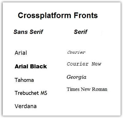
Typography
Stick to fonts that are correctly displayed in all email programs, the size shouldn’t be less than 14, with an interval of 1.5. You don’t have as much choice, but your letter will be seen by all recipients and will be easy to read.
The title in your letter should be bigger in size compared to the rest of the text. You can adjust the accent places by changing fonts and sizes but don’t overdo it with the variety because it might throw off your reader by making the text illegible and hard on the eyes.
Tips on text readability:
- Font effects such as bolding, underlining, and shadow shouldn’t be used.
- Capital letters should be left with a little bit more space, lowercase letters don’t need it.
- Intervals between lines can’t be less than the intervals between words.
- The longer the line of text, the bigger the interval between the lines.
- If there is a title between two paragraphs, the title should be closer to the paragraph it is referring to, instead of being right in the middle of the paragraphs.
Some companies create their own decorative fonts that in the future form an association and familiarity with the brand. We’ll look at these examples in a bit.
Corporate style
A template made with your corporate colors with your company’s logo will help with brand consistency with all your future letters.
It’s common practice to place sections or tabs of the website right in the letter. In this case, the letter becomes an extension of the website in one’s inbox and the user can go directly to the purchases.
Image to text ratio
The spam filter with email software doesn’t allow for letters with too many images and opinions as to the ratio of images and text varies greatly. What should be considered the standard – 60-40, 80-20 or 70-30?
If your IP address has a long history of sending letters with a good open rate and minimal complaints about spam, you can add more images without harming your delivery rates. The image to text ratio isn’t universal and isn’t necessarily the most decisive category that will effect delivery rates. What is significant is the reputation of your IP address. If you haven’t used it to send letters, the images in the letter most likely will affect the delivery rates.
Following this logic, it’s recommended that beginners adapt the ration of 80-20 and a minimum of 500 symbols of text.
CTA
Create your CTA in the form of an HTML button and not a link. The button should contrast the rest of the content and have blank space around it (this increases the chances of it being clicked). If you give the button a more convex form, it will visually appear more clickable. Find more tips on improving your CTA in the SendPulse blog.
A/B tests
You’re not sure which design will bring more clicks and conversions? Create a few versions and try A/B testing your letter. For example, you can create 2 templates – the first one will have a red CTA button, and the second a blue one. With SendPulse, you can set up an automatic mailing system with an A/B test.
Now, let’s take a look at how famous brands use these (and other) tactics to create attractive letter designs.
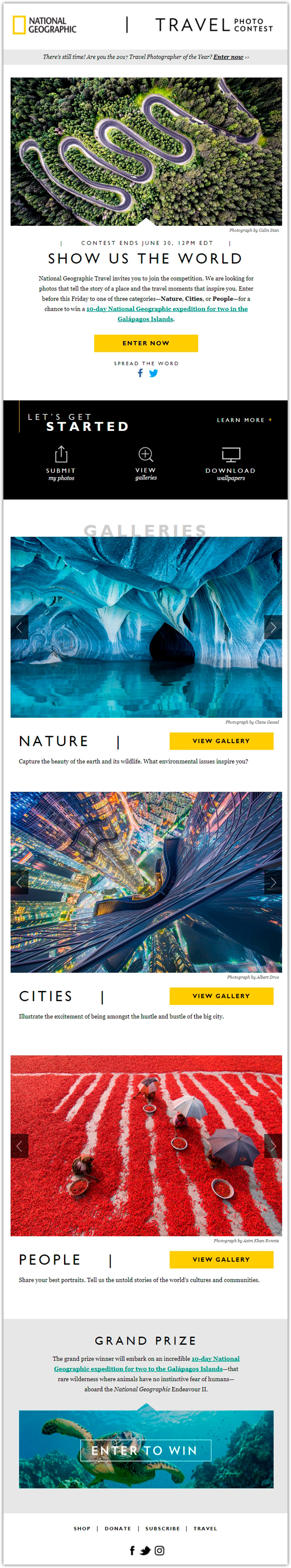
National Geographic
In this digest, National Geographic invites their subscribers to participate in their yearly photography contest, Your Shot. The top part of the letter is a photo from their gallery, below it is the title “Show us the world”, then a short description and a yellow CTA button which is the perfect contrast to the white background. Your glance slides naturally from the photograph, to the title and the bright button.
If you look lower, you’ll see blocks with sections from the gallery – “Nature”, “Cities”, and “People” to introduce works by other photographers. If you’re still uninspired to participate in the contest, the bottom of the letter reveals the grand prize for the first place and a CTA “Enter to win”. The prize is a 10 day expedition to the Galapagos Islands for 2. It’s a great incentive that’s supported by an underwater photograph of a Galapagos turtle.
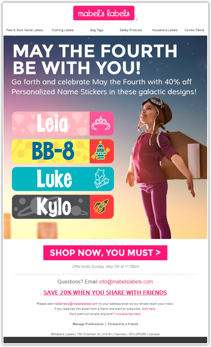
Mable’s Labels
“May the fourth be with you!” – an interesting play on words that’s a reference to Yoda in this letter from a sticker company Marble’s Labels.
Readers are offered 40% discounts on stickers for kids with galactic designs.
A photograph of a kid dreaming to fly spreads warm feelings and results in positive emotions. The bright pink button with the words “Shop now, you must”, in a style of speech much like Yoda’s, really pushes one to purchase. This is a classic scheme – evoke emotions and show the CTA right away.
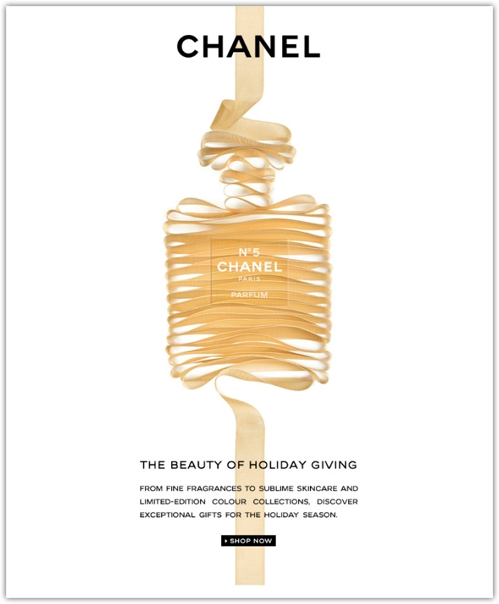
Chanel
A light and airy letter from Chanel that’s really pleasing to look at and compels one to move on to purchases.
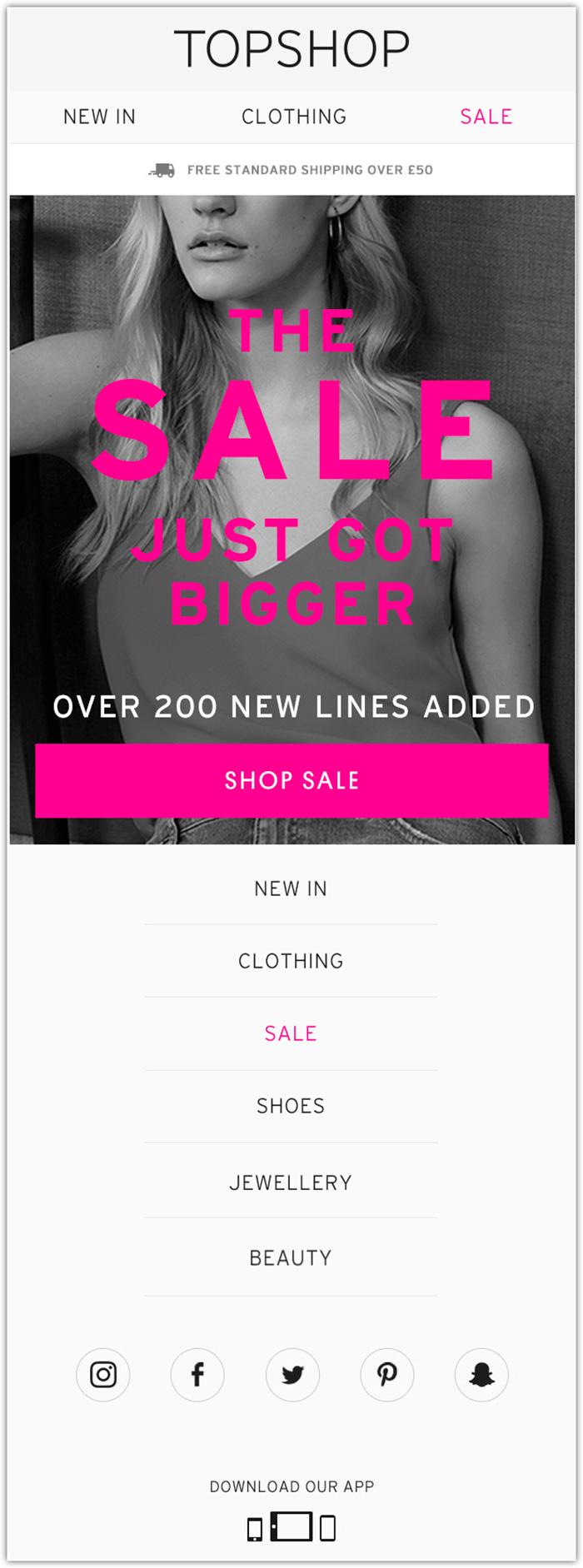
Topshop
A crispy design, a black and white photograph of a woman, hierarchy of fonts, bright pink text with a large, pink button – all these things make it very clear to the reader that the sale is growing, start shopping!
At first glance, the letter has a lot of empty space but it also has sections of the website, a sale announcement, social media buttons and information about free delivery. Not only that, but also the option to download the Topshop app.
True Citrus
True Citrus produces lemonade mixtures, gifting their subscribers with joy and positive emotions at every step of their interactions with them.
Within the realms of drip marketing campaigns, subscribers get weekly letters with the subject “Your Packetful of Happy”. It’s a play on words relating to the packets of concentrated lemonade. Inspiring phrases for every week, together with colorful designs certainly bring a smile on your face and leave you in anticipation of the next letter.
True Citrus has a brand-styled template in a bright array of colors, with a logo and slogan #KeepsYouTrue. At the center is an inspiring quote of the week “Strive for progress, not perfection.” Above it are the different sections of the website so that the reader, under all the nice impressions and emotions, can quickly continue shopping.
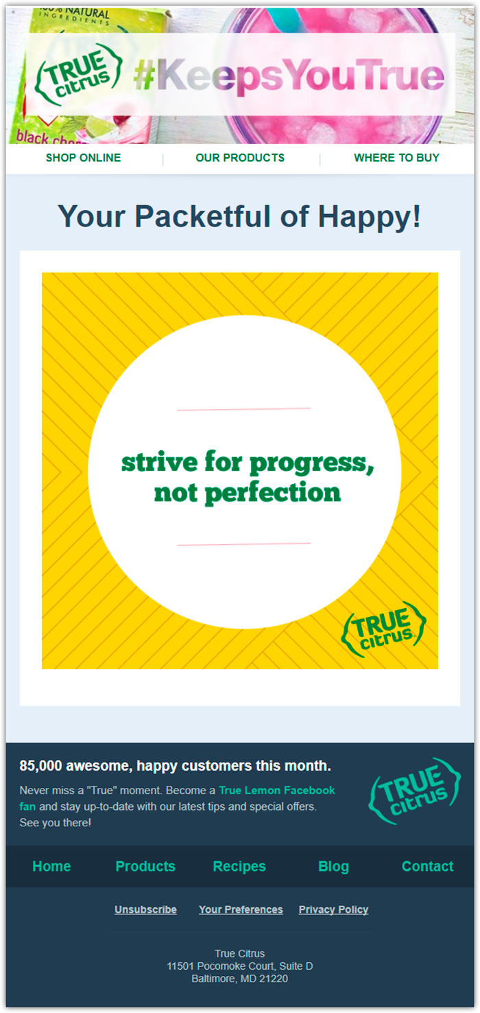
True Citrus actively uses the psychological tactic of social proof; every letter demonstrates the number of happy clients for that month.
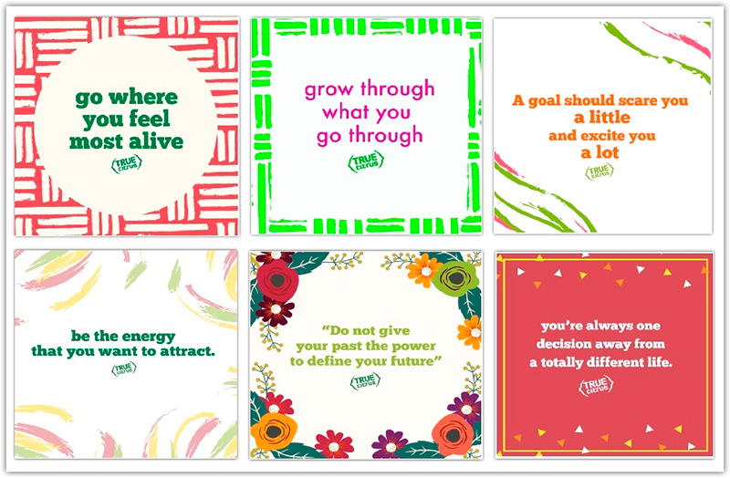
Here’s an example of inspiring thoughts from True Citrus that we have collected over 6 weeks.
These inspirational campaigns are alternated with emails with special offers and discounts. The letter selling products isn’t any less interesting and contains interactive content, like in the letter below, made kind of like a scratchcard.
The image on the left is what you see in the letter. The removable black corner slightly reveals the insides, which piques curiosity and urges you to click on the image. Next, you are taken to the landing page, where you swipe with a cursor and gradually, a special offer is revealed with a clear CTA.
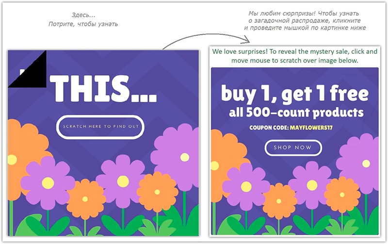
Take note that this is a great example of how you can generate leads and increase audience involvement.
Mud Pie
Clothing brand Mud Pie encourages you to participate in a photography contest in your Mud Pie style. You need to publish the photograph on Instagram with a special hashtag and the winner gets $100 worth of shopping.
The example below demonstrates how you can combine user generated content on Instagram with email marketing and do so with taste.
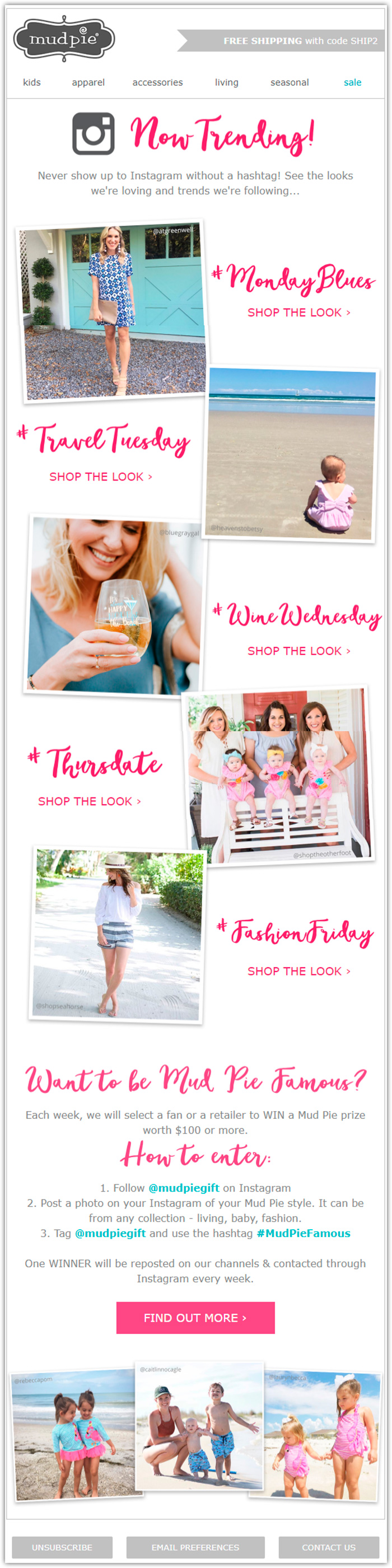
Photographs are composed similar to the way people pin their photographs of happy moments at home on their walls or fridges. You get the sense of cosiness instead of direct advertising even though every block has a CTA that hints – “Shop the look”, urging you to continue shopping.
The company developed their own decorative font that has already become the brand’s signature look. Pink is used for places of emphasis, including the CTA.
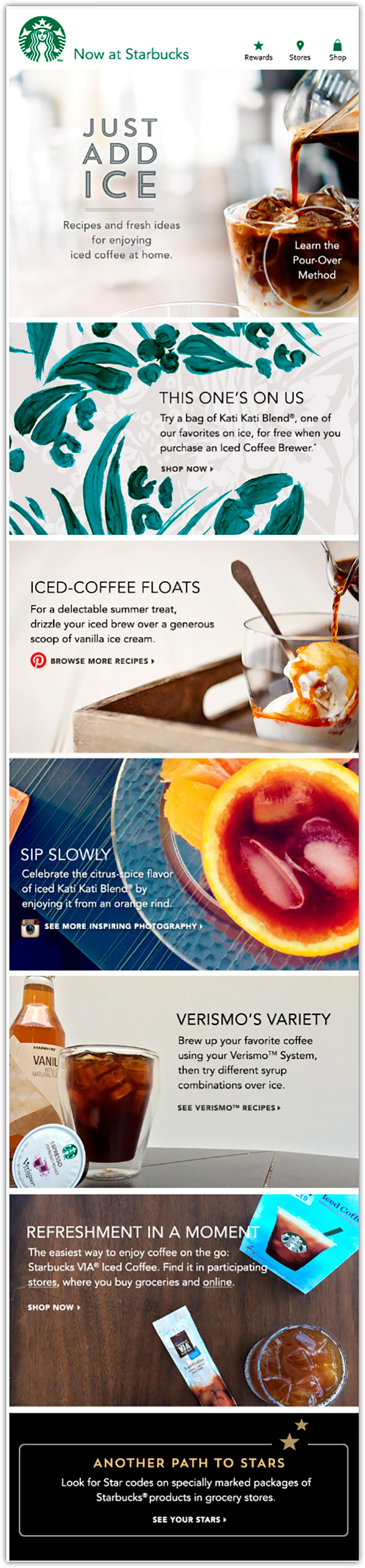
Starbucks
Recipes of coffee drinks with ice and other offers from Starbucks are packed in their letters that are clearly split up into segments. This kind of organization in a letter is easy to skim and avoids confusion.
There isn’t much text in the letter as the high-quality and attractive photographs speak for themselves.
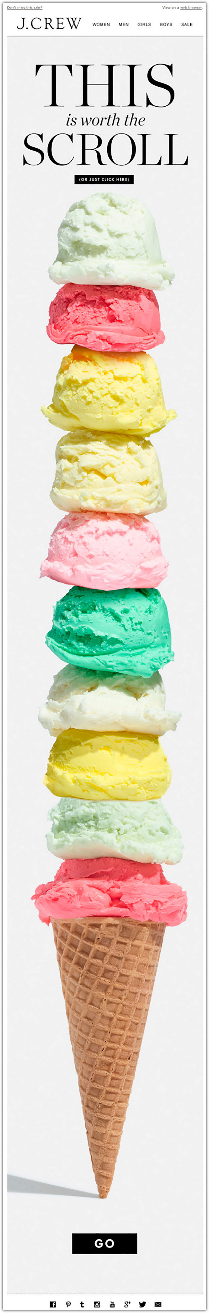
 J. Crew
In this letter, there is an unexpectedly yummy photograph from clothing brand J.Crew, with a title “This is worth the scroll”. An aesthetically pleasing image kind of makes you hungry and intrigues one to wonder, what’s hiding behind the image? It’s not too often you receive letters with this format from clothing brands.
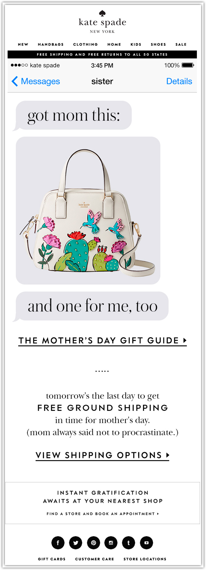
Kate Spade
We’ve prepared two examples from the brand Kate Shade, that often spoil their subscribers with creative and colorful letters.
This letter, dated for Mother’s Day, is pitched in a very original way. The first thing you see is a correspondence between a sister that writes to you that she bought a Kate Spade bag as a gift for her mom and got one for you as well.
The font used to create the messages is characteristic to all the letters from the brand. The accent of the design allows you to quickly scan the main points of the letter: a photo of a bag, “The mother’s day gift guide”, “Free ground shipping”, “Shopping options”.
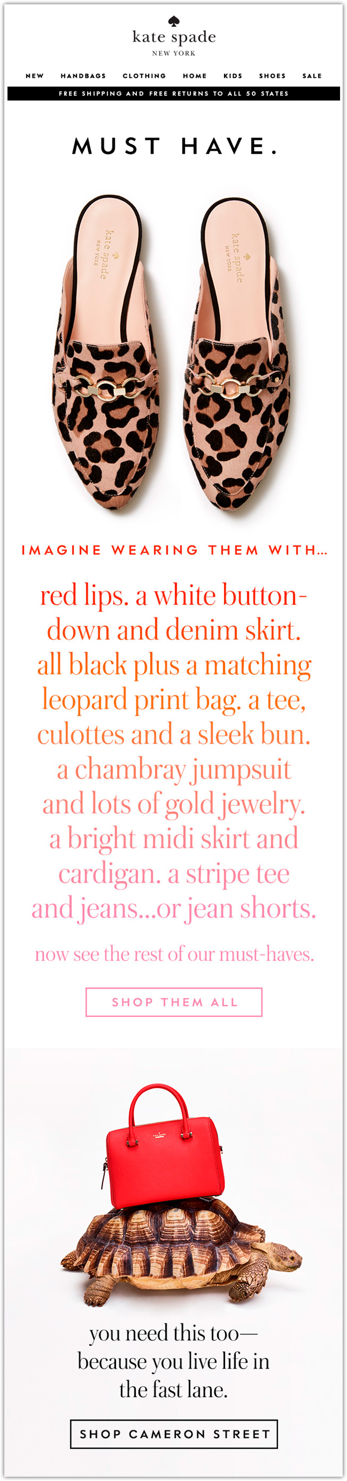
Here’s an ad for a new shoe style, where the shoes are depicted on a large scale and below them a whole story. Clients of the brand are encouraged to dream a little and imagine themselves in several different looks that go with the shoes and ultimately to realize their fantasy by clicking on the link to shop.
Everything is pleasing to the eye in this letter, from the lovely pair of shoes to the decorative font and even the red bag on top of a tortoise. The design creates a specific atmosphere and tells a story.
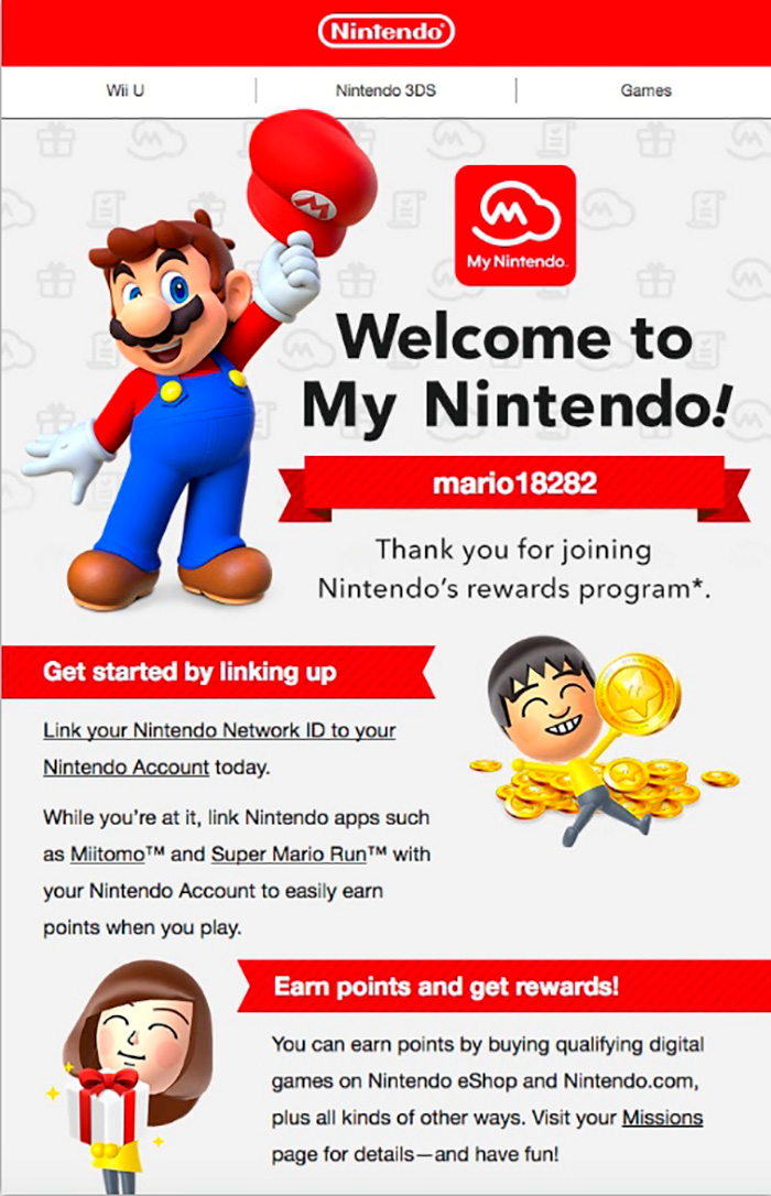
Nintendo
In this confirmation email from Nintendo, you’re greeted with a mascot from the 90s, Mario. All the accent pieces are well placed in the letter and the reader can quickly grasp the logic of the letter – “You’ve successfully registered with ‘My Nintendo’, link up your account to Nintendo ID and earn points!”
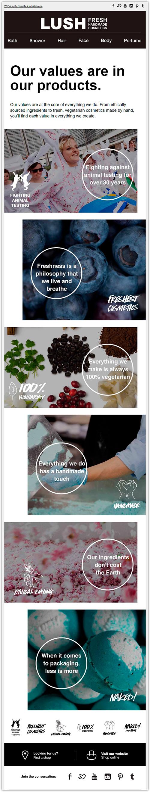
Lush
This letter from Lush tells the story of the basic ideals that go into production of the products. The brand shares what to them is an integral part of production and they support their words with natural and attractive photographs.
The letter is designed with very harmonizing colors. The white circles with text serve as visual accent that carries out a teaser role. The same circles are actually buttons – if you click on them, the subscriber can read more about some of the principles that interests them. Additionally, each principle is marked with their own button that is repeated in the footer of the letter.
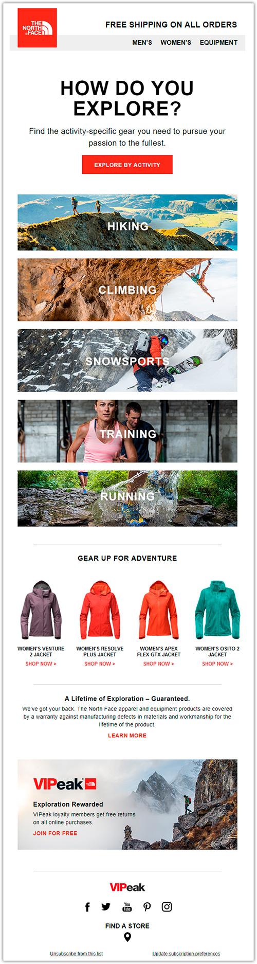
The North Face
The brand places an accent on vigour. To facilitate the users, the names of different sections of the website are complemented with dynamic photographs, and in the footer, you can see the social media buttons and a search for the nearest store. Additionally, subscribers are offered a selection of outerwear for outdoor events. For the CTA, they used the same stimulating red color as the one for their logo.
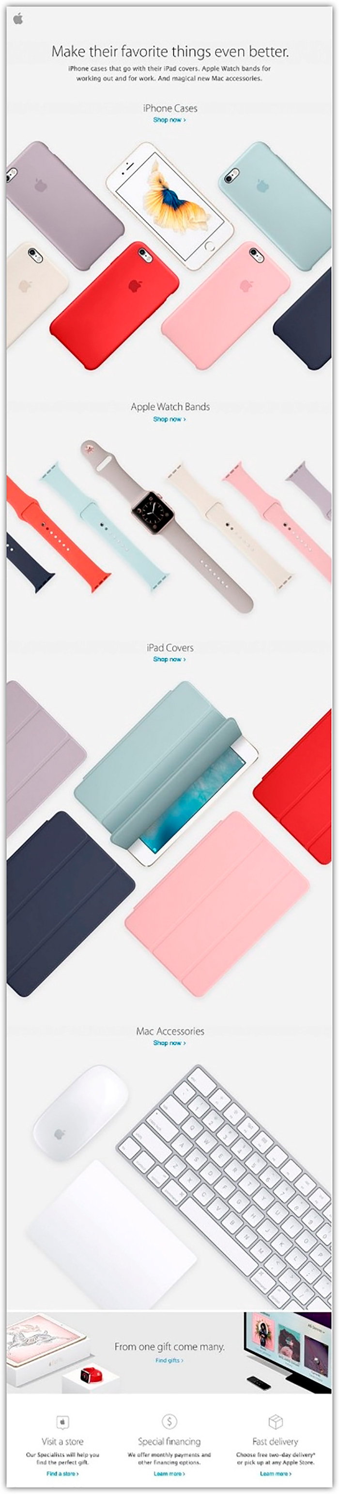
Apple
Apple’s letter captures the beauty of geometric objects on a flat surface, where their products are laid out before you, similar to a window display. Above the photographs of each block, there is the name of the product and a well integrated CTA.
We hope that our tips and this collection of letters from famous brands has inspired you to create beautiful and successful letters. With SendPulse, you can send up to 15,000 letters a month for free and use our gallery of free, ready-made templates as well as a convenient drag-and-drop letter editor.


![25 Graphic Design Portfolio Examples [+ Pro Tips] - Depositphotos Blog](https://depositphotos-blog.s3.eu-west-1.amazonaws.com/uploads/2022/05/25-Examples-of-Graphic-Design-Portfolios-and-Useful-Tips-On-How-to-Create-Your-Own-scaled.webp)