Design Fundamentals for Photographers
Many designers also aim to be photographers. Does the same apply to photographers? Photography and design overlap in more ways than one. If you haven’t thought about it before, consider how design can alter your approach to photography.
Today we look at some basic elements and principles of design that can be applied to photography. Incorporating these elements into your photography can and will make you a better photographer. These tips will help you take pictures that truly stand out and hopefully, make you think twice about the artistic choices you make.
How are elements and principles of design applicable to photography?
There are photographs that make you stop and appreciate them and those that don’t really appeal to you at all. The reason why this is so is because contrary to popular belief, there are rules to photography. Things like the rule of thirds and the Golden Ration are an example of formulas that determine success.
When you are capturing your photographs, you are making artistic choices about how you frame your shots and what you choose to photograph. In this sense, you do design the final outcome. This is where elements and principles of design come in, to help you justify some of your choices from a design perspective.
Elements of design applied to photography
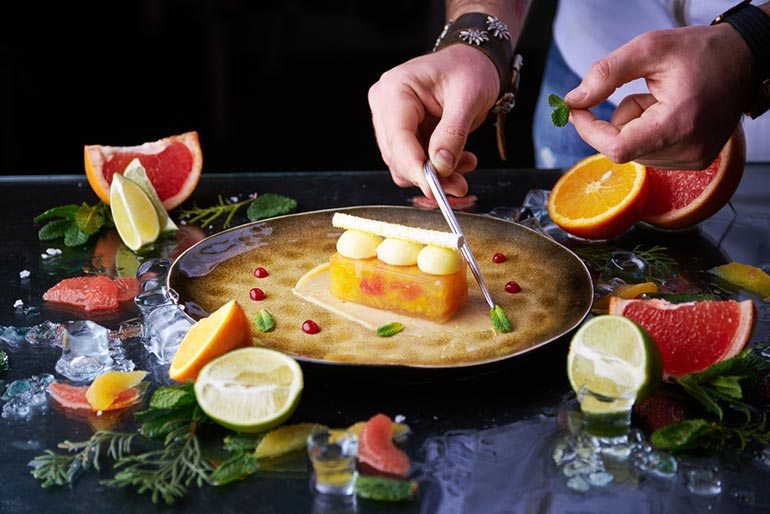
Color
Great use of color (or emphasis on color) is powerful enough to evoke emotions. Color is impactful because it is not something people usually pay too much attention to. Colors captured in a photograph translate a loud message, one that is worth experimenting with.

Tip: Refer to this article for ways to further explore color in your photography.
Shape
Shape and form are not to be confused. Shape refers to a two-dimensional object. For example, if you are taking a picture of trees against a sunset and their outline is clearly seen, that is an image with a focus on shape. Focusing on shape doesn’t concern depth and shadows.
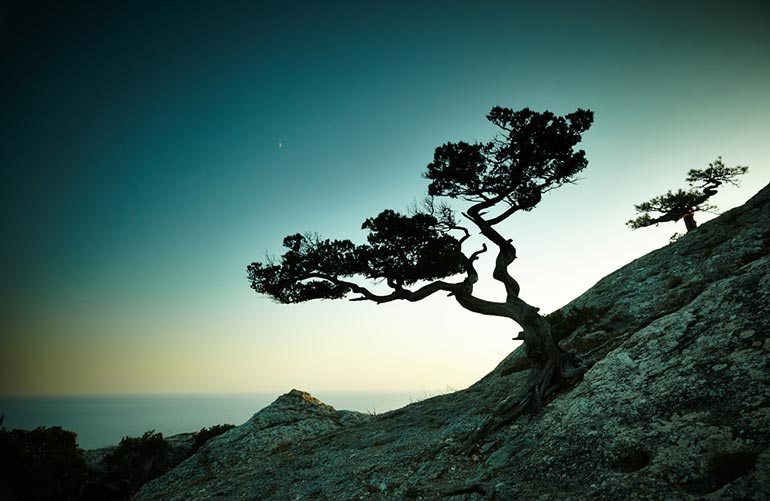
Tip: Here are more details on using shapes in photography.
Texture
With the right lighting, any textured surface can come to life. Similarly to shape, texture is very dependable on the type of lighting. Texture is all about the details so shoot close up photographs of interesting surfaces where the light best illuminates the uniqueness of them.

Tip: Learn to capture texture and other insider photography secrets here.
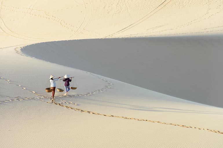
Space
There are two types of spaces – positive and negative. Think about ways in which you can use space to add drama to your final photographs. For instance, you can use small negative space to really bring out the object you are photographing and make it seem larger than life. Similarly, you can use large spaces to make objects seem smaller. Playing with this type of composition style can add drama and an element of memorability to your works.
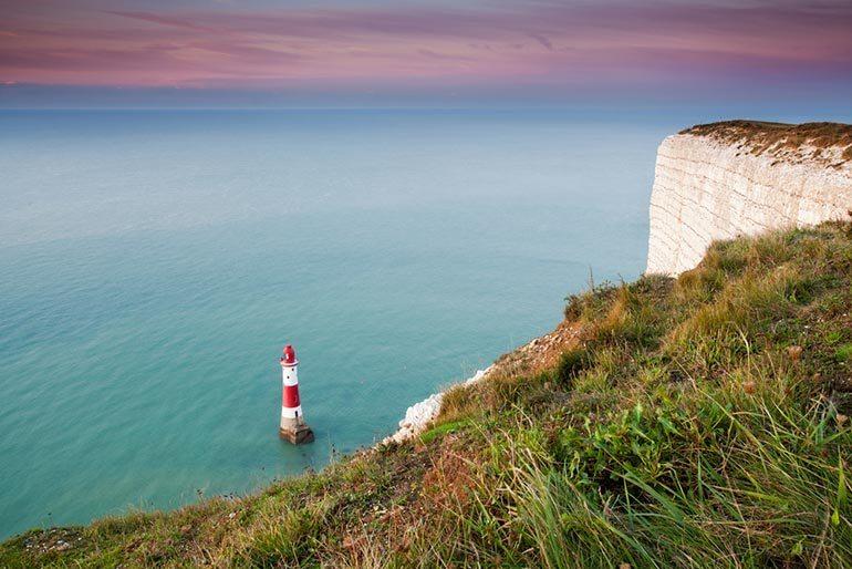
Tip: Not sure how space is used effectively? Here’s a great resource.
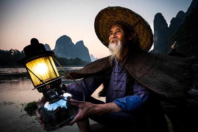
Form
Form is different from shape because it is more concerned with the three-dimensional aspect of an object. How the light interacts and falls on the object will determine the aesthetic appeal. In this example, one can truly appreciate the intricacy and wonders of rock formations thanks to the way the light illuminates the forms.
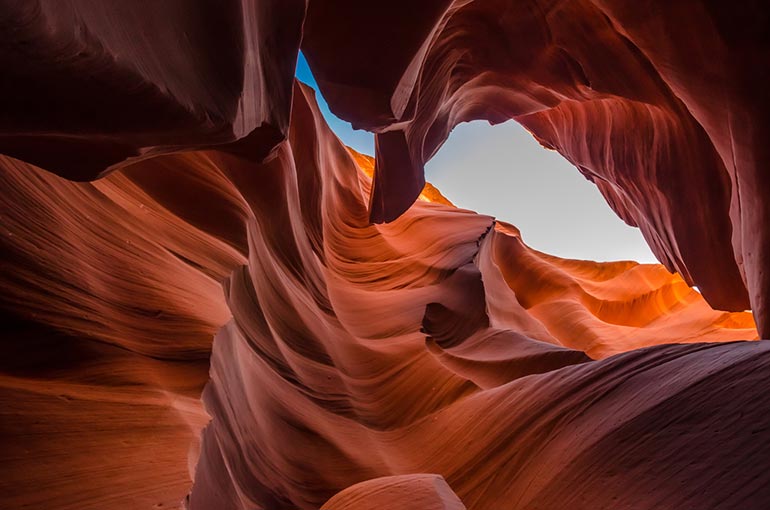
Tip: Read more on how to find form and and enhance your photographs.
Principles of design applied to photography
Unity/harmony
A photograph with perfect unity or harmony is one that is so well presented, where no part of it feels out of place or unnecessary. This can be translated through simplicity, or bringing parts together to form a whole to create ‘harmony’. It is a rather abstract principle that is difficult to grasp and will be better explained in the following example. You can crop this image in many ways and get a perfect image every time because there is unity and harmony in it.

Tip: To better understand unity, here is an article that elaborates on the concept.
Balance
Balance can be achieved in a number of ways as it does not mean that your images have to be perfectly symmetrical. Achieving balance in photographs can be done through asymmetry, radial alignment, proportion etc.
Tip: Refer to this article for a brief overview of hierarchy in visual design.
Hierarchy
An example that can be drawn here is the Golden Ratio. It is a composition style that guides the viewer through the image. A visual hierarchy is achieved through presenting elements of a photograph according to their importance. This way, your viewers perceive and appreciate every detail of the photograph in order of significance.

Tip: Refer to this article for a brief overview of hierarchy in visual design.
Proportion
One of the more fun principles to play around with is the proportion in your photographs. You can explore a subject’s relationship to the whole of the image. Also keep in mind things like the rule of thirds which visually balances your photographs.

Tip: For more information on the rule of thirds and proportion in photography, read this article.
Emphasis
Visual emphasis can be achieved through playing around with the depth of field. Emphasis can be used to create a dominant feature in your photograph to divert the viewer’s attention to certain elements in your photograph. Emphasis can also be achieved through symmetry as a way to dramatize your photographs.
Tip: Here are some quick tips on how to emphasize your subject in photography.
Contrast
A more prominent example of contrast in images can be seen in examples of black and white photography where the black and white balance creates a visually stunning effect. You can further explore contrast in capturing colors that are opposite on the color wheel. Contrast between sizes and elements as well as the light and dark parts of an image can elevate your photographs and make them visually interesting.

Tip: Here is an article that explains how contrast affects your photos.
Every image translates your personal aesthetics. One way or another, you are already implementing these elements and principles. These are just some of the things that can take an image from being ‘good’ to being ‘excellent’. The artistic choices you make, influence your composition and style. That’s why it’s good to refresh your knowledge of some art school basics and to focus on new aspects that can be explored further in your works. Applying these elements to your photographs is yet another way to bring diversity, variety and quality to your portfolio.