Winter Color Palettes for Seasonal Ads and Campaigns
The year 2020 is coming to an end and most of us are happy to bid farewell to these tough times. Not only is it time to look towards a brighter future but also to believe in miracles that often happen in winter, especially around Christmas.
To help you translate this seasonal mood in your creative projects, we put together a selection of color palettes and photo collections to accompany each hue. These latest color combinations and authentic visuals will make your social media posts, ads, and campaigns look classy and trendy this season.
Trendy colors for winter 2020/21
As winter holidays are approaching, audiences get tired from the yearly pre-Christmas rush and seek more tranquility while being on staycations with family and friends. The trendiest colors of winter 2020-2021 are all about stability, coziness, and faith that the best is yet to come.
We analyzed the latest uploads to the Depositphotos library, got inspired by the color of the year announced by Dulux, and explored Pantone’s report to bring you a selection of the trendiest tones and shades. Here they are:
- Snowflake
- Brave Ground
- Prune
- Midnight Blue
To help you quickly find perfect photos, vectors, and video clips, our content team has carefully curated collections of visuals for each of the colors. With these images, your winter projects will be especially ambient and appealing.
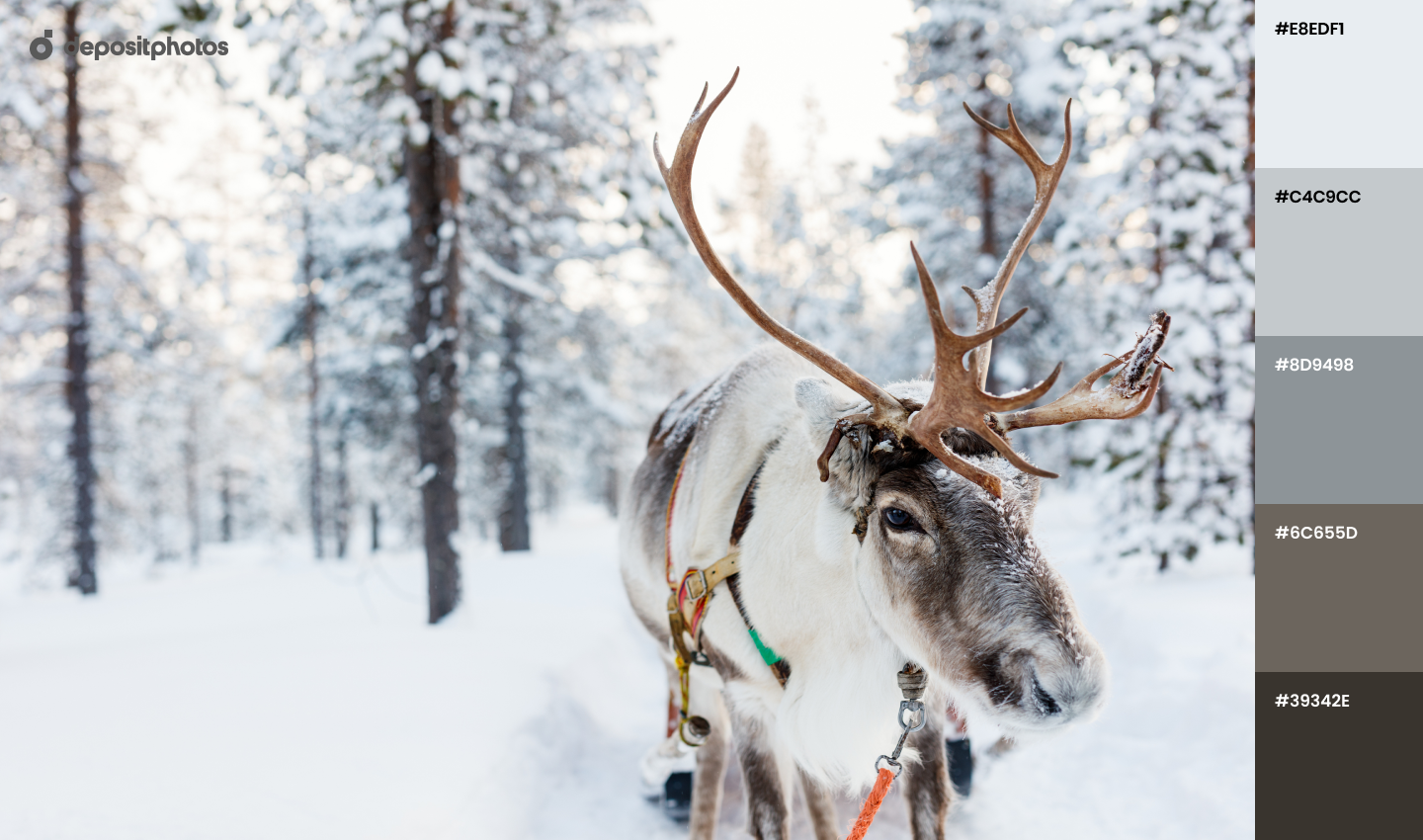
Snowflake
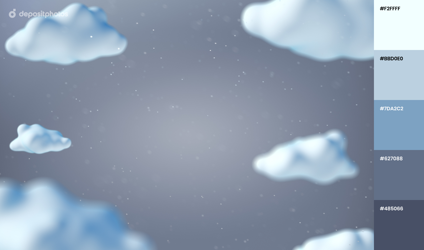
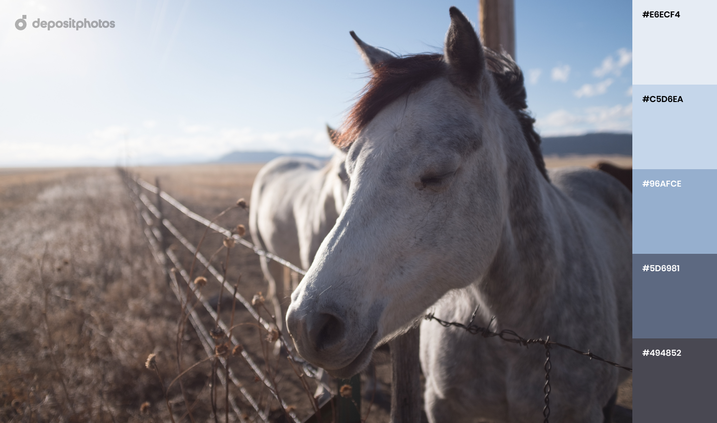
We’re used to thinking that the color of snow is white but in reality, its shades change during the day. For instance, when the sun is not out yet and the streets are empty in the morning, the snow looks bluish. The surroundings are especially peaceful and quiet which makes this calm time of the day the most joyful for many.
Using light blue color in your seasonal projects will help you share the feeling of tranquility that is so appreciated by worldwide audiences at the moment.
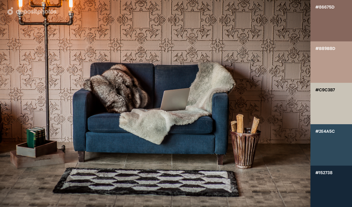
Brave Ground
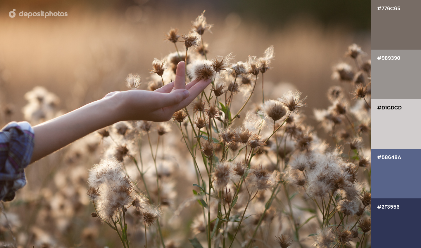
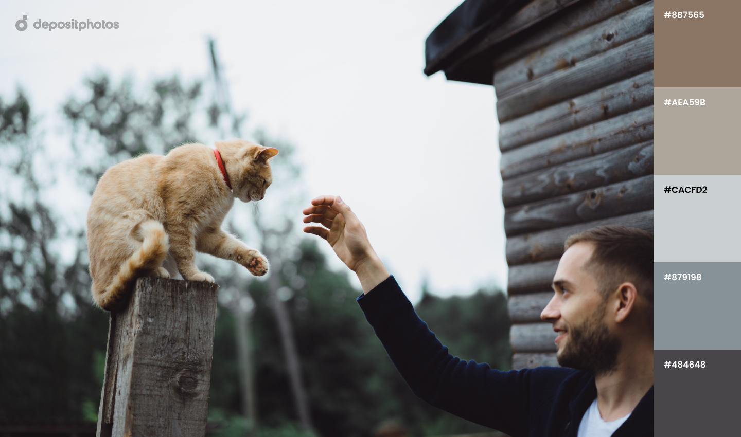
According to Dulux, Brave Ground is the color of the year 2021 – a discreet and calming shade that does not demand attention and leaves space for key design elements and text. From the psychological point of view, this color evokes positive associations, reminding us of our roots and family. Visuals with prevailing ‘Brave Ground’ color serve as perfect website hero images or backgrounds in thematic designs.
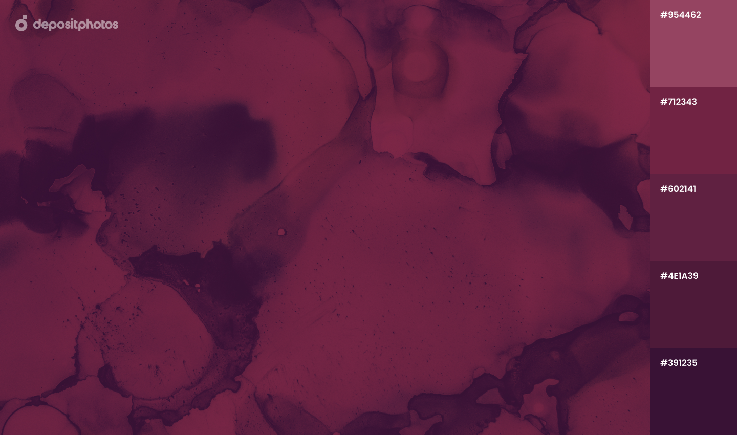
Prune
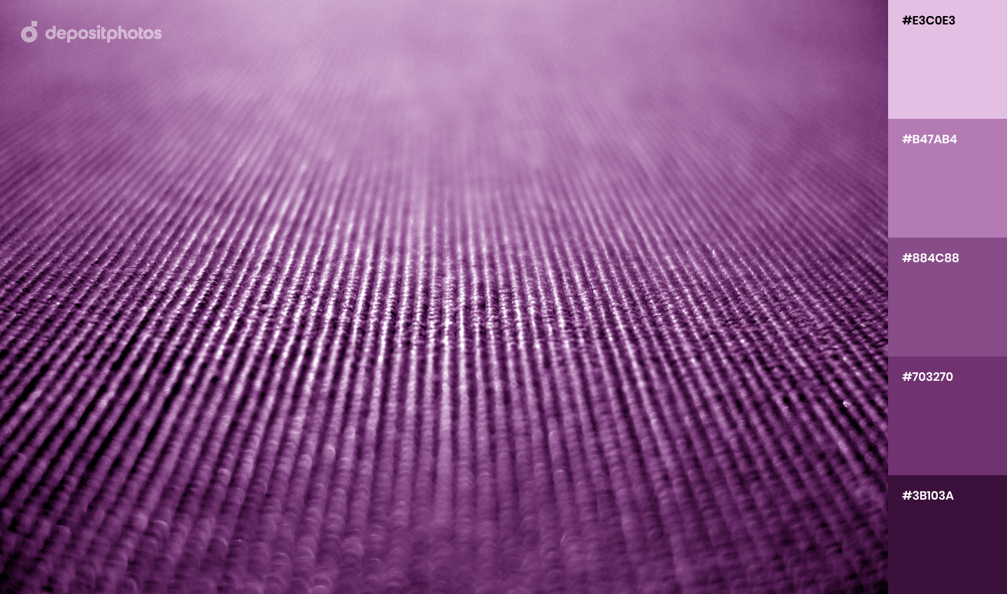
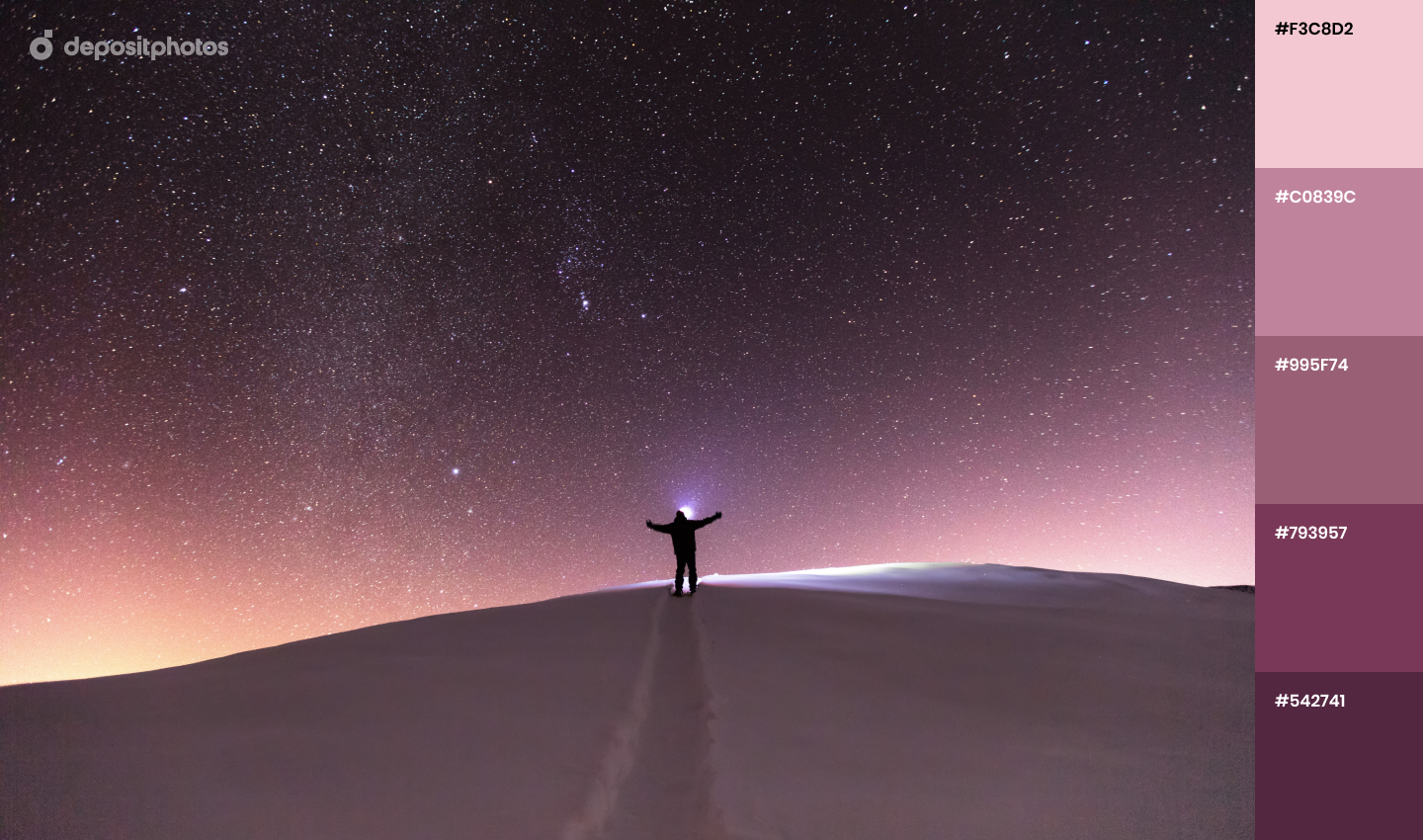
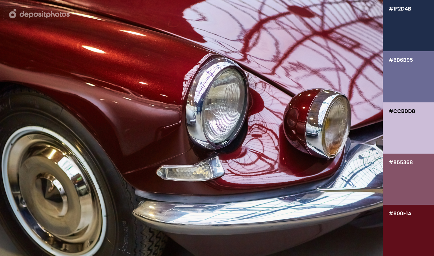
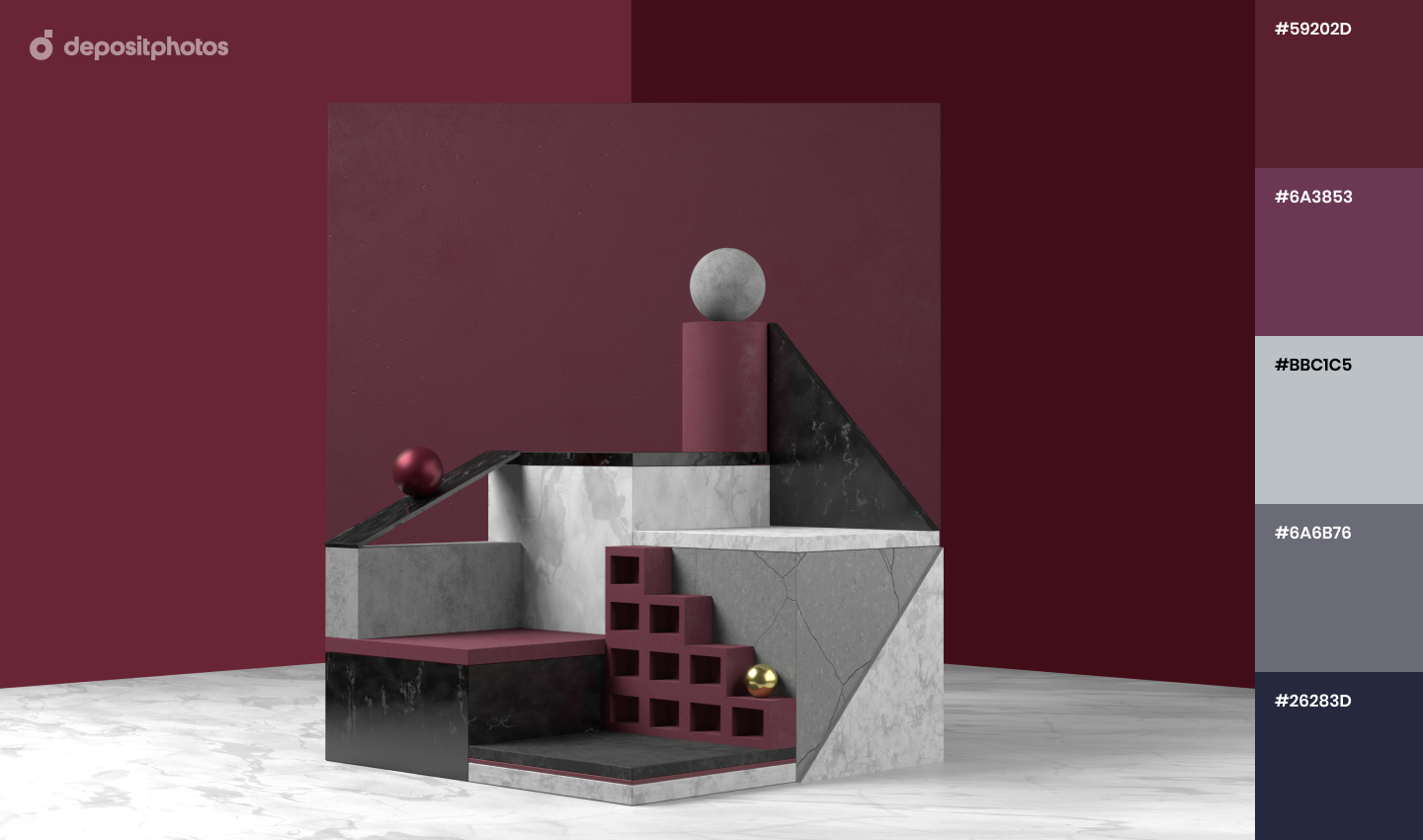
The rich prune shade contrasts with calm ‘Snowflake’ and ‘Brave Ground’ and is quite an unusual shade to experiment with this year. ‘Prune’ represents creativity, dreams, and the future and raises the mood in challenging times like today.
The photo collection below features dozens of images in this trendy shade that will help you cheer up your audience but also provide some sophistication to your projects.
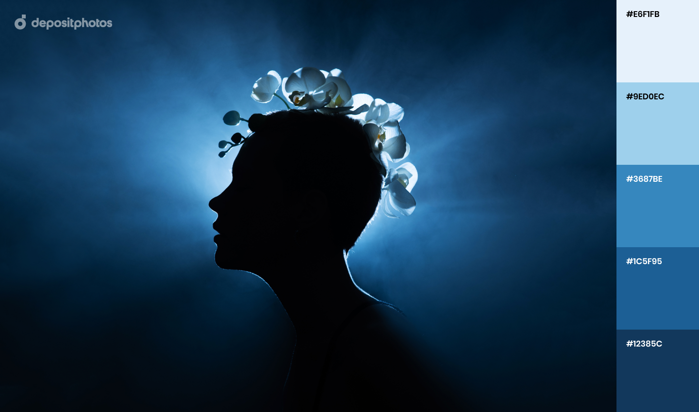
Midnight Blue
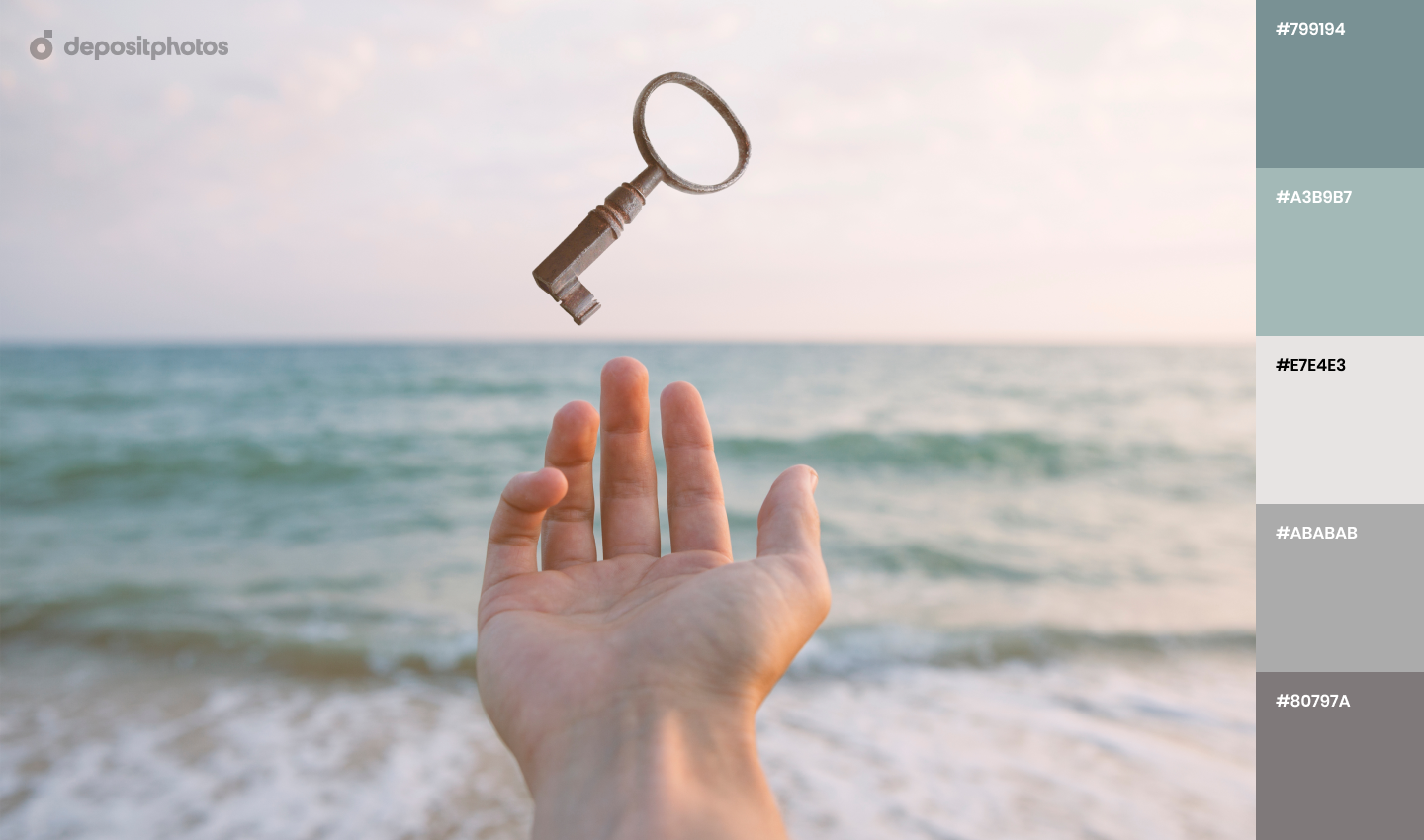
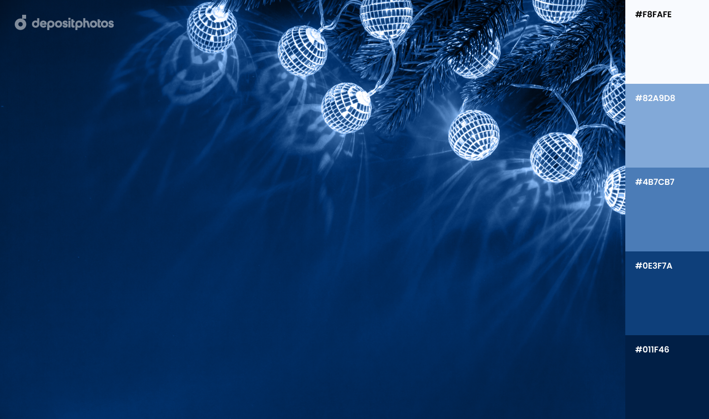
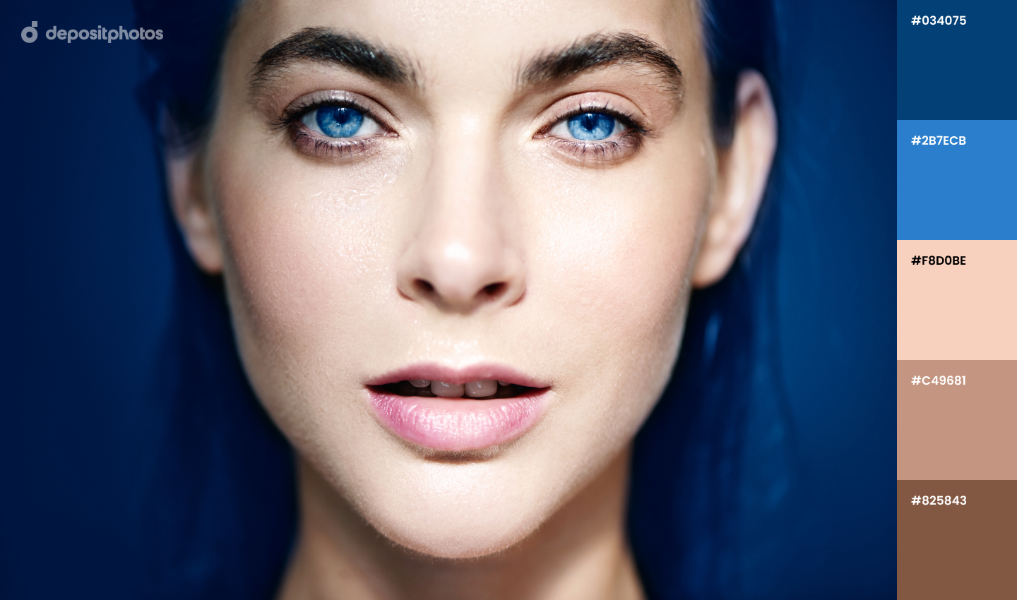
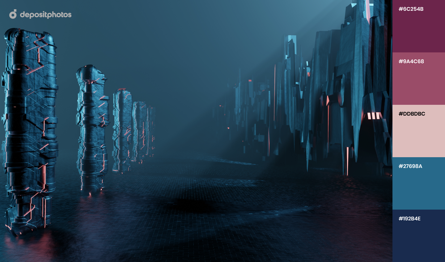
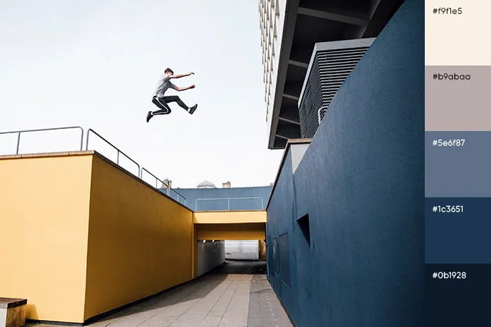
Fairy tales say that miracles often happen overnight and a dark blue shade resembling a midnight starry sky can be just and right fit for your Christmas-related projects. While red and green will be used by most brands this holiday season, ‘Midnight Blue’ visuals will make your design stand out.
It’s also a color of security, stability, and trust that can help you establish a more intimate connection with your clients.
20 Winter color palettes for thematic designs
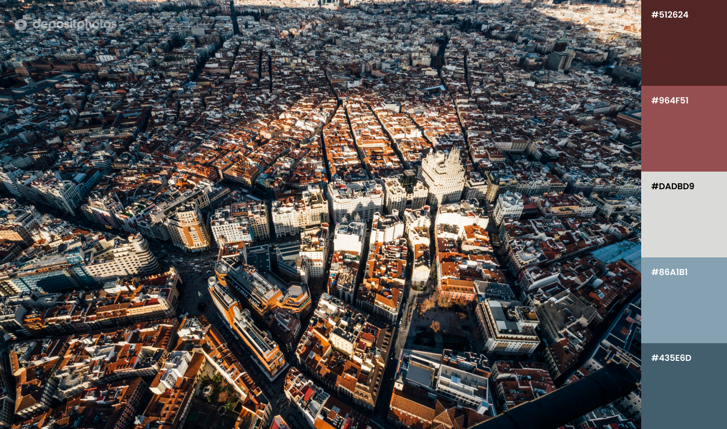
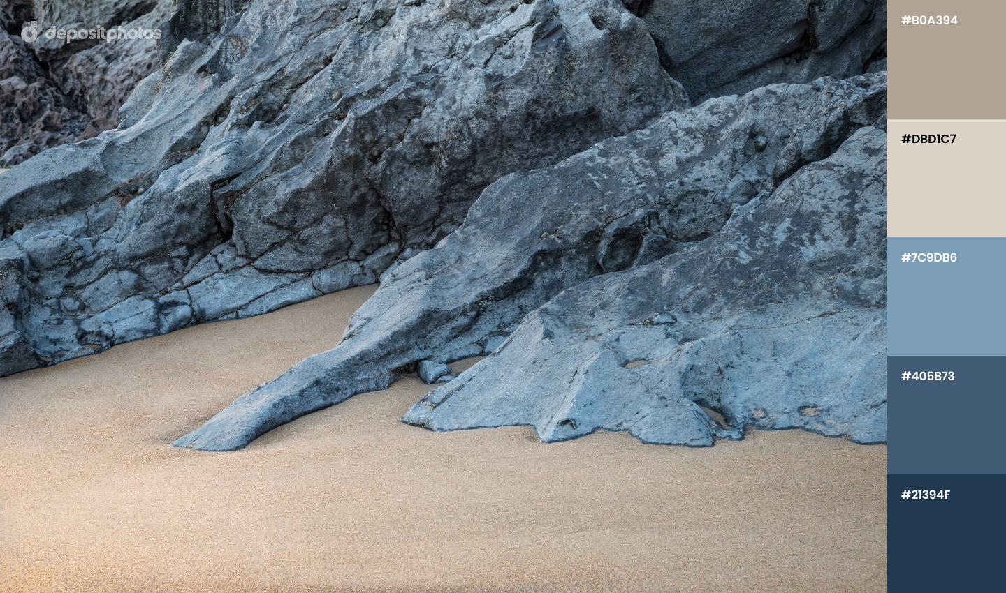
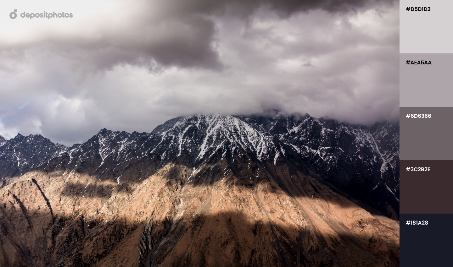
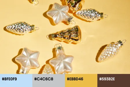
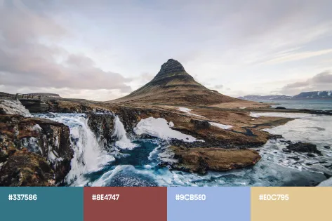
If you’re looking for experiments this winter, these color palettes are full of ideas on how to match two and more shades in the trendiest way. Scroll down to explore our selection of color combinations.
Every time you’re out of design ideas, get back to this article for inspiration. Sometimes even the simplest photograph can turn out to be insightful and useful when you’re researching or planning for your next seasonal project.
To find more project ideas you can realize in the next months, explore these articles:
— Outstanding Christmas Ads and Greetings Ideas 2020
— Christmas Advent Calendar: Enjoy a Gift For Every Day of the Month
— Your Guide Integrating Audio Into Brand Communication [Infographic]
