Fall Color Palettes For Cozy Designs This Season
Time flies. It seems like we just introduced the trendiest colors of summer 2020 but we’re already sharing the fall color palettes with you. Although many still feel the aftertaste of joyful summertime during the first weeks of autumn, the days get shorter, bright colors fade, and the temperature drops ever so slightly. These changes make even the most positive people feel melancholic and seek warmth and comfort wherever they go.
For brands, the new season means a change in designs. To be on the same page with your audience and appeal to people with seasonal vibes, explore our autumn color palettes. These fall palettes feature warm tones and deep shades that will make your autumn designs look cozy and uplifting.
The trendiest colors of autumn 2020
Discovering the trendiest colors of the upcoming season is always exciting. We examine Pantone’s publications, turn to our annual Visual Trends Report, and explore new submissions to the Depositphotos library (which now has over 170 million images!). Also, with the help of analytics, we thoroughly choose the colors that would translate the mood of our contemporary society and help brands better appeal to their audiences.
This fall, you should try to enrich your designs with deep, natural, and perfectly matching colors. As people will be seeking more comfort in food, experiences, and routine, these four colors will make your autumn-related projects look more attractive:
- Deep Mint
- Navy Blue
- Chestnut
- Latte
In addition to sharing the trendiest colors of this season, we have prepared four photo collections corresponding to colors. You can use them to visualize your new ideas or illustrate your upcoming projects and save time searching for images on stock photography platforms.
Deep Mint
According to color theory, green stands for the environment, sustainability, and growth. This autumn, it is particularly relevant in regard to the pandemic that took over the world in early 2020. As most of us re-evaluated our lifestyles during lockdowns, the second part of the year promises to be more stable as we now know how to cope with a crisis situation and stay motivated in tough times.
If you want to support your audience with your autumn-related projects, here’s a photo collection with dozens of visuals in the Deep Mint color.
Navy Blue
Those brands that would like to establish meaningful and trustworthy connections with their potential and existing clients should use Navy Blue in their seasonal designs. The color also symbolizes loyalty and wisdom which today are among the key features that audiences appreciate. Moreover, blue is Pantone’s color of the year and it will definitely make your design look trendy.
Chestnut
Another color that is associated with stability and will be trending this fall is Chestnut. It is a strong color that brings people memories about their roots and childhood. Brands usually use it to highlight that their products are handmade and natural.
Chestnut symbolizes autumn as well. When leaves and chestnuts fall on the floor, this means you should spend more time with your family or simply indoors preparing for Thanksgiving. Besides, Chestnut perfectly matches Navy Blue, Deep Mint, and Latte if you would like to dilute your designs with other colors.
Latte
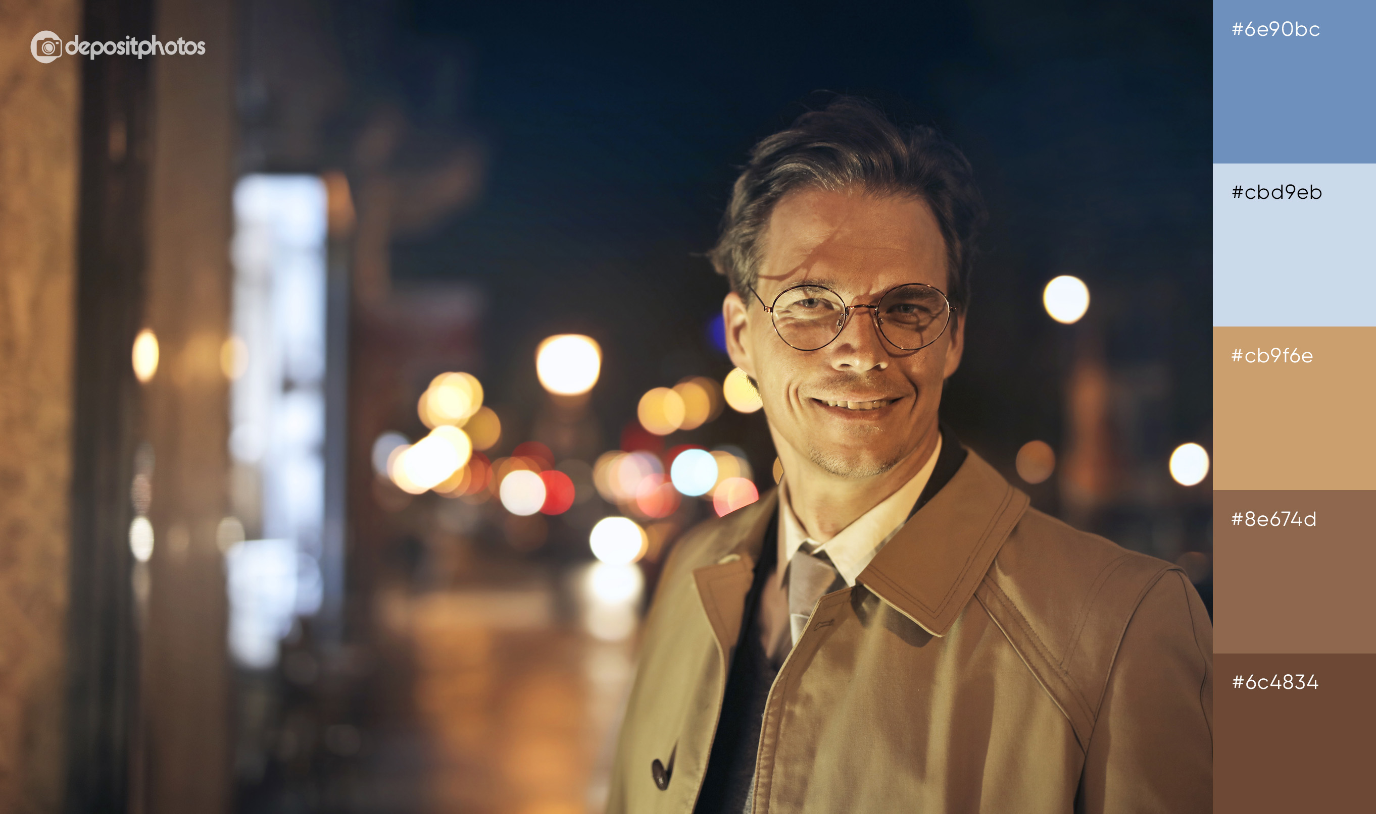
When the temperature drops, we put on our trench coats and opt for hot latte instead of ice-cold drinks. We enjoy sipping the sweet foam on the go and holding a warm takeaway cup in our hand when fallen leaves rustle below our feet. Do you already feel the atmosphere of autumn?
To endow your design with autumn vibes, use images from this photo collection for your seasonal projects. Make your audience feel cozy and comfy this fall.
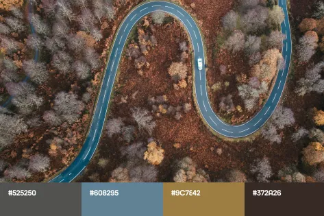
Fall color palettes for cozy designs
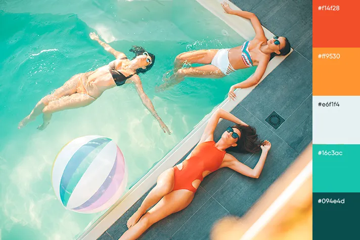
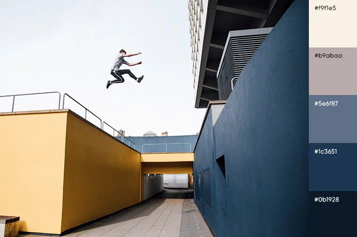
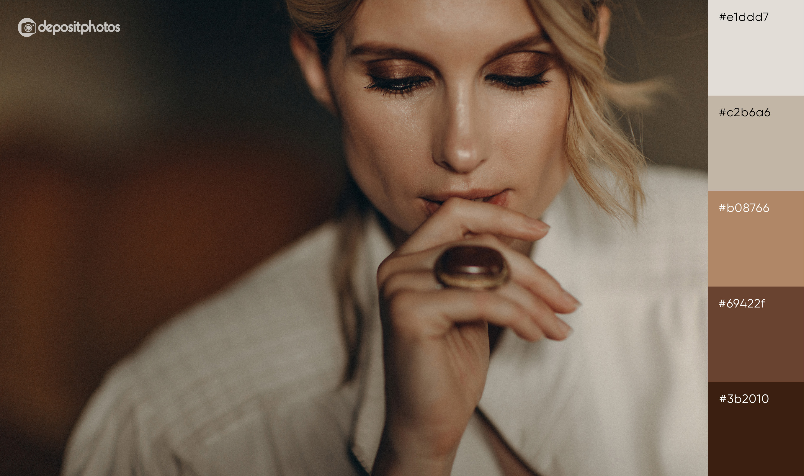
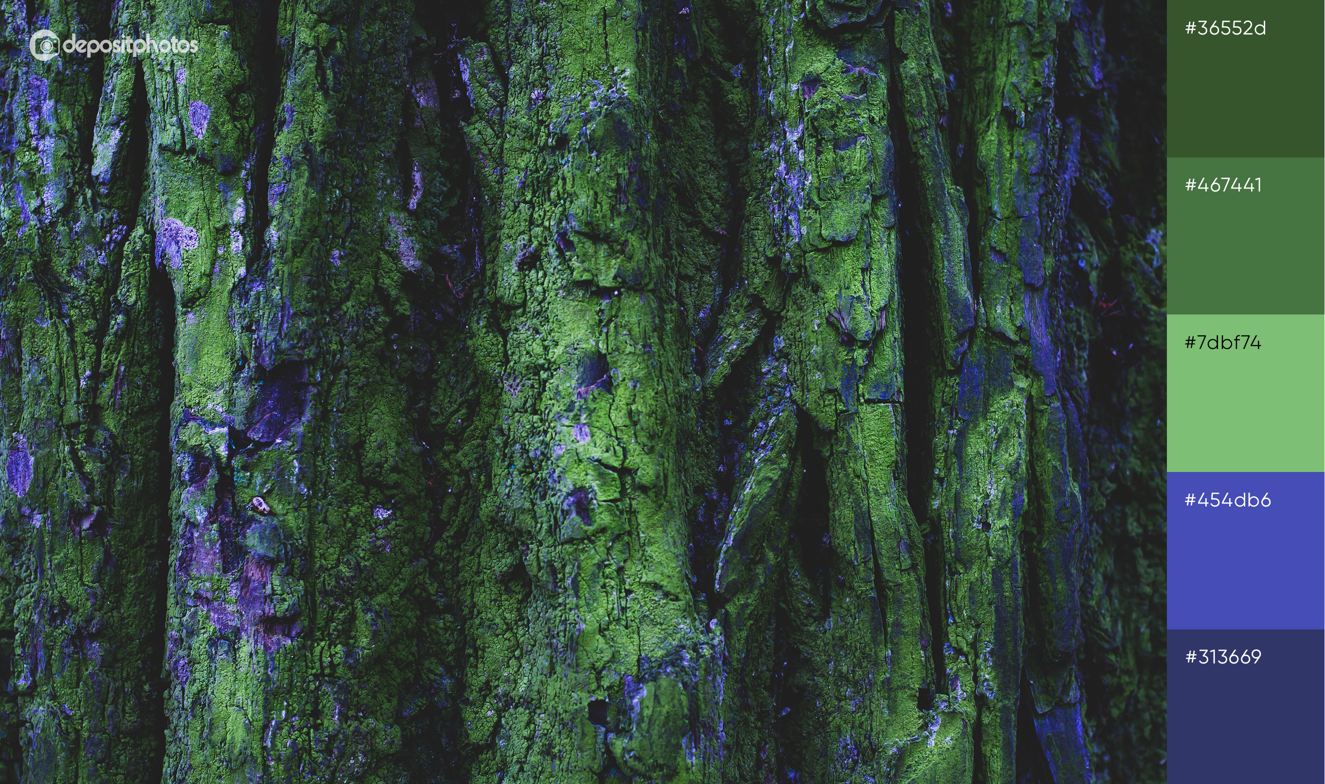
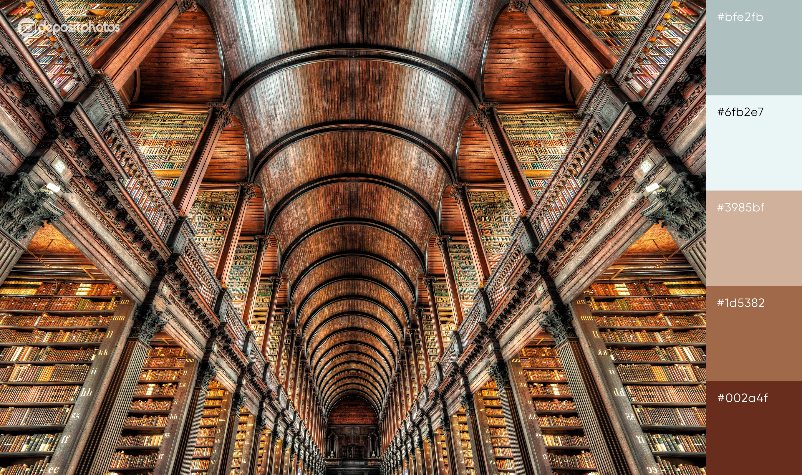
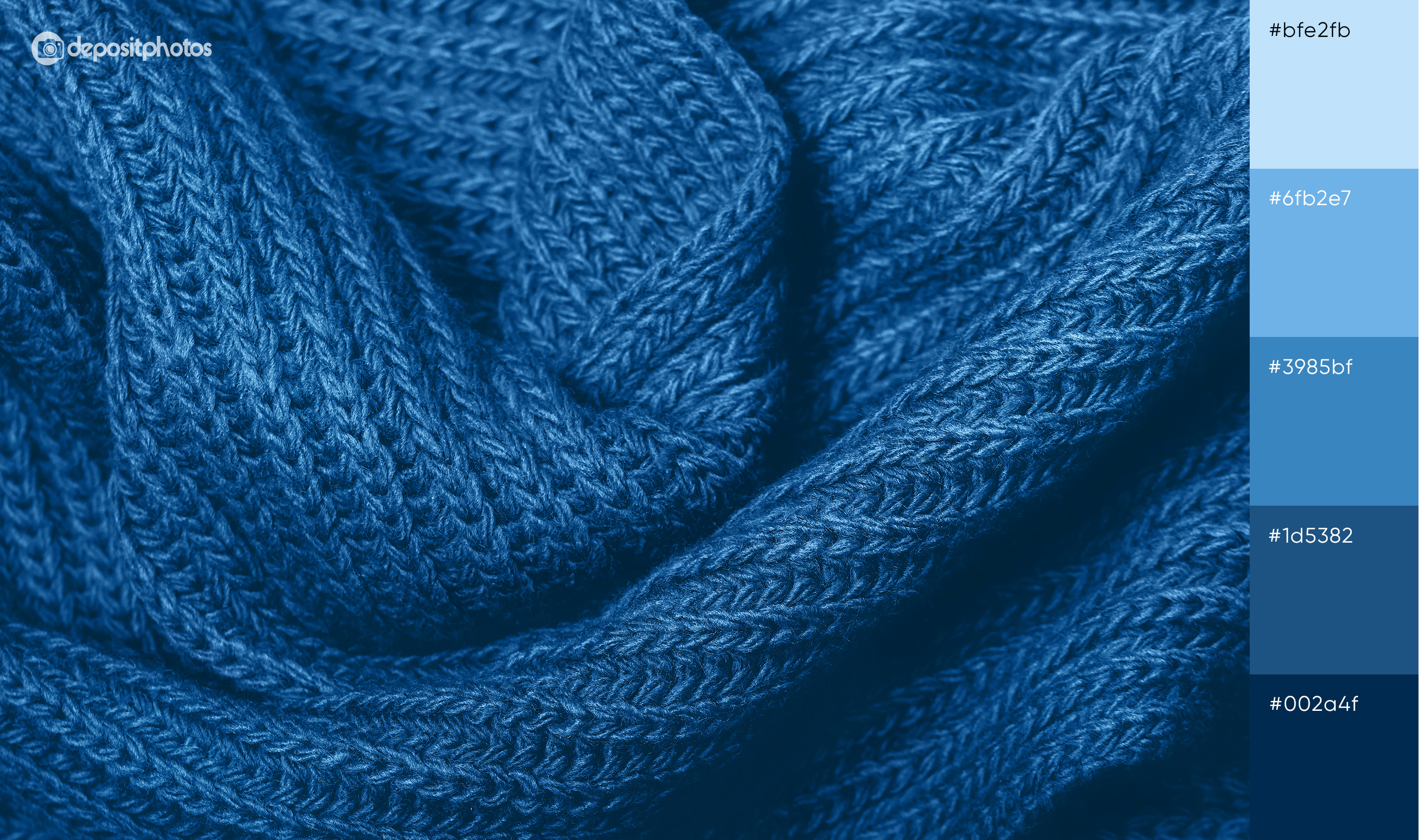
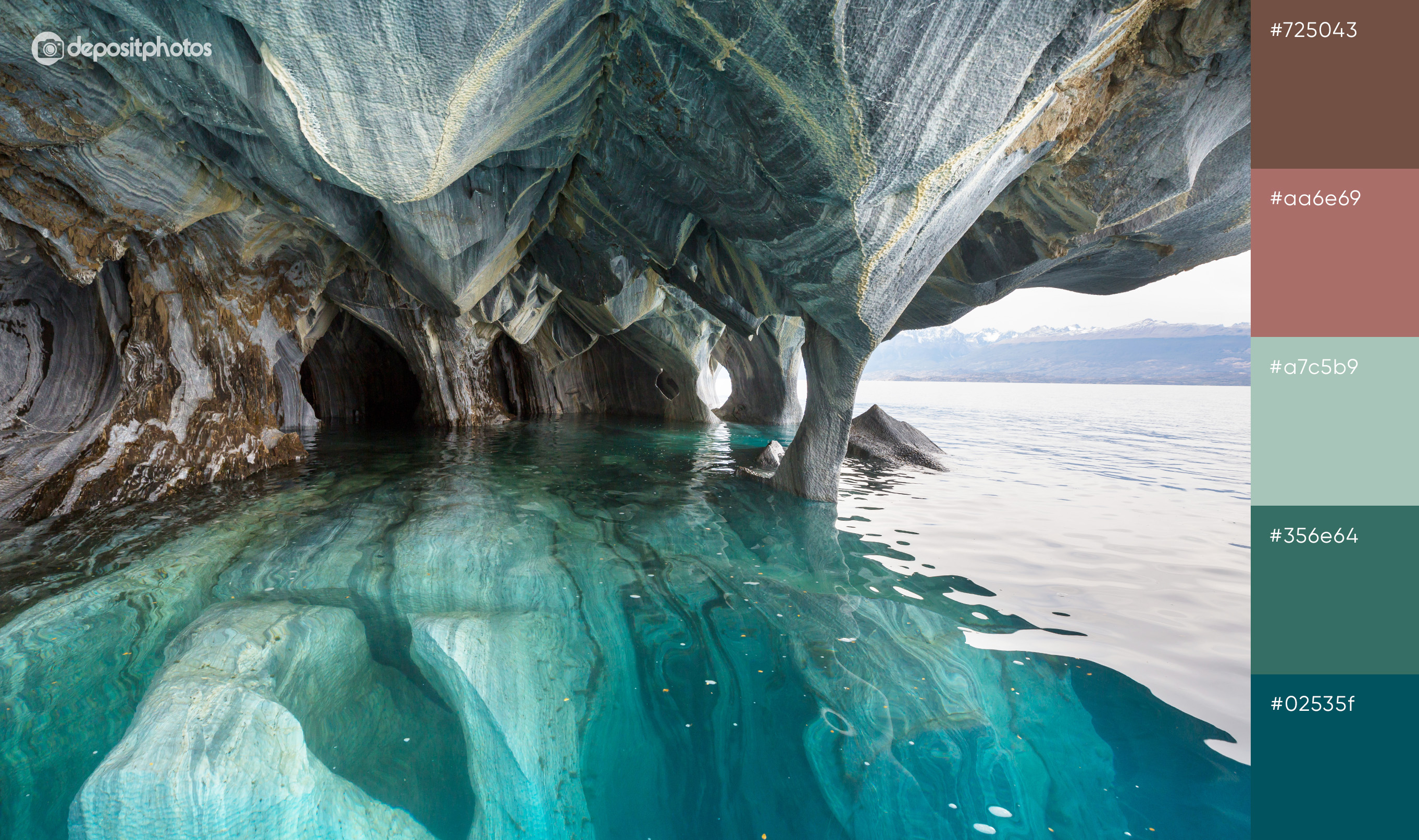
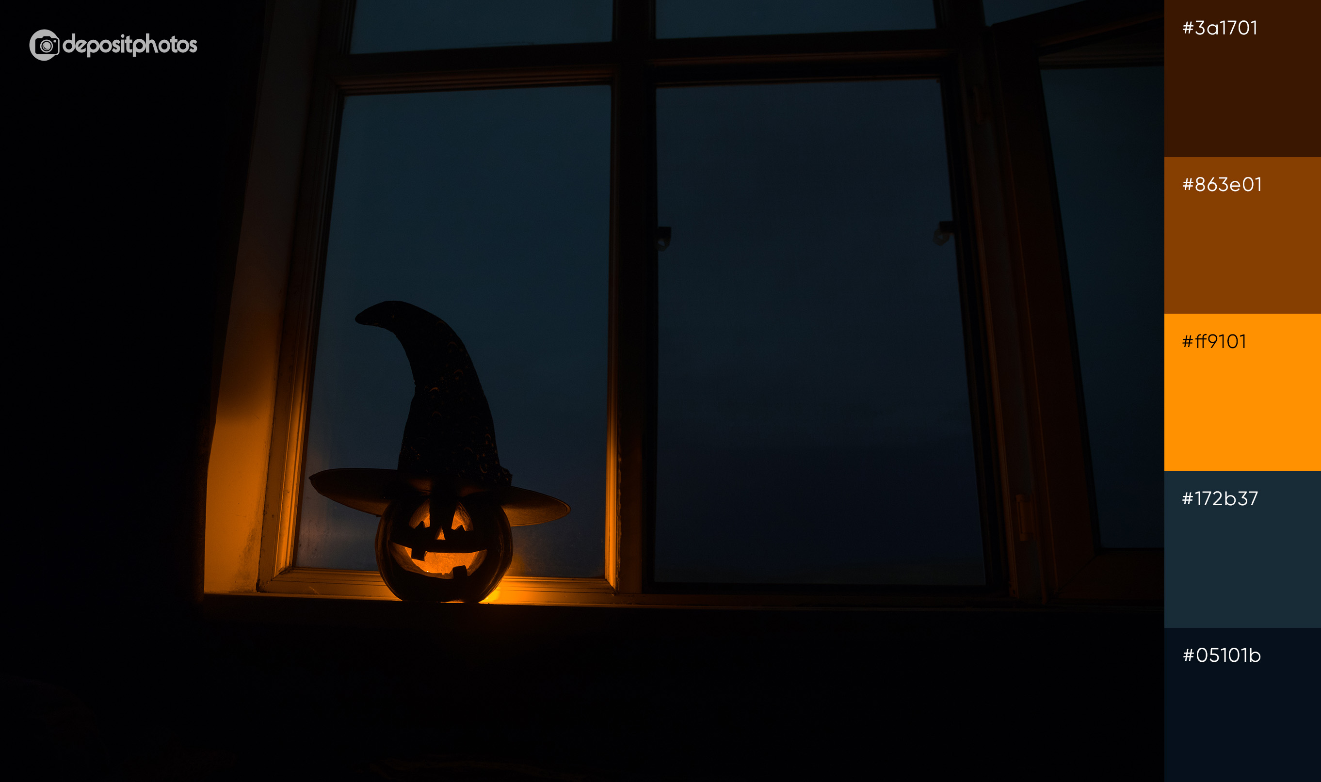
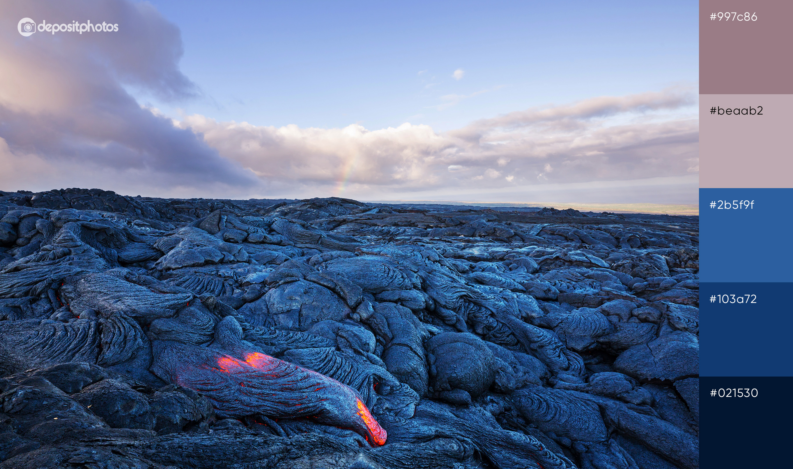
To inspire you even further, here are 20 fall color palettes that translate the ambiance of the season in the best way.
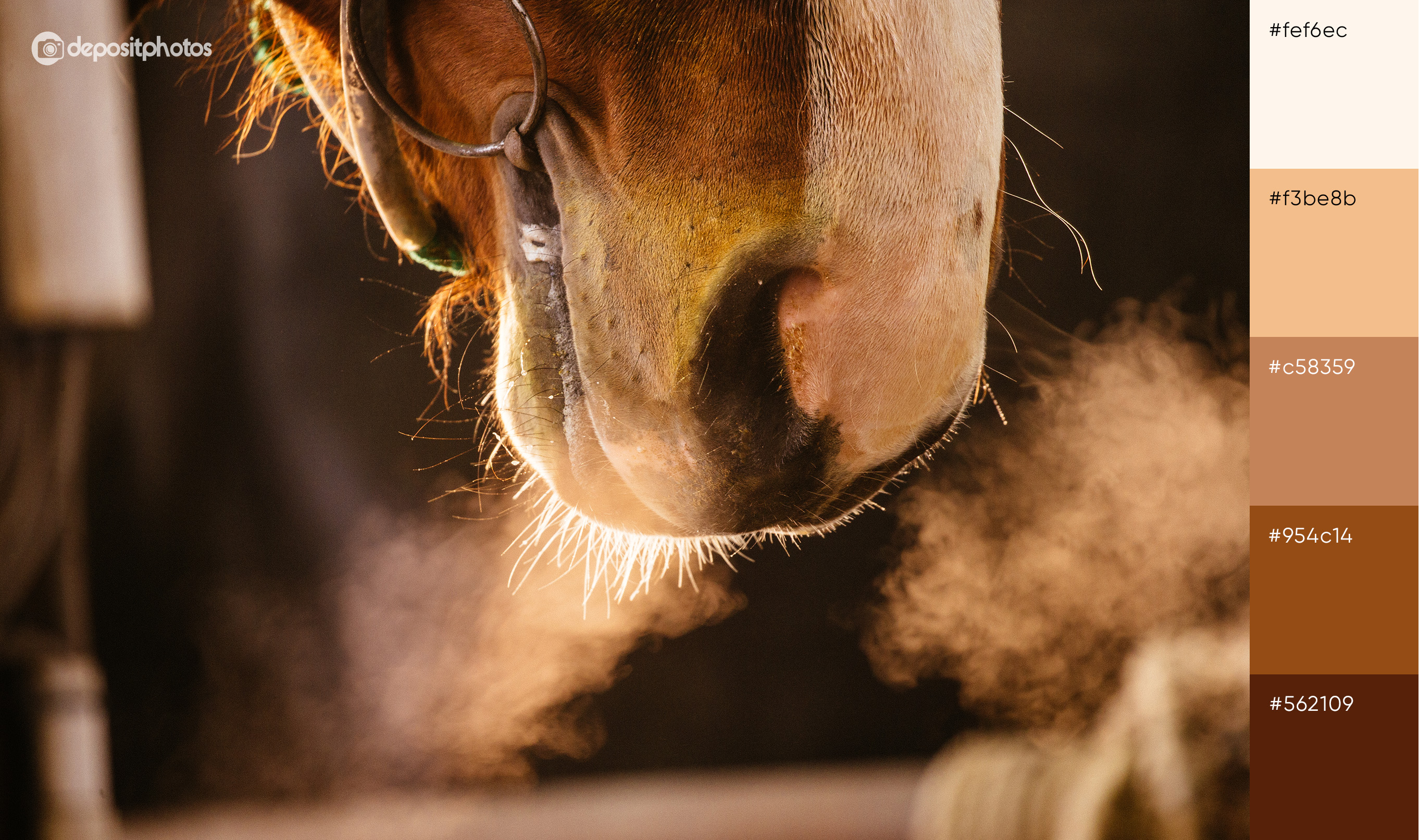
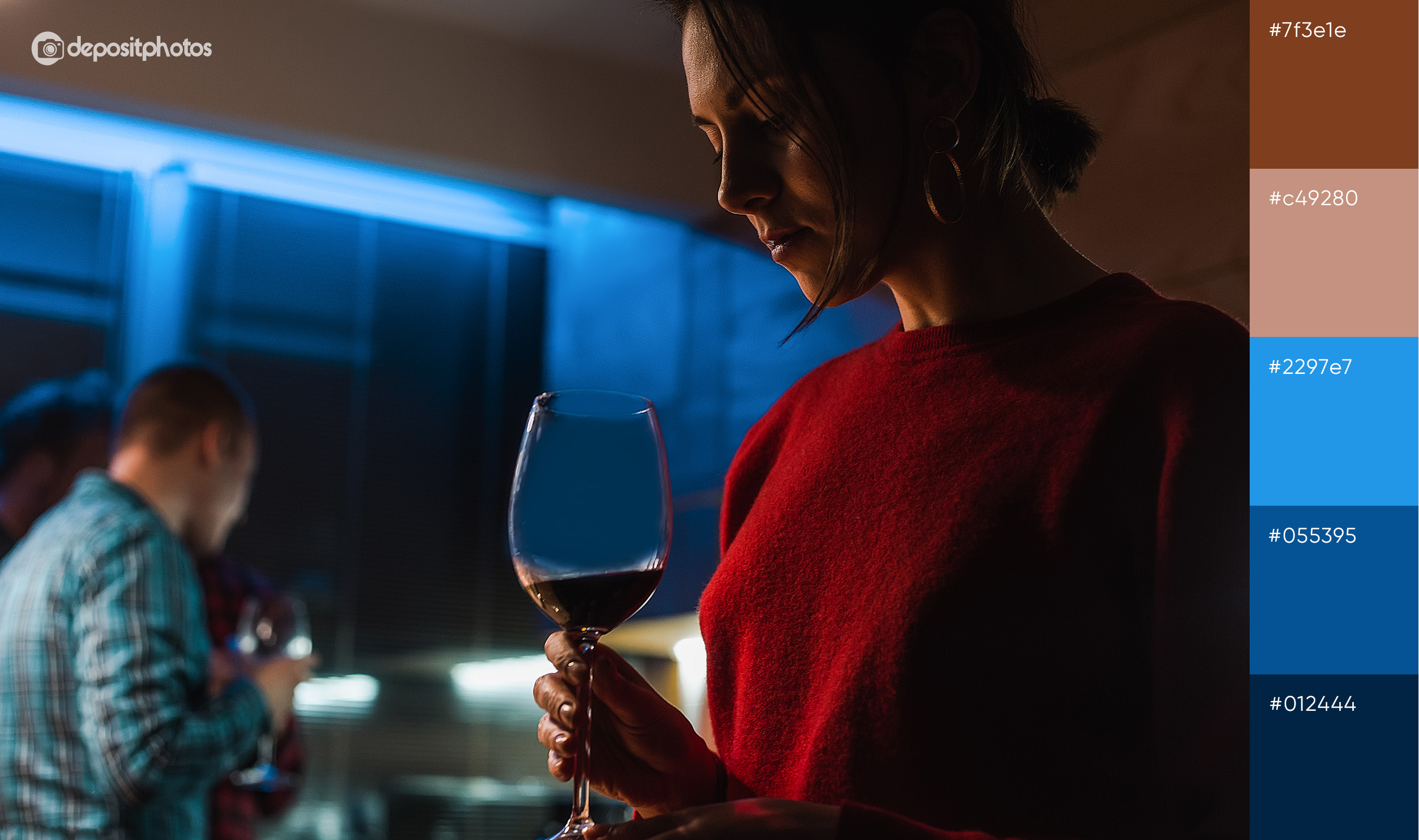
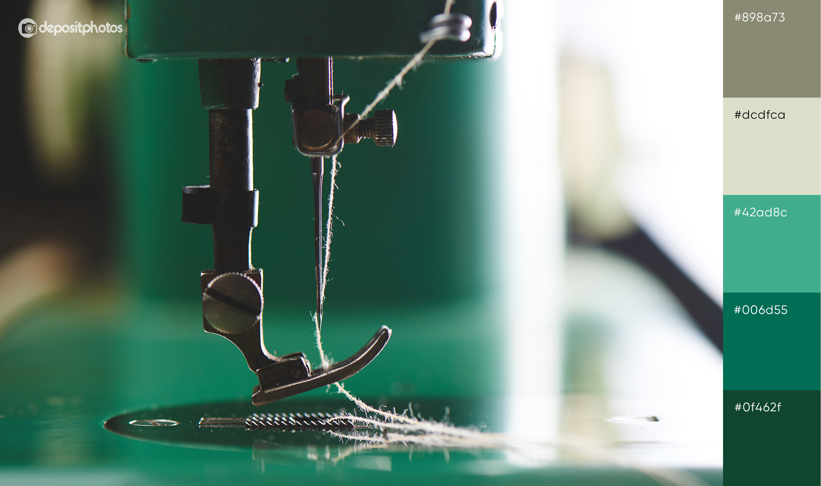
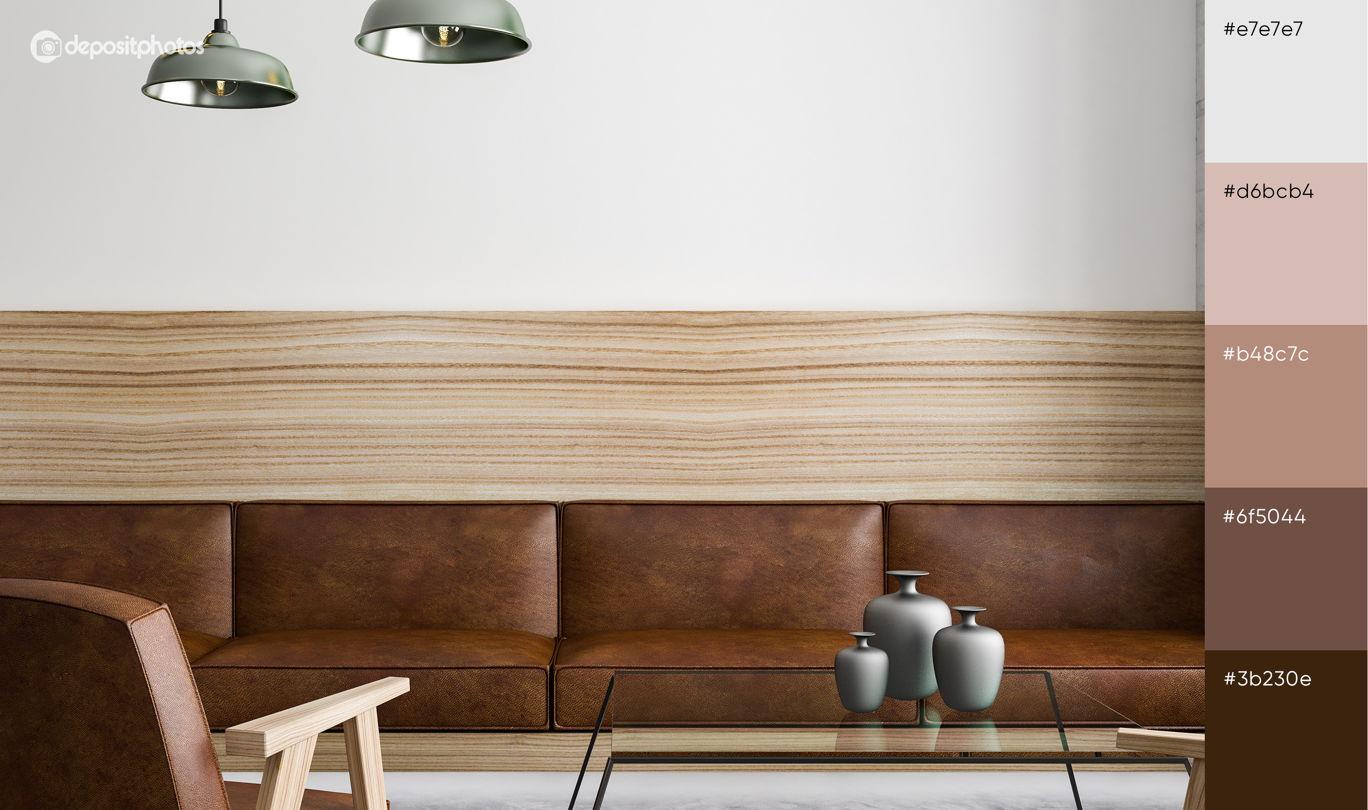
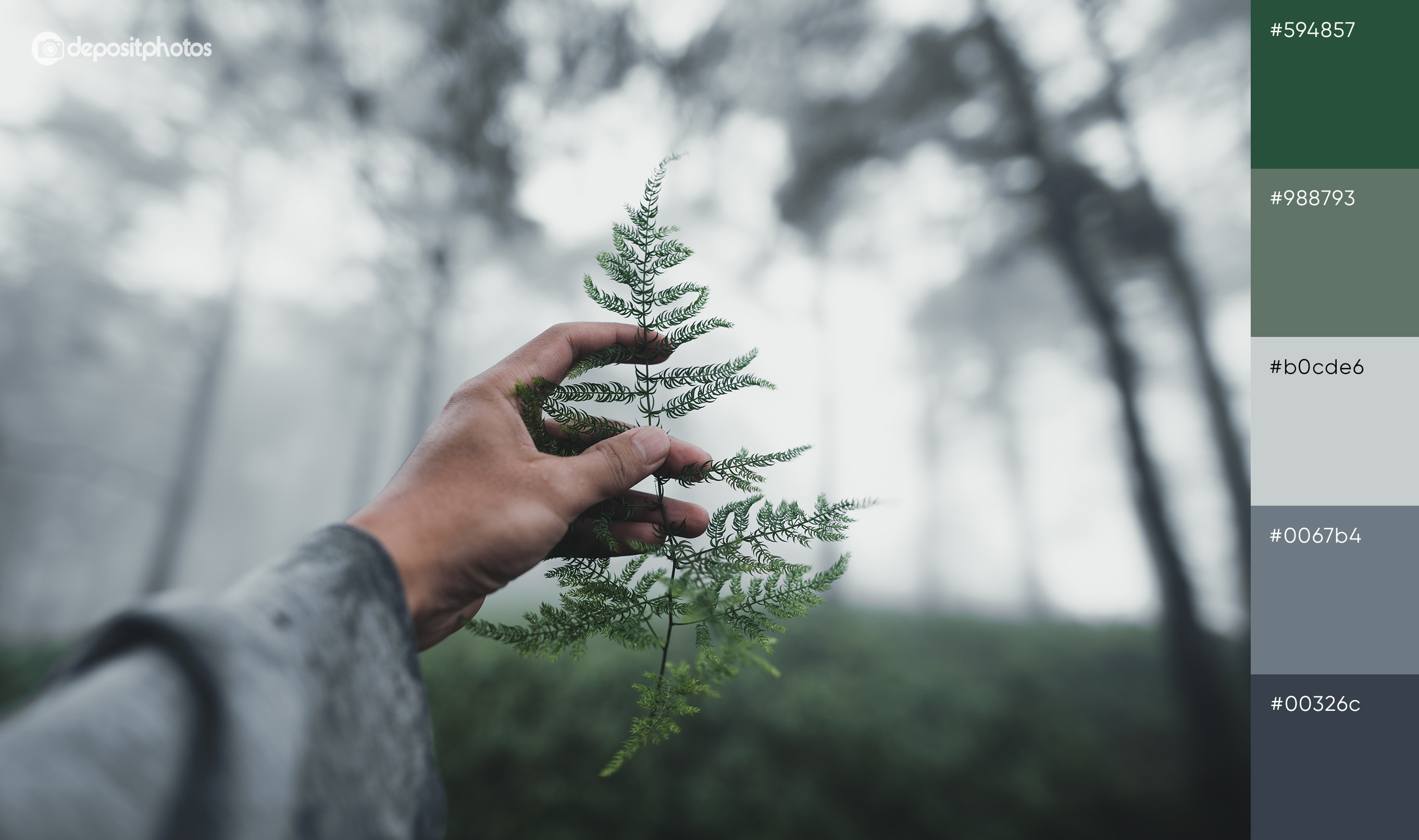
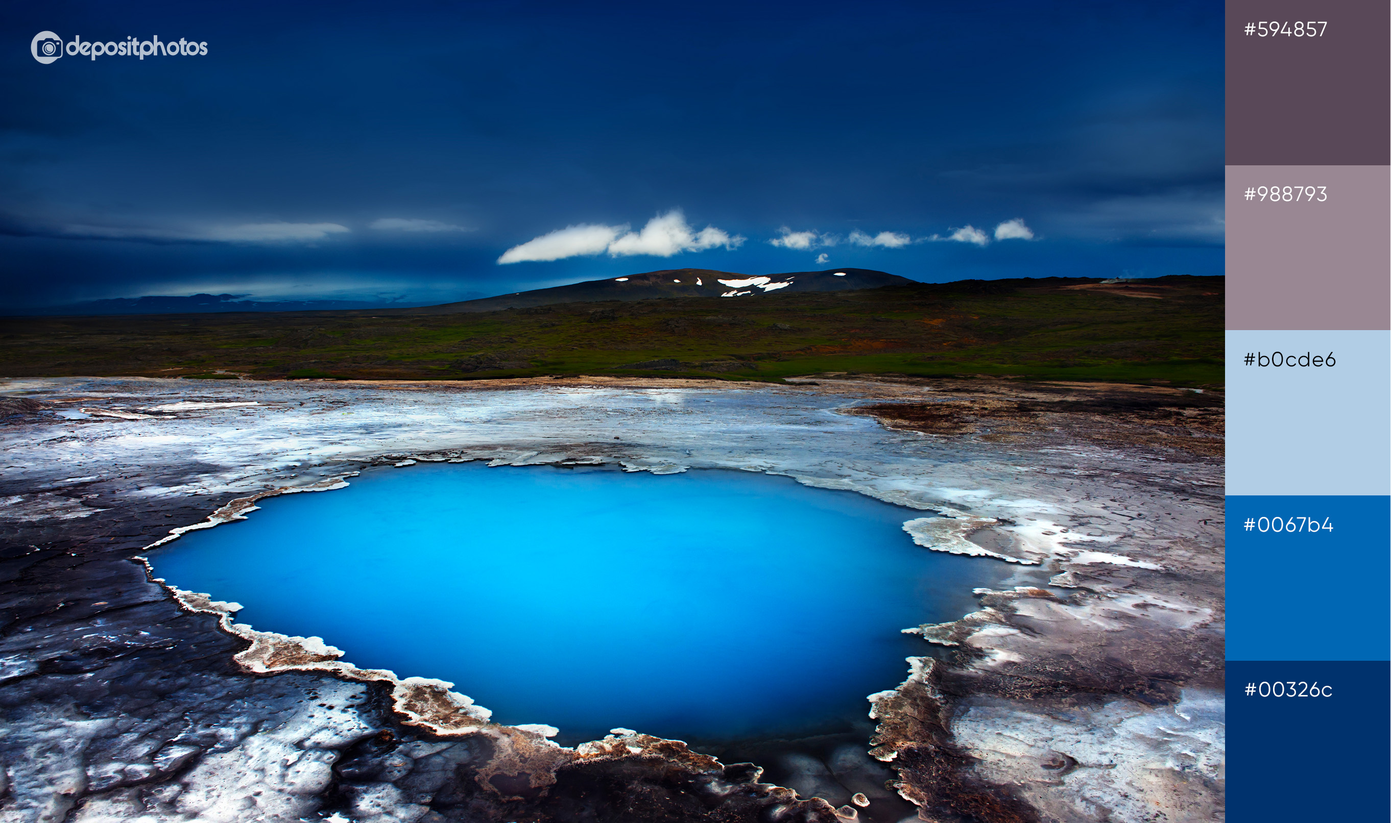
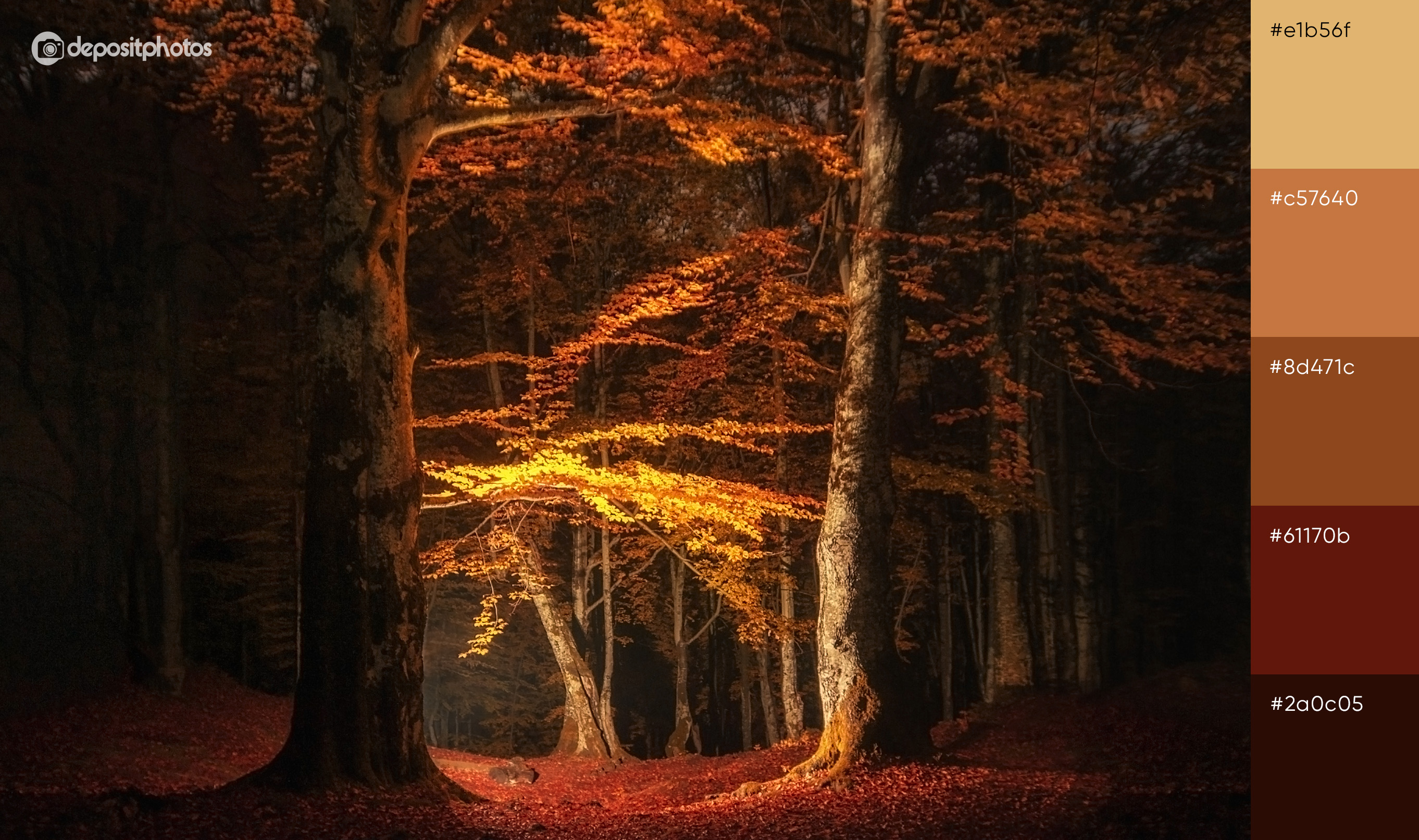
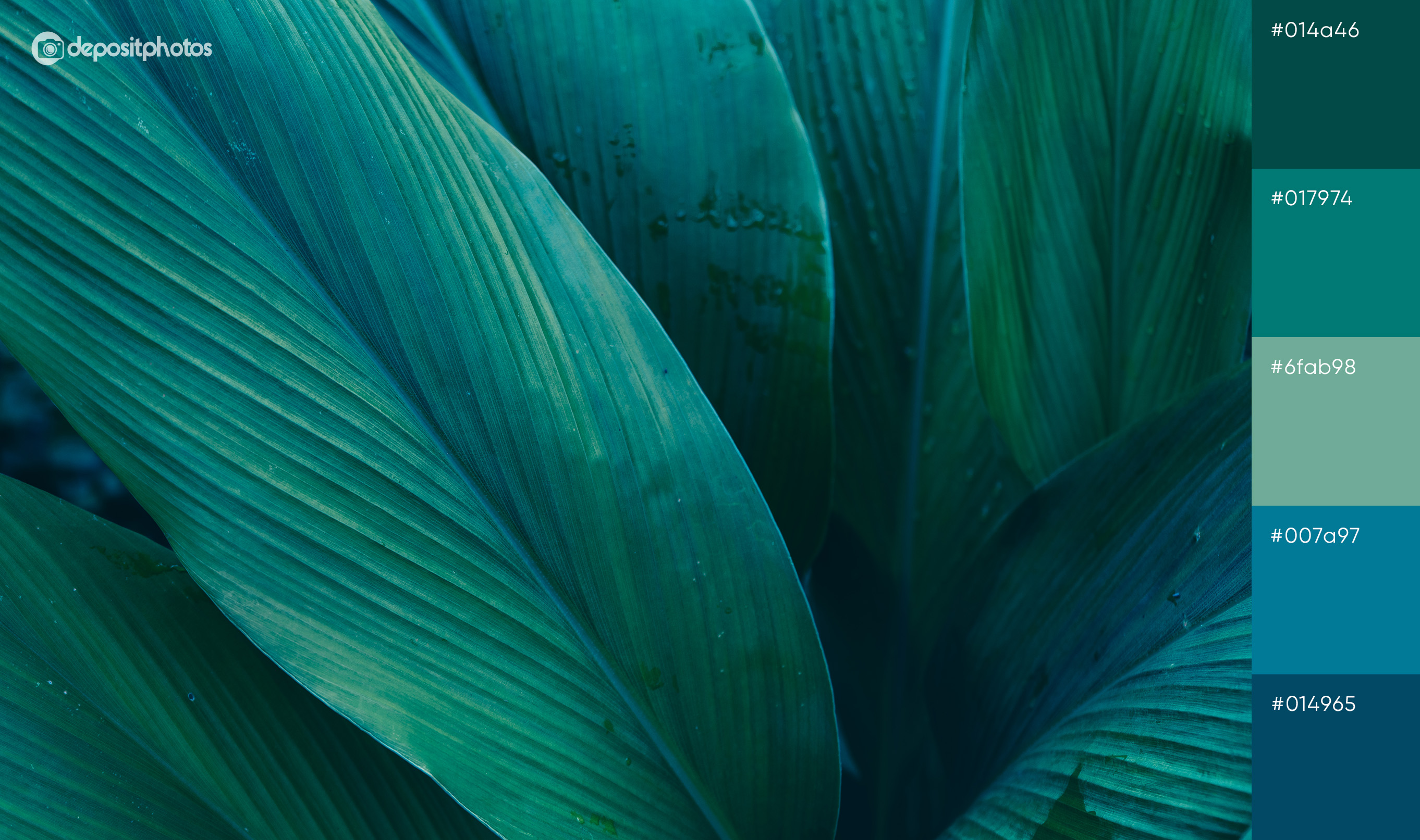
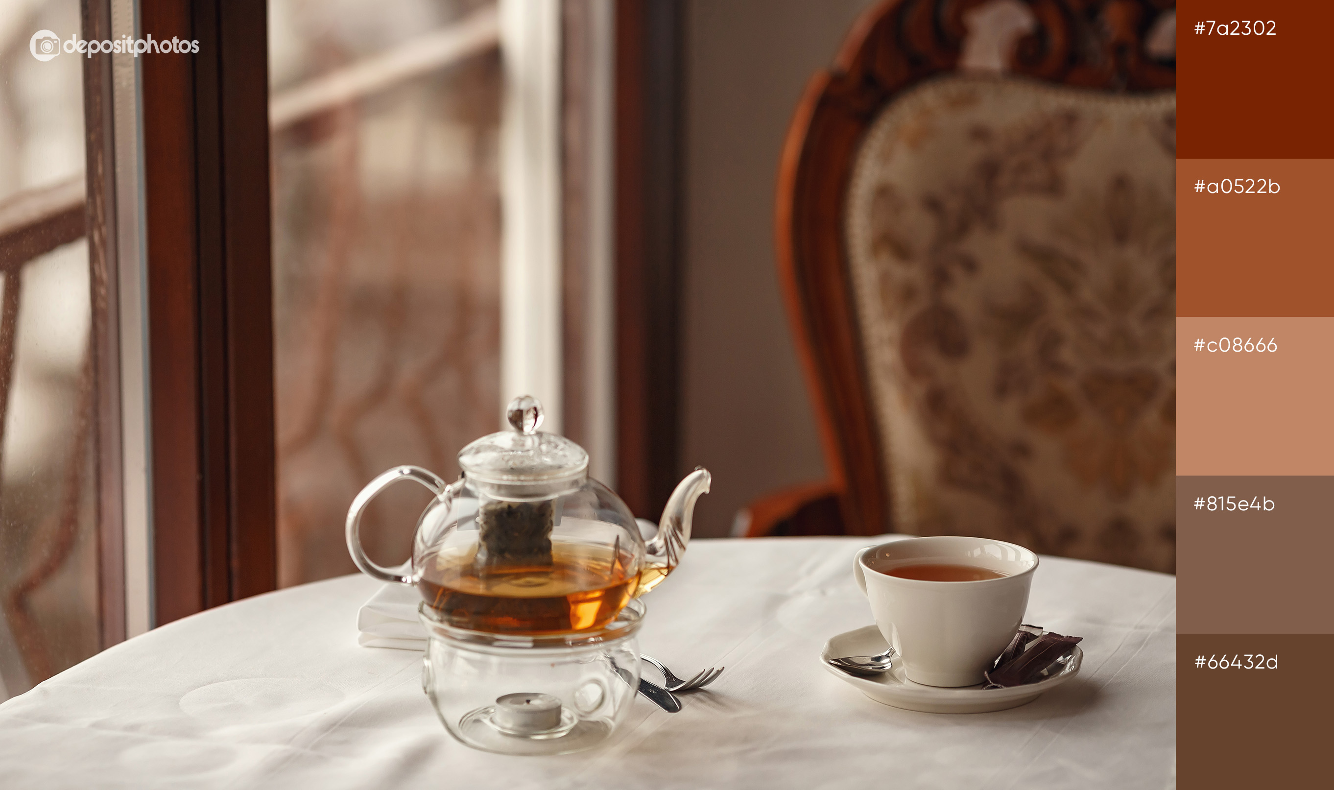
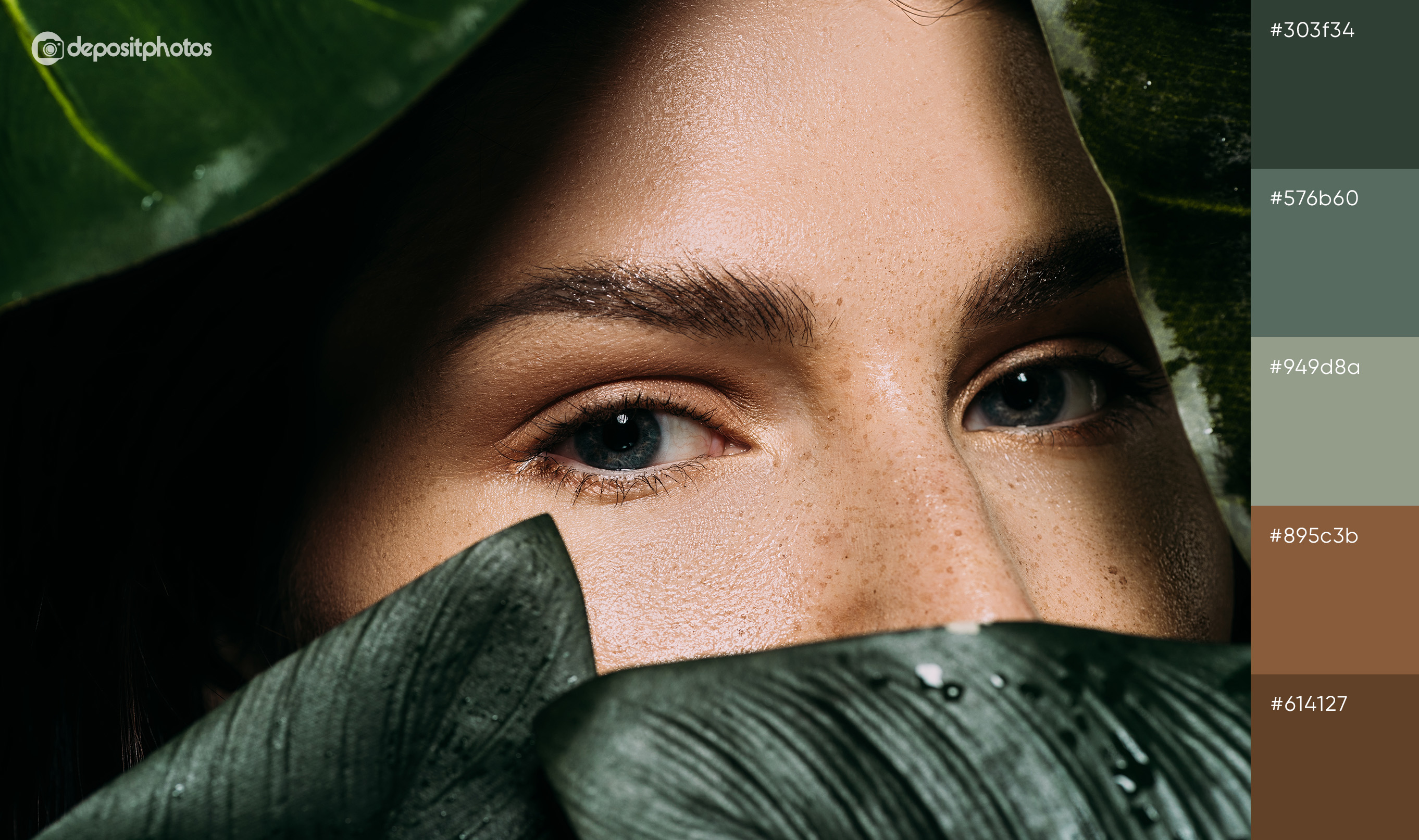
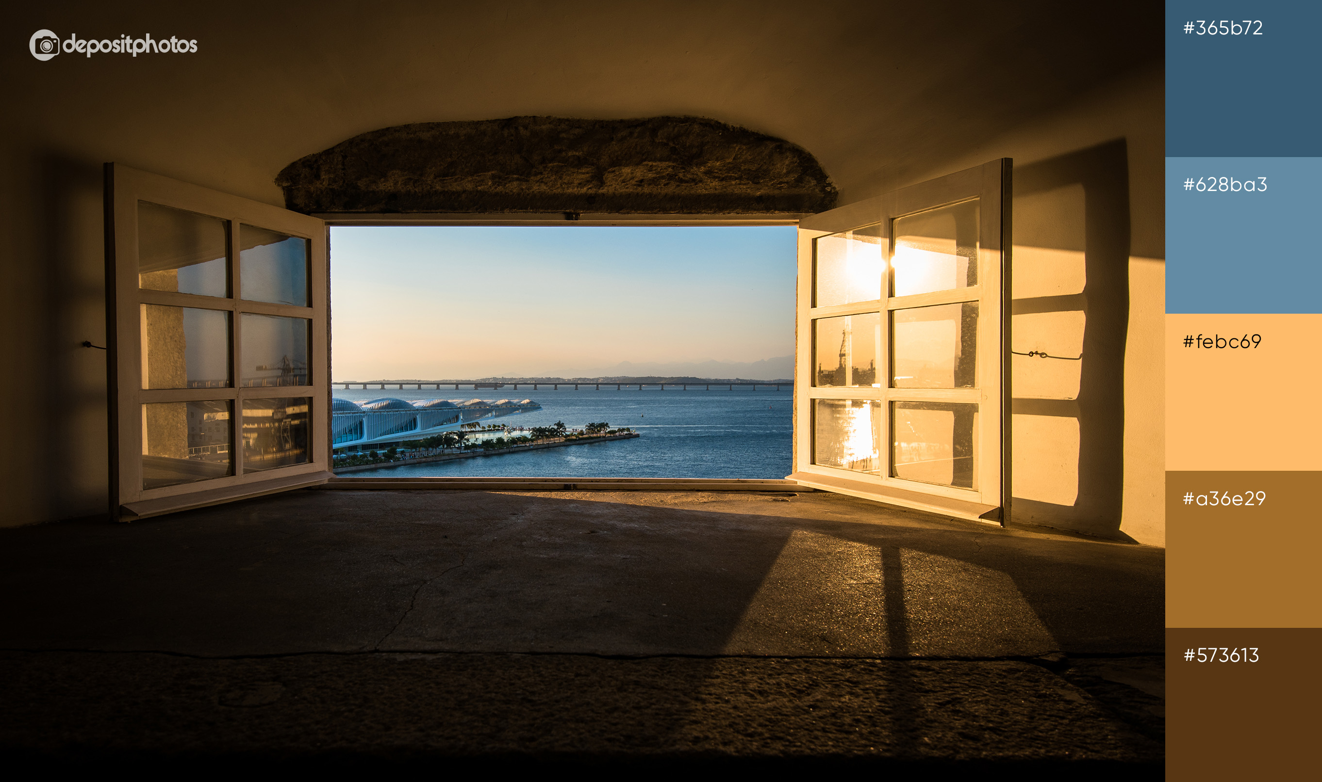
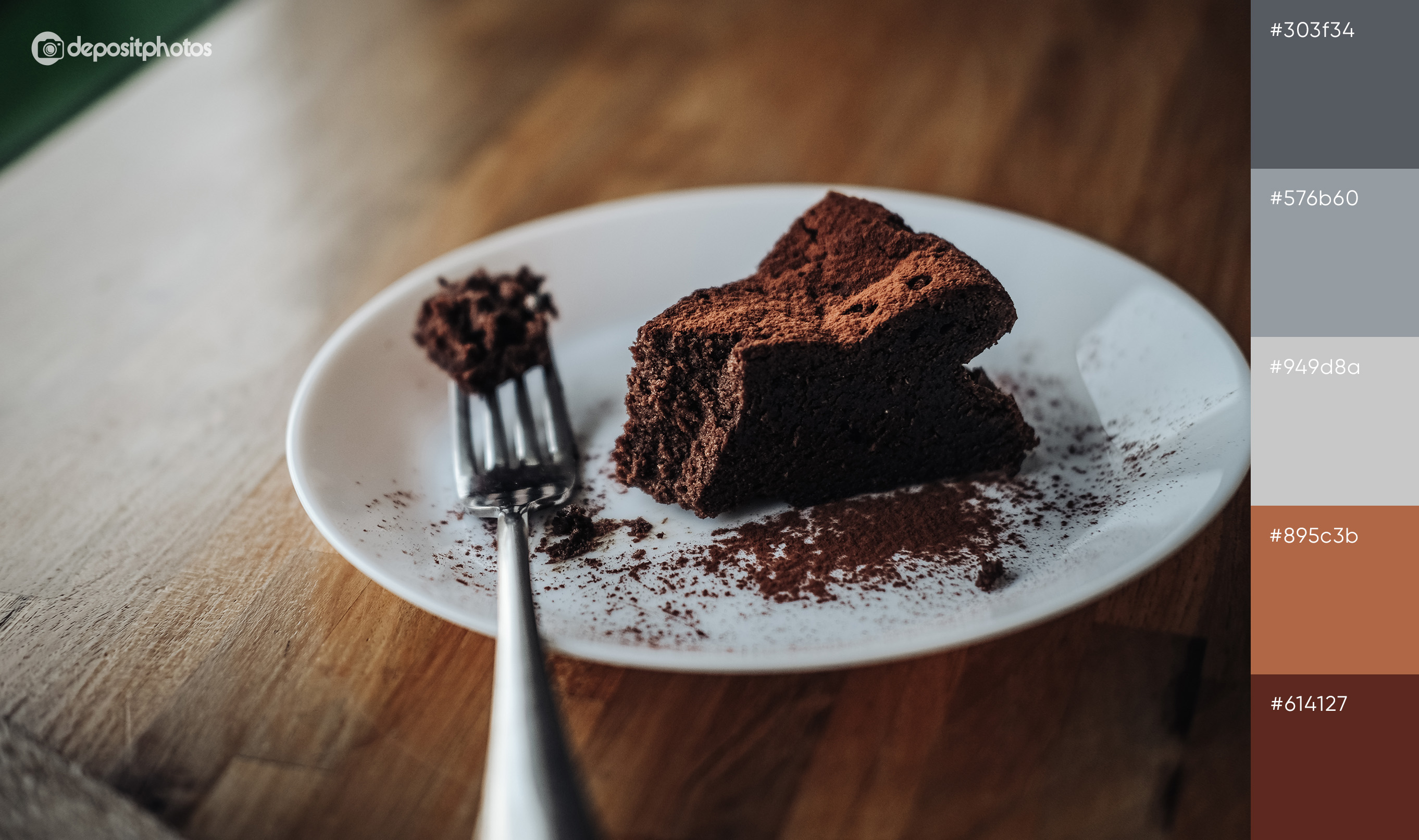
Although autumn means the end of the summer, this season is also associated with new beginnings. Families come back from vacations to the home cities ready to dive into the work routine and are more open to try new things that brands have to offer.
Devote some time to update your designs with seasonal colors and visuals and connect with your clients craving some fall vibes.
