Spring Color Palettes for Outstanding Projects
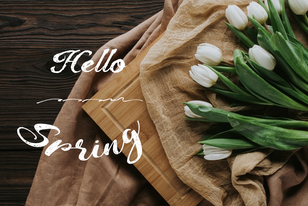
Seasons are quickly changing and campaigns need a slight makeover to reflect our joy for the upcoming spring. Certainly, greeting your clients with the first week of spring by sending a thematic email with tulips on a background is a sure-fire way to stay in touch with them. But consider that your email campaign won’t stand out from dozens of other letters sent to your clients’ inbox on a daily basis.
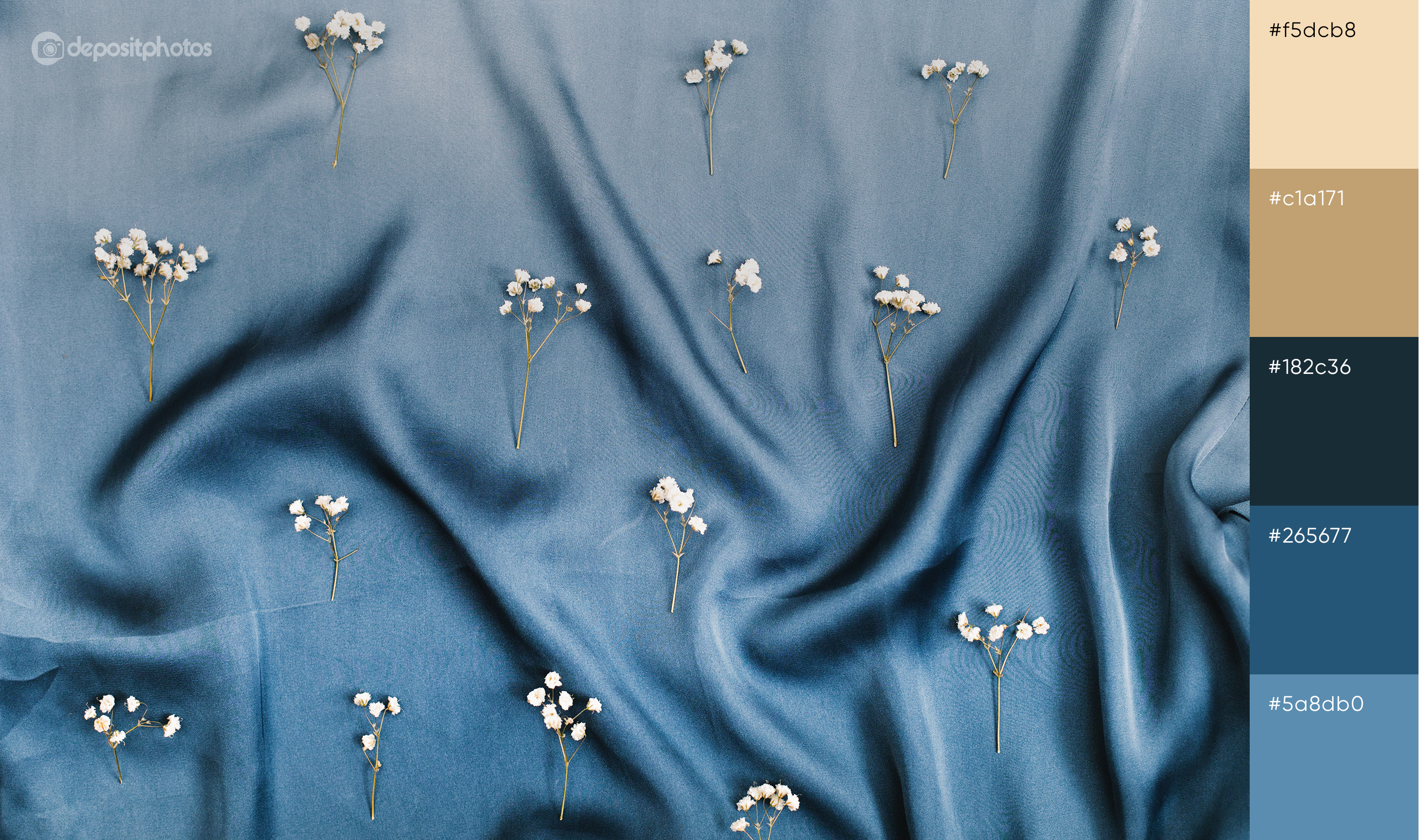
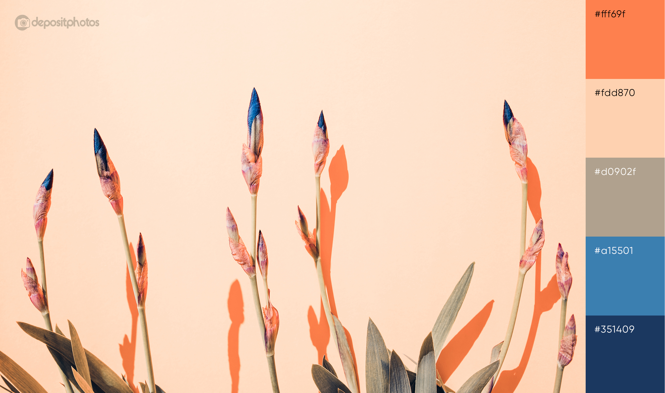
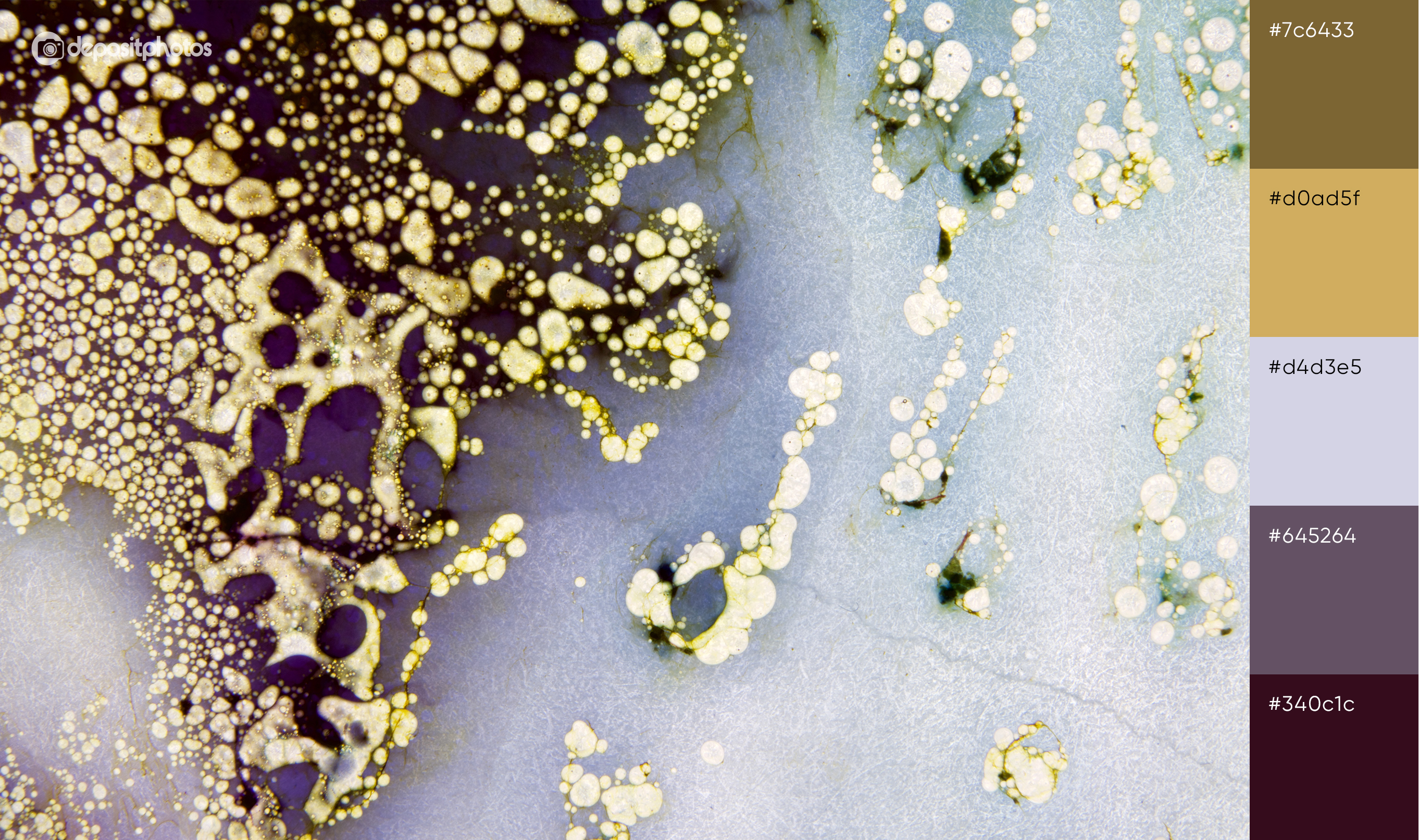
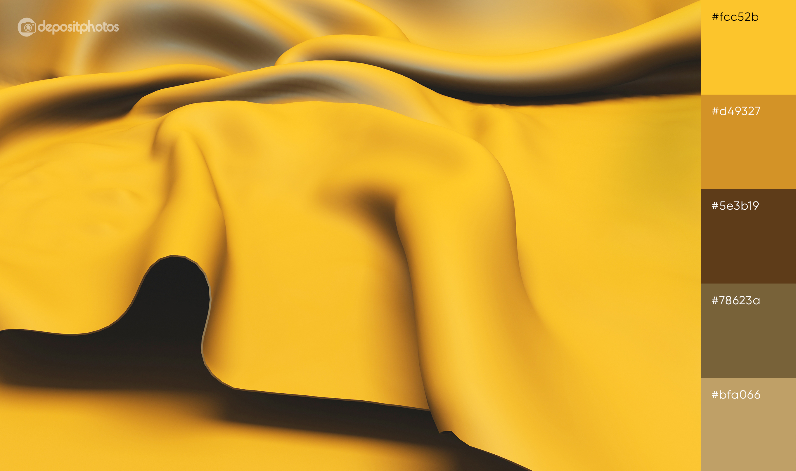
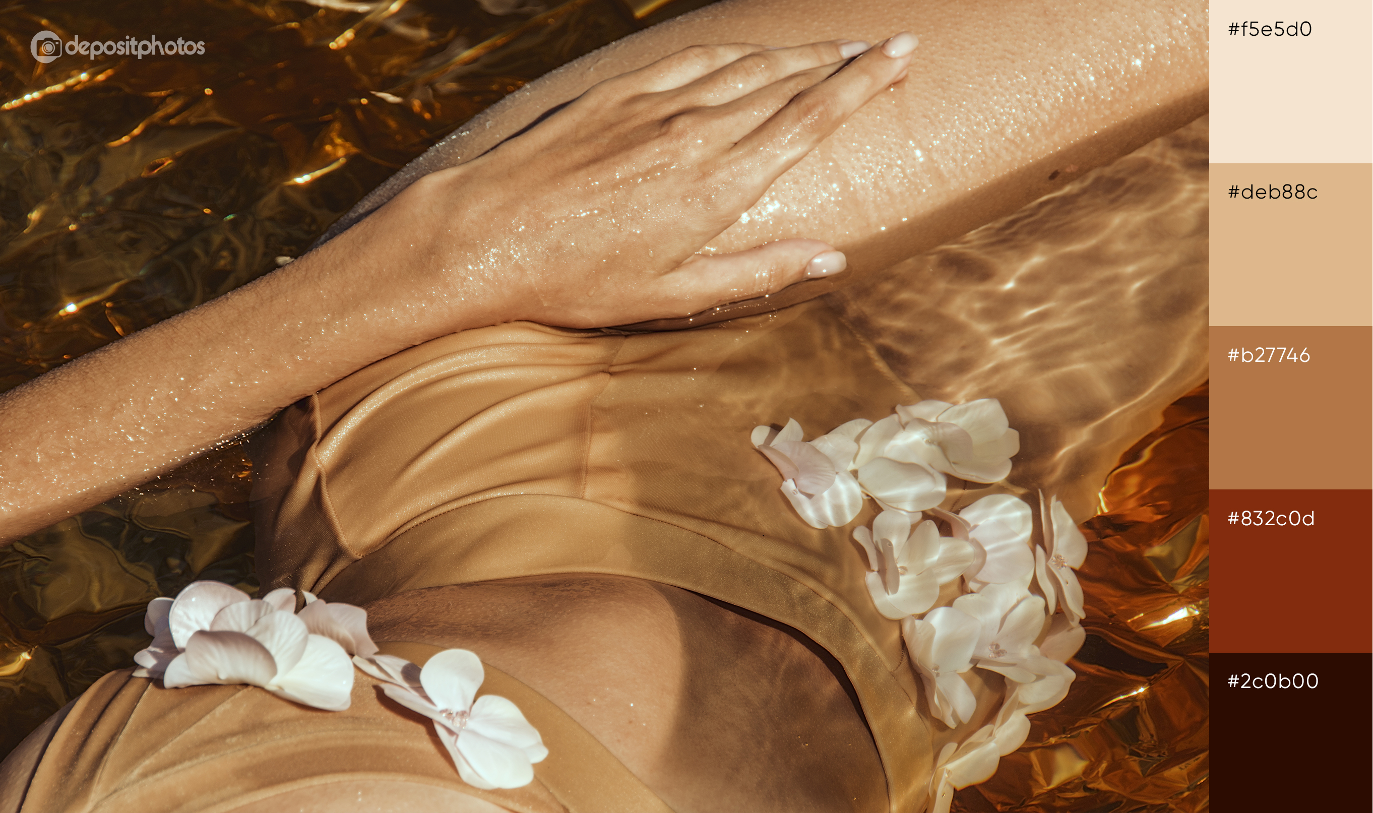
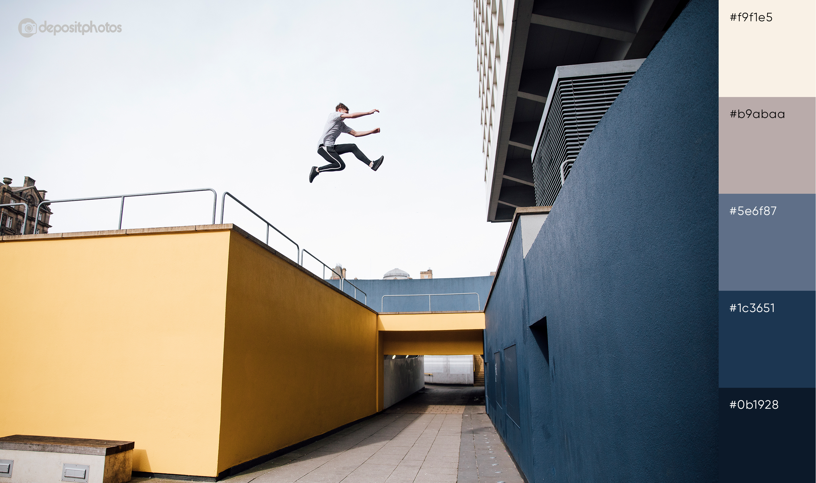
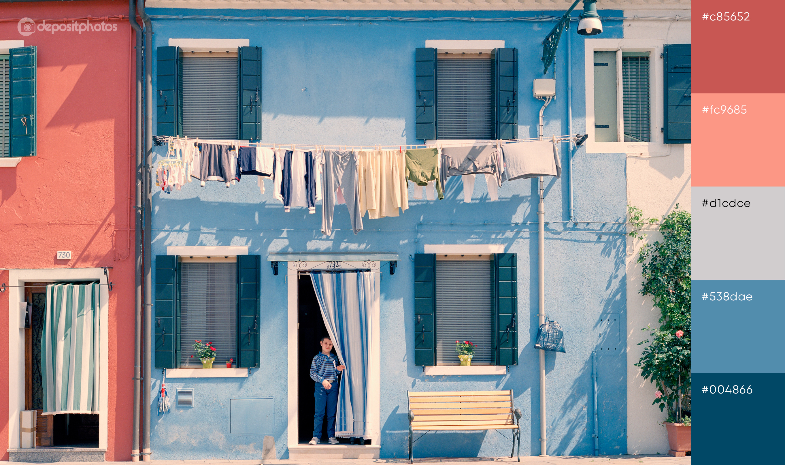
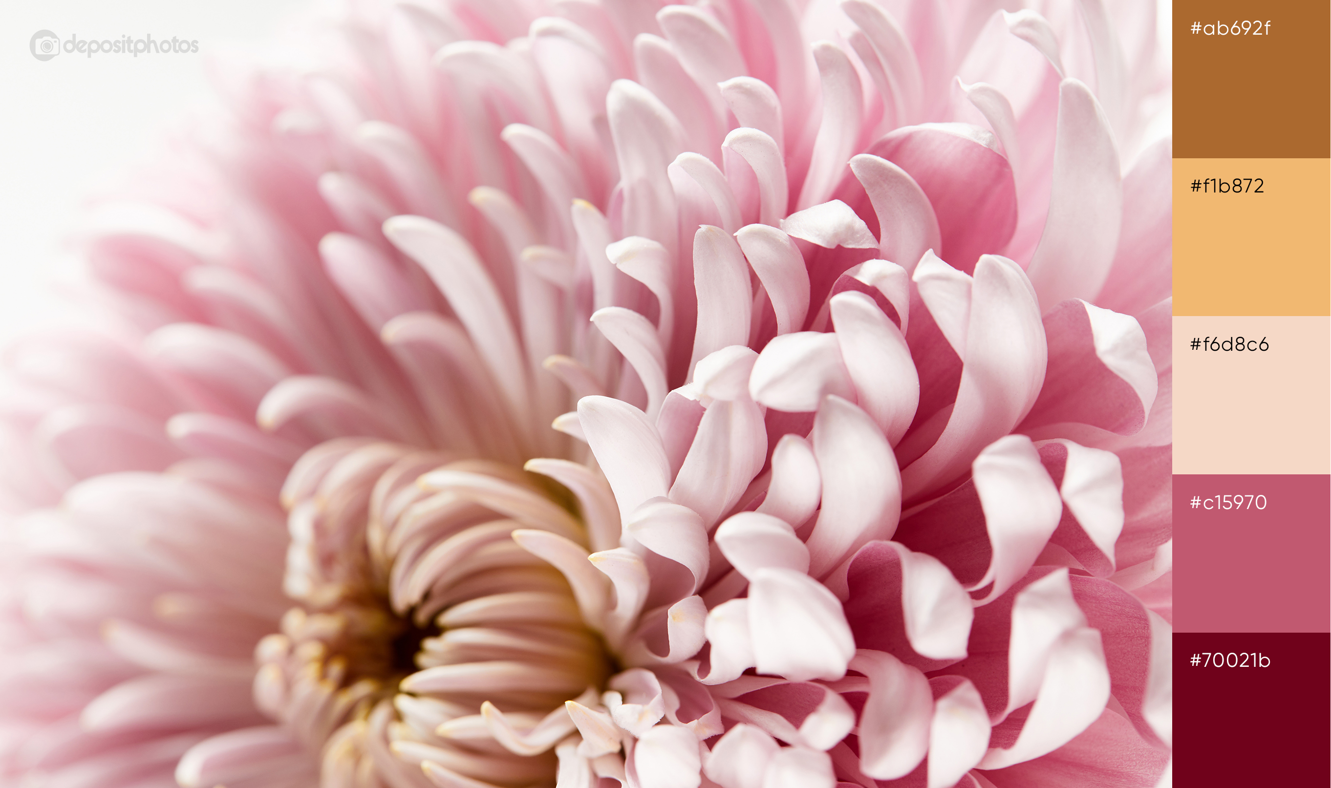
This season, if you’re ready to put more effort into your campaigns in order to stand out from competitors, start using trendy spring color palettes instead of corny images. To help you out with the best color solutions, we’ve analyzed the latest design trends, singled out the most popular colors, and created a collection of thematic palettes you can use this spring.
The trendiest colors this spring
To find out the trendiest colors of this spring, we turned to a couple of credible sources such as Pantone Color Institute and our Visual Trends Report. We’ve also closely monitored the spring 2020 street style in Milan, Paris, and New York, as well as had a look at the newest photos, vectors, and illustrations in the Depositphotos library.
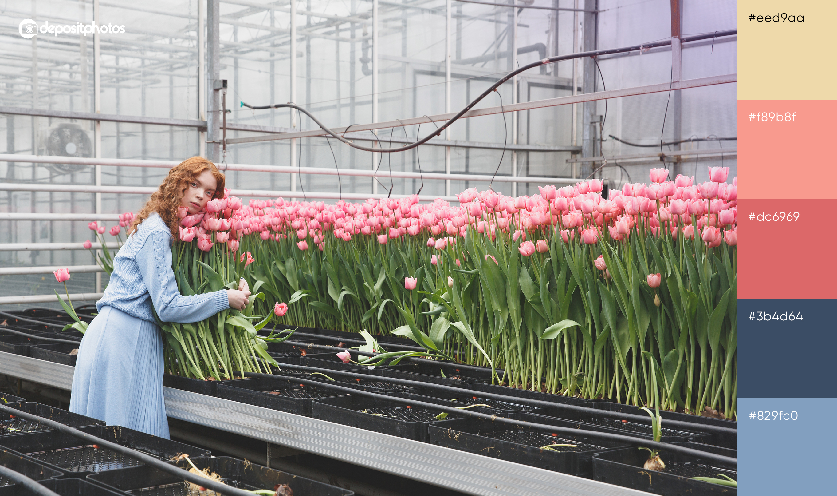
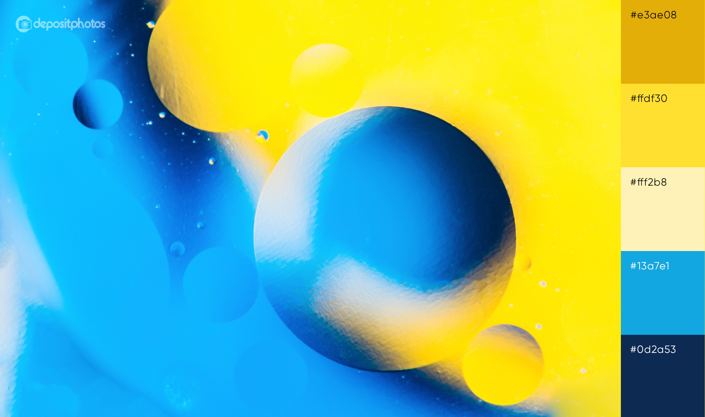
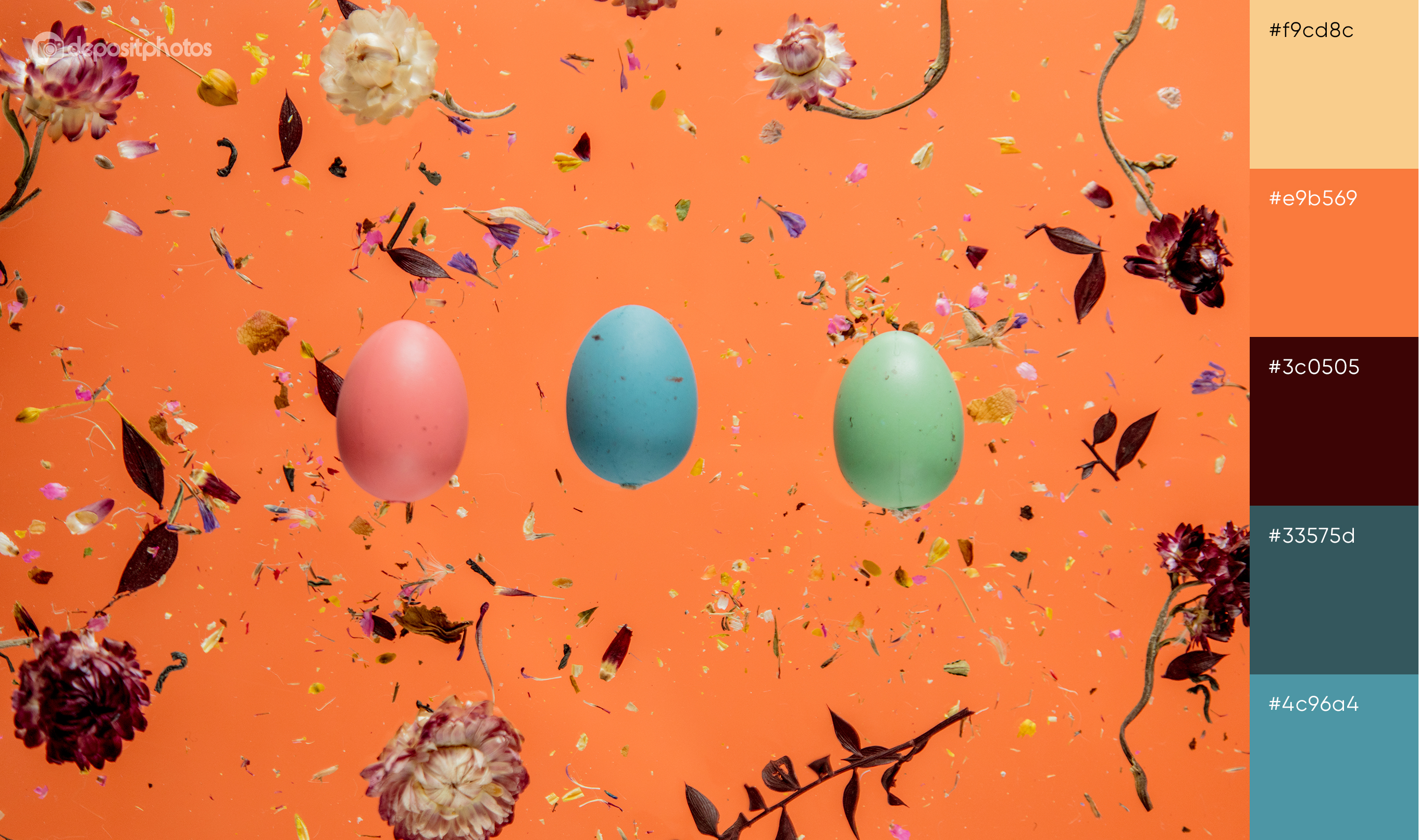
Having analyzed a great scope of information and being largely inspired by fashion trends, here are the four colors that will make your spring-related projects look outstanding:
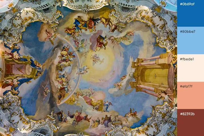
- Denim
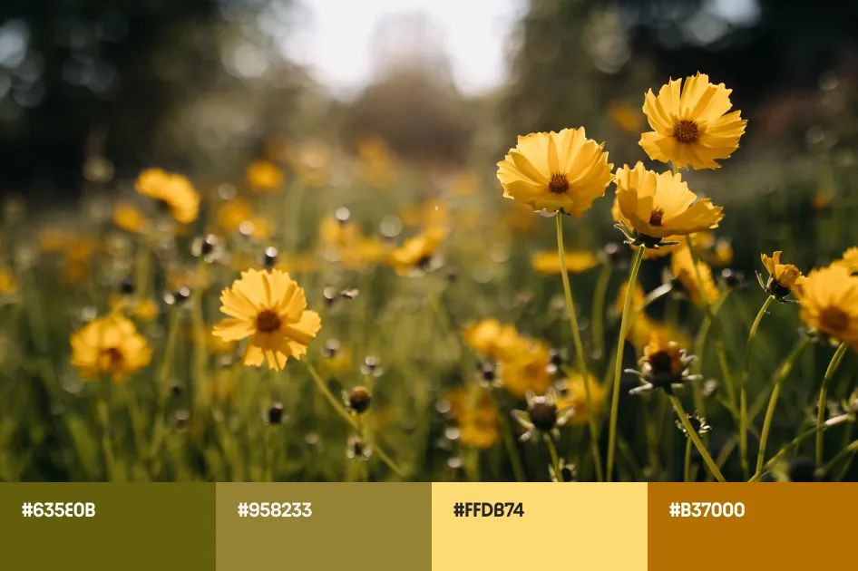
- Sunlight
- Blush
- Cinnamon
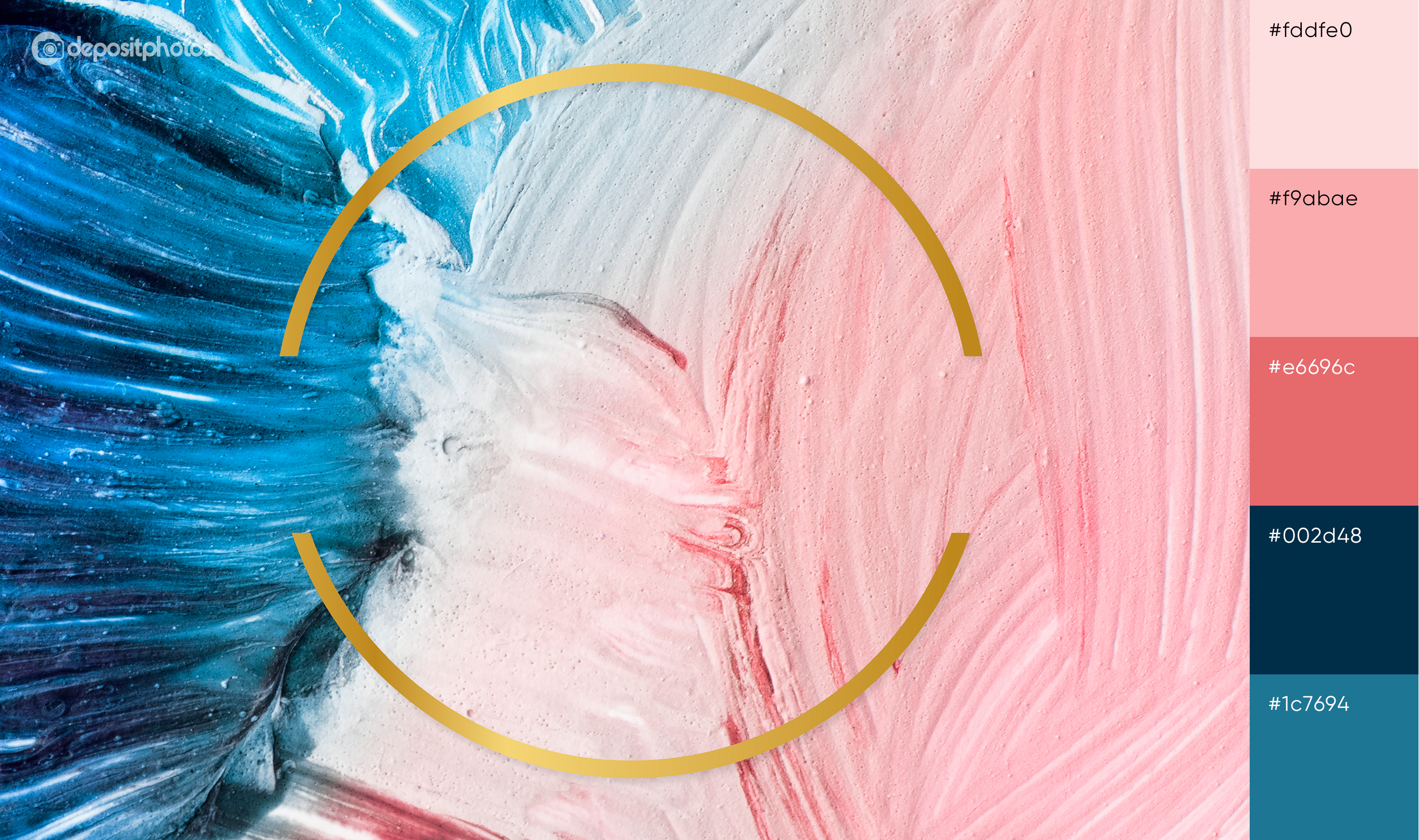
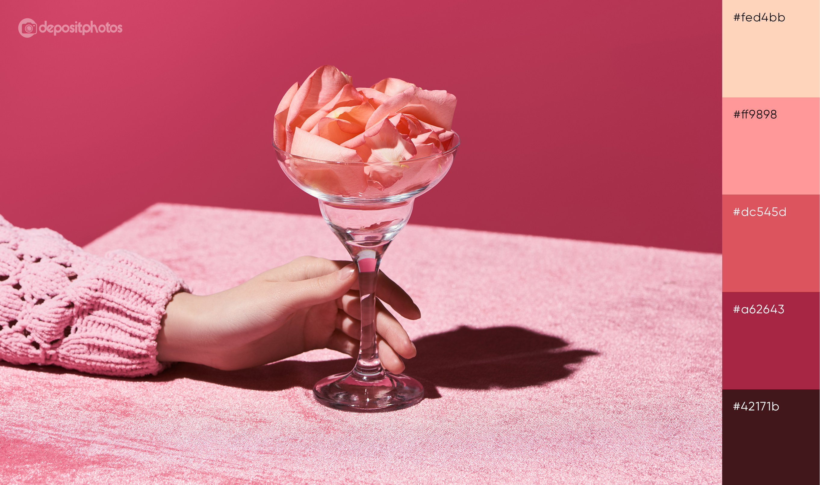
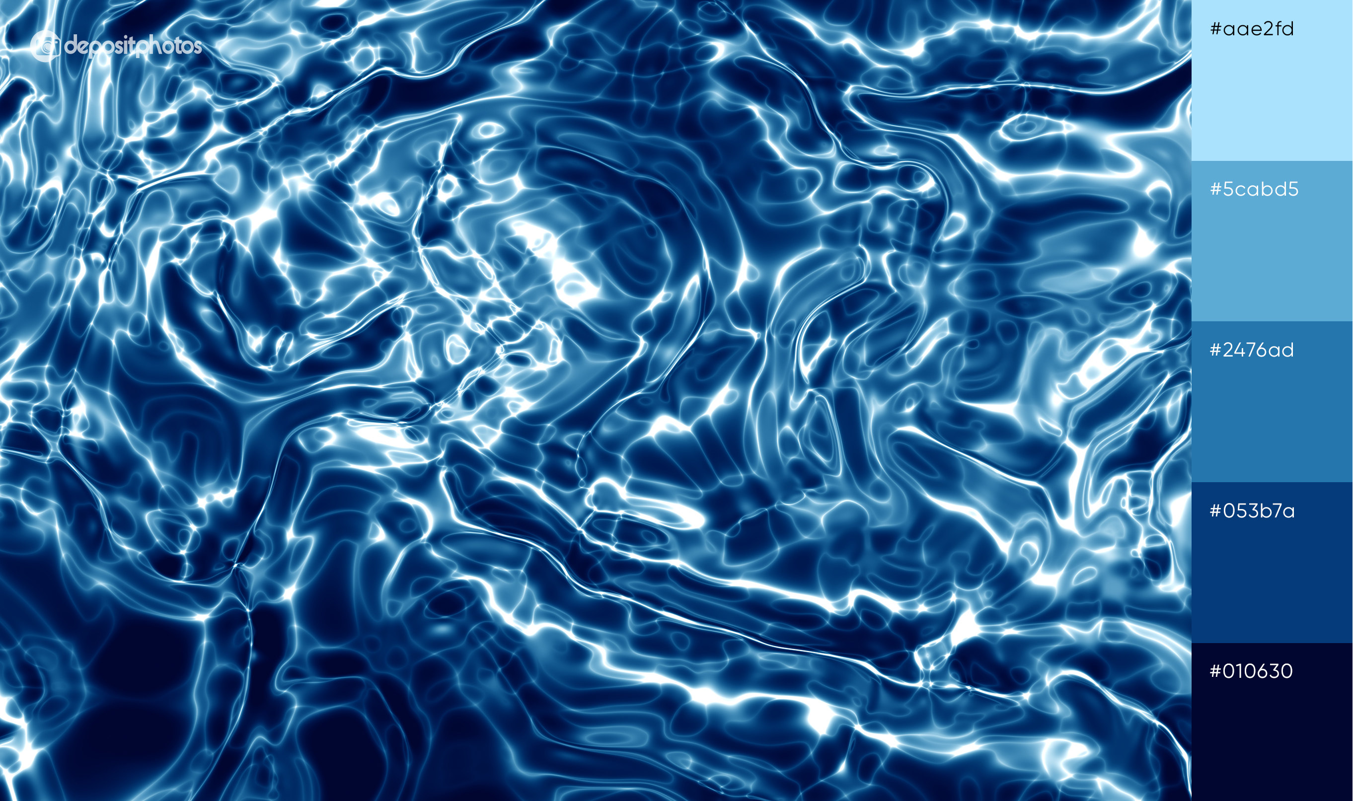
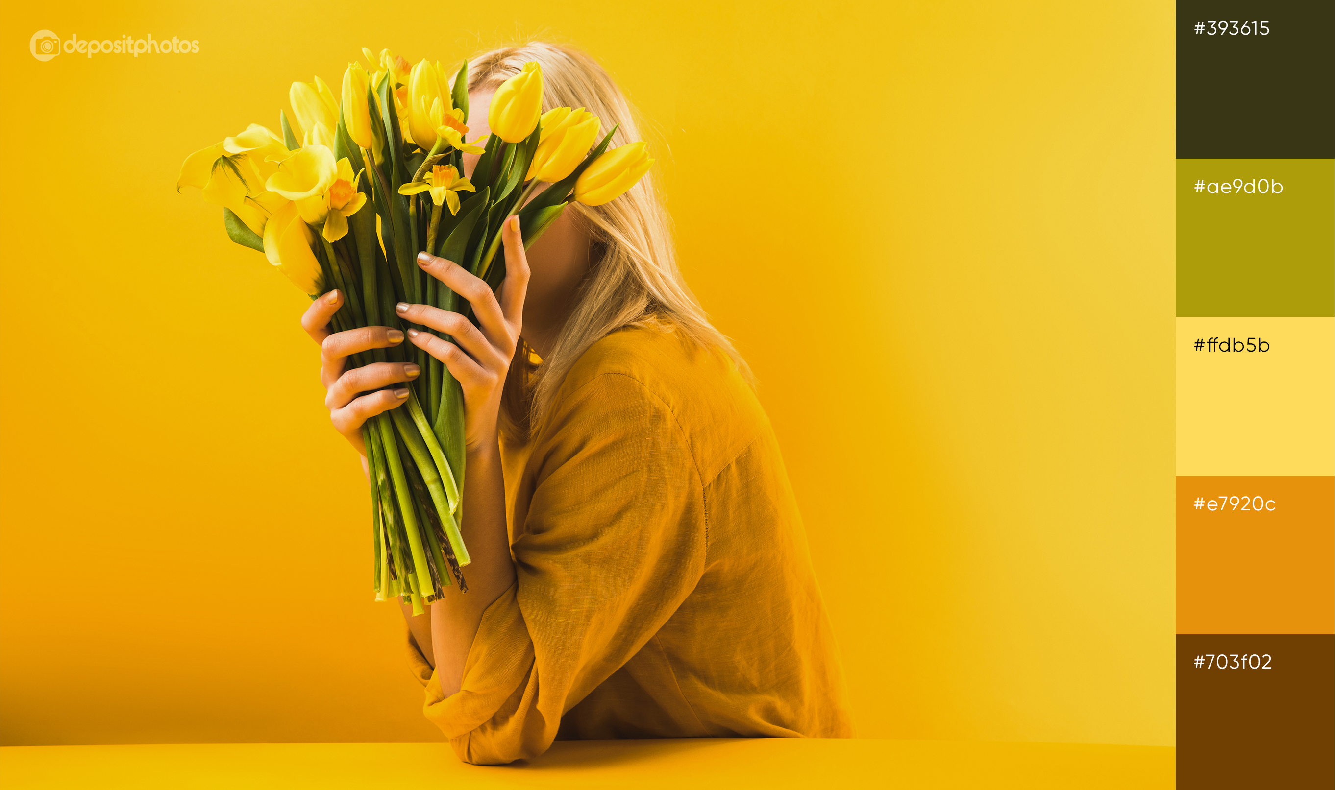
As for perfect color combinations, check out these spring color palettes to get inspired.
Spring color palettes for outstanding projects
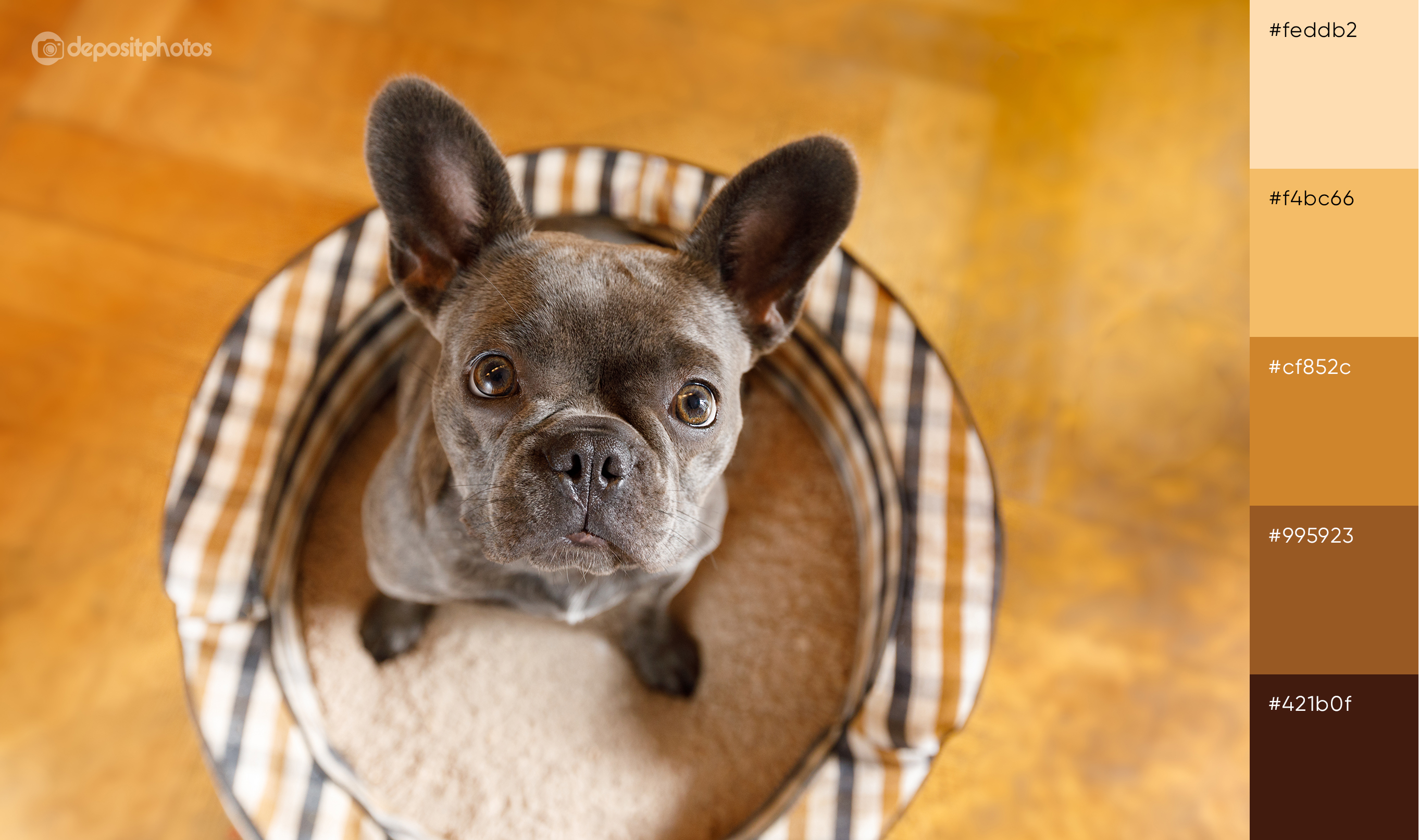
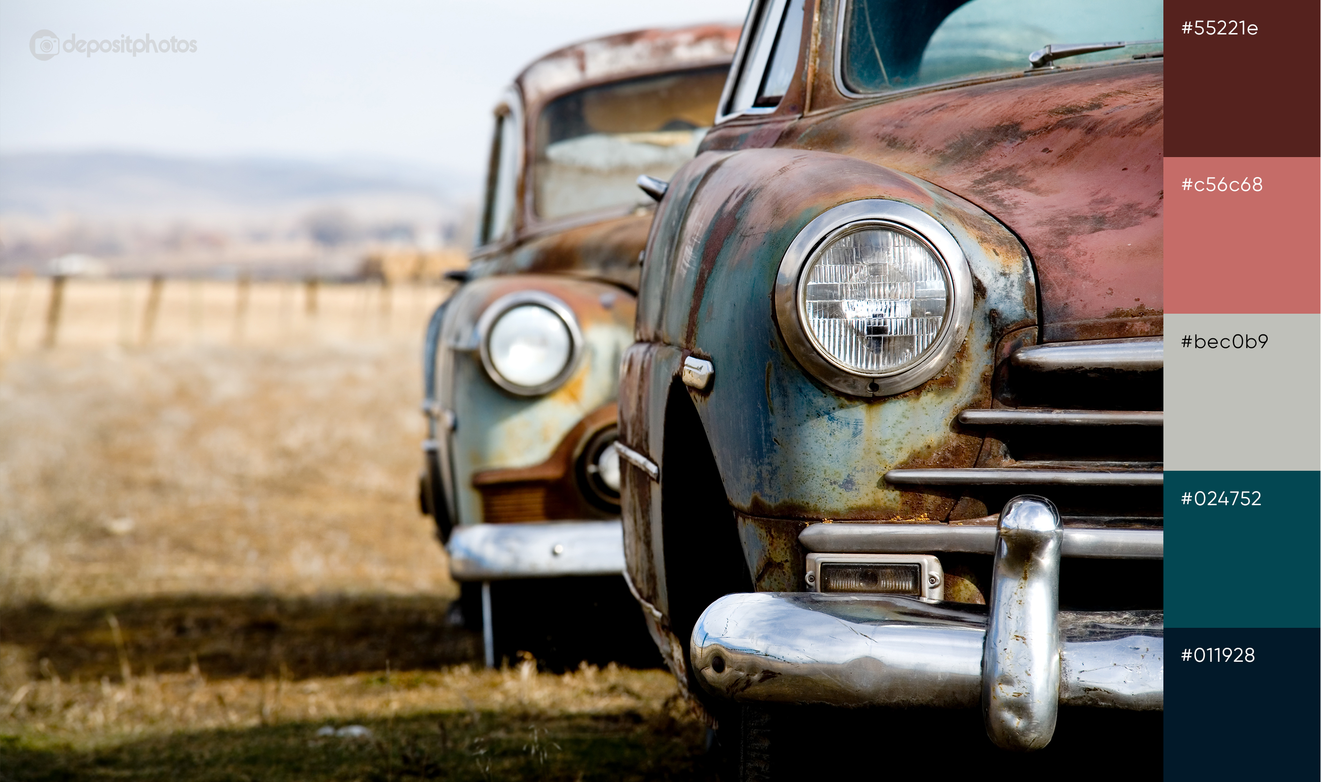
Use colors from these palettes for all your thematic projects, in your holiday campaigns or single ads. Be sure to stand out from other brands on the market with something more unexpected and imaginative. As you experiment with bolder color combinations, you will notice the perks of straying away from the ordinary into the untapped color choices that are on trend.
Happy first week of spring! 😉

![Gradient Color Palettes for Your Next Design Project [Infographic]](https://depositphotos-blog.s3.eu-west-1.amazonaws.com/uploads/2019/08/Gradient-Color-Palettes-for-Your-Next-Design-Project-Infographic.webp)

