Snapseed Tutorial: Learn the Basics to Better Editing
With the advent of Instagram, photography editing skills became necessary not only for professional photographers but also for average social media users. Striving to make our Instagram grids today look better than yesterday, we are always in search of image enhancement apps that will contain all the necessary tools at once.
This universal app already exists. Spanseed is a full-fledged mobile alternative to Photoshop. It offers a wide range of tools and features that allow making even the most boring snapshot look like a masterpiece. In addition, you can get Snapseed for free at any app store which makes it even more indispensable.
From enhancing brightness and contrast to applying more advanced tools like perspective and expansion — this Snapseed tutorial will showcase the basic functionalities of the app.
How to use Snapseed to enhance an image
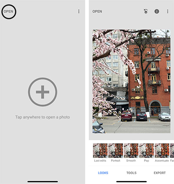
The first thing you have to do is open an app. Then choose an image you’d like to enhance by clicking ‘Open’ at the top right corner. Once you’ve selected an image, you can discover the basic photo enhancement tools.
In our article about 10 ways to enhance an image, we’ve shared Photoshop instruments that every photography fan should be familiar with. Most of them you can find in Snapseed. To do that, click on the ‘Tools’ button at the bottom of the screen and explore the immense arsenal of tools that are at your disposal.
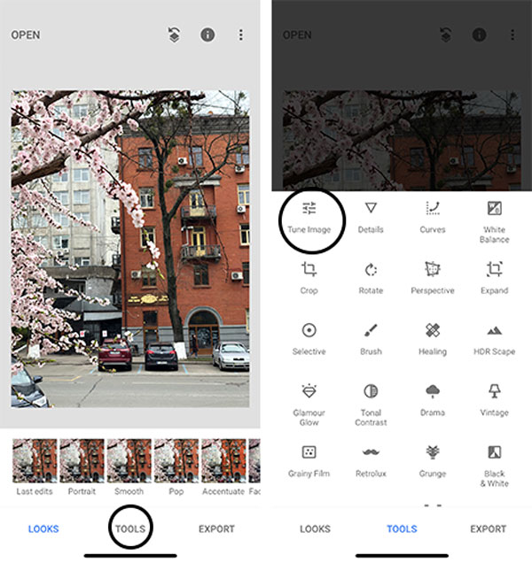
Tune image tool
At the top left corner of the bar, you can see the ‘Tune image’ tool which corrects major errors and is more often used by photographers. To access all the tools it hides, tap on it and then hold your finger on the screen. There you’ll see these seven tools:
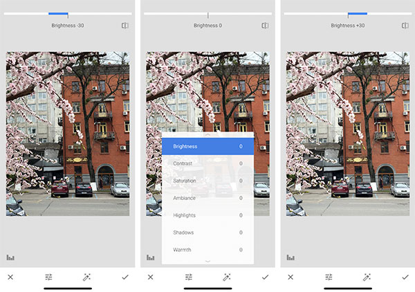
1. Brightness
Although this is an obvious adjustment tool, its functionality is often underestimated.
An important thing to remember is that brightness and contrast always go together. Every time you’re editing brightness, you’ll consequently need to adjust contrast.
2. Contrast
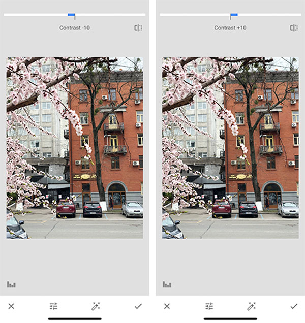
Contrast is a tool that shows the difference between different tones and helps draw attention to an object. It not only adjusts the general appearance of an image but also allows you to create a particular mood.
If you reduce the contrast the image will look faded or washed out, while increasing contrast will make it more striking. Even the slightest changes in contrast are visible. Thus, you should rarely apply it at its maximum.
3. Saturation
The same way that brightness influences contrast, the contrast tool impacts saturation.
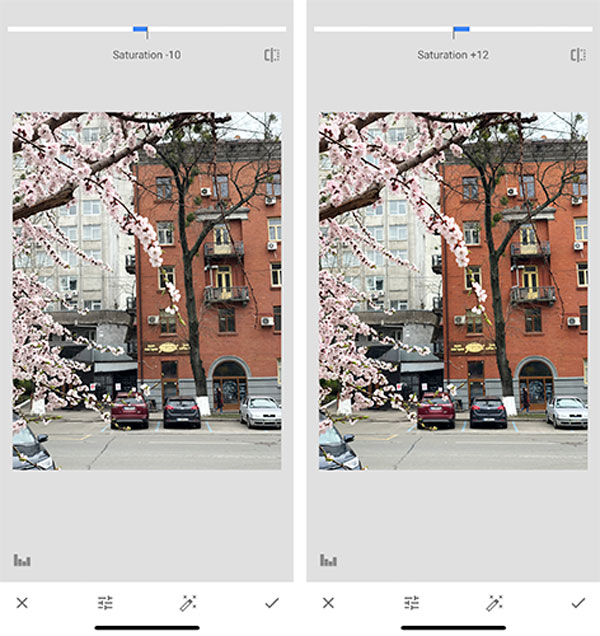
With the help of this tool, you can regulate the color intensity if you feel like it’s not saturated enough.
For example, if you decide to add more saturation to a contrasted image, it will become more vivid and colorful. If you reduce saturation even slightly, you’ll bring your image closer to retro or black and white stylistics.
There’s also no need to apply saturation at +100% or -100%. You’d better be guided by logical or aesthetical considerations to avoid over-editing.
4. Ambience
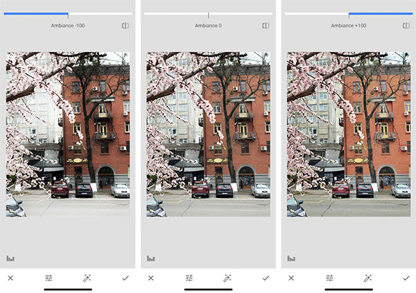
Ambience is actually the only tool that looks great both partly and completely applied.
The image below (right) is +100% ambient and you can spot that all the highlights and shadows are balanced. Meanwhile, the one on the left is -100% ambient – all the highlights are hidden. In addition, it seems as if the quality of the image is better.
5. Highlights
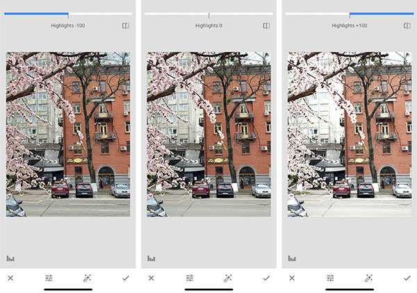
Adjusting the highlights means working with the brights spots of the image. If your photo is overexposed, the first thing you should do is decrease the highlights. You can apply both small or drastic changes. The amount of highlights depends on the initial state of your image.
6. Shadows
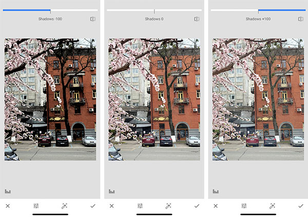
Along with highlights, shadows work just perfectly. They make the image eye-catching, improve overall composition and appearance. If you’re just starting out, you may not be familiar with basic composition rules and the image enhancement tool like shadows will be your savior.
Again, to which extent to apply the tool depends on the original image. Below, you can see how shadows work.
7. Warmth
Tones and hues play a major role in photography. They can be enhanced with warmth – an amazing tool for developing your signature editing style and making your grid stand out.
Although called warmth, the tool endows the image with both warm and cool tones. The snapshot below was taken in mid spring and it definitely needs some warmth to convey the weather and atmosphere around.
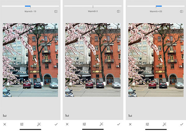
Now, if you’re satisfied with the results, tap on the tick on the bottom right corner, and save the changes. It’s high time to proceed to image details.
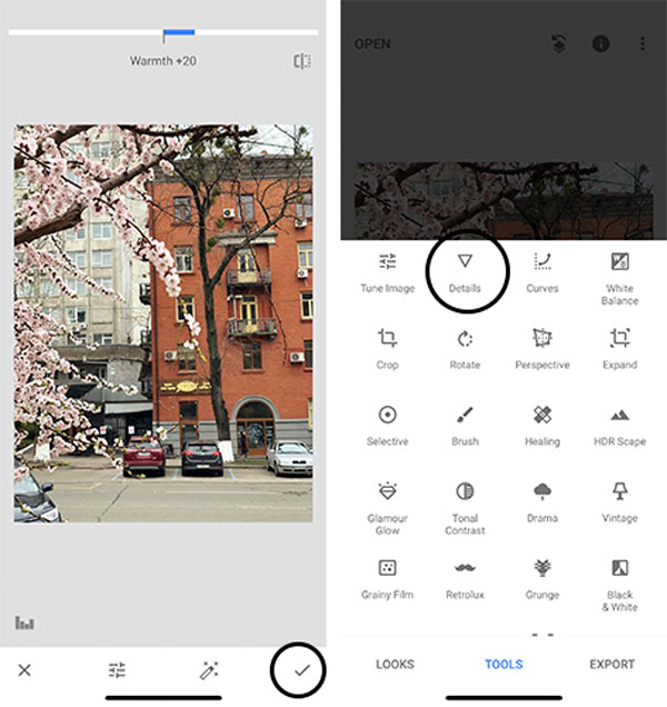
Details
Another two basic tools that we couldn’t help but include in this Snapseed tutorial are structure and sharpening. They point out the details of objects and enhance the overall quality of an image if needed.
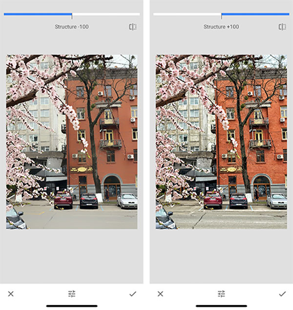
1. Structure
You have definitely seen a photo of a building or any architectural monument that looks like an illustration.
The simplest ways to achieve this result is to add structure. With it, you can enhance image attractiveness but be careful, as too much structure can add unnecessary grain to an image.
2. Sharpening
Sharpening is also a useful tool. Photographers apply it to highlight the textures and details. For example, if your image lacks focus or seems too soft, you can sharpen it and thus provide it with more details.
Unlike the 100% structured image, the 100% sharpened one looks more polished and professional.
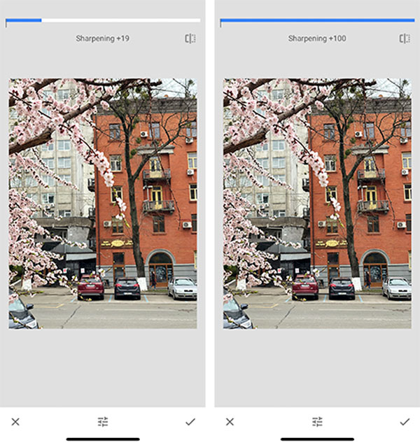
By tapping on the image you can see the original version of it and spot the changes, and evaluate the final result. Are you satisfied with the image appearance? There are even more tools that you can use to enhance the most boring shots. Keep up with our blog for the next Snapseed tutorial on more advanced tools.
Was our Snapseed tutorial useful? Share your results in the comments below. We’re looking forward to discovering the masterpieces you’ve created.


