Nadia Snopek: “98% of the Time I Genuinely Enjoy Being a Digital Illustrator”
The opinion that stocks are boring is a bit dated. The stock photography industry has faced great transformations in the last 10 years and today, libraries feature more authentic, creative, and diverse content than ever.
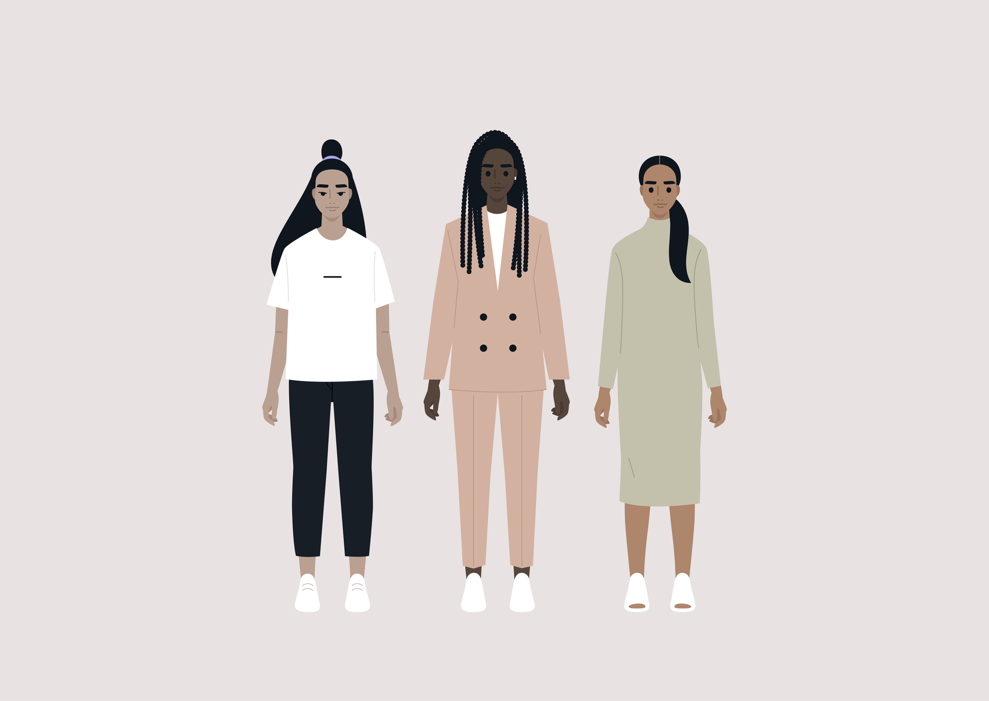
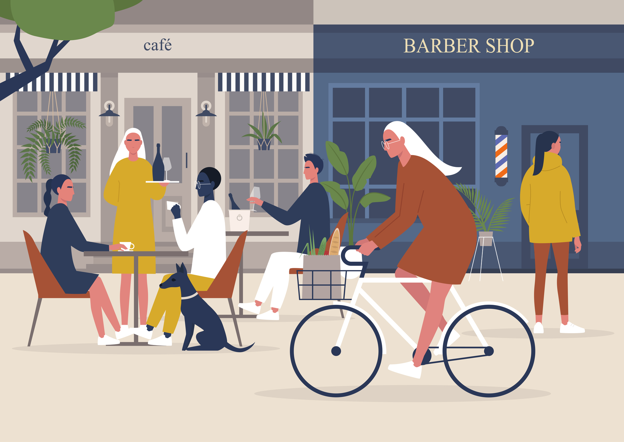
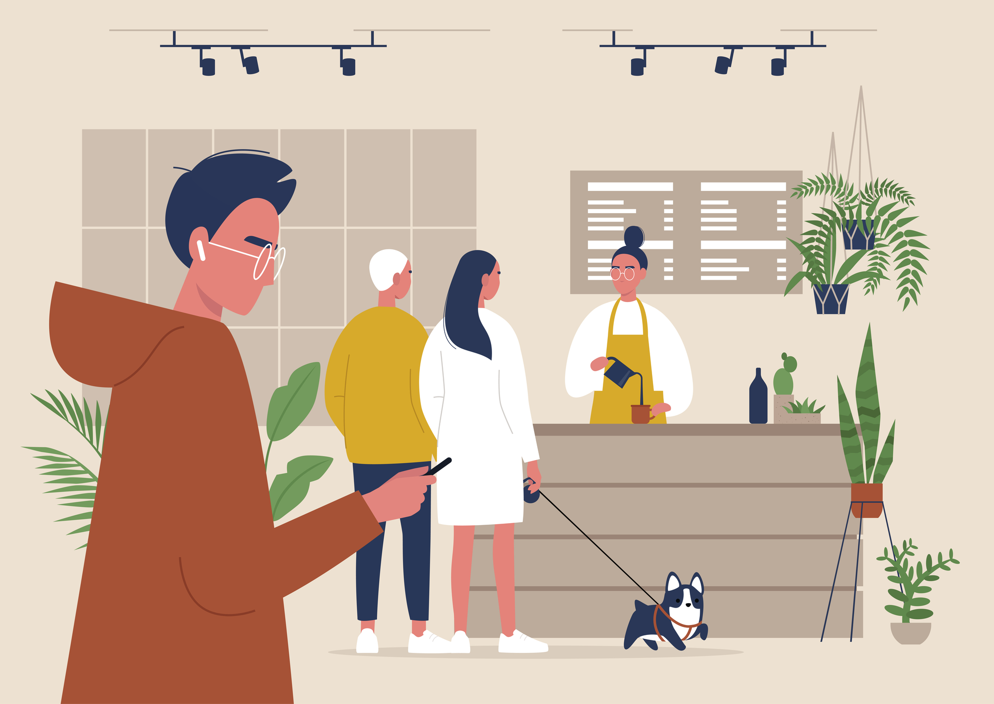
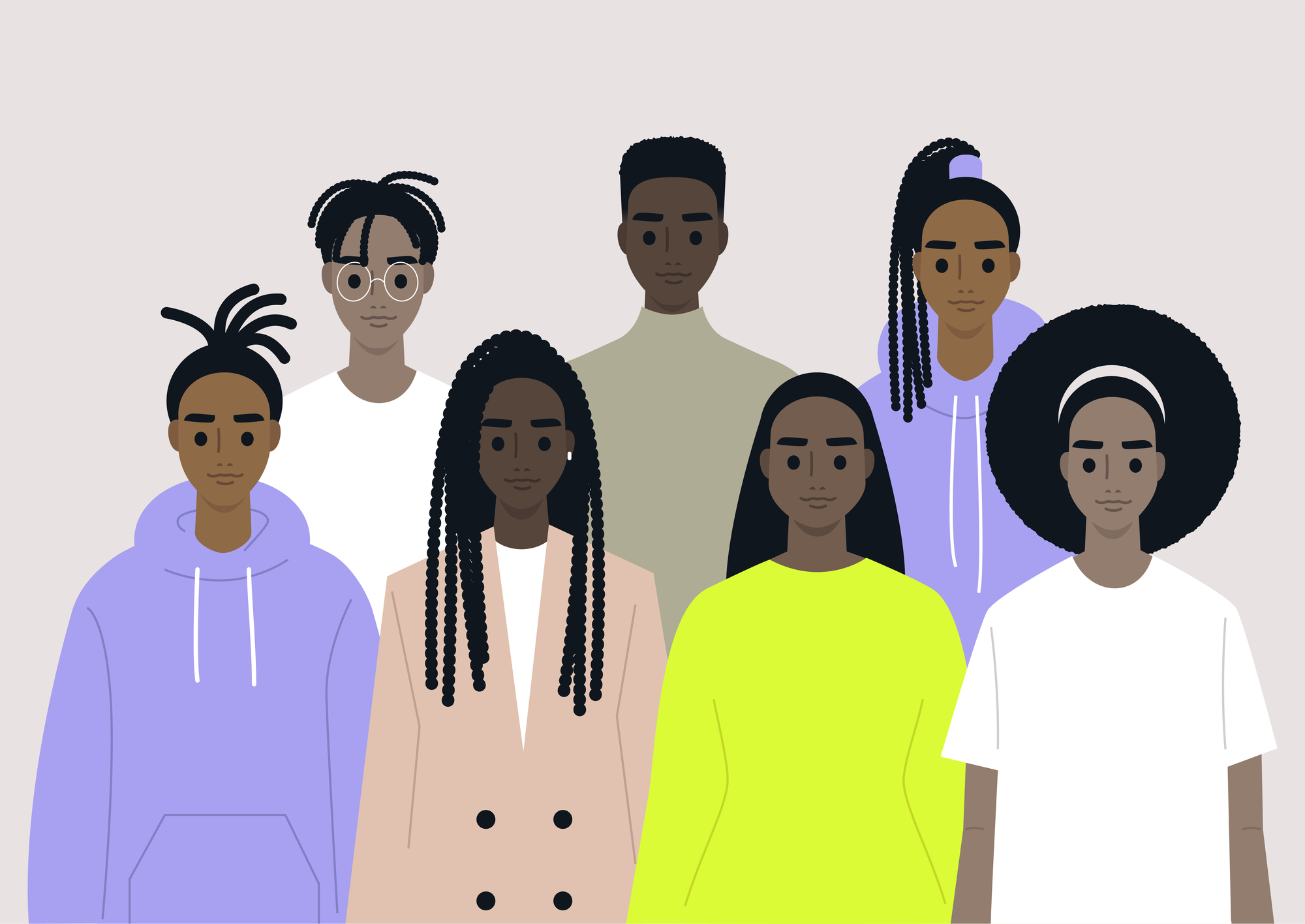
Nadia Snopek, a microstock and freelance illustrator born in Siberia, is among the Depositphotos authors that have greatly contributed to the change. Her portfolio focuses on representing diversity and modern lifestyles, bringing up the most relevant and important topic in our contemporary society with her charming illustrations.
Nadia has her own approach to working with stocks and knows what it takes to get your works featured in the Guardian, Independent, Washington Post, Wired, Vogue, Cosmopolitan, Forbes, and GQ. Read Nadia’s story to find out about her creative rut, passion for illustration, and workflow with clients.
Illustration has been my passion since ever
I’m originally from Siberia, but I’ve also spent some time in Moscow, Poland, Berlin, and California. I work in two fields: as a microstock illustrator and as a freelancer. Illustration has been my passion since ever, but it was not a straight path. For example, I graduated from the High School of Public Administration, and I even spent a year working as a civil servant. That was an eye-opening experience: life can be really annoying when you hate your work and your work hates you back.
I left exactly after a year (my first and last day at work was on Saint Valentine’s) and moved to Moscow. I tried hard to work as an illustrator there but Moscow had some other plans for me.
Life can be really annoying when you hate your work and your work hates you back.
After six months of rare illustrator gigs, I finally found myself in the office of my dreams – a digital publishing house making online media about creative industries, technologies, urban lifestyle, new feminism, and youth. Every single person there was creative, talented, and charismatic. My own duties were not in the creative field though. I was an advertising sales manager. However, this work prepared me for my future career in the arts. First of all, it shaped my field of interest. It also helped me deal with the greatest fear of a young illustrator – business negotiations with real clients.
I could have still been working there, but after two years there came another pivot in my life. A month before 2016 my (future) husband casually said: “Look, our rental agreement is expiring soon. Should we find a new one in some other country?” I casually said yes and became jobless but pretty confident about my future: the time to become an illustrator is close.
How I became a contributor to stock photography platforms
I first tried to contribute to microstocks in 2013, the size of my portfolio back then was about 30 vector files. It brought me enough money to buy a pair of sneakers once a year or two. In 2016, after quitting my job, I decided to make stocks my new full-time job.
I remember the conversation with my husband at a pizza joint:
“I really want to try to invest more time in stocks. I’ve already made 30 bucks this month!”
To which he replied, “I fully support you, but let’s set a deadline. You spend six months on this experiment, and if in a half a year you can earn, say, our monthly rent, we’ll call it successful.”
And I said, “Sounds unrealistic, I’m down!”
That meant a lot to me. I had six months to try and fail. I won’t keep you in suspense: the experiment was successful. The income appeared to be two times higher than we had anticipated.
On approach and workflow with stock illustration
The style I work in is quite common but what I think is different is my approach to finding topics. I invest a lot of time in researching trends. My main focus is social studies, contemporary ethics, modern culture, and new technologies. Although I really appreciate illustrators with a recognizable style, I believe that a really powerful combination for a stock illustration is a mixture of a versatile style and good research of trends.
I call my workflow a Lego approach. Over the years I’ve built a pretty big collection of characters, their poses, and different objects, that match each other like Lego bricks. It saves me a lot of time, so I can focus on researching trends.
A really powerful combination for a stock illustration is a mixture of a versatile style and good research on trends.
I also apply the Lego approach to the most boring part, which is writing keywords and file descriptions. I run a database of files so I can easily access and recycle my previous file attributions. I use online keyword tools as well, but the manual part is still important. Even the most advanced AI won’t suggest specific keywords like “Gen Z”, “cancel culture”, or “pawternity leave”.
Where to find inspiration for illustration themes and concepts
Social media is a bottomless source of themes. My favorite one is TikTok. There is a common, and quite snobbish, opinion that TikTok is just a trash bin with dancing challenges and bathing raccoons. But, let’s be honest: dancing challenges are fun.
If something is a hot topic in your TikTok, Twitter, or Instagram today, there’s a chance there’s going to be an article about it tomorrow.
On a more serious note, during the Black Lives Matter (BLM) protests, the content on TikTok was much more engaged and diverse than on any other platform. Its algorithm gives you a wider angle by showing videos from users you are not acquainted with, in contrast to Facebook or Instagram that keep you in your cozy social bubble. There is a ton of first-hand political, social, scientific, and tech content on TikTok. And bathing raccoons, of course.
Big media produce a lot of content daily, and they buy a lot of stock images to illustrate it. There is a way to foresee the type of images they are going to need in the immediate future. Publishing cycles are quite short today, but still not as fast as the circulation of information in social media. If something is a hot topic in your TikTok, Twitter, or Instagram today, there’s a chance there’s going to be an article about it tomorrow.
What helps an artist develop a broader outlook on the world
Remember the supermarket stands with keychains with different name tags written on them? As a kid, I was always looking for my name and was getting slightly upset when it was not there. It’s not that I wanted that keychain (they were quite ugly anyway), I just wanted to see my name. Everyone wants to. That’s how I explain our generation’s obsession with diversity and inclusivity to my older friends and relatives.
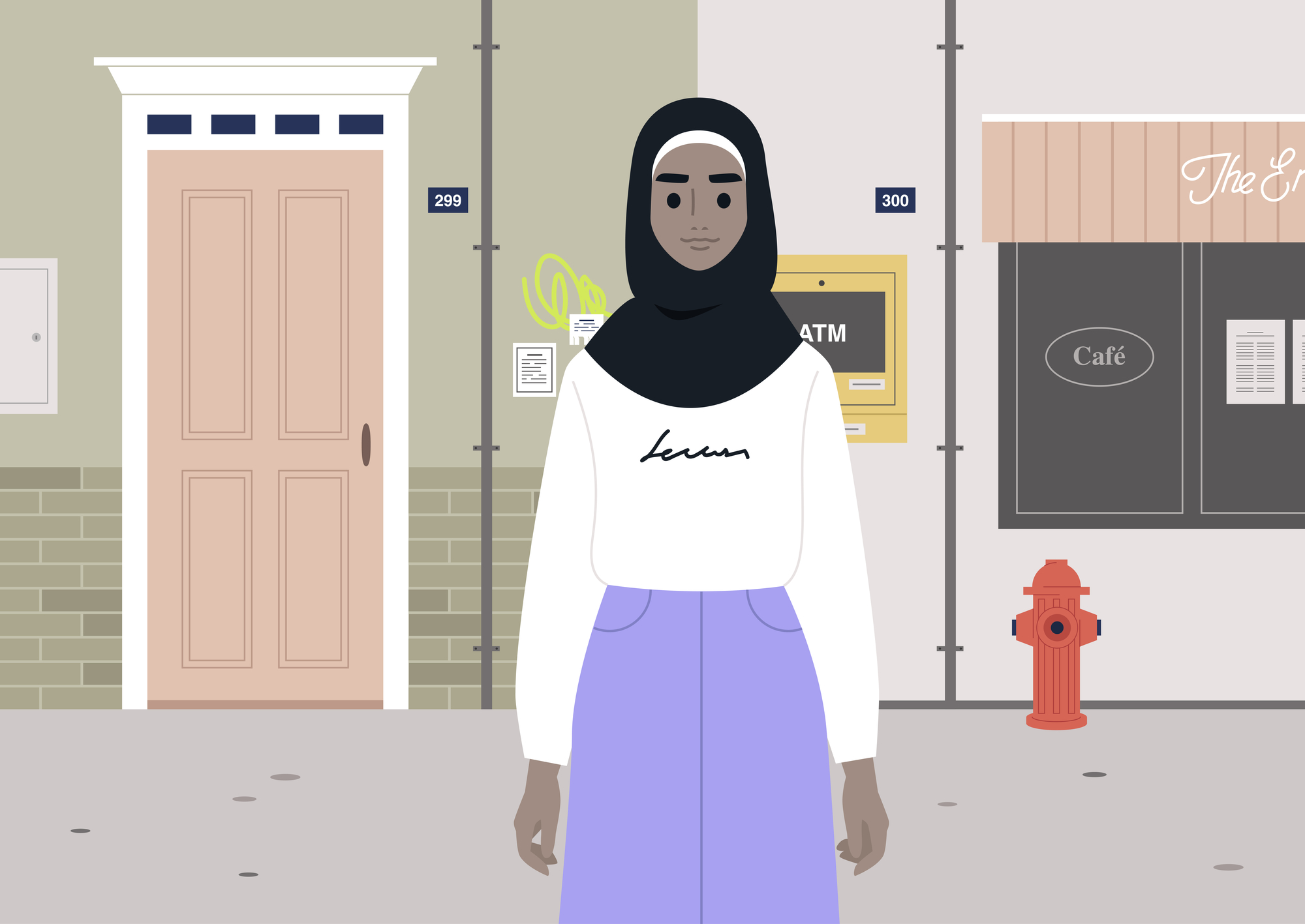
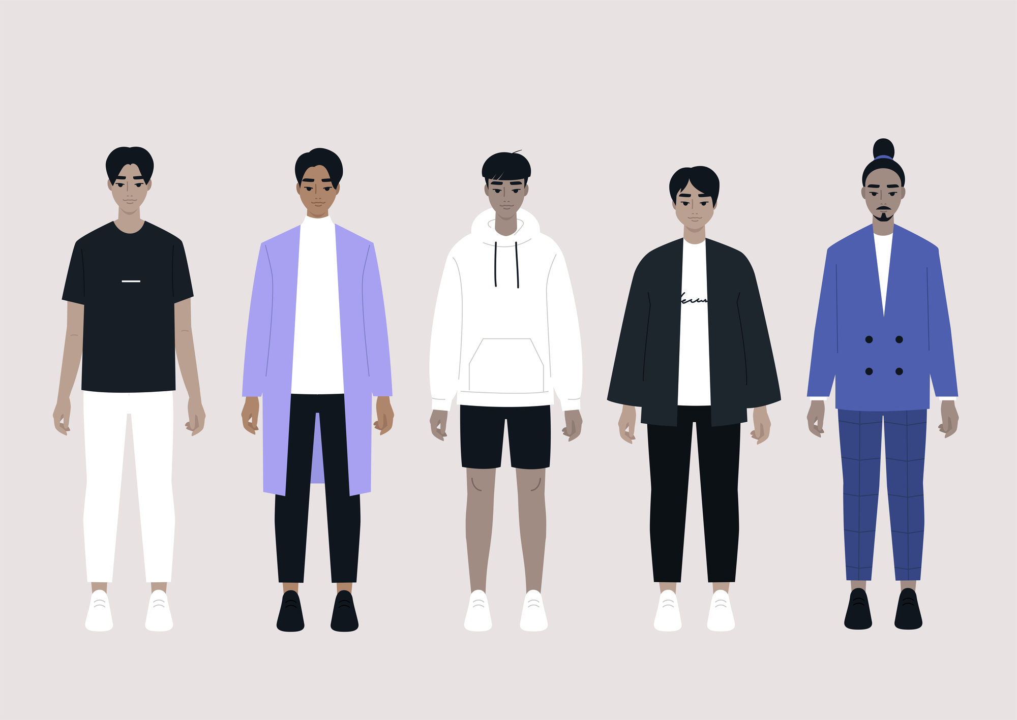
That’s also the principle I’m guided by when creating illustrations. Everyone wants to be included. If you draw a hand holding a smartphone, it does not necessarily need to be white-skinned. LGBTQ+ couples buy family cars too. Curvy body shape is absolutely great to illustrate high-waisted jeans, for example.
98% of the time I genuinely enjoy being a digital illustrator
Being an illustrator feels more like playing a meditative computer game, rather than performing work duties. The remaining 2% are the cases when the digital experience ceases to be seamless: things like “your startup disk is almost full”; “your software needs to be updated”; “your battery is running low”; “your subscription has expired”. My favorite pet peeve is the iTunes icon that pops up from the bottom of the screen once a month.
Aside from actual drawing, freelance illustrators spend a lot of time on video calls, emails, and paperwork. In most cases, the communication between the illustrator and the client is friendly and informal, but we still maintain the business etiquette. We use a lot of phrases like “as per my last email” and “hope your weekend went well”, and more.
Once I was working on a project, and after delivering the final files, I got a message from the client: “You are ******* amazing! Period.”
If you ever wondered what kind of feedback an illustrator really needs, now you know!
How feedback from clients helps you improve your illustration skills
The microstock mechanics doesn’t imply any communication between the artist and the client. Clients buy your work online using the website interface. However, I communicate with people who use my illustrations because of the specifics of my work. I cover underrepresented themes, such as cultural and ethnic diversity, LGBTQ+ community life, different types of disabilities, and others. It appeared that I don’t always know how to depict them in the right way but I often get some help.
For example, once I received a very friendly email, advising me to change one of my transgender characters. The one that I made was wearing a dress and a beard at the same time. My logic was: “This metaphor gives a clear understanding that this character is a transgender person”. But the logic behind this illustration should have been: “Is this metaphor offensive for the transgender community?”. Obviously, it is. The right way to depict a transgender person is to display their preferred gender, not the one they were assigned at birth. So it’s either dress or beard, but not together.
Another email I received was about the way I drew Asian eyes: this illustration was flat and simple, so I used two horizontal sticks. Of course, I didn’t mean to offend anyone but as it appeared, this way of portraying Asians falls into a very specific history of anti-Asian illustrations that go back a century. The author of this email also included a list of examples of how to draw Asian eyes differently, in a more respectful manner.
I appreciate this type of feedback a lot, it helps me identify and filter pejorative stereotypes I have about the cultures I’m not really familiar with.
The best piece of advice ever given to me
This advice was given to me years ago by a friend who first believed in me as a commercial illustrator. Back then, I was drawing raster images. He gave me a project and said:
“Learn vector art. No one needs raster anymore. You have one week to learn”.
I cried, watched tutorials, cried again, and then I learned.
This advice might be quite questionable. Of course, raster illustration is the next level thing.
But for the stock industry, freelance in graphic design, and animation, it’s crucial to draw vector art. It is what it is.

