Mastering the Art of Flat Lay Photography and Design
It has been a while now, and flat lay designs and compositions are still trending and gaining momentum on social media. What is it that lures us to these photographs? Sometimes it’s meticulous symmetry, other times it’s an unusual design of objects. One way or another, flat lay photography should wake the designer in you.
The other explanation is simple – we love ‘stuff’ and we love order. The human eye looks for perfection and orderly, flat-lay photographs fulfil every criteria when it comes to aesthetics. Flat lay design has taken over food, fashion and social media and it’s a trend that is here to stay.
Today we look at the phenomenon of flat-lay photography and share some useful tips to help you master the art of flat lay design in your photography. It is a style that requires an artistic touch and that’s something that you will quickly pick up with our short tutorial.
Choosing a format
Likely, your flat lay images will end up on Instagram. To save yourself time and hassle, shoot in a square format from the start. This way, you’ll be able to compose your images better and will know what the end result will look like. However, you don’t have to limit yourself here; experiment with different formats.
The objective is to shoot your photograph from a bird’s eye view. This is the identifying characteristic of flat-lay design; a shot from above, parallel to the surface.
Order, balance and chaos
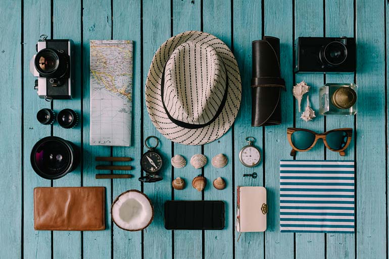
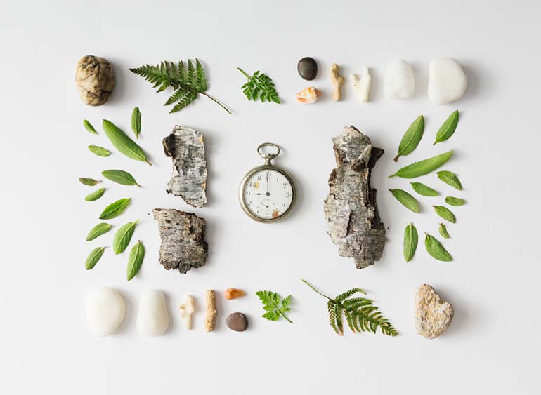
With flat-lay photographs, composition is of uttermost importance. You have to compose your shots keeping balance and unity in mind. For more tips on composition, see our previous article on basics rules of composition.
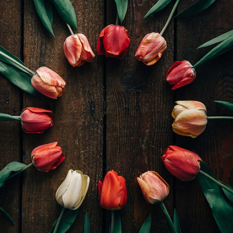
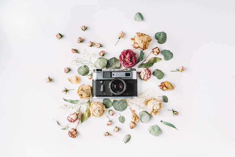
What you will be showcasing is either order or chaos, or the unexpected unity of both. More commonly is a neat, meticulous composition of objects. Like in the examples below, order and chaos can both have their charm.
Color palette
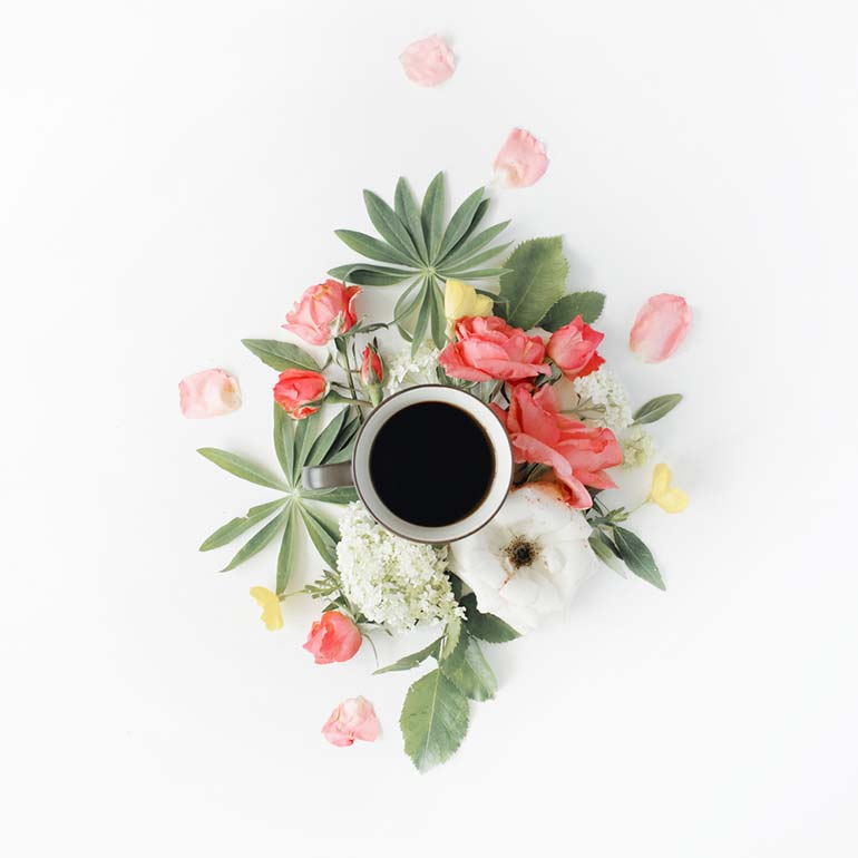
Flat-lay photographs are as much about composition as they are about design. Approach your shoot from a design perspective and choose 2 or 3 unifying colors. This ensures consistency and translates good aesthetics.
If you’d like to take it to the next level, you can go with the 60-30-10 design rule. 60% being the main color, 30% the secondary color and 10% the accent color. It’s a simple rule that is incredibly easy to use but will make a big difference to your palette and composition style.
Use a neutral background that is not distracting to create your flat lay compositions.
Natural lighting
If you look at our examples, you will notice that the lighting in many of the photographs is natural. Photographing under lamps or during later hours of the day creates shadows which can formulate distracting shadows and distort your composition.
Focus on the narrative
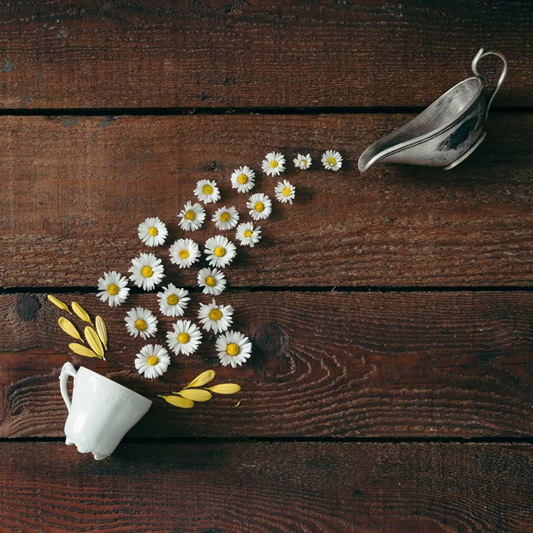
A flat lay composition is more than just a random arrangement of items. Add interesting objects to your framed shots to help tell a story or translate a message. Other things will come into play, like your choice of arrangement and your colors but do try to keep it interesting with an element of surprise. Learn to tell a story even when you’re going with minimalism.
Empty space
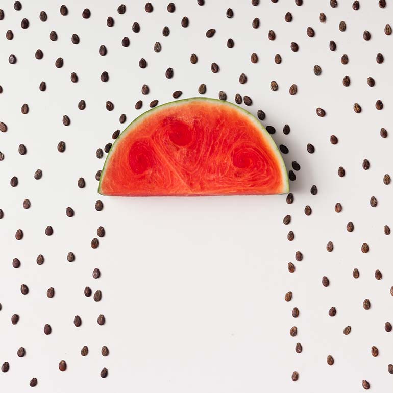
Your composition need not take up the whole frame. You can choose to use empty space to your advantage and you might just discover that sometimes less is truly more. In this example, note how important elements of the main props are cut off and some space empty space is left. This is an unusual break up of the composition which makes photographs more versatile.
Juxtapositions for visual interest
Use the creative opportunity to showcase some contrasting objects. Play around with the hard and the soft, the geometric and round, the dark and light. Juxtapositions in flat lay design add a visual intrigue to the final shot.
Textures and patterns
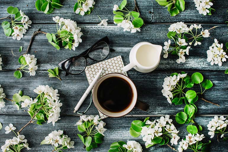
Be on the lookout for objects with textures and patterns. This is more commonly seen in compositions of food. However, flowers and earthy materials also make for interesting props. In the image below, the colors textures and patterns work well together.
Remember that with flat lay photographs, you get to design something beautiful. Scout for objects you can use to make interesting and unique compositions. Your artistic freedom here is endless.
Use an editing app
Post production is an important stage with flat-lay design. Your lighting may not be perfect, but with the help of a few useful apps for editing, you can elevate your photographs and make them stand out.
You should focus on adjusting the brightness and contrast to make the colors pop. Next, play round with clarity and sharpness of your image. Filters are another great option to turn to to make your photographs more abstract and visually interesting.
Don’t be afraid to experiment with composition, colors and lighting. Even something as small as a change of background can help you tell a different story. Every design decision matters with flat lay photography. Be on the lookout for objects you can use in compositions and good luck!
If you have any other tips that you think will be useful, leave them in the comments section below.
