How to Choose a Video For Your Website: 5 Simple Tips
When you have a website, you have to make some firm decisions about your homepage. Video has been a popular format over the past few years. Videos add a dynamic element to an otherwise static page. Fast forward to 2017, is this still a trend you should be chasing?
Simply put, if a video will add visual interest to your homepage, doesn’t matter if it’s trendy or not. As long as the video is not distracting, and helps solidify your message, you have to try it.
When used properly, videos on webpages will catch the attention of the visitors and encourage them to linger for longer. There are lots of details to be considered before you make the change from an image to a looping video. We’ll take it apart one step at a time.
Let’s start with an example.

This one caught your eye. You could probably watch it forever. Or would you prefer this video?

Certainly, this one is much more exciting. There’s movement, the changing lighting and great contrast. Which of these videos do you think would be most suitable for a website background?
The answer is the first one. When you have to make decisions about a website background, you have to give up on some merits – exciting movement, play with lighting and dramatic contrast.
The first video is neutral. It elevates a static image of the northern lights and features very subtle movements. It is neither distracting, nor bold but it would make for a great website background. Here’s why.
Tip #1: Use video with purpose
You’ve probably stumbled on websites where you wondered what the video has to do with the products or services offered on the website. Don’t use video for the sake of using a video. A video with a purpose helps you strengthen your message. It captivates your audience, and gives them a reason to appreciate your artistic choices.
If your business is financial services, it wouldn’t make much sense to use this lovely video of the northern lights. Although it is captivating and really beautiful, if it has nothing to do with your business or your message, don’t waste your time and the time of your potential clients.
A video used without purpose will also confuse your clients. You’re making a first impression and you can be sure that the moving images will be the first thing they look at. Don’t misguide your clients – focus on relevance and supporting video themes.
Tip #2: Contrast and compatibility with content
Too much contrast in a looping video could be distracting. The main reason for this is that you likely have other text and buttons on your home page. Your video should contrast those elements that already exist.
As the purpose of the video is to support your message or theme, the colors in the video have to provide contrast against the main body of text.
A year ago, Airbnb has video on their homepage. Take a look at how the text stands out from the looping videos. Each segment of the video still makes the writing legible and the search button stands out in contrast to each video.
Make sure your video doesn’t hurt the readability of the content on your webpage. This means testing different videos to see which one can be integrated in a way that’s a win win situation for your homepage.

Tip #3: Little tricks to help with contrast
You might find the perfect video that reflects your brand message but it just so happens that it can’t be integrated in a way that enhances your page. You have 3 options for adding more contrast.
- Change your content color
- Overlay your video with a light or dark screen
Here’s an example of a yacht company, Y.Co and their use of a darker overlay to help make the text stand out. If you visit the website, you will also notice that there are lots of fast moving elements which may not be the best choice as it distracts, but the company used relevant videos showcasing their message and didn’t have to compromise on this point.

- Overlay your video with color
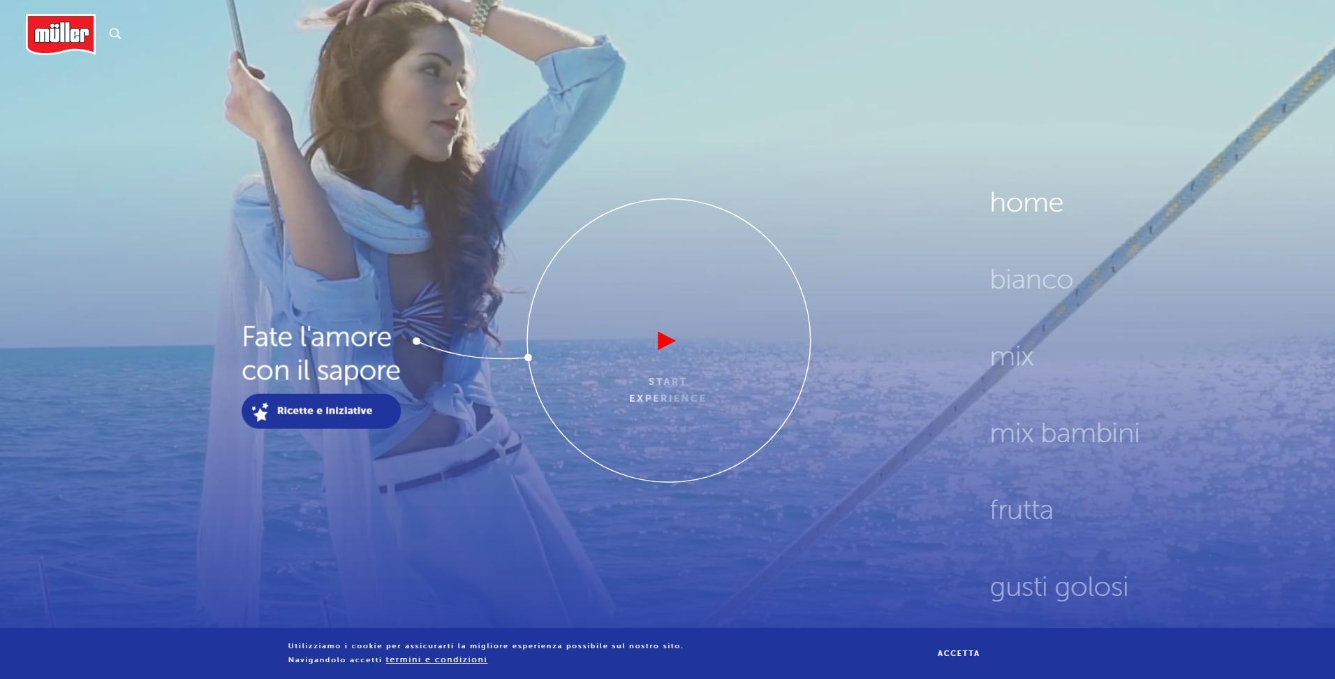
Muller used a blue color grade for overlaying their background video. This brings out the most important features on the homepage without distracting the eye.

Tip #4: Choose a short video that loops
The biggest argument against using videos as website backgrounds is the compromise in loading time. You have to be very careful when choosing the length of your video because in 2010 alone, 57% of online shoppers abandoned a page after 3 seconds because the time it took to load.
What does this mean? Aside from choosing a video according to our tips, you have to be mindful of the user experience and the time it will take for your page to load. The key to avoid this problem is to choose videos that are short and don’t weigh as much.
The general rule of thumb is to keep your original video 5-10 seconds long, and at about 6MB or less. Don’t forget that the video will be on loop, which will make it seem much longer to users.
Tip #5: Cross device and browser compatibility
A very important factor to consider is how your video homepage will look on different devices. Like any other feature on your website, the video should be optimized for a variety of devices and browsers.
While you’re considering this aspect, make sure your video doesn’t have sound. One of the most frustrating things is a website that starts blasting music right when you click enter. If your video has audio, it will play automatically.
All the videos on Depositphotos don’t have audio so you don’t have to worry about that point. Use some of our tips to help improve your website and add an element of surprise to your homepage. Don’t just stick to a trend, choose videos with a purpose!


