Creative Ways to Use Photography in Website Design & 7 Key Trends for Inspiration
Are you looking to impress your clients and attract new customers to your website? Sometimes a single image can make all the difference to your business or personal website. The main question becomes how do you find those images and what’s currently trendy?
We raided the website WebDesign Inspiration to find creative uses of photography. Analysing a few current trends in web design and using these designs as inspiration, we put together a few lessons on creative ways to use photography in website design.
1. HD photography
For photography on a website to be effective, it has to be HD. You have one shot at making a good impression, and it starts here. Make sure the photos you use are top-notch quality. You’re aiming for a sophisticated look that will also reflect you as a professional. Having a blurry image will likely make your visitors question the quality of your services.
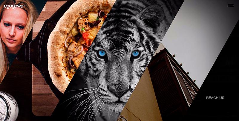
If you’re shopping for images on Depositphotos, download the highest quality available. This gives you room to work with the images. You can see now Egogawa used several HD images to create an attractive collage.
2. Color overlays
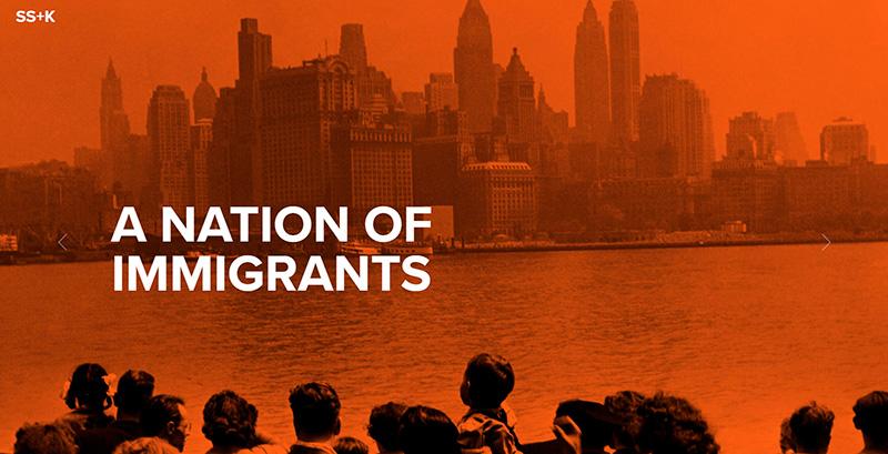
Color overlays are becoming quite popular because they completely transform photographs. Color overlays are made by adding a semi-transparent color box on top of an image. This technique is used to meet certain goals such as show brand colors or also for an emotional response (having a dominating color tends to do that).
One thing to be careful with when using color overlays is making the chosen color contrast to the text and possible CTAs on the page. SSK did a great job with a simple orange overlay that contrasts the writing on the main page. Color overlays tend to intensify the power of contrasting elements.
3. Black and white
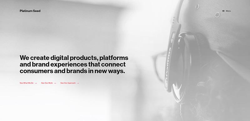
You might assume that bold colors are more eye-catching, but the lack of color can have an equally powerful effect. In web design, it’s all about making your brand stand out. A classic black and white image can be manipulated in many ways – for more or less contrast.
For example, Platinum Seed used an opaque version of a black and white image to not distract from their main message. More and more designers are embracing monochrome photography in web design, and if you’re looking for sharper contrast, it’s a great form of photography to experiment with.
4. Hero images
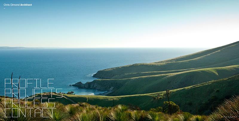
Full-width, HD images are one of the most prominent trends this year. Hero images create an immersive experience for users. This is perhaps the fastest way to grab attention and make users linger on your website.
Here’s a simple example from the Dimond website. It’s a huge image of a landscape which doesn’t distract from the controls on the website at all but gives you a good sense of quality being a priority for this artist.
5. Creative photo manipulation
Personalizing stock photos isn’t unusual practice, in fact it’s encouraged. Editing images gives them a whole new and exciting dimension. You can do this with simple tools like Crello for basic photo manipulation. You can use some of these tricks to create images more in line with your brand’s aesthetics.
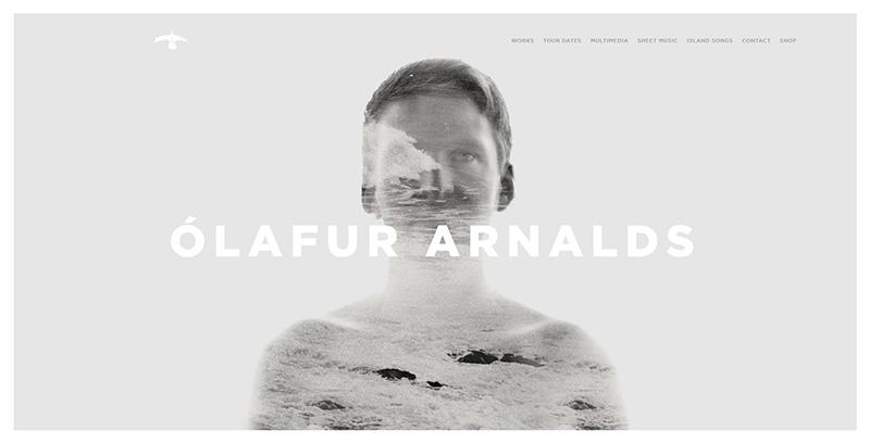
Olafur Arnalds used two images to create this double exposure shot. It’s a creative composition and adds something unexpected to a portfolio website.
6. Minimalism
When in doubt, always resort to minimalism. It’s a trend that’s never really gone out of style. You can find images that are minimalistic in composition. Even the most simple images can have quite a dramatic impact on your landing page.
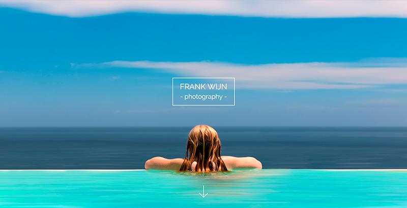
Take Frank Wijn’s page as an example. The hero image is so simple, with really soothing tones and beautiful symmetry. You don’t need much to catch your audience’s eye. Find artists that work in this style and use minimalistic images to compliment your message.
7. Photos + dramatic typography
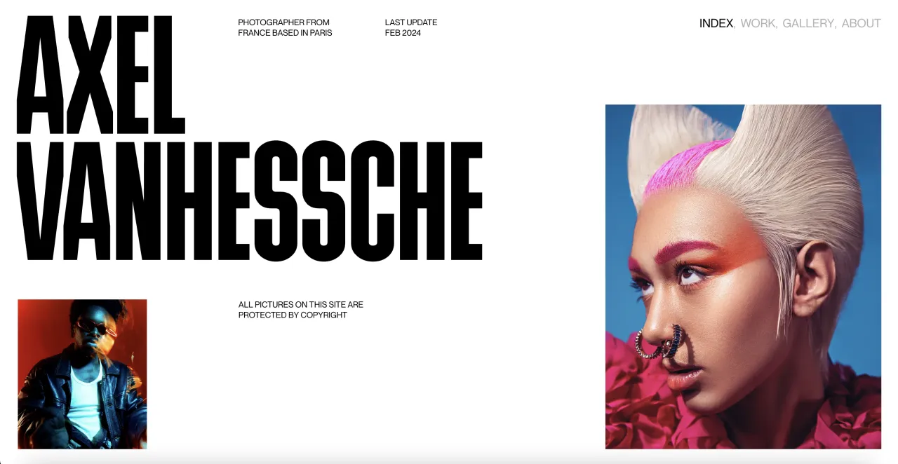
Dramatic typography combine with a custom photo multiplies the impact of the visuals. The fonts you choose makes a big difference to how users will interpret your photo. This is the ultimate combo if you’d like to stand out from the crowd.
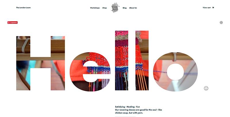
Take the London Loom as an example. They’ve used a video and paired it with a really bold font. The website is dynamic and visually quite striking. You can do the same with images, integrating them into your messages.
Other creative ways to use photography in web design:
White overlay
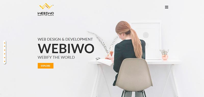
Just as colors are a great way to make images stand out, white overlays can help you create a very dramatic contrast. Webiwo used a very light overlay to tone down the image but note how it contrasts their logo and CTA.
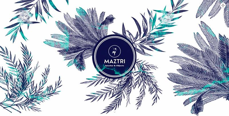
Go for illustrations
You don’t need to get hung up on the perfect images, illustrations can be equally powerful. In this example, Maztri used plant illustrations and it gives their page a very artistic overall appearance.
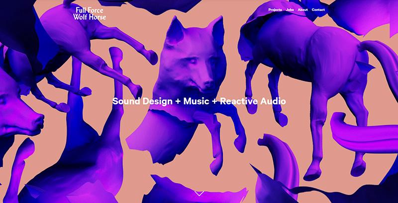
Get funky
We always talk about how images don’t have to be used as they are when you download them. Here’s an example of a brand, Full Force Wolf Horse, that used images in a more fun way. This animation-like website is quite memorable because of the bold colors.
Black and white with accent color
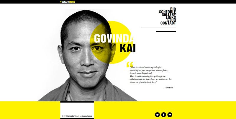
This is quite a trendy trick that you probably spot often. Black and white images paired with an accent color can look very contemporary and fun. Here’s an example of Lunatic Monk, a website that used a blotch of yellow against a black and white portrait for a very trendy design.
