How to Design an App Icon: An Entrepreneur’s Ultimate Guide for Success
Do you plan to launch an app or rebrand an existing one? In both cases, you need a powerful app icon that conveys the essence of your product simply and instantly. Your task is to make the icon eye-catching and motivate users to click on it. Sounds like a bit of a challenge? Don’t worry—with our tips, you can easily design a striking and memorable app icon! Keep reading to boost your app’s visual impact.
Why an app icon is important
Just think about it for a minute: the App Store offers nearly 2 million apps, and the Google Play Store has a million more, increasing daily. Even considering that most of them cover different niches, the competition in this field is incredibly high. That’s why ensuring your app icon looks attractive to your target audience is more critical than ever.
An app icon is the first thing a person sees in a mobile application store. Its design determines whether an app will grab attention or go unnoticed. Consider the last time you choose a mobile game or an app as a user. You might have noticed that some icon designs, unlike others, immediately spark curiosity and make you want to check out the product. While capturing attention is the primary purpose of an app icon, it also serves other essential tasks, such as improving brand recognition and memorability, communicating identity, and increasing conversions.
Now that we know how an icon design affects the prominence of your mobile service or tool in an application store, let’s move on to the best practices for crafting impactful app icons.
How to create an eye-catching and clickable app icon design
1. Consider icon size
First, let’s start with the technical aspects. An app icon may vary in size depending on the gadget and application store a person uses. Each app store has app icon resolutions that must be followed. Such standardization ensures that all apps look consistent.
With the Apple App Store ecosystem, your app icon design should suit iPhones, iPads, and the App Store. Despite the different placements, you only need one file, as the platform will automatically scale it for various purposes.
- File size: 1024×1024 px
- File format: PNG
- Color space: sRGB for color and Grey Gamma 2.2 for grayscale
For the Google Play Store, you must meet the following requirements:
- File size: 512×512 px (automatically resized)
- File format: 32-bit PNG
- Color space: sRGB
- A file should not exceed 1024 KB.
For more details, check out the Apple App Store and Google Play Store icon design guidelines.
2. Stick to a minimalistic layout
App icons are similar to brand logos in many ways. Therefore, the same principles apply to the design of both elements. The main rule is that the simpler your composition is, the better. Try to avoid overloaded designs with various details and embellishments. They will not only make your icon less appealing, but also worsen its memorability and recognition.
Your app icon should be clear and uncluttered, especially considering it’s quite a small image. A minimalistic layout ensures your design will be easily distinguishable at smaller sizes. Take your smartphone and look at the icons of the apps you have. Most of them have concise and balanced compositions with a single visual element or logo. Keep the same approach in mind while creating your app icon.
3. Choose color wisely
The next aspect of an application icon design that requires a strategic outlook is color. Consider color psychology, which explores the influence of different shades on viewers’ perceptions and emotions. It will help you choose a base color that is relevant to your product and conveys the right mood. For instance, go for blue to evoke a sense of trust and reliability (LinkedIn, Booking) or red to deliver energy and excitement (YouTube, Pinterest).
Whatever color you prefer, follow the minimalist approach from the previous step and select one or two shades for your app icon. This way, you will create a clean and distinctive look that is easy to remember. One more great practice for icon design is to use negative space to make the central element of your composition stand out and grab attention.
4. Integrate branding elements
An app icon should contribute to a cohesive image of your mobile service or tool. As it’s the starting touchpoint with users, ensure the design is aligned with the overall product style and mood. To do so, keep an app icon consistent with identity elements such as logo, color scheme, or typography. For example, YouTube uses variations of its play button logo in white and red for both video and music apps. Such integrity enhances brand image and boosts user engagement.
5. Rely on symbols
How do you attract potential users if you don’t have recognition as a leading worldwide brand? Our advice is to make it clear to the audience what your app offers. You can achieve this by incorporating symbolic images in the application icon. Think about associations your product can evoke. For instance, messengers often use simple images of speech bubbles in their icon designs, while music players—symbols of notes. Finding a relevant emblem for your app and creatively integrating it can significantly boost the number of installs.
6. Run A/B testing
When you have a finished app icon design, don’t rush to implement it. First, conduct A/B testing to ensure it resonates with your potential audience. Develop a few versions of an app icon and show your designs to different groups of people to see which one will work best. Don’t underestimate the impact of this step, as it allows you to make data-driven decisions that are more likely to deliver desired outcomes. Well-conducted A/B testing will help you to increase conversion rates and app downloads.
Real-world examples of app icons for your inspiration
The Instagram icon is an excellent illustration of a smart rebranding and a move to a more sleek look. The first app logos featured detailed camera images, clearly indicating this social media’s primary purpose—sharing photos. Over time, the brand replaced the icon with a more abstract and minimalist version, which still shows the outline of the camera.
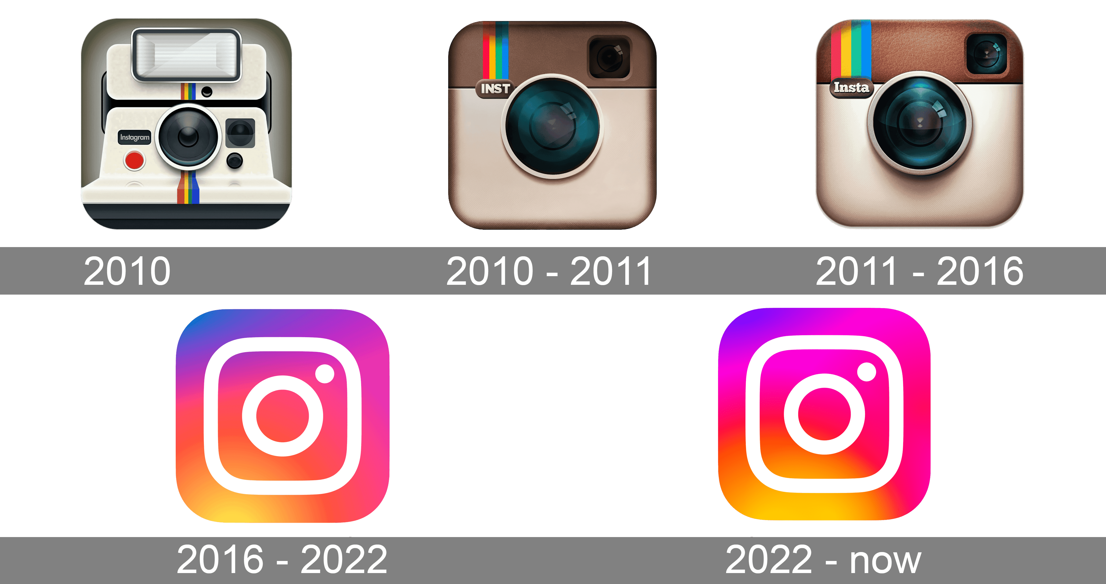
Source: 1000logos.net
Airbnb
Airbnb is another company that has been rebranded several times. Even though the current brand’s app icon was created in 2014, the design hasn’t lost its appeal, proving that minimalism is timeless. Despite the visual simplicity, the image conveys multiple meanings. Its abstract shape resembles the rounded letter A (from the brand name) and stands for the location pin symbol.
Netflix
The Netflix app icon is the golden standard. It implements the principle of minimalism and at the same time powerfully conveys the brand’s personality. The signature letter N immediately captures the eye, and the red color over a black background creates a classy and clean look. This example shows how striking simple designs can be.
Dropbox
The iconic Dropbox app icon is inspired by the company’s 2008 emblem. Its current version features a geometric image of an open box in solid blue. In this case, you can see a remarkable way to utilize negative space—the box’s outline is created by using five blue rhombuses on a white background. It creates a distinctive look that quickly grabs attention.
![]()
Source: blog.dropbox
To sum up
You only have one chance to make a strong impression on a potential customer. This is especially true for an app icon, a little image that can draw people to your service or leave it unnoticed.
An engaging icon is one of the keys to a successful app. And you can make one with the help of our recommendations. Find a concept that reflects the essence of your application, make it the central idea of the icon, and present it in a simple yet unique way. Also, remember to conduct A/B testing to choose the best design that will attract potential users. Bring your app icon to life and watch the number of downloads increase daily!
Other articles you might find interesting
7 Types of Logos & How to Use Different Logo Styles with Examples
How Strategic Color Choices Can Skyrocket Your Brand Identity
