Retro Rewind: Design Trends of the 60s, 70s, and 80s Explained
Despite their transitory nature, trends always seem to come back. Every new generation constantly reinvents and reuses the past, making vintage trends fresh and relevant. The rewind of retro styles from the 60s, 70s, and 80s is no exception. Since their recent comeback, they have absolutely exploded in popularity, appearing almost everywhere: from graphic, interior, and web design to social media, fashion, and pop culture. Creators and companies alike have embraced these retro styles, using them in their creative projects. Even the world’s biggest brands, like Nike, Pepsi, and Ralph Loren, have integrated retro design into their marketing campaigns.
So, what exactly did this retro rewind bring back? To answer this question, we prepared this handy article about all things retro! Keep reading to learn more about design elements of the 60s, 70s, and 80s, get inspired by retro influences, and learn to embrace their characteristics and techniques in your projects.
What is retro design?
Retro design derives from trends and art forms of the past, including graphic design, music, and fashion. More specifically, it usually refers to design styles of the 60s, 70s, and 80s. Retro design may be an updated version of an old design style or only inspired by its features. As a throwback to different eras of the past, it gives viewers a feeling of nostalgia and invests them emotionally by evoking these memories. Yet, retro design is not only popular with those who are already familiar with it, but also with those who are new to it.
Get inspired by the 60s
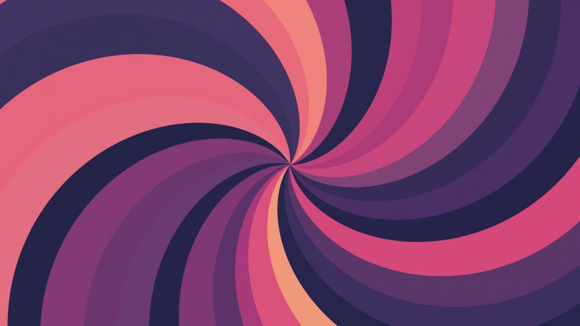
The 60s were all about sex, drugs, and rock and roll, giving rise to the youth rebellion against cultural norms and conventions. It was a decade of the psychedelic movement, which is mirrored in designs of this time. Experiments with mind-altering drugs were quite common, and the trippy sensations they produced inspired artists to experiment with forms and colors. That’s why designs from the 60s incorporate distorted visuals, flowing patterns, and bright colors.
1. Pop art
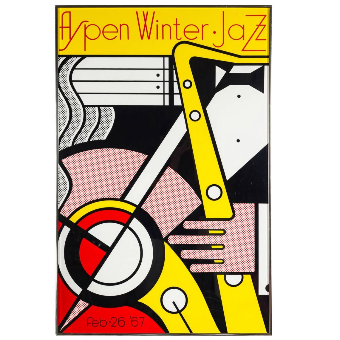 Roy Lichtenstein, Aspen Winter Jazz (1967)
Sourse: moma.org
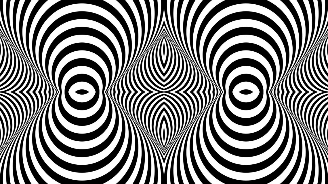
2. Optical art and kaleidoscopic patterns
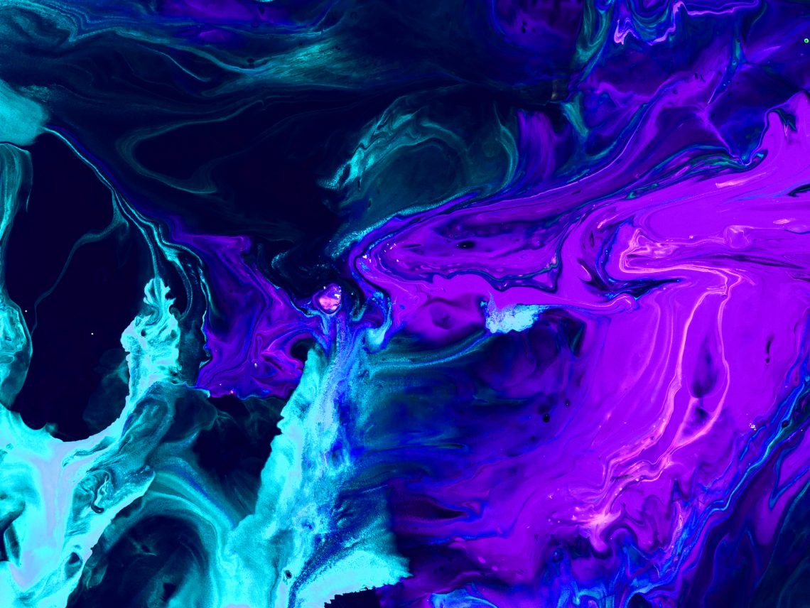
3. Neon colors
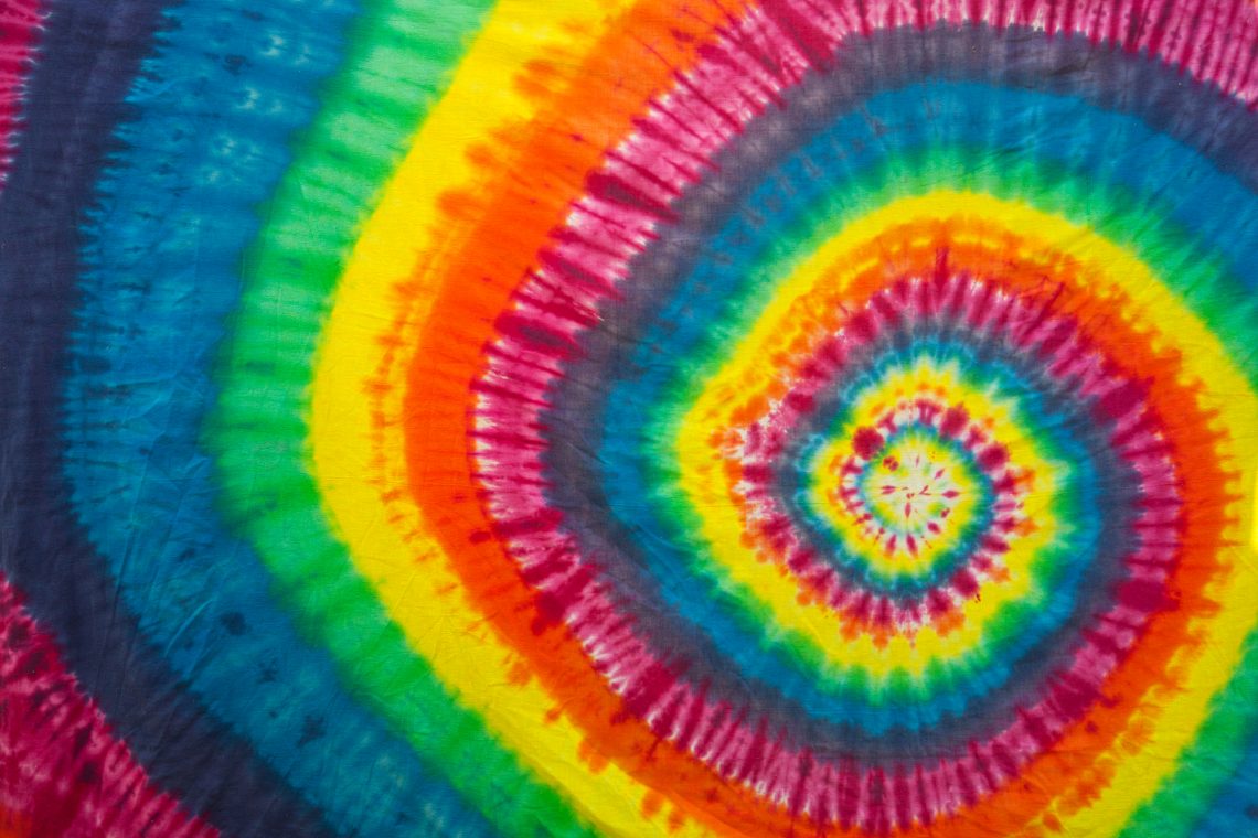
4. Psychedelic art
Retro designs from the 70s
Individual self-expression and psychedelic influences in graphic design from the 1960s continued triumphing in the 70s. This groovy decade was all about bell bottoms, disco, funk, and free love. Design-wise, the decade’s style was ruled by bold colors, thick lines, flowery patterns, and curvy fonts. 70s graphic design developed a lot within advertising, making space for persona-driven graphics that declare devotion to certain products. Due to the availability of typesetting technology, typography evolved into large 3D style letterings.
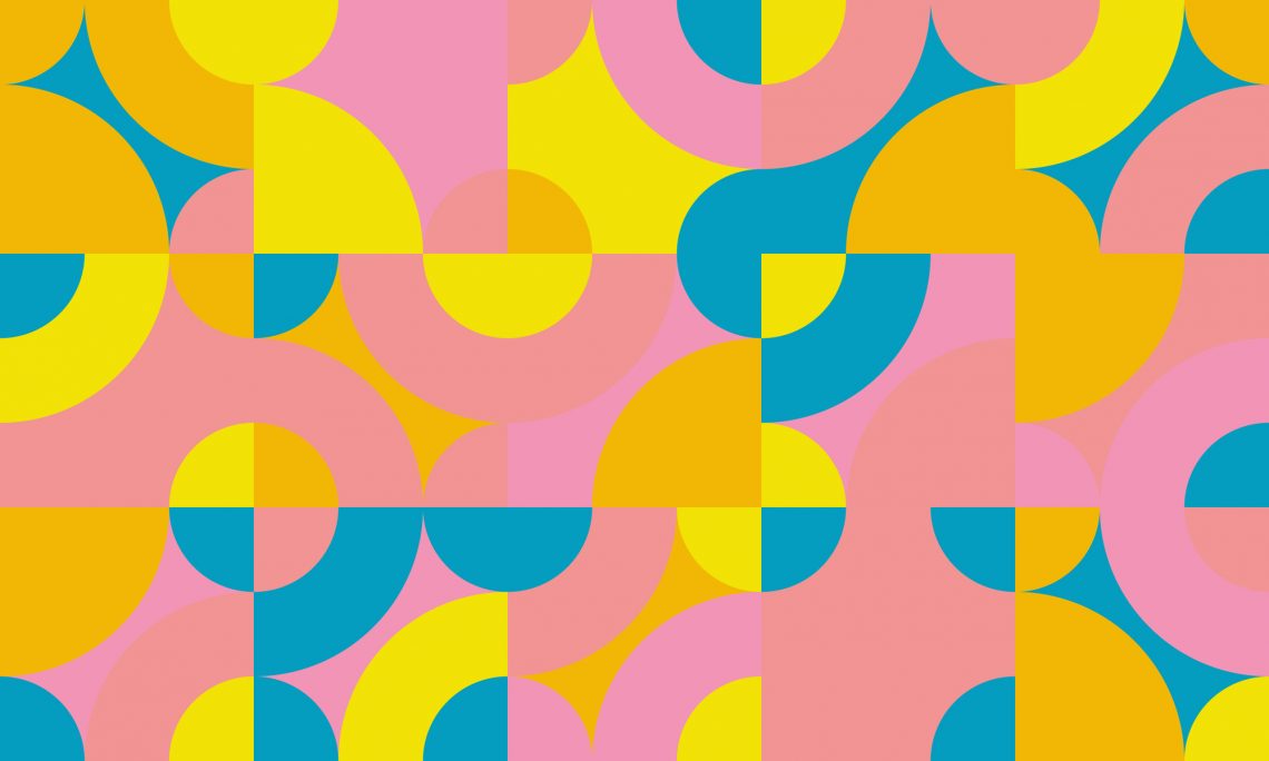
1. Simple shapes and bold colors
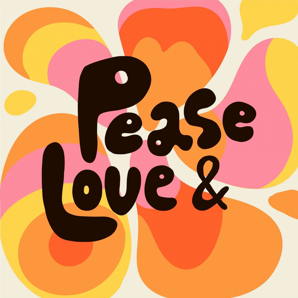
2. Freeform typography
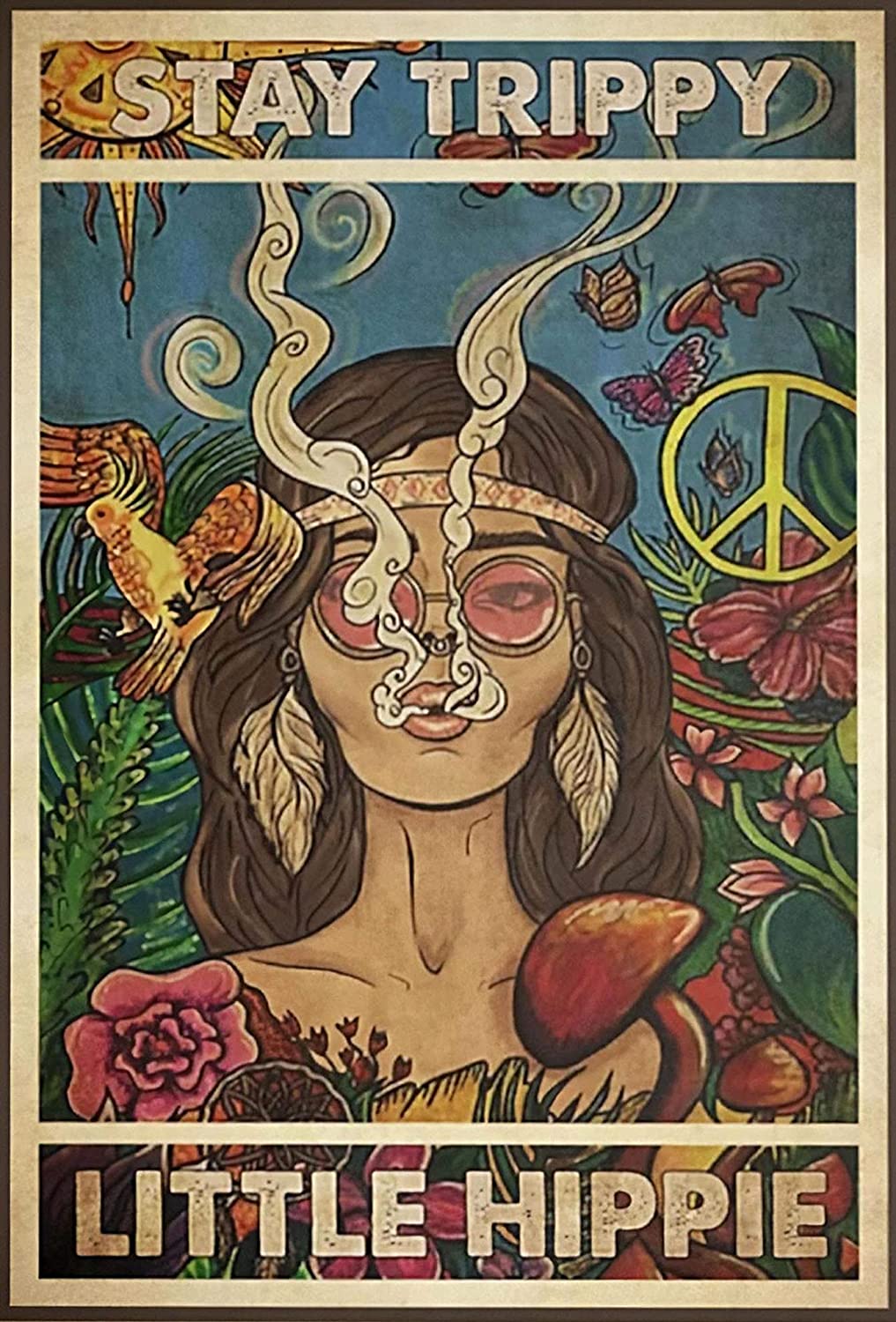
3. Hippie aesthetic
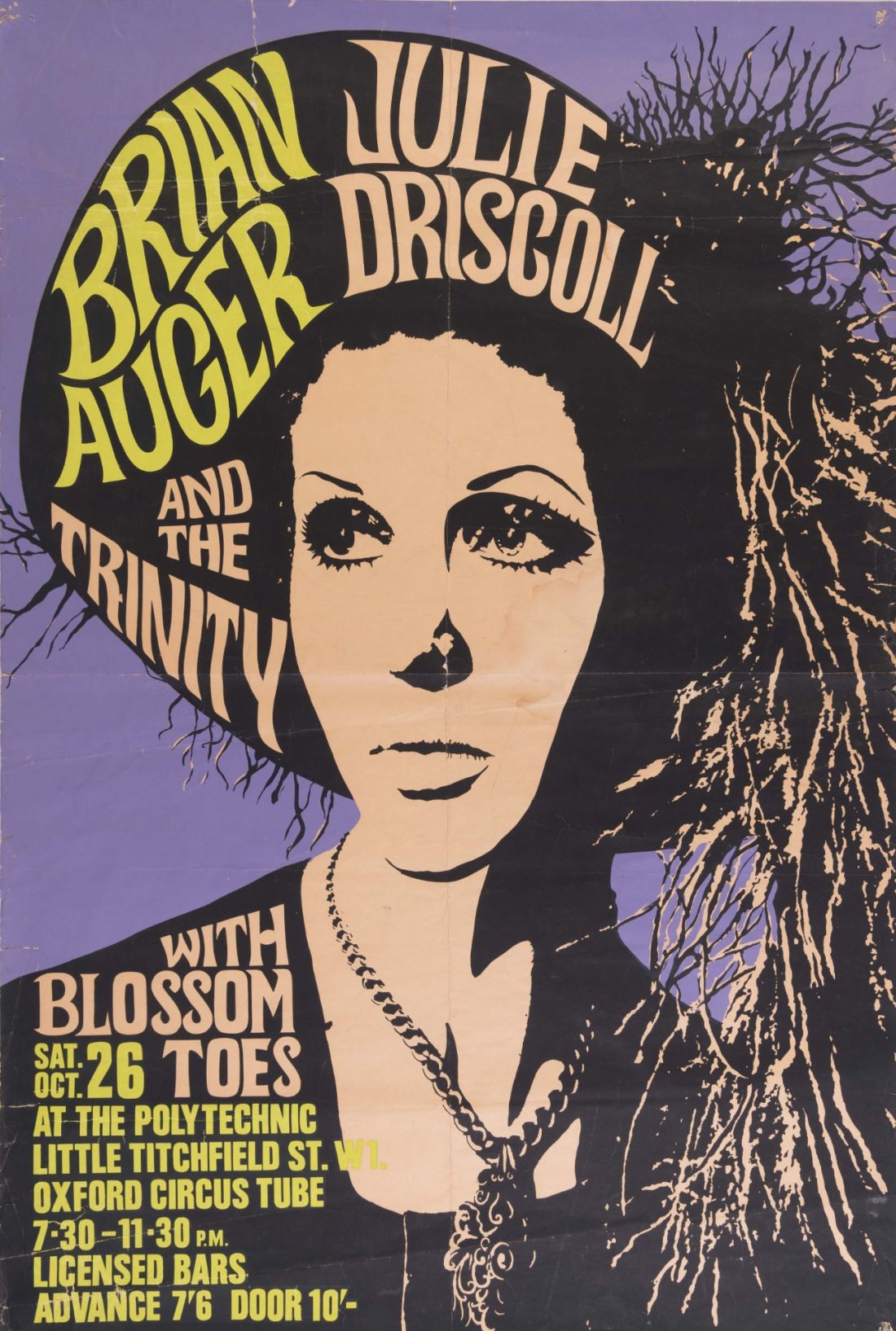
4. Persona-driven graphics
Exploring design trends from the 80s
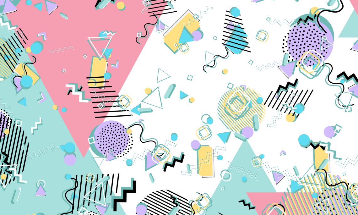
With vibrant neon colors, crazy patterns, and jagged typography, there is no doubt that the 80s were an era of striking designs. The decade saw the introduction of personal computers and the early beginnings of the digital revolution. This gave 80s designs a futuristic feel, as people anticipated changes ahead. The decade marked a technology boom in design software development, allowing artists to easily change the colors, forms, and composition of their designs and create more complex visuals. Designers started experimenting with mixing fonts, complementary colors, and geometric patterns, developing a distinct eye-catching style.
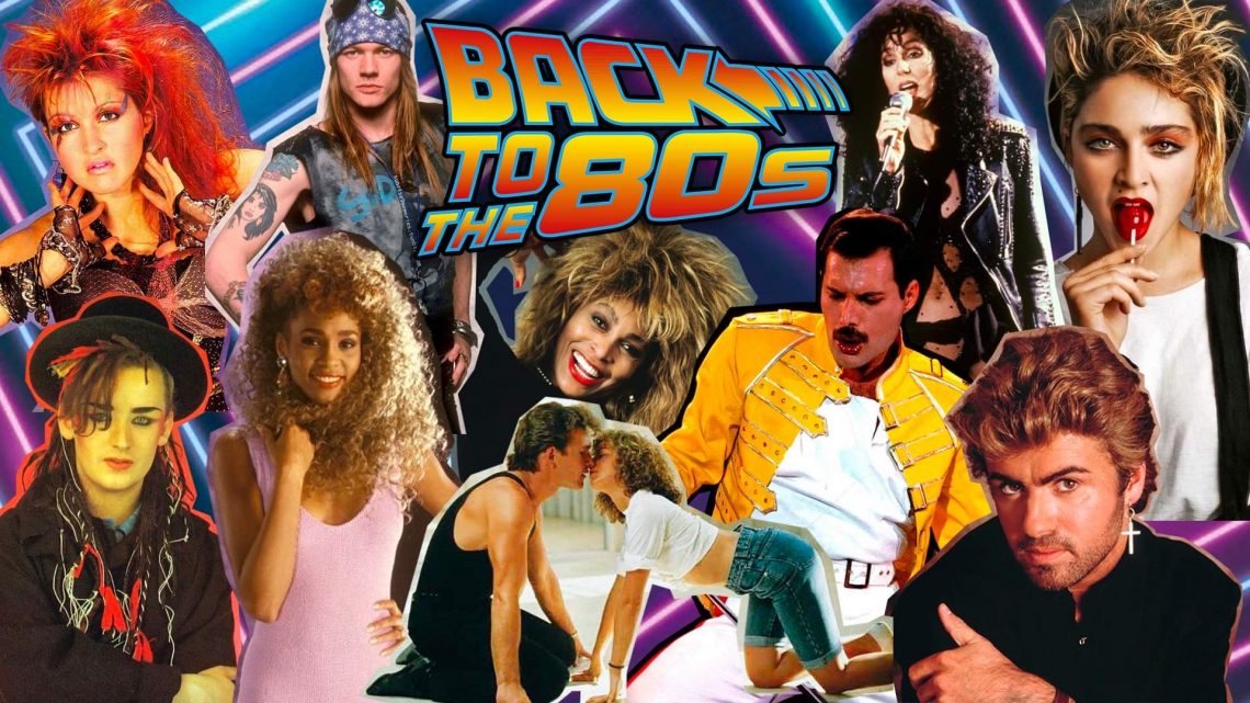
1. Pop culture
2. Cyberpunk aesthetic
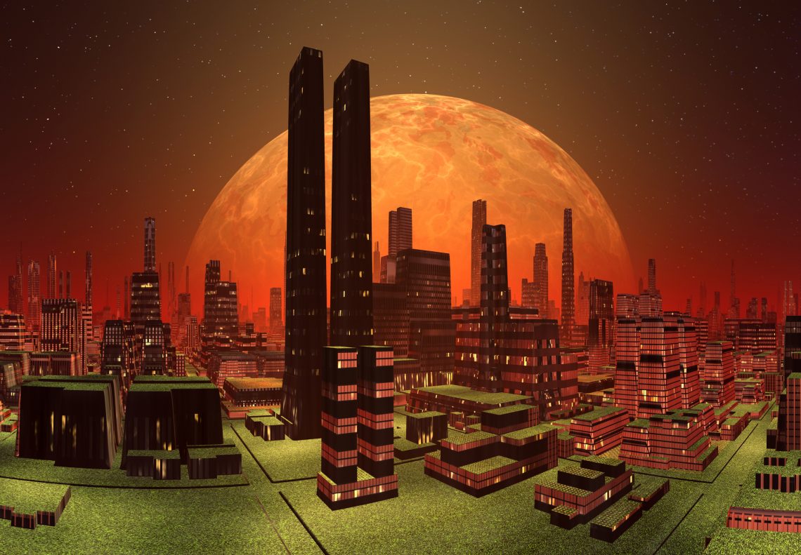
3. Tropical and 80s deco

4. Memphis style
To wrap up
Time is a flat circle, and nothing proves it more than design trends. What was once considered obsolete becomes new again — old designs are brought back. Even though we constantly see new trends popping up, the influence of retro design is increasing and not going anywhere for a long time. However, retro design rewind is not just about incorporating old and outdated elements into current designs. To match modern aesthetics, it’s crucial to reinterpret, revitalize, and blend retro with contemporary styles. This way, retro designs can be a powerful way of engaging with audiences and generating an emotional response.
Other articles you may find interesting
Trippy Psychedelic Art: A Brief History, Design Ideas & Tip
The Power of Neon: Definition, Design Tips, and Color Codes
Cyberpunk Aesthetics: 15 Color Palettes
What Is Nostalgia Marketing And How You Can Use It To Engage Your Audience

![Graphic Design Trends 2021 [Infographic]](https://depositphotos-blog.s3.eu-west-1.amazonaws.com/uploads/2021/02/Graphic-Design-Trends-2021-Infographic-1.webp)
