7 Simple Design Hacks for Social Media Ads
Designing an ad brings up more questions than answers. From choosing colors, to figuring out the layout, format and fonts. Lets not get started on the images! Truth be told, even professional designers don’t get it right every single time. There’s a lot of pressure on designers to whip up the most eye-catching and clever ads for social media. Afterall, it is that one click that brings brands and consumers together.
There’s life hacks for almost every topic out there, and we thought it was time to shine the spotlight on social media ads. Even if you’re a solopreneur, you could probably use all the help you can get. It’s about having the right tricks up your sleeve, but also handy tools that will help you save time and even provide some creative solutions during your workflow.
There are so many factors that go into the graphics and its extremely easy to overlook the most basic ones. It’s the basic tricks that give you an easier head start. The following hacks will not only improve the quality of your social media ads, they’ll make it that much easier to develop compelling ones.
1. The color psychology hack
Selecting the right color scheme is far more important than you think. It’s not about what simply looks good; it’s about how colors work together and what they convey. When creating an advertisement, it’s crucial for designers to understand the psychology behind colors. It’s an extensive field of study, and our brief guide on the meaning of colors might help you with the basic and more advanced color choices.
Select a color based on the emotion you want to convey, not your personal preference. The color scheme can also be in line with your brand colors, but you surely don’t want to repeatedly produce similar looking ads. With careful selection of the right colors, your advertisement’s design will have a greater impact on your audience, resulting in more traffic.
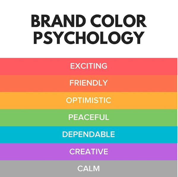
Image credit: Oberlo
2. The color matching hack
A simple hack that will save you time on color matching is Sessions College’s color calculator. Choose a color that will be the focus of your social media ad and receive all complementary, monochromatic, analogous, split complementary, tricatic, and tetradic tones. If you’re set on using a specific image on your ad, simply upload it to Colormind and receive a pallet full of colors that will compliment it. Use those colors for any text or shapes you’re planning to incorporate.
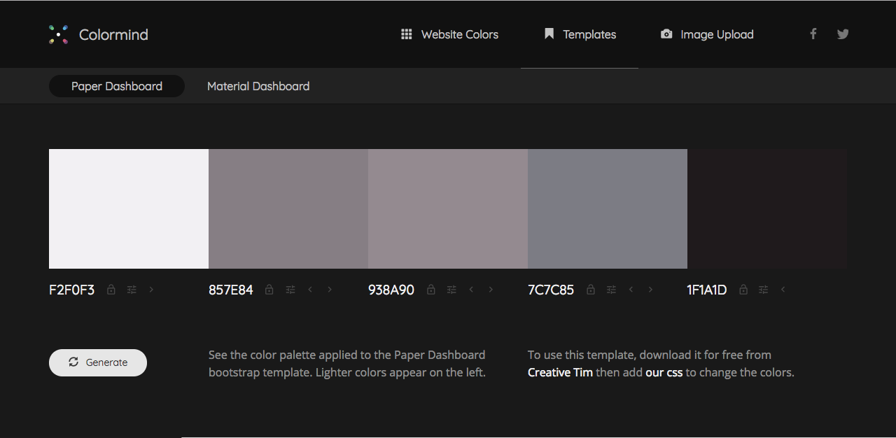
Image credit: Colormind
3. The consistent color hack
When advertising online, you want an audience to immediately associate your design with your brand. Instead of having to worry about color choices every time you post, consider finding the color (one that is the perfect representation of your brand) and use it occasionally for coherence purposes in a series of ads.
This hack ensures that you’re not spending hours figuring out a color scheme. Overtime, your audience will automatically make the connection between your designs and company when scrolling through their hectic news feeds.
If someone were to ask you, “what color do you associate with Coca Cola?” You’d most likely say red. Their ads are consistently red, and for this reason, they always stand out. As mentioned earlier, this is one way to go about it but mind that this trick works for very well established brands that have invested into creating strong associations with millions of people around the world.
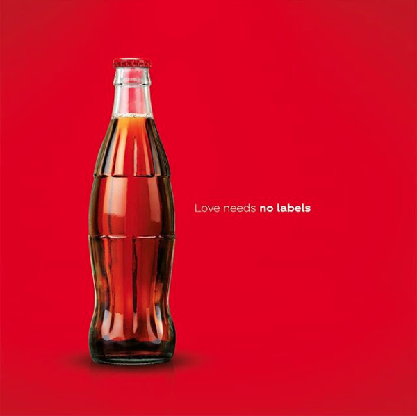
Image credit: Coca Cola
4. The font matching hack
Font pairing is a common issue when it comes to design. Fonts that are too similar might clash and throw readers off, while fonts that are too contrasting just don’t belong together. When designing an advertisement, use tools like typ.io to find the the perfect pairing between fonts. This ensures that your design looks professional and uses the right variety of typefaces.
The general rule of thumb is to never use more than 3 typefaces. Simply keeping this in mind would already elevate your designs. For more tips, see this article on font pairing.
Image credit: Typ.io
5. The online design tool hack
Starting a design from scratch can be a stressful process when all you have to stare at is a blank canvas. However, there are free online design tools that make it easy to create a stunning design. Crello allows you to design any type of visual content based on readymade templates, and that includes digital advertising. You can select from hundreds of professionally curated templates, fonts, and stickers. Free tools like this save so much of your time and deliver the best results.
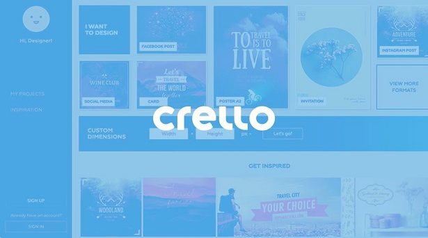
Image credit: Crello
6. The white space hack
When designing around a font, it can sometimes get over-crowded. You might be staring at your design endlessly, trying to figure out what the issue is. No matter where you move shapes and objects, things seem off. The white space design hack suggests that less it more. Next time you’re designing an advertisement, consider removing most elements around your text. It’s likely that their absence will only improve your work.
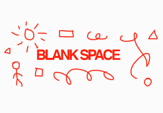
Image credit: Instant Shift
7. The subtle shadow hack
Sometimes, certain sections of text in a design need to stand out more than others. Whether it’s for the purpose of hierarchy, or the need to highlight a word without changing its color or font. Shadows are commonly overlooked when creating a design. However, the subtle shadow hack allow for words to stand out on an advertisement. It immediately captures the audience’s attention and demonstrates its importance.

Don’t get overwhelmed attempting to design the perfect ad. Try to remember that less is more, so there’s no need to overthink it. Think about the logical sequence of where you’d like a user’s attention to go to primarily, and work around the focal point of your design. These hacks will simplify the design process, and that doesn’t necessarily mean that following them makes your design less original. They’re meant to serve as guidelines to elevate your ads and improve customer engagement.