6 Tips for Social Media Graphics That Stand Out
How do you keep your followers interested in your social media accounts? Sometimes it’s a matter of consistency, sometimes it’s the tools and resources available to you. The real secret lies in combining all the tips and producing content unique to your brand while staying true to your aesthetics.
A little inspiration can also go a long way. Some brands have nailed their social media visuals and their pages will be used as examples in this article. Keep in mind that if you really do want to stand out and keep your audience interested, combine your new found knowledge and apply it looking through the prism of your brand’s aesthetics.
Tip #1: Get visual
Coming up with great content takes time, likely most of your time. No matter how loud your message is, visuals can help you stand out in the feed. As people scroll through their Facebook, Twitter or Instagram, visuals are your best way to catch their attention.
If you’re using photographs, make sure they are high-quality and have visual interest to them. You can also create your own graphics using tools that simplify the design process. For more tips, check out our article on how to win over your clients with visuals. You can take your time to experiment with different types of visuals until you find what works for your brand.
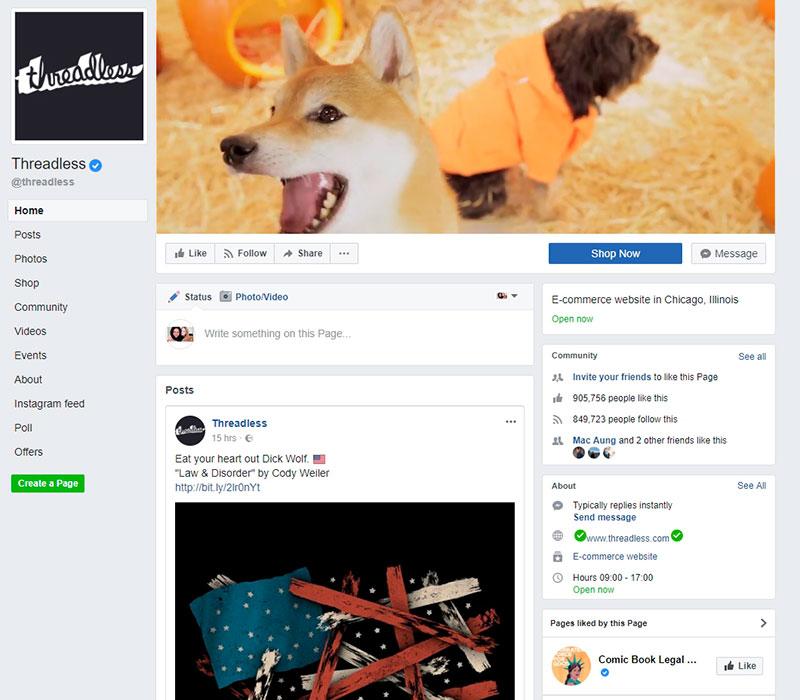
Threadless likes to experiment with different formats. Their Facebook cover is a video, followed by a feed with illustrations, videos, and various graphics with text. Scrolling through their page is like an adventure, and they certainly manage to stay true to their brand with lots of different formats.
Tip #2: Pin down consistency
You can’t devote all your time to experimentation, because eventually you will have to settle on a marketing strategy for your visual posts. Your visuals must be consistent with your brand aesthetics. Sometimes this can be the hardest part – always posting visuals in the same style.
The most important thing to take away from this tip, is that there needs to be some sort of consistency or coherence so that your followers will start associating a certain style with you. Establish your goals and work towards a consistent look. This gives your followers an opportunity to quickly spot you on their feed.
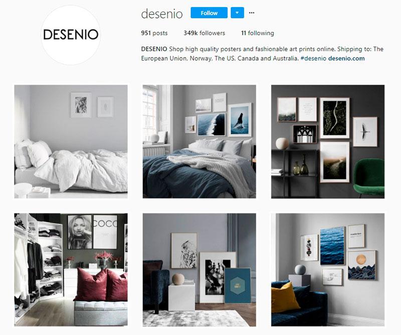
The Swedish online art print company Desenio does a wonderful job with their Instagram. You will notice that their whole feed is about their product in context. Showing a product in context makes it more relatable and certainly more attractive to potential and existing clients. They achieve consistency with the theme as well as their use of colors which corresponds to their brand.
Tip #3: Use images with a vibe
When it comes to choosing images, you definitely want to choose something inspirational, something that will make people look twice. Your social media pages are about projecting an image that clients and other followers will associate with your brand. For this kind of activity, you need a decent collection of images which you can find on Depositphotos or look around our featured collections that we put together based on specific themes and topics.
It’s probably also a great idea to keep all your favorite images in your ‘Favourites’ folders and use our Flexible Plan option to buy your images in bulk. When the need for visual content is a constant, you need to equip yourself with all the right tools.
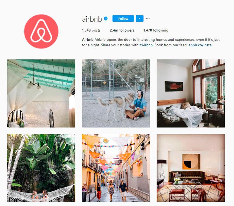
We often look to AirBnb for inspiration. For instance, their Instagram page has a very loud and clear message – feel at home wherever you ar. The images they use are atmospheric and give off positive vibes about all the different places to stay around the world.
Tip #4: Opt for tools to spark your creativity
We’re getting to the good stuff because there’s a tool that makes creating content easy for anyone, regardless of your design skills. Crello is a free online editor that allows you to create graphics for various social media platforms. If you’d like to give your images a little bit more design elements or add font, Crello helps you do so in a few clicks.
You can use already made templates and customize them for your projects. Crello can also help you stay consistent, as you can save your designs in different folders and be organized about your visual content for social media.
Grammarly takes a creative approach with every single one of the Facebook posts. Their style is very coherent, and with the help of graphic designers they post visuals with text which usually inspires lots of reactions from their followers. Crello can help you create similar visuals if you need to quickly put something together yourself.

Tip #5: Add movement to static posts
Now, if you’re covered on all the previous tips, here’s a game changer for you. Crello now offers free animated templates so your visual content on social media can be in the process of constant motion. Animated designs are to new and unique to Crello and a sure way to really captivate your audience.
With animated posts, you can add or remove text and customize the pre-made templates to work for your brand. You can add other elements just as you would creating a post with Crello. Simply choose a template, customize it and click the play button at the bottom of the screen to see how your animated design will look on the feed. You can download your finished design as an mp4 format and use it for your social media posts.
Tip #6: Going that extra mile with UGC
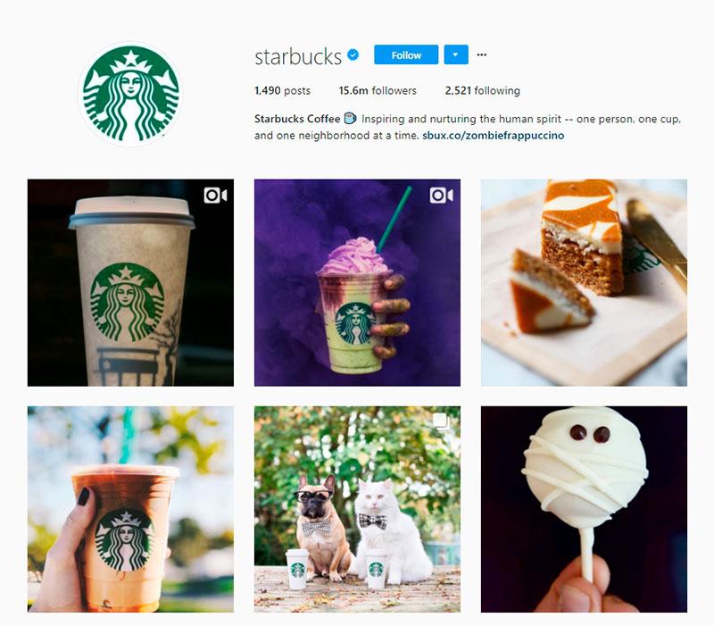
Depending on how you choose to curate your social media pages, there’s always room for creativity and creativity from people that support your brand. For some brands, this is a great way to create a sense of community and promote their products. Starbucks curates their Instagram account solely with user generated content.
If this option makes sense for your brand, why not give it a shot? It’s a way to spread word about your business and find out more about your clients and target audience. You can grow a network of people loyal to your brand and potentially reach new clients, subsequently getting them involved with your brand as well. Let your followers tell your brand story with their images.
Final thoughts
How you choose to use graphics for your brand is entirely up to you. We talked extensively about the importance of consistency and coherence, but you do have to have a stage of experimentation to find out what works for you. Tools like Crello can help you achieve that variety of social media graphics to experiment with, so do take advantage of the tools at your disposal so you can influence your customers and create pages and accounts that truly stand out.
