10 Free Email Headers and 10 Lessons on Aesthetics from Crello
Every article about email marketing will tell you it’s been around for a very long time. Before the rise of social media networks, businesses would send out emails to inform customers about their products, services, news and special deals. Fast forward to today, the tactic remains very relevant.
There’s one problem though. Our attention spans are much shorter now, and a simple letter won’t do the trick. We’re becoming increasingly visual, and text quickly throws a reader off. If text alone isn’t enough, what’s the catch? The secret to all great emails (you guessed it), visuals.
You have to start strong. This means that your email header is going to be a decisive point for customers that will either continue reading or abandon your letters. Crello is a tool that makes creating email headers easy and quick. You just need a few design basics to understand the many styles you can choose to grab your reader’s attention.
1. Focus on your logo
There’s nothing wrong with adding a version of your logo to the email header. Yes, it lets people know it is a branded offer or email, but customers should be able to recognize your brand.
In this template, you can place the logo above your text and even include a CTA at the bottom. If you do include your logo, place it strategically in the center like the palm trees here:

2. Get colorful
Using bold colors in your email headers is one way to catch someone’s attention. Here’s a template with a fun illustration, with a focus on color. You can include a short message but keep it brief and to the point.

3. Focus on photography
Bold, colorful images are another great resource to turn to. You can easily integrate photography into your designs by choosing the ‘Uploads’ option in Crello.
When choosing photographs for email headers, remember to choose universally beautiful shots that don’t distract from the message, that complements your message and the visual style of your brand.

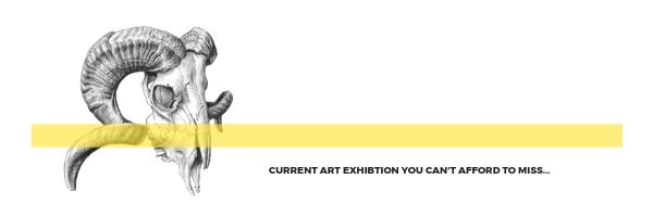
4. Simple color schemes
One great trick that you can implement is using black and white photography with one accent color like so. This makes both your images and your text stand out. It’s a simple color scheme that will draw attention.

5. Stack content
Sometimes there’s simply a lot of information that you want to communicate. Remember that you will have all the space to elaborate on your idea, but if you’d like to pack your header with information, stack your content in a way that’s easily legible.

6. Minimalism to the rescue
We’ve said it time and time again – you can’t go wrong with minimalism. Choose a very simple and soothing nature background together with a font that’s easy to read and you’re good to go. Adding a border around your image will also frame your image nicely.

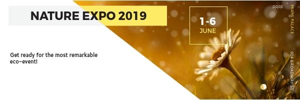
7. Create a visual hierarchy
If you’d like to combine some of the tips in this article, stick to a visual hierarchy. In this email, the eye is drawn to the text in bold (as it is the most prominent part of the header). Next, we glance at the image, the important date and only afterwards do we glance and read through the text.
Prioritize what you’d like to place an accent on in your headers. Do so tastefully and with purpose as to avoid chaos.
8. Embrace empty space
Going in the opposite direction, get rid of all attention grabbers and focus on what’s important. In this template, a simple illustration and an accent color makes the design look sleek and modern. The white space can be used for a little bit of text.
The same way bold colors grab attention, so does a well balanced image with an accent color like this one.
9. Set the mood with color
You can choose your images according to specific color themes. Patterns and flat lay images have a certain charm, and they certainly help set the mood. In this email header, it is used almost like a border which is another design trick you can implement.
The soothing tones of this photographs makes it look very soothing and crafty, which goes with the theme of the email header.

10. Limit font choices
You shouldn’t use more than 3 fonts in a single email header. Note how the fonts are complemented in this header. Using just 2 fonts gives you enough room to experiment and create some contrast between bits of information.

Creating email headers doesn’t have to always be a designer’s job. You can implement some of the tips in this article and start creating today! Impress your clients and readers with something different – a tasteful design and a loud message.