‘The Making of’ Series: Interview with Antony Kitson
We kick off the new year with an inspiring artist, Antony Kitson. He is one of our 19 artists that participated in the project Reimagining Record Covers. Antony’s cover is an outstanding modern interpretation of a classic icon from The Dark Side of The Moon that we’re all so familiar with.
Antony is a very talented graphic designer with a diverse portfolio and lots of interesting and innovative projects. Today he shares with us his thoughts on the record covers project, his process of making it and his new and upcoming projects that we should all be on the lookout for.
Tell us a little bit about yourself, your career and your side hobbies.
I am a designer and founder of independent studio OneTenEleven Media based in Leeds, UK.
My career started out after graduating with a BA Hons in Graphic design. I went on to study with EM Media on a graduate programme, picking up skills that would set me up for a freelance career. Following this I worked in-house for a division of JCB. I went on to setup OneTenEleven in 2008.
2018 will mark the 10th anniversary of the studio. Starting of as predominantly a design and web studio, I made the decision to break into 3D and motion graphics a few years back. Now my work is split 75% design and motion, and 25% web.
Away from work I enjoy travel, photography, DJing & motorcycling. All of which help me unwind and get the creative juices flowing.
What excited or interested you about the ‘Reimagining Record Covers’ project?
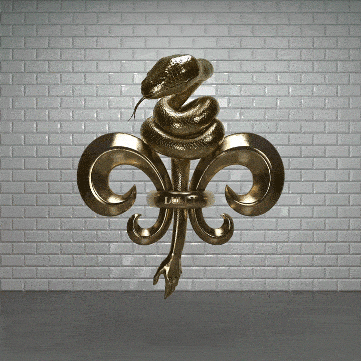
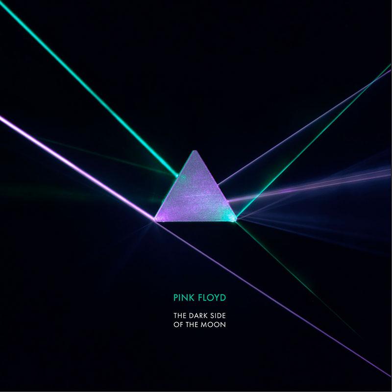
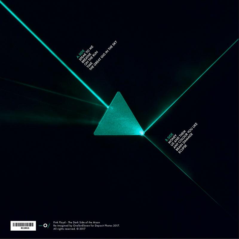
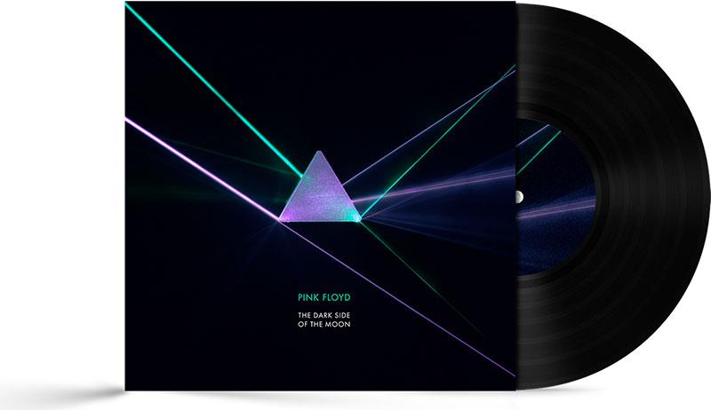
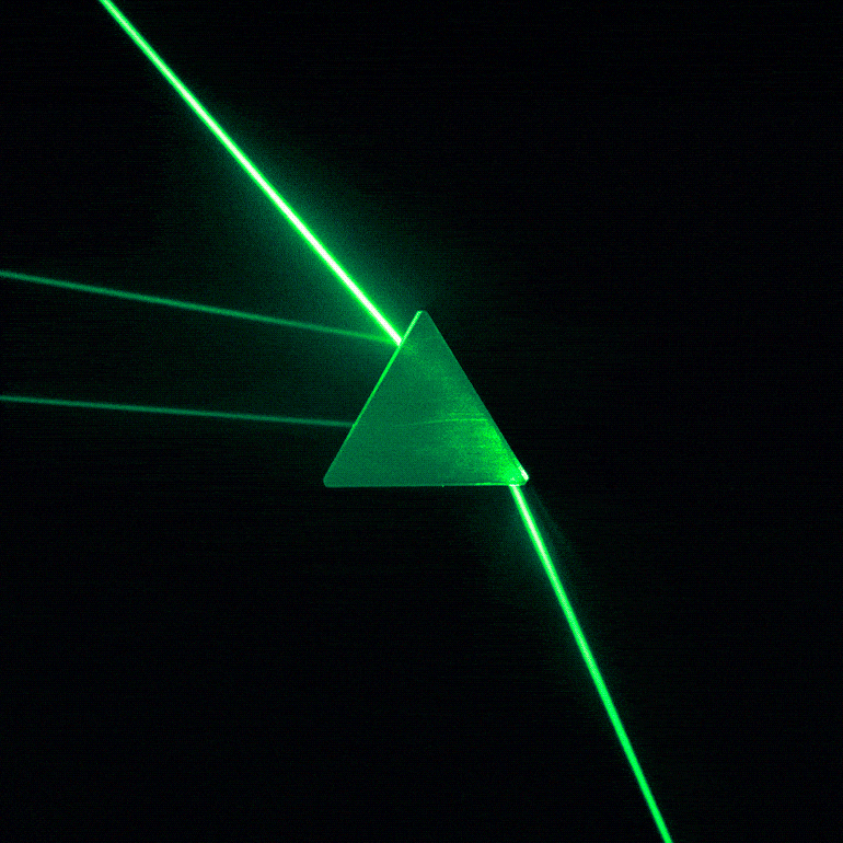
I have been working with a number of music industry clients this year, and it is something I want to continue throughout 2018. So an opportunity to re-imagine one of a list of such classic albums really caught my attention. I narrowed the list down to 5 albums and eventually settled on The Dark Side of The Moon. The use of light was a key factor in the design, something that has been a focus of my work recently.
Your cover is like a modern interpretation, did you go with your initial idea for the cover or did you have other ideas you wanted to see through?
I wanted to stay true to the concept of the original, keeping the prism as a key focus and experimenting with light. Beyond that I wanted to experiment with the theme and see what results I could achieve. Keeping the process organic.
Were your color choices significant in any way to your overall concept?
The final colour choice was really dictated by the UV laser I used. Some slight colour correction was used to boost the saturation, and shifted the hue of the green laser slightly.
What are your thoughts on the music itself? Did you go back to listen to the whole album?
The first thing I did after selecting the album was listen to the whole album on Spotify. It must have been 10 years since I last heard the full album. The album is quite varied and for the most part still sounds fresh today; not bad for an album produced in ’73.
Tell us about how you chose the medium to work on the cover and your thought process to choosing a photograph as opposed to an illustration like in the original cover.
I had an initial idea to recreate the iconic scene in 3D, aiming to experiment with glass textures and light refraction. After some initial experimentation I wasn’t really feeling the results. It turns out I needed a specific render engine to reproduce the light spectrum effect I was looking for. I could have faked it however I decided to make the transition to photography.
Could you take us on a journey of the ‘making of’ process? How long did the project take and what were the different stages of realizing your idea?
After a couple of hours experimenting in 3D and refining my concept. I went online to order supplies, a prism and laser pointers.
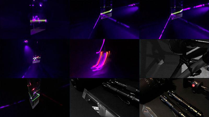
I then went on to setup my first test shoot. Nothing complicated, just some black card, a tripod, various coloured laser pens, my camera and phone. I waited till after dark and started shooting and experimenting with camera settings.
Following these tests I found long exposures produced the best results. However on review I had some camera shake issues producing some ghosting around the prism.
I switched to a sturdier tripod and utilised the self timer and remote App on my phone for steady shots. The laser beams show up better when the light has something to refract so with the addition of a diffuser as a makeshift smoke machine. I was getting some really nice results in camera from this setup.
Once I had shots I was happy with I moved onto the edit. Importing the photos into Adobe Lightroom for colour correction. Some noise reduction was needed as I was using a high ISO, brightness & contrast were adjusted and I experimented with LUTs to get alternative looks.
Once I was happy with the look I spent a few hours in Illustrator working on the typography.
In total I spent around 3 days to realise the concept. Plus a few days of ideas buzzing around my head!
You must have experimented a lot with lazers. Are there any other test shots that were excellent but didn’t make the final cover that you could share with us?
I did experiment with lasers a lot, I found the brightness of the lasers altered with the colour, so required different levels of exposure to get the result in camera. I shot hundreds of images! I should create a set on Deposit Photos!
I have compiled the best shots into a short GIF.
Here are a few behind the scenes photos taken from my iPhone.
What would you say is a key factor of success in taking up a project like this?
The project was a kind of a passion project for me. The key factor was to have fun. I wanted to shake off the restraints of client projects and run with my own ideas.
I saw the project as an opportunity to experiment with new techniques and concepts and learn something new. I know much more about the behaviour of light and prisms now, which is something I can transfer across to other projects.
This is a nice way to work from time to time and something I aim to do more of in 2018. I am building a dedicated area to experimental and personal projects on my new website, so look out for that.
How do you feel having completed the project and seeing it on the website now?
I think the project came together nicely. The website looks great, it is so nice to see other people’s interpretation of the covers.
I don’t think I am ever 100% happy as a designer, there is always something I can look to improve upon. Especially in this case when I had hundreds of photos to choose from. I am a perfectionist I guess, I’m sure I am not the only designer who feels this way. It is just about trusting your instincts and knowing when to stop!
What other projects are you currently working on?
I winding down for Christmas at the moment, so all client work is done! I am currently working on a new portfolio website, due to launch early 2018.
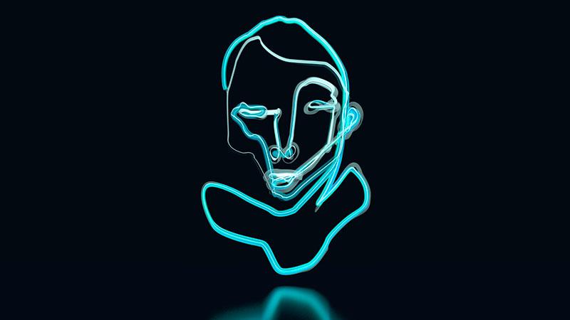
I am also putting concepts together for my first Video artwork for FRAMED (frm.fm/en), a digital-canvas.
I just completed work on an info-graphics animation and a Christmas themed GIF animation.
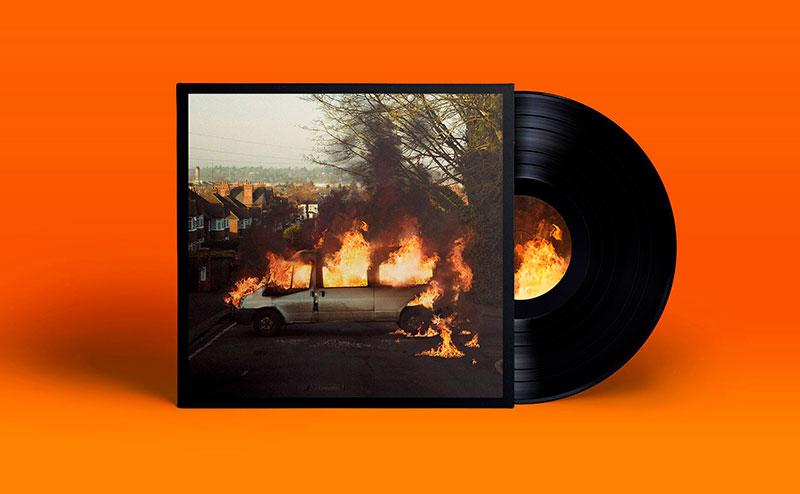
2017 has been a great year working with some great new clients, notably The Amazons debut album artwork on Fiction Records, a music visualiser video for an Aluna George remix of Tom Walker Relentless Records and a lyric video for Juke Ross.
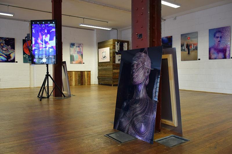
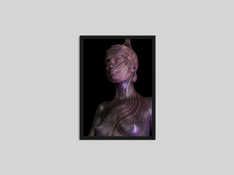
Another highlight was working with Design collector for the Digital Decade Cyberia exhibition at Ugly Duck London. You can find details on the exhibition here.
You can find more work by Antony Kitson on his website.