Guest Blog Post: How to Create Your Own Portfolio Website
Photographers are chosen based on their portfolios which is why it’s so important to make an excellent first impression. Modern tools allow one to not only publish photographs but also build a story around them. A great website can help clients decide whether you’re a professional and choose you from a pool of amateurs.
 We asked Iana Pliusheva, a designer from Tilda Publishing, to share with us how to create a portfolio website for photographers.
Iana: “One of my tasks with Tilda is to create website templates for users. Templates are ready pages that users can take as a basis for their projects and adjust it to their needs, creating their website on their own. This is why my task is to think everything through and to create functional pages that will be both beautiful and functional.”
Tilda Publishing is a modular design tool that allows you to create amazing websites in a really fast and efficient way. You can create portfolios, landing pages, long read articles, interactive stories, blogs and other special projects.
The process of creating a website consists of the following steps:
— Idea and the structure of the website
— Research and inspiration
— Website mockup and prototype
— Content preparation
— Website design
Step 1 – Idea and the structure of the website
Before you begin, you have to decide for yourself what the main idea and purpose of your website is going to be and what exactly you’d like to showcase. Think about the people that you want to visit your website – are they your clients, fans, gallery owners or just your friends? Decide on a target audience, the people you’re creating this website for. Next, try to imagine yourself in their shoes and try to determine why they have come to your website and what they expect to see.
Take a piece of paper and sketch out the structure. Think about whether you need a multipage website or if it will be enough to showcase 10 of your best works and place them on one page that will be easily scrollable. If you’re a photographer and have mastered visual language, you probably are a good writer as well. Will you have a blog? Will it be on the same domain as the main website or a separate one? Can your works be divided into categories or do you stay within the niche of one genre?
The structure of the page will depend on your activities – whether you shoot for different genres or stay in one niche.
Step 2 – Research and inspiration
Once you’ve determined what kind of a website you need, spend some time doing a little research.
Most likely, you spend a lot of time looking at other photography websites and portfolios. There are works that also inspire you. But right now, we have to look at it from a different angle – you need to take note of the website sections that other photographers use and create a list of the main or repeating elements. For example, this can be a section about you, your hobbies, your story (how to get started with photography), and a pricing page.
Check out websites in similar categories from other designers, illustrators and even agencies. It’s likely that you will find something interesting that you can implement.
Take a look at contemporary websites in general, without sticking to one theme. There is quite an abundance of resources on the web where enthusiasts collect great examples:
http://www.designmadeingermany.de/sites-we-like/sebastian/
Try to take note of exactly the things you like. Maybe it’ll be the cool flow of the website, good typography or a good combination of colors.
Step 3 – Mockup and prototype
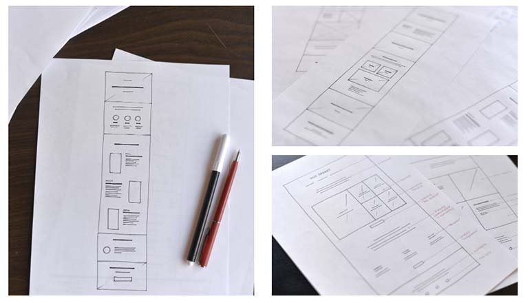
The mockup and prototype are the schematic visualization of blocks that will make up a website. It’s your visual script. This is really easy to do – take a piece of paper, a marker and draw a mockup of the order of your content. You don’t have to do this in great detail, just the general idea.
Step 4 – Content preparation
Select the photographs that will be on your website beforehand and add them to a separate file on your computer. Ideally, you will want to reduce your images down to 1680px wide. This way, the photographs will keep their resolution and won’t slow down the website. If you upload highres files to the website and open it on a mobile phone, it’ll be difficult.
Use a Word processor to write out your text. It’ll be easier to edit this way. Some parts you’ll be able to change on the page right away, but you should have some content to start with.
How do you write text for your website? If you’re writing the text on your own, use the following scheme:
- Write a short text about yourself. This should be one phrase that eloquently describes what your specialty is. For example, Alina Lialina is a child photographer in Moscow.
- Write a more descriptive text. Try to explain what makes you unique. Use simple words as if you’re chatting with a friend over a cup of coffee. Do so using the most comprehensive words.
- Highlight 3 main points to sum up why people should hire you specifically.
- Describe your advantages. Tell your ideal clients exactly what they’ll be receiving when they hire you. Do this in great detail.
- Think about headings. To get a grasp of a flowing text, people are usually lazy and headings are easy to read so don’t think too hard on beautiful metaphors and try to translate the essence in your headings instead.
- Include testimonials. Ask your clients to say a few words about you. This works really well.
Once your content is ready, you’ve selected your photographs and wrote your text, you can go on to creating your website.
Step 5 – Website design
Register with Tilda. Right after registration, Tilda will suggest a website template. We have templates on Tilda specifically for photographers:
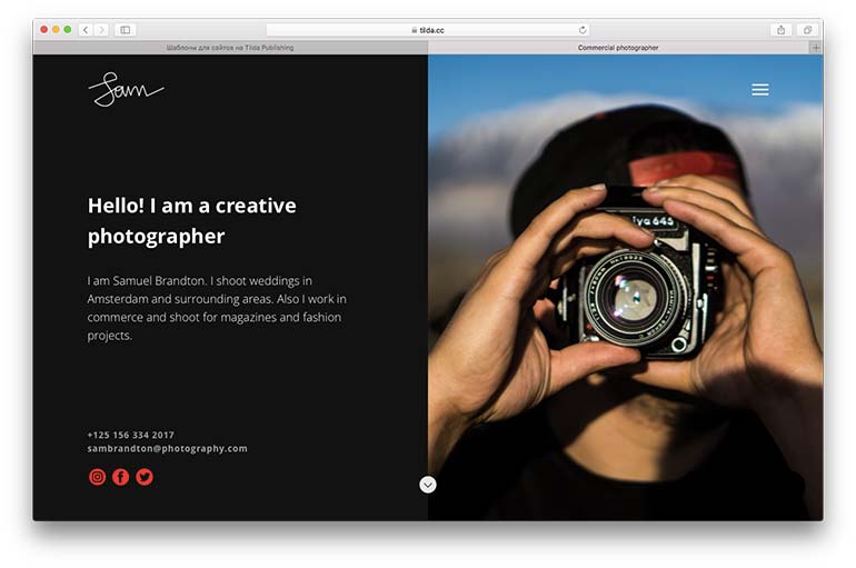
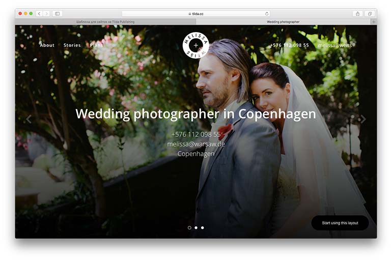
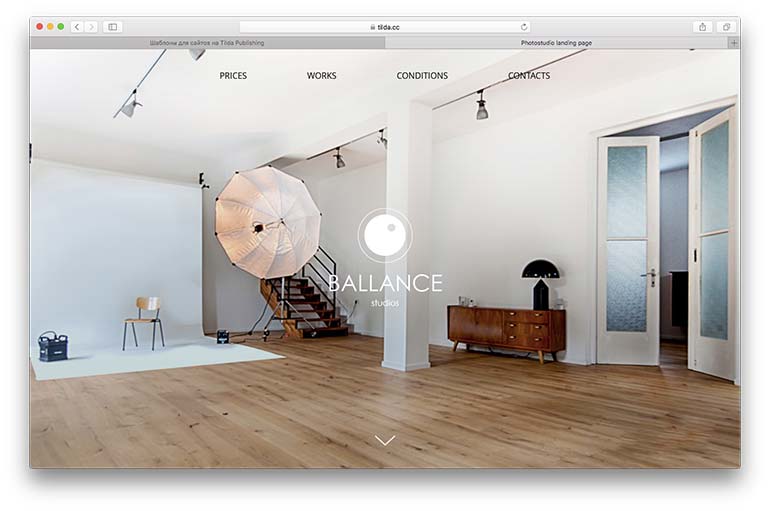
If you don’t like these templates, look at other ones. A template is an example of a good website and a preview for using different blocks. Your choice of template doesn’t limit your creativity in any way – you can change it anytime you want to an unrecognizable form and even start from a blank page.
You’re working with images which is why the first thing thing your visitors should see on your website is a photo. This should be one that shows your specialty (for example, weddings, food, exhibitions, the interior of your studio etc).
First screen
Show your contact information on the first page: your email, phone number, links to social media, city and where you work. This is useful for your clients. The header should have your first and last name. You can also place your logo up there. If you’d like, you can include a big photograph on half the screen so that the client can see your face.
On the cover of a wedding photographer’s website, create a gallery where you can add your chosen photographs and your specialty. Also include headings of popular search enquiries on the Internet. For example, a wedding photographer in Reykjavík.
Navigation
Think about the navigation, how will visitors be able to orient on your website, switch between pages and move around on one page. For organizational purposes, add a menu: a menu with links that will be at the top of the website. It can be quite static or fixated while scrolling, to always be in front of the viewer. It can also be fitted in a concise “hamburger”. To read about this in more detail, refer to the article “How to Add a Menu to the Site”.
Important note – don’t overload your menu, it’s a functional part of your website that should help your visitors orient on your page. Use short words to name your points but don’t use more than 5.
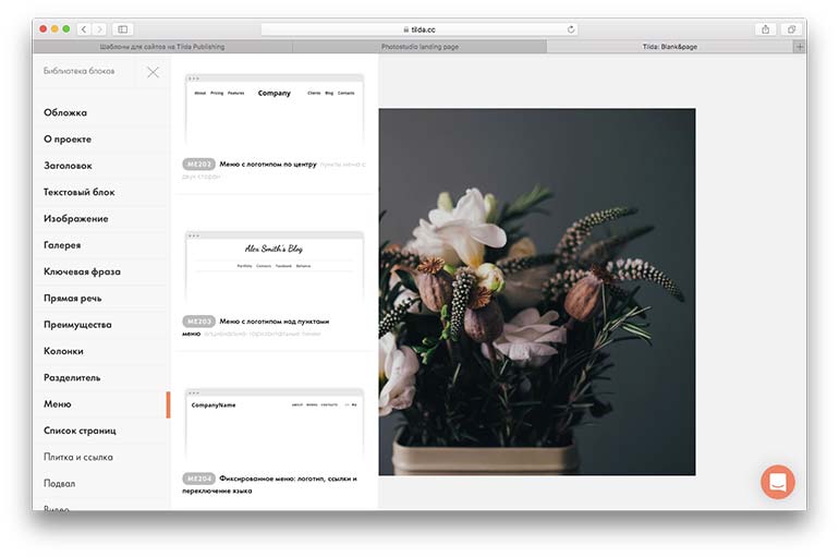
In our library of blocks, there is a special “Menu” category.
Portfolio
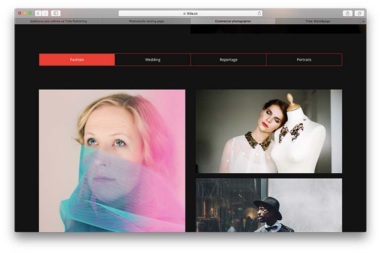
Choose a few blocks to show your portfolio. Add tabs if you would like to showcase several types of photography. Clicking on the names, you will switch between sections. In each section, you should aim to show your best photograph in different genres.
For example, if you’re a wedding photographer, add a gallery with your chosen photographs that will enlarge when you click on them. Next, you can add a photo stories with information about where the wedding took place and the date. You can include a section about the best weddings over the past year.
Under your photographs, you should add a button that one could click and get redirected to a different page dedicated to the project to see more of your works.
Blog
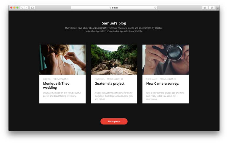
If you have a blog, place it on the page. Show 3 of your recent blog posts and add a button which users can click on to be redirected to other blog posts.
Price list
The next block about your price list can be created in the form of a table or cards. Mention popular services and their prices. Add a button “Order photo session”. Clicking on it, the client will be redirected to a form they have to fill out which will later be sent to your email.
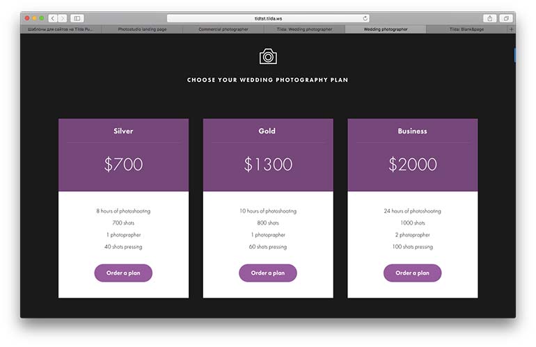
If you offer studio services, mention what kind of a space you have and the rental equipment you have to offer. Set prices and mention why your space and your equipment should be chosen. Adding images of backgrounds, reflectors, lenses, cameras, and other equipment will significantly increase your chances of getting noticed (and earning more).
On a gallery website, add a section about policies. For example, bookings can be changed no later than 3 days before the shoot. You can also include information about payment returns.
Client testimonials
After the price list, don’t forget to add client testimonials. This will catch your visitor’s’ attention and establish trust.
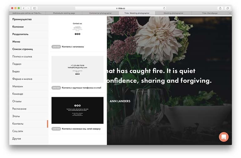
At the very end, leave your contact information again. You can use the “Contacts” block for this.
Before publishing, take care of SEO. Add the title of the page in settings along with a description and an image to share on social network.
If you want your website to open with specific URL, add a domain. To do this, add the URL in the settings of the website and indicate Tilda’s IP when purchasing your domain.
Don’t forget about statistics. Register with Google Analytics and connect the statistics in the site settings.
Before showing your website to clients and friends, look at it from a fresh perspective. Pay attention to how neat it looks and the style in general. Is it over designed? Is there enough space between different elements?
Try to simplify. The simpler you make it, the less mistakes you will have and the website will ultimately look stylish.
Examples of photography website made with Tilda:


