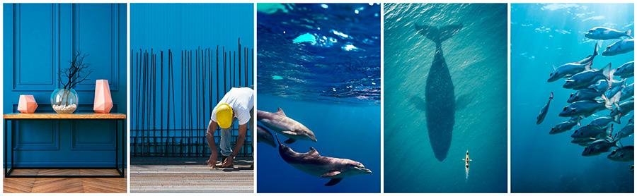
Featured Collection: Pantone’s Niagara

Niagara was said to be the most prevalent color from the Pantone Color Report. It’s a classic shade of blue that we’ve all grown to love for the versatility and resemblance to nature. It’s the color of the deep blue sea, the calm skies and often a popular color in interiors.
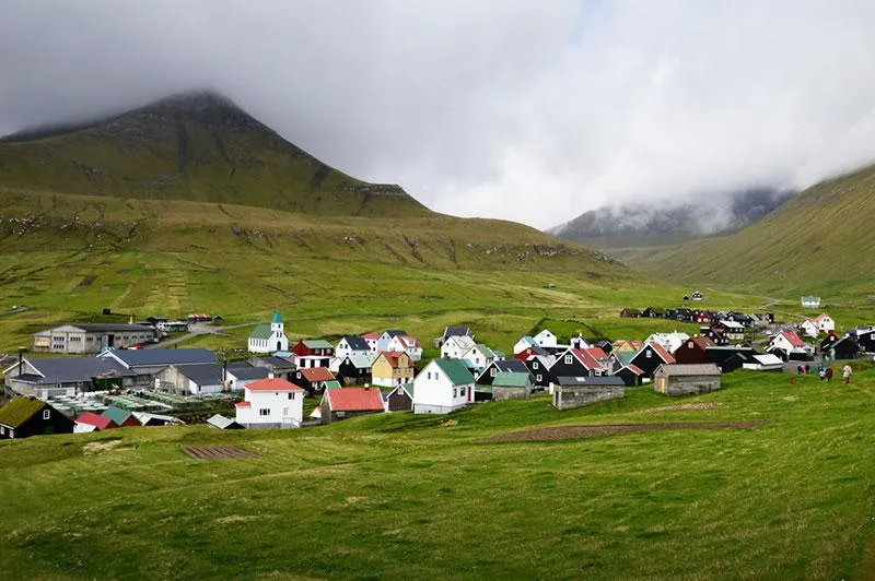
Niagara is a soothing and relaxing hue. It’s reminiscent of the colors we see in nature, as seen in many of the images in our special collection. Take the inspiration and find images that will add this soothing element to your projects.