Creating a Photography Logo That Sells Your Style
They say a picture is worth a thousand words—but can your photography really speak for itself? No matter how striking your images are, you still need a way to distinguish your work. Which is where having a strong photography logo comes in.
Aside from serving as a watermark to identify and protect your work, your logo also communicates your style at a glance. With the right photography logo, clients get a sense of your style—before they even open your portfolio.
But how can one logo capture the style you’ve spent years honing? And how do you decide which aspects of your style to highlight over others? These are tough questions, but with a bit of background on branding and a breakdown of the different types of photography logos, you can craft the picture-perfect logo for your business.
Understanding your photography brand
Your logo communicates what sets you apart, acting as a shorthand for your overall brand. But what exactly does that shorthand stand for? What is the ‘brand’ your logo should communicate?
![]()
While some people think that “logo” and “brand” are synonymous, there’s much more to your brand than just your logo. A brand is, ultimately, the impression of your business that customers hold in their minds. It’s the feelings, stories, and memories that come to mind when they hear your name. While you can’t control this impression entirely, you can influence it through branding materials like your voice, messaging, imagery, and, of course, your logo.
For any photography logo, there are two sides to your brand that you’ll need to consider. Your clients remember you both by your work and what it’s like to work with you. So, while your photography logo should sell your photography style, it also needs to sell your style of doing business.
Translating your brand into a logo
Your logo should capture the complete experience offered by your photography brand—both the product and the process. But before you can translate those components into a photography logo, you need to do a little introspection. To help you better understand your brand, we’ve put together a few questions to ask yourself.
Your photography style
- What subject matter do you photograph most?
- What shapes and lines do you repeat across your photography?
- What mood are you trying to create with your work?
- What angles and framings do you use most?
- What colors and color qualities are consistent throughout your portfolio?
- What techniques and skills do you excel at?
Your work style
- Who are your typical clients?
- Who do you wish they were?
- Why do your clients choose you over other similar photographers?
- What do you pride yourself with in regards to the way you work?
- How organized or casual is your business?
- How professional or personable is your work style?
- How high-end or affordable are your photos?
As you consider your responses, be sure to account for the competition. The traits that set your photography business apart are relative. If the competition outshines you in some areas it may be better to emphasize different traits in your logo.
Photography logo components
After a brief bit of introspection, it’s time to start translating your brand into your photography logo. For this part of the process, we’re going to go through step-by-step through the logo creation process, and discuss which brand traits to consider along the way.
Color
![]()
As a photographer, you’re already well aware of the impact different colors can have on first impressions. To make the most of your logo’s first impression, look to your portfolio’s color palette for inspiration. By creating continuity between your logo and photos, you give clients a sense of your aesthetic and style.
Try to capture the shared quality of colors prevalent to your favorite palette. If your photos favor saturated, neon hues, a bright logo color palette will work well. If your work is more in the neutral, subdued realm, a subtle color palette gives a sense of your overall aesthetic.
Within the bounds of those color qualities, you might look to your brand personality to decide on specific colors. Blues and greens give a calm and collected impression, pinks and purples are a bit more fun, while black and white demonstrate restraint.
By combining aspects of your portfolio with aspects of your personality, you can create a logo color scheme that communicates both sides of your brand. Colors are important when you take your logo out of context and have to put it on other branding materials. A Design.com logo maker can help you experiment with different palettes and see how your design holds up in various formats. That being said, your logo will have to look good both on black and white, with the option of a consistent color scheme for other materials.
Fonts
![]()
While photography logos should incorporate a color, you’ll still need to get some things in writing—namely, your name. The logo fonts you choose to contain your name and slogan should be selected with your aesthetics in mind.
To find a font that acts as an extension of your photos, keep the lines and shapes you use most in mind. Organic lines pair well with rounded fonts, soft corners, and slender lines. On the opposite end of the spectrum, bold, architectural shapes can handle the impact of bolder, sharper, and heavier fonts.
Other aspects of your work process—like personality and level of formality—can govern which font families will make the most sense. Handwritten fonts come across as more personable, while Serif fonts are seen as more professional, and Modern fonts are more forward-thinking.
Remember: you’re likely going to be using your photography logo as a watermark. So, if you need to choose between a font that fits your personality and one that fits your photos, your photos should take precedence. This same rule applies to your other logo elements as well. Because as important as your work process is, it’s the product that clients are ultimately paying for.
Symbols
![]()
Symbols are an easy way to communicate some important aspects of your photography business. For some, this might mean incorporating a camera to convey technical prowess. For others, it might mean using a lion to convey a specialization in wildlife photography. Still, if you don’t want to showcase your skill or subject matter so literally, you can always use an abstract symbol to capture the look and feel of your photos.
Format
![]()
Finally, to frame your photography logo, you need to find the right format. Here, your goal should not be to make any new statement about your personality or photography style. Rather, you should look for a format that complements your logo’s other elements.
Top photography logo styles
Your color, fonts, symbol, and format can all represent key components of your brand. But when they come together, they communicate something more than the sum of their parts. To get an idea of the messages different combinations can send, let’s take a look at some of the top photography styles.
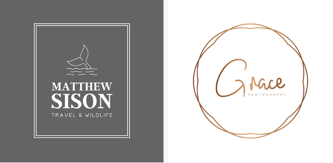
Soft Signature
![]()
The combination of muted colors and Script or Handwritten fonts makes this logo style appealing and artistic. When used as a watermark, this logo can resemble a signature—similar to the kind artists use to sign their work. Whether you use your full name or just your initials, this style is ideal for creating a personalized look and feel.
Whimsical and Wild
![]()
Again, muted colors add an approachable touch to this logo style. However, unlike the Soft Signature style, this type of photography logo takes a more rustic approach to fonts. Serif and Handwritten fonts define the slightly vintage look of this style. With the addition of plant-based symbols, this logo style works well for photographers specializing in outdoor spaces and occasions.
Photography in Focus
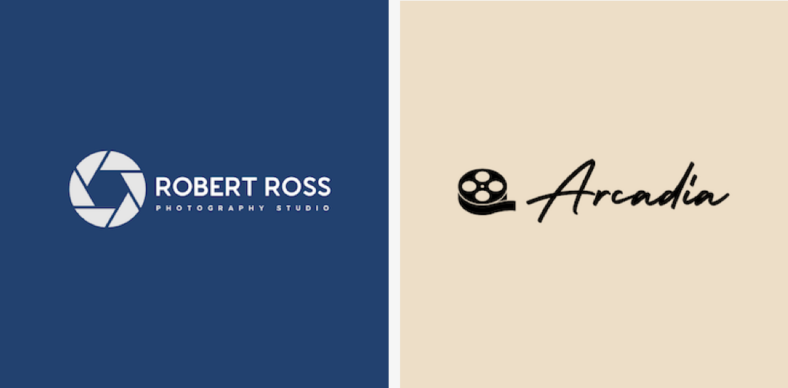
Camera and film-related symbols set this photography logo style apart. Usually paired with straightforward fonts and subdued colors, this logo style leaves the statement-making to its symbol. While putting your photography in focus can quickly communicate what your business does, this style is also a bit overdone. If you do choose to go this route, you’ll need to find another way to make your brand stand out.
Framed
A highly structured container paired with a complementary font is what creates this unique look with the logo style. The composed, restrained look of this style can speak to both a highly professional photography style and a highly professional business style. For this logo style, order is everything.
Going beyond your logo
Once you have a logo that sells your photography style, it’s time to start using it consistently. As you build out the rest of your marketing materials, you can use the colors, fonts, symbols, and format of your logo as the basis for your visual brand. By consistently leveraging your logo and visual brand across your website, business cards, portfolio, and more, you’ll be able to create a distinct impression of your brand at a glance.