23 Beautiful Website Designs From Awwwards
Have you ever heard about Austin Kleon’s book “Steal Like an Artist”? The must-read for all creatives shares one curious idea on how to keep your brain constantly generating something new. In short, it implies research, analysis and modification of already existing ideas. No, it’s not plagiarism and here’s why.
Brief summary of how to steal like an artist
Choose a designer, agency or product you like the most. Then study the biography, practice, experience, and results and pay attention to collaborations and people they follow. Organize the information you got by creating a mind map. This way you will open up a huge world of fresh and diverse ideas for your project. The exercise is meant to help you with drawing patterns and finding new creative solutions based on inspiration.
Whether you’re an artist, a photographer, a designer or a businessman, don’t be afraid to explore something new. You never know when and where a muse will come to rescue you from the creative stalemate. For your inspiration, we have hand-picked a broad collection of beautiful website designs from Awwwards. There are tech, architecture, food, fashion related websites and much more.
Our selection of the beautiful website designs
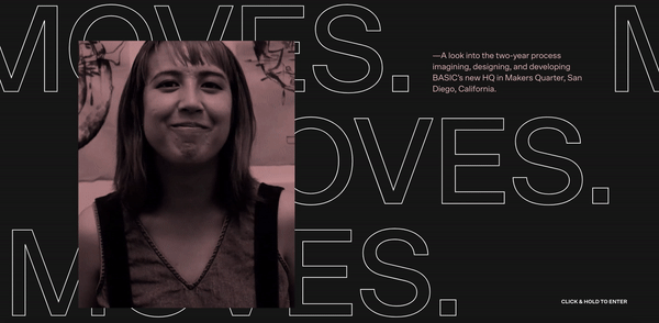
BASIC® — MOVES
by BASIC®
This website is a look at the two-year-long process of designing and developing the BASIC® agency’s new headquarters. The design is complemented with audio what makes the experience even more fascinating.
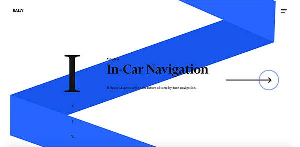
RALLY
by RALLY
There’s no way RALLY — an interactive product studio that works with such brands as Toyota, Google and Nike — has made a boring and dull project.
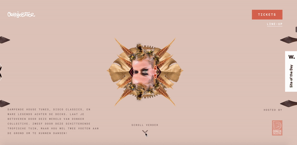
Oranjebitter
by Offf
King’s Day in the Netherlands is not the only event to schedule time for. Oranjebitter is a music festival held at the same time. It has a houseparty format, and people really enjoy it. If you’re still wondering to go or not to go, explore this striking website and plan your getaway for April, 27.
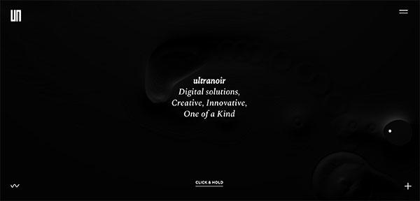
Ultranoir
by Ultranoir
French digital agency Ultranoir has presented a new website and made it with typical local charm. This design looks just mesmerizing!
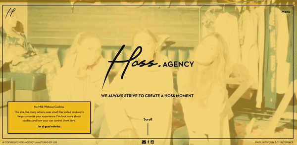
Hoss agency
by tclubterrace
This PR agency website makes you want to party and not in vain – they specialise in events.
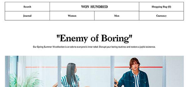
Won Hundred
by Spring/Summer
Danish clothes brand Won Hundred has an ideally minimalistic website with visible grids, black and white colour palette, and retro fashion pieces.
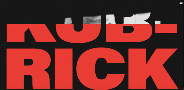
Stanley Kubrick
by Tubik Studio
If Stanley Kubrick was alive, he would have a website and here’s how it would look like.
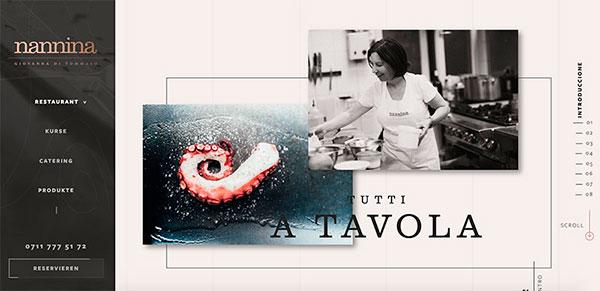
Nannina
by Christian Neitzel
Nannina is a restaurant, the website of which inspires to book a table at the high-end restaurant. This is what happens when proper attention is paid to details.
MAGU KOMBUCHA
by Tom Garcy
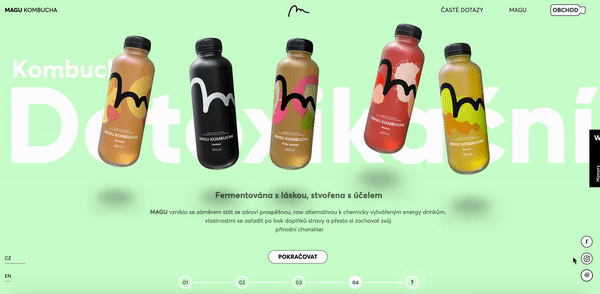
Czech food startup has presented a minimalist website: black and white text, colourful but not too bright background and shaking bottles of kombucha.
Sonoma Valley Museum of Art
by MendeDesign
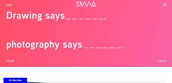
Art is subjective, and the Sonoma Valley Museum of Art invites you to redefine it by filling in the missing words at the website’s homepage.
Aleks Faure
by a-janik to Elegant
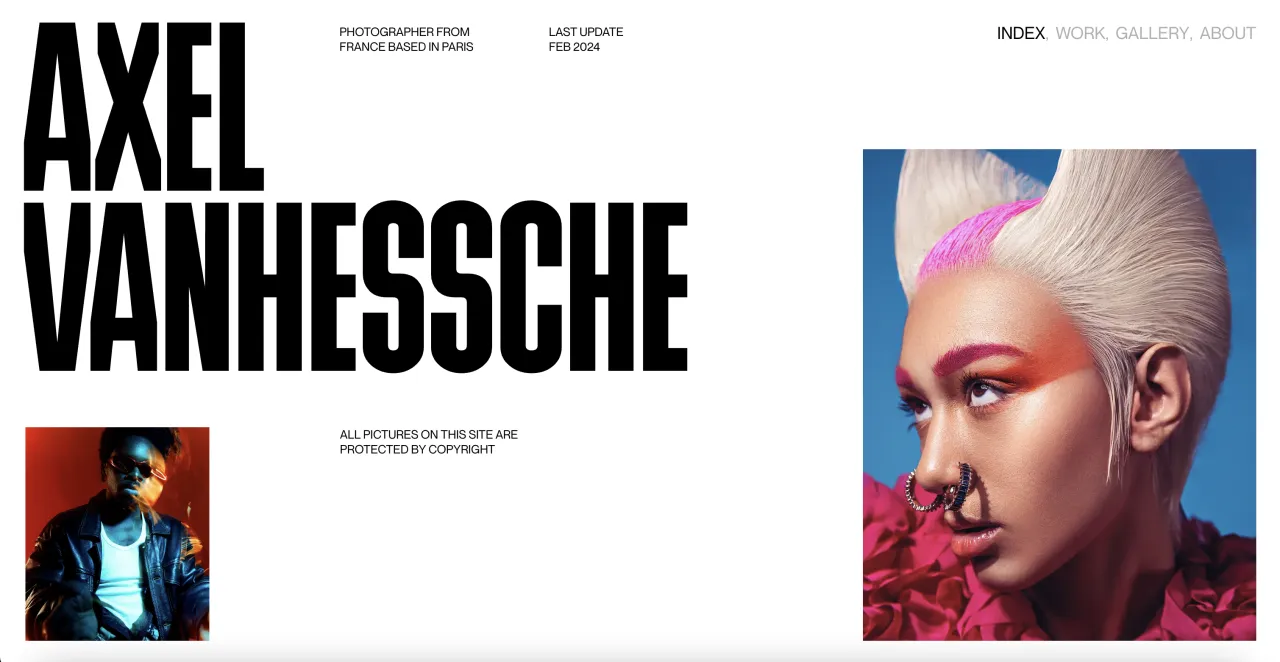
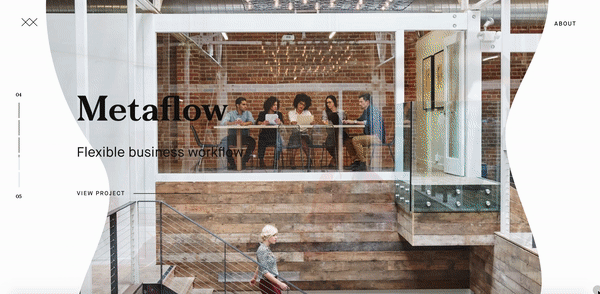
Aleks Faure is a senior designer and a digital art director from France, and his portfolio is what people call the psychology of simple.
PUMA Suede Guerrillas
by Jungle Beige
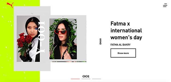
The easy-to-navigate collaboration space by Puma is created in the best graphic design traditions. The layout and colours are pleasing.
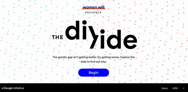
Womenwill The Divide
by Google Brand Studio APAC
Google’s initiative Womenwill is aimed at creating opportunities for women. To display the existing divide between male and female in the Asian region, they created an interactive website that shares curious statistics.
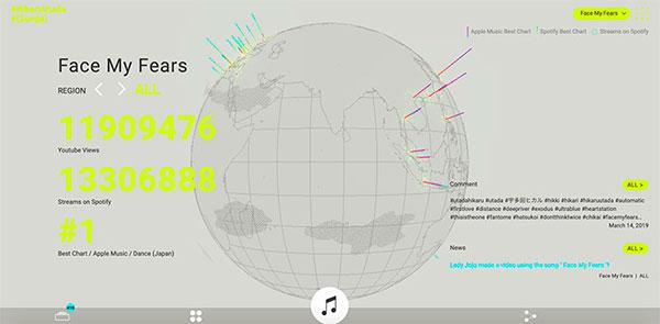
#HikaruUtada #(Songs)
by Sony Music Communications Inc.
Yet another beautiful website design. It is created by Sony Music Communications Inc., and shows how the music of Japanese singer Hikaru Utada is perceived around the world.
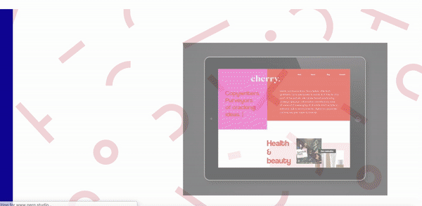
Perq Studio
by Perq Studio
Perq Studio is an agency that specializes in design and branding, and their website speaks for itself.
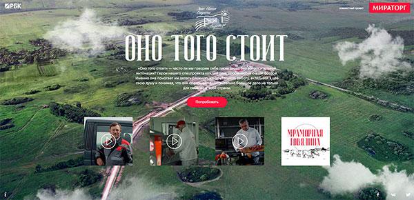
It’s worth it
by RBC SP
This Russian agribusiness website questions how often we ask ourselves is something worth it? It also shares thoughts of people from different occupations who work with meat: a chef, a farmer and a technologist.
Twist: The game
by Stink Studios
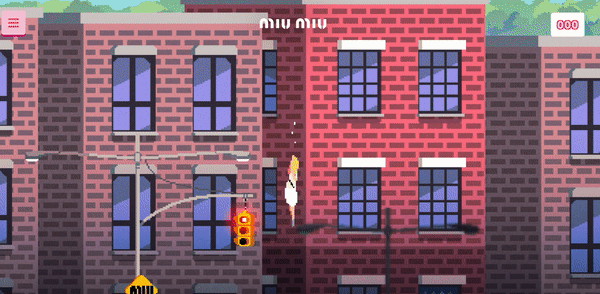
Just imagine watching a pixel art game in 2019! Sounds like Stink Studios have a good sense of humour and aim to create a special ambience around the launch of Miu Miu’s new fragrance.
Opticos
by L+R
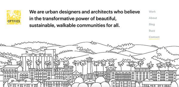
Opticos is an agency of urban designers and architects, who believe that walkable places are crucial for resilient, sustainable and healthy communities. The best way to share your opinion is to create a website that encourages to go for a walk.
M C K N G B R D
by Lundgren | Lindqvist
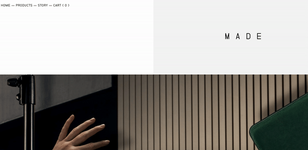
Not only these MCKNGBRD’s personal tech cases look smart but also it’s an easy-to-use website.
ECD-Performance
by PIXIT
The website of CD-Performance looks as exclusive as the vehicles they are dealing with.

O2 SmartNet
by inCUBE interactive
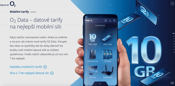
Interactive design, innovative solutions, and better experiences – all these you can find at the O2 SmartNet highly technological website.
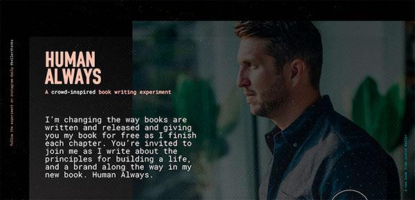
Human Always
by circlefifty Corey Brown
Justin Keller is an author who decided to publish his book online chapter by chapter. The right message, type and colour spectrum of the novel’s website encourage people to follow its release.
Superrb
by Superrb
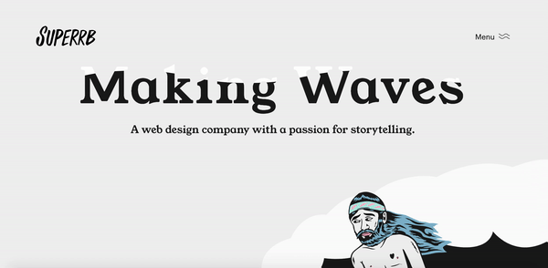
In the contemporary world, storytelling has become a powerful tool of communication, and the website of the design company Superrb is the evidence.
We hope our suggestions were useful and you are full of ideas now. However, if you need more inspiration, read these pieces on website design:
