What makes a good website: checklist for entrepreneurs
Your website is like a business card for your company. It’s the first thing your customers see, a place where they get information about you and decide on making a purchase. It has to include all the information you want your customers to know about your business. But what makes a good website? How do you stand out from 1 billion other sites and provide all the necessary information for clients? We’ve gathered 7 tips that will help you create an attractive and functional site for your business.
1. Add visuals that create certain emotions
A picture is worth a thousand words, it’s a way to attract attention and to convey information about your brand. Images are the essential elements of any design. However, many people don’t know how to use them the right way.
The pictures on your website can connect you with your audience, convey a certain mood and emotions. You need to choose high-quality images which are relevant to your niche. However, don’t overload your site with heavy visuals. Use Photoshop or tiny.png to compress the images.

2. Establish trust with color
It’s not a secret that colors influence our behavior. Certain colors can even improve conversions, motivate customers to take action and trigger the right emotion to make a sale. But how to choose the right color for your brand?
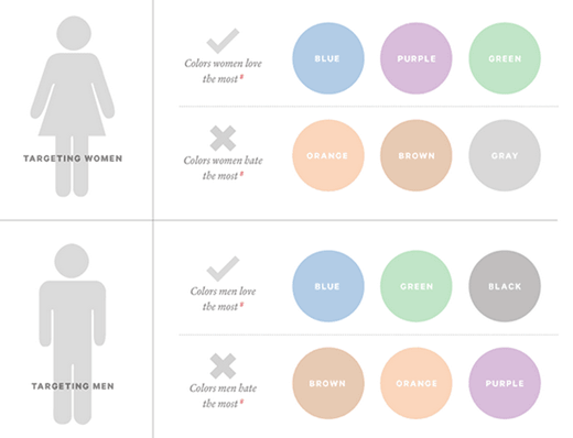
According to some studies women prefer blue, purple and green and don’t like gray, orange, and brown. So if you target mostly women you should use these colors. Men usually choose green, blue, and black.

Image credit: Kissmetrics
If you want to show professionalism and trust, choose blue. Black is associated with value and luxury. Yellow attracts attention and stimulates activity and confidence. Moz conducted a research and changed their call-to-action button from green to yellow. As a result, their conversion rate grew by 187%.
3. Keep F-pattern design
If you already have a site but it doesn’t convert, may be your main problem is not the content or the design. Your call-to-action button may be situated in the wrong place.
People scan the screen in a certain way: they pay more attention to the upper left corner, then they scan down in an F-shape manner. They usually don’t pay attention to the elements situated on the right side of the page, so it’s better not to put any important information there.
4. Make navigation as easy as possible
People should easily move your website, they need to intuitively understand how to get to the page they need. Don’t include too many categories into your menu, add only the basic and most important things. Remember about the three-click rule – users should be able to find the information they need in three clicks.

If you are not sure about navigation on your site – send a link to your friends and ask them what they like about your site and what they’d like to improve.
5. Pay attention to your text
What do you think about sites with inaccurate or incoherent texts? They look unprofessional and not particularly trustworthy. Choosing the right words and the right fonts to support your content will help you build relationships with your customers, provide important information about the product you offer and ultimately result in more sales.
6. Optimize your site for Google
Search engines are one of the most important sources of traffic to your website. To make people find your site, you need to optimize it and add keywords to your URL, heading, meta description and text. Use WordPress plugins for on-page optimization, Yoast or All in one SEO pack are amongst the most popular ones.
Check your website loading speed – if it takes too much time for your site to load, it increases your bounce rate and is also bad for SEO. Get rid of unnecessary elements and optimize your visuals to improve the speed.
7. Make your site mobile-friendly
50% of traffic now comes from mobile devices. So if you don’t want to lose half of your customers, it’s time to optimize your site for mobile. If you buy ready website templates, check whether they are optimized for mobile.

You can take Google’s mobile friendly test to see if your page is optimized. If it needs improvement, it’s better to hire a designer who will change your template and adapt it for mobile devices.
So what have we learned? A good website is a combination of useful content, good design, and functionality. Think about your clients, keep these rules and your website will stand out.


