The Pantone Color of the Year 2026: Collection of Images and Videos
Pantone has officially named Cloud Dancer (PANTONE 11-4201) as the Color of the Year 2026. This tender, glowy white feels like a deep breath in visual form. Unlike cold, clinical whites, Cloud Dancer carries warmth, softness, and emotional intelligence, making it instantly inviting across any design discipline.
If 2025 was more about earthy comfort, 2026 moves toward intentional clarity. Cloud Dancer is the reset button, an atmosphere of quiet focus in a world overflowing with noise.
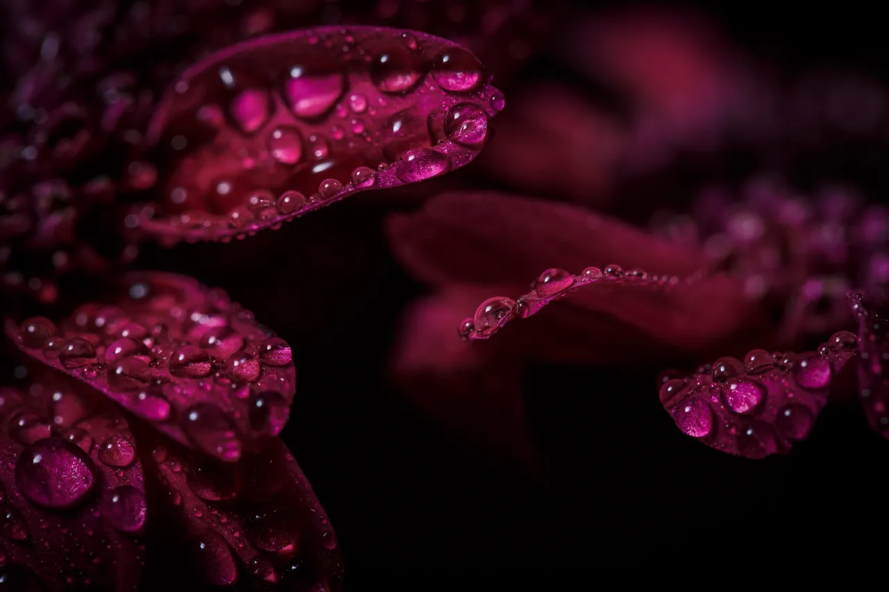
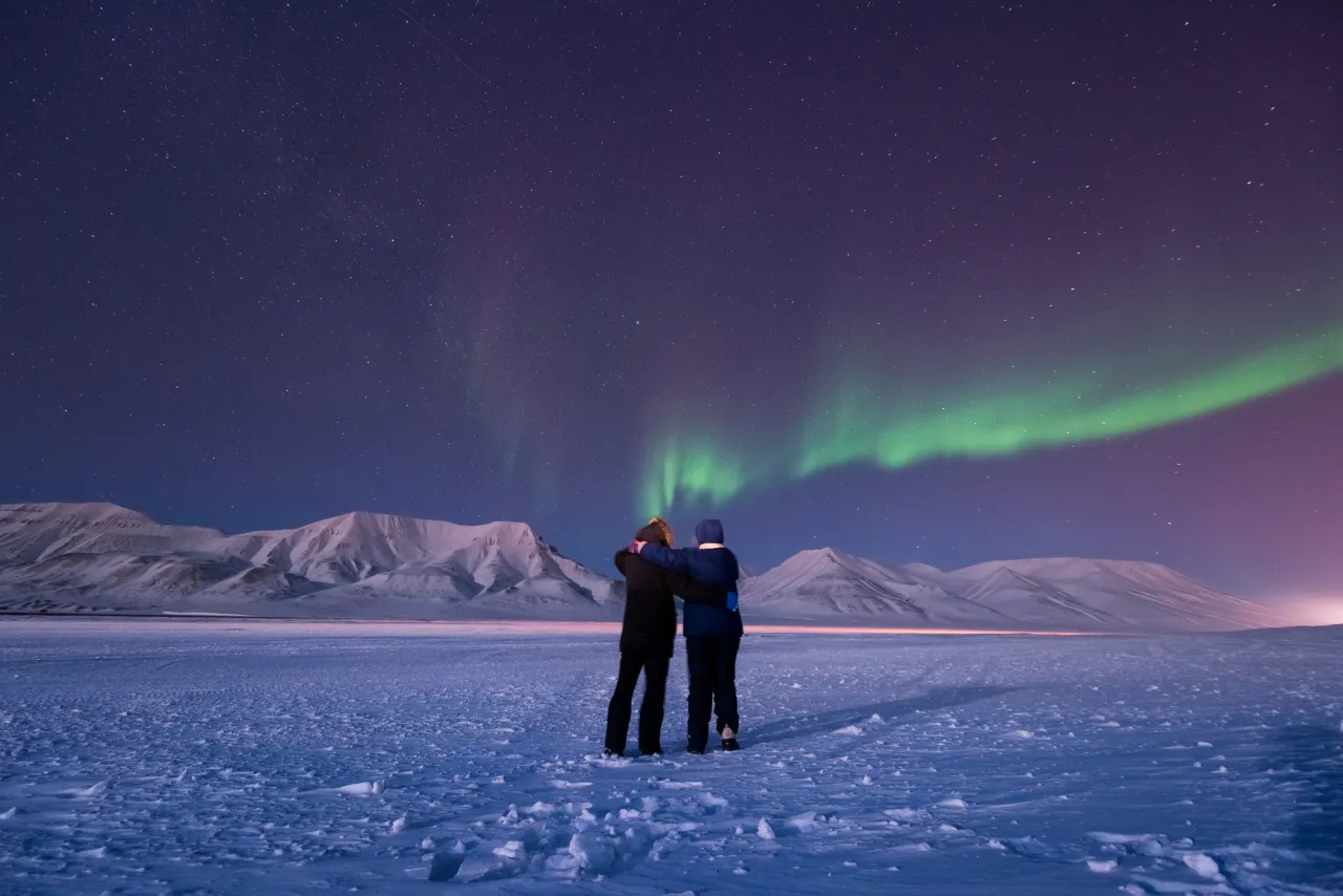
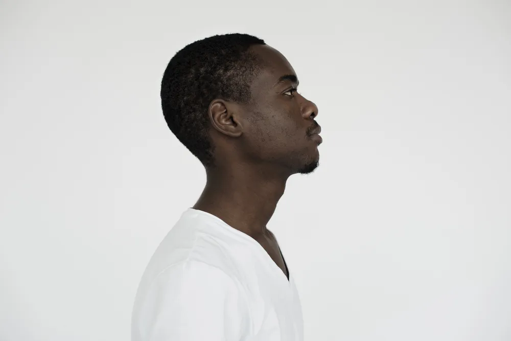
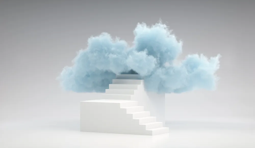
To help you explore this shade, we’ve curated a special collection featuring Cloud Dancer-inspired visuals across photography, illustration, video, vector art, and 3D. Use these images to build clean, balanced, and emotionally grounded campaigns.
Discover Cloud Dancer collection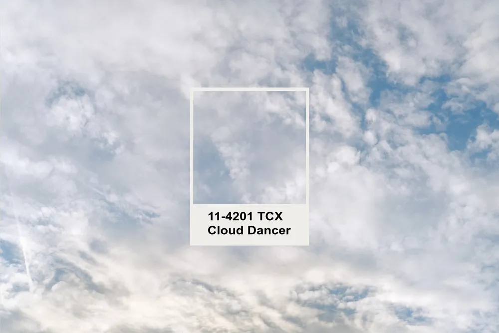
The meaning behind Pantone’s Color of the Year
Cloud Dancer arrives at a moment when both consumers and creators are collectively exhausted by overstimulation. After years of hyper-slick visuals, high saturation, and constant digital noise, this white feels like a pause, a return to presence and simplicity.
“Similar to a blank canvas, Cloud Dancer signifies our desire for a fresh start. Peeling away layers of outmoded thinking, we open the door to new approaches. An airy white hue, PANTONE 11-4201 Cloud Dancer opens up space for creativity, allowing our imagination to drift so that new insights and bold ideas can emerge and take shape.”
—Laurie Pressman, Vice President, Pantone Color Institute
Our Creative Design Trends Report 2026 echoes this sentiment. According to the research, the year ahead signals The Soft Rebellion—a shift toward visuals that feel honest, emotionally grounded, and refreshingly human.

Cloud Dancer sits at the center of this movement:
- less spectacle, more sincerity
- less performance, more presence
- less perfection, more intention
Cloud Dancer’s true power lies in its ability to shape-shift. It can read as airy or structured, poetic or pragmatic, depending on how you pair it. It’s not just a simple backdrop. It’s a quiet and powerful storyteller.
Here are the color codes for this shade:
- Pantone: 11-4201
- RGB: 240, 236, 229
- HEX: #F0ECE5
- LAB: 93.18, 0.79, 3.42
How to design with Cloud Dancer, plus licensed files to get you started
Despite its softness, Cloud Dancer is a strategic color. It opens up space inside busy compositions, grounds bold elements, and makes brand storytelling feel effortlessly intentional.
Instead of guessing how to incorporate this shade, explore our curated collection of photos, vectors, mockups, illustrations, 3D elements, and design objects inspired by Pantone’s 2026 palette. Perfect for:
- campaign key visuals
- social media graphics
- packaging and product showcases
- brand identity refreshes
- editorial layouts
- digital interface design
Remix, experiment, and build confidently, as Cloud Dancer is one of those rare hues that instantly improves visual balance.
Explore Cloud Dancer collection
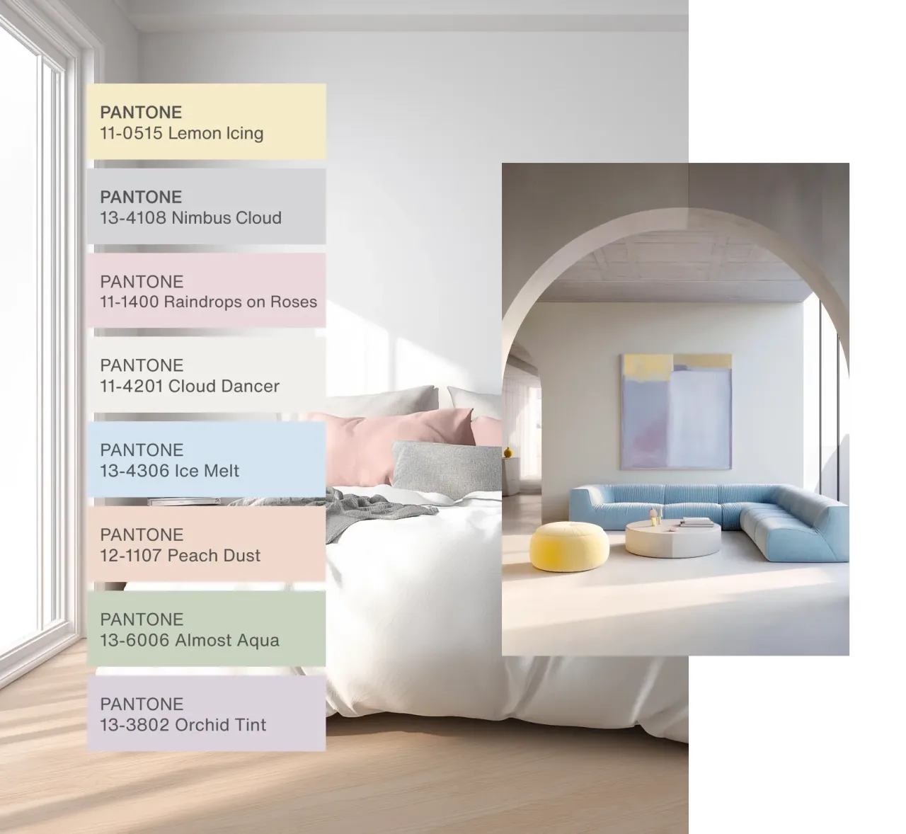
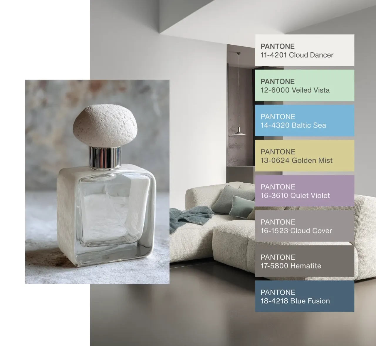
How to pair Cloud Dancer with other shades
Cloud Dancer has an extraordinary ability to adapt. It plays well with almost any palette but gives each pairing a different emotional quality.
- For soft, grounded aesthetics: Try muted earth tones—sand, clay, olive green, dusty sage. The result feels intentional and warm without slipping into minimalism clichés.
- For mature modern branding: Pair Cloud Dancer with charcoal, deep navy, forest green, or espresso brown. It brings clarity and structure without harsh contrast.
- For uplifting lifestyle content: Pastels such as powder blue, peach, lavender, or mint create a dreamy, feel-good palette ideal for wellness, beauty, or interior design.
- For bold expressive storytelling: Combine Cloud Dancer with bright tangerine, electric blue, fuchsia, or high-impact cyber green. It acts as a stabilizer that lets vibrant colors shine without overpowering the viewer.

Source: Pantone
The creative strength of soft whites
White is often considered the simplest color, but in branding, it’s one of the most strategic tools available. Cloud Dancer has the softness that traditional pure white (#FFFFFF) lacks, making it feel intentionally human rather than sterile.
Its strengths include:
- Signals clarity and openness
- Photographs beautifully, adding gentle dimension
- Pairs seamlessly with any typography
- Keeps digital interfaces and navigation calm
- Supports expressive visuals without competing with them
From packaging to app design, editorial to motion graphics, it offers a stable yet adaptable foundation for visual identity.
Pantone’s collaborations with Play-Doh, Command, Joybird, and Pura show just how versatile this shade can be across products and touchpoints. In digital design, Cloud Dancer becomes a canvas where bolder creative ideas can breathe, as represented in our collection of versatile mockups, illustrations, and professional photography.
Browse Cloud Dancer collection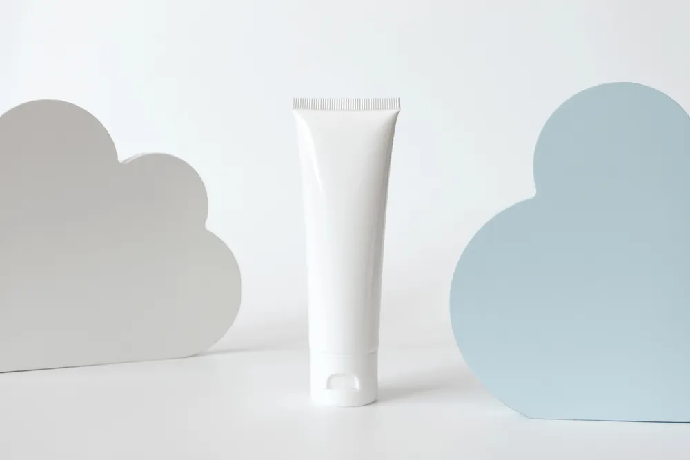
A gentle hue for bold creative choices in 2026
Pantone’s 2026 choice is a cultural signal. Cloud Dancer aligns with a bigger shift toward meaningful clarity and thoughtful communication. In a world overwhelmed by noise, softness becomes a strength.
Download licensed files from our curated collection, experiment with color pairings, and let this warm white guide your creative direction for the year. Think of Cloud Dancer as your design reset—a calm beginning with endless room to imagine what comes next.
Explore Cloud Dancer collection