More Traffic with the Right Visuals: 10 Tips for Choosing Images for Your Blog
Choosing images for your blog can be a daunting task. You want to find something that’s eye catching, creative and different. With so many things to keep in mind, could you be missing something? What can you do today to improve image choices for your blog? Since you’re here, we gathered useful tips and advice on how to take your image selection to the next level.
There are things you can do today to improve the visual appeal of your page, article or blog. Visuals will make or break your projects and we’re here to help you with a slightly more unconventional route that will help increase traffic to your publication.
1. Featured image sets the tone
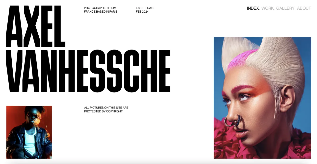
It’s hard to say which is more important, the title of your article or the featured image itself. The title (although important) is only a part of the secret formula to success. Whether you like it or not, books are judged by covers the same way readers will judge your article based on your image choice. The featured image requires a different approach.
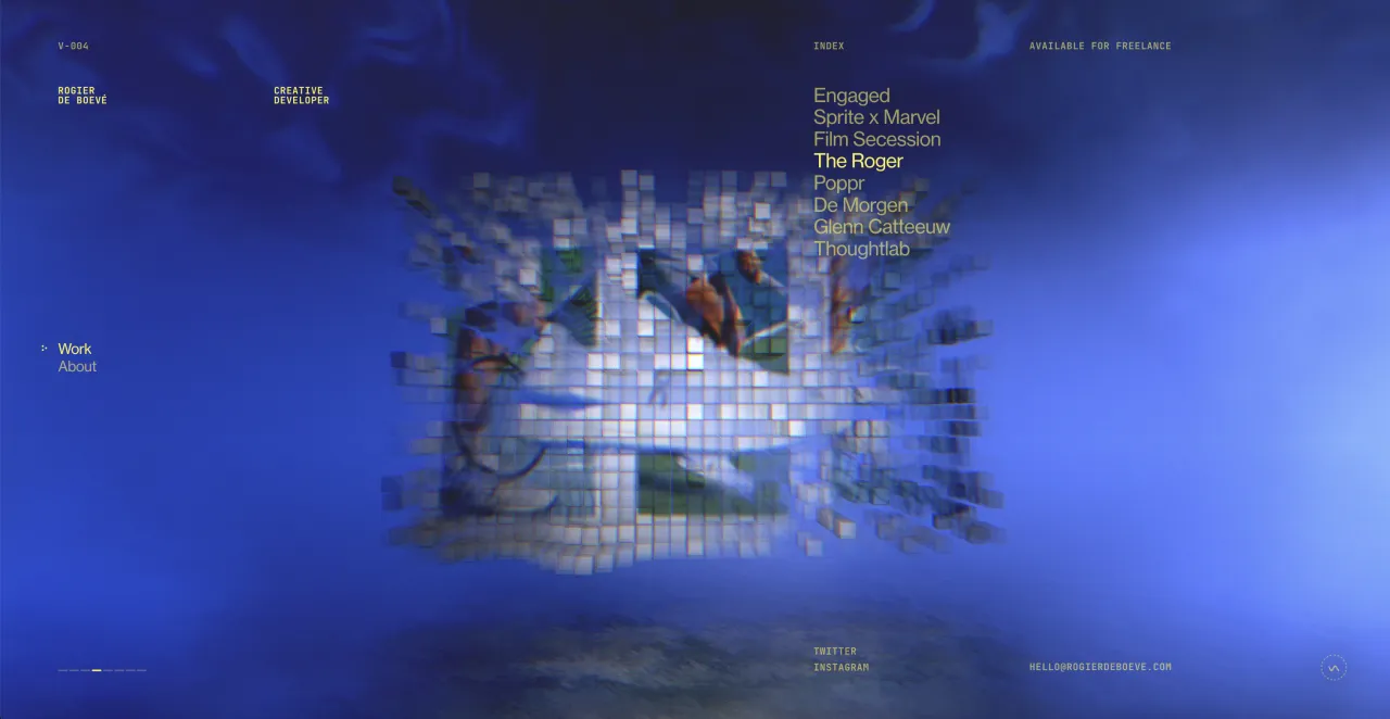
What kind of a tone do you want to set? Don’t be afraid to rely on colors to make an impact. Make your featured image subtly connect to your writing to make the readers think. An unconventional featured image that is clever, artistic and loosely tied to your article will draw more attention than a literal one.
Your primary job is to grab the attention of as many readers as possible with your featured image. This is precisely why literal representations won’t work as they don’t add any purpose to your topic or value to your readers.
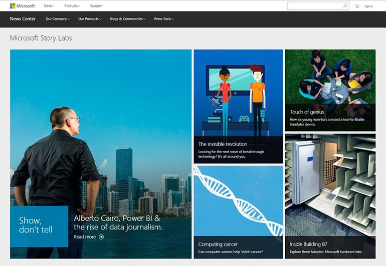
Image credit: Microsoft Stories
2. Find your golden ratio
It shouldn’t come as a surprise that using more images in your blog post will result in a spike in traffic. A study conducted by Buzzsumo and Canva revealed that using images every 75-100 words will double the number of shares as opposed to articles with fewer images.
This speaks volumes because research has shown that people will remember 20% of what they read and 80% of what they see. The visuals that you use will be memorable so next time you write a blog post, try a different word to image ratio and see the difference it makes.
The X axis on the graph shows the number of images between words and the Y axis represents the number of shares. An image every 75-100 words almost doubles the amount of shares.
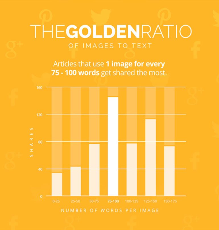
Image credit: Buzzsumo and Canva
3. Image relevancy is a top priority
The visuals in your blog post are not there for decoration. It’s important to value the time of your readers and instead of overwhelming them with random visuals, give them more value with the right visuals. How is this done? That’s the hardest part.
You have to spend enough time searching for the right visuals; ones that are relevant and add meaning to your content. You can approach this by creating your own collection of visuals using Pinterest or the Favourites tab on Depositphotos.
Treat your visuals as content and not a chore. Only then will you see a spike in traffic. You should aim to impress so that your readers feel as if you have put thought into your choices. This in return will add value to your writing if it is accompanied by thoughtful choices that are relevant to the content.
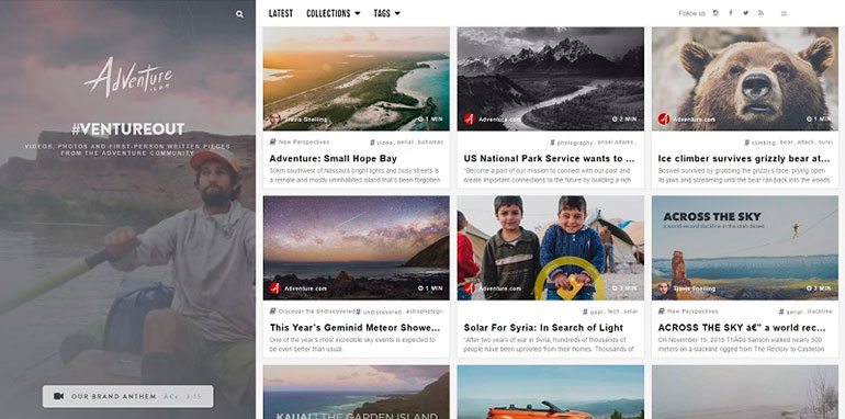
Image credit: http://adventure.com/
4. Quality and creativity above all
You should keep in mind the basic quality check – bright colors, crisp details, good lighting and excellent composition. Always opt for high quality when choosing images for your blog. Stick to the optimal resolution by seeing what image size is optimal for your blog. The recommended size is 500 pixels with a resolution of 72-96 dpi. Anything above this size will cause lagging and might throw off your readers.
For a more creative approach, think of ways in which you can illustrate your ideas. This includes things like graphs, tables, illustrations, screenshots and infographics. If you can illustrate an idea instead of talking about it, by all means do so!
If you don’t know where to start to look for more unconventional and creative photographs, look at some of the latest trends in stock photography. You can also choose trendy Pantone colored photographs or check in with our our themed collections. The collections we compile weekly can help you find exactly what you’re looking for with our suggested themes and topics.
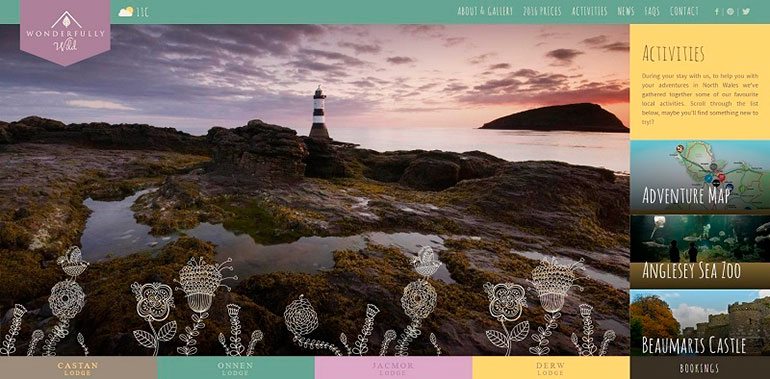
Image credit: www.wonderfullywild.co.uk
5. Avoid being too literal
Don’t take the easy route. A common thought process is “My article is about X, therefore I must find pictures of X.” You can throw this thought pattern out the window because it certainly won’t be of any help if you want to increase traffic to your website.
Think conceptually, think in metaphors and use symbolism. This kind of approach is likely to win over your readers and encourage them to share your article.

6. Tap into emotions
A picture is worth 1000 words but what kind of words? When you use images that showcase emotions, it sparks a reaction from your readers. This is one of the reasons why emotions work – they are relatable.
From personal experience, I can tell you that you can spend all the time in Photoshop creating a visually appealing image but it will never trump an image that shows emotions. This was the case for one of the articles I’ve written and the image with emotions triggered 200% more ‘likes’ and brought more traffic to my blog.
The lesson to be extracted here is that we are social creatures and we’re good at reading faces. If you see someone excited, you would want to know why they’re excited. That’s a guaranteed click from dozens of people.
7. Coherence & style throughout the post
The visuals you choose for your blog speak volumes about your aesthetics, personality and taste. Determine the style you would like to work with to ensure the images you choose are coherent and are in the same style.
Coherence and style determine the visual appeal of your blog post and when done well, will attract more readers. This is mainly due to the fact that it’s a good way of showing your readers that you care and that you’ve spent time carefully selecting your visuals that you think they would enjoy.
For example, for our series of blog posts on unexplored themes in stock photography, we created featured images in the same style and created similar colleges to ensure all 4 blog posts are similar in style and work well together as well as on their own. Which brings us to the next point.
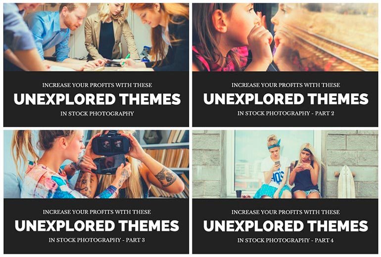
8. Personalization helps with views
When you gather a collection of potential images (which you should to keep your options open), you can add a personal touch to them. One of the ways to go about it is to create collages. Another great tool for image personalisation is Crello. With Crello, you can add text and design elements directly to your images.
Words on images is another way to translate a powerful message. The right phrase on the right image can make a big impact on your audience. Consider customising your images to add some depth to you content.
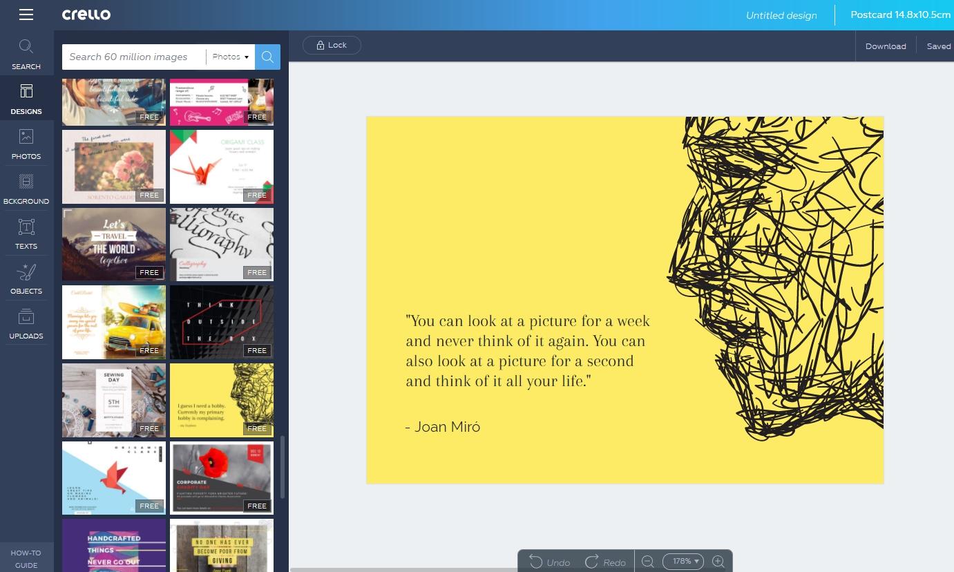
Image credit: Crello
9. Show professionalism
Never copy and paste an image into your blog. As images are as important as content, make sure you approach it in a similar way. Your articles are search engine optimized and the same should be applied to your images.
When you take care of the SEO aspect of images, you are increasing the visibility of your blog in search engines. Add appropriate ALT tags and descriptions. When people search for the topic you’re writing about, they can find it in images and come back to your website if your SEO is on point.
To show professionalism, give credit where credit is due. Honor copyright laws and usage rights where appropriate. This will show your readers that you are thoughtful and undoubtedly professional.

10. Keep shareability in mind
Images are an integral part of your overall design. This means that where you place your images is also important. Don’t use them to simply break up the text. Instead, place them where they are appropriate and fitting.
If you follow through with all of the aforementioned tips, you will increase the shareability of your article and acquire more traffic in the process. When your images are thoughtful and creative, they are likely to be shared as well. Your readers might want to pin your article which in return will bring you new readers.
Is every single one of your images shareable? Ask yourself this question when you’re choosing images for your blog. If they stand out on their own, chances are you’re doing it right.
In conclusion
Never underestimate the power of visuals. There is always a way to improve and perfect your website or blog. On Depositphotos, you have the option of reverse image searching which is a great way to find exactly what you’re looking for.
To take your blogging gig a step further, use your images for other social media posts to link back to your articles. This will create a unity with all your accounts and attract new readers in the process.
Don’t forget that you can link individual images to other content on your website or blog. This will give more meaning to your visuals and create a true purpose for every single one of your choices.


