How to Use Photography to Build Your Brand

The Internet is broken down into text and images. Since our brain processes images much faster than text, it is safe to say that photography is your most powerful tool when it comes to branding.
Your brand identity stretches well beyond your website. Whether you’re starting your own website, have a blog or simply need more visuals to build up your brand identity – visual content is a key element in your strategy. If we are to look into how photography can enhance your designs, we need to draw examples of excellent photography curation.
Let’s take a look at two similar businesses and the choices they have made to build their brands using photography.
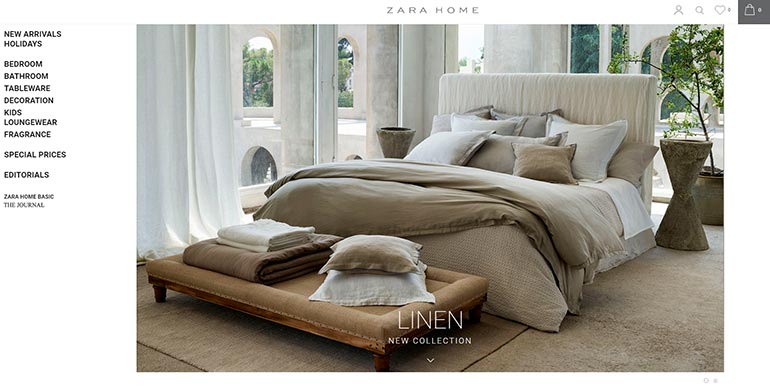
Image credit: Zara Home
Both Zara and Ralph Lauren have a ‘Home’ extension of their brand, however it is worth noting how they approach their portrayal of the brand. Each page tells a story about what their product is like, what their brand is about and the type of clients they are trying to attract.
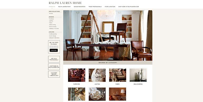
Image credit: Ralph Lauren Home
Zara Home is all about being affordable and cozy, whereas Ralph Lauren is more about luxury and sophistication. As you can see, the brands are quite different and they use visuals to translate their message for two different audiences.
We’re going to be looking at how photography can be used to build your brand and the steps you can take to have a better curated collection of images. Visuals will determine the success of your brand so knowing how to go about choosing them is crucial from the start.
The role of photography in branding
Like in the examples above, both brands used somewhat typical imagery of interiors but for different purposes and different types of clientele. This is how you have to approach representing your brand – taking into consideration the people you want to attract and the message that needs to be communicated.
Every brand incorporates visuals into their brand story. Visuals help translate your personality, aesthetics and support your brand identity. Some brands use photography better than others and we’re here to help you stay at the top.
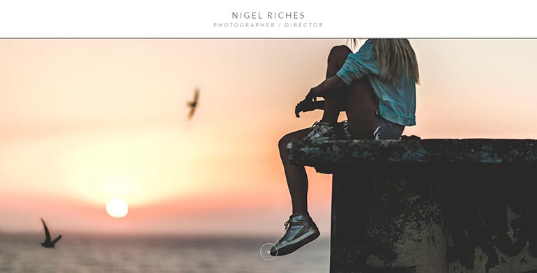
Image credit: http://www.nigelriches.co.uk/
How to use photography to build your brand
1. From concept to visualization
As with all great ideas, building your brand and developing aesthetics starts with a concept. You have to be able to answer the basic questions about your brand message, concept and objective. Having a clear overview of these 3 things will carry you into the next stage – visualization.
In the old days, brands created physical ‘vision boards’ (also known as moodboards). Today, we are lucky to have tools such as Pinterest to aid us in this task. You can start the same process in your Depositphotos Favourites tab. Start gathering images that inspire you from other brands, magazines, products, websites and so on.
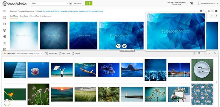
Envision your brand. What message do you want your audience to take away or what do you want them to learn about you? Translate these thoughts (and feelings) into your moodboard. Your brand personality should be loud and clear. This means being consistent in your choice of visuals. Opt for coherent visual aids that look like they belong together.
2. Curate your collection
After you have all your images in one place, turn into a ruthless editor. Looking through your collection, you will begin to see patterns. Take time to filter your selection of images to narrow your vision down to the necessary and essential images. This is perhaps the most difficult part but it is also central in helping you zoom in on the images that represent your brand.
A good way to approach this stage is to place yourself in the shoes of your audience. Envision the people you’d like to work with and the ones that will be interested in your product. You are designing and choosing visuals for them.
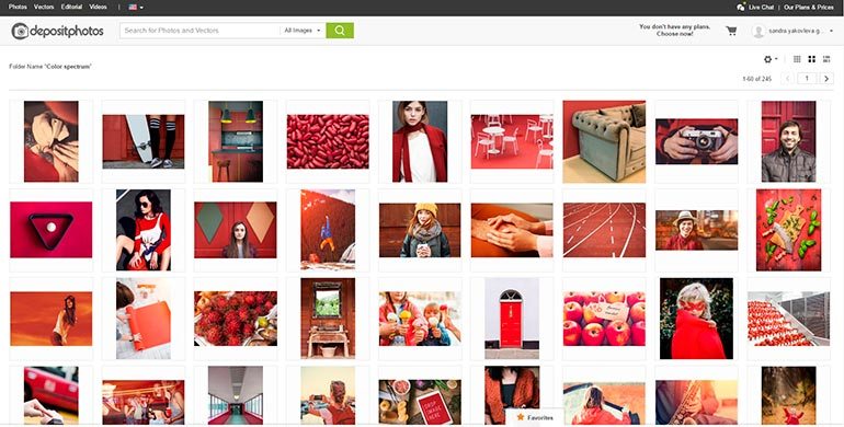
The below example is our Color Spectrum collection which was organized by colors. We began by gathering images in similar colors to later edit the collection for our clients. This brings us to the next step.
3. Filter by excellency
While curating your collection, you have to take into consideration things like colors, style, quality and even the visuals of your competitors. To find out more, check out our article on how to Win Over Your Clients with Visual Content.
Consider the current color trends and the most up-to date trends in visual communications. Opt for images with natural lighting, proper composition and an authentic vibe. If there are people in your images, make sure they look natural and translate sincere emotions.
3. Style of photography will lead to consistency
Aesthetics and trends don’t stay in place. The main design styles you should be aware of include classic, retro, material, handcrafted and minimalist. Spend some time familiarizing yourself with the different styles to see which category your brand fits.
Note that some stock photographers have series of photographs with the same models or scenery which can further help you with consistency and aid the storytelling aspect of for your brand.
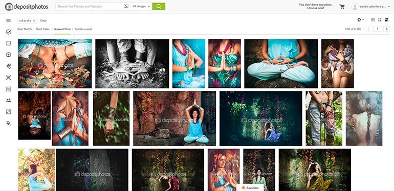
4. Work hard to tell a story
Be critical of your choices of visuals. Always ask yourself “what does this photograph translate?”. Select images that can help tell a story in a narrative style. Don’t opt for images just to have something to add to your content. Rather, try to find the visuals that will enhance your text.
When you’re submersed in the thought of telling a story with your images, consistency in style will unfold before you naturally. You will begin to see emerging patterns and your selection of images will be more coherent as you linger in this editing stage.
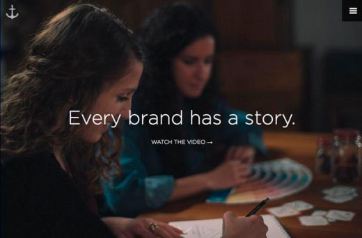
Photo credit: https://www.anchour.com/
5. Prioritize quality and creativity
Judge each photograph the way you would any other design project. The things you should keep an eye on are lighting, contrast, use of colors, composition and possible distractions. The lighting should be natural, the contrast appropriate for the image and the colors appealing and in harmony. Make sure your images don’t clash.
Strong composition is one of the most important aspects. Is the photograph strong and compelling? Question yourself before you make your final call. Lastly, make sure there is no clatter or distracting elements present in the frame.
Opt for unconventional photographs because it is those unusual focal points and compositions that will appeal to a wider audience. Get creative! Don’t get hung up on the technicalities and experiment a little keeping quality and consistency in mind.
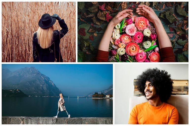
Once you have your images gathered in one place, you will have a visual moodboard that represents your aesthetics and your brand message. This is a collection that you can come back to edit anytime. The most important thing is to start brainstorming and start your search.
Where do you start looking for compelling images to build your brand? Depositphotos is a great place to get a head start without wasting your time aimlessly looking for visuals. It’s one of the few places that will give you the liberty to download any image for $1 with our new Flexible Plan. Simply create an album in your Favourites tab and start your search.

