5 Things Marketers Should Know About Choosing Stock Photographs for Projects
You’ve done the search enough times to work out your own system. Finding stock photography and selecting the winning images requires actual tactics and skills. You have your trusted sources, but how do you really know which ones to select?
What comes next is a wave of questions: Which contrast do you choose? Abstract or specific? Bold and bright or pastel? Which orientation? Which alignment? The list is endless. This is especially true if you’re lucky enough to find a photographer whose style you like but you have hundreds of similar images to choose from.
You need to take it down a notch, and remember that the most important aspect to consider is the end product and where your photographs will be used. Here’s a handy and quick guide on things you should keep in mind as you’re selecting the right stock photographs for your projects.
1. Keep the end result in mind
Where will you use your images? For what purpose and what is the desired outcome?
If you can answer these questions when selecting your photographs and still see them fitting, you’re probably making the right call.
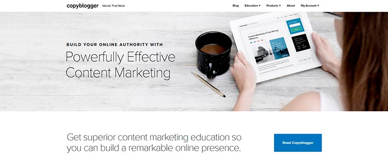
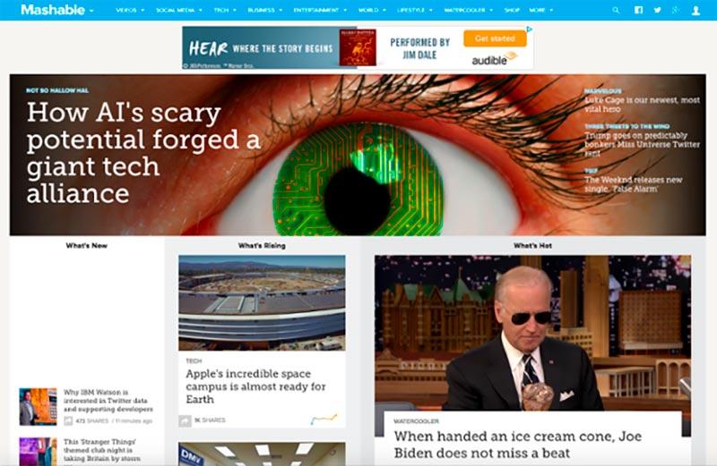
For the sake of making a point, let’s take a look at online content. You can have images that stand alone on your website and social media outlets or you can use stock photographs to add text on top or simply accompany it.
Be sure to know exactly where your image will be used and select your photographs according to the end result. When you know where your image will be used, you’ll have a better sense of direction and an understanding of what the right stock photo will be.

2. Winning shots are versatile
Can you use the photograph in other creative ways?
Versatile images are those that can be cropped and modified to fit different purposes. When you purchase your image, you don’t have to use it as it is. You need to choose photographs that will allow you to play around with composition.
This way, you’re not just buying one image – you’re buying an idea that can be modified to fit your publication or project. If you look at an image, and see that it can be cropped in creative ways and the composition allows some space for text on the image, you’ve got a winner.
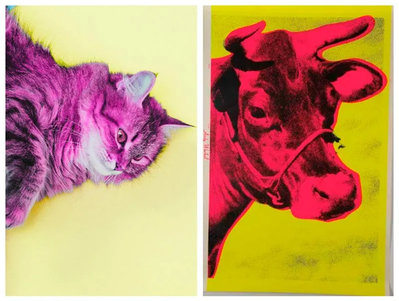
3. Bold and bright is attention grabbing
Are you taking risks with your images?
In our trends report, we mentioned bold and bright as one of the trendy themes this year. There is a reason why bold and bright images work – they’re excellent at standing out on feeds and website pages. They’re simply demand attention.
This doesn’t mean that any bold and edgy image will do. What you should focus on is finding contrast; contrast in colors, lighting, hues, and saturation. Our brain works in mysterious ways but one thing is for sure, an image with plenty of contrast will grab attention for just that little bit longer (until we figure out what’s in the shot).
4. Select images that will compliment your message
What comes first, the image or the text?
Bold images are great as long as they’re not distracting. You want to grab attention, but not divert focus from your text or main message.
Even if you’re not going to have any supporting text and your images are the sole focus of your project, you still have a message you’re trying to communicate. When selecting stock images, always keep in mind what you would like for the images to translate.
You should be able to glance at an image and pick up hints on the subtle messages that it is trying to deliver. Different images give off different vibes and messages and you quickly learn this by scrolling through the databases.
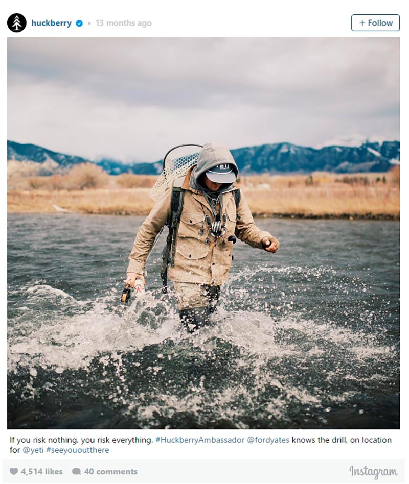
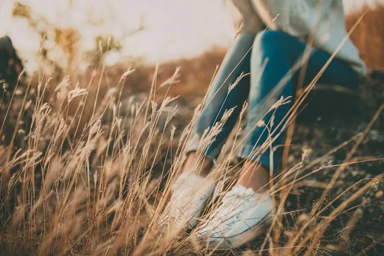
5. Humans and emotions in images need special care
Are the people in your images sincere and relatable? Are the emotions believable?
Plenty of research has been done in this area. The fundamental question is what kind of an effect does an image with a person have on your audience? There are many different ways to include people in your photographs and it’s not necessarily a portrait shot.
The person can be looking at or away from the camera. It could be the back of the head or the back of the face. They can be blocked out by the sun or cropped in a way that is not just their face. The reason why it’s a good idea to include people is because it immediately makes an image relatable (given it is not too staged with fake emotions).
Speaking of trends, images shot from unique perspectives will always perform better. They’re different and make us stop and think twice. Point of view shots are also extremely popular. We’re seeing more and more use of images shot from a first person perspective. These images seem quick and authentic, as if shot with an iphone in the moment.
From personal research, I can tell you that you should go for the slightly imperfect shots where raw emotions shine through. These are magical images that quickly grasp your audience; they set the mood and give your projects context and vibes.
We discussed 5 main concepts and ideas that should be in your head as you’re selecting your images. All other points of consideration are common knowledge such as choosing text friendly photos, natural photographs with good lighting, images that are relevant to your context, and always opting for high quality.
It shouldn’t come as a surprise if you consider the fact that a high quality image is a reflection of your product or service. A great shot can really turn things around.
So get creative and try to edge closer to being conceptual. Be more considerate of your audience, your message and your purpose and you’ll be off to a good start. Picking those winning shots is challenging but you can’t go wrong with images that fall under all these categories.