Trendy Pantone Photo Selection for Your Website
There is something about a color splash on a website that makes the content so much more exciting. Colored visuals are refreshing and quite frankly are appealing to the eye when used tastefully. We can all agree that choosing the right visuals can be quite a headache. But that’s why you’re here isn’t it? You need a splash of color and a fresh perspective. Maybe your website needs a makeover or your blog is looking a little sad and drained of color? Look no further because we have all the answers.
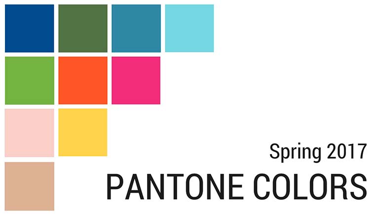
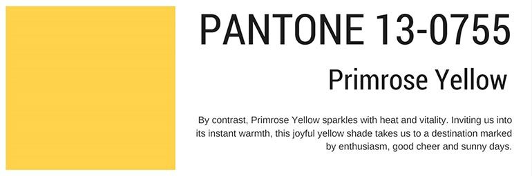
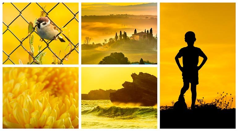
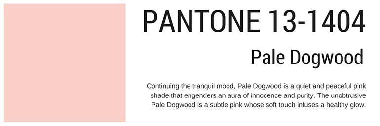
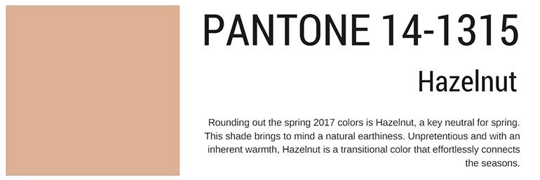
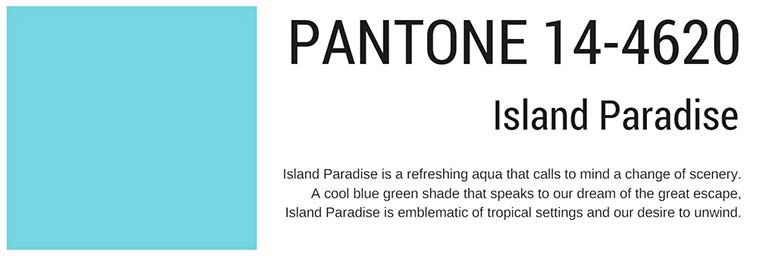
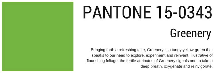
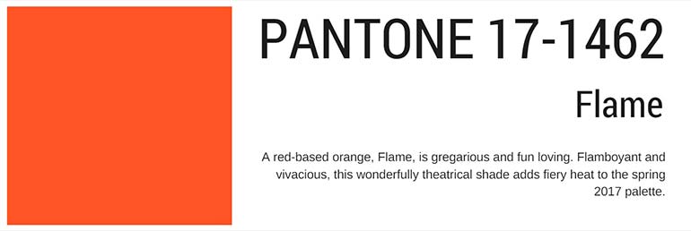
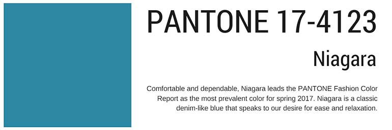
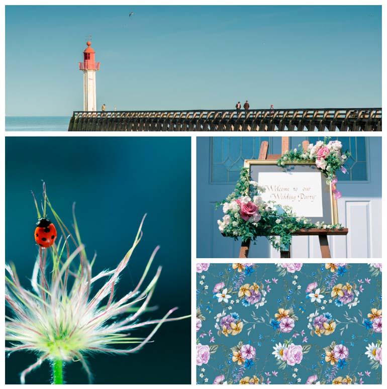
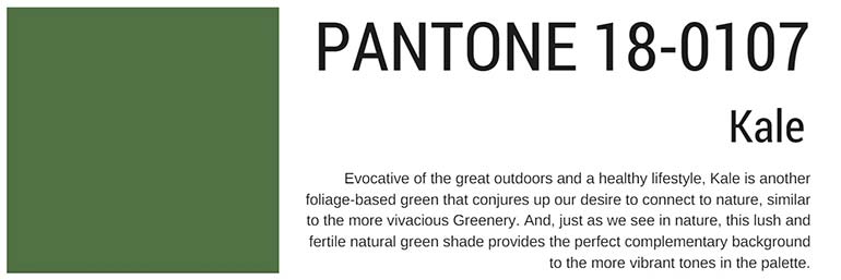
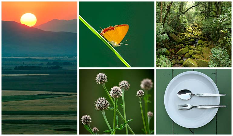
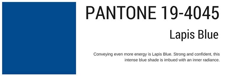
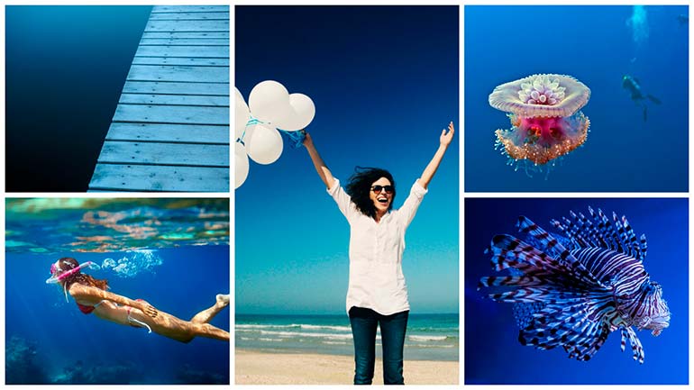
The Pantone colors for spring 2017 are here, which means you have a brand new color palette to work with and an abundance of visuals waiting to be discovered. When you’re short of inspiration, go back to the basics. Maybe the one thing missing in your projects is an element of surprise.
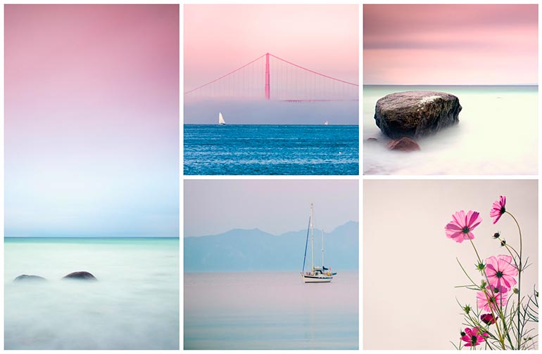
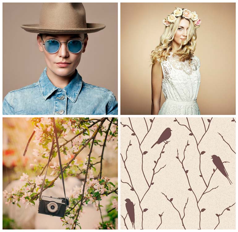
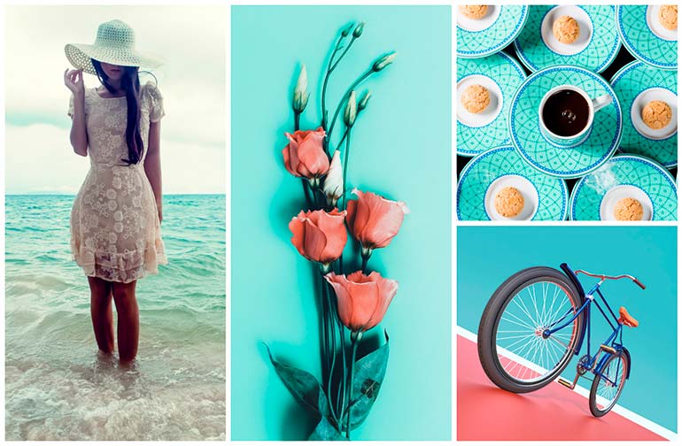
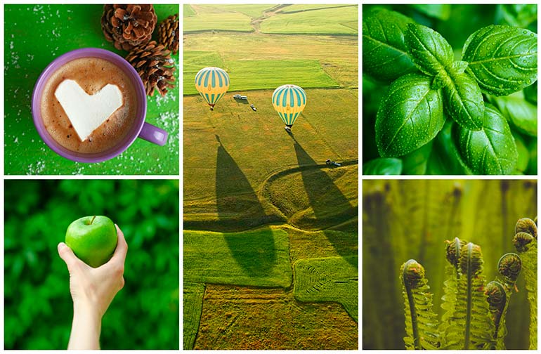
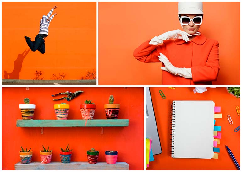
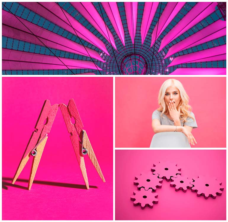
We handpicked some images that are refreshing, trendy and edgy to go along with your content. Scroll through and pick the ones that stand out to you. You can never go wrong with Pantone colors.

What are your favourite Pantone colors this season? Leave your thoughts and comments in the comments section below.