Get unlimited AI generations and 10 downloads for just $25
Buy now
Images
Photos
Vectors
Illustrations
Collections
Free pictures
Videos
Editorial
Music
Tools
AI Image Generator
VistaCreate Editor
Logo Maker
Free Background Remover
Free Video Background Remover
Free Image Upscaler
Reverse Image Search
Refer & Earn
API Program
Depositphotos Blog
Enterprise
English
Українська
Sign Up
Home
en
Home
News and events
Inspiration
Creativity
Marketing
Technology
DepositPhotos Blog
Educating, inspiring, and motivating creatives
Home
News and events
Inspiration
Trends
Design
Video & Animation
Colors
Art
Illustration
Photography
Branding
Aesthetics
Creativity
Creative Thinking & Techniques
Motivation
Productivity
Leadership
Ideas
Mental Health
Marketing
Advertising
Social Media Marketing
Digital Marketing
Brand Marketing
Consumer Behavior
Business
Marketing Trends
Technology
Production
AI Trends & Tools
AI-Generated Images
Software
Online Tools
AR, MR, VR
Home
News & Events
Новини та події
Постачальники
Фотографія
Дизайн
Маркетинг в соцмережах
ШІ-згенеровані зображення
Inspiration
Новини та події
Постачальники
Фотографія
Дизайн
Маркетинг в соцмережах
ШІ-згенеровані зображення
Creativity
Новини та події
Постачальники
Фотографія
Дизайн
Маркетинг в соцмережах
ШІ-згенеровані зображення
Technology
Новини та події
Постачальники
Фотографія
Дизайн
Маркетинг в соцмережах
ШІ-згенеровані зображення
Marketing
Новини та події
Постачальники
Фотографія
Дизайн
Маркетинг в соцмережах
ШІ-згенеровані зображення
Search
Search
featured collection
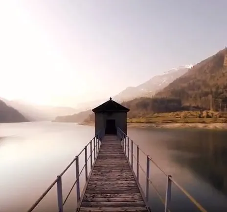
Featured Video Collection: Mesmerizing Drone Footage
Sandra
17\04\18
collections
featured collection
video collection
Featured Collection: Big City Life
Sandra
10\04\18
collections
featured collection
stock photography
Featured Collection: Cosmic Wonders
Sandra
03\04\18
collections
featured collection
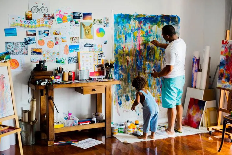
Featured Collection: Life of an Artist
Sandra
27\03\18
collections
featured collection
Featured Collection: Preparing For Easter
Sandra
20\03\18
collections
featured collection
Featured Collection: Home Sweet Home
Sandra
13\03\18
collections
featured collection
Featured Video Collection: Perfect Symmetry
Sandra
06\03\18
collections
featured collection
Featured Collection: All the Neon Lights
Sandra
27\02\18
collections
featured collection
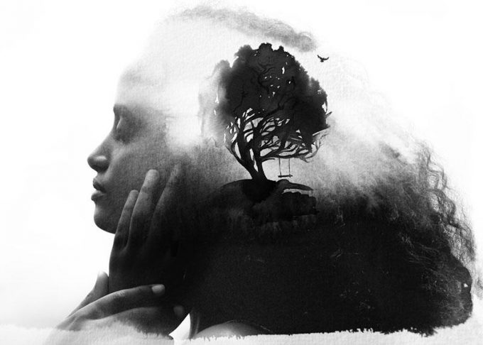
Featured Collection: Double Exposure
Sandra
20\02\18
collections
featured collection
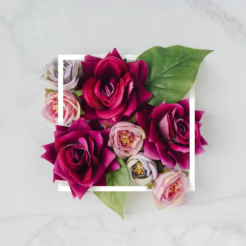
Featured Collection: Refreshing Spring Images
Sandra
13\02\18
collections
featured collection
Featured Collection: Video as a Tool of Communication
Sandra
06\02\18
collections
featured collection
video collection
Featured Collection: Anti Valentine’s Day
Sandra
30\01\18
collections
featured collection
Looking for ideas to make your business thrive? Subscribe now!
Join our blog and receive a batch of valuable insights every month.
I'd like to receive newsletters from DepositPhotos. By clicking on Subscribe you agree to the
Membership Agreement
and
Privacy Policy
*