7 Impressive UX Portfolios You Haven’t Seen
Even if you don’t have an analytical mind and reviewing other works is not a pleasant task for you, you have to admit that seeing and analyzing different portfolios is an effective way to learn. You generate new ideas and get practical insights but also this approach makes research interesting and fun.
Whether you’re curious about the latest in UX or would like to put together a creative portfolio or enhance an existing one, you should definitely explore these impressive UX portfolios. It’s always great to see how people around the world are presenting their top-notch work.
Impressive UX Portfolios You Haven’t Seen
Simon Pan
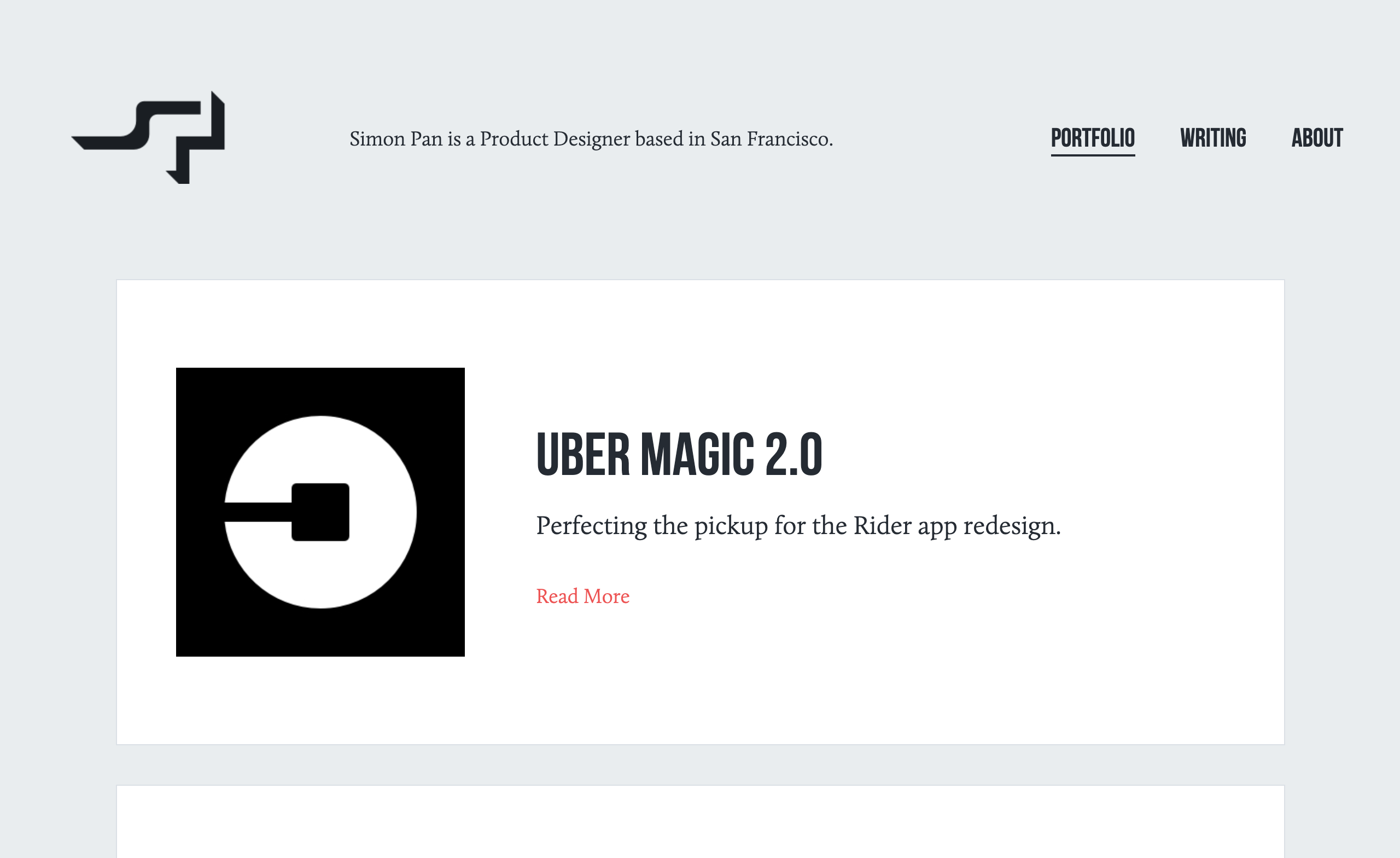
To start with, Simon Pan is a senior interaction designer at Google now. Previously, he worked at Uber and redesigned the Rider app. For Amazon Music, Simon was a part of the team launching and evolving Amazon’s streaming service.
He has an exciting UX portfolio where he shares detailed case studies on the projects he’s been a part of. In addition, Simon is currently writing a book about UX design, has a column on Medium and sends out a newsletter in which he provides all the updates. Our advice: don’t miss out on this one.
Karolis Kosas
Have been wondering what a well-designed UX portfolio looks like? Here it is. Clean, simple, and clear.
Being a product designer at Stripe and a co-founder of Anchovy app, Karolis Kosas definitely knows a lot about great user experience and has plenty of knowledge to share. For every project on his portfolio website, there’s a description of his role, design process and final results.

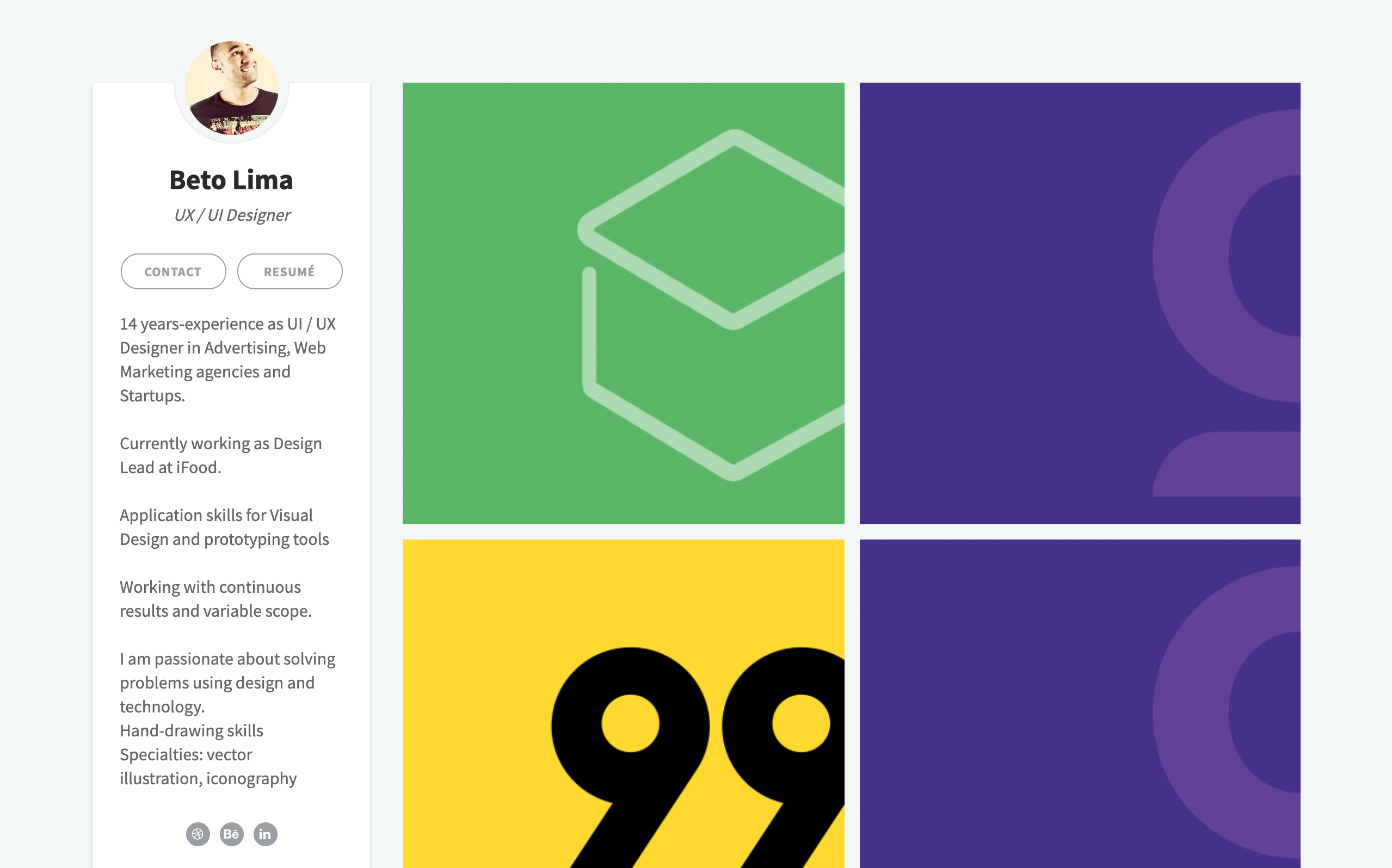
Beto Lima
If you’re just starting your career in the field, this UX portfolio is worth your attention.
Beto Lima has 14 years of experience as a UI/UX designer in advertising and working with web marketing agencies and startups. He is passionate about solving problems using design and technology and this is what every UX designer should be.
Each project on his portfolio website has a case study and you can learn a lot from them. For example, in the process of designing a website for 99app.com he explains and shows in detail the challenges he faced as a designer. He also covers more practical things like making interviews, having a card sorting session, creating a site map, wireframes and many others.
Niya Watkins
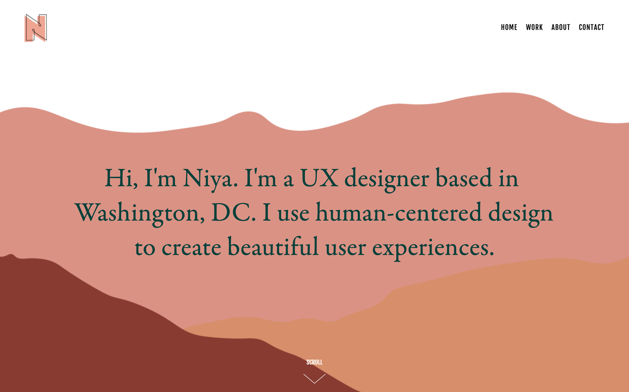
Niya Watkins is a freelance UX designer who uses human-centered design to create a beautiful user experience.
In her portfolio, she provides a clear explanation of what she does as a designer and this is what an excellent UX design portfolio should look like. Niya worked on social feature integration for Spotify and in one of the case studies, you can see every stage of the design process. For other projects for Mirror Clothing Store, Capitol Supermarket in DC, and Kai Food Donation App, the overview structure is identical. Interesting, right?
Lizz Wells
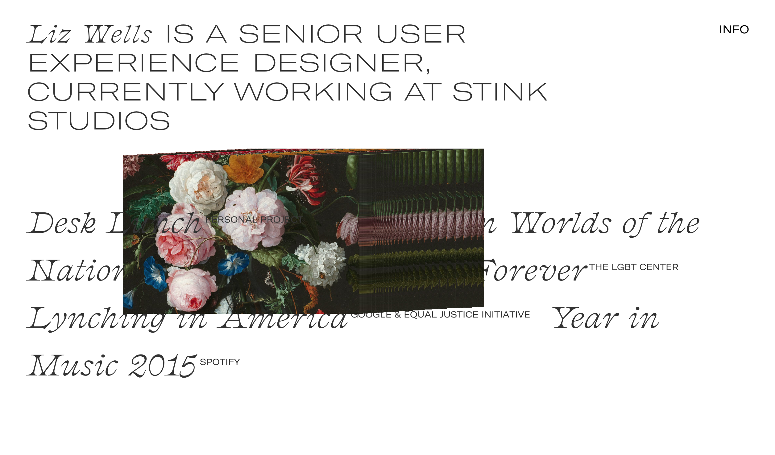
Lizz Wells is a senior UX designer at Stink Studios. In her portfolio, each case study has a clear structure and you can not only marvel her projects but also get some practical knowledge for your future endeavors. There are handwritten sketches, mobile wireframes, exhibitions – in short, everything you’d like to know about each stage of a UX design project.
Make sure you scrutinize Lizz Wells’ portfolio, as her works have been featured by The Verge, The New York Times, Quartz, BuzzFeed, Adweek, Time, Fast Company and Artsy and among her clients are Conde Nast, Facebook, and Google.
Melanie Daveid
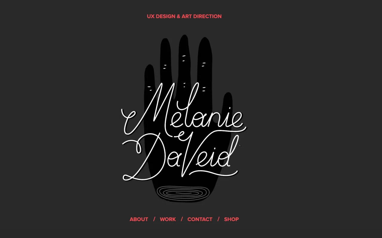
Having a user-centered mindset, Melanie Daveid is collaborating with agencies, clients, and brands to develop digital concepts. In her portfolio, she guides through each process of the UX design and shares the structure of work:
- Research
- Structure setup and content of the project
- Concept and strategy
- Create, evaluate and iterate deliverables like
-
- Personas
- Site maps
- Use cases and scenarios
- User flow
- Sketches and Infographics
- Wireframes
If you’d like to get into the details of what goes into each of her projects, do give her portfolio a scroll.

Pendar Yousefi
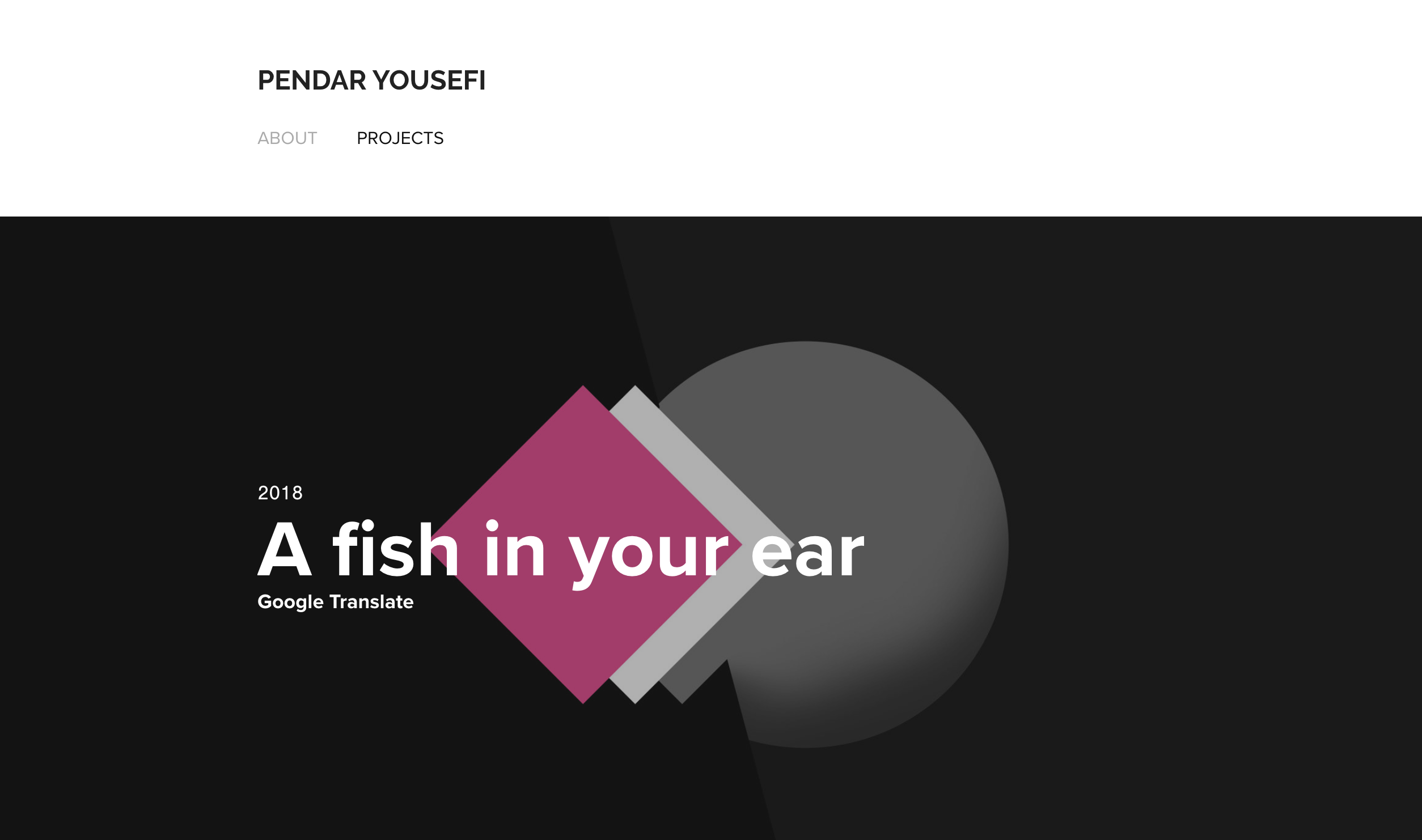
Pendar Yousefi is leading a UX team at Google Translate, and this is basically all the information you need to know in order to get interested in his UX portfolio. He features a redesign of the Google Translate website, provides a case study and shares the implementation of the new website feature where gender bias is reduced.
These UX portfolios are impressive because of the brands, designers collaborated with, case studies they have presented and the personal workflow they have shared with the world to help other professionals. Learning from the best in the field can start with something as simple as studying their portfolios and extracting lessons that are applicable to you.
