Back to Basics: 10 Composition Rules in Photography
Photography is all about creativity, inspiration, and sharing your unique artistic vision. With all the freedom, is there really any space for rules? Yes! Photography composition rules should always be kept in mind because they are fundamental in excelling as a photographer. Your basic knowledge of photography composition rules will give you the tools to experiment as you work on improving and establishing your style.
Even if you know all these photography composition rules well, polishing up on some basics might just ignite a spark of creativity in you. Let’s take a look at all the composition rules that exist out there, and figure out how you can work towards embracing (or breaking) them.
Keep in mind that you can buy images in this article to have a small reminder of the 10 simple rules of composition in photography.
What is a composition in photography?
As in visual arts, composition in photography is simply the arrangement of visual elements within a frame. The term composition literally means ‘putting together’. So, to get the perfect shot, the photographer has to organize all objects in a scene.
Why is composition important in photography?
This may come as a surprise to many, but photo composition is as important as the technical side of a photoshoot. Suppose a photographer arranges the visual elements within a frame, complying with the rules of composition. In this case, a viewer’s eye will automatically be drawn to the most significant and interesting parts of the image. A well-composed shot will stand out from the rest and aid in distinguishing a great photographer from a good photographer.
5 Basic elements of composition in photography
To enrich images and make them more visually appealing, photographers utilize a variety of compositional elements. Patterns, textures, lines, shapes, forms, color, tone, contrast, depth, frames, symmetry, asymmetry, depth of field, viewpoint, negative space, positive space, and visual tension are among them. Read on to learn about the five basic elements of composition in photography.
1. Shape is a two-dimensional compositional element of photography that can define a subject or a structure. It can be organic, like a person, animal, plant, or geometric, like a square, circle, or triangle. When different shapes intersect and overlap, they can unite to create a new shape. They can also surround an area, forming another shape.
2. Form is created when the shape becomes three dimensional. This can be done by adding depth to a photo through lighting and perspective. Thus, when the shape and shadows collide, we see touchable contours brought out by the tonal range.
3. Texture is a compositional element of photography that adds another layer of depth to an image, making it more real and perceptible. Texture itself can be the subject of a photo, such as an ice surface or patterns on leaves. Alternatively, texture can be part of the composition, adding dimension and weight to your image and giving it a sense of reality.
4. Color is characterized by hue, saturation, and luminance. Each variable can influence not only the composition of a photograph, but also its mood. By experimenting with various colors in the frame, you can put visual weight on the specific part of the image. Black and white photography can help show contrast, highlight emotions, or emphasize key visual elements in your photographs.
— Find practical tips and ideas on color contrast in photography on our blog.
5. Positive and negative space. The scale and arrangement of the elements and objects in the frame affect the viewer’s perception of the picture. By effectively using space in your photographs, you can convey a certain mood or draw the viewer’s eye to an interesting or significant part of the image. Positive space refers to the subject or areas.
10 Rules of composition to follow for the best shots
1. Rule of thirds
With the rule of thirds, you have to train yourself to split your camera screen into a grid. Keep in mind the key points of intersection, and place important elements along those lines for visual appeal. This asymmetric composition in photography works well for any genre including landscapes, still-life photography, and portraits.

In this still-life image, the photographer employed the most common way of using the rule of thirds by placing the main subject in the center. However, you can put it off-center as seen in the picture below. The photographer positioned a tree with a model near the grid intersection at the bottom left angle, drawing the viewer’s attention to them and creating a more interesting composition.

Useful hint. Turn on your camera’s rule-of-thirds grid to improve your photography skills.
2. The Golden Ratio
The Golden Ratio differentiates from the rule of thirds by the balance of the photograph. Here, the focus of the photograph is more towards the center (with more details). The roots of this rule go back centuries and can be found in notable works of art. In essence, it is the perfect balance with a ratio of 1 to 1.618, and you can search for this to understand the proportions in photography, architecture, and art.

Instead of nine equal rectangles, the frame is divided into a sequence of squares that form a Golden Spiral, also known as the Fibonacci Spiral, which resembles a shell. The spiral guides the viewer’s eye around the frame and shows how the scene should develop.
— Learn how to use the Golden Ratio to improve your photography composition.
3. Leading lines
Take advantage of the structures and lines in landscapes. Use them in proportion to your subjects to lead the eye into the picture. A centered and symmetrical photography composition is the most preferable one in this case; it helps the viewer focus on your subject or object.

Everything can serve as leading lines: rivers, dunes, waves, roads, paths, bridges, fences, staircases, hallways, patterns, etc. Furthermore, leading lines do not necessarily have to be straight. In our example, we utilized a spiral staircase to lead the viewer’s eye to the point of interest in the frame and create a more beautiful image composition.
Exposure hint. Some fabulous lines might be seen with unusual exposure compensation.
4. Diagonals
One thing about diagonal lines that differentiates it from other composition techniques is that the lines help create movement in the photograph, even when your subjects are still. This is a great tip for photographers that want to step outside of perfect compositions, yet still create appealing photography compositions with the help of diagonal lines.

In our example, diagonal lines assist in emphasizing perspective and add dynamics to the photo. The subject in the image appears still, yet you can tell that he is ready to move.
Diagonals hint. Your composition will look chaotic if you include too many diagonal lines in the frame.
5. Frame within a frame
As you plan how to frame your shots, consider that outside structures can serve as natural frames. This can be things like windows, doors, or arches, so use them to your advantage! This composition in photography is also called frame within the frame. What makes a photograph like this interesting is that it is soothing to the eye.
The photographer added layers and depth to the scene in the image above by placing the subject in the arch. Note that frames don’t necessarily have to be man-made and fully surround your subject. You can also use tree trunks and hanging tree branches for a frame within a frame photo composition technique.
6. Figure to ground
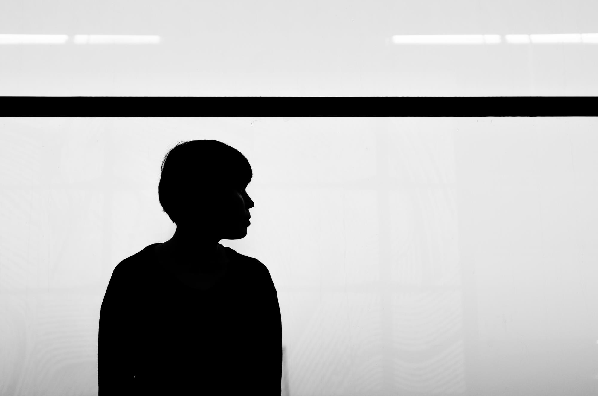
Try to focus on your subjects and make them stand out by narrowing in on the contrast between the subject and the background. The more contrast, the more dramatic your shots, and the more prominent your subject. A winning photo composition is one in which your main subject is isolated due to the contrast solution.
Our picture is a perfect example of the figure to ground photographic composition. The main subject contrasts with the background, making the model stand out. This effect can also be achieved with a contrast light difference, where more light falls on the subject than on the backdrop. Alternatively, you can find a subject that is lighter than your background and place it in the same light.
Hint for photography composition with two subjects in the photo. Use the Golden Ratio rule or the rule of thirds to balance your image.
7. Fill the frame
To fill the frame, your subject should occupy a significant portion of your image, leaving no or little space around it. This way, the photographer removes all distractions, allowing the viewer to focus on the main subject and explore every detail.
Get up close and personal with your subjects. Have them fill in the frame so that they are the focus and the dominant feature of the photograph. Note how in this photo composition example, the background was used as a pattern to fill in the frame.
Useful hint. Use a zoom lens to help fill the frame.
8. Center dominant eye
When photographing people, place their dominant eye in the center of the photograph. This makes the picture more luring as it appears that the subject’s eyes are following the viewer.
Look at our photo and try tilting to the side or scrolling the image up or down. You’ll notice that the subject’s eyes are always following your movement.
9. Patterns and repetition
There is a reason why we love patterns – they are aesthetically pleasing to the eye. Another aspect to explore: include something in your photograph that interrupts a pattern, adding an element of surprise.
In our case, a man-made pattern provides an attractive composition. However, you can look for repetitions and patterns created by nature, such as an alley of trees, dunes, or waves.
Useful hint. Try to break the pattern. The imperfection will add interest to the image and draw the viewer’s attention.
10. Symmetry and asymmetry
There is beauty, simplicity and a certain type of elegance in a photograph that is perfectly symmetrical. It’s pleasing to the eye and a sure way to catch the attention of many. The same goes for a slight variation of the style; asymmetrical shots that include empty space for visual interest (use the first photo composition rule in this list to find out where to place your subject).

Depending on the scene – symmetry can be something to go for – or to avoid completely. In this aerial shot below, the photographer captured horizontal symmetry, creating a strong point of interest and drawing the viewer’s eye to all parts of the photo.
Using a photo editing tool can further refine your composition, allowing for adjustments that enhance the visual impact of your photographs.

Useful hint. You can use reflections in your photos. They allow you to reposition the symmetry axis in the image.
— Want to know more? Check out our guide to symmetry in photography.
Wrapping Up
These are just 10 of the most noteworthy rules of composition in photography. But how do you improve your photography composition skills if none of these principles are applicable? Create AI Videos using any Photo to explore new perspectives and breathe motion into your stills.
All things aside, you know better than anyone else that rules are meant to be broken. The most important thing is that you develop your personal photography style, as well as push forward your aesthetics and your unique vision. That’s the one rule you should stand by 100% of the time.
